10,000 search results
(0.049 seconds)
- Somaton by ParaType,
$25.00 This original display family was designed by Vladlen Erium in 2000 for advertising and display typography, especially for advertising of teenage goods and services. The caps-only face has modern letterforms, dynamic slanted styles, and stable upright ones. It is very useful for creating a memorable product image.
 - Copperlove by Resistenza,
$49.00 Copperlove was born during a very long and hard wintertime in Berlin. This font is based on Giuseppe Salerno’s Copperplate calligraphy. Oblique nib and sepia ink were the tools used to create this sublime english typeface. There are also many opentype features like alternates and beautiful swashes. Turquoise Nautica
 - Parekraf by Nirmana Visual,
$17.00 Parekraf is a natural Handwritten typeface, with 2 style : Regular & italic. full set of lowercase and uppercase letters, numerals and punctuation, multilingual symbols. Very suitable for the title, logo, typography, clothes, magazines, brochures, packaging and much more for your design needs, making your designs more modern and professional.
 - Little Sooner by Dumadi,
$25.00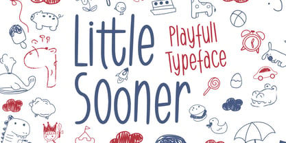 Little Sooner is a special handmade font using the Brush tool. This font is specially designed for children with a full-color style that will enhance the quality of your designs. very suitable for the design of children’s t-shirts, children’s youtube titles, children’s quotes, children’s web, and others.
 - Vilaka Modern Serif Font by Nestype,
$23.00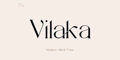 Vilaka is a Fancy Modern vintage serif typeface with beautiful ligatures. It is a very versatile font that works well in small and large sizes. Perfect for editorial projects, Logo designs, product packaging, magazine headers, Clothing Branding or just as a stylish text overlay to any background image.
 - Rillilove by Yoga Letter,
$18.00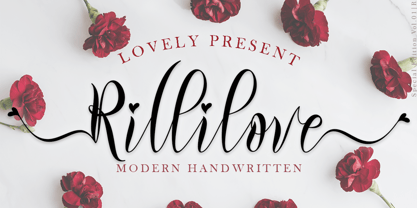 "Rillilove" is a very beautiful, smooth, elegant, and high-quality font. This font is perfect for weddings, marketing products, marketing your business, creating quotes, invitation cards, logos, branding, holiday updates, and more. Equipped with uppercase letters, lowercase letters, numerals, punctuation, swash, titling, uppercase alternates, ligatures, and multilingual support
 - Workbench by Graphicfresh,
$14.00 This font is great for magazine headlines, business cards, social media posts, and a variety of other applications. The text size is very flexible, with multiple font styles and sizing options that allow you to create the look you want without altering the overall design of your text.
 - Mockerel Vintage by HansCo,
$15.00 Mockerel Vintage font is a vintage decorative typeface which is inspired by lettering sign and art. While this font has a victorian touch, it still looks bold and solid. Very suitable for for packaging, headline, logotype, apparel, branding, advertising etc. How to access alternate / ornament ? : https://hanscostudio.com/tutorial/ *Enjoy!
 - Netherland Perpendicular by Greater Albion Typefounders,
$16.00 Netherland Perpendicular, a family of five typefaces, is Greater Albion’s end of year Blackletter release for 2015. It is designed in the fine traditions of Victorian Revival Blackletter, where historical veracity is ever sacrificed to aesthetic calm. The five typefaces share uniform metrics, making for charming colour overlay effects.
 - Glytern by Zeenesia Studio,
$15.00 Hello my new font was present. Glytern ! Glytern is a modern italic serif font. It’s a very versatile font that works great in large. Glytern Perfect for editorial projects, Logo design, web font, branding, product packaging, magazine , or simply as a stylish text overlay to any background image.
 - Magnolian Script by Bosstypestudio,
$14.00 Magnolian Script with a smooth handwriting style and very pretty and lovely. Magnolian Script is perfect for branding projects, home appliance design, product packaging, use in business cards, invitation cards, etc. Just like a stylish text overlay to a wallpaper or anything that needs a touch of love.
 - Hegiena by Muksal Creatives,
$14.00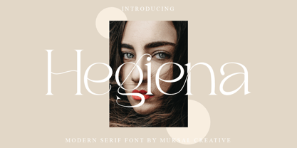 Hegiena Modern serif typeface with beautiful ligatures, special glyphs, ornament and multilingual support. It's a very versatile font that works great in large and small sizes. Perfect for editorial projects, Logo design, Clothing Branding, product packaging, magazine headers, or simply as a stylish text overlay to any background image.
 - Mafra by DSType,
$26.00 Mafra, the debut typeface by Pedro Leal, a type family suited both for editorial and corporate design, available in five weights, ranging from Light to Black with matching italics. Mafra is a contemporary typeface with plenty of style, asymmetrical and very dynamic serifs, and pleasant openness and balance.
 - Street Urban by Blankids,
$20.00 Our new product the name is Street Urban Graffiti Font inspired by graffiti style with a fun theme very good for graffity poster, Hip Hop music, kids poster, flyer, children book, cartoon, comic etc MULTILINGUAL ACCENT : ØÆøæ¢ÐŒœÁĂÂÀÄĄÅÃǼĆČÇĈĊĎÉĔĚÊËĖÈĘĞĜĢĠĤÍĬÎÏİÌĮĨĴĶĹĽĻĿŃŇŅÑÓŎÔÖÒŐǾÕŔŘŖŚŠŞŜȘ ŤŢÚŬÛÜÙŰŲŮŨẂŴẄẀÝŶŸỲŹŽŻáăâäàąåãǽćčçĉċďéĕěêëėèęğĝģġĥíîïìįĩĵķĺľļŀńʼnňņñóŏôöòőǿõŕřŗśšşŝșťţ ŭûüűùųůũẃŵẅẁýŷÿỳźžż FEATURES : Uppercase Lowercase Number Punctuation Multilingual PUA Encode Opentype
 - Montern Vintage by HansCo,
$15.00 Montern Vintage font is a vintage decorative typeface which is inspired by lettering sign and art. While this font has a victorian touch, it still looks bold and solid. Very suitable for for packaging, headline, logotype, apparel, branding, advertising etc. How to access alternate / ornament ? : https://hanscostudio.com/tutorial/ Enjoy!
 - Sticky Time by Bogstav,
$14.00 Here's my super legible and handmade font. I've made several versions, and they overlap and compliments each other very sweetly. To enhance that nice handmade look, the outline and striped versions are a bit more rough - just like they all come with 3 different versions of each lowercase letter!
 - Hello Valentica by Blankids,
$25.00 Introducing of our new product the name is Hello Valentica a Beauty Script Font. Hello Valentica inspired by modern script this font is a fun theme very good for book cover, wedding invitation, t-shirt, quote, logotype, craft and etc. FEATURES : Uppercase Lowercase Number Punctuation Multilingual PUA Encode Opentype
 - Ghaden by Muksal Creatives,
$15.00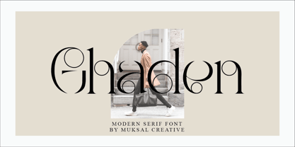 Ghaden Modern serif typeface with beautiful alternete, special glyphs, ornament and multilingual support. It's a very versatile font that works great in large and small sizes. Perfect for editorial projects, Logo design, Clothing Branding, product packaging, magazine headers, or simply as a stylish text overlay to any background image.
 - Hello Girl by Bosstypestudio,
$12.00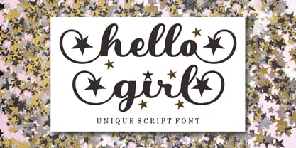 Hello Girl with a smooth handwriting style and very pretty and lovely. Hello Girl is perfect for branding projects, home appliance design, product packaging, use in business cards, invitation cards, etc. Just like a stylish text overlay to a wallpaper or anything that needs a touch of love.
 - Slim Kim by Wiescher Design,
$39.50 Slim Kim is the sister font of Julienne. It mixes perfectly with Julienn. So whenever you need an especially slim serif font this is it! Slim Kim has very spiky serifs, so I did not want to make an extra-slim version. Enjoy this spiky font, your Gert Wiescher.
 - Mozaic by TipoType,
$24.00 The value and individual beauty contribute to the group. Each with their own, but all together with a new identity enriched by exchange, perfected by diversity. Mozaic is sum. Mozaic is strength. It includes a very thorough coverage for a wide variety of Latin alphabet-based language families.
 - Bezamin Harison by Muksal Creatives,
$10.00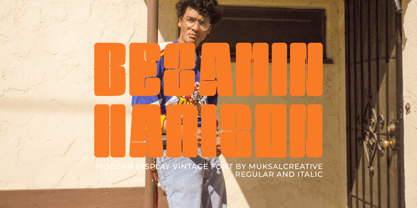 Bezamin Harrison is Modern vintage Display Font, special glyphs, ornament and multilingual support. It's a very versatile font that works great in large and small sizes. Perfect for editorial projects, Logo design, Clothing Branding, product packaging, magazine headers, or simply as a stylish text overlay to any background image.
 - Jecki line by Sulthan Studio,
$12.00 Calligraphy fonts with single line or also with sketch style are very charming plus long swash and cute heart stitches make it look simple and extraordinary This font is equipped with upper and lower case letters, numbers, punctuation and also language support has also been coded PUA Thank You
 - Bouclettes by JBFoundry,
$19.50 Bouclettes is a decorative typeface family with funny and original serifs. It creates a casual and playful vibe to your documents : magazines, brochures, flyers, advertising, greeting cards, logotypes. The combination between the two weights and italics is very interesting to work with Bouclettes. It looks better in large sizes.
 - Faustian by Ben Burford Fonts,
$20.00 Faustian is a modern study and different take on classic historical black letter styles, geometric in its construction, giving a very modern clean look whilst its historical influences shine through. coming in 3 weights with a host of opentype features including old style figure, alternate characters and more
 - CAPUT by JOEBOB graphics,
$37.00 CAPUT is a typeface consisting of only capitals with the appearance of a handwritten font, due to the many ligatures. Written with a soft pencil, the resulting structure fits in with the quirky and raw look of the typeface. It’s very suitable for headlines, posters and packaging design. Enjoy!
 - Twist by Superfried,
$32.50 Twist is an experimental, curvy, display typeface designed by Superfried. As its name suggests, it features intricate twists and turns. Twist has a very retro feel and its chunky structure leads to a distinct, high-impact display font. Twist has been featured on the Behance curated typographic gallery TypographyServed.com.
 - Vanda by SG Type,
$19.00 Vanda – A unique display font with numerous alternate letters, ligatures, decorative elements, and multilingual support. Vanda is a very versatile font that works great in all kinds of projects, from unique branding to bold magazine design. This all-caps typeface features numerous alternate glyphs with decorative elements and ligatures.
 - LGF Avadar by LGF Fonts,
$9.00 Avadar is a typeface with a fine serif of straight lines and an inner line that breaks the glyph in two. The type is indicated for use in large or very large sizes, especially for display graphics; the spacing between glyphs makes the readability of the text increase.
 - Bullerby by Maria Brachmańska,
$10.00 Bullerby is a font inspired by children's handwriting. The letters are characterized by charming curves in the lowercase and distinct condensed traits in the upper case. It is very versatile in use: it is ideal for logos, packaging, posters, advertisements, and much more. The font supports 68 languages.
 - Mafra Display by DSType,
$26.00 Mafra, the debut typeface by Pedro Leal, a type family suited both for editorial and corporate design, available in five weights, ranging from Light to Black with matching italics. Mafra is a contemporary typeface with plenty of style, asymmetrical and very dynamic serifs, and pleasent openness and balance.
 - Bernat Burnoe by Muksal Creatives,
$12.00 Bernat Burnoe Modern Display Vintage Font, special glyphs, ornament and multilingual support. It's a very versatile font that works great in large and small sizes. Perfect for editorial projects, Logo design, Clothing Branding, product packaging, magazine headers, or simply as a stylish text overlay to any background image.
 - Gerush by ZetDesign,
$15.00 Gerush is a font in the form of a fingerprint. This font is neatly crafted to present a formal yet memorable and unique feel. very suitable for brand identity and other uses. This font is made in a regular and light style with an italic style in each.
 - Thwaites by Eyad Al-Samman,
$20.00 ‘Thwaites’ typeface is fully dedicated to one of my best Canadian friends who I do cherish and value highly. This great and industrious Canadian friend is ‘James Douglas Thwaites’ who lives along with his good-natured family in British Columbia, Canada. For me, James is like a source of inspiration and I do consider him as an ideal in my life. Our strong friendship has started since 1999 and I hope that it will endure just to the last moment of my life. Sometimes I see him as the writer and poet that I learn a lot from, sometimes I see him as a devoted religious minister that I try to understand more about his teachings, and other times I see him as the educator that I strive to imitate verbatim in my life. When I want to talk more about this Canadian friend, I will not be able to give him his due in full. Thus, I will instead mention some excerpts of his biography that he wrote himself saying that: “James D. Thwaites is a self-accomplished man. Having worked in various fields including restaurant management and cleaning, he has achieved his goals of being a full-time teacher, past-time writer, and volunteer religious minister for the Christian Congregation of Jehovah's Witnesses. His personal and academic pursuits have led him to be published in various magazines, newspapers, self-published books, and websites, including his now defunct ‘poetryofthemonth.com’ website. He continues to learn and augment the craft of writing while working primarily in early literacy and delayed literacy learners, teaching reading and literature to a wide age range of students. He views his religious endeavors as an extension of his academic ones. He teaches others both as a public speaker and in one-on-one situations, teaching about the benefits of submission to God and to His teachings. His future goals include expanding his ministry and continuing his writing.” The name ‘Thwaites’ itself comes from Great Britain and originated from the last Viking raids upon England, being an Anglicized version of a Scandinavian term meaning—depending on the source material—either "a place that is difficult to approach" or "a small thicket of trees." Another recitation mentions that ‘Thwaites’ can be described also as an English surname but one of pre 7th century Norse-Viking origins. It may be either topographical or locational, and is derived from the word "thveit", meaning a clearing or farm. As a locational surname it originates from any one of the various places called "Thwaite", found in several parts of Northern England and East Anglia to the south. The various modern spelling forms include Thwaite, Thwaites, Thwaytes, Thoytes, Twaite, Twatt, Twaites, Tweats and Twite. The name, although often appearing unique to outsiders, can often be found within other famous names like Braithwaite, Goldthwaites, or Misslethwaites. With various spellings, some families not including the ‘e’ or the ‘s’ at the end, Thwaites and its derivations—although not exceedingly common—is a name found worldwide. ‘Thwaites’ typeface is simply a sans-serif streamlined, stylish, and versatile font. It is designed using a combination of thick and thin strokes for its +585 characters. Its character set supports nearly most of the Central, Eastern, and Western European languages using Latin scripts including the Irish language. The typeface is appropriate for any type of typographic and graphic designs in web, print, and other media. It is also absolutely preferable to be used in the wide fields related to publication, press, services, and production industries. It can create a very impressive impact when used in headlines, posters, titles, products’ surfaces, logos, medical packages, product and corporate branding, and also signage. It has also both of lining and old-style numerals which makes it more suitable for any printing or designing purposes. ‘Thwaites’ typeface is really the cannot-miss choice for anyone who wants to possess unique artistic and modern designs produced using this streamlined typeface.
 - Navaja by Andinistas,
$39.95 Very few letter types with the context of grunge style fonts offer hierarchies to differentiate words in sentences or paragraphs. With Navaja I developed a font family that meets this need. This family is useful to organize the information into a hierarchy with an eroded look. Its central idea mixes grotesque, geometric and humanistic letter conventions. This way, Navaja is a grunge-sans with dense proportions to make graphic design with eroded character. Its main purpose appeared when one of my customers asked me for a t-shirt design for a fan club of an important football player. For this reason its starting point were stained and muddy letters characterizing the toughness and coldness of the sport. Over time their glyphs began to imitate the robustness of "wood type & Tuscan Type" widely used in posters in the late nineteenth century. Its purpose was strengthened in a family with 6 members that when mixed they produce mind catching contrast levels ideal for designing T-shirts, stickers, flyers, brochures, posters, billboards, cinema or TV. Therefore its variants are short up and down height X combined with different widths that by working together produce information that radiates outstanding apparently destroyed controlled violence. Navaja Dingbats consists of 52 illustrations useful for frames and textures. In that vein, the origin of each member comes from skeletons of Roman and Italic calligraphy. The low amount of contrast between thick and thin lines matching the contours apparently gnawed but strictly regulated by optical adjustments equating the sum between full and empty areas. Factors such as finishes, shapes and counter internal and external forms are meticulously planned although its scruffy look which strategic arrangements are offset to provide color typographical homogeneous. And in conclusion, I have plans to continue expanding the family with more complete versions in the future.
 - Sharp End by Asritype,
$18.00 Sharp End fonts support Latin Based Languages only (see Tech Specs). Sharp End's creation is inspired by Gothic sharpness shape but only applied to the ends of normal letters. Make the font look beautiful and elegant, look as semi-serif, as calligraphic touch or others. The base of the Capital Characters is set a little bit lower than the small cases/lowercases. On small/normal size typing, the difference is less visible (obscure), but will be more visible/more clear as the typing set larger. Thus, Sharp End fonts will work well for both text and display. The fonts has also character variants. The character variations (in PUA) set in 5 stylistic sets ss01 ... ss05 (see Sharp End opentype features poster). So, these character variations will be easier accessible in more common application such as MS Words, Text Edit or the others. The glyphs may also be accessed via Character Map, Character viewer, insert character, insert symbol or other similar tools. You can use Sharp End for most of typing and design means such as: greeting, invitation, wedding and other cards; books, magazines, news, banners, logos, Pamphlets, advertising etc., for printing or digital/web display. As addition, with 3 weight variants, the regular will fit for longer text for normal use, while the bold and semi-bold is more suited for the covers, impressions, titling, Logos, design or other usage. With its smoothness curve and sharp ends, Sharp End will pairs well to most fonts of various kinds: Sans Serif, Serif, Handwritten, Scripts and others. As the example in one poster, Sharp End is paired with Astonice and Apresia Script (ornamented script font, one of the richest letter variations and ornaments). Thank you for visiting. Again, thank you very much for downloading this awesome fonts.
 - PGF Caprina Pro by PeGGO Fonts,
$24.00 "PGF Caprina Pro" is an audacious and rough geometric sans-serif font inspired by the wild and untamed personality of mountain goats (the word "caprina"‘ in Spanish is related to or resembling ‘goats’)—amazing animals which can skilfully climb up slopes and withstand very cold temperatures. Was originally developed under the Latinotype team supervision and is now upgraded to this Pro version that comes in 20 font styles, with 739 glyphs each, supports now more than 200 Latin-based languages and includes a wider OpenType features range like: Stylistic Alternates ‘set 01’ for b, d, g, p, q, i, j, t, y, &, I, G, M Stylistic Alternates ‘set 02’ for d, g, j 4 Stylistic Alternate from ‘set 01’ to ‘set 04’ for Enclosed Numbers (circles and squares) Stylistic Alternate ‘set 05’ for curved 3 and ‘Zero with dot inside’ Contextual alternates automatically turns ‘zero’ into a ‘slashed zero’ in alphanumeric contexts Contextual alternates automatically turns “Il” into a serif for improve its legibility Case Sensitive when "All Caps" is activated for ß, ¡, ¿, () [] {}, ‹› «», •(bullet), *(asterisk), -(hyphen) Standard Ligatures for fi, fj, fl Discretionary Ligatures for tt, tr, www, LL, TT Lining Numbers Old Style Numbers Tabular Lining Tabular Old Style Numbers Slashed zero on every number figures Numerators and Denominators from 0 to 9 for any Fraction expression Superiors and Inferiors from 0 to 9 for any scientific notation Ordinal forms for ‘a’ and ‘o’ Localized language customization for German, Dutch, Polish, Catalan, Romanian, Moldavian, Turkish, etc. Every OpenType option is also accessible via Character Map allowing users and designers to choose an alternate design for a particular character. “PGF Caprina Pro” is well-suited for high-impact action publishing and advertising as well related with adrenalynic and extreme sport design stuff.
 - Ringo by typoland,
$9.00 Whassup y’all! Me and my bros got this li’l gang together: we is Ringo, and we got da bling, yo! We is da typeface family for ya all! We got some real sweet stuff for ya, some nice characters. We got all ’em OpenType features like fractions and proportional figgers, we even got da cubic root, man! And check out da question mark, man, is real sweet. And the ampersand, yeah! I luv ’em ampersands. Now my brothers over here got some light action for ya, and they got some real bold action for ya. We got some nice foxy curves goin’ on, some nice tension, and some nice relaxation. My bro Light over here is kind of like the subtle guy, ya know. He’s in for the female fans, ya know. Heh! Hell, yeah! And man, we speak like 84 languages: we speak the German, and the French, and the Spanish, and we speak the Polish, and the Czech, and the Hungarian, and we even speak Shambala and Swahili and Rundi, and we got some Esperanto thing as well for ya. And check out my bro Black right over here, he’s like the action superhero, man! He’s got impact, man! Yeah yeah, but you know, my bros Regular and Bold are the real deal. Them is like da word of da street, man! Like da word of you, and you. And we got a message for y’all: life is hard, life is real, but you should work your mojo, be smooth, be nice, chill. We got all them kerning pairs, and all them weights, and we got ’em alternate letters. So check us out, yo!
 - Sweet Square by Sweet,
$39.00The Engraver’s Square Gothic—like its rounder cousin, the engraver’s sans serif, Sweet® Sans,has been one of the more widely used stationer’s lettering styles since about 1900. Its minimal forms, made without curves, were popularized long ago by bankers and others seeking a serious, established feel to their stationery. One might argue that the design is a possible precursor to Morris Fuller Benton’s Bank Gothic® typeface. Sweet® Square is based on antique engraver’s lettering templates called “masterplates.” Professional stationers use a pantograph to manually transfer letters from these masterplates to a piece of copper or steel that is then etched to serve as a plate or die. This demanding technique is rare today given that most engravers now use a photographic process to make plates, where just about any font will do. But the lettering styles engravers popularized during the first half of the twentieth century remain both familiar and appealing. Referencing various masterplates, Mark van Bronkhorst has drawn Sweet Square in nine weights. The sources offered just uppercase, small caps, and figures, yet similar, condensed examples had a lowercase, making it possible to interpret a full character set for Sweet Square. Italics were also added to give the family greater versatility. The fonts are available as basic, “Standard” character sets, and as “Pro” character sets offering special characters, a variety of typographic features, and full support for Western and Central European languages. Sweet Square gives new life to an uncommon class of typeface: an early twentieth-century commercial invention that brings a singular verve to modern design. Its unique style is as useful as it is novel. Bank Gothic is a registered trademark of Grosse Pointe Group LLC. - Atrament by Suitcase Type Foundry,
$75.00The Atrament font family was originally conceived in 2003 as the corporate display type family for Suitcase Type Foundry. Its original source of inspiration is the front cover of the Devetsil - Revolucni slovn’k almanac (1922), designed by Karel Teige. The lettering on this cover is a condensed sans serif with rounded stroke terminals. Atrament is significantly broader than the model and its characters are better balanced, reflecting the evolution of semi-condensed sans serifs throughout the 1960s. The horizontal strokes of both lower and upper case are less stressed than the vertical stems. Noteworthy are the unusual tiny gaps in the apex and vertex of letters with diagonal strokes, designed to prevent ink from spreading and smudging the letter shapes. This detail is one of the main features of the font's character. The general feel of the italics closely matches the strictly vertical, parallel character of the regular cut. When converting the family to OpenType the alternate character shapes from the Alternator weights were incorporated in the regular cut, which allows the user to switch selected characters from one shape to another within the same font. A number of glyphs and accents were corrected, and all the glyphs missing in the Suitcase Standard character set were added, along with the relevant kerning pairs. The individual weights of Atrament Std thus contain accented upper and lower case, small caps, alternate glyphs for most European languages, nine types of numerals, superscript characters, caps glyph versions, and much more. Its narrow proportions make Atrament the perfect choice whenever economy of space is a must. It is however not very well suited for setting long texts. Ideal for headlines and display use, it is perfect for situations where the text needs to make a great impact in a little space.