5,205 search results
(0.011 seconds)
- Ames' Roman by Greater Albion Typefounders,
$16.00 Ames’ Roman is a stylish ‘New-Style’ Didone Roman family offered in divers weights and widths. It is designed to embody clarity combined with dramatic contrast between horizontal and vertical strokes. All typefaces include small capital forms, new and old style numerals (and indeed ‘small capital’ numerals for consistency). Ames’ is a Roman with the charm of the past and the spirit of the future! It’s ideal for headings and titles and anywhere else you need text of distinction. Watch out for the forthcoming Ames’ Text…
 - Elongated Roman by Aboutype,
$24.99An ultra light thins all caps Victorian design with a slight stroke contrast. Elongated Roman requires subjective display kerning and compensation. - Old Roman by Mad Irishman Productions,
$6.00Intrigued by typefaces of the late 18th and early 19th centuries, the designer was surprised to find no digital renderings of the popular Old Roman typeface. This font is the designer's interpretation of this c. 1895 typeface designed by T.W. Smith. - Marble Roman by MADType,
$21.00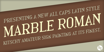
- SoftTimes Roman by Wiescher Design,
$39.50 Designing SoftTimes has been easy on my nerves after the strain of HardTimes. The harder the Times are the more do we need some soft typefaces, this one is the soft counterpart for HardTimes. -Your softspoken typedesigner, Gert Wiescher
 - Roman Wells by Wooden Type Fonts,
$15.00 A revival of one of the popular wooden type fonts of the 19th century, suitable for display, heavy stems, very thin serifs, short descenders. Heavily revised, very much improved, extensive kerning. Now in otf and ttf formats.
 - Elongated Roman by Red Rooster Collection,
$45.00 Elongated Roman is a Didone-style serif typeface. It was originally designed in 1950 by typographers at Stephenson Blake. After International TypeFounders, Inc. acquired exclusive licensing rights to the Stephenson Blake Collection, Steve Jackaman (ITF) digitally revived the typeface in 1997 for the Red Rooster Collection. Much like other Didone typefaces, Elongated Roman’s strong contrast between thick and thin strokes and hairline serif design strengthen its elegance as a “modern face.” Unlike other Didone typefaces in the Red Rooster Collection, Elongated Roman was designed with display size in mind thanks to its strong variance in stroke weight.
 - Monolith Roman by ABC Types,
$45.00 - Informal Roman by ITC,
$29.00Informal is the work of lettering designer Martin Wait and is reminiscent of the late 1940s and early 1950s. Informal is worthy of its name and perfect for anything with a look of the mid-20th century or simply a casual, spontaneous appearance. - Mixtra Roman by T4 Foundry,
$21.00Mixtra is a versatile and complete type family designed by Bo Berndal. The three Mixtra family branches are Roman, Sansserif and Slabserif, each with a full set of weights. The Roman also has a Small Caps font. Combining the three family members is a good starting point for creating a coherent typographical design. Mixtra works well in magazines and all sorts of print in need of a strong visual identity. "Mixtra is a multiface", says Bo Berndal. "With or without serifs, or with powerful slabserifs, you can pick the version that best suits the design and printing technique you have chosen." - Tresillian Roman by ITC,
$29.99 - Romans Lovers by Alit Design,
$12.00 Introducing Roman Lover Elegant typeface + Bonus Boho Illustrations The Roman Lover Serif typeface is an elegantly themed font that has a dynamic serif style. The details of the shape of the "Roman Lover Serif Elegant typeface" are very smooth and flow to create unique and beautiful curves. Elegant Serif typefaces such as “Roman Lover Serif Elegant typeface” are very easy to apply to any design, especially those with an elegant and smooth concept, besides that this font is very easy to use both in design and non-design programs because everything changes and glyphs are supported by Unicode (PUA). The Roman Lover Serif Elegant typeface contains 573 glyphs with many unique and interesting alternative options. Plus, there's a cool serif font family for header and description text from Thin to Heavy. In the poster preview all the letters are in the Roman Lover Serif Elegant typeface.
 - Medium Roman by Monotype,
$29.99Medium Roman is an engravers, all-capitals font for invitations and stationery. Particular characteristics of the Medium Roman font are the tail on Q and the spurs on J and U. - Kingston Roman by Letterena Studios,
$17.00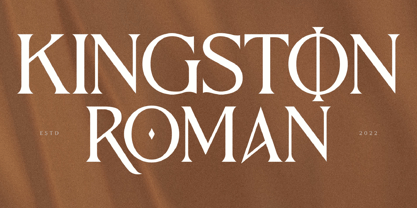 Kingston Roman is a modern and classic serif typeface with a unique style and fancy look. This typeface is perfect for an elegant & luxury logo, book or movie title design, fashion brand, magazine, clothes, lettering, quotes, and so much more. **Uppercase
 - Spry Roman by Stephen Rapp,
$49.00 Handmade, expressive, lively, organic— …words typically used to describe a script font or a casual sans. Spry Roman opens up new possibilities. It’s origin is handwritten letters created using a pointed nib on slightly toothy paper. While based on a Roman form, the letters are designed to break out of the mold and dance along the baseline. Spry Roman Pro is a fully featured opentype font. Among the 964 glyphs are loads of alternate characters and swash letters; a full set of small caps; simple fractions; case sensitive punctuation; and a variety of ornaments, border elements, and flourishes. It also includes a full dose of language support for not only main characters, but also for alternates and small caps. Ligatures have been kept to a minimum to allow users the option of tracking text. **Please note that the Pro version has all the glyphs of the others combined. The smaller versions are for those who don't have opentype savvy apps like Adobe Illustrator.
 - Bechamel Roman by Andinistas,
$39.00 BECHAMEL ROMAN was born interpreting unicase letterings of the movie "Willy Wonka and the chocolate factory". Later these ideas matured with flexible tip nib and paper mixing their naive proportions with some classic ingredients of Baskerville, Bodoni, Didot, Round Hand Script, Graffiti and labels found in Venezuela and Colombia. BECHAMEL ROMAN designed to be combined with Bechamel. BECHAMEL Script, Vein, Words & Ornaments were hand drawn to design words and phrases in logos, packaging, posters, envelopes and greeting cards. BECHAMEL ROMAN 1,2,3 & 4 is an experimental font family designed by #carlosfabiancg. It includes an irregular look to communicate craftsmanship. Its multiple upper cases with condensed width and naive lines are notable for their expressive drawing with a high amount of contrast between thick and thin strokes.
 - Classic Roman by Monotype,
$40.99. - Roman Shaded by URW Type Foundry,
$35.00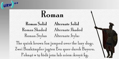
- Roma by Canada Type,
$29.95 Tom Lincoln's award-winning type design work since the 1960s has been one way or another of expressing his fascination for the Roman majuscules inscribed at the base of the Trajan Column in Rome. This time he has really outdone himself by bringing us Roma, a definitive, contemporary, mature sans serif expression of those majuscules. With Roma, Lincoln is not satisfied with simply creating a proper "Trajan Sans". He goes on to make it a family of four weights, with built-in small caps and oldstyle figures, then he really goes to town with the options he makes available for shading and multi-color settings. Precise renderings of the Roma capitals are provided in different fonts that can function individually or be layered atop each other for two- or three-color treatments. The Roma family comes with extended language support that spans the majority of Latin-based languages. For more information on the design, complete character sets, technological features, and print tests, consult the accompanying PDF.
 - Oman by Par Défaut,
$35.00 With five weights and four contrasts, all grouped in three version : sans-serif, slab, serif and all this doubled by a true italic, Oman regroup 120 different styles declined in four variables. Perfect from headlines to text, Oman will meet your needs with a many languages to support (Latin pro, Cyrillic), 14 OpenType features (Fraction, Numerator, Denominator, Tabular figure, Oldstyle figure, Small capital, Small capital from capital, Ordinal, Stylistic set, Case sensitive, Discretionary ligature, Contextual alternate and All access alternate). • Numerator and Denominator includes numerals and currency • Tabular Figure includes : numerals, currency, OldStyle numerals, small capital numerals, small capital currency. • Small Capital features includes the Latin & Cyrillic alphabet with the accents. • Ordinal feature includes the Latin & Cyrillic alphabet. • Two Stylistic set for “a” & “g” includes accents. • Discretionary Ligature includes “AE”, “AÉ”, “IJ”,“OE”, available in lowercase, small capital and ordinal. • Contextual Alternate includes ligatures for arrows : <-->^|v|<->v^|. Add n, d or +, for numerator, denominator or case arrows. All Case sensitive characters become after the uppercase and number.
 - Mrs Eaves XL Serif by Emigre,
$59.00 Originally designed in 1996, Mrs Eaves was Zuzana Licko’s first attempt at the design of a traditional typeface. It was styled after Baskerville, the famous transitional serif typeface designed in 1757 by John Baskerville in Birmingham, England. Mrs Eaves was named after Baskerville’s live in housekeeper, Sarah Eaves, whom he later married. One of Baskerville’s intents was to develop typefaces that pushed the contrast between thick and thin strokes, partially to show off the new printing and paper making techniques of his time. As a result his types were often criticized for being too perfect, stark, and difficult to read. Licko noticed that subsequent interpretations and revivals of Baskerville had continued along the same path of perfection, using as a model the qualities of the lead type itself, not the printed specimens. Upon studying books printed by Baskerville at the Bancroft Library in Berkeley, Licko decided to base her design on the printed samples which were heavier and had more character due to the imprint of lead type into paper and the resulting ink spread. She reduced the contrast while retaining the overall openness and lightness of Baskerville by giving the lower case characters a wider proportion. She then reduced the x-height relative to the cap height to avoid increasing the set width. There is something unique about Mrs Eaves and it’s difficult to define. Its individual characters are at times awkward looking—the W being narrow, the L uncommonly wide, the flare of the strokes leading into the serifs unusually pronounced. Taken individually, at first sight some of the characters don’t seem to fit together. The spacing is generally too loose for large bodies of text, it sort of rambles along. Yet when used in the right circumstance it imparts a very particular feel that sets it clearly apart from many likeminded types. It has an undefined quality that resonates with people. This paradox (imperfect yet pleasing) is perhaps best illustrated by design critic and historian Robin Kinross who has pointed out the limitation of the “loose” spacing that Licko employed, among other things, yet simultaneously designated the Mrs Eaves type specimen with an honorable mention in the 1999 American Center for Design competition. Proof, perhaps, that type is best judged in the context of its usage. Even with all its shortcomings, Mrs Eaves has outsold all Emigre fonts by twofold. On MyFonts, one of the largest on-line type sellers, Mrs Eaves has been among the 20 best selling types for years, listed among such classics as Helvetica, Univers, Bodoni and Franklin Gothic. Due to its commercial and popular success it has come to define the Emigre type foundry. While Licko initially set out to design a traditional text face, we never specified how Mrs Eaves could be best used. Typefaces will find their own way. But if there’s one particular common usage that stands out, it must be literary—Mrs Eaves loves to adorn book covers and relishes short blurbs on the flaps and backs of dust covers. Trips to bookstores are always a treat for us as we find our Mrs Eaves staring out at us from dozens of book covers in the most elegant compositions, each time surprising us with her many talents. And Mrs Eaves feels just as comfortable in a wide variety of other locales such as CD covers (Radiohead’s Hail to the Thief being our favorite), restaurant menus, logos, and poetry books, where it gives elegant presence to short texts. One area where Mrs Eaves seems less comfortable is in the setting of long texts, particularly in environments such as the interiors of books, magazines, and newspapers. It seems to handle long texts well only if there is ample space. A good example is the book /CD/DVD release The Band: A Musical History published by Capitol Records. Here, Mrs Eaves was given appropriate set width and generous line spacing. In such cases its wide proportions provide a luxurious feel which invites reading. Economy of space was not one of the goals behind the original Mrs Eaves design. With the introduction of Mrs Eaves XL, Licko addresses this issue. Since Mrs Eaves is one of our most popular typefaces, it’s not surprising that over the years we've received many suggestions for additions to the family. The predominant top three wishes are: greater space economy; the addition of a bold italic style; and the desire to pair it with a sans design. The XL series answers these requests with a comprehensive set of new fonts including a narrow, and a companion series of Mrs Eaves Sans styles to be released soon. The main distinguishing features of Mrs Eaves XL are its larger x-height with shorter ascenders and descenders and overall tighter spacing. These additional fonts expand the Mrs Eaves family for a larger variety of uses, specifically those requiring space economy. The larger x-height also allows a smaller point size to be used while maintaining readability. Mrs Eaves XL also has a narrow counterpart to the regular, with a set width of about 92 percent which fulfills even more compact uses. At first, this may not seem particularly narrow, but the goal was to provide an alternative to the regular that would work well as a compact text face while maintaining the full characteristics of the regular, rather than an extreme narrow which would be more suitable for headline use. Four years in the making, we're excited to finally let Mrs Eaves XL find its way into the world and see where and how it will pop up next.
 - Mr Eaves XL Sans by Emigre,
$59.00
- Mr Eaves XL Modern by Emigre,
$59.00
- LT Eat - Personal use only

- Let's Eat - Unknown license

- BM leaves - Unknown license

- Leaves & Straw by Stone Type Foundry,
$49.00 These ornaments are made from plants which grow on Alphabet Farm, the place where Stone Type Foundry is located.
 - Sav Display by T-26,
$29.00 - Play Leaves by Yumna Type,
$25.00 Play Leaves is a plant leaves-inspiring display font. Its simple, round letters have natural, organic leaf ornaments along with the unique characteristics of elegant, modern displays in natural looks. For that reason, it is suitable to apply for simple, yet elegant designs with which you can emphasize the delivery of messages in your graphic designs. Such font is perfectly applicable for any related natural, environmental, organic product designs and expresses fresh, cool, natural nuances to apply for health and natural element products such as cosmetics and food. Moreover, Play Leaves provides a clipart in accordance with the font theme as a bonus and features you can enjoy. Features: Multilingual Supports PUA Encoded Numerals and Punctuations Play Leaves fits best for various design projects, such as brandings, headings, magazine covers, quotes, printed products, merchandise, social media, etc. Find out more ways to use this font by taking a look at the font preview. Thanks for purchasing our fonts. Hopefully, you have a great time using our font. Feel free to contact us anytime for further information or when you have trouble with the font. Thanks a lot and happy designing.
 - Withered Leaves by Rvandtype,
$12.00 Withered Leaves is Handwritten font. It has a elegant, and modern look which can be used for logos, branding, invitations, stationary, wedding designs, social media posts, and every other design.
 - Tropical Leaves by Sakha Design,
$10.00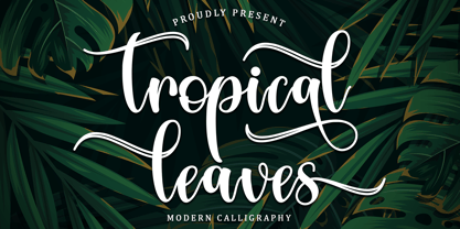 Tropical Leaves is a modern calligraphy font. It will add a luxury spark to any design project that you wish to create! This font is PUA encoded which means you can access all of the amazing glyphs and ligatures with ease!
 - Green Leaves by Sakha Design,
$14.00 Green Leaves is a romantic and sweet handwritten font. It looks astonishing on love letters, greeting cards, logos, business cards, and every other design which needs a personalized touch. This font is PUA encoded which means you can access all of the glyphs and swashes with ease!
 - Autumn Leaves by Matthias Luh,
$15.00 These modern, handwritten letters can be used for fancy headings or images. The characters aren't oriented straight or orderly, but a bit random. So they look like they were written by a human.
 - Falling Leaves by Gerald Gallo,
$20.00 Forty-six leaf designs from the Leaf Assortment font were three-dimensionally rotated to various viewing angles other than perpendicular (which is how they are viewed in the Leaf Assortment). Holding the modifier keys, Shift, Option, Shift + Option, and typing the same character will access different views of the same leaf. Font contains 180 characters
 - FM Eva by FontMeister,
$34.95 Eva is a pretty and legible font. Condensed and with a handwritten touch, Eva gives a warm and friendly feeling to your layout. It was totally inspired by hand-written chalkboards in coffeeshops around the world. You can use this font to create posters, greeting cards, scrapbooks, CD labels, T-shirts, coffee mugs, digital videos websites and banners.
 - Golden Leaves by Innire,
$14.00 I am pleased to present "Golden Leaves" - a stylish floral font inspired by nature and last autumn. It is perfect for business and wedding cards, logos, branding, and much more, and well to emphasize your unique style. It is especially good to put emphasis on the text.
 - Altemus Leaves by Altemus Creative,
$11.00 Each style is a collection of 174 leaf, illustrative and printer cut designs from the 1950s.
 - SAV PT by Puckertype,
$29.00SAV Display PT is directly inspired from hand-painted commercial signage found around Savannah, Georgia. There is a strong tradition of hand-painted signs adorning small car wash stations, to beauty salons, to mechanics and restaurants. Currently a collection of about four to five painters account for the majority of the signs. This font was derived from 10 uppercase letters that seemed to represent the aesthetic thread found throughout the signs. There are no lowercase letters found in these signs, so the lowercase of the font had to be designed from scratch. I felt this added versatility to the font and its possibilities for usage. This font is strictly a display font. However, because of the apparent roots (intended or unintended) of the lettering to transitional/modern modulated fonts, it does read surprising well at smaller sizes. - PSI Leaves by FontFuel,
$19.00 This is a leaves symbols font. Font elements are created from a base set of leaves. What that means is they work perfectly together. Professional artists and designers will appreciate all the ways you can combine these elements or use a single one for a simple elegant logo design. PSI Leaves works great for borders by simply creating a repeating pattern. Scrap-bookers can create beautiful and complex page designs with a few clicks. Thousands of uses equal thousands of ideas!
 - Eva Poshy by Baqoos,
$12.00 Eva Poshy is an exhilaration rollicking handwritten typeface apt for headline, editorial, branding, packaging, printed materials and typographic applications. 220+ glyphs including punctuation and numerical.


