5,042 search results
(0.019 seconds)
- Erbar AT by Linotype,
$29.99 - Caeli AT by Arctype,
$18.99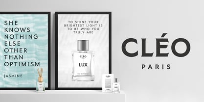 A typeface that invokes the beauty, strength and liberty of nature. Plant life is honoured with curves flowing from strong stems along with subtle references to Art Nouveau letter-shapes.
 - AT Bubley by Amera Type,
$20.00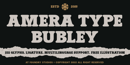 Inspired by the archive of music flyers and skateboarding magazine created in the early 90s. Bubbley is made for the purposes of making posters, magazine headers, book titles, flyers and other print media. Bubbley is made for digital needs that are more modern but still have a vintage feel Every line and curve in letterform is made for the needs of the future industry, the latest version in the modern lettering industry. Bubbley is very suitable to be combined with the illustrations that we provide for free, to complete your needs
 - Tarquin AT by Akufadhl,
$15.00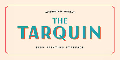 Tarquin is a All-Caps sanserif typeface, inspired by the beautiful hand-painted sign. It has a strong personality, high contrast stem, and widely opened counter to improve the readibility as it designed for display purposes. It's available in 3 different style, REGULAR, STENCIL, and SHADOW designed for display purpose design Crafted beautifully and carefully with hand.
 - AT Glanela by Amera Type,
$15.00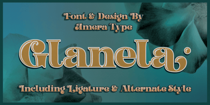 The new fonts from Amera Type are designed in the latest styles and with more inspiration from contemporary typographic art. Glanela was created to complement our visual needs in writing titles, music, fashion and product branding Complete with lowercase and uppercase which have alternate and ligatures to complement every need, support 75+ languages
 - Ink In The Meat - Personal use only

- Ego trip Fat Skew - Unknown license

- KR Irish Kat 2 - Unknown license

- 7 days fat rotated - Unknown license

- Big Fat Ugly Cow - Unknown license

- KR Irish Kat 1 - Unknown license

- KR Irish Kat 4 - Unknown license

- Crop©Bats AOE - Unknown license

- KR Irish Kat 3 - Unknown license

- Digital dream Fat Skew - Unknown license

- KR Deco by Kat - Unknown license

- SF Minced Meat Shaded - Unknown license

- SF Minced Meat Extended - Unknown license

- 7 days fat oblique - Unknown license

- KR Irish Kat 5 - Unknown license

- Digital dream Fat Narrow - Unknown license

- SF Minced Meat Shaded - Unknown license

- SF Minced Meat Extended - Unknown license

- Fat Font Grotesk Streamline by Intellecta Design,
$21.90a stout font with the streamline art deco visual - MTF Jumpin Jack EXT by Miss Tiina Fonts,
$10.00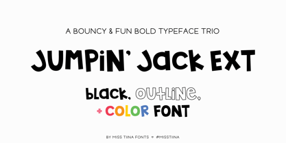 Jumpin’ Jack Extended is a fun, cartoon-like display font capable of taking any product out of the ordinary! Use it on bold and bright creations such as banners, posters, covers, titles, magazines, etc. This bouncy fun font is a perfect addition to your collection!
 - Mrs Eaves XL Serif by Emigre,
$59.00 Originally designed in 1996, Mrs Eaves was Zuzana Licko’s first attempt at the design of a traditional typeface. It was styled after Baskerville, the famous transitional serif typeface designed in 1757 by John Baskerville in Birmingham, England. Mrs Eaves was named after Baskerville’s live in housekeeper, Sarah Eaves, whom he later married. One of Baskerville’s intents was to develop typefaces that pushed the contrast between thick and thin strokes, partially to show off the new printing and paper making techniques of his time. As a result his types were often criticized for being too perfect, stark, and difficult to read. Licko noticed that subsequent interpretations and revivals of Baskerville had continued along the same path of perfection, using as a model the qualities of the lead type itself, not the printed specimens. Upon studying books printed by Baskerville at the Bancroft Library in Berkeley, Licko decided to base her design on the printed samples which were heavier and had more character due to the imprint of lead type into paper and the resulting ink spread. She reduced the contrast while retaining the overall openness and lightness of Baskerville by giving the lower case characters a wider proportion. She then reduced the x-height relative to the cap height to avoid increasing the set width. There is something unique about Mrs Eaves and it’s difficult to define. Its individual characters are at times awkward looking—the W being narrow, the L uncommonly wide, the flare of the strokes leading into the serifs unusually pronounced. Taken individually, at first sight some of the characters don’t seem to fit together. The spacing is generally too loose for large bodies of text, it sort of rambles along. Yet when used in the right circumstance it imparts a very particular feel that sets it clearly apart from many likeminded types. It has an undefined quality that resonates with people. This paradox (imperfect yet pleasing) is perhaps best illustrated by design critic and historian Robin Kinross who has pointed out the limitation of the “loose” spacing that Licko employed, among other things, yet simultaneously designated the Mrs Eaves type specimen with an honorable mention in the 1999 American Center for Design competition. Proof, perhaps, that type is best judged in the context of its usage. Even with all its shortcomings, Mrs Eaves has outsold all Emigre fonts by twofold. On MyFonts, one of the largest on-line type sellers, Mrs Eaves has been among the 20 best selling types for years, listed among such classics as Helvetica, Univers, Bodoni and Franklin Gothic. Due to its commercial and popular success it has come to define the Emigre type foundry. While Licko initially set out to design a traditional text face, we never specified how Mrs Eaves could be best used. Typefaces will find their own way. But if there’s one particular common usage that stands out, it must be literary—Mrs Eaves loves to adorn book covers and relishes short blurbs on the flaps and backs of dust covers. Trips to bookstores are always a treat for us as we find our Mrs Eaves staring out at us from dozens of book covers in the most elegant compositions, each time surprising us with her many talents. And Mrs Eaves feels just as comfortable in a wide variety of other locales such as CD covers (Radiohead’s Hail to the Thief being our favorite), restaurant menus, logos, and poetry books, where it gives elegant presence to short texts. One area where Mrs Eaves seems less comfortable is in the setting of long texts, particularly in environments such as the interiors of books, magazines, and newspapers. It seems to handle long texts well only if there is ample space. A good example is the book /CD/DVD release The Band: A Musical History published by Capitol Records. Here, Mrs Eaves was given appropriate set width and generous line spacing. In such cases its wide proportions provide a luxurious feel which invites reading. Economy of space was not one of the goals behind the original Mrs Eaves design. With the introduction of Mrs Eaves XL, Licko addresses this issue. Since Mrs Eaves is one of our most popular typefaces, it’s not surprising that over the years we've received many suggestions for additions to the family. The predominant top three wishes are: greater space economy; the addition of a bold italic style; and the desire to pair it with a sans design. The XL series answers these requests with a comprehensive set of new fonts including a narrow, and a companion series of Mrs Eaves Sans styles to be released soon. The main distinguishing features of Mrs Eaves XL are its larger x-height with shorter ascenders and descenders and overall tighter spacing. These additional fonts expand the Mrs Eaves family for a larger variety of uses, specifically those requiring space economy. The larger x-height also allows a smaller point size to be used while maintaining readability. Mrs Eaves XL also has a narrow counterpart to the regular, with a set width of about 92 percent which fulfills even more compact uses. At first, this may not seem particularly narrow, but the goal was to provide an alternative to the regular that would work well as a compact text face while maintaining the full characteristics of the regular, rather than an extreme narrow which would be more suitable for headline use. Four years in the making, we're excited to finally let Mrs Eaves XL find its way into the world and see where and how it will pop up next.
 - FF Cst Berlin East by FontFont,
$41.99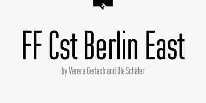 German type designers Verena Gerlach and Ole Schäfer created this sans FontFont in 2000. The family has 5 weights, ranging from Regular to Bold and is ideally suited for editorial and publishing and poster and billboards. FF CST Berlin East provides advanced typographical support with features such as ligatures, alternate characters, case-sensitive forms, and stylistic alternates. It comes with proportional lining and tabular lining figures. This FontFont is a member of the FF creative industriesty Street Type super family, which also includes FF CST Berlin West.
 - The Lazy Cat Writes by HIRO.std,
$14.00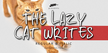 The Lazy Cat Writes is Handwritten Font This font describes about funny, dynamic, informal, easy going, humanist, easy to use and will bring a good harmony when the letters are connected and paired each other. FEATURES - 3 Alternates Uppercase letters - Numbering and Punctuations - Multilingual Support - Works on PC or Mac - Simple Installation USE The Lazy Cat Writes works great in any poster, book, magazine, typeface, quotes, print, social media posts, e-book, and any projects that need semi casual and informal taste. Enjoy using! Thanks. HIRO.std
 - Mr Eaves XL Sans by Emigre,
$59.00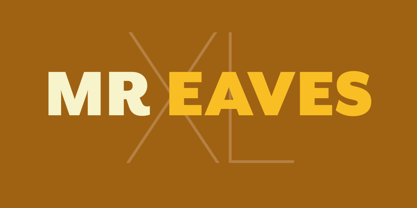
- East India Company NF by Nick's Fonts,
$10.00Put the kettle on and break out the biscuits. This no-nonsense stencil face is a faithful recreation of Tea Chest, released by the Stephenson Blake Type Foundry in 1939. Its bold strokes and slender profile retain their freshness, even seventy-plus years on. Both versions include the complete Latin 1252, Central European 1250 and Turkish 1254 character sets, as well as localization for Moldovan and Romanian. - Mr Eaves XL Modern by Emigre,
$59.00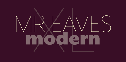
- Jazz Beat Stencil JNL by Jeff Levine,
$29.00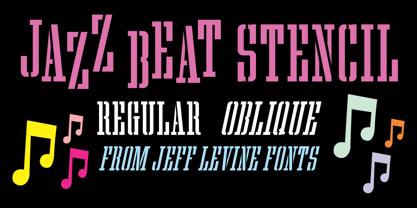 The 1960 British film “Beat Girl” (released in the U.S. as “Wild for Kicks”) was a typical [for its time] story of a teenage girl looking to have some fun by hanging out with SoHo beatniks and going against parental authority. One of the posters for the film features the title in a condensed slab serif stencil form, with eroded edges. The basic letter forms were smoothed out and cleaned up resulting in Jazz Beat Stencil JNL, which is available as in both regular and oblique versions.
 - Slab Four Rounded Ext by Wooden Type Fonts,
$15.00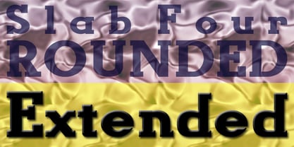 An original slab serif design inspired by the slab serif designs of the 19th century, with a modern geometric look, bold version, extended.
 - Cool Cat Jim NF by Nick's Fonts,
$10.00A handlettered headline in the January 1953 issue of Park East magazine by wacko album artist Jim Flora provided the inspiration for this exercise in extreme lettering. Check out the [brackets] and the bullet point... like, endsville, daddy-o. Due to the complexity of this typeface, the font has no math operators. The Postscript and Truetype versions contain a complete Latin language character set (Unicode 1252); in addition, the Opentype version supports Unicode 1250 (Central European) languages as well. - Funky Fat Jiggly PW by Patty Whack Fonts,
$15.00Funky Fat Jiggly PW is intended and suitable for Display use and Titles. It's not very suitable for long paragraphs of text. This font is meant for fun, fun, fun! It contains the basic characters. Uppercase, lowercase, numerals, and basic punctuation. See the character map for all of the included characters. Funky Fat Jiggly PW is available in OpenType, PostScript and TrueType format. - East To West JNL by Jeff Levine,
$29.00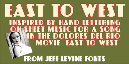 Sheet music for a song featured in "East to West", a film starring Mexican bombshell Dolores Del Rio, had the movie's name lettered in a bold sans style with early Art Deco influences. East to West JNL preserves not only the name, but all of the characteristics of this wonderful bit of typographic nostalgia.
 - ICR Ever East Serif by Nocturnal Workspace,
$15.00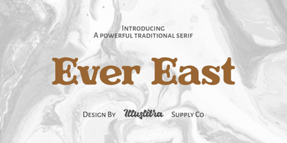 Ever East is a stylish font that is both classic and minimal. Ever East has a regular version plus multilingual support. Includes: Letters, numbers, punctuation, multilingual support. Regular versions
 - East Coast Frolics NF by Nick's Fonts,
$10.00A rollicking fun face based on lettering on a poster for Britain's LNER steamship lines, which featured a piano-playing mouse and a dancing goose. The Postscript and Truetype versions contain a complete Latin language character set (Unicode 1252); in addition, the Opentype version supports Unicode 1250 (Central European) languages as well. - Wine Vat Stencil JNL by Jeff Levine,
$29.00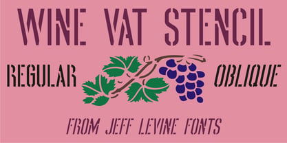 An image of a vintage metal stencil for the French wine region Côteaux du Tricastin [now Grignan-Les Adhemar] served as the inspiration for Wine Vat Stencil JNL. This condensed sans serif design is available in both regular and oblique versions.
 - Fat Face No. 20 by Solotype,
$19.95This is almost a necessity if you are doing reproductions of mid-19th century posters and playbills.


