10,000 search results
(0.05 seconds)
- Links by HouseOfBurvo,
$36.00 Links was built adhering to a strict grid of 'linked' squares; and comes with special "Grid Glyphs" that line up perfectly with all characters. These Grid Glyphs can be used to create an invisible grid for your layout or as a background to enhance your design. Perfect for posters, logos and headlines, this font is available in four styles; Round and Square with accompanying obliques. This font was inspired by much of the lettering from the Dutch movement, or Functionalism which in turn was a descendant of the International Style pioneered by the Swiss. In keeping with these traditions, Links was build adhering to a strict grid of linked squares, taking a clear scientific approach to construct each character. One of the main features of International Style is the implementation of a Grid. This font has built in special characters that I call 'Grid Glyphs'; these Grid Glyphs line up perfectly with every character, enabling you to construct your own grid that echoes the form of the characters. These glyphs can also be used to create a background for your layout, as can be seen in the gallery pictures.
 - FF Mutual by FontFont,
$50.99 FF Mutual is a friendly geometric sans serif full of subtle, unexpected details. Designer Luis Bandovas drew inspiration from an unlikely source—the credits from one of his favorite childhood shows, Space 1999—and turned that spark into a typeface that is warm and approachable, but contemporary. Bandovas built FF Mutual on a geometric skeleton, but the typeface has enough humanist touches to offset the rigidity usually found geometric designs. These touches are most apparent in the italics, where curved strokes on the “a” and “l” bring a softness to text. Generous spacing, angular details on letters like the “r” and “t,” and flared terminals on the “e,” “s,” and “c,” add further character to the design. FF Mutual’s bold shapes and retro-inspired warmth make it ideal for headlines, where the subtle details can really shine. The typeface is similarly well-suited for small blocks of text such as captions and call-outs, packaging design, and branding.
 - ITC Clearface by ITC,
$45.99 The Clearface types were originally designed by Morris Fuller Benton in 1907. Their forms expressed the Zeitgeist of the turn of the 20th century; typical and distinguishing characteristics are the forms of the a" and the "k." The ATF version did not include an accompanying Italic. In 1978, ITC's Victor Caruso was licensed by ATF to develop a new serif typeface and matching italic based on the forms of Clearface. The result was ITC Clearface, a serif typeface with marked stroke contrast and italic weights. The teardrop-formed endings of the lowercase a, c and f (also found in Caslon) define the character of the face. The type's design is also distinguished by its small -- almost slab -- serifs, a large x-height, and little stroke contrast. ITC Clearface, with its historical touch, is good for both texts and headlines, but its slightly condensed nature performs at its best when it is allowed its space.
 - Sales Pitch JNL by Jeff Levine,
$29.00 Have you ever wanted to set a headline within a burst, but found the drawing of all of those angles was a bit too tedious? Sales Pitch JNL solves that problem by setting letters, numbers and punctuation inside individual sections which, when typed out, generates an extended burst pattern. For a flat sided pair of end caps, use the left or right bracket keys. For burst ends, use the left or right brace keys. A blank space is located on the equal sign keystroke, and a wider blank space is on the plus sign. Keep in mind the optical illusion in some program that shows line gaps between characters on the screen. All characters have equal sidebar settings, and are flush with each other. Sales Pitch JNL contains the basic A-Z and 0-9 characters as well as numerous punctuation. For a companion font with a more complete character set, use Prankster JNL, the same type design, but without the burst pattern.
 - Ponderosa by Adobe,
$29.00Ponderosa font is a joint work of the typeface designers K.B. Chansler, C. Crossgrove and C. Twombly, who also created Rosewood, Zebrawood and Pepperwood together. As the name suggests, it is so-called wood type. The origins of this kind of typeface can be found in the early 19th century. Called Italian or Italienne, these typefaces quickly became very popular. They are distinguished by square serifs whose width is larger than the stroke width of the characters. When the letters are set together, the heavy serifs build dark horizontal bands. The distinguishing characteristic of Ponderosa lies in its extremely fine figures between heavy serifs. The designers approached the boundaries of the impossible with this contrast. The typeface is reminiscent of the Wild West with its shootouts and heroes as well as of the 1970s with their platform shoes and wild hair-dos. When used carefully in headlines, Ponderosa font will surely attract attention. - Dozed by Craft Supply Co,
$20.00 Introducing Dozed – Condensed Sans Serif Font Dozed is a modern typeface that combines simplicity and style. With its low contrast design, this font offers a sleek and contemporary look, perfect for a wide range of projects. Streamlined Aesthetics Dozed – Condensed Sans Serif font boasts a minimalist charm that effortlessly captures attention. Its clean lines and compact characters make it an ideal choice for both digital and print applications. Enhanced Readability Dozed prioritizes readability without sacrificing aesthetics. The condensed style ensures that your content fits seamlessly within limited space, making it a practical choice for posters, flyers, and websites. Versatile Applications Whether you’re designing a website, crafting a logo, or working on a branding project, Dozed adapts beautifully to various design contexts. Its versatility shines in headlines, subheadings, and body text. Endless Possibilities With Dozed, your creativity knows no bounds. Its adaptability, modern aesthetics, and user-friendly design make it a valuable addition to your font collection, opening up endless possibilities for your design projects.
 - Seribu Bulan by IKIIKOWRK,
$21.00 Introducing Seribu Bulan - Arabic Type, created by ikiiko. Seribu Bulan is inspired by term in the Islamic world about the night of Lailatul Qadr in the month of Ramadan. Seribu Bulan is a display type adapted from the form of a slab serif style. This typeface has a wide selection of alternative styles to choose from. From hooked letters, to the typical symbols of arabic letters, you can play around by using various stylistic sets to form the character you want. This typeface is perfect for an logo, magazine layout, header & headline design, food & beverages product, packaging, poster, quotes, or simply as a stylish text overlay to any background image that need an a middle east vibes. What's included? Uppercase & Lowercase Number & Punctuation Complete Stylistic Set Complete Alternates Multilingual Support Get also a good offer & FREEBIE at our site : www.ikiiko.com Enjoy our font and if you have any questions, you can contact us by email : ikiikowrk@gmail.com
 - Berfa by Typespec,
$32.00 Berfa is an ultra-black display sans with a grounded temperament and a warm heart. Stern but fair, she’s remarkably agile for her size, ideal for any occasion calling for weighty headlines and a strong character. Berfa also has a quirkier side, sometimes swapping her conventional forms for eccentric alternatives, upon polite request of course. Berfa comes in OpenType (.otf) format for Mac and Windows. Features: Berfa supports the following OpenType features: Standard ligatures, discretionary ligatures, ordinals, custom fractions, numerators, denominators, superscript, scientific inferiors, proportional and tabular lining figures, and a slashed zero. There are also two stylistic sets containing alternate glyphs. Language Support: Each weight has a 528 glyph character set for use in the following Latin languages: Albanian, Afrikaans, Basque, Bosnian, Breton, Catalan, Croatian, Czech, Danish, Dutch, English, Esperanto, Estonian, Faroese, Finnish, French, Gaelic, German, Greenlandic, Hungarian, Icelandic, Indonesian, Irish, Italian, Latvian, Lithuanian, Luxembourgish, Maltese, Norwegian, Occitan, Polish, Portuguese, Romanian, Sami, Serbian (Latin), Slovak, Slovene, Sorbian, Spanish, Swedish, Swahili, Turkish, Walloon and Welsh.
 - Sequel Sans by OGJ Type Design,
$35.00 Sequel Sans is a new chapter in the book of neogrotesque typefaces. Its core idea and its name were conceived in collaboration with the max bill georges vantongerloo foundation. The main inspiration for its design were the sans-serif typefaces used by Max Bill, the larger-than-life Swiss architect, artist, and designer. Honoring these roots, I designed Sequel Sans to be a clean and adaptable font family that is built upon a comprehensive system of styles. 8 weights, each with a corresponding italic, and a matching set of Variable Fonts are available in 4 optical sizes. These range from standard (for text sizes) to Subhead to Headline to Display—larger optical sizes come with tighter spacing and a number of gently adjusted glyph shapes. Like the great neogrotesques found in mid-century Swiss Style designs, Sequel Sans is a vessel that you can fill with any kind of content. It will amplify your message while retaining its own modernist character.
 - F2F Mekanik Amente by Linotype,
$29.99The Face2Face (F2F) series was inspired by the techno sound of the mid-1990s, personal computers and new font creation software. For years, Alessio Leonardi and his friends formed a unique type design collective, which churned out a substantial amount of fresh, new fonts, none of which complied with the traditional rules of typography. Many of these typefaces were used to create layouts for the leading German techno magazine of the 1990s, Frontpage. Leonardi and his fellows would even set in type at 6 points, in order to make it nearly unreadable. It was a pleasure for the kids to read and decrypt these messages! F2F Mekanik Amente appears as if it had once been a normal font whose letters were horribly attacked by a pair of scissors. This font could be a very creative choice for headlines. F2F Mekanik Amente is one of 41 Face2Face fonts included in the Take Type 5 collection from Linotype GmbH. Leonardi designed 11 of these himself." - Due Giorni by Eurotypo,
$80.00 “Due Giorni”, two days in italian language, express a measurement of time, it can be little or a lot, depending on who or what it is used for. “Due Giorni” is a script font very expressive, fresh, agile and dynamic, hand-drawn with connected forms on slanted angle of 23º This font contain 542 glyphs with plenty OpenType features: Standard and discretionary ligatures, stylistic alternates, swashes, Old style figures, small caps, case sensitives and ornaments. It come also, with three kind of capitals: Roman Capitals, Small Caps (different proportions) and Swashes. Roman Capitals are inspired on the beautiful inscription found in the Augustorium’s house in Ercolano, Naples.those letters have been carefully drawn and sculpted. Swashed Cursive Capitals are similar to 18th century penmanship. “Due Giorni” is a versatile font that may give you the chance to create original logos and headlines, specially by many stylistic sets, ligatures and alternates that can be combined with them.
 - Adecion by Dora Typefoundry,
$15.00 Adecion is designed for maximum visual and emotional impact. Its four weights excel in posters, social media, headlines, large format print - and anywhere else you want to get noticed. Hidden between straight lines and firm confidence is a hint of charm and mischievous character; Adecion gives your words a powerful sound as well as fun to use. Perfect for graphic design and any screen use of your projects such as branding, magazines, editorials, wedding invitations, logo design, posters, social media, and more! FEATURES: • 4 Font weight • Uppercase & Lowercase • Alternative Uppercase • Numbers & Punctuation • Characters with accents • Supports Multiple Languages WHAT'S INCLUDED: • Adecion - Light. • Adecion - Regular. • Adecion - Bold. • Adecion - Extra Bold. This type of family has been the work of real love, making it as easy and enjoyable as possible. I really hope you enjoy it! I can't wait to see what you do with Adecion! Feel free to use the #Dora Typefoundry tag and the # Adecion Display font to show what you've been up to!
 - Cartes by insigne,
$39.00 Cartes has a bit of a strange origin story, as far as fonts go. It’s a combination of ideas from 1920’s advertising and hand-painted letters from the 1500s. The typeface was designed to flow with elegance and speed yet retain a sense of the handmade. The serifs flow with indentations implying movement and terminate with inky globules that lend your copy a sense of gravitas. This typeface can be used for headlines, short texts, posters, logos, headlines, headlines in big sizes or just as easily for ad text. At large sizes, pen strokes can be seen that give the typeface a touch of humanity and vigor. At smaller sizes the type is still unique, but readable.
 - Varien SS by Sensatype Studio,
$15.00 A Modern Strong Display Font that perfect for technology, sport, racing, action design project. A new Display Font that we created special for Headline, Title and more stand out typography needs, with extra outline that will add your variations. It's so perfect to add your style and headline overview. And specially for Headline font, we crafted for futuristic style and modern feels so enjoy to create any project that will show your main idea out. Varien Modern Strong Display Font ready with: Any options to get creative variations (combination of Outline Characters) Preview as a inspirations that you can do with Varien font Ready with All Uppercase characters Wish you enjoy our font. :)
 - Manchette by Abjad,
$45.00 Manchette is an Arabic headline typeface that was inspired by the hand-written Naskh newspaper headlines during the 60s-70s era in the Arab world. The word "manchette" is a french word, that means headline. It was used mainly by the Egyptian calligraphers and designers. The typeface presents sharp and contemporary details, while taking into consideration the original Naskh rules to echo the elegancy of the hand-written titles. Featuring many opentype features, such as contextual alternates, ligatures, and a small set of stylistic alternates. The typeface also features a dynamic Kashida that can be controlled through the variable fonts technology in the Variable GX file which contains all the weights as well.
 - Angular by BA Graphics,
$45.00A very contemporary design can be used in any application from headlines to text. Angular serifs give this design a strong base. - Thug Rose by Epiclinez,
$18.00 Thug Rose is a bouncy hand-lettered script font. This smooth hand-lettered script font is suitable for logos, headlines, branding, etc.
 - Latin Extra Condensed by Bitstream,
$29.99The American nineteenth century display form as handed down through ATF and the composing machine companies, largely for use in newspaper headlines. - Zar Brush Gothic by SzarDesign,
$19.95 ZarBrush Gothic is a "speedball" font inspired by showcard lettering done with a loaded red sable brush. Perfect for text and headlines.
 - Beautiful Sky by Epiclinez,
$19.00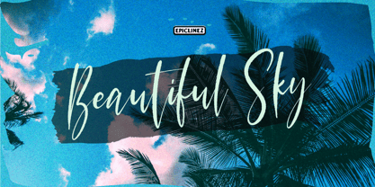 Beautiful Sky is a handwritten signature script font. This authentic script font is suitable for logos, headlines, branding, apparels, Instagram quotes, etc.
 - Jubilant by Gerald Gallo,
$20.00 Jubilant is an extended, geometric, curveless sans serif font. The font is ideal for headlines, titles, branding or small blocks of text.
 - Estilo by DSType,
$21.00Estilo is a very elegant headline typeface in a 30s style with plenty of ligatures for better design possibilities and includes Greek. - La Mesa by FontMesa,
$15.00 La Mesa is a bold font suitable for logos, letterheads & headlines. It also resembles the lettering used by the Miller Brewing Co.
 - JH Amira by JH Fonts,
$50.00 JH Amira is a display modern typeface; it is designed based on Art Deco style, typical for fashion magazines headlines, logos & titles.
 - Draft Beer by FontMesa,
$25.00Draft Beer is a bold script suitable for logos, letterheads & headlines and was inspired by the lettering used by Miller Brewing Co. - Takeshimura by Epiclinez,
$18.00 Takeshimura is a funky brush font with a very strong character. Very cool if use for logos, headlines, brandings, posters, apparel, etc.
 - Noteworthy by Gerald Gallo,
$20.00 Noteworthy is an all caps, bold, contemporary, sans serif font. It is ideal for headlines, titles, branding and small blocks of text.
 - JH Farid by JH Fonts,
$100.00 JH Farid font is designed based on Naskh calligraphy; it is typical for book covers including spine, headlines, short text paragraphs, poetry…..
 - Ten Ton Truck by PizzaDude.dk,
$20.00Ten Ton Truck is a heavy, but very legible font. Works very well with massive text, as well as headlines and such. - Abandon by Suomi,
$35.00 A Sans font family of five weight for headline and text use, with old style numerals and small caps, and extensive kerning.
 - CA Kink by Cape Arcona Type Foundry,
$20.00 CA Kink was originally created for a book cover. Mostly suitable as a headline font and for all kind of "space" themes.
 - Joyscript by Jonahfonts,
$25.00 Inspired by many hand-lettered European package designs. This script face is suitable for logos, casual headlines and designs calling for attention.
 - Corvinus Skyline by GroupType,
$15.00 Corvinus Skyline is an elegant retro 1920/30's looking font great for headlines in magazines, posters, signage and other design projects.
 - Sylar by The Northern Block,
$16.70 A linear modern typeface suited for branding & advertising projects. The variations in weight give great contrast when used across body copy & headlines.
 - Suprapower SE by Hanken Design Co.,
$30.00 Suprapower™SE is a wide typeface for poster, packaging, headline, and titles. It is an update to the Suprapower™ typeface.
 - Hammer Horror by Comicraft,
$29.00Those footsteps you hear as you walk down that dimly lit Victorian street...? That flapping of leathery wings in the air...? The howl of some kind of Wolf-man in the countryside...? Those sounds that chill your spine and triphammer your heart are the sounds of unspeakable, terrifying terrors.... some might say horrifying horrors, scarifying scares... hammering, uh, hammers and now there's a font to capture them... a font that wants to suck your blood. Custom made for Ian Churchill's Awesome comic, THE COVEN. - Drone by Barnbrook Fonts,
$30.00 Drone is a deliberately misproportioned typeface, inspired by hand-drawn lettering found in Spanish/Hispanic Catholic churches in the Philippines and Los Angeles. These naive letterforms appeared to be ‘copies of copies’ – and in aiming to recreate the beauty of the Vatican and the Sistine Chapel they instead created something unique with its own charm and beauty. As a curious aside, the forms are reminiscent of those found in 16th century English calligraphy too. Drone is available in two styles: No.666 and No.90210.
 - MVB Chanson d'Amour by MVB,
$39.00An old book found at a Paris bouquiniste contained samples of the typeface “Caractère de finance,” a bâtarde design by 18th century typefounder Pierre Simon Fournier. Rather than revive the type, Kanna Aoki decided to reinvent it, using a felt pen to achieve a rustic, handwritten quality, departing from the 18th century model as she saw fit. MVB Chanson d'Amour conveys a soulful elegance that stops short of the ostentatious, overwrought found in many formal scripts. It is lovely and sweet, but never saccharine. - Remontoire by MAC Rhino Fonts,
$36.00 The original sketches who formed the base for Remontoire is known as one of the first typefaces drawn by Karl-Erik Forsberg . It was a result of a competition set up by various typographic organizations in the early 1930. The typeface was never completed and sketches are only to be found on paper. Made only as a single font but some the character can later on be found in other of examples of his work; Carolus and Ericus. MRF developed and expanded the family into 5 weights.
 - RAN by URW Type Foundry,
$35.99 RAN Reformed Typeface for Beginners by Georg Salden - a headstrong and courageous approach to an improved handling of handwriting. Diverse and sometimes irreconcilable theories exist about how beginners are supposed to learn writing and reading. This has led to fierce discussions among experts already. We don’t want to pour more oil on the fire, but hope to create a new awareness for this topic, which is important to everyone of us. For beginners the combination of single characters (sounds) to whole words is essential during the acquirement of reading and writing. In this process they develop the skill to recall entire terms from memory. Therefore, after current practice, every word shall be written in a single stroke without lifting the pen in between. Georg Salden contradicts this postulate and warns, that coercively holding the pen down within a word can easily lead to exaggerated loop formations and a general meandering of the written text. The intellectual process in connecting single sounds to words while writing would happen anyway and the prohibition to lift the pen would often lead to tensions. To still support the necessary connections in general and to simplify the connecting, he teaches to write all round letters like a, e, g, o with inclusion of the connecting stroke, so that the spacing and combining with the next character arise by themselves. By settling the stroke at certain points and with a clear and logical writing method, a conscious and careful contact with the various strokes arises. All this automatically leads, together with a certain deceleration, to an increase of beauty and readability in the handwriting. The repeatedly discussed topic »connected or unconnected« appears to be solved in the most comfortable way as, depending on the particular character combination, both solutions are possible.