10,000 search results
(0.027 seconds)
- Costa Mala by Larin Type Co,
$14.00 Costa Mala feels playfully nostalgic and delivers an incredible vintage aesthetic.this font will look outstanding in both formal and non-formal designs. It will add charm and create a unique atmosphere in your design project. This font includes two styles: regular and outline, and also has alternatives that you can use to play with font dynamics. This font is easy to use and has OpenType features.
 - Tabby by Attype Studio,
$10.00 Tabby is display font inspired by connection about human and cat. It has 3 font style, It's super easy to use 3D effect with Tabby family font. Three style Font: Regular, Display & Shadow Tabby perfectly match for any product like book cover, t-shirt, branding, promotion, social media post, quotes, crafting, photography and more. What's included: - Multilingual Support --- Hope you enjoy with our font! Attype Studio
 - Delightful by Jessie Makes Stuff,
$12.00 Delightful is a whimsical and cheerful handwritten font family of varying weights and widths. This typeface is like if Comic Sans had a cousin who studied abroad one summer and now wears scarves to look more grown up, even though inside she's still the same, sweet marshmallow she always was. The letters were inspired by my handwriting on a good day - slowed down, legible, and intentionally drawn. I even threw in some of my favorite doodles as alt characters because the set wouldn't be complete without them. And the name was inspired purely by how it feels when I see it - and by my word of the year, delight. Delightful is ideal for anyone who wants to include a bit more warmth and a personal touch with their messaging. It's friendly and non-threatening, and will enhance personal projects or professional ones alike - whether you're a designer, an Instagram influencer, or you need to create some flyers for the local Mom 'n Pop Shop. There are two versions of this font. The original style is slightly more rounded and gets chubbier as you increase its boldness, and the stretched style is like a condensed version, except it's been stretched taller rather than squished narrower. I hope you delight in it as much as I do!
 - JWX Twisted Star by Janworx,
$19.95 Being a Star is one thing, but being a Twisted one is even better! JWX Twisted Star incorporates your deep desire for stardom into each alpha and numeric glyph, in a bold bordered font. The upper case letters sport a trailing accent, making them shooting twisted stars. This is a single bold typeface, and is intended to be used at a large size in graphics work, adding a not-so-subtle statement to everything from screen printed t-shirts to posters or even embroidery (available at www.janworx.com).
 - SF Old South Arabian by Sultan Fonts,
$9.99Historical Background Old South Arabian Script (OSA) was used before the Islamic era not only in the southwest corner of the Arabian Peninsula, but actually in the entire Peninsula. In addition, samples of OSA have been found as far as Uruk in Mesopotamia, Delos in Greece, and Giza in Egypt. Archaeological finds show that as far back as the 8th century BCE, OSA was used in trade, religious writing, and in civil records. Following the spread of Islam in Yemen, the decline of OSA began in the 7th century CE as it was gradually supplanted by Arabic script. OSA was typically known by the name of the then-dominant peoples in the Southern Peninsula. At various times, it was known as Sabaean, Qatabani, or Hadramite, among others. Although it was used for a variety of languages, OSA is most strongly associated with Sabaean. Many Peninsular languages borrowed OSA before introducing further changes of their own. Prime examples are the Thamudic, Safaitic, and Lihyanite scripts which eventually developed into independent scripts. The westward migration of the Sabaean people into the Horn of Africa introduced the South Arabian consonantal alphabet into the region. The transplanted script formed the roots of the Geez script of Ethiopia, which, in time and under presumably external influences, developed into a rich syllabary unlike any other Semitic script in history. Even a cursory examination of the letter forms of Modern Ethiopic writing reveal a striking similarity to South Arabian Script. OSA inscriptions typically reveal a dominant right-to-left directionality, although there are also many cases of alternating directions, known as boustrophedon writing. Figure 1 is a fine example of this style of writing. OSA inscriptions were discovered early in the 19th century. Soon thereafter, two orientalists, Gesenius and Rödiger, made great strides towards deciphering the script. Styles of Writing Old South Arabian inscriptions have survived primarily on stone, ceramic, and metallic surfaces. Hundreds of artifacts have been found and, to this day, continue to be discovered. Some of the best examples number of inscriptions on softer materials, such as wood and leather, have also been discovered. Although there is a significant difference between the styles of letters on the hard surfaces and those on the soft. Old South Arabian (Musnad) is composed of 29 letters , that is one letter more than the Arabic alphabet, which is between “S” and “Sh”, and names “Samekh”. Aspects of difference between Musnad and the present Arabic writing is that Musnad is written in separate letters, and the shape of the letters do not change according to its place in the word. However, some letters change according to the beginning of the writing. Musnad is either prominent, or deep. Prominent writings are for important writings and deep writings are for ordinary. The material on which the Musnad was written were stones, rocks, wood, and metal. In the course of its development the Musnad use appeared in the “Lehyanite’, “Thamudic”, “Safaitic”, pen to which many changes and amendments were made. And from it “Habashi’ writing was born. As regards his place among the Arabs of the Peninsula , when we look at the internet and its role in cultural dialogue , the Arabs of the Peninsula considered Musnad inscription which was indisputably their national writing until the dawn of Islam. It was used by people in all parts of Arabia in their homeland and abroad . It was their means of chronology and record of their glories and history.2- Features of Musnad Script: 1. It is written from right to left and vice versa. 2. Its letters are not joined. 3. Shape of letters are uniform despite their positions in the word. 4. Words are separated by vertical lines. 5. A letter is doubled in case of assertion. 6. No points and punctuations. 7. Easy to be learned by beginners. My OSA Musnad Font My design and technical work is only a treatment of the OSA Musnad as a symbol of writing. And it is possible to use in computer.. My design is not aimed at demonstrating the linguistic and intellectual structure of the Old South Arabian (Musnad). It is so simple that it could be easy to learn by learners and those who are interested in the OSA Musnad letters in computer. The basis of such importance is that it spares a lot of time and effort for researchers and students in this field. Formerly they used to write the Musnad texts either by handwriting or scan them , But now they can easily write its texts in OSA Musnad by using keyboard directly, so that they can change , amend and fulfill easily and accurately . So, we made use of speed, easiness and accuracy. And anyone interested in the South Arabian history in any part of the world can due to this design read and write OSA Musnad letters most easily. This design will also be used by historians and archeologists. , as well as specialist linguistics . The design also demonstrates the aesthetics of the Himyarit writing. About this font family Old South Arabian is An Arabic, Old South Arabian and Latin typeface for desktop applications ,for websites, and for digital ads. Old South Arabian font family contains two types: Old South Arabian and Old South Arabian serif. The font includes a design that supports Arabic, Old South Arabian and Latin languages. Old South Arabian typeface comes with many opentype features. - Zebramatic by Harald Geisler,
$14.99 Zebramatic - A Lettering Safari Zebramatic is a font for editorial design use, to create headlines and titles in eye-catching stripes. Constructed to offer flexible and a variety of graphical possibilities, Zebramatic type is easy to use. The font is offered in three styles: POW, SLAM and WHAM. These styles work both as ready-made fonts and as patterns to create unique, individualized type. The font design’s full potential is unleashed by layering glyphs from two or all three styles in different colors or shades. Working with the different styles I was reminded of the late Jackson Pollock poured paintings—in particular the documentation of his painting process by Hanz Namuth and Paul Falkernburg in the film Jackson Pollock 51. In Pollock’s pictures the complex allure arises from how he layered the poured and dripped paint onto the canvas. Similar joyful experience and exciting results emerge by layering the different styles of Zebramatic type. Texture In the heart of the Design is Zebramatics unique texture. It is based on an analog distorted stripe pattern. The distortion is applied to a grade that makes the pattern complex but still consistent and legible. You can view some of the initial stripe patterns in the background of examples in the Gallery. Zebramatic POW, SLAM and WHAM each offer a distinct pallet of stripes—a unique zebra hide. POW and WHAM use different distortions of the same line width. SLAM is cut from a wider pattern with thicker stripes. The letter cut and kerning is consistent throughout styles. Design Concept Attention-grabbing textured or weathered fonts are ideal for headlines, ads, magazines and posters. In these situations rugged individuality, letter flow, and outline features are magnified and exposed. Textured fonts also immediately raise the design questions of how to create alignment across a word and deal with repeated letters. Zebramatic was conceived as an especially flexible font, one that could be used conveniently in a single style or by superimposing, interchanging and layering styles to create a unique type. The different styles are completely interchangeable (identical metrics and kerning). This architecture gives the typographer the freedom to decide which form or forms fit best to the specific project. Alignment and repetition were special concerns in the design process. The striped patterns in Zebramatic are carefully conceived to align horizontally but not to match. Matching patterns would create strong letter-pairs that would “stick out” of the word. For example, take the problematic word “stuff”. If Zebramatic aligned alphabetically, the texture of S T and U would align perfectly. The repeated F is also a problem. Imagine a headline that says »LOOK HERE«. If the letters OO and EE have copied »unique« glyphs - the headline suggests mass production, perhaps even that the designer does not care. Some OpenType features can work automatically around such disenchanting situations by accessing different glyphs from the extended glyph-table. However these automations are also repeated; the generated solutions become patterns themselves. Flip and stack To master the situation described above, Zebramatic offers a different programmatic practice. To eliminate alphabetic alignment, the letters in Zebramatic are developed individually. To avoid repetition, the designer can flip between the three styles (POW, SLAM, WHAM) providing three choices per glyph. Stacking layers in different sequences provides theoretical 27 (3*3*3) unique letterforms. A last variable to play with is color (i.e. red, blue, black). Images illustrating the layering potential of Zebramatic are provided in the Gallery. The design is robust and convenient. The font is easily operated through the main font panel (vs. the hidden sub-sub-menu for OpenType related features). The process of accessing different glyphs is also applicable in programs that do not support OpenType extensively (i.e. Word or older Versions of Illustrator). International Specs Zebramatic is ready for your international typographic safari. The font contains an international character set and additional symbols – useful in editorial and graphic design. The font comes in OpenType PostScript flavored and TrueType Format.
 - Haven by Signature Type Foundry,
$33.00 Haven font family is based on the compositionality of constructive elements that create the final shape of individual letters. Mechanical connecting was continuously adjusted by a type designer’s feeling. In this way Haven differs from similar typefaces of the 1960s and 1990s. Six fonts of different stroke intensity create a rich family of typefaces for a variety of uses in typography for special occasions. Although the typeface was drawn for headings, it is suitable for typesetting of long texts in a book. Even in extreme reduction it retains its technical basis, negating classic book alphabets, and it adds an experimental look to the text. Both extreme fonts Thin and Black create strong contrast and their magnification brings attention to their interconnection of all details. Serif version Haven Serif is also being prepared.
 - F2F Frontpage Four by Linotype,
$29.99The Face2Face (F2F) series was inspired by the techno sound of the mid-1990s, personal computers and new font creation software. For years, Alexander Branczyk and his friends formed a unique type design collective, which churned out a substantial amount of fresh, new fonts, none of which complied with the traditional rules of typography. Many of these typefaces were used to create layouts for the leading German techno magazine of the 1990s, Frontpage. Branczyk and his fellows would even set in type at 6 points, in order to make it nearly unreadable. It was a pleasure for the kids to read and decrypt these messages! F2F Frontpage Four is one of 41 Face2Face fonts included in the Take Type 5 collection from Linotype GmbH. Branczyk designed 16 of these himself." - F2F Burnout Chaos by Linotype,
$29.99The Face2Face (F2F) series was inspired by the techno sound of the mid-1990s, personal computers and new font creation software. For years, Alexander Branczyk and his friends formed a unique type design collective, which churned out a substantial amount of fresh, new fonts, none of which complied with the traditional rules of typography. Many of these typefaces were used to create layouts for the leading German techno magazine of the 1990s, Frontpage. Branczyk and his fellows would even set in type at 6 points, in order to make it nearly unreadable. It was a pleasure for the kids to read and decrypt these messages! F2F Burnout Chaos is one of 41 Face2Face fonts included in the Take Type 5 collection from Linotype GmbH. Branczyk designed 16 of these himself." - F2F Haakonsen by Linotype,
$29.99The Face2Face (F2F) series was inspired by the techno sound of the mid-1990s, personal computers and new font creation software. For years, Stefan Hauser and his friends formed a unique type design collective, which churned out a substantial amount of fresh, new fonts, none of which complied with the traditional rules of typography. Many of these typefaces were used to create layouts for the leading German techno magazine of the 1990s, Frontpage. Hauser and his fellows would even set in type at 6 points, in order to make it nearly unreadable. It was a pleasure for the kids to read and decrypt these messages! F2F Haakonsen is one of 41 Face2Face fonts included in the Take Type 5 collection from Linotype GmbH. Hauser designed two of these himself." - F2F El Dee Cons by Linotype,
$29.99The Face2Face (F2F) series was inspired by the techno sound of the mid-1990s, personal computers and new font creation software. For years, Thomas Nagel and his friends formed a unique type design collective, which churned out a substantial amount of fresh, new fonts, none of which complied with the traditional rules of typography. Many of these typefaces were used to create layouts for the leading German techno magazine of the 1990s, Frontpage. Nagel and his fellows would even set in type at 6 points, in order to make it nearly unreadable. It was a pleasure for the kids to read and decrypt these messages! F2F EI Dee Cons one of 41 Face2Face fonts included in the Take Type 5 collection from Linotype. Nagel designed nine of these himself." - Mistyca Brush by Letterena Studios,
$9.00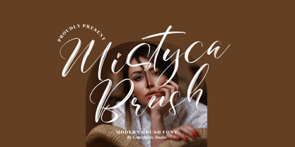 Mistyca Brush is a lovely and delicate script font that exudes elegance and class. This font was particularly crafted for those who need a beautiful and refreshing look to their designs. Mistyca Brush is PUA encoded which means you can access all glyphs and swashes with ease!
 - Dettina Girls by Letterena Studios,
$9.00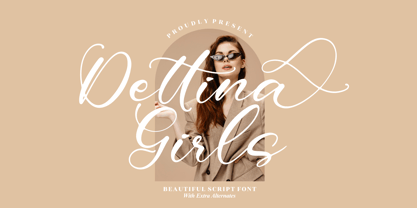 Dettina Girls is a lovely and delicate script font that exudes elegance and class. This font was particularly crafted for those who need a beautiful and refreshing look to their designs. Dettina Girls is PUA encoded which means you can access all glyphs and swashes with ease!
 - Ardegan by Muksal Creatives,
$15.00 Ardegan is a vintage and elegant serif font. Looks cool on various designs that require style such as wedding invitations, greeting cards, logos, fashion, photography, and so on. Ardegan The scenes are PUA coded which means you can access all the glyphs and sweeps with ease!
 - Monday Night by Letterena Studios,
$9.00 Monday Night is a romantic and sweet calligraphy typeface with characters that dance along the baseline. It will add a luxury spark to any design project that you wish to create! Monday Night is PUA encoded which means you can access all glyphs and swashes with ease!
 - Justin Feryina by Letter Muray,
$16.00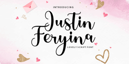 Justin Feryina is a lovely and delicate script font that exudes elegance and class. This font was particularly crafted for those who need a beautiful and refreshing look to their designs. Justin Feryina is PUA encoded which means you can access all glyphs and swashes with ease!
 - Sportesia by ahweproject,
$14.00 Sportesia is a modern and techno-looking display font. It is the perfect font for any sport or racing-themed projects, such as logos, posters, games, product designs, and much more. Sportesia is PUA encoded, which means you can access all the glyphs and swashes with ease!
 - Bodoni Classico by Linotype,
$40.99Giambattista Bodoni (1740–1813) was called the King of Printers and the Bodoni font owes its creation in 1767 to his masterful cutting techniques. Predecessors in a similar style were the typefaces of Pierre Simon Fournier (1712–1768) and the Didot family (1689–1836). The Bodoni font distinguishes itself through the strength of its characters and embodies the rational thinking of the Enlightenment. The new typefaces displaced the Old Face and Transitional styles and was the most popular typeface until the mid-19th century. Bodoni’s influence on typography was dominant until the end of the 19th century and, even today, inspires new creations. The Bodoni Classico of Franco Luin displays less stroke contrast than the original and is therefore also appropriate for smaller point sizes. - Alterhard by Popskraft,
$19.00 The Alterhard typeface combines the inimitable craftsmanship of the great condensed styles of the early twentieth century and at the same time looks organic and even unusual among modern ones. A distinctive feature of the Alterhard typeface is the smooth transition from the geometrically strict extremely compressed shapes of the bold typefaces to the classic sparse shape of the compressed typeface in light weights. Also unusual for vertical fonts are oblique elements in lowercase letters, which give uniqueness, liveliness and originality to the classic type of font. This allows the Alterhard typeface to be used in any design field such as corporate identity, typography, posters, web design, and other design areas. The set comes in 9 font sizes for rich typography.
 - Darka by Sudtipos,
$49.00 Darka is a splendid, mysterious dark lady reincarnated in digital vectors as an original blackletter font. Her gothic, medieval, nocturnal attributes take the form of sharp terminals, seductive curves, calligraphic flair and complex character. Darka blends the balance of Textura, the flow of Fraktur and the elegant lowercase-to-uppercase ratio of Bâtarde into a stylish, inventive typeface with a Mexican soul. Starting as a personal, calligraphic hand, Darka slowly evolved into digital type, developing alternate glyphs, flourishes and special signs to preserve its hand-written origins and delicate tension, making it an excellent display typeface and, surprisingly, even a distinctive, crisp font for short texts. Darka received an Award of Excellence at the Type Directors Club of New York annual competition.
 - Meanwhile Uncial by Comicraft,
$19.00 Aye! Verily ‘twould seem ’tis time for thee to speak in the majuscule language of legendary gods! Yea, thou shalt speak most eloquently in the style and manner of many a pseudo-Shakespearian Bard. Forsooth, thine utterances such as “HAVE AT THEE, VILE VILLAIN!” shall cause all ye creatures of evil to begone from the hallowed halls of Asgard (or other otherworldly domains of the gods). Forsooth, Meanwhile Uncial is a Capital Font, suitable for Gods of Thunder, Mischief or e’en Warriors Three! Meanwhile Uncial contains alternate uppercase characters, auto-ligatures for a more natural, hand-drawn appearance, and Comicraft's magical Crossbar I Technology™, to keep that Mighty Character in its proper place. (Artwork from ELEPHANTMEN #32 by Richard Starkings & Axel Medellin, available on Comixology)
 - Shablon by Context Foundry,
$6.00 Shablon is a Stencil style serif typeface. The family consists of 6 fonts: Shablon Regular, Shablon Italic, Shablon Condensed Regular, Shablon Condensed Italic, Shablon Extended Regular, Shablon Extended Italic. Every font includes uppercase and lowercase letters. You can use Shablon for graphic designs that call for a rough-and-ready look, a military look, or even to create real stencils for signs and marking boxes or luggage. Shablon continues the design of Shablon CYR, created in 1994 by Zhivko Stankulov. A number of shortcomings in the construction of the glyphs have been eliminated, and the typeface as a whole has been updated. Shablon is available with active support and upgradeability. Licensees will receive all new versions of the font free of charge.
 - Frescito by Mans Greback,
$49.00 Frescito is a modern sans-serif typeface that embodies a fresh, cool, and street-smart aesthetic. Designed to be both balanced and versatile, its clear and legible monoline style is designed for branding and advertising in editorial and digital design. The Frescito font family comes in the five classic weights: Thin, Light, Medium, Bold, and Black, along with a Variable font for ultimate flexibility and customization, as well as Italics. Inspired by the energetic spirit of the city and its vibration, Mans Greback set out to create a typeface that would stand out against vivid moment; a type that would work in a traditional café just as well as for contemporary merchandise. The result is a font that combines the best of both worlds: an air of freshness and modernity with an unpretentious, timeless and classy appeal. The font is built with advanced OpenType functionality and has a guaranteed top-notch quality, containing stylistic and contextual alternates, ligatures, and more features; all to give you full control and customizability. It has extensive lingual support, covering all Latin-based languages, from Northern Europe to South Africa, from America to South-East Asia. It contains all characters and symbols you'll ever need, including all punctuation and numbers.
 - Paltime by Typodermic,
$11.95 Step right up, ladies and gentlemen, and feast your eyes on the most dazzling typeface in the land! Paltime is the star of the show, with its all-caps display font and dotted “marquee lights” style that will light up any design like a three-ring circus. But that’s not all, folks! Paltime is a font that knows how to have fun, with layers of dots, hearts, and stars that can be stacked on top of the solid layer to create a multicolored effect that will leave your audience in awe! It’s like a carnival in your design, and everyone is invited. And even if you prefer to keep it simple, Paltime has got you covered. The Marquee, Love, and Glam styles are all standouts on their own, perfect for when you need a monochrome setting or just can’t get enough layer stacking in your life. So come on down to the Paltime font party and join the fun! With its circus barker style, this typeface will be the talk of the town and the star of your design! Most Latin-based European writing systems are supported, including the following languages. Afaan Oromo, Afar, Afrikaans, Albanian, Alsatian, Aromanian, Aymara, Bashkir (Latin), Basque, Belarusian (Latin), Bemba, Bikol, Bosnian, Breton, Cape Verdean, Creole, Catalan, Cebuano, Chamorro, Chavacano, Chichewa, Crimean Tatar (Latin), Croatian, Czech, Danish, Dawan, Dholuo, Dutch, English, Estonian, Faroese, Fijian, Filipino, Finnish, French, Frisian, Friulian, Gagauz (Latin), Galician, Ganda, Genoese, German, Greenlandic, Guadeloupean Creole, Haitian Creole, Hawaiian, Hiligaynon, Hungarian, Icelandic, Ilocano, Indonesian, Irish, Italian, Jamaican, Kaqchikel, Karakalpak (Latin), Kashubian, Kikongo, Kinyarwanda, Kirundi, Kurdish (Latin), Latvian, Lithuanian, Lombard, Low Saxon, Luxembourgish, Maasai, Makhuwa, Malay, Maltese, Māori, Moldovan, Montenegrin, Ndebele, Neapolitan, Norwegian, Novial, Occitan, Ossetian (Latin), Papiamento, Piedmontese, Polish, Portuguese, Quechua, Rarotongan, Romanian, Romansh, Sami, Sango, Saramaccan, Sardinian, Scottish Gaelic, Serbian (Latin), Shona, Sicilian, Silesian, Slovak, Slovenian, Somali, Sorbian, Sotho, Spanish, Swahili, Swazi, Swedish, Tagalog, Tahitian, Tetum, Tongan, Tshiluba, Tsonga, Tswana, Tumbuka, Turkish, Turkmen (Latin), Tuvaluan, Uzbek (Latin), Venetian, Vepsian, Võro, Walloon, Waray-Waray, Wayuu, Welsh, Wolof, Xhosa, Yapese, Zapotec Zulu and Zuni.
 - Lhont Down by Alit Design,
$15.00 Introducing Lhont Down Typeface The Lhont Down font is designed with a serif font concept that has a decorative display style. Irregular dynamic shapes but impressively bold and unique make the font "Lhont Down" different and steal attention. The "Lhont Down" font has 2 font styles, namely decorative ones with irregular shapes with standard or normal font styles. Can be combined so that the designed design has a different rhythm. The lhon Down font is perfect for serious or non-serious design concepts, also suitable for classic retro designs, fashion, pop designs and so on. Serif typefaces such as "Lhont Down" are very easy to apply to any design, especially those with an retro and classic concept, besides that this font is very easy to use both in design and non-design programs because everything changes and glyphs are supported by Unicode (PUA). The "Lhont Down"contains 692 glyphs with many unique and interesting alternative options.
 - The Vintage Town by Nathatype,
$29.00 Looking for a font that will make your branding stand out? Do you sometimes have an appetite for a bit more wholesome typography? Looking for a fabulous, retro, and adventure font? We've got what you want. The Vintage Town- A Script Font The Vintage Town is a script font that has a varied base line, fine lines, retro, and fun touches. This font features thick and angular letters that easy on the eyes and nice to look while it’s also easy to read. It is becomes more special with extruding version option. Fall in love with it's authentic feel and use it to create gorgeous titles., beautiful poster designs, eye-catching social media posts, cute logos, and many more. Our font always includes Multilingual Support to make your branding reach a global audience. Features: Ligatures Stylistic Set Swashes PUA Encoded Numerals and Punctuation Thank you for downloading premium fonts from Natha Studio
 - Korde by Alit Design,
$14.00 Introducing Korde Typeface Korde font is designed with a retro style concept that has a unique and cool shape. It is suitable for header text fonts, book covers and designs that have a retro elegant concept, besides that Korde font is also very good when used for body text. Korde font has 26 families from Thin to Heavy and Condensed. Sans Serif typefaces such as “Korde typeface” are very easy to apply to any design, especially those with an retro and classic concept, besides that this font is very easy to use both in design and non-design programs because everything changes and glyphs are supported by Unicode (PUA). The Korde typeface contains 549 glyphs with many unique and interesting alternative options. Plus, there's a cool sans serif font family for header and description text from thin to heavy and thin condensed to heavy condensed. In the poster preview all the letters are in the Korde typeface.
 - Stempel Garamond LT by Linotype,
$29.99 Opinion varies regarding the role of Claude Garamond (ca. 1480–1561) in the development of the Old Face font Garamond. What is accepted is the influence this font had on other typeface developments from the time of its creation to the present. Garamond, or Garamont, is related to the alphabet of Claude Garamond (1480–1561) as well as to the work of Jean Jannon (1580–1635 or 1658), much of which was attributed to Garamond. In comparison to the earlier Italian font forms, Garamond has finer serif and a generally more elegant image. The Garamond of Jean Jannon was introduced at the Paris World’s Fair in 1900 as Original Garamond, whereafter many font foundries began to cast similar types. The famous Stempel Garamond interpretation of the 1920s remains true to the original Garamond font with its typical Old Face characteristics. The bold italic was a modern addition at the end of the 1920s and the small caps provided an alternative to the standard capital letters. In the mid 1980s, a light version was added to Stempel Garamond. Since its appearance, Stempel Garamond has been one of the most frequently used text fonts.
 - PF Bague Inline Pro by Parachute,
$79.00 Bague Inline Pro is the inline version of Bague Universal a contemporary geometric typeface family which blends distinct minimalist characteristics with mainstream details. Despite its inspiration from Herbert Bayer’s drawings of the 1920s, it diverts from the constructivist rigidity and display structure of early geometric typefaces by incorporating humanist characteristics as well as classic letterform shapes which balance out the extremity of the minimal shapes. Bague Inline is a typeface that stays true to its urban nature and heritage. A very interesting feature of Bague Inline is its vast array of uppercase alternates and ligatures which truly shine when set at display sizes. Make your selection from 4 groups of alternates as well as a rich set of discretionary ligatures and watch it transform into a flexible, charming and stylish typeface with strong modern aesthetics. This typeface offers enormous possibilities and variations for editorial design and branding. Bague Inline is the only commercially available inline typeface that comes in 4 weights for uppercase and lowercase letters. Each style consists of 775 glyphs with more that 128 alternates and ligatures and an extended set of characters which supports simultaneously Latin, Cyrillic and Greek. PDF Specimen Bague Inline on Behance
 - Aviano Copper Variable by insigne,
$199.99 The retro-inspired design of Aviano Copper Variable echos the bold style of America’s Gilded Age. Inspired by the copper-inscribed intaglio printing designs of the early 20th century, the powerful, wide character shape of this font walks softly across your page while carrying a big stick. To create the right balance, small wedge serifs were added onto Aviano Sans, giving you a sophisticated style that looks and acts like it belongs nowhere short of Boardwalk. Developed to a new level of excellence, this design offers a wide range of weights from thin to black. There's full multilingual support of all Latin-based languages and five stylistic sets, swash designs, and 1000 glyphs per weight, including some unique ligatures. Number options include old style figures, tabular figures, and superscripts. Unique median spur alternates, swashes, and ligatures will help you customize every single design. The feel of last century’s personal and business correspondence is waiting for you in this member of the Aviano family. While ideal for headings, displays, logos, and short texts, Aviano Copper’s use for everything from letterhead to wine labels may just give you the monopoly you’re looking for.
 - HWT American Chromatic by Hamilton Wood Type Collection,
$24.95The HWT American Chromatic set is a multilayered font set that will allow for thousands of possible color and pattern combinations. The original 19th Century Chromatic upon which this font set is based included two fonts. The HWT digital version includes eight. The alignment is configured to allow any combination of the eight fonts to all align when identical text is set and arranged, one on top of the other. Due to the highly decorative nature of this font set, the character set is limited to upper case only with basic punctuation. Five of the eight fonts in the set can be used individually as variations of the classic Tuscan style of wood type, which is defined by its concave stems and serifs. There are no accented characters due to the ornate nature of the design and because there were no accents originally intended for this design. This font is best used at sizes of 72 pt or larger and is ideal for a wide array of design uses. For webfont use, CSS with z-index and position will allow for easy online layering. - Mikea by Craft Supply Co,
$20.00 Introducing Mikea – Elegant Luxury Font Elegance Personified Mikea – Elegant Luxury Font is, without a doubt, the epitome of sophistication and class. It has been meticulously crafted to infuse a touch of opulence into your designs. Luxury Redefined Furthermore, this sans serif font exudes luxury in every letterform, making it an ideal choice for projects that require a sense of opulence and refinement. It takes the concept of luxury to a whole new level. Timeless Elegance Mikea encapsulates timeless elegance. It ensures that your designs maintain a sense of prestige and grandeur that stands the test of time. With Mikea, your work exudes a classic charm. Perfect for Prestigious Projects Whether it’s high-end branding, premium packaging, or upscale invitations, Mikea’s elegant luxury font elevates the perception of your projects to new heights. It is the ultimate choice for conveying prestige. In Conclusion In conclusion, Mikea – Elegant Luxury Font is your gateway to a world of sophistication and grandeur. With its timeless elegance and unparalleled refinement, it effortlessly adds a touch of luxury to your designs. When you choose Mikea, you choose the finest in typographic elegance, setting a standard of opulence and prestige that leaves a lasting impression.
 - Nordlig by Prominent and Affluent,
$35.00 A Timeless Revival of 70s Vintage Typography. In the realm of design, where trends ebb and flow, emerges Nordlig—a serif font meticulously crafted to pay homage to the enduring charm of 70s retro typography. Each character carries the essence of an era defined by deliberate lines and distinctive serifs, offering a contemporary take on a classic aesthetic. An Ode to Nostalgia: Nordlig transports you to a bygone era, infusing your projects with the unmistakable allure of 70s design. It’s a font that whispers of nostalgia while maintaining a fresh, relevant appeal. A Bridge Between Eras: Nordlig seamlessly marries the timeless charm of the 70s with the demands of modern design. It’s more than a font; it’s a conduit through which the past and present converge, enabling you to create designs that resonate across time. Elevate your designs with Nordlig, a serif font that not only pays homage to a rich design legacy but also sets a new standard for modern elegance. Embrace the spirit of the 70s with a font that transcends eras, and let your creativity soar. Experience Nordlig today and witness the magic of vintage typography reimagined for the contemporary creator.
 - Aviano Copper by insigne,
$29.99 The retro-inspired design of Aviano Copper echos the bold style of America’s Gilded Age. Inspired by the copper-inscribed intaglio printing designs of the early 20th century, the powerful, wide character shape of this font walks softly across your page while carrying a big stick. To create the right balance, small wedge serifs were added onto Aviano Sans, giving you a sophisticated style that looks and acts like it belongs nowhere short of Boardwalk. Developed to a new level of excellence, this design offers a wide range of weights from thin to black. There's full multilingual support of all Latin-based languages and five stylistic sets, swash designs, and 1000 glyphs per weight, including some unique ligatures. Number options include old style figures, tabular figures, and superscripts. Unique median spur alternates, swashes, and ligatures will help you customize every single design. The feel of last century’s personal and business correspondence is waiting for you in this member of the Aviano family. While ideal for headings, displays, logos, and short texts, Aviano Copper’s use for everything from letterhead to wine labels may just give you the monopoly you’re looking for.
 - Matcha by Los Andes,
$59.00 We decided to explore the concept of fitness, but from a more natural perspective. With so many people drinking detox drinks and eating raw food, we were inspired to create a font that mixes the ‘strength’ of sports and the organic nature of natural products. The result is ‘Matcha’: a strong and energetic typeface that also flows at the same time. Matcha consists of a stable, very friendly Slab face and a calligraphy Script with a handmade style: spontaneous and fickle with some reverse-contrast alternative characters. Can you guess who is the designer behind each style? The duo contains OpenType features and is perfect for labeling natural products, cookbooks, magazine photography, fashion & beauty magazines covers, health & fitness publications, and more. For both print and digital communication. Matcha: the new black coffee!
 - Arek Latin by Rosetta,
$60.00 Arek is Rosetta’s award-winning collection of Latin and Armenian families. Originally designed for use in textbooks and the schoolroom, Arek is an active typeface that holds the reader’s attention with kinetic details tucked into restrained letterforms on the page. For clarity and ease of reading, Arek pairs its nuanced upright and its perky italic styles for both scripts. Though first designed with school books in mind, Arek equips the typographer with eight styles covering a wide range for editorial and other challenging typesetting environments. Essential expert features such as ligatures, lining and ranging figures, and contextual alternates ensure Arek is ready for any assignment. Extras like a full array of bullets, dingbats, and manicules make this family nimble enough to make the grade with readers in all sorts of editorial projects.
 - Thorfin by Mans Greback,
$39.00 Thorfin is a sharp serif typeface. Drawn and created between 2020 to 2022, this modern lettering has a distinct personality while maintaining a regularity of a body text. Thorfin gives any project a smart character with its geometric shapes and crisp edges. The Thorfin family consist of 14 fonts, such as Thin, Light, Regular, Medium, Bold, Black and Italic. Also includes a variable font! Only one font file, but the file contains multiple styles. Use the sliders in Illustrator, Photoshop or InDesign to manually set any weight and width. This gives you not only the predefined styles, but instead more than a thousand ways to customize the type to the exact look your project requires. More info about Variable Fonts: https://mansgreback.com/variable-fonts The font is built with advanced OpenType functionality and has a guaranteed top-notch quality, containing stylistic and contextual alternates, ligatures and more features; all to give you full control and customizability. It has extensive lingual support, covering all Latin-based languages, from Northern Europe to South Africa, from America to South-East Asia. It contains all characters and symbols you'll ever need, including all punctuation and numbers.
 - Paula Natalie by Grezline Studio,
$17.00 Paula Natalie is a cute and playful script font. This font was created to give your headlines and logotype projects a cheerful touch. Paula Natalie font is also usable in a wide range of works such as logos, covers, posters, quotes, product packaging, merchandise, social media and much more! Feature : - PUA Encoded - Multilingual Language - Works on PC & Mac - Simple installations - Accessible in the Adobe Illustrator, Adobe Photoshop, Adobe InDesign, even works on Microsoft Word.
 - Stifin by Maulana Creative,
$22.00 Stifin handwritten display font. Bold stroke, fun character with a bit of ligatures and alternates. To give you an extra creative work. Stifin font support multilingual more than 100+ language. This font is good for logo design, Social media, Movie Titles, Books Titles, a short text even a long text letter and good for your secondary text font with script or serif. Make a stunning work with Stifin handwritten display font. Cheers, Maulana Creative
 - Undine Soul by Maulana Creative,
$15.00 Undine Soul blackletter display font. Bold stroke, fun character with a bit of ligatures and alternates. To give you an extra creative work. Undine Soul font support multilingual more than 100+ language. This font is good for logo design, Social media, Movie Titles, Books Titles, a short text even a long text letter and good for your secondary text font with script or serif. Make a stunning work with Undine Soul font. Cheers, Maulana Creative