10,000 search results
(0.026 seconds)
- WTF Cannibold by Wasabib Type Foundry,
$17.00 Cannibold is a Bold, modern, and square font is a typographic style that exudes confidence and contemporary flair. With its clean lines and strong presence, this font captivates the eye and demands attention. Each letter is meticulously crafted to create a striking visual impact, making it perfect for a wide range of design applications. The bold weight of this font adds a sense of strength and power to every character. It conveys a sense of assertiveness and stands out, even from a distance. The thickness of the strokes gives each letter a solid and substantial feel, making it an excellent choice for headlines, logos, and attention-grabbing text.
 - ITC Tempus Sans by ITC,
$29.99ITC Tempus is the work of British designer Phill Grimshaw. He claims that every calligrapher's aspiration is to draw perfect roman capitals with a pen, but admits that this is extremely difficult. For this typeface, Grimshaw used a fountain pen on cheap, porous paper and, of course, the ink bled. The resulting forms are classic but their rugged edges deviate from the perfection of roman type. And Tempus Sans is just Tempus with the serif surgically removed, yet the proportions of the characters work nicely," says Grimshaw. Because of its rough quality, the typeface works best in larger point sizes, yet maintains its characters even in smaller sizes." - Memento by Linotype,
$29.99Memento is a 1993 design of the type artist Franco Luin, the creative mind behind a variety of types, for instance, Venus and Griffo Classico. Memento's high x-height allows it to be legible even in small point sizes. It is distinguished by its tiny triangular serifs, a characteristic reminiscent of the Dutch types of the 17th century. Memento is an extremely legible typeface with a classical touch. It is available in four different weights with corresponding italics and small caps. This range of weights along with its classic, neutral look makes it a versatile typeface which can be used in anything from books to corporate design to magazine typography. - ITC Tempus Serif by ITC,
$29.99ITC Tempus is the work of British designer Phill Grimshaw. He claims that every calligrapher's aspiration is to draw perfect roman capitals with a pen, but admits that this is extremely difficult. For this typeface, Grimshaw used a fountain pen on cheap, porous paper and, of course, the ink bled. The resulting forms are classic but their rugged edges deviate from the perfection of roman type. And Tempus Sans is just Tempus with the serif surgically removed, yet the proportions of the characters work nicely," says Grimshaw. Because of its rough quality, the typeface works best in larger point sizes, yet maintains its characters even in smaller sizes. - Sliced by ArtyType,
$29.00 The name of this robust typeface is adopted quite literally from the slice taken out of certain characters. The same sliced angle is also applied to many of the terminals, creating a clean-cut styling throughout the family. Tilted versions emphasise the descriptive name further, with an implied cutting stance. Wider versions go even further still, taking on a more thrusting, squat dynamic compared to the condensed styles. The standard Sliced family is complemented by Sliced Open, a lighter, more open set which extends the versatility and design flexibility of the typeface and comprises a total of 14 font styles, all with extended European character sets.
 - TE HAFS2 Tharwat Emara by Tharwat Emara,
$39.00 Introducing "Te Hafs tharwat Emara" - An Exquisite Arabic Font for the Holy Quran Unveil the beauty and elegance of Arabic calligraphy with "Te Hafs tharwat Emara," a meticulously crafted font designed specifically for typing the Holy Quran. This magnificent typeface pays homage to the rich cultural heritage of Arabic script while embracing modern design elements, resulting in a captivating blend of tradition and innovation. With its unique and enchanting aesthetic, "Te Hafs tharwat Emara" captures the essence of Islamic art and typography, making it an ideal choice for any project related to the Holy Quran. Whether you're designing Quranic verses, Islamic manuscripts, or educational materials, this font will elevate your work to new heights and leave a lasting impression on your audience. The essence of "Te Hafs tharwat Emara" lies in its harmonious balance of form and function. Every letter has been meticulously crafted to ensure legibility and clarity, even at smaller sizes. The thoughtful spacing and meticulous attention to detail make this font a delight to read, enhancing the overall reading experience of the Holy Quran. One of the standout features of "Te Hafs tharwat Emara" is its ornate and intricate calligraphic strokes. Each character is a masterpiece in itself, reflecting the skill and expertise of traditional Arabic calligraphers. The fluidity of the strokes and the subtle curves create a sense of rhythm and grace, evoking a sense of reverence and spirituality. The versatility of "Te Hafs tharwat Emara" allows it to adapt effortlessly to various design contexts. Whether you're working on printed materials, digital platforms, or even signage, this font will maintain its beauty and legibility, ensuring your message is conveyed with utmost clarity and impact. To further enhance its usability, "Te Hafs tharwat Emara" includes a comprehensive set of Arabic ligatures, diacritical marks, and punctuation, enabling you to accurately represent the intricacies of the Arabic language. These thoughtful additions ensure that your typography remains authentic and faithful to the traditions of Arabic script. When it comes to font selection, readability is of utmost importance. "Te Hafs tharwat Emara" has been meticulously optimized for digital and print environments, ensuring exceptional legibility in both mediums. Each character has been carefully tested and refined to guarantee optimal reading comfort, making this font an excellent choice for long passages of text. Moreover, "Te Hafs tharwat Emara" supports a wide range of OpenType features, granting you creative control over your typography. From alternate character forms to contextual alternates, swashes, and ligatures, this font offers a plethora of options to customize and elevate your design. With such flexibility at your fingertips, your creativity knows no bounds. Beyond its technical prowess, "Te Hafs tharwat Emara" is a font with a story. It symbolizes a rich cultural heritage, embodying the devotion and reverence associated with the Holy Quran. Its elegant curves and intricate details evoke a sense of spirituality, making it a perfect choice for projects aimed at preserving and celebrating Islamic traditions. In conclusion, "Te Hafs tharwat Emara" is more than just a font; it is a celebration of Arabic calligraphy, Islamic art, and the beauty of the Holy Quran. With its exquisite design, unparalleled legibility, and versatile application, this font is an invaluable asset for any project related to Islamic typography. Embrace the artistry of "Te Hafs tharwat Emara" and elevate your designs to new heights of beauty and elegance.
 - TE HAFS1 Tharwat Emara1 by Tharwat Emara,
$39.00 Introducing "Te Hafs1 tharwat Emara1" - An Exquisite Arabic Font for the Holy Quran Unveil the beauty and elegance of Arabic calligraphy with "Te Hafs1 tharwat Emara1," a meticulously crafted font designed specifically for typing the Holy Quran. This magnificent typeface pays homage to the rich cultural heritage of Arabic script while embracing modern design elements, resulting in a captivating blend of tradition and innovation. With its unique and enchanting aesthetic, "Te Hafs1 tharwat Emara1" captures the essence of Islamic art and typography, making it an ideal choice for any project related to the Holy Quran. Whether you're designing Quranic verses, Islamic manuscripts, or educational materials, this font will elevate your work to new heights and leave a lasting impression on your audience. The essence of "Te Hafs1 tharwat Emara1" lies in its harmonious balance of form and function. Every letter has been meticulously crafted to ensure legibility and clarity, even at smaller sizes. The thoughtful spacing and meticulous attention to detail make this font a delight to read, enhancing the overall reading experience of the Holy Quran. One of the standout features of "Te Hafs1 tharwat Emara1" is its ornate and intricate calligraphic strokes. Each character is a masterpiece in itself, reflecting the skill and expertise of traditional Arabic calligraphers. The fluidity of the strokes and the subtle curves create a sense of rhythm and grace, evoking a sense of reverence and spirituality. The versatility of "Te Hafs1 tharwat Emara1" allows it to adapt effortlessly to various design contexts. Whether you're working on printed materials, digital platforms, or even signage, this font will maintain its beauty and legibility, ensuring your message is conveyed with utmost clarity and impact. To further enhance its usability, "Te Hafs1 tharwat Emara1" includes a comprehensive set of Arabic ligatures, diacritical marks, and punctuation, enabling you to accurately represent the intricacies of the Arabic language. These thoughtful additions ensure that your typography remains authentic and faithful to the traditions of Arabic script. When it comes to font selection, readability is of utmost importance. "Te Hafs1 tharwat Emara1" has been meticulously optimized for digital and print environments, ensuring exceptional legibility in both mediums. Each character has been carefully tested and refined to guarantee optimal reading comfort, making this font an excellent choice for long passages of text. Moreover, "Te Hafs1 tharwat Emara1" supports a wide range of OpenType features, granting you creative control over your typography. From alternate character forms to contextual alternates, swashes, and ligatures, this font offers a plethora of options to customize and elevate your design. With such flexibility at your fingertips, your creativity knows no bounds. Beyond its technical prowess, "Te Hafs1 tharwat Emara1" is a font with a story. It symbolizes a rich cultural heritage, embodying the devotion and reverence associated with the Holy Quran. Its elegant curves and intricate details evoke a sense of spirituality, making it a perfect choice for projects aimed at preserving and celebrating Islamic traditions. In conclusion, "Te Hafs1 tharwat Emara1" is more than just a font; it is a celebration of Arabic calligraphy, Islamic art, and the beauty of the Holy Quran. With its exquisite design, unparalleled legibility, and versatile application, this font is an invaluable asset for any project related to Islamic typography. Embrace the artistry of "Te Hafs1 tharwat Emara1" and elevate your designs to new heights of beauty and elegance.
 - Comenia Sans by Suitcase Type Foundry,
$75.00Comenia Sans was designed in the framework of a unique typographic project for all types of schools. It is a complementary face for Comenia Serif, released by our friends at Storm Type Foundry. Comenia Sans has a lot in common with its serif sister: the height of both upper and lower case, the length of ascenders and descenders, and the general weight. This makes the two perfect partners which work well even when set side by side in a single line of text. Comenia Sans does, however, lack all serifs, ornamental elements and stroke stress variation. All these elements freshen up the feel of long texts, but for shorter texts use, they are not necessary. Despite that, Comenia Sans retains the soft, friendly character of its big sister, as well as a few tiny details which lend it its unique character without compromising legibility or utility. Open counters give all letters an airy feel and permit enough variation in construction. This is why the face works well even in multiple-page texts. All its letters are easily distinguished from each other, so the reader's eyes are not strained. Diacritics and punctuation harmonize with both upper and lower case. As usually, all diacritical marks fully respect conventional shapes of accents and they are perfectly suitable for Czech, Slovak, Polish and other Central European languages, where a lot of diacritics abounds. Similarly to the renaissance italics which refers to the cursive forms, Comenia Sans introduces novel shapes of some characters drawing from the hand-written heritage. This is most apparent in the single-bellied a, the simplified g, and the stem of f which crosses the baseline and ends with a distinct terminal. In the text, emphasized words are thus distinguished not only by the slant of letters, but also by the shapes of the letters themselves. All twelve styles contain set of small caps, suitable for the names, in the indexes or the headlines in longer texts. Legibility in small sizes under 10 points was at the center of designers' attention, too. This is why the counters of a, e and g are large enough to prevent ink spread in small sizes, both on-screen and in print. After all, the font was specifically optimized for screen use: its sober, simple forms are perfectly fit to be displayed on the computer screen and in other low-resolution devices. When used in the context of architecture, the smoothness of all contours stands out, permitting to enlarge the letters almost without limit. A standard at the Suitcase Type Foundry, each style of Comenia Sans boasts a number of ligatures, an automatic replacement of small caps and caps punctuation, a collection of mathematical symbols, and several types of numerals which make it easy to set academic and other texts in an organised, well-arranged way. For the same purpose, fractions may come in handy, too. Apart from the standard emphasis styles, the family also contains six condensed cuts (each set has the same number of characters), designated for situations where space is limited or the need for striking, poster-like effect arises. Comenia Sans is the ideal choice for the setting of magazines, picture books, and navigation systems alike. Its excellent legibility and soft, fine details will be appreciated both in micro-typography and in poster sizes. Although it was designed as a member of a compact system, it will work equally well on its own or in combination with other high-quality typefaces. - Ghibli by Eyad Al-Samman,
$- The word ‘Ghibli’ per se refers to a Saharan hot and dry wind commonly known as the Sirocco. In Arabic language, ‘Ghibli’ is known as ‘Qibli or Kibli’, meaning ‘Southern’ for those Arabic nations who live in the North of Africa. The ‘Ghibli’ wind is most common during spring and autumn, and can blow at almost 60mph; it is this wind which is responsible for the dry, dusty conditions on the Mediterranean coast of North Africa. ‘Ghibli’ can last for days making life miserable and is therefore feared by the desert dwellers in that region. It can also have profound effect on the landscape by moving vast quantities of sand and dunes. Inspired by the Studio Ghibli’s unique and magical characters, the ‘Ghibli’ typeface is designed as a Latin free and literary serif typeface. It strongly expresses transition, imagination, sharpness, characterization, and modernization. It is a literary type that can capture the eyesight of readers and other observers with its acute and stylistic letterforms, dots, and numerals. It has transitional serifs and it is generally based upon the Latin printing style of the 18th and 19th centuries, with a pronounced vertical contrast in stroke emphasis (i.e., vertical strokes being heavier than the horizontal strokes). It has more regular forms in which serifs are bracketed and more symmetrical. The main characteristic of ‘Ghibli’ typeface is in its new designed serif letters. Special letters that can be described as having modern designs include small ‘g’, ‘p’ (with their open ends), ‘x’, and capital ‘B’, ‘P’, ‘Q’, and ‘R’ (with their open ends). ‘Ghibli’ typeface has also both of lining and old-style numerals which makes it more suitable for any literary and printing purposes. This gratuitous font comes in only two weights (i.e., Ghibli Regular and Ghibli Bold). It is absolutely preferable to be used in the wide fields related to literature and publication industry. This includes typing titles of diverse literary and academic books, readable texts of novels, novellas, short stories, prose, poetry, textbooks, newspapers, and magazines. It is also notable if chosen for designs that include movies’ titles, logos of academic institutions such as colleges and universities, organizations and associations’ names, medical packages such as those dedicated for tablets and syrups, and also other different educational and social materials. ‘Ghibli’ is simply a free literary typeface dedicated for all who want to write and read using a modern and stylish serif font. Enjoy it.
 - Mencken Std by Typofonderie,
$59.00 An American Scotch remixed in 27 fonts Mencken has twenty seven styles, divided into three widths, three optical sizes, romans and italics. Generally, optical size typeface families belong to a same common construction. It falls into the same category of type classification, while presenting different x-heights or contrasts. Mencken is unique because it is designed according to different axis and optical sizes. Firstly, Mencken Text is a low-contrast transitional typeface, designed on an oblique axis, asserting horizontal with featuring open counters. Its capitals follow Didots to better harmonize the rest of the family. On the other side of the spectrum, Mencken Head (and narrow variations) is designed on a vertical axis, high contrast, in a contemporary Didot style. The Mencken is therefore a typeface answering to different sorts of uses, whose design is different according to its uses: from oblique axis in small size to vertical axis in large sizes. Vertical proportions (x-height, capitals height, etc.) were calibrated to be compatible with many Typofonderie typeface families. Lucie Lacava and I followed the idea launched by Matthew Carter few years ago for some of his typefaces intended for publications. From Baltimore Sun’s project to Typofonderie’s Mencken It is a bespoke typeface for American newspaper The Baltimore Sun started at the end of 2004 which marks the beginning of this project. The story started with a simple email exchange with Lucie Lacava then in charge of redesigning the American East Coast newspaper. As usual, she was looking for new typeface options in order to distinguish the redesign that she had started. At the time of its implementation, a survey of the newspaper’s readers has revealed that its previous typeface, drawn in the mid-1990s, was unsatisfactory. The Mencken was well received, some reader responses was particularly enjoyable: “It’s easier to read with the new type even though the type is designed by a French.” Why it is called Mencken? The name Mencken is a tribute to H. L. Mencken’s journalistic contributions to The Sun. According to the London Daily Mail, Mencken ventured beyond the typewriter into the world of typography. Because he felt Americans did not recognize irony when they read it, he proposed the creation of a special typeface to be called Ironics, with the text slanting in the opposite direction from italic types, to indicate the author’s humour. Affirming his irreverence, the Mencken typeface does not offer these typographic gadgets. Henry Louis Mencken (1880 — 1956) was an American journalist, satirist, cultural critic and scholar of American English. Known as the “Sage of Baltimore”, he is regarded as one of the most influential American writers and prose stylists of the first half of the twentieth century. He commented widely on the social scene, literature, music, prominent politicians and contemporary movements. Creative Review Type Annual 2006 Tokyo TDC 2018
 - Jellyka, End_less Voyage - Personal use only

- Pepone by Storm Type Foundry,
$43.00 This typeface is primarily optimized for the setting of belles-lettres. The regular styles are balanced to suit small text sizes and enable the reading of long portions of text. The development of the typeface was guided by the goal of creating a contemporary, discreet book serif, with modern expression and numerous functions. Letters feature reduced contrast, the lighter styles may evoke wired letters, while the heavier ones bear distinct slab serif references. The extremes thus work in harmony and fulfil the demanding requirements of advertising and magazine layout. The typeface is suitable for bottle labels, invitations, exhibition catalogs and posters, for printed and online presentations alike. The name Pepone was chosen as an homage to Josef Kroutvor. Of course, the typeface isn’t solely reserved for the setting of the works of Josef K. On the contrary – we’d like to present a universal typeface suited for literature, catalogs and magazines. It wouldn’t be the first and the last example of a typeface created with a specific purpose in mind, which later became used universally.
 - Christmas Signature by Stefani Letter,
$12.00 Christmas Signature is a minimalist script font designed with an incredibly modern, beautiful feel, fresh, rich, and elegant. It’s great for Christmas-themed greeting cards, branding materials, business cards, quotes, posters, and more! Christmas Signature will look outstanding in any context, whether it’s being used on busy backgrounds or as a standalone headline! This font is PUA encoded which means you can access all of the glyphs and swashes with ease! It features a varying baseline, smooth lines, gorgeous glyphs, and stunning alternates.
 - Nortika by Luhop Creative,
$18.00 Nortika is a classy and distinct serif font. Add it confidently to your favorite creations and let yourself be amazed by the outcome generated. This font is PUA encoded which means you can access all glyphs and swashes with ease! Nortika is also included full set of: Uppercase and lowercase letters Multilingual symbols Numerals Punctuation Standard ligatures Discretionary Ligatures Alternates Wish you enjoy our font and if you have a question, don't hesitate to drop message & I'm happy to help :)
 - Fashion Signature by Letterara,
$14.00 Fashion Signature is an enchanting handwritten font. This versatile Monoline font has a wide spectrum of applications ranging from greeting cards, fashion, weddings, posters, beauty cosmetics, and logos to headlines and is guaranteed to add a romantic or casual feel to your next project. Add it confidently to your projects, and you will love the results. This font is PUA encoded which means you can access all the beautiful glyphs and swashes with ease! Add to your collection for future Design and projects!
 - La Fleur Grande by Zeenesia Studio,
$16.00 La Fleur Grande is a an elegant and smooth combine typeface regular and italic serif font. It’s a very versatile font that works great in large. Stylistic Alternate and Ligature makes your project will be awesome. La Fleur Grande Perfect for editorial projects, Logo design, web font, branding, product packaging, magazine , or simply as a stylish text overlay to any background image. This font is PUA encoded, which means you can access all of the glyphs and swashes with ease!
 - Raffaello by Stefani Letter,
$12.00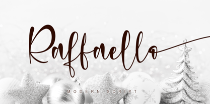 Raffaello is a minimalist script font designed with an incredibly modern, beautiful feel, fresh, rich, and elegant. It’s great for Christmas-themed greeting cards, branding materials, business cards, quotes, posters, and more! Raffaello will look outstanding in any context, whether it’s being used on busy backgrounds or as a standalone headline! This font is PUA encoded which means you can access all of the glyphs and swashes with ease! It features a varying baseline, smooth lines, gorgeous glyphs, and stunning alternates.
 - Antonia Retro by Romie Creative,
$14.00 Introducing Antonia Retro – a bold retro script font that takes you back to the ’60s. This typeface has an extruded version so you can easily create retro-effect fonts. It is suitable to be applied especially to logos, and various other formal forms such as invitations, labels, logos, magazines, books, greeting/wedding cards, packaging, fashion, make-up, stationery, novels, labels, or any advertising purposes. This font is PUA encoded, which means you can access all of the glyphs and swashes with ease!
 - Rafandra by Stefani Letter,
$12.00 Rafandra is a minimalist script font designed with an incredibly modern, beautiful feel, fresh, rich, and elegant. It’s great for Christmas-themed greeting cards, branding materials, business cards, quotes, posters, and more! Rafandra will look outstanding in any context, whether it’s being used on busy backgrounds or as a standalone headline! This font is PUA encoded which means you can access all of the glyphs and swashes with ease! It features a varying baseline, smooth lines, gorgeous glyphs, and stunning alternates.
 - Amica Pro by Eclectotype,
$40.00 Welcome Amica Pro, a workhorse sans designed to give your branding a friendly, approachable look. What is it that makes a typeface friendly? Eclectotype undertook extensive research* in this and the results are in! To cut a long story short, friendliness in sans serif fonts can be summed up in two words – short and fat. Basically, think Danny DeVito in letter form. The shortness in Amica Pro is achieved (somewhat counterintuitively) by pushing up the x-height. This, coupled with short ascenders and descenders, gives the text a squat appearance. For the fatness, that's easy in the bolder weights, but how to carry this through to the lights? Here, the fatness equates to roundness, so the letterforms, even if the stroke weight is light, have a rotund appearance from the wideness and roundness of the circular glyphs. When thinking about friendliness, we think about inclusiveness. To this end, Amica Pro supports a super wide range of latin-based languages, as it uses Underware's Latin Plus character set, as well as extra support for Vietnamese. Amica Pro is best used for branding, logos, infographics etc. It will give your UI a friendlier feel, but that doesn't mean it's not serious. There are many useful typographic features, including alternates, numerous figure styles, automatic fractions and case-sensitive forms. The italics are carefully optically corrected "sloped romans" and as such they are the same width as their upright equivalent, so changing your copy to italics will not mess around with the spacing. *I looked at a few fonts and drew some lazy conclusions.
 - Various by Ahmad Jamaludin,
$17.00 Say hello to VARIOUS! Completely unique and custom font with a 00s style, inspired by vintage and hand-painted retro signs :D Various is a font with a delightful retro touch perfect for capturing the essence of the 60s, 70s, 80s, 90s, and even Y2K designs! Its unique characteristics will transport you to those iconic eras, adding a nostalgic vibe to your creative projects. Various come in two versions - Regular and Outline. With two different style fonts, you can easily create eye-catching designs without any extra effort This font is perfect for a retro 00s theme and can be used for cover magazines, brochures, logos, headlines or quotes, stand-alone displays, and short paragraphs or content. Each font in the family is dynamic and authoritative on its own, making it perfect for any display project. What do you get? Various Various Outline Alternates and Ligatures Instructions ( Access special characters, even in circuit design ) Letters, numbers, symbols, and punctuation No special software is required to use this typeface even work in Canva Multilingual Support Let Various take you on a journey through time Enjoy your day! Dharmas Studio
 - Celtic Knots by Clanbadge,
$20.00 While it is obvious that this is an ornamental style font, it is more than that: it is a Celtic Knotwork design tool! Irish, Scottish, Welsh, even Norse and Viking cultures have used knotwork designs for millenia. These ancient traditional interwoven designs are experiencing a revival as Celtic culture gains exposure in the modern world. Intricate Celtic knots are featured everywhere from jewelry to tattoos. While many enjoy them simply for their beauty and fascinating twists, they can also be used to add an air of myth, magic and mystery to any project. The interlaced lines make them perfect for wedding invitations, borders, dividers and rules, web graphics, and logos. I began using Celtic knotwork designs in my own work as part of my knifemaking and jewelry making hobbies. I read all of the books I could find about Celtic knots and at first I drew them by hand with pencil and paper. Then as I realized how nice it would be to have "undos" I switched over to using Corel Draw. Draw proved to be a natural for this type of artwork with tools like contour and the trim function. But even with these great tools, it was still tedious to create these designs. I noticed that I was able to reuse a lot of parts in repetitive sections. I developed a small library of reusable bits and chunks of Celtic designs. I found them so useful and fun to work with that I began thinking about ways to market my Celtic design kit. I thought about CDR and EPS formats, but then I thought of creating this toolset as a True Type Font. That way anyone with ANY program that uses fonts could easily create Celtic knotwork designs. Word processors, embroidery programs, engraving programs, jewelry design programs, CAD/CAM programs...almost every program can use fonts. I was also interested in CNC work and thought that this font would work well for applications such as laser etching, vinyl signs, and machining. With that in mind, I designed each character of the font with extremes of accuracy. If one character from the font is used at one inch tall, every control point will be placed to an accuracy of better than 0.0001 inch. I wanted every piece to meet exactly with the next, with no possibility for misalignment. The different styles are all very carefully created to fit accurately with each other. So the Filled Style fits exactly into the Outline Style, and the Inverse Style fits precisely around the Outline Style so as to make up the background behind the knotwork. Combining the styles allows you to have complete creative control. By assembling the nearly 200 pieces it is quite easy to produce very complex designs. It is actually a bit like playing with a puzzle and many people really enjoy putting the pieces together to make designs. In fact, I have had many customers tell me of how they love playing with this font and making knots into the wee hours of morning. If you like puzzles then you will absolutely love this font! And creating the patterns is just the beginning of the fun! If you apply your favorite Photoshop tricks on them you can make anything from dazzling chrome knotwork to carved stone. Photoshop plug-ins like SuperBladePro are great for converting knotwork text into corroded bronze or rusted iron. Use your knotwork to add texture to a virtual landscape, or add them as surface embelishments on architecture and furniture. You can also make round knotwork by using this font with "WordArt" (WordArt is included with every copy of Microsoft Word. See http://clanbadge.com/round_knots.htm for a tutorial on how to make round knotwork). For Crafters there are limitless uses for this font. It has been used for embroidery, jewelry, leatherwork, stencils, stained glass, quilting, painting, pyrography, woodcarving and lots more. We have even sold copies to monks for use in decorating handmade books!
 - Drakoni Sans by Mans Greback,
$59.00 Drakoni Sans is a bold and rounded font that exudes a strict and angular aesthetic. Its clean lines and subtle curves give it a humanist touch, making it perfect for a wide range of designs. Designed with a vision of comic book headlines, Drakoni Sans is both playful and professional. Its bold and powerful presence commands attention, while its rounded edges and angled cuts add a touch of personality and charm. Available in four styles - Regular, Italic, Bold, and Bold Italic - Drakoni Sans offers versatility and flexibility for any project. Its clean and clear letterforms make it ideal for logos, headlines, and other display purposes. Whether you're looking to add a touch of softness to your designs or to create a bold and commanding presence, Drakoni Sans is the font for you. The font is built with advanced OpenType functionality and has a guaranteed top-notch quality, containing stylistic and contextual alternates, ligatures and more features; all to give you full control and customizability. It has extensive lingual support, covering all Latin-based languages, from Northern Europe to South Africa, from America to South-East Asia. It contains all characters and symbols you'll ever need, including all punctuation and numbers.
 - Gyllene Elgen by Mans Greback,
$69.00 Gyllene Elgen, created by Mans Greback, is a delicate and captivating handwriting font that exudes romance and charm. With its thin, beautiful lines, and loopy, decorative swirls, this typeface brings a touch of elegance and sophistication to your design projects. Perfect for invitations, personal notes, and other heartfelt communications, Gyllene Elgen captures the essence of delicate, handcrafted beauty. The font was inspired by the golden hues of the Swedish landscape during autumn, as well as the mythical golden elk that roams the forests. Mans Greback sought to bring this enchanting story to life through the graceful curves and fine details of Gyllene Elgen. The font is built with advanced OpenType functionality and has a guaranteed top-notch quality, containing stylistic and contextual alternates, ligatures, and more features; all to give you full control and customizability. It has extensive lingual support, covering all Latin-based languages, from Northern Europe to South Africa, from America to South-East Asia. It contains all characters and symbols you'll ever need, including all punctuation and numbers. Mans Greback is a Swedish typeface designer, celebrated for his innovative and diverse portfolio. With a keen eye for detail and innovative designs, Mans has earned a reputation for creating fonts that resonate with people across the globe, inspiring creativity and capturing the imagination.
 - HS Alwajd by Hiba Studio,
$50.00 Hs Alwajd is an Arabic display typeface, under “titles” category. It is useful for book titles, creative designs and modern logos. Also, it is used when a contemporary and simple look is desired that can fit with the characteristics of Kufi fatmic where horizontal parts are equal than vertical ones. It is a new style based on HS Almajd but without swirling round forms terminating in ball. The font is based on Kufi Fatmic calligraphy along with some derived ideas of decorative fonts, maintaining the beauty of the Arabic font and its fixed rates. Undoubtedly, the insertion of curved ornament in some parts adds more beauty and fascinating diversity in the flow line between sharp, soft and curved parts. This font supports Arabic, Persian, Pashtu, Kurdish Sorani, Kurdish Kirmanji and Urdu, consisting only one weight which can add to the library of Arabic Kufic fonts contemporary models that meet with the purposes of various designs for all purposes and all tastes.
 - Dulcian by insigne,
$- Inspired by the Appalachian culture of the Southeastern United States, the finely tuned forms of Dulcian strike a clear, empowering chord with your audience. This energetic and fresh sans serif flows fast and smooth with its simple lines and slight hand-written character. All total, there are six weights, with complementary italics and three different widths. Dulcian supports OpenType features and is packaged with unicase alternates, unconnected alternates, ligatures, old-fashioned figures, fractions, titling and small caps. Preview any and all of these features in the interactive PDF manual. The Dulcian family of fonts also includes glyphs for 72 languages, providing you with more than 600 glyphs per font. While designed especially for pull quotes, this display typeface can be used for a variety of applications. Dulcian is an excellent choice for websites as well as flyers and packaging. Other uses include coffee, menus, awards, certificates where a touch of humanity and personalization is needed.
 - Sickle by Eclectotype,
$20.00 The Wild West meets Russia and India in this heavy duty display face. Although it's uppercase only, most of the characters vary between the uppercase and lowercase alphabets, so it's easy to give your text a hand-made feel by mixing up your cases. OpenType savvy applications can really exploit the extra features of this font. Engage contextual alternates, and G, C, L and alternate form of E will change when placed before a letter with a crossbar to create some cool effects (see the CK and LE combinations in the poster). There are standard ligatures for ff and FF combinations, and discretionary ligatures for 'and', 'the', 'No', 'Mc' and 'Co'. Engage stylistic alternates for a reversed 3 version of E, and the obligatory backwards R for that faux-Russian effect. Also included in the font is a host of ornaments. This font is perfect for wanted posters, heavy metal band logos, Communist propaganda leaflets and no doubt a load of other things too.
 - Kronix by Hazztype,
$20.00 Introducing Kronix, a geometric, futuristic font that embodies the essence of technology in the digital age. Kronix combines sleek lines, precise angles, and contemporary design elements to create a visually striking font perfect for technology-themed projects. Its clean and minimalist letterforms embody the essence of modernity and sophistication, capturing the attention of tech-savvy audiences. With its crisp edges and precise spacing, this font creates a harmonious visual rhythm that adds a touch of elegance to any design. Kronix is versatile and adaptable, making it suitable for a wide range of applications, including websites, mobile apps, and branding materials. Its modern aesthetic aligns perfectly with the fast-paced advancements in technology, allowing your design to stay relevant and visually impactful. Whether you're designing a tech magazine cover, creating a sci-fi movie poster, or developing a high-tech product packaging, Kronix is the ultimate choice for adding a geometric, futuristic flair that captivates the imagination and elevates your design to the forefront of modern technology.
 - Silent Noise Font Duo by Dora Typefoundry,
$19.00 Silent Noise has two font types, namely serif and handwritten script with a thin size, adding to the impression of elegance and class, both of these fonts have a subtle touch Silent Noise is versatile enough to add an elegant element to almost any project that requires a special touch of class.,perfect for casual type on greeting cards, illustrations, quotes, old branding, cover books, social media posts, packaging and many others :) Features : Uppercase & lowercase Numbers and punctuation Alternates & Ligatures Multilingual PUA encoded WHAT'S INCLUDED Silent Noise Serif Silent Noise Script Once you download this romantic, handwritten font duo you will be able to start creating straight away. Enjoy! We highly recommend using a program that supports OpenType features and Glyphs panels like many of Adobe apps and Corel Draw, so you can see and access all Glyph variations. This type of family has become the work of true love, making it as easy and fun as possible. I really hope you enjoy it! Thak you.
 - Santa Rita by Eurotypo,
$42.00 Santa Rita is a new casual and modern script. This brush style typeface is the perfect blend of elegance and spontaneity. With the total number of 752 glyphs, is equipped with plenty of OpenType features. Uppercase letters can alternate between at least three different forms that can be combined with some ornaments and lowercase letters have leastways five choices more to avoid repetition. These effects include start and end forms of lowercase letters. To activate the optional glyphs you may click on Swash, Contextual or Stylistics Alternates, Standard or Discretionary Ligatures buttons in any OpenType savvy program or manually choose the characters from Glyph Palette. Also, there’s a set of 60 ornaments designed to support the font (access the ornaments through the Glyph Palette) and an important set of catchwords. The Santa Rita font might be the choice to use on creating headlines, logos & posters for branding and packaging purposes. Hope you enjoy!
 - Moodie by LetterStock,
$25.00 Introducing "Moodie" - Your Retro Hand-Drawn Playful Font Bring a splash of retro playfulness to your designs with "Moodie," a font that exudes the charm of hand-drawn lettering. This font is your ticket to a whimsical journey back in time, perfect for posters, invitations, and branding projects that crave a touch of playful nostalgia. Key Features: Retro Hand-Drawn Whimsy: "Moodie" captures the whimsical essence of retro hand-drawn lettering, infusing your designs with a joyful spirit. Playful Vibes: Each character dances with a playful energy, making "Moodie" the perfect choice for designs that seek a lighthearted and retro aesthetic. Why Choose "Moodie": Craft posters that radiate a joyful retro vibe. Design invitations that set the stage for a celebration of playfulness. Establish a brand presence with a font that combines the charm of the past with a modern twist. Download "Moodie" Now and Infuse Your Designs with Retro Playful Vibes!
 - Chandia by Gold Type,
$15.00 Chandia Elegant Script is one of the Elegant script fonts that comes with a very beautiful character change, a kind of classic copper decorative script with a modern touch, designed with high detail to present an elegant style. You will get: Chandia Files Chandia Elegant Script is interesting because the typeface is pleasing to the eye, clean, feminine, sensual, glamorous, simple and very easy to read, because of the many luxurious letter connections. I also offer a number of decent stylistic alternatives for some of the letters. The classic style is very suitable to be applied in various formal forms such as invitations, labels, restaurant menus, logos, fashion, make up, stationery, novels, magazines, books, greeting / wedding cards, packaging, labels or all kinds of advertising purposes. . . Chandia has alternate characters, including multiple language support. With OpenType features with alternative styles and elegant ligatures. If you need help or have any questions, let me know. Thanks & Happy Designing.
 - Swashington by CounterPoint Type Studio,
$29.99 Inspired by a few letters in a hand-drawn logotype, Swashington is a serif font with both an early 20th Century feel and yet is evocative of the swash fonts of the 1970s as well. The real meat of this typeface comes with using all the swash and ligature variants allowing for an enormous amount of typographic flair. Starting with the original logo, Jason Walcott was moved to develop these interesting letterforms into a full typeface with all the swashy might he could muster. In addition to a comprehensive set of Swash and Alternate letters, there are also over 270 Discretionary Ligatures that can be used to create different possibilities by mixing and matching. Included with the downloaded fonts are two .pdf files showing all the swashes and ligatures, that can be printed and used for easy reference. All of the alternates are available via the Glyph Palette or with OpenType features. The font includes support for all Latin based and Eastern European languages.
 - Geller by Ludka Biniek,
$29.00 A truly faithful ally for every designer looking for fresh yet familiar and reliable font choice. Geller was created as a part of graduation project in Typowa Pracownia at Academy of Fine Arts in Warsaw. It is a typeface family especially intended for newspapers, magazines, and advertising. Geller family comes in two optical sizes - headline and text, so it is a complete solution for editorial purposes. During the design process, the technical needs of certain typographic fractions were examined. The capital letters were specially and purposely designed: its modern proportions (derived from Didone fonts) with optimized inner lights as well as short ascenders and descenders work very well within titles and leads. In addition to a wide range of OpenType features, Geller contains bullets & dingbats providing many possibilities of entry points in editorial design. Compact diacritics, proportionally tall x-height, narrow letter construction, all these features allow easy typesetting of narrow text columns and spreads.
 - Brighten by Eurotypo,
$22.00 Brighten is the new family font composed of Brighten Regular and Regular Italic, Brighten Round and Round Italic. With the total number of 606 glyphs, Brighten is the perfect blend of elegant and casual. Brighten is equipped with plenty of OpenType features. Uppercase letters can alternate between at least two or three different forms and lowercase letters have leastways four choices more to avoid repetition. These effects include start and end forms of lowercase letters, which are automatically substituted in at beginnings or ends of words. To activate the optional glyphs, you may click on Swash, Contextual, Standard Ligatures, Stylistic or Discretionary Ligatures buttons in any OpenType savvy program or manually choose the characters from Glyph Palette. Also, there’s some ornaments designed to support the font (access the ornaments through the Glyph Palette). The Brighten family font might be the choice to use on creating headlines, logos & posters for branding and packaging purposes.
 - Selectric Century by Indian Summer Studio,
$45.00 Also known as Schoolbook. 900+ glyphs. After Linn Boyd Benton's and Morris Fuller Benton's 1894 lower contrast version of Scotch Modern, Didone. The part of the large project on revival and further development (by drawing many additional glyphs) of the 20th century’s typewriters’ fonts. And especially the most famous, versatile and beautiful typewriter: IBM Selectric’s golfball fonts, lost for the civilization for many decades after ‘80s, not being created since then in digital vector form. This new sub-project started in July 2018 for the restoration of the most beautiful classical typefaces, used during the 20th century on the extremely rare now IBM Selectric Composer typewriters / desktop publishing systems. Together with Nick Hamze and the Right Reverend Theodore Munk, the collectors of old typewriters. IBM showed the perfect taste by developing these best historical book typefaces of the human civilization for typewriters. So people could type then using both the real book faces, and the famous classical ones.
 - Beauty Athena by 38-lineart,
$19.00 Introducing the OpenType font ‘Athena’, the beautiful calligraphy script. It’s inspired by Athena, goddess of wisdom, courage, inspiration, mathematics, strength, strategy, the arts, crafts, and skill. Athena font is a font that comes with very beautiful changing characters, a kind of classic decorative copper script with a modern touch, designed with high detail to bring stylish elegance, clean, feminine, sensual, glamorous, simple and very easy to read, because there are many letter connections. This is the representative of two styles; you can use it for modern minimalism and also classic expert penmanship styles. Both of these style can be applied in various formal forms such as invitations, labels, restaurant menus, logos, fashion, make up, stationery, novels, magazines, books, greeting / wedding cards, packaging, letterhead, labels or any type of advertising purpose. ‘Athena' has a lot of alternate characters, including various language support and numerals & punctuation. Please contact me if you need any help by drop a messages. So… Enjoy Athena and best regards. - 38.lineart studio
 - AW Conqueror Std Didot by Typofonderie,
$59.00 Homage to 70s phototype typography in 3 styles The AW Conqueror typeface family is a nod to the spirit of phototype typefaces and transfer lettering from the early 70’s. Founded by Ed Rondthaler, Photo-lettering catalogs swarmed with more daring typefaces than the others. Both transfer letter and phototitling have liberated the principle of letter-to-letter spacing, previously impossible with metal type. Phototype allowed operators to position millimeters, on the fly, letter after letter: words, sentences according to the specifications of the art director. AW Conqueror superfamily AW Conqueror Didot is part of a larger family, who include 4 others subfamilies with great potential: They’re but based on same structure, with some connection between them (width for example), to offer a great & easy titling toolbox to any designers, from skilful to beginner. Each of the members try their best to be different from the others because of their features. They should work harmoniously in contrast. Club des directeurs artistiques Prix 2010 European Design Awards 2011
 - Charcuterie by Laura Worthington,
$20.00 Charcuterie is a collection of ten distinct yet related typefaces, and three ornamental typefaces. Used individually or blended with other fonts from this large family, elements of Charcuterie are well suited for headlines, titling, logos, display, packaging, signage, or advertising. The entire collection lends itself to experimentation, acting as a complete and complex toolbox, enabling you to work in extraordinarily varied ways. Each Charcuterie typeface has different, yet complementary features. Engraved features 135 swash alternates and Cursive boasts 275. Frames offers a broad and endless approach to creating frames of any proportion and style. Catchwords features nine different styles for a total of 82 glyphs. 100 Ornaments include a vast array of arrows, brackets, rules, icons, ribbons and more. See what’s included! http://bit.ly/2c5OzoK *NOTE* Basic versions DO NOT include swashes, alternates or ornaments These fonts have been specially coded for access of all the swashes, alternates and ornaments without the need for professional design software! Info and instructions here: http://lauraworthingtontype.com/faqs/
 - Gundrada ML by HiH,
$12.00 Gundrada ML was inspired by the lettering on the tomb of Gundrada de Warenne. She was buried at Southover Church at Lewes, Sussex, in the south of England in 1085. The Latin inscription on her tomb, STIRPS GUNDRADA DUCUM, meaning “Gundrada, descendant of the Duke” may have led to the speculation that she was the daughter of William, Duke of Normandy and bastard son of Robert the Devil of Normandy and Arletta, daughter of a tanner in Falaise. In 1066 William defeated Harold at the Battle of Hastings and was crowned William I of England. More commonly known as William the Conquerer, he commissioned a string of forts around the kingdom and charged trusted Norman Barons to control the contentious Anglo-Saxon population. William de Warenne, husband of Gundrada, was one of these Barons. There has also been the suggestion that Gundrada may have been the daughter of William’s wife, Matilda of Flanders, by a previous marriage. According to the Dictionary of National Biography (Oxford University Press, Oxford, England 1921-22), both of these contentions are in dispute. Searching the past of a thousand years ago is like wandering in a heavy fog: facts are only dimly in view. Regardless, I know that I found these letterforms immediately engaging in their simplicity. Unadorned and unsophisticated, they have a direct honesty that rests well in the company of humanistic sans serifs like Franklin Gothic or Gill Sans, appealing to a contemporary sensibility. The lettering on the tomb is in upper case only. Although Gundrada does not sound Norman French to me, her husband certainly and her father probably were Norman French. Nonetheless, the man that carved her tombstone was probably Anglo-Saxon, like most of the people. For that reason, we are quite comfortable with a fairly generic lower case from an Anglo-Saxon document of the time. The time was a time of transition, of contending language influences. This font reflects some of that tension. Features 1. Multi-Lingual Font with 389 glyphs and 698 Kerning Pairs. 2. OpenType GSUB layout features: onum, dlig, liga, salt & hist. 3. Tabular Figures and Alternate Old-Style Figures. 4. Alternate Ruled Caps (line above and below, matching to brackets). 5. Central Europe, Western Europe, Turkish and Baltic Code Pages. 6. Additional accents for Cornish and Old Gaelic. 7. Stylistic alternates A, E, y and #. 8. Ligatures ST, Th, fi and fl. 9. Historic alternate longs. The zip package includes two versions of the font at no extra charge. There is an OTF version which is in Open PS (Post Script Type 1) format and a TTF version which is in Open TT (True Type)format. Use whichever works best for your applications.
