10,000 search results
(0.026 seconds)
- Cat Talk by Okaycat,
$29.50 Okaycat Font Foundry proudly presents "Cat Talk"! An excellent illustrated picture font containing so many cute cats on the capital letters and small letters without cats to compliment, for easy cat designs. If you're looking for related fonts without cats, you might want to try our Maple Street and Maple Lane fonts.
 - Vanillove by IbeyDesign,
$15.00 Vanillove Calligraphy Family Font is a fantastic font with a personal charm. With its four weights and a signature style, Vanilla is perfect for photography, watermarks, social media posts, advertisements, logos & branding, invitations, product designs, labels, stationery, wedding designs, product packaging, special events, or anything that needs a calligraphy or handwriting taste.
 - Aldenburg by Mozatype,
$11.00 Aldenburg is a natural brush font. Aldenburg would be perfect for sports, music festivals, quotes, special events, or anything. What’s Included : - Works on PC & Mac - Easy to use ( Installations ) - Compatibility Windows, Apple, Linux, Cricut, Silhouette, and Other cutting machines Thank you for purchasing this font. Please appreciate, if you like this. ENJOY it :)
 - Romania by Motokiwo,
$16.00 This casual script designed to handle modern and minimalist projects. Say hello to Romania, a monoline script font with feminine organic character style that very suitable for a chic logo brand, cosmetic projects, wedding, quotes, and many more. FEATURES: Uppercase & lowercase Numeral & Punctuation Multilingual Support Easy to use in any software and OS
 - Kathryn by Typehill Studio,
$14.00 Kathryn attracts a typeface that is smooth, clean, unique, elegant, modern, feminine, sensual, glamorous, simple and very easy to read. Classic style is very suitable to be applied in various formal forms such as invitations, labels, menus, logos, fashion, make up, stationery, letterpress, romantic novels, magazines, books, greeting/wedding cards, packaging, labels.
 - True Message by Attractype,
$15.00 True Message is a handwritten brush font that created by skilled hands to make this font look stylish and elegant. This font is suitable for branding projects, logo, wedding designs, visiting cards, social media posts, advertisements, product packaging, product designs, label, photography, watermark, invitation, stationery and any projects that need unique handwriting taste.
 - Vintage Rough by Nirmana Visual,
$22.00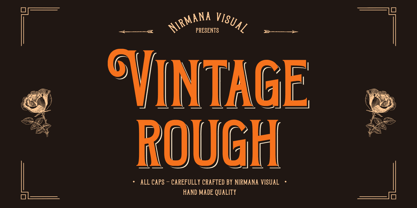 Introducing Vintage Rough. A Vintage display font that has a classy, clean, and has dramatic movement. This font is great for your next creative project such as logos, quotes, invitations, product packaging, posters, and social. It is also great for watermarks on photography and product merchandise, or anything that needs a vintage taste.
 - Setter by Cão Fila,
$10.00 Setter is a type family that stands between geometric and humanist styles. Its unique features and large x-height gives it a modern look. Good for small text blocks, headlines and logos. Vast latin character set: Central, Southeastern and Western Europe. Vietnamese, Pinyin and Pan African Latin. Math and Currency. Enjoy it!
 - Distingue by Burntilldead,
$18.00 Introducing Distingue, an elegant ligature serif font. This font is made to bring strong statement, design with bold geometric face and have swash on alternate characters to keep it look stylish and sharp. An easy & perfect choice to make your design projects; logo, branding, invitation, social media ads & website have classy looks.
 - Toffee Display by Vástago Studio,
$20.00 Toffee Display is a sans serif project inspired on Gill sans, Helvetica and Eurotstile italics. This project is designed for food packaging, candies, commercial, and fast food. I recommend combining it with a light and calligraphy font to get absolute contrast. That is it, Thanks for buy it and work with it!
 - Legal Obligation Serif by Wing's Art Studio,
$4.00 Legal Obligation - Serif Version A dedicated compressed Serif font for movie poster credit blocks and cinematic title designs. A workmanlike tool for adding extensive cast and crew information to movie posters without dominating the overall layout. Supplied with lowercase characters and three weights. Contents: - Legal Obligation (Serif Version) - Light, Regular and Bold Weights
 - Linford by Yoga Letter,
$15.00 "Linford" is a very professional and elegant serif font. This font is very easy to use for all your work. This font comes with 8 elegant and attractive ligatures. This font can be used to promote all your business (branding, banners, posters, social media, hotel promotions, villas, companies, products, invitations, and more).
 - Mathelline by Almarkha Type,
$35.00 Introducing Mathelline is a Classy Script font with 2 style regular and italic. Inspired by luxury and branded stuffs make this font looks classy and awesome in many way to your latest project. Mathelline is perfect for logos & branding, photography, invitation, watermark, advertisements,product designs, special events or anything that need handwritting taste.
 - Phoenica Std by preussTYPE,
$29.00 PHOENICA is a contemporary humanistic typeface family suitable for traditional high-resolution print purposes, office application and multi-media use. Of the creation formed the basis an idea which was developed for the first time by Lucian Bernhard approx in 1930 with the Berhard Gotic and was taken up in the last time by different written creators repeatedly: the repeated elimination anyway (in comparison to a Antiqua, e.g. Garamond) already very much diminished form Grotesque (as for example Helvetica) by systematic leaving out of the serifs. The horizontal direction of the writing is thereby stressed remarkably by which so-called »Rail effect« originates. The eyes can grasp the line to be read very well what is ordinarily left to a Serif-stressed font. By this desired effect is suited PHOENICA also for big text amounts. In numerous test runs Stems and tracking was compared to experienced fonts and was adapted. The experienced was taken over without renouncing, nevertheless, the modern and independent character PHOENICA. PHOENICA offers to you as a welcome alternative to the contemporary humanistic Sansserif. It is a very adaptable family for text and Corporate design uses. Several companies have discovered PHOENICA meanwhile as a Corporate font for themselves and use them very successfully. She provides a respectable typeface combined with refinement and elegance. Every PHOENICA family has at least six weights in each case in regular and italic. In addition more than three fine Haarline weights (Hairline 15, 25, 35). These are a total of 27 possibilities. Phoenica as well as Phoenica Condensed are excellently readable fonts, because they were optimised especially for amount sentence. Both basic styles (Regular and Condensed) are tuned on each other and follow the same form principle. The family is neither exclusively geometrical nor is constructed humanistically, the forms were sketched on quick and light Recognition effect of every single letter. The PHOENICA family design and logo is suited for all only conceivable uses like newspapers and magazines, for the book typography and Corporate Design.
 - Goodfood by MaGo Fonts,
$9.00 Introducing our stunning Goodfood Font Family, a versatile and delicious sans serif display typeface that is perfect for your most tasteful design projects. With a total of five different weights, this font family offers you ultimate flexibility in creating captivating and impactful designs. Whether you're working on a logo, branding materials, product packaging, or editorial projects, this font family will enhance the overall aesthetic and make your designs stand out. To further enhance creativity, Goodfood Font Family includes alternates and ligatures. These additional characters provide you with ample possibilities to customize and stylize your typography, creating unique and eye-catching designs. By utilizing alternates and ligatures, you can bring a distinctive touch to your headers, titles, headlines, and other important elements of your design. Here's what you can expect from this font family: Five Weights: The font family offers five weights, ranging from Light to Bold. This wide range allows you to experiment with different typographic hierarchies and create visually appealing compositions. Alternates: The inclusion of alternates expands the versatility of this font family. By simply swapping characters, you can create different stylistic variations, giving your designs a fresh and creative look. Ligatures: The font family also includes ligatures, which are special characters that combine two or more letters into a single unique glyph. Ligatures ensure smooth and visually pleasing connections between characters, resulting in a harmonious and cohesive typography. Superior Legibility: While the Goodfood Font Family features elegant and decorative serifs, it doesn't compromise on legibility. The carefully crafted characters and balanced letterforms ensure readability across various sizes and mediums. Extensive Language Support: This font family supports a wide range of languages, allowing you to create designs for global audiences with ease. Whether you're a professional designer looking to elevate your creative projects or an individual seeking a unique font for personal use, the Display Serif Font Family offers an impressive array of options. Add sophistication, versatility, and a touch of uniqueness to your designs with this remarkable font family.
 - Stranger Blue by PizzaDude.dk,
$15.00 Stranger Blue is a soft-edged and playful comic font with bouncy ligatures. Multilingual support and legible at even small sizes
 - FranklinGothicHandLight by Wiescher Design,
$39.50 FranklinGothicHandLight is part of a series of hand-drawn fonts from way back in time – before computers changed the way we worked. When I was in advertising – before computers – a very time consuming part of my daily work was sketching headlines. I used to be able to sketch headlines in Franklin Gothic, Times, Futura, Helvetica and several scripts. We had a kind of huge inverted camera – which we called Lucy. We projected the alphabet onto a sheet of transparent paper, outlined the letters with a fineliner and then filled them in. It was very tedious work, but the resulting headline had its own charm and we had a permanent race going on who was best and fastest. I won most of the time! They used to call me the fastest "Magic Marker" this side of the Atlantic. Great days, just like today! Your sentimental type designer from the past Gert Wiescher
 - FranklinGothicHandDemi by Wiescher Design,
$39.50 FranklinGothicHandDemi is part of a series of hand-drawn fonts from way back in time – before computers changed the way we worked. When I was in advertising – before computers – a very time consuming part of my daily work was sketching headlines. I used to be able to sketch headlines in Franklin Gothic, Times, Futura, Helvetica and several scripts. We had a kind of huge inverted camera – which we called Lucy. We projected the alphabet onto a sheet of transparent paper, outlined the letters with a fineliner and then filled them in. It was very tedious work, but the resulting headline had its own charm and we had a permanent race going on who was best and fastest. I won most of the time! They used to call me the fastest "Magic Marker" this side of the Atlantic. Great days, just like today! Your sentimental type designer from the past Gert Wiescher
 - Aesthete Signature by Jinan Studio,
$20.00 Aesthete Signature embodies elegance and style in a handwritten font, with 57 perfectly integrated ligatures that give your projects a natural look and a touch of elegance. Offering a variety of alternative options to enhance your designs, this font makes a fun embellishment for a variety of design endeavors. Its versatility stands out, making it perfect for wedding-themed creations, dazzling wedding invitations, Valentine's Day, promotional materials, branding initiatives, business cards that leave a lasting impression, inspirational quotes, and a wide variety of design endeavors seeking a blend of sophistication and appeal. Additionally, multilingual support ensures global appeal, adding a touch of beauty across language boundaries. Features A set of uppercase and lowercase glyphs Number, symbol, and punctuation Multilingual Support Alternates, ligatures, and swashes PUA encoded Type j_1 until j_8 to features swash, ligatures will automatically replace the standard letter pairs whenever available, when using any OpenType capable software.
 - Braga Huis by Juru Rancang Studio,
$15.00 Braga Huis typeface is a font family that is inspired by the famous street in Bandung that was made to embodies the atmosphere and the environment of Netherland-Indie city at its golden time, whereby all the elements were designed to give the impression of structural, artistic, and advance. Braga Huis typeface has a strong Art Deco character, where the impression is depicted from the strong lines, curvy passion so it is very appropriate to describing the future atmosphere from the perspective of the 19th century. Braga Huis typeface has 3 font styles consisting of uppercase, lowercase and various alternative options that can be customize to your taste, poster is one of the media form of presentation that we believe is very appropriate for this type of font. But whatever the medium is, honestly we say; using Braga Huis typeface will make your artwork will never be cracked by time.
 - Vinyle by Lián Types,
$37.00 Bold, rounded and super cool. Those are the attributes of my latest font “Vinyle”, french for vinyl. In this epoque where all fields of Design are giving a lot of importance and attention to Typography and Lettering, I felt it was my duty to contribute with something that could really stand alone and ‘say something else’ that just words to be read. I've found that lately in the world, regarding a finished piece of design, the role of Typography (and of letters in general) went from being secondary, (like a minor player or a supporting actor) to the most important one. People are starting to understand the beauty of a well-done letter: they want their storefronts with unique scripts, they want to drink coffee surrounded by lettered blackboards, they want to buy books with astonishing covers with swashes ‘por doquier’. I'm more than happy to be alive in a present where even the most unimaginable friends of mine, (who couldn't spot differences between comic sans and helvetica before) are now conscious of the importance of a letter, or let’s say: Of the ‘voice’ of Typography. With Vinyle I tried to make a font with power. Following the nowadays trend of, let me say, “the vintage sans renaissance”. This time I put my brushes and nibs aside and experimented with something new. It wasn't easy, if you will pardon, for me to see swashes all over the place withouth the classic calligraphic ‘thick and thins’, but with after some weeks of work I started to love them. Like I already showed you in other creations (1) let me finish with the phrase: GEOMETRY IS SEXY! TIPS Vinyle has a lot of attitude, it shouts “here I am!” it really can ‘design an entire piece’ for you with just a word or two: It was designed with a 10 degree slant on purpose so the user may rotate it (like on the posters) that amount of degrees in order to see better results. Use Vinyle with the ‘fi’ standard ligatures activates for better kerning and ligatures! NOTES (1) See my font Selfie , the ‘little sister’ of Vinyle.
 - Gemini Type Fontpack by Chank,
$49.00 INTRODUCING THE GEMINI TYPE FONTPACK, an industrial-strength OpenType font bundle inspired by and optimized for dimensional type. Chank Co is proud to introduce the new “Gemini Type Fontpack,” a collection of ten fonts available for use on your desktop computer or web pages, but also optimized for use as exterior cast-metal signage in bronze or aluminum in collaboration with Gemini, a family-owned industry leader in the wholesale manufacture of dimensional letters, logo and plaques based in Cannon Falls, MN. Gemini collaborated with Chank Co to assemble a line of fonts that would work well as dimensional, cast-letter signage for use on the sides of buildings, in stores, and other public spaces. The fonts included in the “Gemini Type Fontpack” are reinterpretations of previous Chank Fonts, now optimized for dimensional signage display, but then also repackaged and presented for your use as an OpenType desktop computer font collection: GT-Adrianna DemiBold GT-Adrianna Bold GT-Adrianna ExtraBold GT-Fairbanks GT-Forward Thinking GT-Hydropower ExtraCondensed GT-Kegger GT-Shopaganda GT-Shopaganda Condensed GT-Timeless Geometric. This is a multi-purpose collection of heavy-lifting fonts to convey your message strong and clearly, full of legibility and clarity, but also displaying personality and distinction. You can purchase and download these fonts in OpenType format for your desktop computer right now via MyFonts. Get it today and you'll also get a great introductory special sale price. These exclusive typefaces are also available as dimensional letters, manufactured by Gemini in bronze or aluminum, from 6" tall up to 18" tall, with a variety of finish options, for use in public signage and wayfinding systems. Gemini manufacture their products in 20 plants through out the US, Canada and Mexico, and all their products are backed by a lifetime guarantee. Chank Co is excited to offer these ten strong, industrial font designs in durable cast metal format via Gemini. ----- More about the fonts in the Gemini Type Fontpack: GT-Adrianna DemiBold, Bold, and Adrianna ExtraBold Clear, invisible, no-nonsense, multi-purpose. A versatile sans-serif heavy-lifting font family. GT-Fairbanks Vintage, silent film, speedball, old-timey, old-fashioned, retro. Based upon the lettering in the 1914 silent film, “The Good Bad Man.” GT-Forward Thinking Futuristic, semi-serif, clean, distinctive, contemporary, idiosyncratic. A font for tomorrow and the future. GT-Hydropower ExtraCondensed Extra-condensed, compressed, strong, rigid and concise. GT-Kegger Strong, sporty, collegiate, athletic. Nothing says “GO TEAM” quite like a big, bold slab-serif font. GT-Shopaganda and GT-Shopaganda Condensed Industrial, geometric, constructivist, propaganda, oh there’s so much to love about the strength and clarity of these two fonts. Based on Chank’s Liquorstore and Nicotine fonts, which have been married and unified here, with a few new twists and turns to their letterforms. GT-Timeless Geometric Bauhaus, anyone? The geometric and minimalist alphabet here is about as clean and straight-forward as a semi-condensed sans can get. ----- All of the fonts in this package are available individually, or save money when you purchase all ten of them as a collection. Download this digital font package from MyFonts today and you'll receive both OpenType and TrueType formats in your download for your desktop computer. Webfont format is also available. (If you'd like to use these fonts as cast-metal letters for exterior, architectural purposes, visit the Gemini website to learn more about how you can find a signage retailer near you.)
 - Iwan Stencil by Linotype,
$40.99 Iwan Stencil is a new revival of an old display typeface. Based on type originally designed by Jan Tschichold in 1929, the style was revived by Klaus Sutter in 2008. The letterforms in this peculiar design are very high contrast; all of the thin bits are much thinner than the thick parts. They have a modern, upright axis. All in all, the creation has a bit of a Bodoni-gone-crazy touch. The thin elements are the unique part of the design that binds this face together. They almost naturally fade away in the stencil gaps (or pylons), making you wonder if you are really looking at a stencil face at all. These thins contribute greatly to the typeface's overall serif-style, making the design at least a semi serif typeface, if not a full serif one. The lowercase n, for instance, has no serifs of its own, but many of the other letters have clear ones, or serif-like terminals. A serif stencil face is a peculiar variety, especially in this day and age, but in the past they were much more common, if not the norm, The Iwan Stencil typeface has only one weight. Naturally, this is just for display. Use Iwan Stencil to cut real stencils, or only to create the effect of stenciled type in your design work. Ivan Stencil includes all of the characters that you have come to expect in a font. Just because this design was originally made in 1929 does not mean that is has a 1929 character set. Instead, it includes a 21st century, with extended European language support Jan Tschichold, who we have to thank for today's Iwan Stencil inspiration, was a man of many faces. A trained calligrapher who went on to codify the New Typography, would go on to become a teacher, a classical book designer, and the creator of the Sabon typeface. Like all young designers, he was occasionally in need of money. Before his emigration from Germany in 1933, he took on many kinds of commissions. In the late 1920s, a time full of waves of economic turmoil within Germany and across the world, he began designing a typefaces for different European companies, mostly display things like this. For a time during the mid-1920s, Jan Tschichold went by the name Iwan" "
 - Abesif by Twinletter,
$12.00 Introducing Abesif sans serif font. This font is stretched from the normal theme, it is boring, while different, it seems strange. from there we design the appearance of this font that is not normal so that it is not boring and we display it differently but not look strange. so if you use this font it will look different from the others but it doesn't look strange because it has a normal design. so that it creates an impression that is easy for each of your audience to remember when they first see your project. This font is very suitable as text with displays for various kinds of branding, advertisements, posters, banners, packaging, news headlines, magazines, websites, logo design, banners, social media design and of course you can use a lot more.
 - Das Riese by Intellecta Design,
$22.90 Das Riese, a type specimen by the most productive Brazilian type foundry, Intellecta Design, is a mix of victorian and art deco influences. A beautiful display type for tiling with uppercases only. It's shadows and volumes refer to pre-modern age whereas its surface to last century 20's. This heavy sans serif strokes characters have a particular appearance, a parallel line texture that reminds Bifur, typeface created in 1929 by A. M. Cassandre. The sideways absence of volume at some leaning letters right side in addition to the patchy darkness of shadows support its handmade design. A type full of historical references designed to small titles printed in big sizes. It's impossible not to think about posters when you look at Das Riese strong face. - (source Slanted Magazine #8)
 - Fornire by Jehoo Creative,
$20.00 The Fornire family of typefaces grew out of a desire to provide a font that has a bold yet simple impression. For this reason, Anwar Patihan drew designs with a high foundation as letters based on humanist shapes and proportions. The letters are kept narrow to enhance the look, and the spacing between characters is narrowed for boldness. While the opentype Fornire feature has an alternate "A B E F P R" letter that looks very striking and easy to recognize, making the Fornire family very suitable for use on Posters, Cover designs, magazines, Banners, packaging designs, design considerations that he put into the Fornire family as well allowing it to perform well in a variety of other design environments. Fornier has a variety of weights ranging from Light, Regular, Medium, Bold
 - Monotype Sabon by Monotype,
$34.99Sabon was designed by Jan Tschichold and released in 1967. Sabon was created in response to the specific needs of a group of German printers who wanted a typeface that would be identical in form when produced by three different metal-casting technologies. Named after Jacques Sabon, a sixteenth century typefounder whose widow married another typefounder, Konrad Berner, who is credited with issuing the first typefounder's specimen sheet. Several types on the sheet were attributed to Claude Garamond, and one of these served Tschichold as the source for Sabon roman. The italic was based on another face on Berner's sheet, cut by Robert Granjon. Tschichold's skillful adaptation of these old style faces has produced an elegant and workmanlike book face. The Sabon font family is a popular choice for setting text. - Excelsor Script by Storm Type Foundry,
$32.00Excelsor Script is inspired by lithographically produced scripts. It is softer and simpler than, for example, engraved Splendid Script, because its designer used pens and lithographic needles. The graver for steel is held in a quite different way and this has an influence on the shape of the letter. Similar type faces were in use from Neo-Classicism until the beginning of Art Nouveau, when they were pushed aside by a completely different view of festive typography. It has, in contradistinction to other scripts, slightly narrowed letters, which signifies a distinctive elegance without wasting space on the line. For practical reasons it was not possible to encircle the bottle with too long a label. It is, therefore, a suitable type face for labels. Its two optical grades cover a wide range of sizes. - Geis by Galapagos,
$39.00In 1978 I went to work at Mergenthaler as a letter drawer. Being an inquisitive sort I decided that I should take a stab at this type design 'stuff'. I drew 25 or 30 glyphs before the work found its way to a high shelf in a dark corner of my apartment. Just 23 years later I found the drawings on a different shelf, in a different home, in a different city and decided to finish what I had started. I'm still trying to deal with my predisposition toward procrastination but I've finished the font. The name of the font is the last name of somebody I played softball with before I moved to Beantown. Ronnie Geis was one of the courageous firefighters we lost on September 11th when the WTC collapsed. - Hyper Brush by Bisou,
$9.00 Hyperartism is an artistic movement born in La Chaux-de-Fonds (Switzerland) which advocates free and uninhibited creation, in all forms, for everyone. HyperBrush was originally created for the new collective's logo and is the perfect cross between the corrosive spirit, the assumed nonchalance and the natural class of Hyperartists' works. HyperBrush is the ideal font for anyone who wants to add a touch of fantasy to a soft design, or a bit of seriousness to a completely crazy project. Its quirky, edgy and clean look is just as suitable for a festival poster as it is for a DIY shop sign, for the title of a trashy short movie or else for a toilet door sign in a hipster lounge bar. With HyperBrush, it's easy to put more hyper into any project!
 - Dezaru Faux by Twinletter,
$15.00 DEZARU is a fictitious Japanese display font created by combining Japanese letters with well-known and understood san serif fonts from throughout the world. Imagine all promotional materials can be understood and understood by all audiences in various parts of the world, your message will reach the hearts of the audience, and your brand will be very easy to remember by many people because the display of this font is contemporary and different from the others. Logotypes, food banners, branding, brochure, posters, movie titles, book titles, quotes, and more may all benefit from this font. Of course, using this font in your various design projects will make them excellent and outstanding; many viewers are drawn to the striking and unusual graphic display. Start utilizing this typeface in your projects to make them stand out.
 - Aguadija by Christian Gamba Pardo,
$12.90 This font contains plant icons from the taxonomic category Orchidaceae, inspired by the multiple specimens that can be found in Colombia that has the largest number of orchids in the world, more specifically in the specimens that have been exposed on the José Celestino Mutis botanical garden. These icons are characterized by having an organic outline; representing flowers, roots, leaves, bulbs and different supports or pots. The vast majority of icons have perfect bilateral symmetry because this is one of the differential characteristics of orchids (compared to other flowers), if they are divided by a central-vertical axis, their right and left sides are practically identical. “Aguadija” can be used in projects related to nature or similar topics, some icons (specifically the digits) are intended to form decorative ribbons or borders.
 - Shaky Kane by Comicraft,
$39.00 He sees you! He can see everything YOU do! He wears X-Ray Spex! He glows in the dark! Top Pop Cult Comic Artist Shaky Kane pushes at the limits of taste, dragging a scalpel down the veil of your illusions to make you see the world as it really is, as HE sees it. You've wondered at his work in the pages of ELEPHANTMEN! THE BULLETPROOF COFFIN! CAP'N DINOSAUR! THAT'S BECAUSE YOU'RE A ROBOT! MONSTER TRUCK and DEADLINE! You've worn the HATEFUL DEAD t-shirt and drawn blood with the SHAKY KANE FAN CLUB pins. Now Shaky Kane isn't just a disaffected punk rock way of looking at the world, it's a font too. A little Shaky, a little Stirred, best served with a purple eyeball spiked on a cocktail stick.
 - Marcopolo by Struggle Studio,
$18.00Marcopolo is an Elegant Caligraphy Font whose work is long enough, The design of the letters is quite beautiful, suitable for those of you who like the Classic & Elegant style, matching classic copper scripts with a modern touch, designed with high detail to open stylish elegance. Marcopolo is interesting as a type of font that is smooth, clean, feminine, sensual, glamorous, simple and very easy to read, because there are many fancy letter connections. I also provide a reasonable alternative value for many letters. The classic style is very suitable to be applied in formal forms such as invitations, labels, restaurant menus, logos, fashion, make up, stationery, novels, magazines, books, greeting / wedding cards, packaging, labels or various types of advertising purposes. Marcopolo has 650+ Glyphs that are very charming and diverse in style - The Philosopher Script by Colllab Studio,
$19.00 "Hi there, thank you for passing by. Colllab Studio is here. We crafted best collection of typefaces in a variety of styles to keep you covered for any project that comes your way! The Philosopher Script is a different take on what a monoline script should be. It’s not like anything else out there and it works in any context The conciseness of The Philosopher Script makes it well-suited not just for those seeking a new direction in design, but also for anyone producing art, looking to add their own style. Professional design and smoothed curves that are inherently better than a standard font. It comes with a vast array of ligatures, alternates, and many other helpful glyphs not found in any other typeface A Million Thanks Colllab Studio www.colllabstudio.com
 - VP Pixel Pro by VP Type,
$29.00 VP Pixel Pro is designed to be the definitive standard for a pixel typeface. With over 1300 characters in each style, it ensures full support for over 230 languages, enabling your work to be localized world-wide, effortlessly. All fonts in this family include upper case, lower case, and small caps letters of the Latin alphabet, as well as extended sets of the Cyrillic and Greek alphabets, along with multiple sets of numerals, a large set of diacritics, punctuation marks, and other symbols. Numerous OpenType features are included, such as multiple vertical positions, diagonal fractional forms, optional slashed zeros, separate old-style and lining figures, and contextual alternates. Versatile and advanced, VP Pixel Pro combines a vast character set with advanced typographic features, thus becoming your go-to pixel typeface no matter the task.
 - Sabon by Linotype,
$45.99 In the early 1960s, the German Master Printers’ Association requested that a new typeface be designed and produced in identical form on both Linotype and Monotype machines so that text and technical composition would match. Walter Cunz at Stempel responded by commissioning Jan Tschichold to design a new version of Claude Garamond’s serene and classical Roman. Its bold, and particularly its italic styles are limited by the requirements of Linotype casting machines, forcing the character widths of a given letter to match between styles, giving the italic its characteristic narrow f. The family’s name is taken from Jacques Sabon, who introduced Garamond’s Romans to Frankfurt. Sabon has long been a favorite of typographers for setting book text, due to its smooth texture, and in large part because Tschichold’s book typography remains world famous.
 - Glaciar by TripleHely,
$16.00 Glaciar is a script typeface based on brush handwriting and inspired by old-style bas-reliefs. All contours were carefully cleaned of brush roughness, but at the same time, minor imperfections were left to create the unique character of this font Glaciar has a built-in auto replacement for lowercase letters without connecting strokes (in the case of word ends) and for ligatures (in the case of letter pairs that do not fit well together). In addition, there are alternates glyphs with starting and ending swashes - the last ones can be used with any OpenType software. And finally, the font has wide multilingual support and can be used in texts in 195 languages Glaciar is a good choice for branding and design projects as well as a cute text overlay to any background image
 - Bright Lady by Sulthan Studio,
$12.00 Bright Lady is a natural handwriting that is beautifully written as a form of love for modern calligraphy. I cleaned some of the stains to make it look smoother and neater, so you can use it for the job you want. Bright Lady - including many alternative characters. Coded with Unicode PUA, which allows full access to all additional characters without having special design software. Mac users can use Font Book. Windows users can use the Character Map to view and copy one of the additional characters to paste into your favorite text editor. For people who have software capable of using OpenType: Alternatives can be accessed by turning on the "Alternative Style" and "Ligature" buttons on the Photoshop Characters panel, or through any software with glyph panels, such as Adobe Illustrator, Photoshop CC, Inkscape.
 - LHF Saratoga Panels 4 by Letterhead Fonts,
$53.00The final collection in the series of 4 fonts. Each font contains 37 expertly drawn panels. All you have to do is add your own text and color for a quick and easy design. All 37 of these panels are exclusive to Letterhead Fonts. Typing each letter generates a different panel. Special Note: Due to the large file size of these fonts, they will not convert for use in Gerber Omega. Instead, Omega users may wish to use an alternate program to type the characters and import them into Omega as .eps files. CorelDraw users should use the "Weld" command rather than "Convert to Curves" command to convert these fonts to vector outlines. Otherwise, the program may crash due to the sheer number of points in each panel.