10,000 search results
(0.047 seconds)
- Haiku by AcidType,
$12.00 Haiku is a very modern old-style typeface. Inspired by late Renaissance-era typography, and carefully optimised for both display and text, digital and print. Featuring ligatures, old-style numerals, wide language support, and true italics.
 - Linotype Xmas Pi by Linotype,
$40.99You need traditional christmas symbols to illustrate your text? How about using these historic designs that had been used in good old typography. xmas is not too far and always comes in winter time. Happy Xmas. - Balinda by TM Type,
$12.00 Balinda is a distinct and graceful script font. Fall for its ravishing style and use it to create gorgeous designs. This font is PUA encoded which means you can access all glyphs and swashes with ease!
 - Balina by Fanart Studio,
$15.00 Balina is a distinct and graceful script font. Fall for its ravishing style and use it to create gorgeous designs. This font is PUA encoded which means you can access all glyphs and swashes with ease
 - Early Christmas by Letterafandi Studio,
$12.00 Early Christmas is a lovely script font featuring charming, playful characters that seem to dance along the baseline. This font is PUA encoded which means you can access all of the glyphs and swashes with ease!
 - Manga Master Pro BB by Blambot,
$10.00 Manga Master, the classic Blambot font, is now Manga Master Pro! It has been updated with new spacing, kerning, and hinting as well as new autoligs, manga translation glyphs, CAlts, fractions, barred-I correction and more!
 - Orange Pumpkin by Letterafandi Studio,
$14.00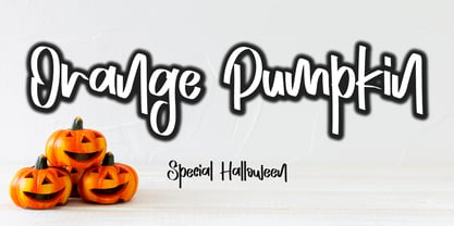 Orange Pumpkin is a handwritten display font. It is perfectly suitable for any Halloween-related project or crafty idea! This font is PUA encoded, which means that you can access all of the glyphs with ease!
 - Teardrop by dgsdesigns,
$8.00 A unique tear drop script with a "nature theme" that will provide a freedom of expression in an elegant approach to all your projects. Ideal for landscape exhibitions, wedding invitations , flyers, gallery exhibitions and much more.
 - Strassenmeister NF by Nick's Fonts,
$10.00 A long-lost gem from Herbert Thannhaeuser named "Buik" provided the inspiration for this classic Deco-era face. Both versions of this font support the Latin 1262, Central European 1250, Turkish 1254 and Baltic 1257 codepages.
 - Mentari by Surotype,
$35.00 Mentari a brush script typeface, bold and elegant, with several alternate characters in each letter to give you ease in accomplishing the work of typographic such as logotype, poster, headline, T-shirt and other creative projects.
 - Via Roma Display by Font&Co.,
$19.00 A font inspired by regime propaganda inscriptions found in Italian institutional and civic architecture of the 20’s and 30’s. Bold, severe lettering, suggestive of pre-war Italian Art Deco and American Depression Modern aesthetics.
 - Iron Lake by Alphabet Agency,
$15.00 Iron Lake is inspired by the pioneer era. The font has a decorative slab serif that really gives the font its vintage western look. The font works great for vintage, western, country, outdoors and rural themes.
 - Dolphus-Mieg Monograms by Intellecta Design,
$21.90 Dolphus-Mieg Monograms is a collection of monograms from a rare cross-stitch booklet from the first year of the 20th Century. This new Monograms series was entirely designed by hand, without use of auto-tracing.
 - Independence Script by Alan Meeks,
$50.00 Independence Script, designed by Alan Meeks and top British calligrapher Satwinder Sehmi, is an old style calligraphic handwritten script. The name is derived from the Declaration of Independence of which the font bears a slight resemblance.
 - Kalash by Tomass Gavars,
$7.00 Kalash is minimalistic monospaced font family. Each glyph has eased 45° angled cut and has the right properties to fit with various styles. Combine multiple weights for best results. Each font includes 230 Glyphs & Latin support.
 - Crunk by Nerfect,
$15.00Crunk was inspired by the creator's (at the time) teenaged hoodlum of a brother. The font Crunk is great for headlines and text and has served its creator well over the years since it was made. - Aqille by Creaditive Design,
$12.00 Aqille is an elegant script font with a contemporary atmosphere and impeccable form, inspired by timeless classic calligraphy. This font is PUA encoded which means you can access all of the glyphs and swashes with ease!
 - Advertisers Gothic by HiH,
$12.00 Advertisers Gothic is bold and brash, like the city it comes from, Chicago. It was designed by the accomplished German-American matrix engraver, Robert Wiebking, for the Western Type Foundry in 1917. As its name suggests, it was designed for commercial headliner work, much as Publicity Gothic by Sidney Gaunt for BB&S the year before. See our Publicity Headline. Alternate letters ‘A’ & ‘S’ are provided. The most popular ad words “Free!”, “New!” and “Sale” (with both esses) are provided at an angle for dramatic tension. Advertisers Gothic became quite popular because it was effective. It can work equally well for a flyer advertising a non-profit event as for a magazine product ad. This font refuses to be a wimp. Use it boldly. Advertisers Gothic ML represents a major extension of the original release, with the following changes: 1. A total of 335 glyphs (compare) with added glyphs for the 1250 Central Europe, the 1252 Turkish and the 1257 Baltic Code Pages. 2. Added OpenType GSUB layout features: pnum, ornm, liga, hist & salt ˜ with total 13 lookups. 3. Added 209 kerning pairs. 4. Revised vertical metrics for improved cross-platform line spacing. 5. The most popular ad words “Free!”, “New!” and “Sale” (with both esses) are provided at an angle for dramatic tension The zip package includes two versions of the font at no extra charge. There is an OTF version which is in Open PS (Post Script Type 1) format and a TTF version which is in Open TT (True Type)format. Use whichever works best for your applications.
 - Vernacular Sans by jpFonts,
$19.95 The Vernacular trilogy was designed by Swiss designer Hans-Jürg Hunziker, who had worked for Adrian Frutiger in Paris for many years. Based on the concept of a transitional Linear Antiqua, he has developed a colorful bouquet of typefaces that contain the entire spectrum of typefaces for book design and corporate identity. Thanks to his "Swiss school" and his outstanding skills, he has succeeded in giving the typefaces a particularly noble and sympathetic expression. In addition to the Sans family, there is a Serif family and a Clarendon family, each of which, including the separately drawn italics, is equipped with 12 font weights that are finely tuned to one another. Each of the 3 font styles develops its own character, but thanks to a concept that brings the different font styles closer together, they also work well together and complement each other perfectly. Sans and Clarendon have a vertical axis and similar endings in contrast to the Serif, which has a traditional diagonal axis and horizontal endings. The straight stems and the proportions are used as an element to stress the closeness of the typeface-trilogy. They thus share a comon feature. All fonts contain tabular and proportional figures as well as old style figures. Small caps and small cap figures are also available in all fonts. In addition, some fonts have alternative characters available via style set, such as «g», which can be used to further vary the typeface. Vernacular offers all the options for well-kept typesetting for print and web - for small and large orders.
 - Cinnamon Peach by Abbasy Studio,
$8.50 Let me introduce my first ever product on my shop. Cinnamon Peach - Layered Font After 2 years of learning how to create a fonts, learn about the anatomy of typography, features of the OpenType fonts, and all of the experience on my collaborations with many friends, Finally I just launched my first personal product with the name Cinnamon Peach. Cinnamon Peach is beauty combinations of layered font. It has a Serif and Script style inside. Both of them are layered font, which is you can express the style on both of it. You can add shadow, inline or hatch on Serif style. Changing the color of the other layer as just easy as change standard color of the fonts but it’s more deep in detail. On the Script style, I give you more freedom of choosing which style do you want, if you want a deep style of layer, you can choose regular and inside with different color. but if you want the outline style, it also available as a single fonts. Looks like on the display that I Created, You can see the most of combinations font in there are perfectly matched even on script version doesn’t include the Uppercase character. Because of the strong characteristic of this fonts you can see the combinations are great with or without layer, monochrome or multi color, pastel or watercolour. It’s great for posters, display, logos, header website, magazine, animation text, etc. Thank You very much, hope you enjoy this fonts !
 - Vernacular Serif by jpFonts,
$19.95 The Vernacular trilogy was designed by Swiss designer Hans-Jürg Hunziker, who had worked for Adrian Frutiger in Paris for many years. Based on the concept of a transitional Linear Antiqua, he has developed a colorful bouquet of typefaces that contain the entire spectrum of typefaces for book design and corporate identity. Thanks to his "Swiss school" and his outstanding skills, he has succeeded in giving the typefaces a particularly noble and sympathetic expression. In addition to the Sans family, there is a Serif family and a Clarendon family, each of which, including the separately drawn italics, is equipped with 12 font weights that are finely tuned to one another. Each of the 3 font styles develops its own character, but thanks to a concept that brings the different font styles closer together, they also work well together and complement each other perfectly. Sans and Clarendon have a vertical axis and similar endings in contrast to the Serif, which has a traditional diagonal axis and horizontal endings. The straight stems and the proportions are used as an element to stress the closeness of the typeface-trilogy. They thus share a comon feature. All fonts contain tabular and proportional figures as well as old style figures. Small caps and small cap figures are also available in all fonts. In addition, some fonts have alternative characters available via style set, such as «g», which can be used to further vary the typeface. Vernacular offers all the options for well-kept typesetting for print and web - for small and large orders.
 - Vernacular Clarendon by jpFonts,
$19.95 The Vernacular trilogy was designed by Swiss designer Hans-Jürg Hunziker, who had worked for Adrian Frutiger in Paris for many years. Based on the concept of a transitional Linear Antiqua, he has developed a colorful bouquet of typefaces that contain the entire spectrum of typefaces for book design and corporate identity. Thanks to his "Swiss school" and his outstanding skills, he has succeeded in giving the typefaces a particularly noble and sympathetic expression. In addition to the Sans family, there is a Serif family and a Clarendon family, each of which, including the separately drawn italics, is equipped with 12 font weights that are finely tuned to one another. Each of the 3 font styles develops its own character, but thanks to a concept that brings the different font styles closer together, they also work well together and complement each other perfectly. Sans and Clarendon have a vertical axis and similar endings in contrast to the Serif, which has a traditional diagonal axis and horizontal endings. The straight stems and the proportions are used as an element to stress the closeness of the typeface-trilogy. They thus share a comon feature. All fonts contain tabular and proportional figures as well as old style figures. Small caps and small cap figures are also available in all fonts. In addition, some fonts have alternative characters available via style set, such as «g», which can be used to further vary the typeface. Vernacular offers all the options for well-kept typesetting for print and web - for small and large orders.
 - Plusquam Sans by Typolis,
$40.00 Plusquam Sans is a humanist sans serif family in eight weights, roman and italic. It’s neutral character and legibility in smaller sizes recommend it as a text face, and wide range of weights and swash capitals make it usable for various designer purposes. While roman fonts are simple, although in humanist spirit, italics are more vivid. Typographic variants are supported through OpenType features. Several kind of numerals are offered: lining and Oldstyle, tabular and proportional, superior and inferior, fractions. Small caps and math symbols are provided. There is a range of standard and discretionary ligatures. Alternates sorted in three stylistic sets are created to soften the overall appearance. Most distinguished feature is a set of swash capitals balanced to match sans serif characters. Plusquam Sans comprises multilingual Latin and monotonic Greek characters.
 - Heller Sans JNL by Jeff Levine,
$29.00 Heller Sans JNL is based on the main letterforms of an experimental alphabet designed by Steven Heller; noted author of over 170 books on design and visual culture. Some modifications were made in turning his design into a digital font. In his own words, here is the background to this typeface: “I recently recovered this from the junk heap. It is a yellowing photostat of my first and only typeface design (1969-70). Total folly! At the time I was smitten by Art Moderne lettering. I called it “Klaus Boobala Bold” because I liked the K and B. I’ve lost the letters S through Z, which were made. The letters were drawn with compass, Techno pen (that frequently clogged). as well as a triangle and T-square. The inline and outline made no real logical sense. I based the design, in part, on Kabel, Avant Garde and it was a product of whatever I could accomplish with those tools. The caps-only alphabet was photographed and produced as a film negative that was cut in foot-long strips and spliced to fit on a Typositor reel. Sadly, the negatives made for the font were too brittle and the splice snapped apart in the Typositor. I worked on it for well over a month and used the face only once. I realized with this attempt, like so many other times I attempted different challenges, that type design — indeed mechanical drawing — was not my strong suit.” Heller Sans JNL is available in both regular and oblique versions.
 - Guillermo by Homelessfonts,
$49.00 Homelessfonts is an initiative by the Arrels foundation to support, raise awareness and bring some dignity to the life of homeless people in Barcelona Spain. Each of the fonts was carefully digitized from the handwriting of different homeless people who agreed to participate in this initiative. Please Note: these fonts include only the latin alphabet; no accented characters, no numbers or punctuation. MyFonts is pleased to donate all revenue from the sales of Homelessfonts to the Arrels foundation in support of their mission to provide the homeless people in Barcelona with a path to independence with accommodations, food, social and health care. Guillermo was born in Argentina. And after crossing four continents and travelling in more than twenty countries, he still has his accent. His luck ran out on the streets of Barcelona. But despite his circumstances, he hasn’t lost a bit of his wit or articulacy. “The worst thing about the street is something that touches your heart, your brain. Not being able to have sex, not having any privacy until it leaves you empty.” On the street he follows his passion for art and writing as best he can, using old cardboard when he can’t find paper and listening to the music that comes to him. His way of thinking and expressing himself leaves people wide-eyed and open-mouthed, but even so he admits he’s a solitary man. “Solitude is an individual word. A solitary type like me can’t bring the word solitude to the whole world.”
 - NCL Nostalgic Wedding by Enxyclo Studio,
$12.00 NCL NOSTALGIC WEDDING is romantic wedding script font. It is unique handwritten script font with lots of swash variants. Masterfully designed to become a true favorite, this font has the potential to bring each of your creative ideas to the highest level! It was purposely crafted to be used in large point sizes, although it doesn’t lose its magic in small point sizes. It is perfect for wedding or romantic event, headline, billboard, magazines, website, titles, poster, branding, t-shirt design, and logos. No matter the topic, this font will be an incredible asset to your fonts’ library, as it has the potential to elevate any creation. With this beautiful font, absolutely you can make your project stand out from the rest. See the previews above to get some inspiration on how to use them. FEATURES Contains 478 Glyphs Uppercase, Lowercase & Numeral Punctuation, Symbol & Currencies 70 Stylistic Set 1-4 48 Swash Variants Support for 87 languages: Afrikaans, Albanian, Asu, Basque, Bemba, Bena, Breton, Catalan, Chiga, Colognian, Cornish, Croatian, Czech, Danish, Dutch, Embu, English, Esperanto, Estonian, Filipino, Finnish, French, Friulian, Galician, German, Gusii, Hungarian, Indonesian, Irish, Italian, Kabuverdianu, Kalenjin, Kamba, Kikuyu, Kinyarwanda, Latvian, Lithuanian, Lower Sorbian, Luo Luxembourgish, Luyia, Machame, Makhuwa-Meetto, Makonde, Malagasy, Maltese, Manx, Meru, Morisyen, North Ndebele, Norwegian Bokmål, Norwegian Nynorsk, Nyankole, Oromo, Polish, Portuguese, Quechua, Romansh, Rombo, Rundi, Rwa, Samburu, Sango, Sangu, Scottish Gaelic, Sena, Serbian, Shambala, Shona, Slovak, Soga, Somali, Spanish, Swahili, Swedish, Swiss German, Taita, Teso, Turkish, Upper Sorbian, Uzbek (Latin), Volapük, Vunjo, Walser, Welsh, Western Frisian, Zulu.
 - LiebeFish by LiebeFonts,
$19.90 LiebeFish is a collection of 172 individually hand-drawn fish. Each has its very own personality; some are happy, some are sad. Some like company, some are bored, most are cute and a few are weird. If you look closely, some fish will surely look like people you know. LiebeFish probably is the most comprehensive collection of hand-drawn fish ever. They look great on almost any greeting card, birthday card or invitation. LiebeFish also serve as a perfect companion to any informal graphic design that needs a personal, handmade touch. If you like this font, have a look at our other cute fonts such as LiebeTweet and LiebeRobots.
 - Frank Ruehl BT by Bitstream,
$29.99Frank-Rühl (or Ruehl) is the ubiquitous Hebrew text font style. There are many fonts that belong to this style, and all are based on an early 20th-century design by Raphael Frank. Some of the fonts are actually called Frank-Rühl (or Ruehl) and some are not. It was originally designed in a single weight. Bitstream developed Frank Ruehl for the Microsoft Windows operating system. The font is encoded with a Microsoft defined Hebrew character set, Hebrew Code Page 1255. Within the TrueType fonts, the characters are assigned Unicode character IDs. The font includes Hebrew characters, and Latin glyphs from Dutch 801 bold. - Dining Room JNL by Jeff Levine,
$29.00 Inspired by the basic letter concept of Walter Huxley's 1935 gem Huxley Vertical, Dining Room JNL is a completely re-drawn typeface, adding even more of an Art Deco feel to an already classic Deco-era letter form consisting of condensed, rounded letters. Thick vertical lines balance against lighter weight ones, giving a dramatic contrast so typical of the Streamline Era of design concepts. This font marks another milestone in the Jeff Levine library of retro-inspired type faces. Beginning in 2006 with only ten designs, the collection has grown steadily with Dining Room JNL being the 750th font in the library.
 - Harlan by Trial by Cupcakes,
$29.00 Harlan is from another place and time. But not just one specific place or time– with its barely-there, knife's-edge serifs, and its smooth curves and flourishes, Harlan feels both vintage and modern; both feminine and masculine. Inspired by the Baltimore bar "WC Harlan", which in turn was inspired by the old candle-lit bars of France, the tucked-away osterias of Italy, and the antique books and journals one might find in a patron's hand. It's a font you'll reach for when you're looking for something refined and elegant, but not too stylized or stuffy.
 - HollaBear by Designova,
$9.00 A cute and funny kid-friendly typeface inspired from bears and handmade with passion and joy. Will you believe if we say, HollaBear is made by bear cubs. The typeface is essentially simple but very uniquely expressive when it comes to the design of posters, flyers, cartoons graphics, logotype, web and display usage. Please see the examples shown above to get an idea about the capability of this typeface. HollaBear comes with Extended Latin character sets including Western European, Central European and South Eastern European character sets. The typeface comes in 6 variants (Regular, Italic, Outline, Outline Italic, 3D and 3D Italic).
 - VLNL Spaghetti by VetteLetters,
$35.00 Originally drawn in 1999 as a college project with the ambition to make the ‘most beautiful’ alphabet in the world. After these heroic beginnings Spaghetti lay dormant in the VLNL vaults for many years, appearing to silently peter away. Now look at it! Ten years hence, it is finally being served up in glorious OpenType, precisely al dente. As automated special sauce, each lowercase character before or after a space receives a nice little ball ending to round things off. And finally, the parmesan cheese sprinkled on top is like a tasty bunch of ligatures – enough to make your mouth water.
 - TT Tangerine by Tropical Type,
$29.00 TT Tangerine made in 2017 has been a global hit. It's been used by the biggest performing artist in the world, luxury brands, designer packaging and more. Due to its popularity an italic style was added in Feb 2023. From the designer: I wanted to make a retro font with that 70's good vibes feel but i didn't want to just copy letters from that era. I decided to make new unique letters that had that groovy 70s feel. The bold curves pay homage to the big hair and bell-bottoms of the golden era.
 - Delaware Pro AOE by Astigmatic,
$24.95 Constructivist flavor typography goes pro enters the digital era with Delaware Pro AOE. Delaware Pro AOE is the revival and elaboration of a limited lettering specimen from a series of old loose book pages. What began as just Capitals & Lowercase was expanded to a rich pro glyphset including numerals, punctuation, small caps, small caps scaled figures, unlimited fractionals, superiors & inferiors, ordinals, tabular & proportional figures, and an expanded language glyph set. From titling to nightclub posters, fashion spreads to stencil play, the Constructivist Era is built up and out, waiting for you to put it to use.
 - SK Merih by Salih Kizilkaya,
$9.99 SK Merih is a geometric sans serif and semi-condensed font family. Produced with a clean and modern design approach, SK Merih can be easily used in titles, body texts and many points you may need in design. SK Merih takes its name from Mars. Although Merih is not used today, it is the Turkish equivalent of Mars. SK Merih consists of 12 fonts and 5244 glyphs in total and has multilingual support. In this way, it contains all the typographic elements you will need in your designs. You can visit my Behance account to examine the project images in more detail.
 - Kis Antiqua Now TB Pro by Elsner+Flake,
$99.00 In the course of the re-vitalization of its Typoart typeface inventory, Elsner+Flake decided in 2006 to offer the “Kis Antiqua” by Hildegard Korger, in a re-worked form and with an extended sortiment, as an OpenType Pro-version. After consultation with Hildegard Korger, Elsner+Flake tasked the Leipzig type designer Erhard Kaiser with the execution of the re-design and expansion of the sortiment. Detlef Schäfer writes in “Fotosatzschriften Type-Design+Schrifthersteller”, VEB Fachbuchverlag Leipzig, 1989: No other printing type has ever generated as far-reaching a controversy as this typeface which Jan Tschichold called the most beautiful of all the old Antiqua types. For a long time, it was thought to have been designed by Anton Janson. In 1720 a large number of the original types were displayed in the catalog of the „Ehrhardische Gycery“ (Ehrhardt Typefoundry) in Leipzig. Recently, thanks to the research performed by Beatrice Warde and especially György Haimann, it has been proven unambiguously that the originator of this typeface was Miklós (Nicholas) Tótfalusi Kis (pronounced „Kisch“) who was born in 1650 in the Hungarian town of Tótfal. His calvinistic church had sent him to the Netherlands to oversee the printing of a Hungarian language bible. He studied printing and punch cutting and earned special recognition for his Armenian and Hebrew types. Upon his return to Hungary, an emergency situation forced him to sell several of his matrice sets to the Ehrhardt Typefoundry in Leipzig. In Hungary he printed from his own typefaces, but religious tensions arose between him and one of his church elders. He died at an early age in 1702. The significant characteristics of the “Dutch Antiqua” by Kis are the larger body size, relatively small lower case letters and strong upper case letters, which show clearly defined contrasts in the stroke widths. The “Kis Antiqua” is less elegant than the Garamond, rather somewhat austere in a calvinistic way, but its expression is unique and full of tension. The upper and lower case serifs are only slightly concave, and the upper case O as well as the lower case o have, for the first time, a vertical axis. In the replica, sensitively and respectfully (responsibly) drawn by Hildegard Korger, these characteristics of this pleasantly readable and beautiful face have been well met. For Typoart it was clear that this typeface has to appear under its only true name “Kis Antiqua.” It will be used primarily in book design. Elsner+Flake added two headline weights, which are available as a separate font family Kis Antiqua Now TH Pro Designer: Miklós (Nicholas) Tótfalusi Kis, 1686 Hildegard Korger, 1986-1988 Erhard Kaiser, 2008
 - Sport by Bogusky 2,
$40.00The most watched and celebrated sports are A-Z, with the lower case showing the same sports flopped. The numbers 1-0 are an assortment of Olympic sports. - Zumbelsburg by Ingrimayne Type,
$12.95 Zumbelsburg is an exuberant, calligraphic typeface. The lower-case letters of Zumbelsburg are fairly standard blackletter characters, but the upper-case letters are ornamental, often with large flourishes.
 - Ps Rooster 2 by Fontopia,
$25.00 Rooster Families are based on a ventilation grill. All the individual characters are isolated from this form. Rooster 1 and Rooster 2 can be combined with each other.
 - Ps Rooster 1 by Fontopia,
$25.00 Rooster Families are based on a ventilation grill. All the individual characters are isolated from this form. Rooster 1 and Rooster 2 can be combined with each other.