10,000 search results
(0.059 seconds)
- Librum Sans by Hackberry Font Foundry,
$24.95 This is the companion sans family to make the Librum serif families work as well as they do. By companion, I do mean stylistically compatible. But mainly, they have the same vertical metrics. So they work very well for run-in heads, inline character styles, and all the rest of the needs in large books with complex formatting. They are designed for use in InDesign, and they work very well in that environment. The fonts use the same OpenType feature files as the rest of the Librum families. The feature files for the italic and bold are more limited—as I have rarely used things like that [over the past 20+ years]. The character shapes are a bit whimsical. The original ancestor of this book design sans was a very playful font I released as Aerle. It’s been calmed down a lot but is still loose and friendly. For a great deal, see Librum Book Design Group , for a package containing all fifteen fonts!
 - Tessie Letters by Ingrimayne Type,
$8.00 A tessellation is a shape that can be used to completely fill the plane—simple examples are isosceles triangles, squares, and hexagons. Tessellation patterns are eye-catching and visually appealing, which is the reason that they have long been popular in a variety of decorative situations, such as quilting. The TessieLetters fonts contain letter shapes that can be used to construct tessellation patterns. Each family has two styles, an outline style and a filled or black style. The black style can be used to construct colored patterns. To see how patterns can be constructed, see the files here for TessieLettersACE, TessieLettersFQ, TessieLettersGJKMN, TessieLettersLL, TessieLettersTT, TessieLettersOSZ, and TessieLettersSingles. Many or these patterns were discovered/created by the font designer during the past twenty years in the process of designing maze books, coloring books, and a book about tessellations. The TessieLetters are picture or dingbat fonts. For fonts of tessellating letter shapes that can be used for text, see the Tescellations family.
 - ArTarumianBehrensInitialen by Tarumian,
$100.00 Behrens Initialen is based on the type graphics of the German architect and type designer Peter Behrens (1868-1940). The drawing of the original typeface is in tune with the Art Nouveau (Jugendstil) style in which Behrens worked. This is a light, delicate, somewhat theatrical typeface, the forms of which bear at the same time a certain shade of Gothic and modernity, and can be used, in particular, when there is a need to make a reference to medieval graphics while maintaining the modern style of composition. In the proposed version, the original initial graphics are used not only for uppercase letters, but also for Arabic figures, while for lowercase letters and for the base of other characters are used the letters themselves - without decorative framing. This feature can be useful for obtaining various effects when using both lower and upper cases in parallel, including when they are overlaid. The font includes the Latin, Cyrillic and Armenian ranges. Created by Ruben Tarumian in 2020.
 - Ico Phone by Setup,
$19.95 Ico Phone is a set of 115 symbols depicting anything that happens on the screen of a regular mobile phone. To name a few, there are Bluetooth and sync icons, signal bars, battery statuses, media playback icons, USB symbol, lock icon as well as a wifi signal strength indicator. The style of Ico is inspired by the look of symbols used on the classic monochrome LCD displays. The symbols are monolinear with rounded corners, composed of a smallest possible number of elements. In addition, the rounded style is accompanied by a second style with sharp corners and more detailed drawing. All symbols of Ico share the same width, making the font compatible with the LCD typeface ION. Together, they are the perfect sollution for LCD style typography. Ico Phone is a part of a larger set. Have a look at the other available Ico fonts and don't forget to check back soon for even more additions.
 - Hunsleitta by Maculinc,
$18.00 Introducing Hunsleitta! It is a typeface easy to read and so comfortable to wear. Hunsleitta is perfect for branding projects, homeware designs, and product packaging. You can use it in a logo, badge, insignia, packaging, headline, poster, t-shirt/apparel, greeting card, business card, and wedding invitation, or simply as a stylish text overlay to any background image and more. The flowing characters are ideal to make an attractive messages to your taste. Ligatures are also available for several lowercase characters (double-letters which flow more naturally). These are only accessible via software with OpenType capability or a glyphs panel, e.g. Photoshop/Illustrator. That's it! I really hope you enjoy it - please do let me know what you think, feedback is always hugely welcomed and appreciated. More importantly, please don't hesitate to drop me a message if you have any issues or queries. Now enough of reading this, get out there and make it happen :)
 - Amsi Grotesk by Stawix,
$40.00 In 2015, Amsi Pro was released with the intention of easy usage and headings. After more than 5 years, Amsi has developed itself into the direction of Grotesk, which can be use comfortably as Graphic, both text and headlines, keeping its friendliness trait with Semi-Rounded and Humanist approach looking pleasing to the eye, succeeding the DNA of Amsi. The font has been set to equipped with 3 widths (Normal / Narrow / Condensed) for flexibilities in various demands. We are truly proud to present Amsi Grotesk.
 - Wonderful Day by Almarkha Type,
$35.00 Wonderful Day – is a Romantic Script font with a natural handwritten feel. It has sweety swash that are perfect for any creative design. This handmade font will make your design has a beautiful natural touch for each details. It is perfect for any design project as Invitation,logo, book cover, craft or any design purposes. This font is PUA encoded which means you can access all of the magical glyphs and swashes with ease! It also features a wealth of special features including alternate glyphs and ligatures.
 - Hammer Horror by Comicraft,
$29.00Those footsteps you hear as you walk down that dimly lit Victorian street...? That flapping of leathery wings in the air...? The howl of some kind of Wolf-man in the countryside...? Those sounds that chill your spine and triphammer your heart are the sounds of unspeakable, terrifying terrors.... some might say horrifying horrors, scarifying scares... hammering, uh, hammers and now there's a font to capture them... a font that wants to suck your blood. Custom made for Ian Churchill's Awesome comic, THE COVEN. - Steno Pro by DBSV,
$10.00 About family “StenoPro” Short for stenography… The name of the font was taken from the method of high-speed writing (shorthand) with a special alphabet. In shorthand, the rule "write as you hear" applies, that is, spelling is not observed. Capitalization, accents, ghosts, and punctuation except the semicolon are removed. In narrow letters you have the advantage of more words in a limited space… This series is composed and includes dozen fonts with 633 glyphs each, with true italics, and supports of course: Latin, Greek & Cyrillic.
 - Vacui by Alessio Agnello,
$10.00 Vacui Inspired by the Latin phrase "Horror Vacui", translating to "fear of empty space", the Vacui typeface ironically portrays the meaning from a different perspective. Originally intended to fill an entire surface, this typeface playfully illustrates an alternate reality, embracing space in a new minimal form. The modern aesthetic utilises white space to suggest the shapes and curves of letters that we are familiar with, connecting the dots on a subconscious level while introducing new breathing room to the flow of characters and phrases.
 - Shelf Numbers JNL by Jeff Levine,
$29.00Shelf Numbers JNL recreates the small plastic pricing tags that were used on grocery, drug, variety and liquor stores shelves for many years. The number keys have alternates in the shift position with a cent sign alongside the numbers. Also included are various phrases such as "for", "each", "lb." in the A-L/a-l keystrokes, and there is an additional set of numbers in the M-V/m-v keystrokes with a decimal point to the right of each numeral for dollar amounts. - Kodiak by Borges Lettering,
$45.00 Kodiak was designed by 40+ year sign painting veteran, Brian Grant, and is loosely based on the works of many great sign painting masters. Brian and Charles Borges de Oliveira teamed up to bring this beautiful sign painters classic to the digital age. Kodiak retains the warmth of a hand lettered font without being stiff and mechanical. Great for period style lettering to modern day logos. With over 160 alternates and 10 ornaments you are bound to find the right look for your next design!
 - Bonaventure by Greater Albion Typefounders,
$9.95 Bonaventure is a Roman display family full of the spirit of the Art Nouveau era, and joins our popular related group of families which also includes Bonning, Bonnington and BonaVia. Three weights are offered, including a shadowed black form, in a choice of three widths: regular, condensed and Expanded. It's the ideal family for signage with a period feel, as well as for posters, headings and certificates. A combination of Bonaventure with Bonning and its other related faces will bring a harmonious design ethos to any project.
 - Pharise by Scratch Design,
$14.00 Introducing Sharine! Our font is inspired by Y2K, a memory of the millennial era. This font has bold, retro, cute and dynamic characters that are perfect for creating a retro-futuristic-experimental vibe in your design. This font will be perfect for posters, packaging, invitations, branding, social media posts, headlines, and other designs. What you'll get : All caps font in two styles (You can combine those two uppercase styles to make your design more stunning) Numbers & punctuation Multilingual support Ligatures Swashes Thank you for purchase!
 - Chandler Pro by SoftMaker,
$15.99 SoftMaker’s Chandler Pro is a flamboyant brush script face. Originally designed with a certain far-Eastern touch in mind, it is great for casual typopgraphy. Chandler Pro contains OpenType layout tables for sophisticated typography. It also comes with a huge character set that covers not only Western European languages, but also includes Central European, Baltic, Croatian, Slovene, Romanian, and Turkish characters. Case-sensitive punctuation signs for all-caps titles are included as well as many fractions, and separate sets of tabular and proportional digits.
 - Brush Script by Linotype,
$29.99Brush Script is a lively font with brush-written characteristics, designed by Robert E. Smith in 1942 for American Type Founders. Brush Script continues to be a favorite, despite competition from other similar typefaces of the period and more modern looking scripts digitized in recent years. Perhaps that's because Brush Script is peppy, informal, and unabashedly confident. The letterforms are casual, yet look as if they have been written quickly. Today, Brush Script is used for advertisements and sales materials, especially for luxury and consumer products. - Beautimy by Almarkha Type,
$35.00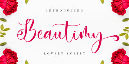 Beautimy – Lovely Script font with a natural handwritten feel. It has sweety swash that are perfect for any creative design. This handmade font will make your design has a beautiful natural touch for each details. It is perfect for any design project as Invitation,logo, book cover, craft or any design purposes. This font is PUA encoded which means you can access all of the magical glyphs and swashes with ease! It also features a wealth of special features including alternate glyphs and ligatures.
 - Kinuhi by Twinletter,
$15.00 Introduce a display font named Kinuhi. What can you do with a font like this? With a simple line of code and some creativity, you can make it the centerpiece of your next snowboarding gear or create a cool logo for your design agency. Or, maybe use it to quickly make a fun Halloween party invitation. The possibilities are endless. Of course with this font your various design projects will be perfect and amazing, get a beautiful title and start using our font for your special project.
 - Saturated by Almarkha Type,
$35.00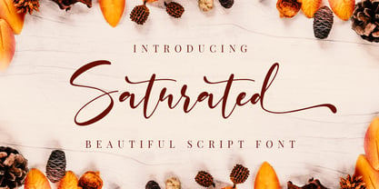 Saturated is a script font with a natural handwritten feel. It has lovely ligatures and alternates that are perfect for any creative design. This handmade font will make your design has a beautiful natural touch for each details. It is perfect for any design project as Invitation,logo, book cover, craft or any design purposes. This font is PUA encoded which means you can access all of the magical glyphs and swashes with ease! It also features a wealth of special features including alternate glyphs and ligatures.
 - XRoomingHouse by Ingrimayne Type,
$9.95 XRoomingHouse is a typeface of pictures that I did many years ago. Most of the pictures are border elements, and within a set they can be combined to make borders or frames. There is no real style consistency in the font—it is an eclectic collection of elements. (Minor corrections and additions were made in 2018 to improve sets that can form frames. For a more ambitious attempt at a font that can form frames, see Framealot). As for the name, boarders stay in a rooming house.
 - Ginkgo by Linotype,
$29.99 Designed by Alex Rütten, Ginkgo is a stylish text typeface. It works well for setting extended passages of text at small sizes thanks to its open counters, generous character widths, and clear and unique letterforms. On top of that, the handling of details such as in the serifs, cross bars, and terminals are wonderful to appreciate when used at large point sizes as well. Gingko received a Certificate of Excellence in Type Design at the Type Directors Club of New York TDC2 competition in 2009.
 - Romantics by Almarkha Type,
$35.00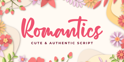 Romantics – is a Cute & Authentic Script font with a natural handwritten feel. It has sweety swash that are perfect for any creative design. This handmade font will make your design has a beautiful natural touch for each details. It is perfect for any design project as Invitation,logo, book cover, craft or any design purposes. This font is PUA encoded which means you can access all of the magical glyphs and swashes with ease! It also features a wealth of special features including alternate glyphs and ligatures.
 - Drive Eddie by Ingrimayne Type,
$4.95 DrivEddie was an attempt to create a rough, hand-drawn typeface that was quirky but easily readable. It has a few serifs so it is almost but not quite san serif. All vertical stems are curved. For almost 25 years DrivEddie was a one-font family and one-font families often have limited applications. In 2020 I returned to this typeface to increase its possible uses by adding five new styles: italic, semibold, semibold-italic, bold, and bold-italic. I also corrected mistakes and added characters.
 - Girly by Almarkha Type,
$35.00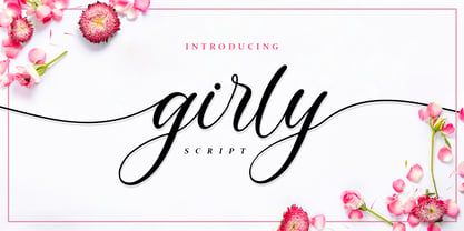 Girly – is a Lovely Script Calligraphy font with a natural handwritten feel. It has sweety swash that are perfect for any creative design. This handmade font will make your design has a beautiful natural touch for each details. It is perfect for any design project as Invitation,logo, book cover, craft or any design purposes. This font is PUA encoded which means you can access all of the magical glyphs and swashes with ease! It also features a wealth of special features including alternate glyphs and ligatures.
 - Christmas Wonderland by Letterara,
$14.00 Christmas Wonderland is an elegant and flowing bold script font. It is PUA encoded which means you can access all of the glyphs and swashes with ease! These alternate and swash features are also designed to be easy to use in Silhouette software. It features a varying baseline, smooth lines, gorgeous glyphs, and stunning alternates. This font will look great in any creative project such as logos, printed quotes, invitations, cards, product packaging, headers, and more! Add it to your designs and make them come alive!
 - Memorita by Almarkha Type,
$35.00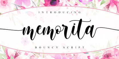 Memorita is Bouncy Script font with a natural feel, It has sweety swash that are perfect for any creative design. This handmade font will make your design has a beautiful natural touch for each details. It is perfect for any design project as Invitation,logo, book cover, craft or any design purposes. This font is PUA encoded which means you can access all of the magical glyphs and swashes with ease! It also features a wealth of special features including alternate glyphs and ligatures.
 - Realitta Sinta by Zamjump,
$10.00 "Realitta Sinta" is a handwritten font that was created using the Infinite Painter application for sketches. This font is inspired by simplicity which is then attached to each stroke. Realitta sinta is a simple font that includes various features such as ligatures and alternates. Realitta Sinta suitable for various needs such as writing invitations, signatures, promo needs, business card design, Photography logos, casual wear, profession or work and others. Ligature and lowercase alternate swash are differentiators for various purposes or adjust the desired style,
 - Generisch Mono by Akufadhl,
$29.00 Generisch Mono is a monospaced version of Generisch Sans. Generisch - a german equivalent of generic - sans serif typeface has gain its own place among designers and earn such popularity due to its "simple" design. Generisch is influenced by early grotesk typefaces from early 1900's when sans was starting to get popular and used as a body type. Some old ligatures such as ch ck and ng are present in generisch (not the ct and st tho), old style numeral for better typesetting experience and more.
 - Kamelitta by Almarkha Type,
$35.00 Kamelitta – is a Beautiful Curvy Script font with a natural handwritten feel. It has sweety swash that are perfect for any creative design. This handmade font will make your design has a beautiful natural touch for each details. It is perfect for any design project as Invitation,logo, book cover, craft or any design purposes. This font is PUA encoded which means you can access all of the magical glyphs and swashes with ease! It also features a wealth of special features including alternate glyphs and ligatures.
 - Horse Drawn Carriage JNL by Jeff Levine,
$29.00 Picture if you will, a balmy autumn evening in Manhattan during the 1930s and a well-dressed couple out on the town. They hail one of the hansom cabs located near Central Park and climb in for an old-fashioned romantic ride around the green. Such are the type of images the stylized Art Deco hand-lettering comprising Horse Drawn Carriage JNL evokes. The inspiration for this font was the title card for a 1935 Bette Davis feature entitled "The Girl from 10th Avenue".
 - Liquorstore Bold & Bolder by Chank,
$99.00 In this modern era, sometimes being bold is not enough. Sometimes you need to go BOLDER! So here comes the Liquorstore Bolder font family, the long awaited sequel to the popular Liquorstore industrial, geometric display font. This new bolder font family features multiple styles that work on their own or as overlapping layers to create stunning multi-color typography. Chromatic layering effects are created with inline, outline, bi-line, and tri-line styles can be used together to create extra impactful words in your logos and headlines.
 - Gastromond by James Todd,
$40.00 Gastromond began about five years ago with a question: why are fat faces always based on Didot or Bodoni models? Was there a reason that the stresses of these display faces was always vertical or horizontal and never angled? It was time to find out. Gastromond is meant to blend the Renaissance stylings of the Garamond types with the Victorian outlandishness of the fat faces. The result is an emphatic take on a classic genre. Loaded with swashes and alternates, Gastromond has enough character to go around.
 - Brush Script by Monotype,
$29.99Brush Script is a lively font with brush-written characteristics, designed by Robert E. Smith in 1942 for American Type Founders. Brush Script continues to be a favorite, despite competition from other similar typefaces of the period and more modern looking scripts digitized in recent years. Perhaps that's because Brush Script is peppy, informal, and unabashedly confident. The letterforms are casual, yet look as if they have been written quickly. Today, Brush Script is used for advertisements and sales materials, especially for luxury and consumer products. - Lithium by FSD,
$40.00Lithium is a set of symbols coming from different communicative context but designed to be used together. It's like turning on 5 radios trying to understand the mixture of sounds. Lithium was created, above all, to present this kind of sensation using images. Obviously, the result is chaos in lowercase text. Lithium represents the overload of images we are subjected to. With advertising no longer working like in past years, we end up seeing nothing but noise. FF Mode 01 is created with similar concept. - Kaffemoster by Hanoded,
$16.00 Kaffemoster is a Swedish slang word for a lady, usually a bit older, who likes to drink coffee and gossip while she’s drinking it. I have decided to study a bit of Swedish, so I downloaded an app and I am practising my Swedish vocabulary every night! Det går långsamt, men jag klarar det! Kaffemoster is a nice, handmade pencil font. It comes with extensive language support (including Swedish) and a nice set of alternates for the lower case letters. Kaffemoster är ett riktigt bra typsnitt!
 - Neuzeit Office Soft Rounded by Linotype,
$29.99 Every year, more and more text is read directly on a computer screen in office applications, or from freshly printed sheets from a copier or laser printer. Clear, legible text faces are more imperative to office communication than ever before. Yet every worker desires a small bit of personality in the corporate world. Most office environments are only equipped with a few basic fonts that are truly optimized for use in text, with laser printers, and on screen. The Linotype Office Alliance fonts guarantee data clarity. All of the font weights within the individual family have the same character measurements; individual letters or words may have their styles changed without line wrap being affected! All numbers, mathematical signs, and currency symbols are tabular; they share the same set character width, ensuring that nothing stands in the way of clear graph, chart, and table design. In addition to being extremely open and legible, the characters in this collection's fonts also share the same capital letter height and the same x-height. The production and reading of financial reports is duly streamlined with the Linotype Office Alliance fonts. The Neuzeit Office family is designed after the model of the original sans serif family Neuzeit S, which was produced by D. Stempel AG and the Linotype Design Studio in 1966. Neuzeit S itself was a redesign of D. Stempel AG's DIN Neuzeit, created by Wilhelm Pischner between 1928 and 1939. Intended to represent its own time, DIN Neuzeit must have struck a harmonious chord. DIN Neuzeit is a constructed, geometric sans serif. It was born during the 1920s, a time of design experimentation and standardization, whose ethos has been made famous by the Bauhaus and De Stijl movements in art, architecture, and design. Upon its redesign as Neuzeit S in the 1960s, other developments in sans serif letter design were taken into account. Neuzeit S looks less geometric, and more gothic, or industrial. Separating it from typefaces like Futura, it has a double-storey a, instead of a less legible, single-storey variant. Unlike more popular grotesque sans serifs like Helvetica, Neuzeit S and especially the redesigned Neuzeit Office contain more open, legible letterforms. Neuzeit Office preserves the characteristic number forms that have been associated with its design for years. After four decades, Neuzeit has been retooled once again, and it is more a child of its age than ever before. Akira Kobayashi, Linotype's Type Director, created the revised and updated Neuzeit Office in 2006. His greatest change was to retool the design to make its performance in text far more optimal. Additionally, he created companion oblique to help emphasize text. The other three families in the Office Alliance system include Metro Office, Times Europa Office and Trump Mediaeval Office.Some weights of the Neuzeit Office are availabla as soft rounded versions. "
 - TT Rationalist by TypeType,
$39.00 Please note! If you need OTF versions of the fonts, just email us at commercial@typetype.org TT Rationalist useful links: Specimen | Graphic presentation | Customization options We thought, "What if we provide the user with a collection of matching fonts, each of which would still be unique?"—and so we started developing TT Rationalist. For those familiar with the bestsellers TT Norms® Pro and TT Commons Pro, the new font will be intuitive to use. It has similar proportions, characteristics and functionality, but yet it is an independent and original font family. Unlike the geometric sans serifs TT Norms® Pro and TT Commons Pro, TT Rationalist is a slab serif typeface. It is functional and original. Slabs are characterized by massive rectangular serifs, but in TT Rationalist they are trapezoidal and refined, which makes them look modern. Speaking of modernity, when creating the typeface, we wanted to avoid the excessive historicism that can be seen in many slab serif fonts. We have been particularly careful working on the Black style, which in the first sketches had something in common with the Wild West posters. When we balanced out the excessive contrast caused by visual compensation, the font stopped evoking retro associations. Now TT Rationalist Black is perfect for headlines, especially on posters and posters, and works great with Light styles in TT Norms® Pro and TT Commons Pro. The new typeface works well for both headings and text arrays. It looks especially aesthetically pleasing in printed production (books, magazines, brochures). The TT Rationalist typeface consists of 22 two styles: 10 upright, 10 real Italics and two variable fonts, each with over 950 glyphs. It supports over 200 languages and contains 27 OpenType features. In addition to the standard ones, there are Small Capitals for Latin and Cyrillic languages, alternative versions of the ampersand and the letter g. The italics have two stylistic sets allowing to switch the design of style-forming characters (k, v, w, y, z) between italic and classical forms. TT Rationalist font field guide including best practices, font pairings and alternatives. FOLLOW US: Instagram | Facebook | Website
 - FS Aldrin by Fontsmith,
$80.00 Elegant and round Having harboured a desire for a rounded font within the Fontsmith library for some time, Phil Garnham recognised that FS Emeric offered the perfect skeleton around which to design it. Most new rounded fonts rely on scripts or other in-app automation to form their characters. For all their warmth and approachability, they too often conjure images of jelly sweets and sausages. Not so FS Aldrin, where every curve and transition has been crafted by hand, giving a distinctive look and elegant feel. Design highlights FS Aldrin enjoys wide-open ‘lunar’ counters and soft, tube-like terminals. These improve legibility, especially on backlit signage and screens. The open proportions and circular strokes are juxtaposed against a more serious technical aspect that exists within each counter shape. The lighter weights feel precise and efficient, perfect for notes on blueprints or technical drawings. The heavy weights are equally crafted but more playful by their rotund nature, and are perfect for strong headlines or packaging projects. UI icons A suite of 268 icons complement the typeface beautifully and extend the design language in all directions. They cover a range of commonly used applications and themes ranging from ecommerce to weather, and also serve as a solid starting point for a bespoke brand icon set or UI. In addition, born of FS Aldrin’s astronomical theme and playful nature is a special collection of space-themed icons, including rockets, shuttles and lunar modules (hint: if you type the word BUZZ with ligatures enabled, an astronaut appears). Earth to Buzz Buzz Aldrin was the pilot of Apollo 11’s lunar module, the one that put man on The Moon for the very first time. Early on in the project’s life, FS Aldrin emerged as the ideal hook on which to hang the font’s space helmet (hardly surprising given Phil’s fascination with space travel and astronomy). An approach was made to Buzz’s management to see if he would sanction the association. Not only was the great man himself happy to see his name on a typeface, he also asked to use it in his upcoming keynote talks, book launches and online projects.
 - Compiler by Identity Letters,
$39.00 Legible, technical, clear—with a hint of retro: Compiler is a no-frills font family straight from the heart of a microprocessor. Inspired by console typefaces, the humanist sans serif typeface combines a large x-height with striking serifs on certain letters such as i and l. Those serifs evoke the aesthetics of monospace typefaces for programming. Even though Compiler is a proportional typeface, this detail improves glyph recognition and helps differentiate between individual letters. Combined with vertical stroke ends, which allow for particularly even spacing, the serifs make for an extremely legible typeface. (Even in small sizes.) Brand recognition guaranteed: Compiler is ideal for applications that require a mechanical flavor without appearing offish. You can use it for websites, apps, branding, corporate design, annual reports, signage, and many other areas with perfect results. Compiler consists of two font families; the second one is Compiler Plain. In Compiler Plain, the signature letters lose their serifs and the forms of "a" and "g" are simplified. This way, the shapes are neutralized. The technical impression recedes into the background. Both families can be combined smoothly: you might use the standard Compiler fonts for display sizes and Compiler Plain styles for body copy. For total design control, you can toggle each of the defining design elements individually from Compiler to Compiler Plain and vice versa. Just use Stylistic Sets to fine-tune your Compiler fonts. Compiler provides you with 8 weights in 4 variations: Upright, Italics, Plain Upright and Plain Italics. That's a total of 32 fonts. Each style contains more than 860 glyphs, including advanced typographic tools such as proportional and tabular figures (both lining and old-style) or small caps—something you'll rarely find in this genre. Other glyphs are optimized for display sizes, such as circled figures and various arrows. There's also a set of glyphs designed for web use: with symbols for shopping carts, hamburger menus or checkboxes, you can implement your web projects elegantly and consistently without relying on third-party tools (like an external icon font). Powered by highly productive OpenType functions, Compiler is an intermedia workhorse straight from cyberspace.
 - Portada by TypeTogether,
$35.00 For everyone wishing for a modern serif that’s as clear and readable as a sans in restrictive digital environments, meet Portada by Veronika Burian and José Scaglione. Sans serifs are commonly used on small screens to save space and carry a modern tone. Serifs may appear fickle and unsteady, pixel grids change from one product to another, and space is at a premium. Portada now provides a serif option for these restrictive digital environments, putting that old trope to rest. The screen has met its serif match. Portada was created from and for the digital world — from e-ink or harsh grids to Retina capability — making it one of the few serifs of its kind. Portada’s text and titling styles were engineered for superlative performance, making great use of sturdy serifs, wide proportions, ample x-height, clear interior negative space, and its subservient personality. After all, words always take priority in text. It’s not all business, though. Portada’s italics contain an artefact of calligraphy in which the directionality of the instrokes and the returning curves of the outstrokes give the family a little unexpected brio. Yet even the terminals are stopped short of flourished self-absorption to retain their digital clarity. When printed these details are downright comforting. Portada’s titling styles enact slight changes while reducing the individual width of each character and keeping the internal space clear. Titling italics have increased expressiveness across a few characters rather than maxing out the personality in each individual glyph. Digital magazines, newspapers, your favourite novel, and all forms of continuous screen reading benefit from Portada’s features. This family can also cover many of the needs developers have: user interface, showing data intensive apps on screen, even one-word directives and dialogs. And, as a free download, an exhaustive set of dark and light icons is included to maintain Portada’s consistent presence, whether as a word or an image. The complete Portada family (eight text styles, ten titling styles, and one icon set) is designed for extensive, clear screen use — a rare serif on equal footing with a sans.