10,000 search results
(0.101 seconds)
- Holi Christmas Eve by Letterara,
$12.00 Holy Christmas Eve is a chic and modern calligraphy font. It is ideal for crafting, branding, greeting cards and for adding a joyful touch to your designs! It is PUA encoded which means you can access all of the glyphs and swashes with ease! These alternate and swash features are also designed to be easy to use in Silhouette software. It features a varying baseline, smooth lines, gorgeous glyphs, and stunning alternates. Add it to your designs and make them come alive!
 - Nieanana by 066.FONT,
$9.99 Nieanana is a display font whose design is inspired by the distinctive style of 8-bit computers. It exudes a varied and extravagant style, reminiscent of the retro aesthetic of games and graphics from that era. Its distinctive and daring letters are perfect for creative projects such as posters, invitations or branding materials. Nieanana blends in with the atmosphere of nostalgia, adding a unique touch to projects that reminds us of the old days of computer entertainment. Remastered in 2023.
 - Natasha Walker by Hadiftype,
$16.00 Natasha Walker is Thin sans serif that gives it a high class appeal. Comes in 2 weights, Regular and Bold. The inspiration for this typeface comes from the Art Deco era, feels modern and contemporary. Thick and thin branches are done daintily. Giving this entire font a highly polished look. Perfectly in luxury designs. Also contains 150 discretionary ligatures uppercase characters, giving you a variety of layout options. It’s perfect for fashion and lifestyle themes and even for branding purposes.
 - Christmas Magic by Letterara,
$14.00 Christmas Magic is an elegant and flowing handwritten font. It is PUA encoded which means you can access all of the glyphs and swashes with ease! These alternate and swash features are also designed to be easy to use in Silhouette software. It features a varying baseline, smooth lines, gorgeous glyphs, and stunning alternates. It maintains its classy calligraphic influences while feeling contemporary and fresh. Fall in love with its incredibly distinct and timeless style and use it to create spectacular designs!
 - Pax by Linotype,
$29.99Pax is clearly a didone, using Vox classification. The contrast between the thin lines and the thicker ones is noticeable, as you would expect from a didone. The basic form is relatively narrow, therefore I designed another Pax, slightly wider and darker, and called it Pax #2. Otherwise they are more or less identical. Pax is Latin for peace, on everyone's want list in 1995 - as well as every single year before and after that. Pax was released in 1995. - Roselle by Gassstype,
$23.00 Here comes a New font, Introducing Roselle is a Fun Script Font is a Authentic script that is written casually and quickly. Letters are made with handwritten on paper. Roselle Perfect for designs,branding projects, Logo design, Quotes product packaging ,design project as Invitation,logo, book cover,. This font is PUA encoded which means you can access all of the magical glyphs with ease! It also features a wealth of special features including You can activate 22 Ligatures OpenType panel.
 - Nerves of Steel BB by Blambot,
$9.00 Here's a deluxe comic book dialogue font with a vintage feel! Nerves of Steel BB comes with Regular, Italic, Bold, and Bold Italic. Contextual Alternates and Auto-ligatures enable six versions of every letter, and three versions of each number, the exclamation point and question mark. Barred-I correction is included as well as bouncy baselines when three or more duplicate letters are typed. To top it off, you get glyphs included for manga letterers, and a large European set of characters!
 - Gliners by Dumadi,
$25.00 Gliners is a simple stylized font that overlies the center of the glyphs bar in the font. Glyphs font doesn’t have too many, it only offers Uppercase and Multilingual, but don’t worry because its simple shape will make your project look interesting. The Gliners font is very suitable for use as movie titles, movie title poster covers like the review image I shared above. how? are you interested in trying it? Thank You, stay the center of attention and classy!
 - Corbert Wide by The Northern Block,
$- A geometric sans serif typeface influenced by Bauhaus and the early modernist era. Precise shapes are optically adjusted to create a clear, natural typeface with excellent legibility. Corbert is a regular, self-evident design that works well across a wide range of applications. Details include nine weights with matching italics and over 540 characters per style. Opentype features consist of five variations of numerals, including inferiors, superiors, fractions, alternative lowercase a, e and g, and language support covering Western, South, and Central Europe.
 - Almeira by Almarkha Type,
$35.00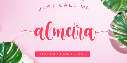 Almeira Lovely Script font with a natural feel, It has sweety swash that are perfect for any creative design. This handmade font will make your design has a beautiful natural touch for each details. It is perfect for any design project as Invitation,logo, book cover, craft or any design purposes. This font is PUA encoded which means you can access all of the magical glyphs and swashes with ease! It also features a wealth of special features including alternate glyphs and ligatures.
 - Handil Pro by Alifinart Studio,
$- Handil Pro is a geometric sans-serif font that serves as the perfect complement to the Mustica Pro font family. This font boasts geometric shapes with optical adjustments and enhanced gestures. The name "Handil" is derived from a place where two rare and nearly extinct species reside, the Proboscis Monkey and the Muller's Bornean Gibbon. Hearing the word "Handil" reminds us that amidst the bustling world, there are endangered creatures in the remote forests that we must preserve. Get it now.
 - Trivia Sans by Storm Type Foundry,
$39.00 When looking for a neutral typeface with no historic reminders, we always end up with notorious designs made about 60 years ago. It’s a part of the whole Trivia type system. To our surprise, there are still people who can’t distinguish three basic latin type categories. The present font family has been created for them. A simple typographic Trivia: three ways to look at printed word, three fonts to design anything from business card to a billboard, three tunes for endless variations.
 - Listian by Top Type,
$9.00 Hello, I'm back with my best product. This product is a serif font family because there are four style options, namely regular, italic, bold and bold italic. This font is also equipped with several alternates and ligatures so that you have the best choices for your work. This font can be used for wedding invitations, advertisements, web designs, quotes, banners, presentations and more. This font is PUA encoded which means you can access all the glyphs and ligatures with ease!
 - Lucky Goldfish by Hanoded,
$15.00 I am not really sure if goldfish in general are lucky. They tend to swim in circles in a bowl, but maybe, years from now, scientists discover that these goldfish count themselves lucky to be in a bowl, rather than in a stream in Asia. Personally, I think they’d be better off in a stream. Lucky Goldfish font is a cute and happy font, ideally suited for book covers, posters and toy packaging. Comes with a school of diacritics too.
 - Jonquin by Greater Albion Typefounders,
$11.50 Jonquin was inspired by some hand lettering seen on a World -War One recruiting poster. It's a family of three faces for display work and headings designed to be used readily as an 'All-Capitals' face as well as in upper and lower case format. Regular and bold weights are offered, as well as an even more decorative incised form. The whole family is ideally suited for poster and advertising work, as well as book and record covers and period themed signage.
 - Luminum JNL by Jeff Levine,
$29.00In hardware stores across the country are display racks with letters and numbers silk-screened onto self-adhesive aluminum "parallelograms". These handy and durable items have graced countless mailboxes, office doors, hallway signs and automobiles for years. My fellow font designing buddy [Harold Lohner] suggested that I make a font based on this form of lettering as a counterpart to my Mailbox Letters JNL (also based on self-adhesive signage product)... and now his suggestion takes shape as a digital font... Luminum JNL. - Benjammin' by SavoringSurprises,
$10.00 Benjammin' is a handwritten sans-serif font. My 12 year old brother wrote this font himself, and it would be great for any kid's design or project! - Contains over 200 accented characters for language support. Some of the languages supported are: English, Spanish, Portuguese, German, Italian, French, Polish, Catalan, Irish, Norwegian, Croatian, Gaelic, and more! If you would like to know if a certain language is supported, please contact me with the language and/or any special characters you wanted to know about.
 - Doubleline Caps by URW Type Foundry,
$29.00 The basic idea for this headline typeface is to create strictly geometric letters, similar to script typeface, as far as possible in a single sweep, without setting them down. And similar to a typeface written with a quill, there is a thin and a thicker stroke. The upercase letters can also be used with the lowercase keys. The varied and unusual variety of forms in this typeface gives headlines, keywords and even short texts the attention they are looking for.
 - Lateman by Dumadi,
$25.00 Lateman is a casual font built with apps. with freestyle and natural make this font look friendly to the project you are working on. Lateman only consists of uppercase letters, but if it collaborates with other fonts, it will feel more striking like the preview example above. This font was created for superhero movie titles and is perfect for movie titles, superheroes, action, animation, war, and more. You can see the sample preview above for comparison, stay the center of attention and classy!
 - Pax 2 by Linotype,
$29.99Pax is clearly a didone, using Vox classification. The contrast between the thin lines and the thicker ones is noticeable, as you would expect from a didone. The basic form is relatively narrow, therefore I designed another Pax, slightly wider and darker, and called it Pax #2. Otherwise they are more or less identical. Pax is Latin for peace, on everyone's want list in 1995 - as well as every single year before and after that. Pax was released in 1995. - Baby Valentina by Mega Type,
$12.00 Baby Valentina is a beautiful, romantic and trendy modern calligraphy font. Amazing romantic theme fonts make your Valentine's Day even more spectacular. I hope you are interested in this font. This font is PUA encoded which means you can access all glyphs and swashes with ease! This font is perfect for you to use for Valentine's Day greeting cards, greeting cards, love quotes, wedding invitations, birthdays, parties and other romantic projects. Thank you very much for looking and Enjoying it!
 - Winterline by Almarkha Type,
$35.00 Winterline Sweety Script font with a natural feel, It has sweety swash that are perfect for any creative design. This handmade font will make your design has a beautiful natural touch for each details. It is perfect for any design project as Invitation,logo, book cover, craft or any design purposes. This font is PUA encoded which means you can access all of the magical glyphs and swashes with ease! It also features a wealth of special features including alternate glyphs and ligatures.
 - Carllitos by Bluestudio,
$15.00 Hello.. Introducing our latest product Carllitos luxury Signature Font. Carllitos is made to resemble hand scratches, so has a natural look, like your own hand scratches. Carllitos offers beautiful typographic harmony for a variety of design projects, including watermark, logos, branding, wedding designs, social media posts, advertisements, product designs, magazines and others. What's included? You will get : -Ligature -swashes -Multilingual support We can't wait to hear your comments and we are very grateful for your visit to our store. Happy designing!
 - ITC Oldbook by ITC,
$29.99For some time, Eric de Berranger had wanted to create a distressed typeface design - one that gave the appearance of antique printing and showed signs of wear, yet was still highly readable. He was busy designing a new face called Maxime, when an idea struck: I realized that I could use these lettershapes as the basis for my antique typeface," he says. The two faces ended up being designed in tandem. While ITC Oldbook clearly captures the flavor of aged, uneven and imperfect printing, it also meets de Berranger's goal of being exceptionally readable in text sizes. Beginning with well-drawn characters was the key, and these were carefully modeled into the distressed forms. "The process was more difficult than I originally thought," says de Berranger. "The antique letters had to be tested and modified several times to work correctly." ITC Oldbook elegantly simulates antique printing in both text and display sizes. And while stroke weights are uneven and curves are irregular, the design has remarkably even color when set in blocks of text copy. Add to this the design's inherent legibility, and ITC Oldbook acquires a range far beyond replication of things old; it's suitable for any project that calls for warm and weathered typography. ITC Oldbook is available in roman and bold weights with complementary italic designs. Small caps, old style figures and a suite of alternate characters and ornaments provide additional flexibility and personality to the design." - Protipo by TypeTogether,
$35.00 Protipo helps information designers work smarter. Veronika Burian and José Scaglione’s Protipo type family is an information designer’s toolbox: a low-contrast sans of three text widths with a separate headline family, accompanied by an impressive two-weight icon set, and working with the advanced variable (VAR) font format. From annual reports and wayfinding to front page infographics and poster use, designers consistently turn to the simplicity and starkness of grotesque sans fonts to get their point across. Protipo is made for such environments. When designing information you may start with the headline, which in the case of this family is called Protipo Compact and comes in eight weights. From Hairline to Black, set it large, overlap it, or let it run off the page. Protipo Compact was made to hit hard and attract attention with a different character set and different proportions than the three text fonts. It sets the stage for what’s to come. Great information designers are aces at melding form and function, so we’ve stacked the Protipo family with Narrow, Regular, and Wide versions as a way of organising your information and directing the reader. Each width has seven distinct weights (light to bold) and italics, while maintaining the round-rect shapes of its DNA. Subtle details amplify its place in the typographic universe, like an ‘a’ and ‘e’ that go from solid to supple when italicising, an ‘f’ that gains an italic descender, two versions of the lowercase ‘r’ and ‘l’, and clipped corners on diagonals to keep the tight fit inherent to this kind of design work. Protipo is not meant to be loudmouthed, but stakes its claim through refinement, breadth, and impact. Some changes at first don’t seem substantial, but the Protipo family doesn’t handle text like most in its category. Protipo helps readers find and process data in a clear and unequivocal way and accounts for the complexity involved in rendering large amounts of information while still appealing to aesthetics. Protipo is ideal in all informative situations: apps, infographics, UI, wayfinding, transport, posters, display, and even internet memes. Add to all this the icon sets and upcoming variable font capability, and you’re assured a level of creativity, productivity, and impact on a much greater scale.
 - Hotrod by Otto Maurer,
$25.00 HotRod the Flame Font. Hot Font in 50th Flames Style. Made for all US Custom Cars Fans. The Font comes with many Graphics for Vintage Cars like Dices and Skulls
 - Linotype Typo American by Linotype,
$29.99Mark Stanczyk designed Linotype Typo American in 1999. The font is an excellent revival of American style typewriter type. As most of us can remember from our childhood years, or through old stories and movies, everyone used to type with typewriters before the invention of computers. Unlike computers, most individual typewriters only had one typestyle, or font, to chose from. To make matters worse, the letters in a typewriter font would wear down with use. Over time, text typed out on a typewriter would look more and more corroded, old, and uneven. Stanczyk has captured exactly these features in this “revival” font! Also like most older typewriter styles, Linotype Typo American’s letters are all mono-spaced, i.e., the letter i is the same width as the letter w. Typewriter letters also all tended to be cast in the same size, around 12 points or so. When using typewriter-style fonts, it is best to keep setting your text in similar sizes. (Of course, you can set really large and fun headlines with Linotype Typo American, too; if anything the unevenness of the design will come even more across in these applications.) - Basic Commercial Soft Rounded by Linotype,
$29.99 Basic Commercial is a font based on historical designs from the hot metal typeface era. It first appeared around 1900, and was created by type designers whose names have not been recorded but whose skills cannot be overlooked. This typeface's design has been popular among groups and movements as diverse as the Bauhaus, Dadaism, and the masters of Swiss/International-Style typography. It influenced for a variety of later grotesque fonts, such as Helvetica and Univers. Basic Commercial was distributed for many years in the United States under the name Standard Series. The typeface worked its way into many aspects of daily life and culture; for instance, it became the face chosen for use in the New York City subway system's signage. The Basic Commercial's font family members have a clear and objective design. Their forms exhibit almost nothing unusual, but remain both lively and legible nonetheless. Perhaps for this reason, Basic Commercial's design has been popular with graphic designers for decades. To read more about the history of typefaces like Basic Commercial, visit our font feature, The Sans Serif Typefaces. In addition several weights of this typefamily are available as soft rounded versions."
 - "My Nerd" is a distinctive font created by renowned font designers Kevin and Amanda, known for their playful and innovative approach to typography. This font stands out due to its quirky and endearin...
- Joke font, as its name playfully suggests, embodies a spirit of fun and creativity, standing out with its quirky and whimsical style. Picture letters that seem to dance and wiggle on the page, each c...
- The font "Catchland PERSONAL USE ONLY PERSONAL USE ONLY" by Måns Grebäck is a distinctive typeface that embodies creativity and flair. This particular font comes from the prolific body of work produc...
- The KR Heartalicious font, designed by Kat Rakos, stands as an embodiment of playfulness and affection, masterfully woven into a font design. This distinctive typeface captures the whimsy and warmth ...
- The PR Compass Rose font by Castles & Crypts embodies a unique blend of adventure and elegance, a typeface that seems to have been forged from the very spirit of exploration and mystery. With its des...
- Formasi by Michael Browers,
$25.00Formasi, Azeri for "Form of," resulted from the concept of a civil war between serif and sanserif. What would the aftermath of such a war be? The answer is simple: Formasi! - Garava - 100% free

- Schism One by Alias,
$55.00 Schism is a modulated sans-serif, originally developed from our Alias Didot typeface, as a serif-less version of the same design. It was expanded to three sub-families, with the thin stroke getting progressively heavier from Schism One to Schism Three. The different versions explore how this change in contrast between thick and thin strokes changes the character of the letterforms. The shape is maintained, but the emphasis shifts from rounded to angular, elegant to incised. Schism One has high contrast, and the same weight of thin stroke from Light to Black. Letter endings are at horizontal or vertical, giving a pinched, constricted shape for characters such as a, c, e and s. The h, m, n and u have a sharp connection between curve and vertical, and are high shouldered, giving a slightly square shape. The r and y have a thick stress at their horizontal endings, which makes them impactful and striking at bolder weights. Though derived from an elegant, classic form, Schism feels austere rather than flowery. It doesn’t have the flourishes of other modulated sans typefaces, its aesthetic more a kind of graphic-tinged utility. While in Schism Two and Three the thin stroke gets progressively heavier, the connections between vertical and curves — in a, b, n etc — remain cut to an incised point throughout. The effect is that Schism looks chiselled and textural across all weights. Forms maintain a clear, defined shape even in Bold and Black, and don’t have the bloated, wide and heavy appearance heavy weights can have. The change in the thickness of the thin stroke in different versions of the same weight of a typeface is called grading. This is often used when the types are to used in problematic print surfaces such as newsprint, or at small sizes — where thin strokes might bleed, and counters fill in and lose clarity, or detail might be lost or be too thin to register. The different gradings are incremental and can be quite subtle. In Schism it is extreme, and used as a design device, giving three connected but separate styles, from Sans-Didot to almost-Grotesk. The name Schism suggests the differences in shape and style in Schism One, Two and Three. Three styles with distinct differences, from the same start point.
 - TT Lakes Neue by TypeType,
$39.00 Introducing TT Lakes Neue in version 2.0! Please note that the TT Lakes font has been removed from platforms, but you can still order it by sending a request to the studio's commercial department: commercial@typetype.org We have released a continuation of the geometric sans serif inspired by Finnish functionalism. The new version provides more opportunities, because we not only increased the character set and improved the font technically, but also reworked its visual character. What changed? Font character. TT Lakes Neue 2.0 has become calmer, as we have removed the display details in the characters of the main set, making the font more versatile. New stylistic sets were created, thanks to which the nature of the font can be controlled, making it more expressive. Changed the forms of the characters "Кк", "ЖЖ", "Дд", "Лл", lowercase "b" and alternative "g". Added alternative forms for all types of the number "1", for the characters "Mm", "DD", "Ll". Added technological character sets, with which the font looks stylish and expressive. You may notice that in these sets, the forms of lowercase characters with arches (r, m, n) are changed, and there are gaps in the places of infusions and connections of all characters. Scope of application. The scope of TT Lakes Neue 2.0 have become even more diverse, because the sans serif has become more neutral in character and more functional. TT Lakes Neue 2.0 is the perfect font for the gaming industry. Suitable for game interfaces of different genres. Technological sets can be used in architectural projects, in the headlines of posters and magazines, on outdoor signs. The font is suitable for logo design, looks great in branding. Character set and technical characteristics. We have significantly improved the set of the font, increasing the number of characters from 736 to 921. The font has become more functional due to the updated technical stuffing and new features, of which there are now 36 instead of 24. Added characters of extended Latin, fractions, arrows. Created new kerning and hinting. Updated variable font. Added new OpenType features. The TT Lakes Neue font has 5 subfamilies: Compressed, Condensed, Regular, Extended, Expanded. In total, there are 91 styles in the font: 9 upright and 9 slanted in each subfamily and 1 variable font. Each style has 921 characters and 36 OpenType features.
 - Sassoon Handwriting Starter by Sassoon-Williams,
$45.99 Sassoon fonts package for handwriting starters The three upright "infant" fonts developed to meet the demand for letters to produce pupil material for handwriting as well as for reading. Letters have extended ascenders and descenders ideal on screen and print. They facilitate word recognition. The exit strokes link words together visually, also crucially, they space the letters for improved legibility. The "joined" font puts the skills gained into practice producing joined-up handwriting. Together these typefaces provide a valuable resource for Teachers to create consistent material across the curriculum. Sassoon Infant Tracker B font: This font with its direction arrows helps pupils to start in the correct place. Motor movements can be refined by keeping inside the line. When starting and direction is no problem, the arrow font can be dropped and the Dotted font used. Sassoon Infant Dotted B font: Writing over the dots of this font refines motor skills. The aim here is to give confidence by reinforcing starting points, exits and to now encourage fluidity. Sassoon Infant font: With some words in this font and a baseline beneath to copy onto, pupils can use their learned starting points and exit strokes to write freely along the baseline - still unjoined. Once learned, this leads to spontaneous joins along the baseline leading logically to a joined-up hand. Sassoon Joined font: Having learned to write letters with correct starts and exits, this is when the joined font for teaching handwriting can be used. With some words in this font and a baseline beneath to copy onto, pupils can use their learned starting points and simply extend their exit strokes to make joined-up writing. The default joins the font provides are recommended, however there are alternative letterforms that are so important for some Teachers which can be accessed. Create ‘pen lifts’ anytime too! NOTE: Fonts display unjoined by default on this website and are delivered that way - joining is controlled by your text editing application such as Word or TextEdit, read more for instructions… Free to download PDF resources: Stylistic Sets and how to access the alternative letters feature in these OpenType fonts. Using the separate letter fonts Using the joined font Teachers copybooks using these fonts: How to teach pre-cursive Copybook How to teach cursive handwriting Copybook
 - Schism Three by Alias,
$55.00 Schism is a modulated sans-serif, originally developed from our Alias Didot typeface, as a serif-less version of the same design. It was expanded to three sub-families, with the thin stroke getting progressively heavier from Schism One to Schism Three. The different versions explore how this change in contrast between thick and thin strokes changes the character of the letterforms. The shape is maintained, but the emphasis shifts from rounded to angular, elegant to incised. Schism One has high contrast, and the same weight of thin stroke from Light to Black. Letter endings are at horizontal or vertical, giving a pinched, constricted shape for characters such as a, c, e and s. The h, m, n and u have a sharp connection between curve and vertical, and are high shouldered, giving a slightly square shape. The r and y have a thick stress at their horizontal endings, which makes them impactful and striking at bolder weights. Though derived from an elegant, classic form, Schism feels austere rather than flowery. It doesn’t have the flourishes of other modulated sans typefaces, its aesthetic more a kind of graphic-tinged utility. While in Schism Two and Three the thin stroke gets progressively heavier, the connections between vertical and curves — in a, b, n etc — remain cut to an incised point throughout. The effect is that Schism looks chiselled and textural across all weights. Forms maintain a clear, defined shape even in Bold and Black, and don’t have the bloated, wide and heavy appearance heavy weights can have. The change in the thickness of the thin stroke in different versions of the same weight of a typeface is called grading. This is often used when the types are to used in problematic print surfaces such as newsprint, or at small sizes — where thin strokes might bleed, and counters fill in and lose clarity, or detail might be lost or be too thin to register. The different gradings are incremental and can be quite subtle. In Schism it is extreme, and used as a design device, giving three connected but separate styles, from Sans-Didot to almost-Grotesk. The name Schism suggests the differences in shape and style in Schism One, Two and Three. Three styles with distinct differences, from the same start point.
 - Malaga by Emigre,
$59.00 Why do we need another typeface? This is a prickly question often asked of typeface designers. Depending on who you ask, the answer in simplified form is usually one of two: 1. As the basis of written communication, type design carries social responsibility, so we must continue to improve legibility. 2. Type design is a form of artistic expression. Without art, life is not worth living. The best work, of course, accomplishes both. Xavier Dupré, the designer of the Malaga typeface family, has at least one leg securely planted in the latter notion. He believes, like others, that within typeface design most legibility needs have been worked out and that today we are satisfying aesthetic desires. We design typefaces to differentiate our communications. Type design is primarily a formal exercise reflecting our personal quirks, technological obsessions, and cultural heritage. In case of Dupré’s work, issues of cultural heritage and personal quirks are of particular consequence. An incessant traveler, he visited the following countries during the development of the Malaga type family: Thailand, Malaysia, Indonesia, Myanmar, Cambodia, Vietnam, France, Belgium, and finally, Spain, where his choice for the name Malaga originates (Malaga is a port city in southern Spain). Dupré’s home is where his laptop is. He travels with a 12- or 15 inch PowerBook, without a printer, and with sporadic access to his reference books and other historical documents. All he needs is a table and chair. He even learned to design without a mouse since hotel and cafe tables are often too small to also fit a mousepad. Dupré is the new global designer who can take disparate influences and fluidly process the information into a coherent whole. Malaga is a case in point. It is inspired by ideas ranging from blackletter to Latin fonts, and from the Quattrocento’s first Venetian antiquas to brush stroke types. This makes Malaga a richly animated font saturated with unorthodox detail. Its black and bold weights are particularly suited for headlines and short texts, while the subtle modulation and moderate contrast in the regular and medium weights makes it perfectly readable in extended text settings. While Malaga doesn’t claim to resolve any particular legibility issues, it is nonetheless perfectly readable and will impart any design with a healthy dose of visual character.
