10,000 search results
(0.035 seconds)
- TT Fellows by TypeType,
$39.00 TT Fellows useful links: Specimen | Graphic presentation | Customization options There can't be too many universal fonts! Meet TT Fellows, a new workhorse whose functionality allows you to comfortably use the font in a variety of projects. Calm and neutral at first glance, the mood of TT Fellows can change. Working with the typeface, you can reveal its soft and friendly nature, or even the brutal one, for example, by typing the text exclusively in capital letters in the bold style. TT Fellows is easy to use and perfect for setting large text arrays. Thanks to the font's uniwidth and versatility, the font is ideal for use on websites or in periodicals. Bold styles will work harmoniously in headlines or as accents in print or on packaging. TT Fellows is a humanist sans serif with a mechanical touch. With its open shapes, the friendly neutral character of thin weights and an even softer character in bold weights, the new typeface differs in character from the classic TT Norms® and TT Commons sans serifs, while still offering the same functionality. Calm regular styles differ from bold, deliberately display and more expressive ones. By the way, TT Fellows is a unwidth typeface. It was important for us that the user could change the styles, knowing that the layout will not suffer. The typeface features equal width proportions, open apertures, and slightly squared ovals, which associatively brings it closer to other popular modern fonts. Since the idea of the typeface was focused on it being a uniwidth typeface, we needed to fit the bold styles into the regular em squares, which led to interesting graphic solutions that are noticeable, for example, in the k and ж characters, in which the branches are cut directly into the stems. TT Fellows consists of 19 styles: 9 upright, 9 italic and 1 variable, each with over 700 glyphs. The font has 26 useful OpenType features. For example, there is a switch to single-part versions of letters a and y, fractions, tabular characters, case versions of punctuation, and localized versions of characters for different languages. There is a ligature for a combination of two characters of a complex design fl. TT Fellows font field guide including best practices, font pairings and alternatives.
 - Sancoale Gothic by insigne,
$35.00 In comparison to the powerful and commanding original, Sancoale Gothic is a more sober version of Sancoale. The medium contrast between thick and thin strokes makes for a typeface that stands out with striking clarity in longer texts, yet is very readable. This new addition to the Sancoale family is a perfect alternative if you want to use a different style than the original family. Using the utmost care and restraint, the designer strove to avoid overbearing futurism in favor of a typeface with clean lines and clear forms. Show your customers the world with Sancoale Gothic, a versatile sans with a wide range of styles, from delicate thins to bold, hefty weights that dominate the page and screen with confidence and futuristic flair. A fresh, friendly voice for all kinds of uses, from corporate statements to fashion, Sancoale Gothic is a versatile sans with a wide range of styles, from delicate thins to bold, hefty weights that dominate the page and screen with confidence and futuristic flair. Sancoale Gothic has a distinct personality, which allows you to create a wide range of projects, including posters and websites. The Sancoale Gothic fonts come in many varieties, so you can go with a light or thick weight, depending on what fits your project best. With their sweeping curves, the heavy fonts are meant for huge headings on posters and websites. The Sancoale Gothic family is made up of 48 distinct styles, with 660 glyphs and supports 70 languages, allowing you to communicate with your customers all over the world. Small Capitals and other OpenType features abound! The design is sleek with no stems or spurs in the default character set, but OpenType alternates have alternates with stems. OpenType capable applications such as Quark or the Adobe suite can take full advantage of the automatically replacing ligatures and alternates. The superfamily offers an array of optical sizes, contrasting weights, and contrasting optical sizes to discover the right balance, contrast, and optical size for your design. Prepare to be blown away by Sancoale Gothic’s smooth curves and captivating allure. Sancoale Gothic is perfect for both a contemporary and forward looking style. Sancoale Gothic is both practical and unique, in a standalone capacity or with the companion Sancoale fonts. Use it to make an impact today.
 - 99 Names of ALLAH Clear by Islamic Calligraphy75,
$12.00 We have transformed the “99 names of ALLAH” into a font. That means each key on your keyboard represents 1 of the 99 names of ALLAH Aaza Wajal. The fonts work with both the English and Arabic Keyboards. We call this Calligraphy "Clear" because of how clear and easy to read the design is. The first "Alef" has a "hamzit wasel", this indicates that you can pronounce it as both "AR-RAHMAAN" or "R-RAHMAAN" (in the zip file you will find a pdf file explaining the differences in the "harakat", pronunciation and spelling according to the Holy Quran). The "Ye" in this calligraphy doesn't have the two dots, nor does it have a decorative "Ye", just like the Holy Quran. Also, we went for the traditional "soukoun" instead of the Quranic "soukoun" & decorative symbols are at a minimum. Decorative letters used in this calligraphy: "Mim, Aain, Sin, HHe, He, Kaf, Tah & Saad". Purpose & use: - Writers: Highlight the names in your texts in beautiful Islamic calligraphy. - Editors: Use with kinetic typography templates (AE) & editing software. - Designers: The very small details in the names does not affect the quality. Rest assured it is flawless. The MOST IMPORTANT THING about this list is that all the names are 100% ERROR FREE, and you can USED THEM WITH YOUR EYES CLOSED. All the “Tachkilat” are 100% ERROR FREE, all the "Spelling" is 100% ERROR, and they all have been written in accordance with the Holy Quran. No names are missing and no names are duplicated. The list is complete "99 names +1". The +1 is the name “ALLAH” 'Aza wajal. Another important thing is how we use the decorative letters. In every font you will see small decorative letters, these letters are used only in accordance with their respective letters to indicate pronunciation & we don't include them randomly. That means "mim" on top or below the letter "mim", "sin" on top or below the letter "sin", and so on and so forth. Included: Pdf file telling you which key is associated with which name. In that same file we have included the transliteration and explication of all 99 names. Pdf file explaining the differences in the harakat and pronunciation according to the Holy Quran. --------------------------------------------------------------------------------------------------------------------------- Here is a link to all the extra files you will need: https://drive.google.com/drive/folders/1Xj2Q8hhmfKD7stY6RILhKPiPfePpI9U4?usp=sharing ---------------------------------------------------------------------------------------------------------------------------
 - Anisette Std Petite by Typofonderie,
$59.00 Geometric font inspired by shop signs in 4 styles Anisette has sprouted as a way to test some ideas of designs. It has started with a simple line construction (not outlines as usual) that can be easily expanded and condensed in its width in Illustrator. Subsequently, this principle of multiple widths and extreme weights permitted to Jean François Porchez to have a better understanding with the limitations associated with the use of MultipleMaster to create intermediate font weights. Anisette built around the idea of two widths capitals can be described as a geometric sanserif typeface influenced by the 30s and the Art Deco movement. Its design relies on multiple sources, from Banjo through Cassandre posters, but especially lettering of Paul Iribe. In France, at that time, the Art Deco spirit is mainly capitals. Gérard Blanchard has pointed to Jean Francois that Art Nouveau typefaces designed by Bellery-Desfontaines was featured before the Banjo with this principle of two widths capitals. The complementarity between the two typefaces are these wide capitals mixed with narrow capitals for the Anisette while the Anisette Petite – in its latest version proposes capitals on a square proportions, intermediate between the two others sets. Of course, the Anisette Petite fonts also includes lowercases too. Anisette Petite, a geometric font inspired by shop signs in 4 styles So, when Jean François Porchez has decided to create lowercases the story became more complicated. His stylistic references couldn’t be restricted anymore to the French Art-déco period but to the shop signs present in our cities throughout the twentieth century. These signs, lettering pieces aren’t the typical foundry typefaces. Simply because the influences of these painted letters are different, not directly connected to foundry roots which generally follow typography history. The outcome is a palette of slightly strange shapes, without strictly not following geometrical, mechanical and historical principles such as those that typically appear in typefaces marketed by foundries. As an example, the Anisette Petite r starts with a small and visible sort of apex that no other similar glyphs such as n or m feature, but present at the end of the l and y. The famous g loop is actually inspired by Chancery scripts, which has nothing to do with the lettering. The goal is of course to mix forms without direct reports, in order to properly celebrate this lettering spirit. This is why the e almost finishes horizontally as the Rotis – and the top a which must logically follow this principle and is drawn more round-curly. This weird choice seemed so odd to its designer that he shared his doubts and asked for advise to Jeremy Tankard who immediately was reassuring: “Oddly, your new top a is fine, it brings roundness to the typeface, when the previous pushes towards Anisette Petite to unwanted austerity.” The Anisette Petite, since its early days, is a mixture of non-consistent but charming shapes. Anisette, an Art Déco typeface Anisette Petite Club des directeurs artistiques, 46e palmarès Bukva:raz 2001
 - Costa Std by Typofonderie,
$59.00 A mediterranean style sanserif in 4 styles The original idea of Costa was to create a contemporary mediterranean typeface style. Costa is a synthesis of the purity, as found on Greek capitals, and softness, found in Renaissance scripts. First thing was the design concept that take its roots on the Chancery script. Such writing style appeared during Italian Renaissance. Later few typefaces have been developed from such cursive models. Today most serifed typeface italic take their roots on such triangular structure we can find on gylphs like the n, p, or d. The Costa capitals remains close to pure sanserif models when the lowercases features an ending serif on many letters like the a, n, d, etc. This ending serif being more like a minimal brush effect, creating a visual contrast and referencing the exoticness of the typeface. Knowing that the Costa typeface family began life in the 90s as a bespoke typeface for Costa Crociere, an Italian cruise company — it suddenly makes sense and explains well why Jean François Porchez focused so much on Italian Chancery mixed to a certain exotism. The curvy-pointed terminals of the Costa n can obviously get find on other glyphs, such as the ending of the e, c and some capitals. So, the sanserif looks more soft and appealing, without to be to pudgy or spineless. The general effect, when set for text, remains a sanserif, even not like Rotis Semiserif. Costa is definitly not a classical typeface, or serif typeface which convey past, tradition, historicism as Garamond does beautifully. Because of the Costa crocieres original needs, Costa typeface was designed to be appropriate for any uses. Anytime you’re looking for good mood, qualitative effects, informal tone, cool atmosphere without to be unconvential or blowzy, Costa will convey to your design the required chic and nice atmosphere, from large headlines sizes, brands, to small text sizes. It’s a legible typeface, never boring. A style without neutrality which doesn’t fit comfortably into any typeface classification! Does it proves the novelty of its design and guarantees as well as its originality? Its up to you to be convinced. Barcelona trip Originally not planned, this need appeared because of a trip to Barcelona at the time of the project, where Jean François was giving a lecture. He wanted to pay an homage to that invitation to create something special. So, he designed during his flight some variations of the Spanish Ch, following ideas developed by the Argentinian type designer Rubén Fontana for his typeface called Fontana ND (published by the Barcelona foundry Bauer). Then, he presented during his lecture variations and asked to the audience which design fit the best to their language. They selected the design you can find in the fonts today. Read more about pairing Costa Type Directors Club 2000 Typographica: Our Favourite Typefaces 2004
 - Manics - The Holy Bible - Unknown license

- Antique Borders & Corners 2 by Aerotype,
$29.00 Hand selected from multiple sources, the 60+ glyphs of Antique Borders & Corners 2 can be mixed and matched to make authentic 18th and 19th century borders of any length. Flip the orientation for 'bottom' borders with the shift key.
 - Ivan by Hot Russian Pancakes,
$- Monospaced black slab-serif without any philosophy or idea, it doesn't pretend to be anything sophisticated, it is as simple as chewing gum or a can of soda. Simple and angry typeface Ivan has a lively friend — Juan typeface.
 - Strima by Nicolas Deslé,
$24.90 Strima is a geometric sans serif typeface that stands for minimalism and legibility. With over 1000 glyphs and extensive language support Strima offers full professional typographic features. The Strima family consists of 4 weights: light, book, medium and bold.
 - Ristretto Pro by Mint Type,
$- Ristretto Pro is an extremely narrow display sans-serif font family available in 8 weights. It features rich language support, 6 sets of figures and small caps. Ristretto Pro also comes with its slab-serif counterpart - Ristretto Slab Pro.
 - Big Country by Robert Petrick,
$19.95 Big Country is a versatile bold new font that is great for headlines or product logos. It is an elegant design but can also be used playfully. "Big Country" is easy to read even at fairly small point sizes.
 - AdPro by Linotype,
$29.99Roman Sehrer, a seasoned German advertising professional, digitized his handwriting to create this family of three fonts. Sehrer recommends this family for posters, logos, and restaurant menus. It works well with traditional sans serifs such as Helvetica or Univers. - Enchatty by Gassstype,
$23.00 Hello Everyone, introduce our new product Font Enchatty it is Handwritten Font.This is a Textured Natural Style and classy style with a clear style and dramatic movement. You can activate 13 Ligatures glyphs and 4 Alternate glyphs OpenType panel.
 - Khadijah by Nandatype Studio,
$13.00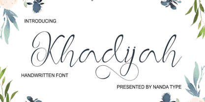 Khadijah is a classy and elegant modern calligraphy font. It can be used for various purposes, such as logos, wedding invitations, t-shirts, letterhead, signage, posters and more. It includes OpenType features including alternates, ligatures and multi-language support.
 - Florisa by limitype,
$10.00 Florisa is a typeface inspired by the unique shape of flower petals, which are made into unique letters. Florisa can be used for displays, headlines, logos etc. Florisa comes with capital letters, numbers and some symbols, and line version
 - DGS Art Deco Greek by dgsdesigns,
$10.00 DGS Art Deco Greek is a unique typeface breaking all boundaries available in Latin and Greek scripts. It can be used in a wide range of projects including invitations, theatre and cinematic productions, branding, logos , adverts and much more.
 - Lithos by Adobe,
$35.00Old Greek inscriptions were Carol Twombly's inspiration when she created Lithos, which appeared with Adobe in 1990. The alphabet is composed exclusively of capital letters, which can also be used as initials combined with other fonts, such as Caslon. - Saga Arjuna by Saxofont,
$18.00 Saga Arjuna is a modern, elegant and luxurious font with custom alternatives and multilingual support. With a strong desire and grace, it can be used as a logo and title. Great for books, product packaging, advertisements, brands and more.
 - Incompleeta by Rex Face,
$19.99 Incompleeta is a modern sans serif, display font. Removing structural elements from some of the characters results in some really interesting word forms. Incompleeta is a graphic designer�s best friend. It�s great for branding, headlines, and signage.
 - Grazia by Autographis,
$39.50 Grazia is a joining script with zero contrast. That means that I designed the line of the letters so, that they look equally thick all the time. The script is almost upright and has this 1930s look to it.
 - Black Stamp by Andrey Font Design,
$9.00 Black Stamp is a unique, strong, and original handwritten font. Natural and elegant, this font can be used on a wide variety of designs such as headlines, titles, headings, logos, branding, posters, invitations, books, and any other creative design.
 - More Deco Lettering JNL by Jeff Levine,
$29.00 Occasionally font projects are started, but then set aside for other designs and are subsequently forgotten for a while. Such is the case of More Deco Lettering JNL; a bold thick-and-thin sans modeled from vintage source material.
 - Tasty Matcha by Crumphand,
$20.00 Here is it, Tasty Matcha Fonts. Based on my favorite drink become a fonts called Tasty Matcha. The fonts looks good, stunning, great, ease reading. What's Included Inside The Fonts ? Uppercase Lowercase Symbols Numerals European Multilingual Thank You, Regards!
 - Gothic Special Normal Italic by Wooden Type Fonts,
$15.00 A revival of one of the popular wooden type fonts of the 19th century, suitable for text or display, short descenders, tall ascenders, the narrow, italic version, completing the Gothic Special family of 5 fonts in total, sans serif.
 - Cassella by Gassstype,
$29.00 Hello Everyone, introduce our new product Font Cassella This Is Quick Brush Font.This is a Textured Natural Style and classy style with a clear style and dramatic movement. You can activate 28 Ligatures and 22 Alternate glyphs OpenType panel.
 - Halena by Sakha Design,
$12.00 Halena is a modern and adaptable sans serif font. Suitable to a wide variety of designs due to its neat and simple style, this font has the potential to become your favorite go-to font, no matter the occasion!
 - Lovely Hydrillas by Letterhanna Studio,
$19.00 Lovely Hydrillas Font is a modern handwritten font loaded with 55 ligatures for that handwriting look. Lovely Hydrillas Script Font can be used for wedding invitations and wedding calligraphy, feminine or organic logos, small business branding, packaging, and more!
 - Minda Script by Nandatype Studio,
$13.00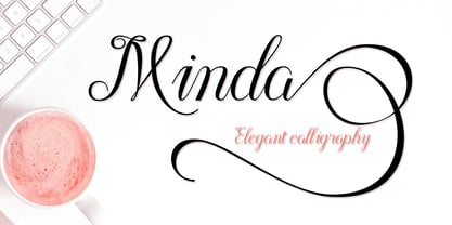 Minda is a classy and elegant modern calligraphy font. It can be used for various purposes, such as logos, wedding invitations, t-shirts, letterhead, signage, posters and more. It includes OpenType features including alternates, ligatures and multi-language support.
 - Juan by Hot Russian Pancakes,
$- Monospaced black slab-serif without any philosophy or idea, it doesn't pretend to be anything sophisticated, it is as simple as chewing gum or a can of soda. Simple and lively typeface Juan has a ascetic friend — Ivan typeface.
 - Linear Tektu by TeGeType,
$19.00 The basic idea of this type family was to keep the "ductus" of the fraktur calligraphy only. And to adapt it to draw a sans serif typography which still keep the magic rhythm and colour of the original letters.
 - Antisa Brush by Stripes Studio,
$20.00 Antisa Brush is a super casual hand brushed script with detailed brush stroke texture, and a quirky, Can be used for various purposes. such as the title, signature, letterhead, signage, labels, newsletters, posters, logos, correspondence, wedding invitations, badges, etc.
 - Atlantis by Solotype,
$19.95This is Solotype's alternative sans serif version of the once popular caps-only font Atlanta issued by the Central Type Foundry in St. Louis in 1885. As we often do, we have created a lowercase, adding to its versatility. - Nyack JNL by Jeff Levine,
$29.00 Nyack is a built-from-scratch sans serif font with both inline and solid versions. There's a touch of Art Deco to its design for a touch of past elegance, but its use is not limited to retro projects.
 - Green Mexican by Vozzy,
$10.00 Introducing a vintage look label font named "Green Mexican". You can see all available characters in the posters. This font has 4 styles. This font will look good on any retro design like poster, t-shirt, label, logo etc.
 - Yang by Wiescher Design,
$39.50 Yang is a new Sans typeface that has a little bit of Ying in it. This combination makes it a very versatile font. Just give it a try and you will see. Yours working on the "Ying", Gert Wiescher
 - Empire by Monotype,
$29.99Empire was originally designed in 1937. This version is an all-capitals face with tall condensed characters. The Empire font can be used for headlines and posters where space is tight, or where an empression of height is desired. - Babitta by Gassstype,
$27.00 Hello Everyone, introduce our new product Font Babitta This Is Fun Brush Font.This is a Textured Natural Style and classy style with a clear style and dramatic movement. You can activate 23 Ligatures and 4 Alternate glyphs OpenType panel.
 - Milonia by Khoir,
$15.00 Milonia - Serif font that prioritizes beauty with beautiful letter shapes and beautiful tails, has many alternative font choices that can support your design to be perfect. What's included? Uppercase Characters Lowercase Characters Support 75+ Language 87 Alternative FEATURES Milonia
 - PR Valendoodle 01 by PR Fonts,
$14.00 This is a romantic set of ornaments inspired by Valentine’s Day. It includes calligraphic flourishes which include heart shapes, and many that can be combined to form heart shapes, as well as images of hearts, roses, and cupid’s arrows.
 - Showmanship JNL by Jeff Levine,
$29.00 Despite the racially demeaning 1906 sheet music for "The Ghost of the Banjo Coon", the title's lettering provided an interesting hand-lettered sans serif that has been re-drawn digitally as Showmanship JNL in both regular and oblique versions.
