5,505 search results
(0.022 seconds)
- Swiss 721 by Bitstream,
$29.99 Swiss 721™ is a sans serif family that ranges in style from thin to black while mixing in a few unexpected, but beautifully made and ironically flattering, outline weights that spice up the grotesque design. Couple these upstanding letterforms with matching italic styles and you have yourself a beautiful tool that is as legible on screen as it is off, has the technical prowess to conquer even the trickiest of design riddles and will work in a myriad of projects. Swiss 721 is a staple sans serif that you’ll never be sorry you have in your library. It’s been said that a simple sans serif is one of the most difficult typefaces to design. This is because when letters are reduced to their most basic details, irregularities and inconsistencies in design become immediately visible. The Swiss 721 typeface family is a quintessential example of letterforms distilled to their essence while still possessing warmth and verve. Based on mid-century sans serif typefaces, Swiss 721 is a versatile family of weights and proportions ideally suited to a wide variety of print and interactive design projects and is equally at home as headlines on billboards as it is navigation content on small screens. Swiss 721 takes the essence of mid 20th century sans serif typefaces and melds it with modern design consistency and a systematic weight range.
 - Sultan by Canada Type,
$24.95Sultan is a revival and expansion of a 1954 Matrin Kausche typeface called Mosaik. This design highlights the unmistakable Arabic/Moorish calligraphy influence on Celtic lettering, by way of the highly active Andalusian culture from the ninth century until the crusades in the early eleventh century. Although Celtic lettering evolved on its own and prompted different calligraphic styles after the crusades, elements of the Arabic influence survived with it, its appeal remaining evident to this very day. For instance, this kind of lettering is very similar to the one Louis Tiffany used to make the most recognizable athletic insignia in North America - the New York Yankees logo, which is now over 110 years old, and has inspired hundreds of spin-offs in many athletic and non-athletic fields all over the world. The original character set made by Kausche was quite minimal, consisting of only numerals and uppercase letters along with a few alternates. But in this digital version the set has been considerably expanded into uppercase, lowercase, numerals, punctuation, a complete set of accented characters, and more than 15 alternate letters built into the font. Sultan is a great font choice particularly for design contexts of fantasy, middle ages legend, mystical and new age content, pirate literature, and Irish history. But it is also an excellent all-purpose display and poster font in general. - Porte by Groteskly Yours,
$18.00 - Unique Modernist Look - 590+ characters per font - Standard & Discretionary Ligatures - Multiple Stylistic Sets - Old Style Figures - Case-Sensitive Punctuation - Multilingual - Cyrillic Included - Uppercase + Lowercase Porte is an elegant sans serif font inspired by stone carving and modernist typefaces of early 20th century. While at its core Porte is a display font, it can also be used for larger bodies of text and in a variety of projects. Thanks to its unique proportions and feel Porte is reminiscent of early 20th century type, wherein aesthetic qualities often overweighed matters of practicality and applicability. Porte is at once delicate and sturdy, subtle and unyielding. Porte is very OpenType friendly, boasting an awesome selection of useful OpenType features, precise and exhaustive kerning (around 1000 pairs) and lots of discretionary ligatures to make your designs look amazing. A selection of wider and narrower alternate glyphs allow the designer to modify the rhythm of the typeface, extending its application and impact. With 590+ characters on board, Porte supports all major Latin based languages as well as a number of Cyrillic languages. Porte received its first major update in fall 2022. Not only was the character set expanded considerably, but also some glyphs were re-drawn to fix visual inconsistencies, and a large number of stylistic alternates was added. The kerning, too, was re-done to accommodate new letterforms. Trials available upon request.
 - Jannon Pro by Storm Type Foundry,
$55.00 The engraver Jean Jannon ranks among the significant representatives of French typography of the first half of the 17th century. From 1610 he worked in the printing office of the Calvinist Academy in Sedan, where he was awarded the title "Imprimeur de son Excellence et de l'Academie Sédanoise". He began working on his own alphabet in 1615, so that he would not have to order type for his printing office from Paris, Holland and Germany, which at that time was rather difficult. The other reason was that not only the existing type faces, but also the respective punches were rapidly wearing out. Their restoration was extremely painstaking, not to mention the fact that the result would have been just a poor shadow of the original elegance. Thus a new type face came into existence, standing on a traditional basis, but with a life-giving sparkle from its creator. In 1621 Jannon published a Roman type face and italics, derived from the shapes of Garamond's type faces. As late as the start of the 20th century Jannon's type face was mistakenly called Garamond, because it looked like that type face at first sight. Jannon's Early Baroque Roman type face, however, differs from Garamond in contrast and in having grander forms. Jannon's italics rank among the most successful italics of all time – they are brilliantly cut and elegant.
 - Garnet by Ksenia Belobrova,
$19.00 Garnet as a modern font kit inspired by fonts and calligraphy of XX centure. It includes Capitals (6 Styles) and Script so you can combine them as you like. Geometric Sans + Handwritten Script is a modern and fresh looking combination which can be used for many tasks. Garnet is good for headlines, posters, packaging, book covers, cards and as a starting point for logotypes.
 - Hero Sandwich Ingredients by Comicraft,
$19.00 As comic book readers know all too well, team ups are every super hero’s bread and butter... when the brave and the bold are in a pickle, and super villains are running onion rings around them, here’s how they roll: They Meat! They Team-Up with your taste buds! They Fight Hunger! Yes, some hero combos may get along better than others, but they are always more powerful together. So take a footlong bite out of crime, and make the subways safe again with our mouthwatering HERO SANDWICH! Prepared with plastic gloves on by those awfully nice chaps at the Comicraft deli. Anyway you slice it, these five Ingredients can be layered to generate a Hero Sandwich with the carbs and protein you need to deliver a knuckle sandwich to the bulking agents of your deadliest foes! See these families related to Hero Sandwich Ingredients: Hero Sandwich Combos Hero Sandwich Pro
 - SandWriting by Scholtz Fonts,
$21.00One of my earliest memories of being able to write - an exciting skill - was of writing with my finger in the fine soft sea sand. I remember the freedom - I had no fear of making mistakes, of smudging ink or of doing anything wrong - and the ease with which I could write or wipe out any thing in the sand. Designing SandWriting was a tribute to those early memories. The font was an attempt to capture the simplicity and ease of a finger effortlessly making its mark in the sand. It can be used in many ways: in menus and invitations, in newsletters and advertisements, and in scrapbooks and brochures. It might be particularly useful for written material aimed at younger people. SandWriting contains all upper and lower case characters, all punctuation and special characters as well as all accented and standard European characters. - Hero Sandwich Combos by Comicraft,
$19.00 As comic book readers know all too well, team ups are every super hero’s bread and butter... when the brave and the bold are in a pickle, and super villains are running onion rings around them, here’s how they roll: They Meat! They Team-Up with your taste buds! They Fight Hunger! Yes, some hero combos may get along better than others, but they are always more powerful together. So take a footlong bite out of crime, and make the subways safe again with our mouthwatering HERO SANDWICH! Prepared with plastic gloves on by those awfully nice chaps at the Comicraft deli. If you're an avenging hero on the go, have no fear, we've pre-assembled these eight classic Hero Sandwich Combos! Because choosing your fillings shouldn't get in the way of knocking out a supervillain’s fillings. See these families related to Hero Sandwich Combos: Hero Sandwich Ingredients Hero Sandwich Pro
 - Widdershins by Hanoded,
$15.00 I like strange words. Widdershins is one of them: it means ‘to go counter clockwise’ and I picked it up from a book I am reading at the moment. Widdershins font was created using a broken bamboo satay skewer and Chinese ink. It is a little messy, uneven and maybe even unnerving, but I am sure you’ll find a way to put it to good use.
 - Ornata D by Wiescher Design,
$39.50 Ornata D is the fourth of a series of old ornaments that I am trying to save from oblivion. I am completely redesigning the ornaments from scratch, trying in this one to keep the rough "letterpress" character. These ornaments have been first designed by Auriol around 1910. This set is perfect to design a great number of frames. Your digitizing type-designing savior, Gert Wiescher
 - Deco Metro by Greater Albion Typefounders,
$20.00 Deco Metro is a 1920s and 30s inspired display family, ideal for posters, banners, book covers and other promotional work. Two weights, regular (with an incised centre line) and bold (without the centre line) are offered. The family has an extensive range of features including discretionary ligatures, old-style numerals, Swash Letter and numeral forms, small capitals, Roman numerals and fractions.
 - Vendetta by Emigre,
$69.00 The famous roman type cut in Venice by Nicolas Jenson, and used in 1470 for his printing of the tract, De Evangelica Praeparatione, Eusebius, has usually been declared the seminal and definitive representative of a class of types known as Venetian Old Style. The Jenson type is thought to have been the primary model for types that immediately followed. Subsequent 15th-century Venetian Old Style types, cut by other punchcutters in Venice and elsewhere in Italy, are also worthy of study, but have been largely neglected by 20th-century type designers. There were many versions of Venetian Old Style types produced in the final quarter of the quattrocento. The exact number is unknown, but numerous printed examples survive, though the actual types, matrices, and punches are long gone. All these types are not, however, conspicuously Jensonian in character. Each shows a liberal amount of individuality, inconsistency, and eccentricity. My fascination with these historical types began in the 1970s and eventually led to the production of my first text typeface, Iowan Old Style (Bitstream, 1991). Sometime in the early 1990s, I started doodling letters for another Venetian typeface. The letters were pieced together from sections of circles and squares. The n, a standard lowercase control character in a text typeface, came first. Its most unusual feature was its head serif, a bisected quadrant of a circle. My aim was to see if its sharp beak would work with blunt, rectangular, foot serifs. Next, I wanted to see if I could construct a set of capital letters by following a similar design system. Rectangular serifs, or what we today call "slab serifs," were common in early roman printing types, particularly text types cut in Italy before 1500. Slab serifs are evident on both lowercase and uppercase characters in roman types of the Incunabula period, but they are seen mainly at the feet of the lowercase letters. The head serifs on lowercase letters of early roman types were usually angled. They were not arched, like mine. Oddly, there seems to be no actual historical precedent for my approach. Another characteristic of my arched serif is that the side opposite the arch is flat, not concave. Arched, concave serifs were used extensively in early italic types, a genre which first appeared more than a quarter century after roman types. Their forms followed humanistic cursive writing, common in Italy since before movable type was used there. Initially, italic characters were all lowercase, set with upright capitals (a practice I much admire and would like to see revived). Sloped italic capitals were not introduced until the middle of the sixteenth century, and they have very little to do with the evolution of humanist scripts. In contrast to the cursive writing on which italic types were based, formal book hands used by humanist scholars to transcribe classical texts served as a source of inspiration for the lowercase letters of the first roman types cut in Italy. While book hands were not as informal as cursive scripts, they still had features which could be said to be more calligraphic than geometric in detail. Over time, though, the copied vestiges of calligraphy virtually disappeared from roman fonts, and type became more rational. This profound change in the way type developed was also due in part to popular interest in the classical inscriptions of Roman antiquity. Imperial Roman letters, or majuscules, became models for the capital letters in nearly all early roman printing types. So it was, that the first letters in my typeface arose from pondering how shapes of lowercase letters and capital letters relate to one another in terms of classical ideals and geometric proportions, two pinnacles in a range of artistic notions which emerged during the Italian Renaissance. Indeed, such ideas are interesting to explore, but in the field of type design they often lead to dead ends. It is generally acknowledged, for instance, that pure geometry, as a strict approach to type design, has limitations. No roman alphabet, based solely on the circle and square, has ever been ideal for continuous reading. This much, I knew from the start. In the course of developing my typeface for text, innumerable compromises were made. Even though the finished letterforms retain a measure of geometric structure, they were modified again and again to improve their performance en masse. Each modification caused further deviation from my original scheme, and gave every font a slightly different direction. In the lower case letters especially, I made countless variations, and diverged significantly from my original plan. For example, not all the arcs remained radial, and they were designed to vary from font to font. Such variety added to the individuality of each style. The counters of many letters are described by intersecting arcs or angled facets, and the bowls are not round. In the capitals, angular bracketing was used practically everywhere stems and serifs meet, accentuating the terseness of the characters. As a result of all my tinkering, the entire family took on a kind of rich, familiar, coarseness - akin to roman types of the late 1400s. In his book, Printing Types D. B. Updike wrote: "Almost all Italian roman fonts in the last half of the fifteenth century had an air of "security" and generous ease extremely agreeable to the eye. Indeed, there is nothing better than fine Italian roman type in the whole history of typography." It does seem a shame that only in the 20th century have revivals of these beautiful types found acceptance in the English language. For four centuries (circa 1500 - circa 1900) Venetian Old Style faces were definitely not in favor in any living language. Recently, though, reinterpretations of early Italian printing types have been returning with a vengeance. The name Vendetta, which as an Italian sound I like, struck me as being a word that could be taken to signifiy a comeback of types designed in the Venetian style. In closing, I should add that a large measure of Vendetta's overall character comes from a synthesis of ideas, old and new. Hallmarks of roman type design from the Incunabula period are blended with contemporary concerns for the optimal display of letterforms on computer screens. Vendetta is thus not a historical revival. It is instead an indirect but personal digital homage to the roman types of punchcutters whose work was influenced by the example Jenson set in 1470. John Downer.
 - Red Star Line NF by Nick's Fonts,
$10.00A 1926 travel brochure for a steamship line provided the basis for this darkly sparkly spritely font. Smooth curves and an off-center inline treatment gives this typeface a strong architectural feel. - AZ Clouds by Artist of Design,
$20.00 AZ Clouds was inspired from a need to develop a sans serif typeface with center accents for a t-shirt design. This font was designed for use as a fun bold headline.
 - Selectric by Indian Summer Studio,
$55.00 Selectric typewriter font. The part of the large, many years project on revival and further development (over 1000 glyphs) of the 20th century’s most famous typewriter Selectric golfball fonts, lost for many decades, not being created since then in digital vector form.
 - MoreLeaves by Ingrimayne Type,
$14.95 In 1990 I designed the font XLeafMeAlone. In 2006 I decided that it was time to improve it. Instead of adding to it, I created two new fonts containing almost 200 leaves: MapleOaks and More Leaves. Among the leaves you will find in MoreLeaves are elm, cottonwood, tulip tree, ash, hickory, locust, ginko, aspen, sassafras, hawthorn, beech, and birch. There are also a few that come from shrubs and I am not sure what they are, but they looked interesting so I put them in. You will not find oaks, maples, or sycamores--they are in MapleOaks. Why leaves? Because people like them. As a large part of the biological world that is all around us, leaves are fascinating in their shapes and endless variations. In XLeafMeAlone I took about 50 shapes and rotated them 180 degrees to give a typeface with approximately 100 glyphs. In each of these two typefaces, MoreLeaves and MapleOaks, there are almost 100 glyphs. Each of those glyphs is rotated in 90-degree increments to yield two families of four typefaces that should be very useful if one wants to create borders of leaves.
 - Square Beat by Hanoded,
$15.00 After a lot of time sitting at my desk, creating fonts and trying to figure out how my new software works, I really like to work out a bit. The only thing that I do not like is the music they play at the gym; it is usually a selection of poppy tunes that appeals to a large audience. But not to me. I prefer my death metal - and eighties music, as it brings back a lot of good memories. So, I bought myself some ear buds and installed a music streaming app on my phone. Yes, I know, I am probably the last person on earth who discovered streaming... One day, during a workout session, I listened to a list of eighties music and one song that I had forgotten about started playing: Rappers Delight by The Sugarhill Gang. When I started working on the font, I had to think about the song and named it Square Beat. Square Beat font, other than the name implies, is a rounded, handmade font, ideally suited for books and magazines aimed at a young audience, toy packaging or posters. It comes with great language support, including Vietnamese.
 - ITC Werkstatt by ITC,
$29.99ITC Werkstatt is a result of the combined talents of Alphabet Soup's Paul Crome and Satwinder Sehmi, along with Ilene Strizver and Colin Brignall. It is inspired by the work of Rudolph Koch, the renowned German calligrapher, punchcutter, and type designer of the first third of this century, without being based directly on any of Koch's typefaces. Werkstatt has obvious affinities with the heavy, woodcut look of Koch's popular Neuland, but also with display faces like Wallau and even the light, delicate Koch Antiqua. Brignall began by drawing formal letters with a 55mm cap height, which Sehmi reinterpreted using a pen with a broad-edge nib. “Not an easy process,” says Brignall, “since one of the features of Koch's style is that while it was calligraphic in spirit, most of the time his counter shapes did not bear any resemblance to the external shapes, as they would in normal calligraphy. This meant that Sehmi could not complete a whole character in one go, but had to create the outside and inside shapes separately and then ink in the center of the letters.” The process was repeated, only without entirely filling in the outlines, for the Engraved version. Crome handled the scanning and digitization, maintaining the hand-made feel while creating usable digital outlines. “The collaboration of artisans with particular skills,” says Brignall, “in a modern-day, computer-aided studio environment, seems very much in step with the 'workshop' ethos that Rudolph Koch encouraged and promoted so much.” - Hermann by W Type Foundry,
$29.00 Hermann is one of our most readable typefaces so far. Since last year, the W Design team had been examining closely the possibility of developing a text font. Thus, we dug into concepts within some of our favorite novels, such as The Steppenwolf and Brave New World, written by Hermann Hesse and Aldous Huxley respectively. Ideas like duality, surrealism, and wildness mainly appeared. With these concepts in mind, we analyzed carefully the typefaces used in both Hesse’s and Huxley’s creations; Sabon and Garamond showed up catching our attention and, of course, awakening our admiration. Consequently, the challenge was to combine the key features of these fonts with the concepts already identified. At first, we made a text font which was suitable to compose long texts. However, we realized that we needed to refine some characteristics to convey all the ideas. A full set of capital discretionary ligatures was designed, which convert Hermann in a display font when is required. We also designed swashes (from A-Z) and final forms (in letters h, k, m, n, r and x in romans, and in letters a, d, e, h, i, l, m, n, r, t, u, x and z in italics), conveying more dynamism and versatility when it comes to composing visually. Hermann was designed not only to be accurate in terms of legibility but also to be wild and bold. That is why we took a big leap and designed from the beginning a font that is inspired by the world of 20th-century novels, using the name of one of its greatest exponents, Hermann Hesse.
 - UCT Found Receipt by uppercaseTYPE,
$12.99Inspired by the idea of found paper objects, this font centers around a strict grid. Combining dot-matrix printers with subtle serifs, it combines old and new. Recommended usage is as a display font. - Beanstalker by Hanoded,
$15.00 I’m not particularly fond of beans. I do eat them, but they’re not my idea of a delicacy… But this font has ‘fairy tale’ feeling to it, and I liked the name Beanstalker. Beanstalker is a hand made font (I used a fineliner to draw the glyphs). It is quite neat and organized, but does come with some rough edges and a bit of texture.
 - Heibird by Letterena Studios,
$17.00 Heibird is a bold and elegant serif font. It looks gorgeous and stylish and it will most certainly enhance a large range of designs. This font is PUA encoded which means you can access all of the glyphs and swashes with ease! This typeface is perfect for an elegant & luxury logo, book or movie title design, fashion brand, magazine, clothes, lettering, quotes, and so much more.
 - Fendysa by Stringlabs Creative Studio,
$25.00 Fendysa is a script font with beautiful romantic calligraphy style. Whether you’re looking for fonts for calligraphy scripts for DIY projects, Styll Love will turn any creative idea into a true piece of art! This font is PUA encoded which means you can access all of the cute glyphs with ease! It also features a wealth of special features including stylistic alternate glyphs and ligatures.
 - Lets get crazy by Pedro Teixeira,
$14.00 Let's get crazy is a font inspired by modern lettering and calligraphy with pronounced swashes, ascending / descending and crazy ear in "r" (btw you have more ordinary alternates) and so on, challenging the boundaries of reasonable. This font is good for titles or short sentences in combo with Let's get crazy sans serif majuscule letters, giving you a nice pairing of the modern lettering.
 - Loving me by Letterara,
$12.00 Loving me is a new, fresh, sweet, and quirky handmade font. It’s ideal for branding and decorate your projects. Loving me font has a classy, and modern look that can be used for logos, branding, invitations, poster, advertising, stationery, wedding designs, social media posts, and much more! It is PUA encoded which means you can access all of the glyphs and swashes with ease!
 - Flawless Valentines by Aldedesign,
$25.00 Flawless Valentines is a beautiful and light handwritten font. Its unique feel and stunning impact will add a luxury spark to any design project you wish to create! This font is PUA encoded, which means you can access all of the amazing glyphs and ligatures with ease! Each Font Has: Stylish modern handwritten script Beautiful Swash (Ending tail) Beautiful Titling (Beginning tail) Special Ligatures Multilingual Support
 - Honey Butterfly by Illushvara,
$15.00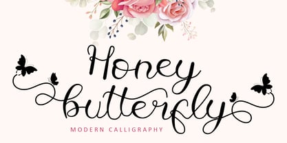 Honey Butterfly is a beautiful handwritten font. It has a classy, elegant, and modern look which can be used for logos, branding, invitations, stationery, wedding designs, social media posts, and much more.This font is PUA encoded which means you can access all of the butterfly-themed glyphs and swashes with ease! It also features a wealth of special features including alternate glyphs and ligatures.
 - Poster by MP&A,
$22.00 Poster is the first type created by this team. Its an experiment. This geometric typeface is based on bold and clean rounded rectangles. It’s soft and friendly look lends itself to a number of applications. It´s a good choice for company logotypes, magazine headlines and, of course, posters applications. This font was designed to be used in large sizes, so you can appreciate the little details.
 - Battle Cry by Comicraft,
$19.00 As Titans Clash in The Final Battle of Good versus Evil, Man versus Machine, God versus Mortal and Coke versus Pepsi, ace lettering artist, Ferran Delgado from Spain teams up with our very own John ‘JG’ Roshell for one last attack on the assembled Cover Lettering Styles of Yore. Fill your lungs and prepare for... BATTTTTTLECRRRRRYYYYYYYYYYY! See the families related to Battle Cry: Battle Scarred & Battle Damaged .
 - Sharland by Heinzel Std,
$13.00 Sharland is a beautiful and refined script font. It has a classy, elegant, and modern look that can be used for logos, branding, invitations, stationery, wedding designs, social media posts, and much more! This font is PUA encoded which means you can access all of the amazing glyphs and ligatures with ease! Fall in love with this font and bring your projects to the highest levels!
 - Brillianissa by Letterara,
$14.00 Brillianissa is an enchanting handwritten font. This versatile script font has a wide spectrum of applications ranging from greeting cards, logos to headlines and is guaranteed to add a romantic or casual feel to your next project. Add it confidently to your projects, and you will love the results. This font is PUA encoded which means you can access all the beautiful glyphs and swashes with ease!
 - Cristiano by Stefani Letter,
$12.00 Cristiano is a minimalist script font designed with an incredibly modern, beautiful feel and elegant. Fall in love with its incredibly versatile style and use it to create gorgeous wedding invitations, beautiful stationary art, eye-catching social media posts, and much more! This font is PUA encoded which means you can access all of the cute glyphs with ease! It also features a wealth of including ligatures.
 - Agitha by Awan Senja,
$14.00 Agitha is a lovely, round lettered handwritten font. This font is PUA encoded which means you can access all of the glyphs and swashes with ease! It features a varying baseline, smooth lines, gorgeous glyphs and stunning alternates. Fall in love with its incredibly versatile style and use it to create gorgeous wedding invitations, beautiful stationary art, eye-catching social media posts, and much more!
 - Glorando by Letterena Studios,
$10.00 Proudly present Glorando Typeface, created by Story type, A serif modern and classic typeface that has its own unique style & modern look. This typeface is perfect for an elegant & luxury logo, book or movie title design, fashion brand, magazine, clothes, lettering, quotes, and so much more. This font is PUA encoded which means you can access all of the glyphs and swashes with ease!
 - Miya Mine by Arunatype,
$15.00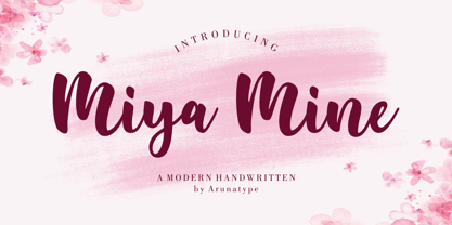 Miya Mine is a sleek and unique handwritten font, carefully crafted with a touch of creativity. Great for product packaging, branding projects, magazine covers, social media, weddings, or simply used to express words over a background. This font is made for those who need a beautiful and refreshing look. This font is PUA encoded, which means you can access all of the glyphs and swashes with ease!
 - Kathira by Awan Senja,
$14.00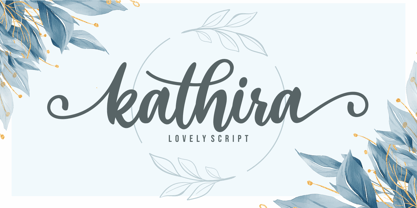 Kathira is a lovely script font. It has a modern and elegant look and is perfect for logos, branding, invitations, photography, wedding stationary, labels, and every other design which needs an unique and luxurious touch. This font is PUA encoded which means you can access all of the cute glyphs and swashes with ease! It also features a wealth of special features including alternate glyphs and ligatures.
 - Rolling Beat by Letterara,
$16.00 Rolling Beat is a bold script font, carefully handcrafted to become a true favorite. Its casual charm makes it appear wonderfully down-to-earth, readable, and, ultimately, incredibly versatile. This font will look outstanding in any context, whether it’s being used on busy backgrounds or as a standalone headline! This font is PUA encoded which means you can access all of the glyphs and swashes with ease!
 - Kuzimy by Twinletter,
$15.00 Introducing kuzimy Arabic style font. With this, Font lets you create designer-quality designs with ease. You will get a variety of styles for your project. They come in upper and lower case and alternate with different shapes. You will be able to easily create professional designs with an Arabic Style theme. This font gives you the best results when used in your projects.
 - Bravecho by ahweproject,
$10.00 Bravecho is a highly detailed and distinct display font. Use this serif display font to add any design idea you can think of! Masterfully designed to become a true favorite, this font has the potential to bring each of your creative ideas to the highest level! This font is PUA encoded which means you can access all of the glyphs and swashes with ease!
 - Allofera by Stefani Letter,
$12.00 Allofera is a beautiful script font designed with an incredibly modern feel. Whether you’re looking for fonts for Instagram or calligraphy scripts for DIY projects, Styll Love will turn any creative idea into a true piece of art! This font is PUA encoded which means you can access all of the glyphs and swashes with ease! It features a varying baseline, gorgeous glyphs, and stunning alternates.