10,000 search results
(0.03 seconds)
- Kathaline by Fikryal,
$15.00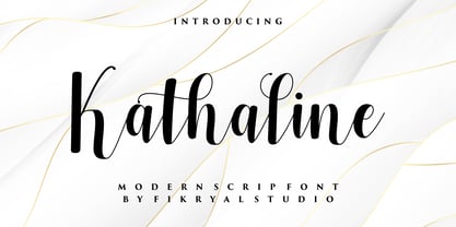 Kathaline is a natural script font perfect for crafting, branding, invitation, stationery, wedding designs, social media posts, advertisements, product packaging, product designs, label, photography, watermark, special events, or anything. Kathaline comes with full set of uppercase and lowercase letters, alternates, ligatures,multilingual symbols, numerals and punctuation.
 - Bastery by Multype Studio,
$13.00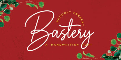 Bastery is a handwritten script font that contain uppercase, lowercase, symbol, number, ligature, and also support multi language. Bastery is perfect for photography, watermark, social media posts, advertisements, logos & branding, invitation, product designs, label, stationery, wedding designs, product packaging, special events or anything that need handwriting taste.
 - Halloween Day by Goodigital13,
$20.00 These font can be used in web design and apps as well as in booklet, posters, or any other printed matter. Halloween, is a display spooky feel font. It’s suitable for dark and Halloween theme. Such as a Poster, Logotype, Social Media Promotion, Merchandise or Crafter.
 - Dearlove by Fikryal,
$16.00 Dearlove is a beautiful calligraphy font perfect for crafting, branding, invitation, stationery, wedding designs, social media posts, advertisements, product packaging, product designs, label, photography, watermark, special events or anything. Dearlove comes with full set of uppercase and lowercase letters, swash alternates, ligatures,multilingual symbols, numerals and punctuation.
 - Calligramy by IbeyDesign,
$16.00 Calligramy Calligraphy Script Font is a unique stylish calligraphy font. It’s perfect for adding a personal charm to your photography, watermarks, social media posts, advertisements, logos & branding, invitations, product designs, labels, stationery, wedding designs, product packaging, special events, or anything that need calligraphy or handwriting taste.
 - Yellow Spring by Sakha Design,
$10.00 Yellow Spring is a fresh and vibrant handwritten font that radiates a cheerful and youthful energy. Its organic and imperfect shapes create a natural and authentic look, making it perfect for logos, social media graphics, and packaging designs that aim to convey a fun and friendly vibe.
 - Toykids by Sakha Design,
$10.00 Toykids is a playful and stylish font with a youthful spirit. Is suitable for both professional-looking projects such as branding designs, labels, websites, and business cards as well as casual designs like packaging, posters, flyers, quotes, social media posts, invitations, and special occasions cards, etc
 - The "Burgundian" font, created by Altsys Metamorphosis, embodies a distinctive blend of historical allure and modern craftsmanship, making it a fascinating subject in the realm of typography. This fo...
- Terfens Contrast by insigne,
$35.00 Terfens draws influence from chancery scripts, updating it for the twenty-first century. Terfens Contrast is derived from Terfens' DNA and retains its humanist tone. It’s tall x-height gives it a friendly but not informal feel. With Terfen Contrast, calligraphy-inspired letterforms are rendered with a high contrast nib, lending raw vitality and expressivity. This juxtaposition gives the letters a sense of firmness and energy, but also of heavenly, delicate beauty. Terfens is a full-service branding and packaging solution, containing a lot of personality, combining the passion of a broad nib pen with the beauty of a brush. Terfens is a "workhorse typeface" comprising 48 typefaces in three widths and eight weights. There are ligatures and swashes in all weights, as well as support for more than 72 languages. Another powerful typeface to add to your collection of eye-catching fonts. Terfens draws influence from chancery scripts, updating it for the twenty-first century. Terfens Contrast is derived from Terfens' DNA and retains its humanist tone. It’s tall x-height gives it a friendly but not informal feel. With Terfen Contrast, calligraphy-inspired letterforms are rendered with a high contrast nib, lending raw vitality and expressivity. This juxtaposition gives the letters a sense of firmness and energy, but also of heavenly, delicate beauty. Terfens is a full-service branding and packaging solution, containing a lot of personality, combining the passion of a broad nib pen with the beauty of a brush. Terfens is a "workhorse typeface" comprising 48 typefaces in three widths and eight weights. There are ligatures and swashes in all weights, as well as support for more than 72 languages. Another powerful typeface to add to your collection of eye-catching fonts. • Recommended uses: modern branding and logo design, powerful editorial design, exciting packaging, and a wide range of additional jobs. • 54 font styles, including eight weights, eight italics, and three widths. • Each weight has 500+ glyphs. Useful Opentype features include: Access All Alternates, Discretionary Ligatures, Denominators, Fractions, Kerning, Standard Ligatures, Lining Figures, Numerators, Oldstyle Figures, Ordinals, Scientific Inferiors, Subscript and Superscript.
 - Lust Stencil by Positype,
$39.00 When you hear that name, you likely ask yourself, ‘why?!’ I did too, but the number of requests could not be ignored. Once I finally decided to move forward with it, the only way to solve the offering would be to adhere to the same theme of indulgence, I planned for the same number of optical weights AND Italics. Yeah, italic stencils… ok, why not? It’s not a new concept. One thing to note and a creative liberty I assumed during the design. Lust Stencil would not be just a redaction or removal of stress to produce a quick stencil. To do that, would just be a cheap solution. Strokes had to resolve themselves correctly and/or uniquely to the concept of the stencil format. And, it had to be heftier. For it it to look correctly, it needed about 8% additional mass to the strokes for it to retain the effervescent flow of the curves and the resolute scalloped lachrymals. The Lust Collection is the culmination of 5 years of exploration and development, and I am very excited to share it with everyone. When the original Lust was first conceived in 2010 and released a year and half later, I had planned for a Script and a Sans to accompany it. The Script was released about a year later, but I paused the Sans. The primary reason was the amount of feedback and requests I was receiving for alternate versions, expansions, and ‘hey, have you considered making?’ and so on. I listen to my customers and what they are needing… and besides, I was stalling with the Sans. Like Optima and other earlier high-contrast sans, they are difficult to deliver responsibly without suffering from ill-conceived excess or timidity. The new Lust Collection aggregates all of that past customer feedback and distills it into 6 separate families, each adhering to the original Lust precept of exercises in indulgence and each based in large part on the original 2010 exemplars produced for Lust. I just hate that it took so long to deliver, but better right, than rushed, I imagine. It would have taken even longer if not for font engineer and designer, Potch Auacherdkul. Thanks Potch.
 - Noad Sans by Groteskly Yours,
$60.00 Noad Sans is an experimental sans serif typeface with a strong character and some very unique visual features. At the core of Noad Sans is a sturdy sans serif with closed apertures and fairly simple letterforms. The defining feature of Noad Sans, however, is its visualised nodes: all control points of Bézier curves in each of the fonts in the family are intentionally visualised. The effect of this feature is largely defined by the usage: in titles and larger bodies of text, the visualised nodes stand out and create a rhythmic pattern of their own. In smaller sizes, the sans serif base of the font becomes more prominent and the nodes create a visual fuzz. Noad Sans comes in 6 styles and as a Variable Font with two axes–Optical Size and Slant. The size of each node can be changed from the smallest (Mini and Mini Italic) to the largest (Extra and Extra Italic). Variable Font technology allows you to fine tune the size of the nodes and the slant angle, so that your version of Noad Sans can be truly unique. Noad Sans has a large character set of 570+ glyphs, covering the vast majority of Latin based languages. In addition to that there are dozens of special characters, punctuation, numbers, and symbols. Noad Sans is equipped with a number of useful OpenType features, such as Case-Sensitive Punctuation, Stylistic Alternates, Ligatures, Fractions and many more. Noad Sans began as an experimental project, and during its development the spirit of experimentation was at the heart of the project. Thanks to the unique nature of the typeface, it can feel at home in a variety of settings: from web development, graphic and product design to more novel uses like 3D and NFTs. Noad Sans type family includes 6 static fonts (Mini, Mini Italic, Regular, Regular Italic, Extra and Extra Italic) and one variable font. Each style can be purchased separately. There is a free trial version of Noad Sans that can be downloaded free of charge on MyFonts. For more information on the typeface, feel free to download Noad Sans PDF Specimen.
 - Bomberg Display Serif by iframe,
$32.00 Bomberg Display Serif Font Immerse yourself in the world of art and typography with Bomberg Serif Font by iframe type foundry. Inspired by the legendary David Bomberg's iconic painting, "The Mud Bath." Just as Bomberg's brush strokes conveyed raw emotion and creativity, our font captures that very essence in each meticulously crafted letterform. With Bomberg Serif Font, your designs transcend the ordinary, taking on a unique and expressive character. Like the vivid colors of "The Mud Bath," our font injects vibrancy and depth into your projects. Whether you're a designer seeking to infuse artistic flair or an artist searching for the perfect typographic medium, this font lets you channel the spirit of Bomberg's masterpiece into your work. Unleash your creativity, tell your story, and make your designs a work of art with Bomberg Serif Font. Explore the intersection of artistry and typography today! Design by iframefonts.com
 - Ciutadella Slab by Emtype Foundry,
$69.00 The family keeps growing, Ciutadella Slab is the ‘serif’ counterpart of the popular Ciutadella font. The former alternate characters like 'a', 't' and '&' are now the default ones (and the former default characters are now the alternates), giving way for a typeface more suitable for texts. Thus, the new Ciutadella Slab is not only a great headline family, it will also work in texts of intermediate length and size. Especially appropriate for magazines, brochures or branding. This new addition provides even more versatility to the family started with Ciutadella and Ciutadella Rounded. It is available in Open Type format and includes Alternate Characters, Ligatures, Tabular Figures, Fractions, Numerators, Denominators, Superiors and Inferiors. It supports Central and Eastern European languages. As the sans version, the type family consists of 10 styles, 5 weights (Light, Regular, Medium, SemiBold and Bold) plus italics. For more details see the PDF.
 - Tanger Serif by Typolar,
$72.00 Inspired by New Transitional and Egyptian fonts, Tanger Serif has elements of a sturdy work-horse text face and finely detailed headline font. A wide variety of widths and weights support many text sizes. Typically Narrow is used in headlines, Medium in body and Wide in smaller print. Nothing is predefined, though. By combining the right widths with the right weights this traditional approach can easily be challenged. Let’s take an oversized (over 10 pt) body copy for instance. In conjunction with using a bigger size to enhance readability, a narrow and slightly lighter weight will save space and brighten text color. Tanger Serif Narrow is a slim normal rather than a condensed face. As an Open Type “Pro” font each weight includes an expanded character set, small caps, old style figures, tabular figures, ligatures, fractions etc. All these are easily accessible through OpenType features.
 - Valentina SG by Spiece Graphics,
$39.00 Here’s what happens when your trusty felt tip marker takes a trip to cartoonland. Each of Valentina’s plump characters has a rough and splotchy texture. Some letters even bounce up and down like a 3-year old. As cartoon faces go, Valentina is a bit on the imperfect side. But that’s normal for a funny face. Use it in a variety of comical situations. Make convincing captions under your own artwork or design greeting cards with it. You can even blow it up to huge sizes to create a wild and crazy look. Valentina Medium is now available in the OpenType Std format. Some new characters have been added to this OpenType version as stylistic alternates. This advanced feature works in current versions of Adobe Creative Suite InDesign, Creative Suite Illustrator, and Quark XPress. Check for OpenType advanced feature support in other applications as it gradually becomes available with upgrades.
 - Core Sans A by S-Core,
$19.00 Core Sans A Family from S-Core is a modern sans-serif typeface that is clean, simple and highly readable. It is a part of the Core Sans Series (Core Sans N SC, Core Sans N, Core Sans NR, Core Sans M and Core Sans G). Letters in this type family are designed with genuine neo-grotesque and neutral shapes without any decorative distractions. The spaces between individual letter forms are precisely adjusted to create the perfect typesetting. Core Sans A family consists of 8 weights (Thin, Extra Light, Light, Regular, Medium, Bold, Extra Bold, Heavy) with their corresponding italics. Core Sans A contains complete Basic Latin, Cyrillic, Central European, Turkish, Baltic character sets. Each font includes proportional figures, tabular figures, numerators, denominators, superscript, scientific inferiors, subscript, fractions and case features. We highly recommend it for use in books, web pages, screen displays, and so on.
 - Delicato Pro by MAC Rhino Fonts,
$59.00 In many aspects, built in a traditional way. Still, some modern details have been implemented which classic designs sometimes lack. The prime goal was to make a strong text font for books and longer texts in general. This fact does not exclude the possibilites for use elsewhere. Throughout history existing designs have often been the source of inspiration for newer ones. Delicato is no exception and looking closely, similarities can be found in the lowercase of Jeremy Tankard’s Enigma and the stems of Petr van Blokland’s Proforma. The goal is to respect these sources and turn the the typeface into something new with a unique and personal touch. Most text faces carry a basic set of weights like Regular, Italic, Bold and Small Caps. MRF wanted to expand that a little bit further and added a Medium, Alternates and a set of Ornaments to make the family complete and versatile.
 - Juxta by NaumType,
$19.00 Juxta is a unique experimental and futuristic script. It was born from the idea to combine two antipodes: programming fonts aesthetics and handwritten script. Juxta has witty and jagged character combined with a perfect grid structure and certain decorative elements, such as cross out letters, that gives it the spirit of Nordic minimalistic design. Juxta script is a part of Juxta superfamily, united by the same aesthetics, which currently also includes Juxta sans. Juxta script is available in 7 weights, including Thin, Light, Regular, Medium, SemiBold, Bold, and Black. It is a potential leitmotif of graphic design projects that need a creative breakthrough, including logos, labels, branding, identity, website design, album art, posters, advertising. Juxta offers standard ligatures, contextual and stylistic alternates. It extends multilingual support to Basic Latin, Western European, Euro, Catalan, Baltic, Turkish, Central European, Pan African Latin, Afrikaans, and Basic Cyrillic for exceptionally far-reaching global accessibility.
 - Octagen Condensed by deFharo,
$11.00 Octagen is a family of 16 condensed Sans Serif fonts of geometric construction and neo-Gothic style with short descenders and a humanistic finish in the curves and auctions of the tiny letters to avoid the coldness of the grotesque typographies, providing expressiveness, energy, warmth and docility , resulting in a friendly typography with a lot of personality and readability, specially drawn for the composition of short and medium texts, signage or headlines where horizontal space saving is needed. The typography has 529 glyphs (Latin Extended-A) with advanced OpenType functions, several number games, a complete set of neutral-style alternative lower case letters and the Bitcoin symbol. For Octagen cursive styles I used a set of lowercase letters without terminal finishes, more neutral than the regular versions, this being compensated by the expressiveness of the italics inclination, thus achieving important morphological, coherent differences within the conceptual development of this typographic family.
 - Kurri Island by Mans Greback,
$29.00 Kurri Island is a positive sans-serif typeface. It was drawn and created by Måns Grebäck between 2017 and 2020. With its slightly irregular strokes and bends the font has a characteristic fun and comical and look. The sans is easy-going and relaxed while being serious enough to be used professionally. Kurri Island is an extensive multi-style font family, composed of 24 high quality fonts. The weights are Thin, Light, Regular, Medium, Bold and Black. Being favorably used as a block letter sans-serif, it has an additional Caps style to maximize the impression, and each font are provided as Italic. Its range of styles gives the typeface great flexibility, while also giving the ability to emphasize phrases or words. Kurri Island contains all characters you'll ever need, including all punctuation and numbers. It has an extensive lingual support, covering all European Latin-based scripts.
 - Cute Letters by Harald Geisler,
$68.34 Cute Letters is a hand drawn font family in two styles with extensive character sets. Cute Letters - Hearted is a vibrant happily singing script, all capital as well as some lowercase letters are decorated with heart shapes. Second: Cute Letters - Heartless is still as vivid as it’s sister Hearted but a little less briskly, some straightened forms and without the decorative hearts. Both styles are readable and suitable for longer texts in medium point sizes. Cute Letters Hearted & Heartless is a part of the Light Hearted Font Collection that is inspired by a recording of Jean Baudrillard with the title, "Die Macht der Verführung" (The Power of Seduction) from 2006. Further inspiration came from the article, "The shape of the heart: I'm all yours". The heart represents sacred and secular love: a bloodless sacrifice. by British writer Louisa Young printed in EYE magazine (#43) London, 2002.
 - Sweet Revenge PS by pentagonistudio,
$14.00 Sweet Revenge Is A Modern Family Font Serif Including 8 Font Style. Font Features : Sweet Revenge Thin OTF/TTF/WOFF/WOFF2 Sweet Revenge Extra Light OTF/TTF/WOFF/WOFF2 Sweet Revenge Light OTF/TTF/WOFF/WOFF2 Sweet Revenge Regular OTF/TTF/WOFF/WOFF2 Sweet Revenge Medium OTF/TTF/WOFF/WOFF2 Sweet Revenge Semi Bold OTF/TTF/WOFF/WOFF2 Sweet Revenge Bold OTF/TTF/WOFF/WOFF2 Sweet Revenge Extra Bold OTF/TTF/WOFF/WOFF2 SOFTWARE REQUIREMENTS : Fonts and alternate : No special software required they may be used in any basic program /website apps that allows standard fonts That's it folks! You can go ahead and get cracking :) Follow My Shop For Upcoming Updates Including Additional Glyphs And Language Support. And Please Message Me If You Want Your Language Included or If There Are Any Features or Glyph Requests, Feel Free to Send me A Message. Have a Good Day !
 - Cruell by VP Creative Shop,
$20.00 Introducing Cruell Serif Typeface - 5 fonts Cruell is clean, luxury typeface with 5 fonts loaded with ligature glyphs, alternates and multilingual support to enchant your next project. Very versatile fonts that works great in large and small sizes. Cruell is perfect for branding projects, home-ware designs, product packaging, magazine headers - or simply as a stylish text overlay to any background image. Uppercase, numeral, punctuation & Symbol Light Regular Medium Bold Black ligature glyphs alternates Multilingual support How to access alternate glyphs? To access alternate glyphs in Adobe InDesign or Illustrator, choose Window Type & Tables Glyphs In Photoshop, choose Window Glyphs. In the panel that opens, click the Show menu and choose Alternates for Selection. Double-click an alternate's thumbnail to swap them out. Feel free to contact me if you have any questions! Mock ups and backgrounds used are not included. Thank you! Enjoy!
 - Finador Slab by Julien Fincker,
$24.00 Finador Slab is a soft slab-serif family. It has a strong character and can be used for a lot of cases, especially for editorial, branding, packaging and logos. The Slab version is based on the Finador Sans version. It matches perfectly and can be used easily together. The Finador Slab family includes 8 weights, from thin to heavy + their matching italics. With 900+ glyphs per style it supports over 200+ latin based languages, includes an extended currency symbol set and a lot of Open Type Features like small caps, ligatures, fractions, alternates and many more. The lightest and boldest weights are good for display usage, while the middle weights can be also used for body text. Finador Slab supports almost every of your needs. It meets all the requirements to become your next favorite workhorse family. So just give it a try. The Medium weight is for free.
 - Capraia by CAST,
$45.00 Capraia is a book typeface, with a heavily quirky look when shown at big sizes, and with an irregular but attractive rhythm at text sizes. Capraia Book and Regular are designed specifically for continuous texts: Book meets a current preference of Italian publishers for lighter faces, while the slightly heavier Regular is intended for the wider international market. True to its vocation for publishing, Capraia has a big x-height, medium contrast and wide bracketed serifs. Furthermore, its slightly flattened curves, some unconventional roman letterforms (a, G, Q) and the 'slanted roman' italics, along with design details such as ball terminals, give to the whole family a very contemporary appeal. Originally the design was intended as a tribute to Caslon's Great Primer but at a certain point the designer was enthralled by Baskerville. Capraia is the unpredicted and original result of that intense experience.
 - Garibaldi by Harbor Type,
$50.00 🏆 Selected for Tipos Latinos 6. 🏆 Selected for the 12th Biennial of Brazilian Graphic Design. 🏆 Typographica Favorite Typefaces of 2015. Garibaldi is a text typeface based on humanist calligraphy. It has an organic look and feel, while preserves the traditional construction of roman typography. It all started with a desire to learn more about the origin of the strokes on humanist typefaces. To accomplish that, Garibaldi features a 20° axis, medium contrast based on translation and expansion, asymmetric serifs, and terminals related to the broad nib stroke. Garibaldi Regular was nominated for Tipos Latinos 2014. Since then, the family was expanded with more weights and matching italics, making it a solid choice for setting books, magazines and documents. Among many OpenType features, each font contains small caps, ligatures and contextual alternates, totalling more than 750 glyphs and supporting at least 80 languages.
 - Core Sans C by S-Core,
$20.00 Core Sans C family is a part of the Core Sans Series, such as N, M, E, A, D, G, R and B. Core Sans C is inspired by classic geometric sans (Futura, Avenir, Avant Garde etc.). It is based on geometric shapes, like near-perfect circle and square. It has a much higher x-height (height of lowercase letters), an effect which promotes readability especially at small print sizes. The Core Sans C Family consists of 9 weights (Thin, Extra Light, Light, Regular, Medium, Bold, Extra Bold, Heavy, Black) and Italics for each format. Core Sans C supports complete Basic Latin, Cyrillic, Greek, Central European, Turkish, Baltic character sets. Each font includes proportional figures, tabular figures, oldstyle figures, numerators, denominators, superscript, scientific inferiors, subscript, fractions and case features. Core Sans C is an ideal font family for use in magazines, web pages, screens, displays, and so on.
 - Whiskey Tango by Missy Meyer,
$15.00 I've been in a vintage-meets-modern mood in my most recent font construction, and this is no exception. Whiskey Tango is a fun retro-style tall and narrow sans-serif font with a scoop of variety: it includes over 110 items in the Private Use Area, including small caps, alternates, ligatures, and ordinal indicators. There's just enough imbalance in stroke widths to make this font a little goofy and quirky, and really charming. All of the lines and curves are clean and sharp, making it great for text that's large, medium, or small. And it's great for crafting as well! As usual for me, this font contains over 300 extended Latin characters for language support, as well as full uppercase and lowercase sets of Greek and Cyrillic characters. And everything, as always, is fully PUA-encoded so all characters are easy to access, no matter what method you use.
 - Blanc Groove by Godbless Studio,
$28.00 BLANC GROOVE, a font with a futuristic and experimental concept created with a strong and charismatic character. following the current trend design style. BLANC GROOVE is made experimentally following a futuristic style recipe with alternate characters made with outstanding alternate and display that makes this font more stylish and varied. BLANC GROOVE is a variable font that has 18 Font, 9 weights with 2 Variable from thin to black & Italic. also includes alternates that are more varied with variables. BLANC GROOVE is a versatile font system, designed primarily for display uses with a need of visual impact. Variable : Thin & Italic Light & Italic ExtraLight & Italic Regular & Italic Medium & Italic SemiBold & Italic Bold & Italic ExtraBold & Italic Black & Italic Feature : Alternate Character Ligature Discretionary Ligature Multilingual Support Numeral & Punctuation Symbol etc alihbWish you enjoy our font and if you have a question, don't hesitate to drop message & I'm happy to help.
 - Ryo Gothic PlusN by Adobe,
$79.00Ryo Gothic is a new Japanese sans serif (or gothic) kana typeface design. Created by Adobe type designer Ryoko Nishizuka , the typeface has a bright and speedy calligraphic touch and can be used to compose readable body text, as it gives a calm and well-controlled color to the typeset page. Supplied in OpenType format, each Ryo Gothic font includes hiragana, katakana and some punctuation marks and should be combined with the kanji and other glyphs in existing Japanese gothic typefaces that contain full character sets. This typeface family is available in seven weights--extra light, light, regular, medium, bold, heavy, and ultra heavy--which allow end users to select the best-matching weight for their favorite full-set Japanese gothic typeface. Creative professionals using the Japanese version of Adobe InDesign may use that program's Composite Font tool to easily combine Ryo Gothic with other typefaces. - Stapel by ParaType,
$30.00 Stapel is a contemporary closed sans serif with sci-fi looking forms and eloquent, thin stroke joints. The superfamily consists of three subfamilies of different width: Normal, Narrow and Condensed. Each subfamily contains seven weights with corresponding true italics. Additionally, there are several extra wide bold styles. All these styles work perfectly in headings and short display texts. Another important subfamily is Stapel Text which includes upright and italic styles of lower contrast and more generous spacing. Text styles are great for body text in small and medium point sizes. Most styles include alternate characters, proportional and lining figures, math symbols, fractions, currency signs and case-dependent punctuation. A wide range of styles and typographic features makes Stapel ideal for use in brand identity, infographics and all kinds of designs related to technology, science, finance, politics or sports. Stapel was designed by Alexander Lubovenko and released by Paratype in 2020.
 - Bilokos Pro by AukimVisuel,
$14.00 Bilokos Pro is a cool and modern display font. Designed by experts to make your design look out of this world, this font has the potential to take your creative ideas far. This is a condensed sans serif display font. On the one hand, it has rounded curves with very open terminals that make this font family elegant, user-friendly and contemporary and on the other hand very useful for writing titles in any medium. It also comes with stylistic variations of 0-9, A-Z and a-z to satisfy the most demanding professionals. It has OpenType features like full ligatures, tabular figures for tables, old style figures to elegantly insert numbers into your sentences. With its large character set, it meets the needs of professionals because it will support several languages of Western Europe, Eastern Europe, Central Europe, Greek and Cyrillic for international communication.
 - Dupincel by Plau,
$30.00 A typeface for telling stories. After seven years through which Rodrigo Saiani worked on Dupincel, Plau’s team still had months of dedication until found a good way of summing up this typeface. All this effort was rewarded, though, when we came up with a motif that gave Dupincel the grandiosity it deserves. Telling stories is this typeface’s gift because it has the emotion for it, resources for it and the breadth for it. Like all that wasn’t enough, it has the scale for it: optical sizes Small, Medium and Large make Dupincel optimized for stories of every length. From short stories displayed big or long stories on small letters. We don’t want to dictate the types of stories either, anything goes. But if ornaments make a good fit with that story, we will be even more thrilled. In the end, Dupincel makes us want to find new stories to tell.
 - Informative by Latinotype,
$39.00 Informative is a typeface consisting of a whole family of sans fonts and a collection of thematic pictograms. This combination of two different types of communication reflects the current need for using text and images as means of conveying information in a complementary way. The family comes with a text version of 7 weights (with matching italics)—Thin, Light, Regular, Medium, SemiBold, Bold and Black, and includes 7 thematic icons sets which allude to elements related to alimentation, city, energy, people, politics, sports and work. Each set contains 88 glyphs and includes both outline and black versions. The text font contains a set of 423 glyphs that support 207 different languages. Informative is a clean, simple and versatile typeface well-suited for a wide range of graphic design and visual communication projects. This font has especially been designed for infographics, maps and digital applications.
 - Norden Display by Asgeir Pedersen,
$19.99 The name Norden means “the Nordic”, as in the geographical area or its countries. Inspired by the simplicity of Nordic and Scandinavian design, the Norden fonts give you clarity of expression, beyond the usual geometric look and feel of traditional sans-serifs. Open and spacious, the shapes of the glyphs play both with and against each other. Round and soft versus square and solid, a basic curve versus a straight line, creating a detached yet distinct style of expression, from the light-as-air Hairline to dark and Bold. The Display variant has diagonal as well as slightly rounded ends, similar to the Standard version but with and edge, so to say. As its name suggests, this font is intended for use in headlines and/or for small chunks of text at medium and large sizes. Norden comes in three variants: Standard, Round and Display.
 - Fondue by Latinotype,
$29.00 Fondue: an eclectic-flavoured contemporary typeface. Designed by Jorge Alberto Martínez and Latinotype Team. Fondue is a type family of eclectic shapes, inspired by Art Deco designs, in particular, the lettering used by the Mexican cartoonist Ernesto “El Chango” Cabral on almost the entire publication Revista de Revistas ("Magazine of Magazines"). Far from being a copy, Fondue expects to be an adaptation of the thinking of that time to be used in contemporary context. Fondue has a cursive ductus, wide horizontal proportion and large x-height. Its friendly consistent rhythm makes it ideal for medium-sized text, headlines, branding, and so on. The family comes in 6 weights, from Thin, which reminds of the cartoonist’s loose strokes, to Ultra Bold, the version with powerful and unique voice. Fondue has a set of 496 characters that support 207 different languages.. OpenType features include standard and discretionary ligatures as well as stylistic alternates.
 - Structorator by Furiosum,
$15.00 Structorator is a grid-based, experimental display font. This typeface emerged from experiments with generative type design. It evolved from a piece of code into a fully usable opentype font. The two main features are its rigid but playful design and a multitude of alternate glyphs. These features make it possible to create interesting lettering when using the default spacing. The glyphs are constructed from a limited set of patterns which are arranged within a predefined grid. The line thickness corresponds to the different cuts. Due to the rather complex shape this font will look best in larger sizes and resolutions. Its best suited for headline, display or illustrative work. - 3 weights: light, medium and heavy - 5 character sets - 3 number sets - Basic punctuation - Seperate diacrits - Ornamental glyphs - Access via stylistic sets *OT feature - Random access from the whole range of chars *OT feature - Total of 1062 Glyps
 - Widy by Pasternak,
$12.00 Wide font family is a geometric sans serif font, which features 9 styles. It’s based on the Futura developed by Paul Renner and neo sans-serif fonts. At the same time, it has significant stylistic differences. Massive lengthy letters are among the unique features of this font. They will help you come up with the perfect composition. The letters have optical compensation, while a circle is the main figure of the fonts. Due to wide fonts, your project will have modern and fresh design. The composition will keep its contrast regardless of a background you’ve chosen. The Widy family includes 9 styles: Thin, Extra Light, Light, Semi Light, Regular, Medium, Semi Bold, Bold and Extra Bold. Each of them also has Italic variation. The fonts are perfect for both graphic design projects (posters, brand identities, logotypes) and simple interface design, which needs the necessary style.
 - Tighten Caps Light - Personal use only

- Reina by Lián Types,
$37.00ATTENTION! See the newest version of Reina here. Reina Neue is now a family of 45 styles and it's also a Variable Font! Have a look. For the traditional version of Reina, you may stay here ;) --- Reina is Sproviero’s didone of the year. We recommend seeing its user’s guide . Inspired in the sweet letters of calligraphy and typography masters of our past; such as Didot, Bodoni and the incredible Herb Lubalin, its aim was to incorporate the decorative accolades from blackletter and copperplate styles of calligraphy into a Modern Roman typeface. Reina reflects sovereignty due to the enveloping atmosphere and the sensation of greatness that can be felt when using it. It has an unique way of standing over paper and screen, being its swashes responsible of an extreme elegance. Similar to what Lian did in his last font Breathe , Reina was designed to be playful yet formal: While none of its alternates are activated it can be useful for short to medium length texts; and when the user chooses to make use of its open-type decorative glyphs, it can be useful for headlines with dazzling results. TECHNICAL Reina is a family with many members. In order to achieve better results when printing, Lian took his time to design the necessary styles: Reina 72 Pro, prepared for display sizes; Reina 36 Pro, for medium sizes; and Reina 12 Pro, the best for text or decorative words in small size. Each of these members have variants inside, which are open-type programmed: The user decides which glyph to alternate, equalizing the amount of decoration wanted. Reina Engraved Pro has the same features than the variants mentioned above. The family also contains variants which were made exclusively for decoration. These are: Reina Words, a set of the most common words used in english, german, italian, french and spanish; Reina Capitals, which consists in a big set of ornamented capitals; and Reina Fleurons, those little friends which always help to embellish our work.
