8,738 search results
(0.073 seconds)
- Mellisthya by MonoLIne Calligraphy,
$21.00 Mellisthya is interesting because the typeface is pleasing to the eye, clean, feminine, sensual, glamorous, simple and very easy to read, because there are many fancy letter connections. I also offer a number of decent stylistic alternatives for multiple letters. Classic styles are very suitable to be applied in various formal forms such as invitations, labels, restaurant menus, logos, fashion, make up, stationery, novels, magazines, books, greeting / wedding cards, packaging, labels or all kinds of advertising purposes. . . Mellisthya has alternative characters, including support for multiple languages. With OpenType features with an alternative style and elegant binding. The OpenType feature does not work automatically, but you can access it manually and for the best results required for your creativity in combining these Glyph / Character variations. Font Features : * Lowercase beginning and ending swash * Uppercase beginning swash * Initials * Intenational Language I heavily use programs that support OpenType features and the Glyphs panel such as Adobe Illustrator, Adobe Photoshop CC, Adobe InDesign, or CorelDraw, so that you can view and access all the variations of the Glyph. Mellisthya Font is coded with Unicode PUA, which allows full access to all additional characters without having any special design software. Mac users Mac users, and Windows users can use Character Map to view and copy any of the additional characters to paste into your favorite editor / application.
 - Alverata by TypeTogether,
$58.00 Gerard Unger’s new typeface Alverata is a twenty-first-century type-face inspired by the shapes of romanesque capitals in inscriptions of the eleventh and twelfth centuries, without being a close imitation of them. It is additionally based on the early twentieth-century model, but tweaked so as to prevent blandness and monotony. Alverata performs beautifully in both screen and on paper, delivering excellent legibility. Its letters are open and friendly in small sizes and lively and attractive in large sizes. They are robust, and show refinement in their detail. It is an extensive type family, with versions for both formal and informal applications. Alverata consists of three different fonts: Alverata, Alverata Informal and Alverata Irregular, that variate in form and width, but maintain the same spirit. The ‘irregular’ version is particularly inspired by the Insular letterforms, the uncials, and their constantly changing positioning. Alverata PanEuropean includes Greek and Cyrillic relatives. The typeface strikes a balance among Europe’s diversity of languages, combining contemporary typographical practices with features of medieval letterforms, from the time when Europe came into being. Visually, some written languages, such as Czech and Maltese, differ quite strongly from languages like English and German, notably because of their many accented characters. While other typefaces will show this difference, Alverata removes it. As a result, Alverata enables harmonious convergence of languages.
 - European Soft Pro Variable by Bülent Yüksel,
$99.00 EUROPEAN SOFT PRO VARIABLE ABOUT FAMILY: What makes "European Soft Pro Variable" elegant, friendly and contemporary is its very rounded curves with very open terminals. "European Soft Pro Variable" has been designed with a higher "x-height" than other fonts in its class to make tiny readability more obvious in any use situation. It will be ideal for use in small sizes such as business cards or mobile applications. This typeface is also equipped with powerful OpenType features to satisfy the most demanding professionals. It has solid features like case sensitivity, small, true capitals, full ligatures, tabular figures for tables, old style figures to elegantly insert numbers into your sentences and more alternative characters to give personality to your projects. The extended, "European Soft Pro Variable" supports around 85 languages in the Latin, Cyrillic and Greek scripts, and its non-Latin components were developed with native consultants. With over 1200+ glyphs per style, "European Soft Pro" cares about localised letterforms and has the OpenType features to match. FEATURE SUMMARY: - 9 weights: Thin, ExtraLight, Light, Book, Regular, Medium, Bold, ExtraBold, and Black. - 4 widths: Normal, Narrow, Condensed, and Extra Condensed. - Matching italics (12º) for all weights and widths . - Matching small caps for all weights and widths. - Lining and old style figures (proportional and tabular). - Alternate characters (A, G, M, N, R, U, a, g, l, m, n, u, y). - Unlimited fractions. - Automatic ordinals (1st, 2nd, 3rd, etc.). - 24 Dingbats + 19 Social Media and Block Chain icons. - Extended language support: Most Latin-based scripts (including Vietnamese), Cyrillic, and Greek. - Extended currency support. You can contact me at buyuksel@hotmail.com, pre-purchase and post-purchase with questions and for technical support. You can enjoy using it.
 - DT Skiart Serif Leaf by Dragon Tongue Foundry,
$10.00 ‘Skiart Serif Leaf’ has been on a long growing path getting to where it is now. Originally inspired by the san serif font ‘Skia’ by Mathew Carter for Apple. ‘Skiart’ was designed to feel more like a serifed font, but without any serifs. It took a step between sans serif and serif fonts. Next on the path towards a serif font came Skiart Serif Mini, with tiny serifs added. This was a true serif font, although they were subtle. This font ‘Skiart Serif Leaf’ is the next in the series. After many reiterations, ‘Skiart Serif Leaf’ was built and rebuilt many times until finally, this version deserved to be presented to the world. Style and flow had been added to this font. It remained fully readable and feels as clean and normal as any of the best body copy serifs, and yet has an original modern flair to it. The font feels strong and solid while having a subtle organic flow in its form. If compared to one of the more commonly used serifs like ‘Times New Roman’, the ‘Skiart Serif Leaf’ lowercase is more open with a taller x-height, increasing its readability and friendliness. The serifs are smaller and less distracting. They are not pretending to be ligatures. This font may be organic but is not in anyway script like. Where ‘Times’ makes its p q b d forms out of a barely touching oval and stem, the ‘Serif Leaf’ forms are much more firmly attached, appearing clearly as single letters. The standard setting for the a’s and g’s are round single story, feeling warmer and more inviting in the ‘Serif Leaf’ font. Much more friendly than the stuffy double storied versions in fonts like ‘Times’ etc. ‘Skiart Serif Font’ comes with a somewhat organic italic.
 - Andron 2 by SIAS,
$44.90 The sister fonts Andron 2 English and Andron 2 Deutsch provide a groundbreaking new possibility to render literature text bodies in a sophisticated traditional and yet modern way of type. In German typographic history there has once been a long-lasting struggle called the Frakturstreit (the blackletter quarrel). It was about wether German text ought to be composed in blackletter or rather in Roman type, a question upon which even Goethe, Schiller and other period celebrities got grey over time. However, blackletter type remained alive and has just recently seen an astonishing renaissance. This is not about a blackletter revisionism or some ‘mixture’ concept arguably bridging the gap between either worlds. Andron 2 English and Andron 2 Deutsch offer a new approach to circumvent that old antagonism. As for the lowercase letters I applied certain features of blackletter type onto the glyphs – but entirely abandoned the principle of the broken stroke as such. The result is a lowercase alphabet in the classical Andron style which may be considered an attractive alternative for text in English, German or even other languages. So it’s no longer entirely about choosing between ‘modern’ Roman or ‘ancient’ blackletter only. Andron 2 English Regular and Andron 2 Deutsch Regular feature the same lowercase glyphs but differ in the majuscules (Andron 2 English has normal Latin capitals). ++++ 2012 + NEW! +++ In response to its growing popularity we now present five new fonts as part of the Andron 2 series. Andron 2 English is completed by an Italic and a Bold font. Andron 2 Deutsch now contains three interesting alternative fonts: Italic, Scriptive and Laendlich. Last but not least – A new set of wonderful classical typographic ornaments is part of the Italic and Scriptive fonts. – You can also purchase these ornaments separately as “Andron Ornamente”.
 - FS Pimlico by Fontsmith,
$80.00 Born in the 70s Personal influences are unavoidable in type design and usually find their way through into finished fonts. At Fontsmith, one period in particular provides inspiration, according to FS Pimlico designer, Fernando Mello. “Jason and Phil have always known that I’m very into the visual language of the 70s. I know that Jason shares my love of the 70s and Phil will sometimes admit to being a fan, too. I think that’s the reason they were both so supportive in the development of this font. “And, of course, we all share an interest in good-humoured and intelligent design. We like to think it’s a Fontsmith characteristic.” Back from black FS Pimlico started in an unusual place: with a tubby, penguin-like lowercase “a” that Fernando Mello had been sketching. From “a” grew the rest of the alphabet – a bubbly, fat, friendly family with a brush-written quality that became FS Pimlico Black. The black weight certainly isn’t the normal starting point for creating a regular and bold weight, but Fernando pressed on, driven by a glut of influences: brush-writing; Letraset and early digital systems catalogues; the type of Herb Lubalin and Tony di Spigna; 70s clothes and vinyl; and 70s revival disco nights in London’s Pimlico and Vauxhall. Natural or flourished Not often do fonts come along that seem to span the ages. FS Pimlico is at home in an office environment providing a fresh clear identity in communications or providing text that’s clear and easy to read. But it likes to party, too, 70s style. With the OpenType features switched on, a designer can totally change the look of their work, and create point-of-sale, headlines and titles that stand out and get noticed.
 - Sancoale Slab Soft by insigne,
$24.75 Ready for the designs of today, the Sancoale superfamily takes a softer turn with a rounded slab serif. Crafted from Sancoale’s simple geometry, new softened slab serifs provide a lively typeface that conveniently enhances its cousins: Sancoale Softened--a sans with blunted terminals; Sancoale Slab; and, certainly, the first Sancoale. The weights of each and every member are balanced diligently to be compatible with one another. When used alongside one another, the combination makes for robust and tight design. With weights starting with the slender thin ranging to the juicy black, Slab Soft opens the doorway to the vary of uses. Its design is legible and neutral enough for bodies of copy--both in print and on your website. The web font also stands out perfectly as a headline or a display face. Slab Soft carefully places a foot ahead, and doesn't overpower like many slabs. This font’s the choice to seize the day and get the job done. All insigne™ fonts are absolutely loaded with OpenType options. Sancoale Slab is geared up for pro typography, together with alternates with stems, compact caps and lots of alts, together with “normalized” capitals and lowercase letters. The font features many numeral sets, with fractions, old-style and lining figures with superiors and inferiors. OpenType-capable programs like Quark or the Adobe suite allow you to quickly change ligatures and alternates. You can see these options shown in the .pdf brochure. Bundled are compact caps, fractions, old-style and lining quantities, scientific superior/inferior figures, entire ordinal and inferior alphabet. The Sancoale superfamily also features the glyphs to aid a variety of languages, together with Central, Eastern and Western European languages. In all, Sancoale Slab supports around forty languages that utilize the Latin script, earning Sancoale the pick for for multi-lingual publications and packaging.
 - Initiate by Stiggy & Sands,
$24.00 A Stylish Technology Sans Serif Initiate began as a digitization of a film typeface from LetterGraphics in the early 70's known as "Kent". The original specimen was only in a Black weight with a tall x-height and included standard Capitals, Lowercase, Numerals and minimal Punctuation. It was a techno style sans-serif, ripe with potential. As a single weight typeface, it yearned for so much more: from family weight development to stylistic variants. We also decided to create a more normalized x-height version as well, leaving the original design as the Display series. Extras we developed for this family are Unicase variants, High & Low hairline position glyphs, as well as other alternate styled characters. The Initiate standard family has 1154 characters per font, while the Display family and Monoline font has 685 characters per font. A comprehensive character map preview is at the end of the poster graphics collection. Opentype features for Initiate Family include: Ligatures Unicase Stylistic Alternate Set Stylistic Set 02 - Limited Alternate Characters (A,K,X,Y,k,u,x,y and variants) Stylistic Set 03 - Lower Hairline Characters (B,C,E,F,G,H,P,R,Æ,a,c,e,r,s and variants) Stylistic Set 04 - M & N alternates Stylistic Set 05 - I alternates Smallcaps Set Smallcaps Lower Hairline Set when Stylistic Set 03 is enabled Limitless Fractions Ordinals Superscript & Subscript Opentype features for Initiate Display Family & Monoline font include: Ligatures Unicase Stylistic Alternate Set Stylistic Set 02 - Limited Alternate Characters (A,K,X,Y,k,u,x,y and variants) Stylistic Set 03 - Lower Hairline Characters (B,C,E,F,G,H,P,R,Æ,a,c,e,r,s and variants) Stylistic Set 04 - M & N alternates Stylistic Set 05 - I alternates Limitless Fractions Ordinals Superscript & Subscript
 - Veto Sans by Monotype,
$50.99 Veto® Sans is both highly legible and handsomely distinctive – a rare blend in a typeface. It’s a design that stands out and fits in. Veto Sans is equally competent on screen and in print. It’s four carefully determined weights in both normal and condensed proportions, each with an italic complement, give the family an exceptionally deep range of applications. All the designs in the family are valuable design tools. None are superfluous. Advertising, brand, corporate, editorial and interactive design are all in Veto Sans’ wheelhouse. It also shines in wayfinding and other signage projects. And to all these, it brings a warmth and personality. An ample x-height, open counters, vertical stroke endings and subtly condensed capital letters enable Veto Sans fonts to perform with grace in print and digital environments while being space efficient. An added benefit is that all-capital typography set in Veto Sans is not only space saving, it’s also easy to read. Drawn as a complete reimaging of his earlier Veto design, Swiss designer Marco Ganz worked to create character shapes distilled to their purest forms while maintaining a relaxed and natural demeanor. Ganz, who is also a three-dimensional artist, is acutely aware that the negative space between letters and the internal space within letters is as important as the positive shape of the letters themselves. This dynamic balance between the negative and positive aspects of character forms gives Veto Sans a sense of immediacy without looking hurried. Ganz also took great care to draw a suite of italic designs that not only complement the roman weights perfectly, but also give the family a dynamic verve. A large international character set also ensures ease of localization. “Veto Sans,” says Ganz, “is a typeface for designers that search for a new and different solution to age-old typographic challenges.”
 - Aramus by Hackberry Font Foundry,
$24.95 Aramus is a new serif font in my continuing objective of designing book fonts that I can really use. In many ways, Aramus is a very different direction for me. It comes from a scan of an old display face that has been radically modified to a much smaller x-height than I have been using lately, plus taller ascenders. Many of the characters needed a lot of correction to bring them into my taste. In general, I have decided that many of my fonts create a type color that is too dense. Aramus is an attempt to get away from that look. Although Amitale has been a very successful book family and excellent to work with, I find I still need something more open with a lighter color. Aramus is the first look at the new direction. The original hand-cut serifs vary a lot, different for almost every character. This gives a little looseness and helps the lightness I am looking for. It will be interesting to see where this all goes. This is a normal serif for me in that it has caps, lowercase, small caps with the appropriate figures for each case. This font has all the OpenType features in the set for 2009. I didn't bother with the CE accents (though I can add them upon request. They will be in the final new book family). There are several ligatures for your fun and enjoyment: bb gg ff fi fl ffi ffl ffy fj ft tt ty Wh Th and more. Like all of my fonts, there are: caps, lowercase, small caps, proportional lining figures, proportional oldstyle figures, & small cap figures, plus numerators, denominators, superiors, inferiors, and a complete set of ordinals 1st through infinity. Enjoy!
 - Ahoura by Naghi Naghachian,
$58.00 The Ahoura font family, designed by Naghi Naghashian, was developed considering specific research and analysis on Arabic characters and definition of their structure. The Ahoura innovation is a contribution to modernisation of Arabic typography; gives the Arabic font letters real typographic arrangement and provides for more typographic flexibility. This step was necessary after more than two hundred years of relative stagnation in Arabic font design. Ahoura supports Arabic, Persian, and Urdu and includes proportional and tabular numerals for the supported languages. The Ahoura Font family is available in three weights; Light, Regular and Bold. Each has two different styles-- normal and italic. Ahoura is the first real italic Arabic typeface known until now and its intuitive design arrangement fulfils the following needs: - It is precisely crafted for use in electronic media and it fulfils the demands of electronic communication. Ahoura is not based on any pre-digital typefaces and it is not a revival. Rather, its forms were created with today’s ever-changing technology in mind. - Ahoura is suitable for multiple applications, and gives the widest potential for acceptability. - It is extremely legible not only in its small sizes, but also when the type is filtered or skewed, e.g., in Photoshop or Illustrator. Ahoura's simplified forms may be artificially obliqued with In Design or Illustrator, without any degradation of its quality for the effected text. - Ahoura is an eye-catching and classy typographic image that developed for multiple languages and writing conventions. - Ahoura uses the very highest degree of geometric clarity along with the necessary amount of calligraphic references. The Ahoura typeface is of a high vibration that is finely balance between calligraphic tradition and the contemporary sans serif aesthetic commonly seen in Latin typography.
 - FS Pimlico Variable by Fontsmith,
$249.99Born in the 70s Personal influences are unavoidable in type design and usually find their way through into finished fonts. At Fontsmith, one period in particular provides inspiration, according to FS Pimlico designer, Fernando Mello. “Jason and Phil have always known that I’m very into the visual language of the 70s. I know that Jason shares my love of the 70s and Phil will sometimes admit to being a fan, too. I think that’s the reason they were both so supportive in the development of this font. “And, of course, we all share an interest in good-humoured and intelligent design. We like to think it’s a Fontsmith characteristic.” Back from black FS Pimlico started in an unusual place: with a tubby, penguin-like lowercase “a” that Fernando Mello had been sketching. From “a” grew the rest of the alphabet – a bubbly, fat, friendly family with a brush-written quality that became FS Pimlico Black. The black weight certainly isn’t the normal starting point for creating a regular and bold weight, but Fernando pressed on, driven by a glut of influences: brush-writing; Letraset and early digital systems catalogues; the type of Herb Lubalin and Tony di Spigna; 70s clothes and vinyl; and 70s revival disco nights in London’s Pimlico and Vauxhall. Natural or flourished Not often do fonts come along that seem to span the ages. FS Pimlico is at home in an office environment providing a fresh clear identity in communications or providing text that’s clear and easy to read. But it likes to party, too, 70s style. With the OpenType features switched on, a designer can totally change the look of their work, and create point-of-sale, headlines and titles that stand out and get noticed. - Rae's Monogram Family by Outside the Line,
$19.00 Rae's Monogram Family is a contemporary take on monograms. Rae's Monogram One letters are best used as the right and left letters. You can add Rae's Monogram Two for the middle letter. Rae's Monogram Doodles One are 50 small illustrations to use with the monogram. If you don't see the one you want take a look at over 1,000 others in Outside the Line's Doodle font library. Of course just because it was planned this way doesn't mean you have use them this way. Use your imagination! You can use just one font, or two or all three. Commercial Licensing: Rae's Monogram Doodles One uses Outside the Line's normal licensing if you are using an illustration alone or not in a monogram on commercial goods. Plz read the http://www.outside-the-line.com/license/ Rae's Monogram One and Two offers Impression Licensing. If you don't intend to sell any items made from these fonts you don't need an additional license. But if you do, to make it easier Outside the Line offers the added ability to buy this license upgrade at the time you place your order. Plz contact Rae directly to do that. By default, you're allowed to sell 250 items in total without any additional licensing required and should you intend to sell more items, additional levels of licensing can be purchased now or at any time in the future. To be clear, 250 items doesn't refer to how many different items you may create but rather refers to the number of total sales of any item or items created with these fonts. If you have any questions or need additional commercial licensing feel free to contact Rae at hello@outside-the-line.com She is always happy to hear from you.
 - Eksja by Protimient,
$29.00 Eksja is a modern slab serif available in four weights, each with a corresponding italic. All the fonts in the family have small caps, the extended latin character set, diacritical f-ligatures, enclosed numerals (numbers in circles) and case-sensitive punctuation. The general design of the typeface has been with a strong human touch in mind. The ends of the serifs have been given a subtle rounding, just enough to take the edge off which, when coupled with the largely humanist structure of the design, creates an open, friendly and approachable design, abandoning the usual geometric severity commonly associated with slab serif typefaces. Eksja contains quite a comprehensive numerals system. Obviously, each font has the standard proportionally and tabularly spaced lining and old-style figures but, crucially, the tabular numerals share the exact same width in each font variant. That means that you can choose to use the thin, regular, bold, black and their italic forms all in the same setting and they will always line up. In addition to the 'normal' numerals there are super-script and sub-script numerals and OpenType fractions that can be automatically composed as you type. There are also the enclosed numerals, numbers inside a circle, that are useful for numerically listing items and, thanks to the wizardry of OpenType, they can contain any number of digits (typically, enclosed numerals are precomposed single digits, only encompassing the 0–9 range, the enclosed numerals in Eksja can go to double digits, triple digits or, in fact, any number of digits*). *The automation of the enclosed numerals is accessed via either "Stylistic Set #1" or "Stylistic Alternates" which requires the use of an application that supports OpenType stylistic sets or stylistic alternates, such as Adobe's InDesign or Photoshop.
 - Cabrito Inverto by insigne,
$- Life’s always more fun when you reverse the stress. The same goes for the new member of the Cabrito family. Cabrito itself is a recently developed slab serif made for the kid’s book The Clothes Letters Wear. Cabrito proved to be more popular than I thought, and I promised I would create an inverted style for this new addition to the font world--a variant that would pair well with the original or even stand well on its own. And so now, here it is. Cabrito Inverto, which features the reversed stress of the strokes from a font’s “normal” traits. Inverted stress fonts are most often associated with cowboys and the Old West. The inverted stress gives it a happy-go-lucky appearance, not to be taken too seriously. It’s a pleasantly rounded, not-so-strictly geometric typeface with handwriting-inspired forms. Whew, that’s a mouthful! Inverto’s bundle of alternates is accessible in any OpenType-enabled program. It contains a workforce of alternates, swashes, and alternate titling caps to embellish the font. Also bundled are swash alternates, aged design and style figures, and compact caps. Peruse the PDF brochure to examine out these solutions in action. OpenType-enabled purposes such as Adobe suite or Quark will allow ligatures and alternates. This font family also includes the glyphs for 72 different languages. Cabrito Inverto does pair well with Cabrito. There is even an extra font weight, Black, for when you want to punch it up a bit. Jeremy Dooley designed Inverto to be a welcoming, day-to-day font family. Use it to express friendliness on just about anything, from candy to food to children’s toys. Cabrito Inverto’s one-of-a-kind visual appearance brings a bundle of fun to the party. Buy Cabrito Inverto to give a boost to your designs every day of the week.
 - Rose Garden Deluxe by Fenotype,
$25.00 Rose Garden Deluxe is an elegant type collection including a luscious high contrast serif in three weights and an ethereal pen script also in three weights. Together the fonts form an effective all-around set for sophisticated display purposes. The fonts are best used for imposing headlines, as a logotype, in packaging and posters. Rose Garden Serif has an extra high contrast giving it a sophisticated look, suitable for fashion or luxurious high-end products, magazines and anything such. Rose Garden Pen has no contrast, as if it was written with a steady and precise inking pen. Rose Garden Pen is equipped with plenty of useful OpenType features: it has Contextual Alternates and Standard Ligatures to enliven the flow of “writing” and to keep the connections between letters smooth. In addition it has Stylistic and Swash Alternates for every standard uppercase and lowercase characters, as well as for ampersand and few ligatures. On top of that it has initial and terminal swashes - a feature that is set in Titling Alternates. The feature works following: click it on and write normally. Type a space before a word and after it to get a special swash character in the beginning and in the end of the word. If that isn’t enough seek for even more alternates in the Glyphs Palette. Each weight has over 650 glyphs in total. Rose Garden Ornaments is an extension to Rose Garden Pen. It’s a set of Ornaments with the same weight and handwriting style as the font. The swooshes can be combined with the font for even more ornamental looks and the swashes set in lowercase letters can be used as additional terminal swashes, combined with any lowercase character.
 - European Sans Pro Variable by Bülent Yüksel,
$99.00 EUROPEAN SANS PRO VARIABLE ABOUT FAMILY: What makes "European Sans Pro Variable" elegant, friendly and contemporary is its very rounded curves with very open terminals. "European Sans Pro Variable" has been designed with a higher "x-height" than other fonts in its class to make tiny readability more obvious in any use situation. It will be ideal for use in small sizes such as business cards or mobile applications. This typeface is also equipped with powerful OpenType features to satisfy the most demanding professionals. It has solid features like case sensitivity, small, true capitals, full ligatures, tabular figures for tables, old style figures to elegantly insert numbers into your sentences and more alternative characters to give personality to your projects. The extended, "European Sans Pro Variable" supports around 85 languages in the Latin, Cyrillic and Greek scripts, and its non-Latin components were developed with native consultants. With over 1200+ glyphs per style, "European Sans Pro" cares about localised letterforms and has the OpenType features to match. FEATURE SUMMARY: - 9 weights: Thin, ExtraLight, Light, Book, Regular, Medium, Bold, ExtraBold, and Black. - 4 widths: Normal, Narrow, Condensed, and Extra Condensed. - Matching italics (12º) for all weights and widths . - Matching small caps for all weights and widths. - Lining and old style figures (proportional and tabular). - Alternate characters (A, G, M, N, R, U, a, g, l, m, n, u, y). - Unlimeted fractions. - Automatic ordinals (1st, 2nd, 3rd, etc.). - 24 Dingbats + 19 Social Media and Block Chain icons. - Extended language support: Most Latin-based scripts (including Vietnamese), Cyrillic, and Greek. - Extended currency support. You can contact me at buyuksel@hotmail.com, pre-purchase and post-purchase with questions and for technical support. You can enjoy using it.
 - Domotika Pro by Zetafonts,
$39.00 Domotika was first designed for Zetafonts by Cosimo Lorenzo Pancini in 2018, trying to translate the modernist and humanist ideals into typographic form, looking for a conversation between the classical and the contemporary, the hand-made and the technological. Following the motto of Mies Van Der Roe and Gustave Flaubert ("God is in the details"), Domotika takes inspiration from architectural practice, with a pragmatic attention to functionality that doesn't forget aesthetics. Its design juxtaposes the open humanist letterforms to slight calligraphic curve endings that marries perfect readability to expressive design. The name itself of the typeface is an homage to the science of living comfortably, with its reference to "domotics", robotic technology for use in the home. In 2021 Andrea Tartarelli, who originally designed Domotika italics, completely reworked the original type family adding over five hundred glyphs to the original set and extending the language coverage to include over two hundred languages using latin, Cyrillic and greek alphabets. Open type features have been also expanded, including positional numbers, small caps, ligatures, contextual alternates and stylistic sets, as well as tabular, lining and old-style numerals. • Suggested uses: conceived as a great tool for editorial use, great for display usage too, where readability and personality must match design space needs; • 18 styles: 8 weights + 8 italics + 2 variable fonts; • 1075 glyphs in each weight; • Useful OpenType features: Access All Alternates, Small Capitals From Capitals, Contextual Alternates, Case-Sensitive Forms, Glyph Composition / Decomposition, Denominators, Fractions, Kerning, Lining Figures, Localized Forms, Mark Positioning, Mark to Mark Positioning, Alternate Annotation Forms, Numerators, Oldstyle Figures, Ordinals, Proportional Figures, Stylistic Alternates, Scientific Inferiors, Small Capitals, Stylistic Set 1, Subscript, Superscript, Tabular Figures, Slashed Zero; • 219 languages supported (extended Latin, Cyrillic, Greek alphabets): English, Spanish, Portuguese, French, Russian, German, Javanese (Latin), Vietnamese, Turkish, Italian, Polish, Afaan Oromo, Azeri, Tagalog, Sundanese (Latin), Filipino, Moldovan, Romanian, Indonesian, Dutch, Cebuano, Igbo, Malay, Uzbek (Latin), Kurdish (Latin), Swahili, Greek, Hungarian, Czech, Haitian Creole, Hiligaynon, Afrikaans, Somali, Zulu, Serbian, Swedish, Bulgarian, Shona, Quechua, Albanian, Catalan, Chichewa, Ilocano, Kikongo, Kinyarwanda, Neapolitan, Xhosa, Tshiluba, Slovak, Danish, Gikuyu, Finnish, Norwegian, Sicilian, Sotho (Southern), Kirundi, Tswana, Sotho (Northern), Belarusian (Latin), Turkmen (Latin), Bemba, Lombard, Lithuanian, Tsonga, Wolof, Jamaican, Dholuo, Galician, Ganda, Low Saxon, Waray-Waray, Makhuwa, Bikol, Kapampangan (Latin), Aymara, Zarma, Ndebele, Slovenian, Tumbuka, Venetian, Genoese, Piedmontese, Swazi, Zazaki, Latvian, Nahuatl, Silesian, Bashkir (Latin), Sardinian, Estonian, Afar, Cape Verdean Creole, Maasai, Occitan, Tetum, Oshiwambo, Basque, Welsh, Chavacano, Dawan, Montenegrin, Walloon, Asturian, Kaqchikel, Ossetian (Latin), Zapotec, Frisian, Guadeloupean Creole, Q’eqchi’, Karakalpak (Latin), Crimean Tatar (Latin), Sango, Luxembourgish, Samoan, Maltese, Tzotzil, Fijian, Friulian, Icelandic, Sranan, Wayuu, Papiamento, Aromanian, Corsican, Breton, Amis, Gagauz (Latin), Māori, Tok Pisin, Tongan, Alsatian, Atayal, Kiribati, Seychellois Creole, Võro, Tahitian, Scottish Gaelic, Chamorro, Greenlandic (Kalaallisut), Kashubian, Faroese, Rarotongan, Sorbian (Upper Sorbian), Karelian (Latin), Romansh, Chickasaw, Arvanitic (Latin), Nagamese Creole, Saramaccan, Ladin, Kaingang, Palauan, Sami (Northern Sami), Sorbian (Lower Sorbian), Drehu, Wallisian, Aragonese, Mirandese, Tuvaluan, Xavante, Zuni, Montagnais, Hawaiian, Marquesan, Niuean, Yapese, Vepsian, Bislama, Hopi, Megleno-Romanian, Creek, Aranese, Rotokas, Tokelauan, Mohawk, Onĕipŏt, Warlpiri, Cimbrian, Sami (Lule Sami), Jèrriais, Arrernte, Murrinh-Patha, Kala Lagaw Ya, Cofán, Gwich’in, Seri, Sami (Southern Sami), Istro-Romanian, Wik-Mungkan, Anuta, Cornish, Sami (Inari Sami), Yindjibarndi, Noongar, Hotcąk (Latin), Meriam Mir, Manx, Shawnee, Gooniyandi, Ido, Wiradjuri, Hän, Ngiyambaa, Delaware, Potawatomi, Abenaki, Esperanto, Folkspraak, Interglossa, Interlingua, Latin, Latino sine Flexione, Lojban, Novial, Occidental, Old Icelandic, Old Norse, Slovio (Latin), Volapük
 - Milligram by Zetafonts,
$35.00 Grotesque sans typefaces: you know you won’t ever get tired of those. And any moment you decide that Vignelli was right and one Swiss font is enough, here comes a new specimen from the past inviting you to try new takes on the modernist letterforms. It's a tight and crowded design space, so design decisions are subtle and almost unnoticeable. Whoever you decide to be in the details - either God or the Devil - you surely need a taste for the infinitesimal to work with these shapes. Time design borders sandstoning shapes, in a delicate equilibrium between modernist precise ideals and the fascinating energy of old lead grotesques. The resulting typeface develops around an idiosyncratic relationship with negative space, inspired by the tight metrics modernist designers imposed on their layouts. Leaving a text optimised spacing to the text subfamily, Milligram plays with a feeling of attraction behind shapes, something brought to the extremes in the logo-oriented Milligram Macro Variant. Designed by Cosimo Lorenzo Pancini with Andrea Tartarelli, Milligram is a fine but bold homage to the Akzidenz Grotesk that never was. • Suggested uses: Milligram is a versatile type family: perfect for modern branding and logo design (Milligram Macro), for text and editorial design (Milligram Text), web design, packaging and countless other projects; • 36 styles: 7 weights + 7 italics x 3 different styles + 2 variable fonts; • 759 glyphs in each weight; • Useful OpenType features: Access All Alternates, Case-Sensitive Forms, Glyph Composition / Decomposition, Denominators, Fractions, Kerning, Lining Figures, Localized Forms, Mark Positioning, Mark to Mark Positioning, Alternate Annotation Forms, Numerators, Oldstyle Figures, Ordinals, Proportional Figures, Scientific Inferiors, 5 Stylistic Sets, Subscript, Superscript, Tabular Figures, Slashed Zero; • 207 languages supported (extended Latin and Cyrillic alphabets): English, Spanish, Portuguese, French, Russian, German, Javanese (Latin), Turkish, Italian, Polish, Afaan Oromo, Tagalog, Sundanese (Latin), Filipino, Moldovan, Romanian, Indonesian, Dutch, Cebuano, Malay, Uzbek (Latin), Kurdish (Latin), Swahili, Hungarian, Czech, Haitian Creole, Hiligaynon, Afrikaans, Somali, Zulu, Serbian, Swedish, Bulgarian, Shona, Quechua, Albanian, Catalan, Chichewa, Ilocano, Kikongo, Kinyarwanda, Neapolitan, Xhosa, Tshiluba, Slovak, Danish, Gikuyu, Finnish, Norwegian, Sicilian, Sotho (Southern), Kirundi, Tswana, Sotho (Northern), Belarusian (Latin), Turkmen (Latin), Bemba, Lombard, Lithuanian, Tsonga, Wolof, Jamaican, Dholuo, Galician, Ganda, Low Saxon, Waray-Waray, Makhuwa, Bikol, Kapampangan (Latin), Aymara, Ndebele, Slovenian, Tumbuka, Venetian, Genoese, Piedmontese, Swazi, Latvian, Silesian, Bashkir (Latin), Sardinian, Estonian, Afar, Cape Verdean Creole, Maasai, Occitan, Tetum, Oshiwambo, Basque, Welsh, Chavacano, Dawan, Montenegrin, Walloon, Asturian, Kaqchikel, Ossetian (Latin), Zapotec, Frisian, Guadeloupean Creole, Q’eqchi’, Karakalpak (Latin), Crimean Tatar (Latin), Sango, Luxembourgish, Samoan, Maltese, Tzotzil, Fijian, Friulian, Icelandic, Sranan, Wayuu, Papiamento, Aromanian, Corsican, Breton, Amis, Gagauz (Latin), M?ori, Tok Pisin, Tongan, Alsatian, Atayal, Kiribati, Seychellois Creole, Võro, Tahitian, Scottish Gaelic, Chamorro, Greenlandic (Kalaallisut), Kashubian, Faroese, Rarotongan, Sorbian (Upper Sorbian), Karelian (Latin), Romansh, Chickasaw, Arvanitic (Latin), Nagamese Creole, Saramaccan, Ladin, Palauan, Sami (Northern Sami), Sorbian (Lower Sorbian), Drehu, Wallisian, Aragonese, Mirandese, Tuvaluan, Xavante, Zuni, Montagnais, Hawaiian, Marquesan, Niuean, Yapese, Vepsian, Bislama, Hopi, Megleno-Romanian, Creek, Aranese, Rotokas, Tokelauan, Mohawk, Warlpiri, Cimbrian, Sami (Lule Sami), Jèrriais, Arrernte, Murrinh-Patha, Kala Lagaw Ya, Cofán, Gwich’in, Seri, Sami (Southern Sami), Istro-Romanian, Wik-Mungkan, Anuta, Sami (Inari Sami), Yindjibarndi, Noongar, Hotc?k (Latin), Meriam Mir, Manx, Shawnee, Gooniyandi, Ido, Wiradjuri, Hän, Ngiyambaa, Delaware, Potawatomi, Abenaki, Esperanto, Folkspraak, Interglossa, Interlingua, Latin, Latino sine Flexione, Lojban, Novial, Occidental, Slovio (Latin), Volapük.
 - Chucara Next by Letritas,
$25.00 Chucara next is the newest font designed by Juan Pablo De Gregorio, a typeface aimed at high readability when set in paragraphs or large chunks of text. Its predecessor "Chúcara", born in 2003, sought after increasing readability by achieving big and simple counterforms. This time around Juan Pablo went further by increasing the X-height and trimming both ascenders and descenders, thus the font appears to be much larger than it is and can be readable at smaller sizes. The DNA of the whole font is marked by the terminal of the "a" character. Juan Pablo used a specially crafted cut to design this counterform, and this shape together with the graceful and winding forms of the letter resembles the form of a horse, hence the name Chúcara, or untamed. The italic version has a 10-degree angle and a 10% condensation, making it way more streamlined than a regular italic font. The Philosophy of a larger counterform is maintained through and through in the italic variant. This version looks different not only due to its inclination, but the sheer effort put into carefully taking care of the condensation and the gestures allow the italic to enrich the texts gracefully, for the highlighting of the words stands out without affecting the grey of the paragraph. Chucara next is a typeface optimal for being used in books, newspapers, magazines, texts, printing, headlines, editorial, quotes, corporate identity, and lo res printing. The typeface has 8 weights, ranging from “thin” to “black”, and two versions: "regular" and "italic". Its 16 files contain 635 characters with small caps, stylistic sets and different kind of numbers. It supports 219 Latin-based languages, spanning through 212 different countries. Chucara next supports this languages: Abenaki, Afaan Oromo, Afar, Afrikaans, Albanian, Alsatian, Amis, Anuta, Aragonese, Aranese, Aromanian, Arrernte, Arvanitic (Latin), Asturian, Atayal, Aymara, Bashkir (Latin), Basque, Bemba, Bikol, Bislama, Bosnian, Breton, Cape Verdean Creole, Catalan, Cebuano, Chamorro, Chavacano, Chichewa, Chickasaw, Cimbrian, Cofán, Corsican Creek,Crimean Tatar (Latin),Croatian, Czech, Dawan, Delaware, Dholuo, Drehu, Dutch, English, Estonian, Faroese, Fijian Filipino, Finnish, Folkspraak, French, Frisian, Friulian, Gagauz (Latin), Galician, Ganda, Genoese, German, Gikuyu, Gooniyandi, Greenlandic (Kalaallisut)Guadeloupean, Creole, Gwich’in, Haitian, Creole, Hän, Hawaiian, Hiligaynon, Hopi, Hotc?k (Latin), Hungarian, Icelandic, Ido, IgboI, locano, Indonesian, Interglossa, Interlingua, Irish, Istro-Romanian, Italian, Jamaican, Javanese (Latin), Jèrriais, Kala Lagaw Ya, Kapampangan (Latin), Kaqchikel, Karakalpak (Latin), Karelian (Latin), Kashubian, Kikongo, Kinyarwanda, Kiribati, Kirundi, Klingon, Ladin, Latin, Latino sine Flexione, Latvian, Lithuanian, Lojban, Lombard, Low Saxon, Luxembourgish, Maasai, Makhuwa, Malay, Maltese, Manx, M?ori, Marquesan, Megleno-Romanian, Meriam Mir, Mirandese, Mohawk, Moldovan, Montagnais, Montenegrin, Murrinh-Patha, Nagamese Creole, Ndebele, Neapolitan, Ngiyambaa, Niuean, Noongar, Norwegian, Novial, Occidental, Occitan, Old Icelandic, Old Norse, Oshiwambo, Ossetian (Latin), Palauan, Papiamento, Piedmontese, Polish, Portuguese, Potawatomi, Q’eqchi’, Quechua, Rarotongan, Romanian, Romansh, Rotokas, Sami (Inari Sami), Sami (Lule Sami), Sami (Northern Sami), Sami (Southern Sami), Samoan, Sango, Saramaccan, Sardinian, Scottish Gaelic, Serbian (Latin), Seri, Seychellois Creole, Shawnee, Shona, Sicilian, Silesian, Slovak, Slovenian, Slovio (Latin), Somali, Sorbian (Lower Sorbian), Sorbian (Upper Sorbian), Sotho (Northern), Sotho (Southern), Spanish, Sranan, Sundanese (Latin), Swahili, Swazi, Swedish, Tagalog, Tahitian, Tetum, Tok Pisin, Tokelauan, Tongan, Tshiluba, Tsonga, Tswana, Tumbuka, Turkish, Turkmen (Latin), Tuvaluan, Tzotzil, Uzbek (Latin), Venetian, Vepsian, Volapük, Võro, Wallisian, Walloon, Waray-Waray, Warlpiri, Wayuu, Welsh, Wik-Mungkan, Wiradjuri, Wolof, Xavante, Xhosa, Yapese, Yindjibarndi, Zapotec, Zulu, Zuni.
 - Mila Script Pro by FaceType,
$79.00 Proud to introduce: The all hand-drawn Mila Script Pro Family Mila Script is a handmade brush script with round and soft letterforms, a low x-height and jumping baseline. Smart OpenType features care about all letterforms and choose between connected and non-connected styles. AutomaticSwashControl adjusts the swashy letters to the available white space. It’s installed within Mila’s main features OpenType Contextual-Alternates, Swashes and Titling-Alternates. Switch one on and let Mila do the rest. · Please read over the manual. It describes the family in detail. · Of course there’s a little more know about Mila Script Pro: 2600+ characters offer four different initial styles, capital swash and titling alternates, connected words, 17 different initial and terminal swashes and much more. All of course with full ISO latin 1 & 2 language support. · Mila Script Basic (900+ characters) offers all single features contained in OpenType Contextual-Alternates: subtle contextual swash alternates, positional forms, ligatures, connecting and non-connecting characters … · Mila Script Sans: Mila Script Sans is a hand-drawn/handwritten “all caps” in three different weights. Mila Script and Mila Script Sans go well together: combine them and equal the line weights by choosing Light, Regular or Bold. Always keep it way smaller than Mila Script. Mila Script Sans also works well as a standalone. It offers negative typesetting, bicolor typesetting by layering two styles and even alternates without counters. Please see the manual for instructions. · Mila Script Ornaments: Change the size and keep the line weight: activate Contextual Alternates, type a letter and add + to enlarge all swashes according to your likings. Mila Script Ornaments contains 69 different swashes and symbols, all of them available in seven different sizes, which makes a total of 483 characters. All ornaments are within easy reach and there’s no need to access certain symbols manually via your glyph palette. · Have fun! · View other fonts from Georg Herold-Wildfellner: Sofa Serif | Sofa Sans | Mila Script Pro | Pinto | Supernett | Mr Moustache | Aeronaut | Ivory | Weingut · Language Report for Mila Script / 195 languages supported: Abenaki, Afaan Oromo, Afar, Afrikaans, Albanian, Alsatian, Amis, Anuta, Aragonese, Aranese, Aromanian, Arrernte, Arvanitic, Asturian, Aymara, Bashkir, Basque, Bikol, Bislama, Bosnian, Breton, Cape Verdean, Catalan, Cebuano, Chamorro, Chavacano, Chickasaw, Cimbrian, Cofan, Corsican, Creek, Crimean Tatar, Croatian, Czech, Danish, Dawan, Delaware, Dholuo, Drehu, Dutch, English, Estonian, Faroese, Fijian, Filipino, Finnish, Folkspraak, French, Frisian, Friulian, Gagauz, Galician, Genoese, German, Gooniyandi, Greenlandic, Guadeloupean, Gwichin, Haitian Creole, Han, Hawaiian, Hiligaynon, Hopi, Hotcak, Hungarian, Icelandic, Ido, Ilocano, Indonesian, Interglossa, Interlingua, Irish, Istroromanian, Italian, Jamaican, Javanese, Jerriais, Kala Lagaw Ya, Kapampangan, Kaqchikel, Karakalpak, Karelian, Kashubian, Kikongo, Kinyarwanda, Kiribati, Kirundi, Klingon, Ladin, Latin, Latino Sine, Latvian, Lithuanian, Lojban, Lombard, Low Saxon, Luxembourgish, Makhuwa, Malay, Maltese, Manx, Maori, Marquesan, Meglenoromanian, Meriam Mir, Mohawk, Moldovan, Montagnais, Montenegrin, Murrinhpatha, Nagamese Creole, Ndebele, Neapolitan, Ngiyambaa, Niuean, Noongar, Norwegian, Novial, Occidental, Occitan, Oshiwambo, Ossetian, Palauan, Papiamento, Piedmontese, Polish, Portuguese, Potawatomi, Qeqchi, Quechua, Rarotongan, Romanian, Romansh, Rotokas, Sami Lule, Sami Southern, Samoan, Sango, Saramaccan, Sardinian, Scottish Gaelic, Serbian, Seri, Seychellois, Shawnee, Shona, Sicilian, Silesian, Slovak, Slovenian, Slovio, Somali, Sorbian Lower, Sorbian Upper, Sotho Northern, Sotho Southern, Spanish, Sranan, Sundanese, Swahili, Swazi, Swedish, Tagalog, Tahitian, Tetum, Tok Pisin, Tokelauan, Tongan, Tshiluba, Tsonga, Tswana, Tumbuka, Turkish, Turkmen, Tuvaluan, Tzotzil, Uzbek, Venetian, Vepsian, Volapuk, Voro, Wallisian, Walloon, Waraywaray, Warlpiri, Wayuu, Welsh, Wikmungkan, Wiradjuri, Xhosa, Yapese, Yindjibarndi, Zapotec, Zulu, Zuni
 - Typewriter Spool by Typodermic,
$11.95 Introducing Typewriter Spool, a typeface collection inspired by the timeless beauty of the Underwood No. 5, and carefully crafted for the modern designer who appreciates the artistry of typewritten text. With 122 fonts to choose from, Typewriter Spool offers a stunning variety of styles that are sure to add an air of erudite elegance to any project. One of the standout features of Typewriter Spool is its incredible attention to detail. Each letterform has been meticulously modeled after the classic manual typewriters of the twentieth century, resulting in a collection of fonts that exude a sense of refined authenticity. And with seven weights, three widths, and underline available in the clean and precise Typewriter Spool CLN, you’ll have all the options you need to create polished and professional-looking text. For those seeking a more realistic typewriter effect, the smooth and slightly misaligned Typewriter Spool SFT is an excellent choice. With six weights, three widths, and an automatic variation shuffle for the alphanumeric characters, this font offers a convincing manual typewriter appearance that will make your work truly stand out. Looking for something a little more unique? Typewriter Spool XRX offers a fascinating blend of typewritten text with the aesthetic of multiple generations of faxing and photocopying. And with six weights, three widths, underline, and a variation shuffle effect, you’ll have endless possibilities for creating eye-catching designs. For those seeking a touch of vintage charm, Typewriter Spool RUF offers a worn ink ribbon texture and clunky misalignment that harks back to the days of classic typewriters. And with four weights, underline, and a variation shuffle effect, you’ll have everything you need to create stunningly authentic-looking text. All Typewriter Spool fonts include fractions, punctuation, and mathematical symbols, as well as smart quotes for added convenience. With its wide range of weights, widths, special effects, and language support, Typewriter Spool is truly the last typewriter typeface you’ll ever need to buy. So why settle for ordinary typography when you can elevate your work to the level of artistry with Typewriter Spool? Try it today and experience the difference for yourself. Most Latin-based European, Vietnamese, Greek, and most Cyrillic-based writing systems are supported, including the following languages. Afaan Oromo, Afar, Afrikaans, Albanian, Alsatian, Aromanian, Aymara, Azerbaijani, Bashkir, Bashkir (Latin), Basque, Belarusian, Belarusian (Latin), Bemba, Bikol, Bosnian, Breton, Bulgarian, Buryat, Cape Verdean, Creole, Catalan, Cebuano, Chamorro, Chavacano, Chichewa, Crimean Tatar (Latin), Croatian, Czech, Danish, Dawan, Dholuo, Dungan, Dutch, English, Estonian, Faroese, Fijian, Filipino, Finnish, French, Frisian, Friulian, Gagauz (Latin), Galician, Ganda, Genoese, German, Gikuyu, Greenlandic, Guadeloupean Creole, Haitian Creole, Hawaiian, Hiligaynon, Hungarian, Icelandic, Igbo, Ilocano, Indonesian, Irish, Italian, Jamaican, Kaingang, Khalkha, Kalmyk, Kanuri, Kaqchikel, Karakalpak (Latin), Kashubian, Kazakh, Kikongo, Kinyarwanda, Kirundi, Komi-Permyak, Kurdish, Kurdish (Latin), Kyrgyz, Latvian, Lithuanian, Lombard, Low Saxon, Luxembourgish, Maasai, Macedonian, Makhuwa, Malay, Maltese, Māori, Moldovan, Montenegrin, Nahuatl, Ndebele, Neapolitan, Norwegian, Novial, Occitan, Ossetian, Ossetian (Latin), Papiamento, Piedmontese, Polish, Portuguese, Quechua, Rarotongan, Romanian, Romansh, Russian, Rusyn, Sami, Sango, Saramaccan, Sardinian, Scottish Gaelic, Serbian, Serbian (Latin), Shona, Sicilian, Silesian, Slovak, Slovenian, Somali, Sorbian, Sotho, Spanish, Swahili, Swazi, Swedish, Tagalog, Tahitian, Tajik, Tatar, Tetum, Tongan, Tshiluba, Tsonga, Tswana, Tumbuka, Turkish, Turkmen (Latin), Tuvaluan, Ukrainian, Uzbek, Uzbek (Latin), Venda, Venetian, Vepsian, Vietnamese, Võro, Walloon, Waray-Waray, Wayuu, Welsh, Wolof, Xavante, Xhosa, Yapese, Zapotec, Zarma, Zazaki, Zulu and Zuni.
 - As of my last update, there is no widely recognized or documented font named "MacType" created by an individual named Timour Jgenti. It's possible there might be confusion or a mix-up with another fo...
- WildWords Lower by Comicraft,
$49.00 WILD WORDS! WILD WORDS! Buh-Buh-Buh-DUH-DUH! WILD WORDS! Wild Words never lose it! Wild Words never chose this way… Wild Words never close their eyes… Wild Words always sh-- I'm sorry? WILD WORDS is NOT a song by Duran Duran? Really? But I got myself the Simon Le Bon ’80s haircut and my MAD MAX outfit and everything… It’s a font from Comicraft? Now available in lower case? Well that’s good too, right? Comicraft fonts are created BY comic book letterers FOR lettering comic books. Accept no substitutes! See the family related to WildWords Lower: Wild Words
 - Hempa Sans by Yukita Creative,
$9.00 Hempa Sans is a modern sans serif font family with a geometric touch. Consists of 16 Styles 8 upright and 8 inclined to match. Thin Weight - Black Designed with strong open-type features in mind. This font has alternate characters in Letters (G, M, R, g, k, r, t, u, y). Each weight includes extended language support for numbers, arrows, binders, and more. Great for graphic design and any display use. It can easily work for Web, Print, and more. This typeface comes with a standard 445 character set that supports more than 80 Latin-based languages.
 - Vintage King by Putracetol,
$25.00 Introducing Vintage King. A retro bold script style font, come with clean and rough font version. Inspired from retro typography and lettering in the 70's and 80's combine with bold typography style. Vintage King is perfect for vintage and retro design, badge, logos,t-shirt, poster, branding, packaging, signage, book coverand so much more! Come with Opentype feature with a lot of alternates, its help you to make great lettering. This font is also support multi language. The extrude and shadow in the preview are not included in the package, it is used only for presentation purposes.
 - Almalik by Arterfak Project,
$29.00 Salaam. Introducing Almalik, an Arabic style font, created in monoline shape and based on original Arabic letters adapted into Latin typography. Almalik represents the middle-east feel in a modern touch, with fewer calligraphy shapes, and dynamic swashes. Perfect for many purposes such as fashion, food, packaging, label, logo, logotype, quotes, headline, branding, and more! This font provides 400+ glyphs including lots of alternates characters that you can apply to get your design looks more attractive! What you'll get : Uppercase Lowercase Numbers & symbols Stylistic alternates Stylistic sets 01-03 Ligatures Multilingual support. PUA encoded. Thank you for your support!
 - Adelios by Ilham Herry,
$20.00 Adelios is a display typeface with 12 styles that can stand alone or with layering system. There are 6 styles that can stand alone: Outline, Base 01, Inline, Block, Wireframe, and Monoline, and also allows for mix and match to make this font more decorative by adding Outline, Extrude, Line, Cast, Light, Bottom. Traveling posters, movie theater sign, and Building art deco were the main inspiration for this font. Geometric and decorative shapes are the main characteristics of this font. This font is perfect for Headline, Poster, Signage, Menuboard, Greetingcard, etc. Hope you enjoy with this font.
 - Dorris by Creativemedialab,
$20.00 Dorris - Swirly font family Unique, cute and versatile serif family with alternates and ornaments to create a more stunning display. Try capital letters for groovy vintage style look or Capitalize for a happy, cute and beauty. This Family has 9 weights from thin to black with a soft and curly tail that makes this font look funky and fresh. Suitable for use in many design forms, for example, magazines, DIY projects, quotes, ice cream, postcards, logos, vintage look badges, old classic music, the 60s, 70s, 80s era, stickers, label, kids, baby, wedding projects and many more. We recommend using Adobe Programs.
 - Dezen Pro by DizajnDesign,
$- Dezen is a contemporary, mechanical grotesque typeface. Its letters were first constructed from individual modules and then optically refined to enhance its rhythm. Its tight letter spacing and narrow proportions make the typeface particularly well suited for display sizes and headlines. When you add spacing, font can be used for shorter amount of text, bigger than 12 points. The Dezen type family consists of a wide variety of styles – solid and stencil. The Dezen Pro subfamily combines all 4 styles (Solid, Stencil 01, Stencil 02, Stencil 03) in a specific sequence, which originates a “pattern” for the alphabet (or dezen, in Slovak).
 - Dezen Solid by DizajnDesign,
$39.00 Dezen is a contemporary, mechanical grotesque typeface. Its letters were first constructed from individual modules and then optically refined to enhance its rhythm. Its tight letter spacing and narrow proportions make the typeface particularly well suited for display sizes and headlines. When you add spacing, font can be used for shorter amount of text, bigger than 12 points. Dezen type family consists of a wide variety of styles – solid and stencils. Dezen Pro subfamily combines all 4 styles (Solid, Stencil 01, Stencil 02, Stencil 03) in a specific sequence, which originates a “pattern” for the alphabet (or dezen, in Slovak).
 - Marne by Eurotypo,
$30.00 “Marne” is a new font inspired by letter designs from the 80's but updated. Standing out for its condensation, its angular touch, its slight slant and its thick and thin lines, “Marne” is the perfect mix of elegance and informality. Open Type features include a full complement of international characters, alternatives and ligatures. With all this, the text will look alive and dynamic, without the monotony of repeated letterforms. “Marne” can be the choice to create titles, logos and posters for branding and packaging, invitations, greeting cards, magazine and book covers, children's material, fashion, and wherever you want!
 - Used Servers by AltaTech,
$17.99 Jump back to the future with both faces of the Used Servers family. This blocky titling font comes ready with ligatures and diacritics for all of your English, French, and German retro-future needs. Art Deco density combines with subtly-weighted horizontals for a slight 3D effect. As a retro omni-technical font with roots in OCR and n-segment displays, Used Servers is equally at home as: Titling in an 80s cassette-punk text adventure Environmental advertising in a cyberpunk megalopolis Art Deco filigree worked into a sacred orb Glyphs holding secrets from before time
 - Loubag by Creativemedialab,
$15.00 Loubag is a combination of modern sans serif and serif with a retro touch which makes Loubag unique. This family has 9 weights from thin to black, also includes a Variable style as well as multilingual support, numbers, and currency symbols. This versatile font is suitable for use in many design forms, for example magazines, postcards, logos, DIY Projects, invitation card, quotes, vintage look design, old classic ,60s, 70s, 80s era, wedding projects and much more. We recommend using Adobe Illustrator or Photoshop. how to access alternate? Adobe Photoshop go to Window - glyphs Adobe Illustrator go to Type - glyphs
 - Nipok by Gravitype,
$14.90 Nipok is a single weight display typeface, inspired by the aesthetics of different decades. Rounded terminals and playful intersections from the 60’s and 70’s, joined with straight and compact lines from the 80’s and 90’s. The particular style is given by the alternation of upper and lower case letters, chosen to fill the empty spaces greatly and create harmony. In addition, alternates are included to give you more stylistic options. While by default this font is a semi unicase, the alternative glyphs extend the Ascent and Descent metrics. Multilingual support is available.
 - Mountriel by Typetemp Studio,
$18.00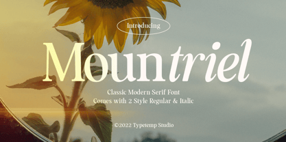 Mountriel - Classic Modern Serif Font is a stylish font It has both Classic modern and 80s 90s look. Comes with alternatives and ligatures, helps to create stunning logos, quotes, posts, blog posts. branding projects, magazine imagery, wedding invitations, and much more. WHAT'S YOU GET ? Unique Letterforms Works on PC & Mac Simple Installations Accessible in the Adobe Illustrator, Adobe Photoshop, Microsoft Word Fully accessible without additional design software. I really hope you'll get pleasure using Allenoire font and it will be perfect addition to your font collection! Contact me with an inbox message If you have any question. Thank you! Happy Creating.
 - Geom Graphic by Dharma Type,
$19.99 Inspired by Japanese robot animations in 80s such like Gundam and Ideon, Geom Graphic is a square geometric sans serif for wide range of usage. The family give an impression similar to Eurostile but is more squared and geometric. The letterforms of Geom Graphic are designed slightly rounded to appear natural, warm and retro. This family consisting of 4 weights with matching Italics. The wide range of languages is designed targeting use for futuristic product of game, movie, logo and so on. We released 4 big Sci-Fi families in 2013. Check it out! Clonoid Controller Geom Graphic Space Colony
 - Marones by Arterfak Project,
$18.00 Complete your vintage style with Marones font! Marones is a serif font with inky effect and spurs on the letterforms. Inspired by old school garage and vintage logo, Marones visualize a quite strong look so that's perfect for any display such as packaging, bottle, headline, logo, apparel, posters, stickers, craft projects and more! Marones is an all-caps font equipped with a Stylistic set and multilingual support that you can mix and match the letters to ease your design project. Fonts featured : Uppercase Smallcaps Numbers Symbols Punctuation Stylistic alternates Stylistic set 01-04 Thank you for watching! Ramz
 - Dezen Stencil 02 by DizajnDesign,
$39.00 Dezen is a contemporary, mechanical grotesque typeface. Its letters were first constructed from individual modules and then optically refined to enhance its rhythm. Its tight letter spacing and narrow proportions make the typeface particularly well suited for display sizes and headlines. When you add spacing, font can be used for shorter amount of text, bigger than 12 points. Dezen type family consists of a wide variety of styles – solid and stencils. Dezen Pro subfamily combines all 4 styles (Solid, Stencil 01, Stencil 02, Stencil 03) in a specific sequence, which originates a “pattern” for the alphabet (or dezen, in Slovak).
 - Superscience by Storm Type Foundry,
$39.00 A font drawn in a rounded rectangle looks modern – if we do not mind that it was in vogue mainly in the 80s of the last century and was created in the fifties, when various Italian designers noticed that the outline of a glass TV screen is actually the letter “o“. Since then, this progressive idea has undergone many improvements, which can be summarized in the notion of “popular-scientific typographic revival”. The present incarnation called “Superscience” has the advantage of having extreme variations and nicely simplified letters, as well as the usual repertoire of OTF functions and playful variations.