1,371 search results
(0.023 seconds)
- Weekend Tabloid JNL by Jeff Levine,
$29.00Weekend Tabloid JNL is a classic sans serif wood type design that found its way into the setting of newspaper headlines during the pre-electronic age of publishing. - Austrual SRF by Stella Roberts Fonts,
$25.00 Austrual SRF is a collection of star dingbats created by Jeff Levine for Stella Roberts Fonts. There are over sixty images for adding the perfect intergalactic embellishment to any project. The net profits from my font sales help defer medical expenses for my siblings, who both suffer with Cystic Fibrosis and diabetes. Thank you.
 - Victorian Ornaments by Gerald Gallo,
$20.00 Victorian Ornaments was inspired by the decorative borders and panels produced during the Victorian era. There is an assortment of 47 ornaments all located under the character set keys.
 - Al Beauty Ballerina by Aluyeah Studio,
$125.00 Introducing Beauty Ballerina, the top choice for those looking for a typeface that exudes beauty and grace. Every exquisite detail of this typeface mirrors the strength, passion, and elegance innate to each ballerina, making it an embodiment of the beauty and grace that ballet dancers exude. Featuring an extensive collection of over 360+ quick-access ligatures and alternatives, it allows everyone to delve deeper into their imagination and reshape their creations with luxury.
 - Rosette Ornaments by Gerald Gallo,
$20.00 Rosette Ornaments was inspired by the wide spectrum of ornamental styles produced during the Victorian era. There is an assortment of 47 ornaments all located under the character set keys.
 - Trafalgar Stencil JNL by Jeff Levine,
$29.00Trafalgar Stencil JNL gets its inspiration from a set of lettering stencils manufactured by Reese and Sons in Great Britain during the 1950s as does its counterpart, British Stencil JNL. - Dirty Money SRF by Stella Roberts Fonts,
$25.00 Dirty Money SRF is a novelty font with a limited character set emulating the lettering found on U.S. currency. The typeface was designed by Brad O. Nelson of the Brain Eaters Font Company. The net profits from my font sales help defer medical expenses for my siblings, who both suffer with Cystic Fibrosis and diabetes. Thank you.
 - AT Move Frutta by André Toet Design,
$39.95 FRUTTA (Fruit) is a new typeface made with the ever expanding food industry in mind. But don’t let that deter you from using our font on the cover of the forthcoming cd of the Black Keys or Beady Eye or Damon Albarn or Paul Weller or Daft Punk or Whatever... Concept/Art Direction/Design: André Toet © 2017
 - Caorgen by Zeenesia Studio,
$17.00 Introducint Caorgen Caorgen is a Condensed modern display font with serif style. It's modern and classic font with a unique and deference look . Perfect if you need a dose of fun in your project. Perfect for editorial projects, Logo design, web font, clothing branding, product packaging, magazine headers, or simply as a stylish text overlay to any background image.
 - Devama SRF by Stella Roberts Fonts,
$25.00 Devama SRF was designed by Typodermic's Ray Larabie and provided for Stella Roberts Fonts. Available in Regular, Backlash and Forward, this typeface evokes a retro-80s look while still remaining clean and fresh. The net profits from my font sales help defer medical expenses for my siblings, who both suffer with Cystic Fibrosis and diabetes. Thank you.
 - Broman by Zeenesia Studio,
$17.00 NTRODUCING BROMAN!! BROMAN is a bold modern display font with serif style. It's modern and classic font with a unique and deference look . Perfect if you need a dose of fun in your project. Perfect for editorial projects, Logo design, web font, clothing branding, product packaging, magazine headers, or simply as a stylish text overlay to any background image.
 - Bionca by Zeenesia Studio,
$15.00 BIONCA is a bold modern display font with sans serif style. It's modern and classic font with a unique and deference look . Perfect if you need a dose of fun in your project. Perfect for editorial projects, Logo design, web font, clothing branding, product packaging, magazine headers, or simply as a stylish text overlay to any background image.
 - Nouveau Hippie JNL by Jeff Levine,
$29.00 The cover of the 1907 sheet music for "I'd Rather Twostep Than Waltz, Bill" was hand lettered in an Art Nouveau sans serif alphabet. During the hippie counter-culture movement of the 1960s, rock posters, album covers and other printed ephemera of the time embraced the styles of lettering and art made popular during the early 1900s. It seemed only fitting to name this type design Nouveau Hippie JNL as an homage to both eras. The font is available in both regular and oblique versions.
 - Roycroft Initials, crafted by the talented Dieter Steffmann, is a font that harks back to the charm and distinctiveness of the Arts and Crafts movement. This font category, known for its artistic bea...
- The Mage 1999 font, designed by Dieter Schumacher, is a captivating typeface that transports its audience back to the edge of the 20th and the dawn of the 21st century, encapsulating the essence of a...
- Carton Stencil JNL by Jeff Levine,
$29.00 Antique brass stencils hand-cut for shipping items during the early part of the 20th Century were for sale in an online auction; and are the basis for Carton Stencil JNL.
 - Firefly by Canada Type,
$24.95 Firefly was designed by Miranda Hopper during her time in Patrick Griffin's type design class of 2010 at Humber. It is a light, narrow alphabet that works well in casual, leisurely design.
 - Chamferwood JNL by Jeff Levine,
$29.00 Chamferwood JNL is another interpretation of the block lettering style most popular during the late 1800s and the early 1900s. The design was modeled from examples from a set of wood type.
 - BAQ Rounded by Thinkdust,
$10.00 BAQ Rounded sets itself up as a simplistic and blocky font, but it hides a deeper form. With indents in all the right places, this font creates a double image in our mind, of the form we see and the form we know, letters that bulge into blobs and letters that are easy to follow. This double image results in a casual, over the top yet easy to read font designed for relaxing and carefree messages.
 - Vododeo JNL by Jeff Levine,
$29.00 Vododeo JNL is directly named for the free-form sheet music title lettering from Jack Yellen and Milton Ager's "Vo-Do-De-O". The term itself was a catchphrase made popular during the era known as the "Roaring 20s". Yellen and Ager were responsible for such hits as "Ain't She Sweet" (1927) and "Happy Days Are Here Again" (1930) along with countless others. During his career, Jack Yellen provided lyrics to over 200 songs. As a side note, Yellen was married to a distant cousin of type designer Jeff Levine's late mother.
 - Andreae by Proportional Lime,
$9.99 Hieronymus Andreae or latter in life Hieronymus Formenschneider as he proudly took a new surname to proclaim his success in the printing industry as the man who introduced the Fraktur script to the world of print. This project was undertaken at the orders of Emperor Maximilian I. One of Fraktur’s first appearances was in a joint venture with the great Albrecht Dürer. This font was based on a later work, Andreae’s magnus opus in the music field, the Coralis Constantini by Henry Isaac. Andreae worked as woodblock cutter and then became a publisher in the city of Nuremberg until his death in 1565. We at PLTF are proud to revive this enormously influential typeface.
 - Rococo Titling by Three Islands Press,
$15.00Rococo Titling is a set of ornate titling caps based on work done by Jacques-Francois Rosart (1714-1777) and Pierre Simon Fournier (1712-1768) during the middle decades of the 18th century. - Display Inline JNL by Jeff Levine,
$29.00Display Inline JNL is a companion design to Jeff Levine's Signboard JNL font - both derived from die-cut display letters and numbers popular during the 1950s and 1960s for signs and show cards. - Epical Comeback by Zeenesia Studio,
$15.00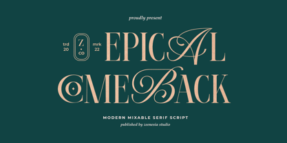 Introducing Epical Comeback Epical Comeback is a modern display font with serif with script style. It's modern and classic font with a unique and deference look . Perfect if you need a dose of fun in your project. Perfect for editorial projects, Logo design, web font, clothing branding, product packaging, magazine headers, or simply as a stylish text overlay to any background image.
 - Fenimore SRF by Stella Roberts Fonts,
$25.00 Fenimore SRF is a variation of Jeff Levine's Theater District JNL with added highlights, created especially by Jeff for Stella Roberts fonts. This Art Deco-influenced typeface typifies the streamlined style of 1930s era-influenced modernism and streamline. The net profits from my font sales help defer medical expenses for my siblings, who both suffer with Cystic Fibrosis and diabetes. Thank you.
 - Mighty Courage by Zeenesia Studio,
$15.00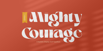 Introducing Mighty Courage Mighty Courage is a modern and elegant serif font. Mighty Courage is It's modern and classy font with a unique and deference look . Perfect if you need a dose of fun in your project. Perfect for editorial projects, Logo design, web font, clothing branding, product packaging, magazine headers, or simply as a stylish text overlay to any background image.
 - School Desk JNL by Jeff Levine,
$29.00 School Desk JNL is a block-style sanserif based on die-cut cardboard letters used in classrooms during the 1940s and 1950s for making various projects and teaching children the basic shapes of letters.
 - Western Railway JNL by Jeff Levine,
$29.00Western Railway JNL was inspired by sample lettering found in an old sign painter's reference book published during the early part of the 20th Century and modified for today's digital applications by Jeff Levine. - Restaurant And Lounge JNL by Jeff Levine,
$29.00 Restaurant and Lounge is a casual, brush-style type face based on hand lettering found on a 1940s matchbook for the Park Avenue Restaurant (a popular dining spot during the golden years of Miami Beach).
 - Lebensjoy by Monotype,
$29.99Lebensjoy was used by the Co-op chain stores in Sweden for a nationwide fortnightly flyer (called Livsgldje = Joy of Life) during 1993 and 1994. They wanted a simple but still lively and active letterform. - PL Davison by Monotype,
$29.99PL Davidson Americana is an all-capital typeface based on woodcut designs from the nineteenth century. The PL Davidson Americana font was designed by M. Davison in 1965, during the revival of American headline faces. - PL Davison Zip by Monotype,
$29.99PL Davidson Americana is an all-capital typeface based on woodcut designs from the nineteenth century. The PL Davidson Americana font was designed by M. Davison in 1965, during the revival of American headline faces. - Claudius - Unknown license

- Matthia by Linotype,
$29.99Linotype Matthia is part of the Take Type Library, which features the winners of Linotype’s International Digital Type Design Contest from 1994 to 1997. Dieter Kurz designed Matthia as a slender, flowing brush font. Its characters are in a handwritten style yet stand almost straight, making Matthia a mixture of reserved and lively, of static and dynamic. The font is reminiscent of advertisement typefaces popular in the 1950s and extremely versatile, suitable for short texts in small point size or headlines on posters. - Lexis by Typedepot,
$29.00 You can Download All 36 Demo Fonts The Lexis font family is a sans serif “super” family consisting of two sub-families - Lextis & Lexis Alt. While the first one follows the humanist model, its alternative version Lexis Alt dives way deeper into the geometric aesthetic. It’s simple yet versatile, packing great amount of well balanced weights, extensive character set and numerous Opentype features. The Lexis typefamily comes in 9 weights plus their italics, two distinctive styles and support for over 200 languages.
 - ITC Korinna by ITC,
$40.99New York designers Ed Benguiat, Victor Caruso, and the staff at Photo Lettering, Inc. developed the ITC Korinna typeface family during the 1970s. ITC Korinna is based on an older German design that was originally cast at the beginning of the 20th century. That ITC Korinna was created speaks to the status that Art Nouveau had for designers during the 1960s and 70s. Thanks to their keen reviving of this ever-popular style, computer users can still use this type style today. ITC Korinna is perfect for display and advertising typography, as well as for headlines in newsletters and magazines. - Nouveau LX Expanded by Vanarchiv,
$31.00 The original design came from Berthold Herold typeface, designed by Hermann Hoffmann during 1913 (Art Nouveau style) in Germany. This project started from flyer printed during 1947 with movable type, the specimen was scanned as a source to development some of the uppercase letterforms. However the most unusual and tricky element from this sample is the leg from the uppercase (R) which is different from the original Herold design, until now I didn’t found where this version originally came from. This expanded version only contain the bold weight, however there are also stencil (Nouveau LX Stencil) and condensed version (Nouveau LX) available.
 - Nouveau LX by Vanarchiv,
$27.00 The original design came from Berthold Herold typeface, designed by Hermann Hoffmann during 1913 (Art Nouveau style) in Germany. This project started from flyer printed during 1947 with movable type, the specimen was scanned as a source to development some of the uppercase letterforms. However the most unusual and tricky element from this sample is the leg from the uppercase (R) which is different from the original Herold design, until now I didn’t found where this version originally came from. This font family only contain the bold weight, but there are also a stencil and expanded versions available.
 - ITC Juanita by ITC,
$29.99 ITC Juanita is the work of Argentinian-born designer Luis Siquot and was inspired by a text set only with woodcuts which he was reading during a long international flight. ITC Juanita is a series of six distinct typefaces which Siquot sees as a personal reinterpretation of designs that originated in the 1930s and 40s and were still popular during his childhood in the 1950s. For me, Juanita is like a toy, charming, expressive, and also dramatic," says Siquot. The ITC Juanita series offers designers a range of variations based on similar structures, each variation with its own look."
 - Alpha by CTR,
$30.00 The initial designs for this font first came from the idea of creating a dynamic and visually appealing typeface just by using squares so throughout the development stages I had restricted myself to just the use of squared paper. The hardest thing that I found was overcoming the problems regarding letter forms that have diagonal lines and therefore defer from the ongoing style of the typeface.
