10,000 search results
(0.043 seconds)
- Alpha One by Wiescher Design,
$18.00 »AlphaOne« is my newest addition to the experimental Alpha-font-collection. I just had to do this one! It is based on Paul Renners fonts, but has got nothing to do with them, I just took the widths and some basic forms. No – or hardly no – optical corrections were made to the glyphs. I wanted the pure geometric forms to come to life. This was a lot of fun to design, I especially like the »Q« with the negative tail. I did make four weights, but nothing is normal with this font, so weight doesn’t really mean anything. Have fun!
 - Ice Cream by Positype,
$25.00 Ice Cream is the product of an abandoned typeface concept a non-connected script for food packaging. The original exemplars were so iconic, so inspiring, it demanded completion. Curvy with a huge dollop of fun, to be honest, and I wouldn’t have it any other way with this one. Influenced heavily by Kari and Juicy (and even the shameless copies of my originals, wink wink), Ice Cream’s recipe blends in some very simple elements that are unobtrusive and clean, perfect for packaging designs, children’s books, and anywhere a light-hearted scoop with a cherry on top is needed.
 - Jeeves by Red Rooster Collection,
$79.00 The inspiration for Jeeves came from Leslie Carbarga's wonderful book LETTERHEADS, One Hundred Years of Great Design, 1850-1950. It was based on a secondary type usage for the letterhead for Sutherland in New York. The rest of the letterhead had features that were more typical of the Art Deco period, but this script added a touch of timeless elegance. And since at the time I was reading every scrap of P.G. Wodehouse I could get my hands on, the name Jeeves seemed like a perfect fit. The font is loaded with a plethora of extra glyphs, ligature characters and OpenType features.
 - Liam by Laura Worthington,
$29.00 Liam is a quirky hand-drawn serif font that bounces playfully around the baseline. Named after my young nephew, Liam’s cute cowlick curls and varying slants add childlike charm while retaining legibility, making it ideal for use in storybooks, toys, and other kids stuff. It includes 130 alternates and 52 adorable illustrations. See what’s included! http://bit.ly/2ci2MN0 *NOTE* Basic versions DO NOT include swashes, alternates or ornaments This font has been specially coded for access of all the swashes, alternates and ornaments without the need for professional design software! Info and instructions here: http://lauraworthingtontype.com/faqs/
 - Blueberry Jam by Hanoded,
$15.00 I love blueberries. When my brother and I were young, we used to pick them in the forest by the bucket. Afterwards, we’d always look like victims of a serial killer, but it was all worth it, as nothing quite tastes likes homemade blueberry jam. I don’t know why I named this cute little font Blueberry Jam. Maybe I was craving some… Blueberry Jam is a highly legible, extremely cute and very handmade font. It would look good on just anything, but book covers, product packaging and homemade jam labels come to mind. Blueberry Jam comes with a bucketload of diacritics.
 - Buckley by Laura Worthington,
$23.00 Buckley is a condensed, hand-lettered font based on characters created with my favorite vintage fountain pen: a Waterman Ideal #2. Its textured strokes reveal its ink-on-paper origins, while randomized contextual alternates cycle through letterforms as you type, for a convincing and handwritten look. Buckley’s friendly, happy, and casual appearance helps make packaging, greetings, and storybooks charming and approachable. See what’s included! http://bit.ly/2c98p0L This font has been specially coded for access of all the swashes, alternates and ornaments without the need for professional design software! Info and instructions here: http://lauraworthingtontype.com/faqs/
 - Sing Along by Hanoded,
$15.00 We just had the Eurovision Song Contest here in Holland. I quite like to watch it, as it is usually a freak show of kitsch, political incorrectness and often really bad music. But it is a laugh and this year was no different. It inspired me to create this particular font with this particular name. Sing Along is a happy, wobbly, kitschy font that comes with a bit of ‘over-the-topness’, a few personality issues and an unsteady gait. Needless to say, it is politically incorrect, but that, my friends, is not necessarily a bad thing.
 - Bacterio by Wiescher Design,
$39.50 Bacterio is a typeface I designed for this hulk of a friend of mine who is a kitchen designer. He is huge but has a very delicate feeling for form. One day he said he was trying out something new and if I couldn't make a font for him. Then he showed me the surface design, a hard-plastic covered multilayered wood. The surface design was called "Bacteria" and it looked just like that, only in multicolors. Well here is "Bacterio" the font that looks just like that surface of my hulky friend. Yours very design infected Gert Wiescher
 - Nouveau Hippie JNL by Jeff Levine,
$29.00 The cover of the 1907 sheet music for "I'd Rather Twostep Than Waltz, Bill" was hand lettered in an Art Nouveau sans serif alphabet. During the hippie counter-culture movement of the 1960s, rock posters, album covers and other printed ephemera of the time embraced the styles of lettering and art made popular during the early 1900s. It seemed only fitting to name this type design Nouveau Hippie JNL as an homage to both eras. The font is available in both regular and oblique versions.
 - Bruschetta by Canada Type,
$24.95The problem with scripts in general, and brush scripts in particular, is that the majority of them cannot be set in all-caps words or sentences. So as a rule of thumb most designers try to avoid brush scripts when they know they will be entering an all-cap zone. But here comes Bruschetta, so you won’t need to reduce your design options. Bruschetta is a great flowing brush script that can be attractively used in upper-lower, lower-lower, or upper-upper settings. Bruschetta also has so much variety in its design features – original, funny, natural, friendly, legible, and even somewhat psychedelic – it just may be the most versatile brush script ever made. Bruschetta also has an historical value as the revival of the Helmut Matheis’ Contact design from 1963. Why it hasn’t been digitized until this point is beyond us! So we digitized it from original specimen, expanded the character set to completion, and even added a few built-in alternates. Bruschetta’s versatility allows it to be used in a variety of applications. It is great for signage, posters, product labels, menus, book covers, and pretty much anywhere where a friendly bold brush type is needed. Get yourself a copy and show your friends and clients why the overused Choc and Cooper aren’t the last word in cool! - Skeina by MJType,
$25.00 Skeina is an elegant sans serif font that fuses contemporary flair with classic undertones. Designed to offer versatility and sophistication, this typeface can adapt to a multitude of projects, bringing clarity and style wherever it’s applied.
 - Relic Island 1 by Jehansyah,
$9.00 this is a very special curving font, designed in such a way to add an old feel but still maintain a modern feel, there are several options that you can use and get creative with it
 - Helinda Rook by Monotype,
$29.99The Helinda Rook font is a popular choice in advertising, invitations, greeting cards, and wherever a formal hand-lettered or engraved look is desired. Helinda Rook is an elegant connecting alphabet font based on formal handwriting. - Calingthon by Jehansyah,
$10.00 calington is a very charming, beautiful and elegant calligraphy font, there are several alternate characters that you can use, it is perfect for all types of your design needs, covers, branding, magazines, invitations and many more
 - Satero Serif by Linotype,
$29.99 Satero was designed by Prof. Werner Schneider in 2007. Never before have we had so much written material to consume; this is the age of mass-communication. Unfortunately, the decision of which typeface to use is too often made lightly. The typeface is one of the most elementary means of language, and it can play a major role in a text's legibility and the amount of time the reader needs for it. The Satero Type System offers a high degree of legibility due to its dynamic and forms. The individual characters have been based on classical concepts. They are clearly made, and leave all unnecessary elements behind. The type works to create an environment of extreme legibility. Essential parts of the a, c, e, s, and r are to be found at the x-height line, which is the most important area of a line of text in determining legibility. The Satero Type System includes two members whose basic forms are the same. The Sans Serif members are more horizontally differentiated than common grotesques, which aides their legibility. The Serif design employs asymmetrical serifs, avoiding elephant feet" altogether. Their dynamic is progressive. The condensed nature of the seriffed counterparts is optimal for newspaper and magazine applications, where space is at a premium and paper must be saved. All fonts in the Satero Type System include a number of alternate glyphs, as well as ligatures and proportional lining figures; all weights except the Heavy and Heavy Italic fonts are also equipped with small caps, small cap figures, and oldstyle figures as OpenType features. "
 - Satero Sans by Linotype,
$29.99 Satero was designed by Prof. Werner Schneider in 2007. Never before have we had so much written material to consume; this is the age of mass-communication. Unfortunately, the decision of which typeface to use is too often made lightly. The typeface is one of the most elementary means of language, and it can play a major role in a text's legibility and the amount of time the reader needs for it. The Satero Type System offers a high degree of legibility due to its dynamic and forms. The individual characters have been based on classical concepts. They are clearly made, and leave all unnecessary elements behind. The type works to create an environment of extreme legibility. Essential parts of the a, c, e, s, and r are to be found at the x-height line, which is the most important area of a line of text in determining legibility. The Satero Type System includes two members whose basic forms are the same. The Sans Serif members are more horizontally differentiated than common grotesques, which aides their legibility. The Serif design employs asymmetrical serifs, avoiding elephant feet" altogether. Their dynamic is progressive. The condensed nature of the seriffed counterparts is optimal for newspaper and magazine applications, where space is at a premium and paper must be saved. All fonts in the Satero Type System include a number of alternate glyphs, as well as ligatures and proportional lining figures; all weights except the Heavy and Heavy Italic fonts are also equipped with small caps, small cap figures, and oldstyle figures as OpenType features. "
 - Serendipity by Nicky Laatz,
$15.00 Say hello to **Serendipity** - A font that you were meant to find, and is now destined to be with you :) An elegant cousin of Saturday Script, Serendipity is a lovingly handwritten brush script , with an air of grace and flamboyancy. **Serendipity** is special in that one word can be written in a million different ways - thanks to the large selection of extra letters that it has built in. It comes with 2 sets of alternate lowercase letters, a set of alternate uppercase letters as well as a set of double letter ligatures - all for you to play with, and make your words look exactly how you need them to look. Perfect for Type-based creations, branding, websites, merchandise, packaging, quotes, invites, greetings and so much more, Serendipity will take you where you need to be. The brush script comes in 2 variants - Regular, and Wide each with its own unique feel.
 - Braga Huis by Juru Rancang Studio,
$15.00 Braga Huis typeface is a font family that is inspired by the famous street in Bandung that was made to embodies the atmosphere and the environment of Netherland-Indie city at its golden time, whereby all the elements were designed to give the impression of structural, artistic, and advance. Braga Huis typeface has a strong Art Deco character, where the impression is depicted from the strong lines, curvy passion so it is very appropriate to describing the future atmosphere from the perspective of the 19th century. Braga Huis typeface has 3 font styles consisting of uppercase, lowercase and various alternative options that can be customize to your taste, poster is one of the media form of presentation that we believe is very appropriate for this type of font. But whatever the medium is, honestly we say; using Braga Huis typeface will make your artwork will never be cracked by time.
 - Vandal Blow Graffiti Regular by Sipanji21,
$15.00 "Vandal Blow" is a 3D layered graffiti font that includes solid, shadow, and inner shadow styles, providing the tools to create a three-dimensional appearance in your text. Fonts with layered styles like this are commonly employed in graffiti art, street art, posters, and other designs where a dynamic and eye-catching 3D effect is desired. By utilizing the solid, shadow, and inner shadow layers in "Vandal Blow," you can enhance the visual impact of your text, creating a sense of depth and dimension. This font is particularly suitable for projects where you want to infuse a graffiti-style aesthetic with a three-dimensional twist, making your text stand out and grab attention.
 - Morison by Fenotype,
$35.00 Morison is an original but versatile serif family. With just about the right amount of personality and character, it can stand out when needed, but works equally well in everyday tasks where legibility is the key. The Morison family consists of separate stylistic ranges for display and text use. Each range comes in eight weights with corresponding italics. The display versions are sophisticated enough for tasks where a certain amount of extra elegance and flair are required, without compromising much on legibility. The text versions, however, are true workhorses, suitable for continuous texts in small sizes. All Morison fonts are equipped with handy Open Type features, such as built-in small capitals and multiple numeral styles.
 - Contra Slab by Wiescher Design,
$16.50 Contra Sans is the slab serif version of my Contra family.
 - College Grad by Throndsen,
$9.00 College Grad is inspired by my Graphic Design class of 2019!
 - Rodinia by Sylvestre Studios,
$20.00 Rodinia displays my love of the carnival and the Slavic culture.
 - Natuxal by PizzaDude.dk,
$20.00Natuxal is my handmade idea of something elegant, decorative and romantic. - Malnor Sans by Sikifonts,
$24.00 Malnor Sans is a normal sans serif family of 18 fonts. With modern style or neo-grotesque, Malnor sans has balanced proportions in every letter, and it's clean, minimal and cool. There are several alternative letters that can be used in both upright and oblique styles. Single story 'a' can give a more geometric impression, even though it is not purely geometric. There is also an alternative double story 'a' with a tail, a double story 'g' and an alternative 'l' that can be applied together via the 'salt' or 'stylistic sets' features for a slightly warmer feel. Malnor Sans currently has around 900 glyphs, including diacritical marks, that support a broad Latin-based language.
 - Laurels Qeylla by Asd Studio,
$15.00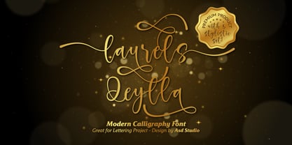 Laurels Qeylla is a script font created with love, sincerity, and patience. can be used to make invitation writing, lettering, and all graphic design needs. This font is equipped with 5 stylistic sets and several alternative letters that will make your design look more attractive and beautiful. Thank you if you are interested in purchase and using my font.
 - Drop Dead Gorgeous by Hanoded,
$22.00 Drop Dead Gorgeous is a slightly slanted all caps Brush font. I made it with the last of my Chinese ink (I ordered a new batch, it should arrive tomorrow). Drop Dead Gorgeous is a very legible font, ideal for headlines, posters and book covers. Comes with alternates for lower case letters and a truly breathtaking amount of diacritics.
 - Gancio by Funk King,
$39.00 Gancio is my first fully realized hand-drawn font and has a robust character set. Its simple lines and sophisticated curves are contemporary, but recall vintage and retro cool. The font is very adaptable and flexible and can be used effectively in a number of themes. Also included are the dingbats used in the poster art.
 - Norma by Linotype,
$29.99Norma was my second sans serif. You can find a few details in common with Dialog, but the graphic impression of Norma is totally different.Every typeface has some characters that are the favourites. In Norma I simply love the lowercase roman a. Don't you, too, think that it is perfection itself? Norma was released in 1994. - Criss Cross by Hanoded,
$15.00 Criss Cross is a scratchy, scribbly, rough-n-tough kinda font. The idea comes from the many notes I wrote in my horrible handwriting. When I want to stress things, it sort of looks like Criss Cross. So... Now you can write notes and stress things too! And guess what? It comes with a bunch of alternates, so enjoy!
 - Splinterhand by Hanoded,
$12.00 No, I did not have a splinter in my hand when I came up with the name for this font. It sounded right, so I used it! Splinterhand is a script font made with an almost dried out marker pen. It comes with a whole bunch of diacritics and it can be used for just about anything.
 - Zuider Postduif by Roland Hüse Design,
$25.00 Zuider Postduif was my very first font design 3 years ago and I decided to remake and extend it including the Cyrillic alphabet and some OpenType features. It looks pretty cool as printed text(lyrics, poems) and fits best for decorations, posters, menu carts for restaurants, brochures, newspaper headlines or logos. It’s comfortable to read above 12 px.
 - Vida Bandida by Vozzy,
$20.00 Introducing vintage label font named Vida Bandida. It is based on my other font, Black Widow. All available characters you can see at the screenshots. This font has six styles: Regular, Full, Shadow, Shadow FX, Texture and Texture FX. This font will look good on any vintsge styled designs like a poster, T-shirt, label, logo, etc.
 - If This Be Doomsday by Comicraft,
$19.00 THE END IS NIGH! Judgment Day has come and this planet has been CONDEMNED! Do not conspire to hide what remains of your paltry world from my eyes! Know you not that NONE may thwart my will? Of what import are brief, nameless lives -- to DOOMSDAY?? Death is Certain! Apocalypse is UNAVOIDABLE. At last, my cosmic hunger will be sated, if only briefly! This planet shall SUSTAIN me until it has been drained of all elemental life! SO SPEAKS DOOMSDAY! But do not fret. Even if the Domesday Book has been closed on your planet... your utter destruction is being made available in Font form, I call it IF THIS BE DOOMSDAY, and I will deliver it to you via comicbookfonts.com in Regular, (Roach) Chew and Outline weights. Never let it be said that DOOMSDAY is without mercy. Features: Three weights (Regular, Chew & Outline) with small cap characters and Western & Central European international characters.
 - Wave by Jennifer Delaney Designs,
$23.00 WAVE is characterized by curved lines and intricate details. Each character was individually made in Illustrator and Type Tool using my original illustrations. Wave is a decorative font best used for titles or short bursts of texts in large point settings. The typeface is based on the uppercase letterforms, but I have also created lowercase letters, numbers, and glyphs. The motion lines used in the making of Wave mirror an art deco-style. Inspired by an illustration of a large wave, I was fascinated that by using only lines and solid colors we as artists can depict the translucency and ever-changing movement of waves. I began by delicately sketching out all of the letters using graph paper and micron pens. My work always begins with traditional media. I'm an illustrator, freelance artist, and graphic designer from Chicago, IL. I studied at Texas Christian University, and received my Bachelors of Arts in Graphic Design from Columbia College Chicago. Visit www.jennyddesigns.com for more! :)
 - Perron by Fontforecast,
$39.00 Meet the successor of our bestselling design kit 'Chameleon': Perron. The concept of designing multiple contrasting designs under the same name was first introduced by Fontforecast in TyfoonSans and TyfoonScript. Two font families that were designed to complement each other. And that's exactly what this new release does. With the three designs in Perron, which means 'platform' in dutch, you will be able to take your design projects where ever you want them to go. This flexible kit consists of 7 fonts in three basic designs, and when combined Perron No1, No2 and No3 reïnforce each others charm. This offers great potential for creating lively layouts for many different projects, e.g. invites, menu's, magazines, brochures, packaging, greeting cards, T-shirts, etc. Perron No1 is a serif display font with large and small Caps. This font requires an Opentype savvy application to reach its full potential. Turn on contextual alternates and beginning and ending characters are replaced by their alternative versions, as you type. Stylistic sets and swashes offer even more variations. Perron No1 comes in two versions: No1 and No1 Shade. They can be used separate or layered for a colorful or shaded effect (if your application allows you to stack text frames). Perron No2 is a charming handwritten font, with slightly rough contours, that was added for an extra personal touch. It comes in regular and Italic. Perron No3 is a clean, tall and very skinny font family. It has large and small Caps and comes in three weights: Light, Regular and Bold. Because of its clean appearance No3 adds a modern touch to the design kit.
 - Wild Wolf by HansCo,
$12.00 Wild Wolf is a handwritten display font with a bold and rough style in a dry brush texture. This texture is very detailed. You can get the swash brushes include as an alternate in this font. Wild Wolf is suitable for logos, product branding, printable templates, posters, flyers, shirts, or for text overlay to any background image. Highly recommended to use it in OpenType capable software - there are plenty out there nowadays as technology catches up with design. The OpenType features can be accessed by using programs such as Adobe Illustrator, Adobe InDesign, Adobe Photoshop Corel Draw X version, Afinity and more. Enjoy!
 - Sourta by HansCo,
$15.00 SOURTA is a sharp italic and bold font with unique style that will make your design looks modern and futuristic. You can use this font for any purpose, especially to make logotype like a technology or sports logo brand. This typeface is comes in uppercase, lowercase, punctuation, symbols, numerals, etc also support multilingual. Highly recommended to use it in OpenType capable software - there are plenty out there nowadays as technology catches up with design. The OpenType features can be accessed by using programs such as Adobe Illustrator, Adobe InDesign, Adobe Photoshop Corel Draw X version, Afinity and more. Enjoy!
 - Dinghy by Atlantic Fonts,
$32.00 Dinghy is a shore thing. Like three fonts in one, Dinghy sports a friendly, bold lower-case, a salty, strong upper-case, and in all-caps with discretionary ligatures turned on, Dinghy is tightly interlocking. Turn some ligatures on, others off, to craft the look you want - whatever floats your boat. Dinghybats contains 26 original Amy Dietrich seaside illustrations from curious ocean animals to dune grasses to, well, dinghies.... So enjoy making waves with Dinghy family!
 - Reina Neue by Lián Types,
$29.00 Hey! See Reina Neue in action here! INTRODUCTION When I designed the first Reina¹ circa 2010, I was at the dawn of my career as a type designer. The S{o}TA, short for the Society of Typographic Aficionados, described it as complex display typeface incorporating hairline flourishes to a nicely heavy romantic letterform². And it was like that; that’s what I was pursuing at that time since I was very passionate about ornaments and accolades of Calligraphy. Why? I felt that Typography, in general, needed more of them. These subtle flourishes could breathe life into letters. Maybe, I thought it was the only way I could propose something new into the field of type. However, after some years, I came across a very interesting quote: –Beautiful things don’t ask for attention– Wow! What did this mean? How could something be attractive if it’s not actually showing it. Could this be applied to my work? Sure. I think every type-designer goes through this process (aka crisis) regarding his or her career. At the beginning we love everything. We are kind of blind, we only see the big picture of a project. And that’s not because we are lazy. We actually can’t see the small mistakes nor the subtleties that make something simpler beautiful. We are not able. But, the small subtleties… They are actually everything: With experience, one puts more attention into the details and learns that every single decision in type has to be first meticulously planned. Here I am now, introducing a new Reina, because I felt there was a lot of it that could be improved, also the novelty of Variable Fonts caught my attention and I had to take that to my type library. THE FONT A thing of beauty is a joy forever Now, a decade later, I’m presenting Reina Neue. This font is not just an update of its predecessor: –A thing of beauty is a joy forever– is the first line of the poem ‘Endymion’ by John Keats, and despite the meaning of “beauty” may vary from person to person, and even from time to time (as read in the last paragraph), with Reina I always wanted to bring joy to the eye. In 2010, and now, in 2020. I believe the font is today much better in every aspect. It was entirely re-designed: Its shapes and morphology in general are much more clean and pure. The range of uses for it is now wider: While the old Reina consisted in just one weight, Reina Neue was converted into a big family of many weights, even with italics, smallcaps and layered styles. The idea behind the font, this kind of enveloping atmosphere made out of flourishes, is still here in the new Reina. This time easier to get amazing results due to the big amount of available alternates per glyph and also more loyal from a systemic point of view. However, and as read in the introduction -Beautiful things don’t ask for attention-, if none of the flourishes are activated the font will look very attractive anyway. Reina Neue is ready to be used in book covers, magazines, wedding cards, dazzling posters, storefronts, clothing, perfumes, wine labels and logos of all kind. Like it happened with the previous Reina, I hope this new font satisfies every design project around the world if used, and can be a joy forever. SOME INSTRUCTIONS Before choosing the right style for your project, hear my advice: -Reina Neue Display was meant to be used at big sizes. If you plan to print the font smaller than 72pt, I suggest using Reina Neue, not Display. Otherwise, if the font will be BIG or used on a digital platform, Reina Neue Display should be your choice. For even smaller sizes, use Reina Neue Small. This style was tested and printed in 12pt with nice results. (Note for variable fonts: Print them in outlines) -Reina Italic is not a slanted version of the roman, and this means some flourishes are different between each other. The Italic version has other kind of swirls. More conservative, in general. -All the styles of Reina Capitals have Small Capitals inside. -Reina Capitals Shine should be used/paired ONLY with Reina Capitals Black. The engraved feeling can be achieved if Reina Capitals Black and Reina Capitals Shine are used as layers, with the same word. Variable fonts instructions: -For more playful versions, choose Reina Neue VF, Reina Neue Italic VF or Reina Neue Capitals VF: With them you can adjust between 3 axes: Weight (will change the weight of the font) – Optic Size (will thicken/lighten the thin strokes and open/close the tracking) – Accolades (will modify the weight of the active flourishes). SOME VIDEOS OF REINA NEUE VF https://youtu.be/8cImmT5bpQM https://youtu.be/1icWfPmKAkg https://youtu.be/YC9GkJDL1a8 NOTES 1. The original Reina, from a decade ago: https://www.myfonts.com/fonts/argentina-lian-types/reina/ 2. In 2011, Reina received an honourable mention by S{o}TA. “Great skill is shown in the detailing, and an excellent feel for the correct flow of curves and displacement of stroke weight.” https://www.typesociety.org/catalyst/2011/ Reina was featured in the “Most Popular Fonts of the year” in MyFonts in 2011 https://www.myfonts.com/newsletters/sp/201201.html In 2012, the font was also selected in Tipos Latinos, the most prestigious competition of type in Latinoamerica. https://www.tiposlatinos.com/bienales/quinta-bienal-tl2012/resultados Also, chose as a “Favorite font of the year” in Typographica. https://typographica.org/typeface-reviews/reina/