10,000 search results
(0.034 seconds)
- 1470 Sorbonne by GLC,
$21.00 This family was created inspired from the first font carved and cast in France, for the Sorbonne University’s printing workshop (Paris). The characters were drawn by Jean Heynlin, rector of the university - inspired from Pannartz’s - and in all probability was carved by Adolf Rusch. It has only one style, in one size (about 14 Didots points). We have added the U, J, W and Y, some accented characters and others not in use in the original, but the standard and historical ligatures and the numerous Latins abbreviations are these of the original font. The font is proposed in two choices : Basic Latin, MacTT & TTF, free for a private use, and “Pro”, TTF/OTF, available for standard basic Latin plus Central Europe, Baltic, Turkish, Croatian, Romanian, Celtic.
 - Emporia Roman by Bean & Morris,
$35.00 SPQR Senatus Populusque Romanus or The Senate and People of Rome as quoted by the likes of Marcus Tullius Cicero or Tully to his friends and Titus Livius otherwise known as Livy. SPQR appeared on battle standards carried by Roman troops and no doubt can still be seen chiseled into stone facades across the old empire of the ancient Romans. This evokes visions of stonemasons delicately inscribing messages that were meant to endure, one which can still be seen on the Trajan column circa 114AD. Emporia Roman is a modern display font that was inspired by the craft of those ancient artisans, with an added lowercase set, some flourished alternates, an oldstyle set of figures and now with a matching Italic.
 - Ale by Linotype,
$29.99The Ale symbol fonts designed by Alessio Leonardi supply a large range of different characters. The two "Ale Ornaments" fonts contain a large set of different spirals, which can be used on tapestries, or as placeholders in presentations. The four separate "Ale Signs" fonts contain a set of daily glyphs, like male and female, smoking and non-smoking, danger, ying and yang, arrows and mathematical signs. The "Ale Transport" font is a large collection of funny pictures for the various kinds of transportation available over air, land and water. Here you can see Alessio's Italian design joy, which he has presented in many ways. Have fun in discovering the various pictures such as the submarine on the railway, or the airplane with a "Do it again" banner. - Argumentum by Kostic,
$40.00 In December 2013 two new weights - Thin & Ultra (with Italics) were added to the set, Small Caps included! The intention was to make a technical-looking sans with a warmer feel to it, balanced between hard geometric shapes and friendly curves with slightly narrower endings. It should be useful in a wide range of tasks, whether combining the eight weights with distinct italics for editorial design, setting multiple pages of text, making financial reports, or using the highly contrasted lights and blacks for display and packaging design. Argumentum has a character set to support Western and Central European languages, and an extended set for monetary symbols. Each weight includes small caps, ligatures, proportional lining and oldstyle numbers, tabular figures, fractions and scientific superior/inferior figures.
 - Surfbird by Vintage Voyage Design Supply,
$15.00 Summer vibes are here with Surfbird! • A playful Display family with large variety options. Four styles comes with seven widths & two graphic fonts. The point of this family is getting more modern moods into a classical cowboy-western typographic. The result is a playful western slab which can be used for any design project. Home decor / mugs / t-shirts / stickers / music or podcast covers / menu's / logo's / posters. It can be playful with "western cut" and smooth styles or more serious with the sharp styles. • The Surfbird has two graphic styles. 82 decor graphic elements to add more fancy style to your design. The first one is a contour and the second is a fill for them, to get full color elements.
 - Vanitas Stencil by Reserves,
$49.00 Vanitas Stencil is an elegant high contrast contemporary sans. It is rooted in the style of a classic didone, excluding the typical serifs and ball terminals as well as being designed with a cleaner, more reductionist appearance. Strict attention was given to the cohesiveness and balance between letterforms as well as the careful refinement of all curves. The careful, atypically placed stencil marks complement Vanitas’ refined character, presenting a distinct slant on the average stencil treatment. Stylistically, Vanitas Stencil’s alluring, sophisticated sensibility is directly inspired by high fashion. The upright styles are complemented by a pairing of optically adjusted true italics, which were purposefully adapted to retain the sharpness of their counterparts. Abandoning traditionally executed cursive italic letterforms retains Vanitas Stencil’s distinct characteristic through each style.
 - Shady Lady NF by Nick's Fonts,
$10.00 The 1907 Barnhart Brothers & Spindler type specimen catalog called this unique typeface simply "Umbra". Since that name is already taken, it now has another. Due to the highly ornate nature of this face, the font has a limited character set (all accented characters, but no math operators or fractions). The Opentype version of this font supports Unicode 1250 (Central European) languages, as well as Unicode 1252 (Latin) languages.
 - Performance by ParaType,
$25.00 Performance is a set of perforated plates that appear to be characters. The construction of characters is described by sequences of holes whose shape and placement define the appearance and mood of font styles. An interesting feature of the design is an absence of side bearings and leading. Due to this feature a text article set by Performance forms a perforated coherent surface similar to postage stamp block.
 - We Love Nature Stems Two by kapitza,
$85.00 We Love Nature Stems Two is a picture font consisting of 52 all new high quality, hand drawn illustrations with clean outlines and a minimum of vector points. Due to the overwhelming success of our flower font We Love Nature Stems, we have created this brand new set of original illustrations. We loved creating these beautiful new flowers and hope that you will love designing with them. Enjoy!
 - Knuckleball by Bebop Font Foundry,
$25.00 Knuckleball is a wonky, octagonal sans-serif typeface produced by Bebop Font Foundry in 2023. The font shares its name with the elusive knuckleball - a baseball term for a pitch that is thrown without spin. The throw is erratic and unpredictable due to the airflow over the motionless seams. The strange and unexpected letterforms of the font represent the pitch's movement. Knuckleball is ideal for logos, branding, and merchandise.
 - Satsuma by Hanoded,
$20.00 Satsuma. It used to be only a Japanese orange, but now it's a typeface as well. A rather unusual typeface. Satsuma is rough around the edges, squarish and playful. It is handmade and comes with over 400 interlocking ligatures. If that ain't fun, I don't know what is! Of course, Satsuma comes with extensive language support AND accented ligatures! Due to the complexity of this font, it only comes as TTF.
 - Valise Montreal by Device,
$29.00 A condensed loose brush style. This font has a breezy elegance and casual sophistication, yet in a different context or color, it could be seen as nervous and urban. A weird dichotomy. Set in smallish text blocks, it has a surprisingly even color. This is due to a balace that has been struck between keeping the roughness and idiosyncracies of a hand-drawn face but ensuring an overall regularity.
 - Natalya Monoline by insigne,
$21.99 Natalya Monoline is the rounded monolinear companion to Natalya. Like its predecessor, Natalya Monoline has a smooth rhythm and flows fluidly, due in no small part to its reliance on the golden spiral for its ornate swirls. This makes for an especially harmonious script with timeless appeal. The typeface family includes five weights with three alternate variations of the ascenders and descenders and includes OpenType ligatures, oldstyle figures and ending swashes.
 - Killernuts by Dharma Type,
$14.99 Wood type for display. Serifs like brush strokes are associated with Japanese calligraphy ‘Shodo’. East meets West. There are two styles, Regular for ordinary use and 3D for more eye-catchy part.
 - Chubbet Distended by Emboss,
$25.00 Chubbét (pr. Chub-bay) Distended is the extended version of Chubbét. The regular weight starts off plumper than plump, then it expands inward until there is a minimal amount of positive space.
 - ITC Aspera by ITC,
$29.99ITC Aspera is the product of graphic experimentation. Olivera Stojadinovic, who designed the face, recalls, Over the last 15 years, I have made several small prints using Cyrillic characters. Often, I made my first sketches with a special pointed brush which was difficult to manipulate well, but once tamed, gave me interesting results." Stojadinovic decided to see if she could reproduce the unique brush quality in digital form. "The idea was to preserve the look of strokes made by my brush, so I kept the scanned shapes as close as possible to the originals, making interventions just to maintain consistent proportions, slope and weight." While this typeface is not a connecting script, Stojadinovic did create a number of letters, such as the 'o' and 's' that are natural connecting characters. She also drew a set of ligatures and matching ornaments to accompany the design." - Poliphili by Flanker,
$19.99 Hypnerotomachia Poliphili, which can be translated in English as “Dreaming Love Fighting of Poliphilus”, is a romance about a mysterious arcane allegory in which the main protagonist, Poliphilo, pursues his love, Polia, through a dreamlike landscape. In the end, he is reconciled with her by the “Fountain of Venus”. The author of the book is anonymous, however, an acrostic formed by the first, elaborately decorated letter in each chapter in the original Italian reads “POLIAM FRATER FRANCISCVS COLVMNA PERAMAVIT”, which means “Brother Francesco Colonna has dearly loved Polia”. Despite this clue, the book has also been attributed to many other authors. The identity of the illustrator is less certain than that of the author. It was first published in Venice, in December 1499, by Aldo Manutio. This first edition presents an elegant and unique page layout, with refined woodcut illustrations in an Early Renaissance style and a refined Roman font, cut by Francesco da Bologna, which is a revised version of the type used in 1496 for the De Aetna of Pietro Bembo. The print quality is very high for the time, but nevertheless it presents many inconsistencies and imperfections due to the non-ideal inking and adherence of the matrix to the paper. For that reason numerous samples of the original have been used to create every single glyph which will result in an appropriate reconstruction and not a mere and humble reproduction. Some letters like \J, \U and \W were extrapolated, because they are not part of the original alphabet of the period. Some letters like \Q, \X, \Y, \Z and \h have been updated to more modern variants, but the original shape is accessible by Stylistic Alternates Opentype Feature, which also changes the shape of the \V and the \v. The original numerals \zero, \one, \tree, \four and \six have been accompanied by reconstructions of the missing numbers and extended by modern figures. Finally, swashed lower cases and original scribal abbreviations were also included. The font has joined by a matching Italic variant, closely inspired from Aldo Manuzio's 1501 "Vergilius", the first book printed entirely in Italic type by Francesco da Bologna.
 - Butti by RMU,
$25.00 In 1951 Alessandro Butti cut a fontfamily for Nebiolo which he called Fluidum. Both weights, light and bold, were now revived and named Butti.
 - French Stencil JNL by Jeff Levine,
$29.00 French Stencil JNL was inspired by images of a set of metal stencils from France that were offered for sale in an online auction.
 - Eight by Zang-O-Fonts,
$25.00Eight was desinged to be heavily geometric. The main lines were intended to be entirely comprised of lines of eight different but set angles. - Juan Carlos by Homelessfonts,
$49.00 Homelessfonts is an initiative by the Arrels foundation to support, raise awareness and bring some dignity to the life of homeless people in Barcelona Spain. Each of the fonts was carefully digitized from the handwriting of different homeless people who agreed to participate in this initiative. A biography/story of each homeless person captures their story, to help raise awareness and bring some dignity to the life of homeless people. Monotype is pleased to donate all revenue from the sales of Homelessfonts to the Arrels foundation in support of their mission to provide the homeless people in Barcelona with a path to independence with accommodations, food, social and health care. Juan Carlos was born in Barcelona, Spain 46 years ago. Since the age of 17 – and during eleven years – he worked double shifts of eight hours every day in a factory. Excessive work and family problems debilitated his health and he lost his job. He then faced a dilemma: to spend unemployment benefits to pay for rent or for food. For a few years, he worked helping in the kitchens of different restaurants while he lived on a pension, until he was definitively left without work and ended up living in the street for 10 years. “In the street I tried to find rest in the ATMs of banks. I preferred to be alone, and if I ran into conflictive people, I looked for somewhere else” he explains. Living in the street he was the victim of an aggression. Since then, with the help of Arrels he moved into a pension. Today, Juan Carlos is a volunteer in the shower service of Arrels, the same showers he used during years. He also collaborates with the maintenance team, helps prepare hygienic and cleaning material, and participates in activities such as the theatre group and the football team.
 - Asparocus by Prestigetype Studio,
$16.00 Asparocus is a modern and clean font duo that includes all caps sans serif and script font style. Sans serif style comes in 16 weights with italics + variable fonts. Designed with a modern minimalist mind, Asparocus is suited for display, advertising, web design, headline, branding, logo, text, business card, and many editorial design purposes. What you will get: All caps sans serif and script font style Numbers and punctuation Multilingual Ligatures Alternates Opentype features Future Updates Available We highly recommend using a program that supports OpenType features and Glyphs panels like many Adobe apps and Corel Draw so you can see and access all Glyph variations. We hope you enjoy our font - please do let us know by emailing us at info@prestigetype.com or prestigetypestudio@gmail.com if you need something!
 - Mailuna Pro AOE by Astigmatic,
$24.00 Mailuna Pro is a family of gothic typefaces of weight and oblique stature, finding themselves on a line between modern and historical gothic styles. Originating as a revival and elaboration of a limited lettering specimen from a series of old loose spanish specimen book pages, it finds itself in the visual company of vintage transportation roll signs, wood type gig posters, financial publications, etc. What began as just Capitals, Lowercase and Numerals was expanded to a rich pro glyphset including small caps, unlimited fractionals, superiors & inferiors, ordinals, tabular & proportional figures, a Caps to small caps feature and an expanded language glyph set. From modern letterpress back to historical adverts, book covers, headlines, or anything else you want to give a dash of vintage authenticity to, the Mailuna Pro Family is here to fill your needs. Be sure to download and take Mailuna Pro AOE - Book weight for a spin for free.
 - Gothiks Round by Blackletra,
$50.00 Gothiks Round is the rounded version of Gothiks. It is a narrow 6-weight display sans-serif influenced by Texturas. The rhythm and verticality of Texturas can be easily identified on the letters with diagonal strokes like A N M K k V v W w X x Y y Z z: here they are all vertical. This kind of morphology was chosen because it accepts condensation in a very natural way, giving to this sans-serif a very unique personality. The intermediate weights can be used for short texts while extreme weights are excellent for big sizes. It has an extensive character set—with extensive language support—and many OpenType features like fractions, small capitals and different figure sets. Default figures align with lowercase. The typeface’s name refers to the plural of the word Gothic, which in turn can refer to both sans-serifs or Blackletter, depending on geographic location.
 - Weatsyam by Sealoung,
$25.00 Weatsyam is a unique and elegant handwritten font. It looks beautiful on a variety of designs requiring a personalized style, such as wedding invitations, thank you cards, weddings, greeting cards, logos and so on. Weatsyam is PUA encoded which means you can access all of the amazing glyphs and ligatures with ease!
 - Yellowish by Daily Studio,
$15.00 Yellowish - a typeface designed by Daily Studio. This font is a curls-style font, it can make your design more cheerful. you can enjoy and play with the uppercase or lowercase to make it more entertaining. Perfect for header, poster, title, and cards. Yellowish contains full uppercase, lowercase, punctuation, and multilingual letters.
 - Rosalita by Forberas Club,
$16.00 The Rosalita font is a cute and playful font. This font was born for crafter, you can use it as T-Shirt Design, merchandise, greeting card, invitation card, cricut design, decorative, or making some artwork. Lighter weights are well-suited for body text while heavier ones are ideal for high impact headlines.
 - Adellia Heart by Rotterlab Studio,
$15.00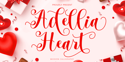 Adellia Heart is a modern calligraphy font created especially for Spring. Adellia Heart is great for unique branding, photo overlays, watermarks, greeting cards, posters, business cards, invitations, weddings, photography, fashion, clothing, letters, stationery, etc. This font is PUA encoded which means you can access all the glyphs and sweeps easily! Thank You
 - Choosing by OKSHUtypeCO,
$12.00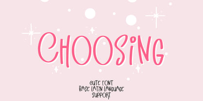 Choosing - a new fresh handmade calligraphy font. Very suitable for greeting cards, branding materials, business cards, quotes, posters, and more!This font are perfect for wedding postcard. Or you can create perfect and unique design of your logo, blog, stationery, marketing, magazines and more :) Features : UpperCase & Lowercase Numerals & Punctuations Multilingualcharacters(AÀÁÂÃÄÅCÇDÐEÈÉÊËIÌÍÎÏNÑOØÒÓÔÕÖUÙÜÚÛWYÝŸŸ ÆŒßÞàáâãäåæçèéêëìíîïðñòóôõöøùúûüýÿ)
 - Bugmansta by OKSHUtypeCO,
$12.00 Bugmansta - a new fresh handmade calligraphy font. Very suitable for greeting cards, branding materials, business cards, quotes, posters, and more!This font are perfect for wedding postcard. Or you can create perfect and unique design of your logo, blog, stationery, marketing, magazines and more :) Features : UpperCase & Lowercase Numerals & Punctuations Multilingualcharacters(AÀÁÂÃÄÅCÇDÐEÈÉÊËIÌÍÎÏNÑOØÒÓÔÕÖUÙÜÚÛWYÝŸŸ ÆŒßÞàáâãäåæçèéêëìíîïðñòóôõöøùúûüýÿ)
 - Thalita by Slex Studio,
$12.00 Thalita is an elegant and luxurious calligraphy font. It looks beautiful on a variety of designs requiring a personalized style, such as wedding invitations, thank you cards, weddings, greeting cards, logos and so on. This font is PUA encoded which means you can access all of the glyphs and swashes with ease!
 - Sporting by OKSHUtypeCO,
$14.00 Sporting- a new fresh handmade calligraphy font. Very suitable for greeting cards, branding materials, business cards, quotes, posters, and more!This font are perfect for wedding postcard. Or you can create perfect and unique design of your logo, blog, stationery, marketing, magazines and more :) Features : UpperCase & Lowercase Numerals & Punctuations Multilingualcharacters(AÀÁÂÃÄÅCÇDÐEÈÉÊËIÌÍÎÏNÑOØÒÓÔÕÖUÙÜÚÛWYÝŸŸ ÆŒßÞàáâãäåæçèéêëìíîïðñòóôõöøùúûüýÿ)
 - Revain by Sign Studio,
$24.00 Revain has the power to be mindful of typographic design. Equipped with an OpenType feature that can make a variety of style choices, namely: Small Caps, Stylistic Set 1 (for Uppercase), Stylistic Set 2 (for Lowercase). All characters have been PUA Encoded so that they can be accessed on most software in general.
 - Gabilo Script by Sulthan Studio,
$14.00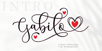 Gabilo Script font with a smooth, handwritten style. Gabilo script is perfect for branding projects, homeware design, product packaging, use in business cards, invitation cards, etc. Simply as a stylish text overlay onto a background image or anything that requires a touch of elegance. also comes with heart swashes that can be spliced.
 - Amania by Sealoung,
$15.00 Amania Signature is a unique and elegant handwritten font. It looks beautiful on a variety of designs requiring a personalized style, such as wedding invitations, thank you cards, weddings, greeting cards, logos and so on. This font is PUA encoded which means you can access all of the glyphs and swashes with ease!
 - Chalky Letters by DimitriAna,
$22.00 Chalky Letters is a multilayered font collection, created for the chalk-lettering lovers. Letters and ornaments are carefully hand-drawn to resemble the authentic chalk effect. 4 different vintage typographic styles along with a variety of decorations and shadow effects make endless combinations. The collection gives the designer the freedom to use it in any typographic project he can imagine: greeting cards, labels, large scale prints, branding, packaging, signage, editorial design. Typographic styles: Chalky Letters Heading: All caps, old fashioned, serif, with 2 styles of decoration and shadow effects Chalky Letters Label: All caps, heavy, serif, vintage, solid and outline, with 4 styles of decoration and a shadow effect Chalky Letters Script: Simple modern calligraphic with terminal forms and 2 alternate styles of descenders. Combined with a shadow effect. Chalky Letters Note: All caps, simple, thin, old fashioned, with a shadow effect Chalky Letters Extras: 2 styles of ribbons, frames and ornaments. The font collection supports Central, Eastern, Western European, Baltic, Turkish and Greek languages.
 - Maira by Prestigetype Studio,
$18.00 Beauty can change the perspective of the target audiences. Choose the right typeface to represent the beauty of your brand. Introducing Maira is a beautiful and versatile script font, with a careful touch of every single curve. Maira font has a beautiful and neat form so it can be easily read. Maira has a ton of alternate characters and bonus swash, making this font perfect for your branding project. It is suitable for use as a logo, Title, business cards, T-shirts, posters, printed quotes, wedding invitations, or any advertising purposes. Maira includes: numbers and punctuation multilingual ligatures alternates swash opentype features We highly recommend using a program that supports OpenType features and Glyphs panels like many Adobe apps and Corel Draw so you can see and access all Glyph variations. We hope you enjoy our font - please do let us know by emailing us at info@prestigetype.com or prestigetypestudio@gmail.com if you need something!
 - Mannish by Tacikworks,
$14.00 Tacikworks Studio presents Mannish Retro Display Font, an all caps font which is inspired by retro designs. Make the classic impression of this font stand out more. This font has approximately 400+ glyphs characters including uppercase, lowercase, discretionary ligatures and standard ligatures alternatives. It is suitable for creating vintage designs such as logo posters, merchandise, clothing, brochures, business cards and others. It can be accessed by using Open Type savvy programs like Adobe Illustrator and Adobe InDesign. features can be accessed by using Open Type save programs such as Adobe Illustrator, Adobe InDesign, Adobe Photoshop. So that all the alternate and ligature characters Easily can be accessed in full by a Craftsman or designer. Features: Uppercase Lowercase Numbers Punctuations Stylistic Alternates & Ligatures Multilingual Languages Supported HOW TO ACCESS ALTERNATE CHARACTERS Open Glyphs Panel: In Adobe Photoshop go to Window – glyphs In Adobe Illustrator go to Type – glyphs Not included: Product mockup, design template and textured background.
 - 1565 Venetian by GLC,
$20.00 This set of initial decorated letters is an entirely original creation, drawn inspired by Italian renaissance engraver Vespasiano Amphiareo's paterns published in Venice circa 1568. It contains two roman alphabets : the first of large Initials, the second of small caps. Both containing thorn, eth, L & l slash, O & o slash. It can be used as variously as web-site titles, posters and flyers design, publishing texts looking like ancient ones, or greeting cards, all various sorts of presentations, as a very decorative, elegant and luxurious additional font... This font is conceived for enlargements remaining very smart and fine. The original height of the initials is at least about one inch equivalent to about four lines of characters, small caps may have the same height than the caps of the font used with, but cover two lines is better. This font may be used with all GLC blackletter fonts, but preferably with "1543 Humane Jenson", "1557 Italic", "1742 Civilite", "1776 Independence" without any fear for doing anachronism.
 - Sagittarius by Hoefler & Co.,
$51.99 A typeface with lightly-worn futurism, Sagittarius is equally at home among the beauty and wellness aisles, or the coils of the warp core. The Sagittarius typeface was designed by Jonathan Hoefler in 2021. A decorative adaptation of Hoefler’s Peristyle typeface (2017), Sagittarius’s rounded corners and streamlined shapes recall the digital aesthetic of the first alphabets designed for machine reading, a style that survives as a cheeky Space Age invocation of futurism. Sagittarius was created for The Historical Dictionary of Science Fiction, where it first appeared in 2021. From the desk of the designer: Typeface designers spend a lot of time chasing down strange valences. We try to figure out what’s producing that whiff of Art Deco, or that vaguely militaristic air, or what’s making a once solemn typeface suddenly feel tongue-in-cheek. If we can identify the source of these qualities, we can cultivate them, and change the direction of the design; more often, we just extinguish them without mercy. Sometimes, we get the chance to follow a third path, which is how we arrived at Sagittarius. During the development of Peristyle, our family of compact, high-contrast sans serifs, I often found myself unwittingly humming space-age pop songs. Nothing about Peristyle’s chic and elegant letterforms suggested the deadpan romp of “The Planet Plan” by United Future Organization, let alone “Music To Watch Space Girls By” from the ill-advised (but delicious) Leonard Nimoy Presents Mr. Spock’s Music from Outer Space, but there they were. Something in the fonts was provoking an afterimage of the otherworldly, as if the typeface was sliding in and out of a parallel universe of high-tech spycraft and low-tech brawls with rubber-masked aliens. It might have had something to do with a new eyeglass prescription. But I liked the effect, and started thinking about creating an alternate, space-age version of the typeface, one with a little more funk, and a lot more fun. I wondered if softer edges, a measured dose of seventies retrofuturism, and some proper draftsmanship might produce a typeface not only suitable for sci-fi potboilers, but for more serious projects, too: why not a line of skin care products, a fitness system, a high-end digital camera, or a music festival? I put a pin in the idea, wondering if there’d ever be a project that called for equal parts sobriety and fantasy. And almost immediately, exactly such a project appeared. The Historical Dictionary of Science Fiction Jesse Sheidlower is a lexicographer, a former Editor at Large for the Oxford English Dictionary, and a longtime friend. He’s someone who takes equal pleasure in the words ‘usufructuary’ and ‘megaboss,’ and therefore a welcome collaborator for the typeface designer whose love of the Flemish baroque is matched by a fondness for alphabets made of logs. Jesse was preparing to launch The Historical Dictionary of Science Fiction, a comprehensive online resource dedicated to the terminology of the genre, whose combination of scholarship and joy was a perfect fit for the typeface I imagined. For linguists, there’d be well-researched citations to explain how the hitherto uninvented ‘force field’ and ‘warp speed’ came to enter the lexicon. For science fiction fans, there’d be definitive (and sometimes surprising) histories of the argot of Stars both Trek and Wars. And for everyone, there’d be the pleasure of discovering science fiction’s less enduring contributions, from ‘saucerman’ to ‘braintape,’ each ripe for a comeback. A moderated, crowdsourced project, the dictionary is now online and growing every day. You’ll find it dressed in three font families from H&Co: Whitney ScreenSmart for its text, Decimal for its navigational icons, and Sagittarius for its headlines — with some of the font’s more fantastical alternate characters turned on. The New Typeface Sagittarius is a typeface whose rounded corners and streamlined forms give it a romantically scientific voice. In the interest of versatility, its letterforms make only oblique references to specific technologies, helping the typeface remain open to interpretation. But for projects that need the full-throated voice of science fiction, a few sets of digital accessories are included, which designers can introduce at their own discretion. There are alternate letters with futuristic pedigrees, from the barless A popularized by Danne & Blackburn’s 1975 ‘worm’ logo for NASA, to a disconnected K recalling the 1968 RCA logo by Lippincott & Margulies. A collection of digitally-inspired symbols are included for decorative use, from the evocative MICR symbols of electronic banking, to the obligatory barcodes that forever haunt human–machine interactions. More widely applicable are the font’s arrows and manicules, and the automatic substitutions that resolve thirty-four awkward combinations of letters with streamlined ligatures. About the Name Sagittarius is one of thirteen constellations of the zodiac, and home to some of astronomy’s most inspiring discoveries. In 1977, a powerful radio signal originating in the Sagittarius constellation was considered by many to be the most compelling recorded evidence of extraterrestrial life. Thanks to an astronomer’s enthusiastically penned comment, the 72-second transmission became known as the Wow! signal, and it galvanized support for one of science’s most affecting projects, the Search for Extraterrestrial Intelligence (SETI). More recently, Sagittarius has been identified as the location of a staggering celestial discovery: a supermassive black hole, some 44 million kilometers in diameter, in the Galactic Center of the Milky Way. <