10,000 search results
(0.014 seconds)
- Lektorat by TypeTogether,
$35.00 Florian Fecher’s Lektorat font family is one for the books, and for the screens, and for the magazines. While an editorial’s main goals are to entertain, inform, and persuade, more should be considered. For example, clear divisions are necessary, not just from one article to the next, but in how each is positioned as op-ed or fact-based, infographic or table, vilifying or uplifting. From masthead to colophon, Lektorat has six concise text styles and 21 display styles to captivate, educate, and motivate within any editorial purpose. Magazines and related publications are notoriously difficult to brand and then to format accordingly. The research behind Lektorat focused on expression versus communication and what it takes for a great typeface to accomplish both tasks. In the changeover from the 19th to 20th century, German type foundry Schelter & Giesecke published several grotesque families that would become Lektorat’s partial inspiration. Experimentation with concepts from different exemplars gave birth to Lektorat’s manifest character traits: raised shoulders, deep incisions within highly contrasted junctions, and asymmetrical counters in a sans family. After thoroughly analysing magazine publishing and editorial designs, Florian discovered that a concise setup is sufficient for general paragraph text. So Lektorat’s text offering is concentrated into six total styles: regular, semibold, and bold with their obliques. Stylistic sets are equally minimal; an alternate ‘k, K’ and tail-less ‘a’ appear in text only. No fluff, no wasted “good intentions”, just a laser-like suite to focus the reader on the words. The display styles were another matter. They aim to attract attention in banners, as oversized type filling small spaces, photo knockouts, and in subsidiary headings like decks, callouts, sections, and more. For these reasons, three dialed-in widths — Narrow, Condensed, and Compressed — complete the display offerings in seven upright weights each, flaunting 21 headlining fonts in total. If being on font technology’s cutting edge is more your goal, the Lektorat type family is optionally available in three small variable font files for ultimate control and data savings. The Lektorat typeface was forged with a steel spine for pixel and print publishing. It unwaveringly informs, convincingly persuades, and aesthetically entertains when the tone calls for it. Its sans serif forms expand in methodical ways until the heaviest two weights close in, highlighting its irrepressible usefulness to the very end. Lektorat is an example of how much we relish entering into an agreed battle of persuasion — one which both sides actually enjoy.
 - Ratilla Script by Krafted,
$10.00 Be yourself; everyone else is already taken -- Oscar Wilde Being a human being often means fulfilling who you really are. It’s about fulfilling your potential and living to the best of your abilities. And the Ratilla Script will help you show the world who you are! The Ratilla Script paves the way for you to write the information you need to send out to your audience. Make your projects to works of art, conveying your intentions clearly with the font! Maximize your designs with this urban and wavy font. It surely fits anywhere you want them to, giving them a place perfectly tucked in between your designs. Connect with your audience and stand out in the crowd as these fonts will show you that you and your works deserve their attention. Show your boldness as you make the world see of the elegant details put together in your projects! The Ratilla Script will be the perfect addition to aid you in your journey to be who you really are. Let the world see your beauty, bring it out through your handiwork and give your viewers a new perspective!
 - EbuScript by Type-Ø-Tones,
$40.00 EbuScript by José Manuel Urós. OpenType, 1 style The very first font of Type-Ø-Tones, EbuScript, comes from the pen of José Manuel Urós —nicknamed Ebú in those times. Now it is still in our catalogue thanks to a completed and improved version.
 - Colosseum by Alan Meeks,
$45.00 Although a sans serif, Colosseum owes its style to the original Trajan Roman form. Borrowing some characteristics from Friz Quadrata, in its san serif form it is more adaptable to text usage whilst still having a modern and original look which works well in headlines.
 - Driade by IHOF,
$24.95 Driade is a font family based on personal calligraphic expression. It is exotic but still familiar, readable and graced with a human touch. The “Aged” style features irregularities found in Kothay’s original brush drawings. While the “Lined” pares the letterforms down to their basic forms.
 - Blastatic by Remedy667,
$18.00 Blastatic! is a highly versatile and unique sans-serif display typeface, but still desires an offbeat, modern style. Blastatic!, new from Remedy667, has the power to turn your designs into masterpieces. With ligatures, extended glyphs, and complimentary alternates, this typeface can do it all. Whether you’re designing for a Jazz Album, Godzilla Movie, or Hot Rod Magazine, Blastatic! will give you an irresistible style. Saul Bass fans take note, this stuff’ll give you vertigo.
 - Kontradix by Invasi Studio,
$19.00 A new collection of retro display fonts. Kontradix is a reverse contrast display font with a contemporary concept and modern styling. Ensuring carefully crafted styles result from the use of this font. The alternates and ligatures in this font can make your projects more interesting. The imperfections keep it casual while still providing legibility. It's ideal for headlines, flyers, posters, greeting cards, product packaging, book covers, logotypes, and album covers, among other things.
 - Untold History by Arterfak Project,
$15.00 Lights up your past memory with Untold History font, a classic typewriting font designed in modern style. Comes in four available styles: regular, bold, underlined, and inky. Each style has its own unique touch, allowing you to create a variety of designs. The inky style adds a subtle ink bleed effect to the letters, giving it a more authentic vintage look. Inspired by classic typing machines, this font gives the taste of the past while still being versatile enough for modern designs. Untold History is suitable for a range of projects, such as editorial designs, vintage posters, books, branding, and quotes. Fonts featured : Uppercase Lowercase Numbers & symbols Punctuation Stylistic alternates Multilingual support Thank you for always supporting our work!
 - Brogads by Stringlabs Creative Studio,
$25.00 Brogads is a magical script font carefully created with a touch of elegance. This is a beautiful combination of timeless elegance and authentic calligraphy. It features an incredibly classic style, while still keeping a friendly feel. Brogads is the perfect font for making original and outstanding designs.
 - Kuriland by RahagitaType,
$15.00 Kuriland is a magical handwritten font carefully created with a touch of elegance. This is a beautiful combination of timeless elegance and authentic calligraphy. It features an incredibly classic style, while still keeping a friendly feel. Kuriland is the perfect font for making original and outstanding designs.
 - Eye Spy, designed by the talented David Martin, is a font that captures the very essence of intrigue and mystery, designed to evoke a sense of curiosity and keen observation in its viewers. With its ...
- Contane Condensed by Hoftype,
$49.00 Contane Condensed is the slim complement to the Contane Family. Its economic proportions permit space saving applications, in particularly, eye catching headlines and subheads. Contane Condensed is high-contrasted, and the spiky wedge shaped serifs, still result in an elegant text flow. Contane supports up to 80 languages and it’s OpenType format allows a wide range of typographic applications. 20 styles offer fine graduation of the weights. All weights contain small caps, ligatures, superior characters, proportional lining figures, tabular lining figures, proportional old style figures, lining old style figures, matching currency symbols, fraction- and scientific numerals, matching arrows and alternate characters.
 - Fact by ParaType,
$29.00 Fact is a workhorse open sans serif type system. It is inspired by the great Frutiger typeface. While the Regular style is slightly modernized but still quite close to Frutiger, changing the weight or width makes differences of the design more pronounced. The style range of Fact is wider than of any cognate type family, including weights from Thin to Black and widths from Compressed to Expanded. Fact type system contains 48 upright styles and 48 italics with variations in width and weight. The font was designed by Alexandra Korolkova and Manvel Shmavonyan and released by Paratype in 2018-2019.
 - Contane by Hoftype,
$49.00 Contane is a new font with a classical character. It is high-contrasted and nobel in appearance, but still objective and clean. It is predestined for headlines, editorials and small text applications. All Italic weights also contain Swash Capitals for especially fancy occasions. Contane supports up to 80 languages and it’s OpenType format allows a wide range of typographic applications. 20 styles offer fine graduation of the weights. All weights contain small caps, ligatures, superior characters, proportional lining figures, tabular lining figures, proportional old style figures, lining old style figures, matching currency symbols, fraction- and scientific numerals, matching arrows and alternate characters.
 - ITC Johnston by ITC,
$29.00ITC Johnston is the result of the combined talents of Dave Farey and Richard Dawson, based on the work of Edward Johnston. In developing ITC Johnston, says London type designer Dave Farey, he did “lots of research on not only the face but the man.” Edward Johnston was something of an eccentric, “famous for sitting in a deck chair and carrying toast in his pockets.” (The deck chair was his preferred furniture in his own living room; the toast was so that he’d always have sustenance near at hand.) Johnston was also almost single-handedly responsible, early in this century, for the revival in Britain of the Renaissance calligraphic tradition of the chancery italic. His book Writing & Illuminating, & Lettering (with its peculiar extraneous comma in the title) is a classic on its subject, and his influence on his contemporaries was tremendous. He is perhaps best remembered, however, for the alphabet that he designed in 1916 for the London Underground Railway (now London Transport), which was based on his original “block letter” model. Johnston’s letters were constructed very carefully, based on his study of historical writing techniques at the British Museum. His capital letters took their form from the best classical Roman inscriptions. “He had serious rules for his sans serif style,” says Farey, “particularly the height-to-weight ratio of 1:7 for the construction of line weight, and therefore horizontals and verticals were to be the same thickness. Johnston’s O’s and C’s and G’s and even his S’s were constructions of perfect circles. This was a bit of a problem as far as text sizes were concerned, or in reality sizes smaller than half an inch. It also precluded any other weight but medium ‘ any weight lighter or heavier than his 1:7 relationship.” Johnston was famously slow at any project he undertook, says Farey. “He did eventually, under protest, create a bolder weight, in capitals only ‘ which took twenty years to complete.” Farey and his colleague Richard Dawson have based ITC Johnston on Edward Johnston’s original block letters, expanding them into a three-weight type family. Johnston himself never called his Underground lettering a typeface, according to Farey. It was an alphabet meant for signage and other display purposes, designed to be legible at a glance rather than readable in passages of text. Farey and Dawson’s adaptation retains the sparkling starkness of Johnston’s letters while combining comfortably into text. Johnston’s block letter bears an obvious resemblance to Gill Sans, the highly successful type family developed by Monotype in the 1920s. The young Eric Gill had studied under Johnston at the London College of Printing, worked on the Underground project with him, and followed many of the same principles in developing his own sans serif typeface. The Johnston letters gave a characteristic look to London’s transport system after the First World War, but it was Gill Sans that became the emblematic letter form of British graphic design for decades. (Johnston’s sans serif continued in use in the Underground until the early ‘80s, when a revised and modernized version, with a tighter fit and a larger x-height, was designed by the London design firm Banks and Miles.) Farey and Dawson, working from their studio in London’s Clerkenwell, wanted to create a type family that was neither a museum piece nor a bastardization, and that would “provide an alternative of the same school” to the omnipresent Gill Sans. “These alphabets,” says Farey, referring to the Johnston letters, “have never been developed as contemporary styles.” He and Dawson not only devised three weights of ITC Johnston but gave it a full set of small capitals in each weight ‘ something that neither the original Johnston face nor the Gill faces have ‘ as well as old-style figures and several alternate characters. - Tiler JNL by Jeff Levine,
$29.00 Tiler JNL is a novelty font with geometric styling. Its use can be as diverse as an ad for wall or floor tile to conveying a modular feel within a futuristic setting to signage on the wall of an old-time subway station.
 - Halgeta by AF Type,
$10.00 Meet the slick new calligraphy font - Halgeta. This beautiful script is for those who need elegance and style for their designs and is perfect for wedding invitations, storing date cards, feminine branding and other necessities. This font is modern, simple, but still authentic. Halgeta includes a full set of Basic Uppercase and Lowercase Characters, Numbers and Punctuation. It also contains binders and lots of style alternatives to perfectly recreate natural calligraphy (check the preview to see them all).
 - Chatter Pro by Jonahfonts,
$35.00 Chatter Pro is a handwritten unconnected script face in four styles: Light, Regular, Semibold and Bold with Small-Caps. Chatter Pro is a Pro-version of my previous font 'Chatter'. A free style specifically designed for Packaging but still works well for Greeting cards, Magazines, Posters and Advertising Ads. Invoking the OpenType CONTEXTUAL ALTERNATIVE variant. A space after any lower-case glyph will produce the word terminal. (Opentype variants may only be accessible via Opentype-Aware applications.)
 - Faddy by Ani Dimitrova,
$25.00 Faddy is always fresh, smiling, slightly crazed, sometimes angry, often fuzzy, and can also be very funny. You can write with Faddy in multiple languages. Faddy contains 3 different styles - Regular, Circle & Shaggy. Each style includes more than 500 glyphs, as well as the necessary OpenType features: Superscript, Subscript, Tabular Figures, Arrows, Matching currency symbols, and fractions. Faddy also has a lot of fun stylistic sets, variants of letters that can give him a different mood and look.
 - Mosaic by Paul O'Connell,
$9.95 This innovative styled Mosaic font was created to suit various design applications within the typeface market and is aimed at people looking for a modern styled brush script typeface that doesn't fit in with the regular trends of script fonts. Designed and produced by Paul O'Connell of POCT, it is a slick and light hearted script typeface that reflects many irregularities, but still manages to retain a very balanced and modern feel with just a touch of fun too.
 - Checker by Shinntype,
$29.00 Checker is an all-cap ‘three-D’ font which automatically alternates white letters on black tiles with black letters on white tiles, by means of the Contextual Alternates feature. Checker is an attention grabber suitable for logos, titles and short headings. With its tiled construction, it's a natural for colorful interpretation. The letters are properly italicized and back-slanted, and adjusted for maximum readability within the constraints of the font’s concept. The letter style is bold grotesque, so Checker will mix smoothly with any other fonts in a layout.
 - Gazardiel by Scriptorium,
$18.00Gazardiel is a decorative new script font with elaborate flourishes on the upper case characters, interlocking lower case and calligraphic-style weighting which creates a very attractive overall look. The upper case characters are quite complex, but still readable. It's an excellent font for invitations or other formal designs. - Overexposed by Cool Fonts,
$24.00 This is a "Grunge" style font that looks as if it was overexposed on film. It is funky yet still very readable. It is best used in sizes over 12 points but really looks cool when used over 16 points. This is a favorite for use in video graphics.
 - Awely Shiny by Stringlabs Creative Studio,
$29.00 Awely Shiny is a magical handwritten font carefully created with a touch of elegance. This is a beautiful combination of timeless elegance and authentic calligraphy. It features an incredibly classic style, while still keeping a friendly feel. This font is the perfect font for making original and outstanding designs.
 - Taniya Relly by Stringlabs Creative Studio,
$25.00 Taniya Relly is a magical handwritten font carefully created with a touch of elegance. This is a beautiful combination of timeless elegance and authentic calligraphy. It features an incredibly classic style, while still keeping a friendly feel. This font is the perfect font for making original and outstanding designs.
 - Yolan Script by FadeLine Studio,
$15.00 This is a new font script with a unique and thin style. Not only unique, the font is made in detail also has an elegant style, sweet, simple and firm character. With a unique style that dancing, this font can make your design more alive. When you use this font sometimes you do not need to use other fonts pairing, this font can be used in single, but still as you wish! If you are curious, please try it! With a style like this, this font will be suitable in use for logo's, branding projects, homeware designs, product packaging, mugs, quotes, posters, shopping bags, logo's, t-shirts, book covers, name card, invitation cards, greeting cards, and all your other lovely projects.
 - Malista by Genesislab,
$5.00 Malista is a large yet elegant Family display font. The unique and creative character according to today's style will be very interesting for you to create any design work with a classy model while still maintaining a calm and classy style to look at. You're sure to have inspiration to match your creativity! Multilingual Support. Ligature Pounding . Malista . Malista Italic . Malista Italic Outline . Malista Outline . Malista Rounde . Malista Rounde Italic Don't delay any longer to download quality goods only here. Thank You
 - Farmhand by Adam Ladd,
$25.00 Farmhand is a textured, hand drawn family featuring serif, sans, inline, italic, and extras styles suited for display titling. An all-caps typeface with individually drawn small caps for lowercase. Experiment by mixing and matching the casing for titling effects. Great for packaging and branding. The sans adds a different look but still has the vintage appeal. Try the inline styles to add a little more distinction to your type or the matching catchwords and ornaments to add typographic interest.
 - Clarendon LT by Linotype,
$40.99The first slab serif fonts appeared at the beginning of industrialization in Great Britain in 1820. Clarendon and Ionic became the names for this new development in England, known as English Egyptienne elsewhere in Europe. Clarendon is also the name of a particular font of this style, which, thanks to its clear, objective and timeless forms, never lost its contemporary feel. In small point sizes Clarendon is still a legible font and in larger print, its individual style attracts attention. - Clarendon by Linotype,
$29.99 The first slab serif fonts appeared at the beginning of industrialization in Great Britain in 1820. Clarendon and Ionic became the names for this new development in England, known as English Egyptienne elsewhere in Europe. Clarendon is also the name of a particular font of this style, which, thanks to its clear, objective and timeless forms, never lost its contemporary feel. In small point sizes Clarendon is still a legible font and in larger print, its individual style attracts attention.
 - The Aquebella by Jafar07,
$18.00 The Aquebella font was made because I had too much trouble finding a font that was unique but still within the serif standard, as a branding designer about finding a suitable font for a client who is looking for a luxurious and elegant design, and finally this font is finished which you can use as a designer or someone who need a serif font with a very unique style, elegant style and can be used as a logo, magazine header, poster, etc.
 - Milenium by FadeLine Studio,
$15.00 This is a new modern calligraphy font in casual and simple style. This font is italic and semibold that is made slowly and thoroughly which aims to convey the character of writing that is elegant, neat, simple, bold and still stylish. With a style like this, this font will be suitable in use for logo's, branding projects, homeware designs, product packaging, mugs, quotes, posters, shopping bags, logo's, t-shirts, book covers, name card, invitation cards, greeting cards, and all your other lovely projects.
 - Lovetina by Cooldesignlab,
$12.00 Meet the new slick calligraphy font - Lovetina. This gorgeous script is for those who need some elegance and style for their designs and is perfect for wedding invitations, saving date cards, feminine branding, and other necessities. This font is modern with a love style, but still authentic. Lovetina includes the complete set of Basic Uppercase and Lowercase Characters, Numbers, and Punctuation. It also contains binders and many stylistic alternatives to perfectly recreate natural calligraphy (check the preview to see all of them).
 - Byronic by Alan Meeks,
$30.00 Byronic is soft modern sans-serif but with an antique style lower-case. The rounded end soft look gives Byronic a friendly soft look whilst still retaining a classical typographic appearance. A very clean style and slightly condensed it is excellent for text setting and headline with an unusual loser case that compliments the caps perfectly. Available in a range of 5 weights and 5 italics and a Latin Pro character set of 430 characters including ranging numerals and small caps.
 - Aden by Sultan Fonts,
$19.99 Aden is An Arabic typeface for desktop applications. Aden is Modern typeface style. The font comes in two styles: normal and bold. The design is open, calligraphic, and very dynamic. This makes it suitable for large display sizes, especially in the area of advertising, while still functioning well as a text face. The font includes a matching Latin design and support for Arabic. It also includes proportional and tabular numerals for the supported languages. Aden typeface comes with many opentype features.
 - Anhattan by Stringlabs Creative Studio,
$25.00 Anhattan is a nostlagic retro script with a fun feel. Get inspired by its vintage aesthetic! This is a beautiful combination of timeless elegance and authentic calligraphy. It features an incredibly classic style, while still keeping a friendly feel. Anhattan is the perfect font for making original and outstanding designs.
 - Mere by Josh Grzybowski,
$19.99 Loosely based on a Jan Tschichold specimen, Mere is a clean geometric sans-serif with simple lines that are best viewed as larger print but still have an impact at smaller point sizes. In addition to ligatures and fractions, Mere’s other OpenType features include old style numbers and small caps.
 - Bridgera by Akrtype Studio,
$15.00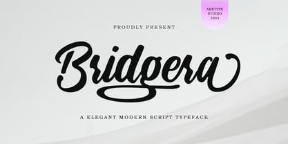 Bridgera script font is a magical script font carefully created with a touch of elegance. This is a beautiful combination of timeless elegance and authentic calligraphy. It features an incredibly classic style, while still keeping a friendly feel. Bridgera script font is the perfect font for making original and outstanding designs.
 - Performer JNL by Jeff Levine,
$29.00 Performer JNL, is a typeface re-drawn from condensed hand lettering found on a piece of vintage sheet music. Fairly basic in style, there are still some hints of the Art Deco influence that permeated the 1930s and 1940s art, design and typography. Available in both regular and oblique versions.
 - Carnaby Street by Mysterylab,
$19.00 Carnaby Street is a vintage style bold font that pairs strong rectangular framing with softer rounded elements. It has a cool, funky, and groovy vibe, while still retaining a strong sense of linearity and geometry. This lettering style conjures up the retro vibes of the 1960s swinging London scene, or the psychedelic poster art of posters and handbills for the Fillmore Auditorium and Avalon Ballroom in San Francisco in the mid to late '60s. It represents a new take on a classic array of hand lettered stylings that have their roots both in the Art Nouveau Movement and the hippie counterculture movement of the 1960s and early 1970s.