8,142 search results
(0.018 seconds)
- Tangential Rounded by ArtyType,
$29.00 This variation of Tangential (see also the Standard & Semi Serif variants) continues with the angles that give the typeface its name; however, the square terminals are half-rounded to create a softer and slightly more fluid styling. The Tangential style I envisaged for the family is complemented by the prominent use of negative space throughout, most apparent on the drop-shaped ‘o,’ which is a key feature of the typeface and a letterform I'm particularly pleased with. Available in 2 weights, Regular & Bold, in both OpenType OTF & TrueType TTF formats.
 - Appleyard by Red Rooster Collection,
$45.00 Appleyard is a transitional serif font family that combines the elements of a modern serif and old-style typefaces. It is loosely based on an old Monotype design called ‘Prumyslava.’ Appleyard was designed by A. Pat Hickson (P&P Hickson) exclusively for the Red Rooster Collection and produced by Steve Jackaman (ITF) in 1992. The typeface’s rounded serifs give it a sophisticated, warm, and friendly feel; it excels in projects that need a delicate touch. Appleyard was designed with legibility in mind, and is ideal in children’s books and for young readers.
 - Caffe by IHOF,
$24.95 Caffe was originally designed for the Artz Gallery Cafe in Budapest Hungary. The design is a contemporary handwriting style adapted from examples in lettering exercise books. It has been redrawn and expanded into six styles. The four weights were created by drawing the style using different mediums: Cappuccino in pen, Pastry in felt-tip, Lemonade in brush, and Tobacco—the original—in pencil. Poster and Poster Inline round out the family and are well suited for display purposes. This font family is perfect for bistro menus or other European-flavored poster and print design.
 - Claremont by Red Rooster Collection,
$45.00Claremont is a serif font family designed by Les Usherwood (Typsettra). Usherwood originally created four weights – a light, extra bold, light italic, and extra bold italic. Paul Hickson (P&P Hickson) and Steve Jackaman (ITF) digitized the family and created eight new weights, and it was released exclusively for the Red Rooster Collection in 1993. Claremont shares similarities to Bookman Old Style, but also shares properties with slab serif Egyptian-style typefaces. Like all Usherwood typefaces, the family was engineered with great care for maximum legibility and aesthetics. ©1993. International TypeFounders, Inc. - Lemoo by Locomotype,
$15.00 Lemoo is a family of fat fonts made with irregular shapes to make it more dynamic and unusual. This font will give the impression of solid, strong and prominent. Suitable for headlines, posters and messages that want to stand out. There are two styles in each variant: clean and press. You can mix and match the Lemoo font family to get different results. The ligature feature makes some pairs of letters more interesting on your headline and posters. Lemoo fonts are available in OTF and TTF format, also multilingual support.
 - Biffo by Monotype,
$29.99Biffo was designed by David Marshall and produced in 1964. The alphabet in handwritten style has the character of writing done with a broad tipped pen. The figures are round and flexible, even its vertical strokes have rounded edges, softening the look of the characters. The basic forms show parallels with a pear shape: generous in the lower third and thinning out as they move upward. Biffo is a unique, lively typeface perfect for personal correpondence and for communicating spontaneity. It is best for short and middle length texts as well as headlines. - Turkuaz by Fontop,
$10.00 Welcome my new typeface family Turkuaz. Funny and stylish, creative and distinctive Turkuaz is great in headlines, premiums and web sites + blogs. Being a super readable it can be used in texts as well. Three fonts are included into the family – Turkuaz Regular, Turkuaz Deco and Turkuaz Italic. Special ligatures that you can switch on/switch off make headlines and texts sooo cute, I love them! Both OTF and TTF are included for each font. Fonts are Latin multilingual and have uppercase letters, lowercase letters, numbers and basic punctuations.
 - Tangential SemiSerif by ArtyType,
$29.00 This variation in the Tangential series (see also the Standard & Rounded families) continues with the angles that give the typeface its name, however a semi-serif is applied wherever appropriate to create a more open, softer variant. The Tangential style I envisaged for the family is complemented by the prominent use of negative space throughout, most apparent on the drop shaped ‘o’ which is a key feature of the typeface and a letterform I'm particularly pleased with. Available in 2 weights, Regular & Bold, in both OpenType OTF & TrueType TTF formats.
 - 1676 Morden Map by GLC,
$42.00 This family was created -- inspired from the engraved typeface (Two styles : Normal & Italic) used in the pack of 52 playing cards who was describing the 52 counties forming a small Atlas of England and Wales and depicting English roads for the first time, published by Sir Robert Morden in 1676. Our OTF and TTF versions are covering Western, Eastern and Central European languages (including Celtic), Baltic and Turkish, containing historical and standard ligatures plus specific Old English abbreviations. The MacTT Classic version is containing the basic standard 256 glyphs including some extra ligatures.
 - Alghera Pro by Red Rooster Collection,
$60.00 Alghera Pro is a casual script font family. It was digitally engineered in 1996 by Pat Hickson of P+P Hickson and Steve Jackaman of International TypeFounders, Inc. (ITF). Jackaman revamped the family in 2017 and added wider language support to include Western, Central, and Eastern European languages. Alghera Pro has a hand-written, antique feel, and was inspired by an old label on a bottle of Portuguese wine. As with all the Red Rooster “Pro” versions, the family contains a 40% larger glyph set and improved designs.
 - Chelsea by Red Rooster Collection,
$45.00 Designed by Les Usherwood. Chelsea is a ‘modern’ Old Style serif font family designed by Les Usherwood (Typsettra) in the early 1980’s. Steve Jackaman (ITF) digitally engineered the family exclusively for ITF’s Red Rooster Collection in 1993. Usherwood drew influence from Frederic Goudy’s 1911 creation ‘Kennerley Old Style’ when designing Chelsea; Chelsea, however, tends to be wider with a taller x-height. Chelsea has the clean and upscale feel that is present in all Usherwood creations, and its legible design lends itself to projects of any size.
 - Everything Preserved by Graphicxell,
$19.00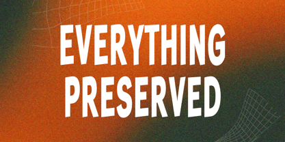 Everything Preserved Sans Font Typeface inspired by the famous minimalist logo perfect for the purposes of designing templates, brochures, videos, advertising branding, logos, invitation, layout design, elegant crafting, beauty design and other What's Included : + otf/ttf file + Standard glyphs + International Accent + Works on PC & Mac + Simple installations Accessible in the Adobe Illustrator, Adobe Photoshop, Corel Draw. PUA Encoded Characters - Fully accessible without additional design software. Fonts include multilingual support Image used : All photographs/pictures/vector used in the preview are not included, they are intended for illustration purpose only. Thank You
 - Europa Grotesque by Red Rooster Collection,
$49.00 Europa Grotesque is a condensed sans serif font family that was originally designed by Sam Ardell (TP) in the 1950’s for the Techni-Process Collection. Steve Jackaman (ITF) acquired the rights to the TP Collection in 1991 and produced Europa Grotesque in its digital form in 1994. Europa Grotesque has impressive impact at display and subhead sizes, and its geometric forms sustain that distinctiveness in both all-caps and lowercase. The family is flexible and freeform enough to support both a laid-back feel while still feeling tight and controlled.
 - Jenson by Supfonts,
$22.00 Introducing the elegant new Jenson Font! For those of you who are needing a touch of elegance and modernity for your designs, this font was created for you! Jenson was built with OpenType features and includes beginning and ending swashes, alternate swash characters for most lowercase letters, numbers, punctuation, alternates, ligatures and it also supports all latin languages :) What's Included Jenson TTF Jenson OTF Multilingual support all Latin languages Check out my blog: www.instagram.com/youthlettering pinterest.com/dmitriychirkov7 Thanks so much for checking out my shop! All the best, Dmitrii
 - Episode by Fontop,
$12.00 Introducing a new sanserif typeface EPISODE. Elegant yet distinctive and creative. Perfect for posters, leaflets, books, magazines, presentations as well as headers in advertising layouts. Two fonts are included into the family – Episode Condensed and Episode Condensed 3D that gives more opportunity for your creativity. Both fonts has swashes that are very easy to add – just use number 0-9 + letter you want to add the swash to. Both OTF and TTF are included for each font. Fonts are Latin multilingual and have uppercase letters, lowercase letters, numbers and basic punctuations.
 - Qualux by Asenbayu,
$12.00 Qualux is a versatile high-contrast serif font family. Qualux comes from the words Quality and Luxury. This font has vintage characteristics with a luxurious style in light, but also has a friendly and playful style in bold. Each glyph has a soft, rounded tip. This font is suitable for many various projects such as logos, branding, magazines, signage, fashion and many more. Qualux consists of 8 styles: Light, Light Italic, Regular, Italic, Semibold, Semibold Italic, Bold, and Bold Italic. These fonts feature Kerning, Standard Glyph, Stylistic Alternate & Ligature, Numeral, Symbol, and Multilingual Supports.
 - Dungeon by Red Rooster Collection,
$45.00 Dungeon is a glyphic font family that combines elements of both sans serif and spur serif typefaces. It was designed exclusively for the Red Rooster Collection in 1998 by Steve Jackaman (ITF). The family is loosely based on Dick Jensen’s famous design “Serpentine,” which was created for the Visual Graphics Corporation (VGC) in 1972. Dungeon is available in four weights, each of which is optimized for legibility at any size. The family’s masculine feel has helped it to turn up in a variety of projects, ranging from brand identity to advertising.
 - HGB Bluesband One by HGB fonts,
$23.00 The roots of this font go back to 1967. A book title in trendy letters was created in a completely ingenuous way as a film prop for a Super 8 fun film. I drew the letters with felt-tip pen and poster paint without thinking too much about it. It wasn't until a good 50 years later that I realized, this was a first awkward typeface draft. The flower power vibe was captured here subconsciously. In 2019 I completed the few glyphs and created variants that I would not have thought of at the time.
 - Westack by Almarkha Type,
$35.00 Introducing Westack – Modern Display Serif inspired by the famous minimalist logo, perfect for the purposes of designing templates, brochures, videos, advertising branding, logos and more. What’s Included : Westack (OTF/TTF) Standard glyphs Ligatures Web Font International Accent Works on PC & Mac Simple installations Accessible in the Adobe Illustrator, Adobe Photoshop, Adobe InDesign, even work on Microsoft Word. PUA Encoded Characters – Fully accessible without additional design software. Fonts include multilingual support +Image used : All photographs/pictures/vector used in the preview are not included, they are intended for illustration purpose only. Cheers! Thank You
 - Banshee by Adobe,
$29.00The wind howled, the night grew long, and British type designer and lettering artist Tim Donaldson created the typeface Banshee. This dramatic display face is modeled after one of Donaldson�s handwritten lettering styles. Banshee began as letters rapidly written by Donaldson with one of his homemade ruling" pens. The letterforms are firmly rooted in the tradition of classical chancery italics. With its ragged lines and counters, Banshee realistically captures the irregularity of pen and ink on paper, lending an immediacy to packaging, advertisements, posters, and invitations that few digital typefaces can match." - Argus by Red Rooster Collection,
$45.00 Designed by Les Usherwood. Argus is a flared serif font family. Its analog form was designed by Les Usherwood (Typsettra) in the 1980’s, and Paul Hickson (P&P Hickson) and Steve Jackaman (ITF) designed the digital version exclusively for the Red Rooster Collection in 1992. Argus is an expressive, graceful typeface that was inspired by Baroque typography. Its diamond-shaped punctuation shares similarities with other glyphic typefaces, such as Arthur Baker’s ‘Baker Signet.’ The font family gives a beautiful gravitas to any project, whether it be packaging, motion picture, or magazines.
 - 1848 Barricades by GLC,
$38.00 This family was inspired from a lot of 1848-1850 French engraved documents reproducing handwritten texts talking about the Paris' insurrection days in June 1848 (described by Victor Hugo in Les misérables) . It seems that all were first written using quill pens, as the strokes are too much heavy and bold for metal pens and even though the engraver work is very fine. We have added only a few characters, most of them were present in the originals. The TTF and OTF versions are enriched with more than 50 ligatures or alternate characters.
 - TS Remarker by Vitaliy Tsygankov,
$9.90 The font accelerates the process of adding inscriptions and eliminates the need to redraw the same letters every time. The lettering is based on a simple felt-tip pen. The lines have minimal contrast and are not meant to be perfect. A simple and uncomplicated design goes great with a happy holiday mood. The font is suitable for small postcard texts, social media images, invitations, branding, mockups, packaging, ads, and captions. The TS Remarker typeface consists of 4 fonts: 2 upright (normal for regular lettering and alternative for a more colorful impression) and 2 italic.
 - VanderHand by JOEBOB graphics,
$29.00 The 'VanderHand' font is a friendly and easy to use handwritten font. It is so loaded with ligatures it could easily pass for actual handwriting. The font was created with a felt-tip brush pen and so there are natural thick and thin parts in the characters. All writing was done upright with tightly fit characters. As a result this font has a unique 'instant logo' quality. But you should really try this out for yourself. O, and the font was written by Jeroen van der Ham. It's his handwriting. That's why it's called VanderHand.
 - PB Carolingian Xc by Paweł Burgiel,
$32.00 PB Carolingian Xc is a font face designed for imitate Carolingian minuscule (from the region of the German southeastern scribal schools) found in 10th century manuscripts. All characters are handwritten by use ink and quill pen, scanned, digitized and optimized for best quality without lost its handwritten visual appearance. Character set support codepages: 1250 Central (Eastern) European, 1252 Western (ANSI), 1254 Turkish, 1257 Baltic. Include also additional characters for Cornish, Danish, Dutch and Welsh language, spaces (M/1, M/2, M/3, M/4, M/6, thin, hair, zero width space etc.), historical characters (overlined uppercase Roman numerals, many mediaeval abbreviations, d-rotunda, r-rotunda, I-longa, e-caudata, historical ligatures for “nomina sacra”) and wide range of ancient punctuation. OpenType TrueType TTF (.ttf) font file include installed OpenType features: Access All Alternates, Localized Forms, Fractions, Ordinals, Superscript, Tabular Figures, Proportional Figures, Case-Sensitive Forms, Stylistic Alternates, Contextual Alternates, Stylistic Set 1-11, Historical Forms, Historical Ligatures, Standard Ligatures. Include also kerning as single ‘kern’ table for maximum possible backwards compatibility with older software. Historical ligatures for additional glyphs are mapped to Private Use Area codepoints. OpenType features automatically exchange some default glyphs by stylistic alternates and create ligatures for better historical appearance.
 - MMC Grafik by MMC-TypEngine,
$37.00 Modular Matrix «Calligraffiti» Robotic Letterform Typeface! New Edition. Redesigned with Obliques and OT Features! This Typeface was inspired by Graffiti Calligraphic Broad Markers and Underground Lettering Technic and Style, grid based by squares perpendiculars and Diagonals… Is Part of a juxtaposed “Type-Game” based on inversions and rotations… Type cool legible digital manuscript Aesthetics body text, scripts, lyrics, articles; Plus, Create Fancy Display’s Branding designs, Packaging, Publishing, Advertisement, Posters, Art Support, Motion, Games, tastes good to text on everything! Experiment Automatic and Responsive OpenType Features, like Fractions, Ordinals, Nominators, Denominators, Scientific Inferiors, Numerators, Localized forms and Kerning. Previous Released by MMC-Typo* 2020. Post Released by MMC-TypEngine 2022. Tip 1: Combine styles into infinite possibilities of Digital Monochromatic or Color Typesetting, by ‘central pasting’ or you may dislocate layers for improvisations! TIP 2: *BLIND BLOCKS ‘FREE-STYLES’ Use Block «Free Styles» 1 & 2 also to add 3D, change 3D directions by switching Block 1 to Block 2, that way you can Zig-Zag words and lines. *Also shift the block layer up to bottom limit, it makes the 3D direction turn upside down. *All Styles have 917 Glyphs. Follow the Groove!! & Power to The Pixel!! Greetings !! André, MMC-TypEngine.
 - Man Ray by Andinistas,
$29.00 ManRay is a photogenic typefamily of 6 fonts designed by @andinistas, with more than 2600 glyphs distributed in 3 Scripts and 3 Caps. Its shapes are ideal for attention-grabbing and for its eloquent character set, each style is presented with three levels of erosion planned with meticulous dotted texture bézier drawing, diagonal texture, and vertical texture pattern. ManRay Script, Script2, Script3 is based on calligraphy made with a fine tip brush and therefore communicates pleasant and attractive ideas. Its capital letters measure three times the height of the lower case and stand out for its artistic curved lines ideal for writing on photos, logos, labels, packaging, posters, covers of food products, spirits, organic teas, etc. In that order, it also offers other expressive alternate letters that activate spontaneously, and each of the three styles is case-infinite with and without Swash, Stylistic, and Titling Alternates. ManRay Caps, Caps2, Caps3 are inspired by calligraphic Roman letters drawn with a brush with a square tip and are equipped with descending flourishes for word start and end. The core of ManRay mixes the ideas of Ed Benguiat and Ross F. George and its name is a tribute to the Dada hero who changed history a century ago by working against the conventions of art and photography.
 - Quendel by URW Type Foundry,
$39.99 Quendel has been expanded to become Quendel Happy Family. Apart from the new Bold weight for easy distinction and emphasis, there are now four other very exciting variants, rendering different writing tools and writing materials. The basic form of Quendel was written with a Japanese bamboo tip and therefore embodies a form letter of natural flow. The new versions show other features that provide the feel of written scripts. While the styles Wood and Crayon include some alternate characters, Q Marking Pen and Q Fingertip, due to their apparently more complex enacted forms, do not need additional alternates without looking stiff or boring. The wood relief of Quendel Wood was created by a freehand wood relief drawn with oiled chalk. Quendel Marking Pen seems to be written with a felt-tip pen soon depleted. At the same time it is also reminiscent of the blooming effect, which we know from photography. The name of Quendel Fingertip suggests what can be seen - someone seems to have written with the finger in a grainy material. One would like to try it himself. The effect of broken lines which can be gained by writing with chalk as reflected in Quendel Crayon. Almost like parched sandy soil, the writing material seems to crumble.
 - Aspire SmallCaps by Grype,
$18.00 Geometric/Technical style logotypes have been developed for car chrome labels since the early 1980's. Many of these sleek logotypes are lacking an expansive family to enhance and express their brand in a richer sense, becoming true brand workhorses. The Aspire SmallCaps family finds its origin of inspiration in the ACURA automotive company logo, and from there expands to an 6 font family of weights & oblique styles, striving to become a workhorse. Aspire SmallCaps is perhaps the most true to form tribute to the original all capitals inspiration logotype. It maintains all capital forms (whether standard or smallcaps) and yet is still strikingly powerful in its presence and readability including numerals, and a comprehensive range of weights, creating a straightforward, uncompromising collection of typefaces that lend a solid foundation and a broad range of expression for designers. Here's what's included with the Aspire SmallCaps Family bundle: - 438 glyphs per style - including Capitals, Small Caps, Numerals, Punctuation and an extensive character set that covers multilingual support of latin based languages. (see the 6th graphic for a preview of the characters included) - Stylistic Alternates - alternate characters that remove the angled stencil cuts for a more standardized text look. - 3 weights in the family: Light, Regular, & Black. - 3 obliques in the family, one for each weight: Light, Regular, & Black. - Fonts are provided in TTF & OTF formats. The TTF format is the standard go to for most users, although the OTF and TTF function exactly the same. Here's why the Aspire SmallCaps Family is for you: - You're in need of automotive sans font family with a range of weights and obliques - You're love that ACURA letter styling, and want to design anything within that genre - You're looking for an alternative to Eurostile with more stylized letterforms. - You're looking for a battle-tech typeface for your futuristic war chest labelling. - You just like to collect quality fonts to add to your design arsenal
 - Aspire by Grype,
$18.00 Geometric/Technical style logotypes have been developed for car chrome labels since the early 1980’s. The styles are loaded with inspiration for great font families, but surprisingly, many of these sleek logotypes are lacking an expansive family to enhance and express their brand in a richer sense, becoming true brand workhorses. The Aspire family finds its origin of inspiration in the ACURA automotive company logo, and from there expands to an 6 font family of weights & oblique styles. Aspire pays homage the techno display styling of the inspiration logotype, further evolving beyond its brand inspired origin to give birth to a font family that pulls on modern and historical styles. It adopts a sturdy yet approachable style with its uniform stroke forms and curves, and goes on to include a lowercase, numerals, and a comprehensive range of weights, creating a straightforward, uncompromising collection of typefaces that lend a solid foundation and a broad range of expression for designers. Here’s what’s included with the Aspire Family bundle: 477 glyphs per style - including Capitals, Lowercase, Numerals, Punctuation and an extensive character set that covers multilingual support of latin based languages. (see the 6th graphic for a preview of the characters included) Stylistic Alternates - alternate characters that remove the angled stencil cuts for a more standardized text look. 3 weights in the family: Light, Regular, & Black. 3 obliques in the family, one for each weight: Light, Regular, & Black. Fonts are available in TTF & OTF formats. The TTF format is the standard go to for most users, although the OTF and TTF function exactly the same. Here’s why the Aspire Family is for you: - You’re in need of automotive sans font family with a range of weights and obliques. - You’re love that ACURA letter styling, and want to design anything within that genre. - You’re looking for an alternative to Eurostile with more stylized letterforms. - You’re looking for a clean techno typeface for your starship console labelling. - You just like to collect quality fonts to add to your design arsenal.
 - Sunblock Pro by Grype,
$19.00 Clean and geometric deco sans typefaces have been used in a range of scientific publications, corporate logotypes, and beauty products over the years. However, a typeface of this style has yet to have an expansive range of widths and weights to become a design workhorse, until now. The Sunblock family finds its origin of inspiration in the Coppertone sunscreen company logo, and from there expands to type megafamily. Sunblock celebrates the rounded geometric forms of deco and bauhaus lettering through a compressed lens, transcending its brand inspired origin to give birth to a font family that pulls on modern and historical styles. It inherited its soothing tone from the limited character logotype that inspired it, and goes on to include a lowercase, small caps, and a comprehensive range of widths and weights, creating a straightforward, uncompromising collection of typefaces that lend a solid foundation and a broad range of expression for designers. Here's what's included with the Sunblock Collection bundle: 643 glyphs per style - including Capitals, Lowercase, Numerals, Punctuation and an extensive character set that covers multilingual support of latin based languages. (see the 7th graphic for a preview of the characters included) 21 fonts in 5 width subfamilies: Ultra Condensed, Extra Condensed, Condensed, Semi Condensed, & Standard. 5 weights per subfamily (except Ultra Condensed): Thin, Light, Regular, Bold, & Black. Fonts are provided in both TTF & OTF formats. The TTF format is the standard go to for most users, although the OTF and TTF function exactly the same. Here's why the Sunblock Collection is for you: You're in need of a deco geometric font family with a big range of weights and widths You're love that Coppertone letter styling, and want to design anything within that genre You're looking for an alternative to Chalet Comprime with a more versatile range of styles You're looking to start up your own derivative Sunscreen product line You just like to collect quality fonts to add to your design arsenal
 - Tailwind by Grype,
$19.00 The world of aviation is filled with clean and iconic logotypes, yet some of the earlier logotypes were friendly and simple. The Tailwind family finds its origin of inspiration in an early Air Jamaica company logo, and from there is expanded into a small but comprehensive font family. Tailwind celebrates the typographic stylings of the 70’s, with the soft rounded terminals and open geometric feel, transcending its brand inspired origin to give birth to a family that feels both retro and modern. It inherited the friendly stylings of the mostly lowercase logo that inspired it, and goes on to include a full standard character set with expansive international support of latin based languages, small caps styles, and three weights jumping from light to regular to a heavyweight black. This family is ready to chart a course for your designs towards that of a modern, comfortable appeal. Here's what's included with the Tailwind Collection bundle: 382 glyphs per style - including Capitals, Lowercase, Numerals, Punctuation and an extensive character set that covers multilingual support of latin based languages. (see the 6th graphic for a preview of the characters included) 6 fonts in 3 weights: Light, Regular, Black . Small Caps versions available in all weights. Fonts are provided in TTF & OTF formats. The TTF format is the standard go to for most users, although the OTF and TTF function exactly the same. Here's why the Tailwind Collection is for you: You're in need of a soft rounded font with a variety of weights with small caps for your designs You're a retro airline junkie and have to have anything inspired by Air Jamaica You love VAG Rounded, but you really want something just a little different You really dig the Akademics & Bloomingdales logos, but would like a softer type in that genre You just like to collect quality fonts to add to your design arsenal
 - Problematic Piercer - Personal use only

- Fontocide - Unknown license

- Sláine - Unknown license

- Publication JNL by Jeff Levine,
$29.00If Publication JNL looks very familiar, this is no accident of design. It is Jeff Levine’s rendering of De Vinne, a classic typeface designed in honor of T.L. De Vinne (circa 1890-91) and given the gentle nuance of emulating hand-set type. - Symptomatic by Hanoded,
$15.00 No, rest assured - I am not ill. I just liked the letter combination of Symptomatic! Symptomatic is a messy connected brush script. Use if for your book titles, posters and product packaging. Comes with double letter ligatures and a whole lotta diacritics.
 - Ongunkan Greek Script by Runic World Tamgacı,
$50.00 This beautiful writing, which belongs to the Greek culture, is in a good place among the world writing cultures. I wouldn't have done it if I didn't make the font in this article. Dozens of beautiful fonts all have the same elegant lines.
 - Lazy Monk by Mirco Zett,
$18.00 In the past it was the monk's duty to duplicate the bible, as they wrote everything by hand. The "Lazy Monk" font shows how these replica could have appeared if the monks had been too drunk or too lazy to rewrite the bible.
 - Love Princes by Sulthan Studio,
$10.00 Love Princes is a handwritten script font that was written using a marker on paper and then I made it into a charming and very natural font, with two very cool writing characters if paired or used in one of your works


