10,000 search results
(0.038 seconds)
- Cirque De La Lune by Dawnland,
$9.00 Once a year Through mist and rain October soon to end Have no fear Beneath the full moon we gather. Welcome to the show! Now - Silence... Cirque de la Lune is an uppercase only poster/display/headline font in two variants - Eclipse (regular) & Fullmoon (outline). Alternate, nudged or slightly rotated uppercase letters are placed on the lower case keys!
 - Blop11 by osialus,
$15.00 Blop11 is a geometric sans-serif type family, consisting of 3 weights. Blop11 Bold is inspired by 1800s-style wood, poster typeface. Owing to its rounded terminals, Blop preserves natural organic quality of wood typeface. The Regular and Light versions are contemporary original projects. Blop11 is well-suited to headlines and short text. See also Blop77
 - SF Sultan by Sultan Fonts,
$19.99Sultan is a font family for print and web. It includes four coordinated weights: Light, Regular, Medium, and Bold. Sultan supports Arabic, Latin, Persian, Urdu, and Kurdish. Graphic designers can use the variable Sultan font to reach wider options in working with the text, such as changing the weight, width, and slant of the font to create different effects. - Disco Salvation by Funk King,
$10.00 Disco Salvation and Disco Salvation Solid are two display faces inspired by the fun and funky disco era and disco balls. The Regular version uses the grid pattern to achieve the disco ball effect; the white space of the grid is transparent and will allow any image beneath the type to appear through the grid holes.
 - Rose jane script by Sipanji21,
$15.00 "Rose Jane" is a vintage-themed script font enriched with stylistic alternates and swashes to elevate your designs' impact. With its timeless and graceful style, this font adds a nostalgic touch of elegance to your projects. Additionally, the font offers two distinct styles: regular and shadow effects, providing options for depth and dimension in your designs. .
 - Morning Miow by Arttype7,
$6.00 We want to introduce the newest product from us. which we named "Morning Meow." Morning Meow comes with 2 weights. Regular Morning Meow and Morning Meow Outline. and accompanied by ligatures that will bring your design to life. This Morning Meow is perfect for craft designs, birthday greeting cards, t-shirts, movie titles, quotes, logos. and Silhouette crafts.
 - Special Birthday by Allouse Studio,
$16.00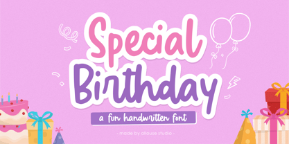 Proudly Presenting, Special Birthday Regular A Fun Handwritten Font Special Birthday is perfect for any titles, logo, product packaging, branding project, megazine, social media, wedding, or just used to express words above the background. Special Birthday also come with Multi-Lingual Support. Enjoy the font, feel free to comment or feedback, send me PM or email. Thank You!
 - TuNninG Pro by RodrigoTypo,
$30.00 Tunning Pro, is a perfect font for action titles, it contains 12 fonts that are separated into Regular version and Alternative version, each one contains the Cyrillic and Greek alphabet, in the alt version you will find many alternative letters for example Letter "A" contains 5 styles to add to the beginning or middle or end of a text.
 - Flocking Stencil JNL by Jeff Levine,
$29.00 Vintage packaging for Frosty Stencil Flock contained the hand lettered term “spray flock” which served as the basis for Flocking Stencil JNL; available in both regular and oblique versions. Commonly referred to as “Spray Snow”, these kits of holiday stencils and spray cans were a popular item in the households of the 1950s and early-to-mid 1960s.
 - Penmanship by Essqué Productions,
$9.00 This font was designed with scholastic visuals in mind. Whether advertising for a school event, or creating handwriting worksheets for young children, this font covers all the basics with Latin alphabet languages. Three fonts with identical spacing to make interchangeable. Spacebar adds a regular space between words/sentences. To connect words with ledger lines, use the underscore (_).
 - COCOTA by Top Type,
$9.00 Cocota is a sans serif/display font. This font has a gentle and authoritative character. You can use this font to make banners, advertisements, websites, business cards, quotes, and more. The advantages of this font include features such as : Regular, Italic, All Caps, Stylistic Alternate. Cocota is the best choice for you. Don't hesitate to own it.
 - Zenia by Greater Albion Typefounders,
$9.50 Zenia, offered in regular and bold weights is a homage to the streamline era of the later 1930s. It's a distinctive display family, glyphic yet still intuitive and easy to read. Use it anywhere you want that 30's streamlined feel, or perhaps in science fiction inspired work particularly those that have a 'past inspired future' feel...
 - Arnika by Typejockeys,
$50.00 This charming type family comes in four widths: Regular, Semi Condensed, Condensed and Extra Condensed – bringing flexibility and diversity to your drawing table. Crisp details convey confidence without losing fineness. Arnika is your ally for all things classy. Although it is a match made in heaven for beauty products and fashion magazines, we leave its usage to your imagination.
 - Fuglesans by Björn Berglund Creative Studio,
$25.00 Fuglesans is a homage to the first Swede in space. The sans serif font is inspired by Scandinavian aesthetics, Sci-fi movies and space. Use it for visionary brands or designs that aspire to be high-tech, modern and futuristic. The font is currently available in 3 weights, Light, Regular and Bold, and comes with over 200 glyphs.
 - Conscription JNL by Jeff Levine,
$29.00 The sheet music for the 1914 Word War I comic novelty song "When the War Breaks Out in Mexico I'm Going to Go to Montreal" had one of those overly-worded song titles popular during this period (13!), along with interesting sans serif hand lettering. It now debuts digitally as Conscription JNL in both regular and oblique versions.
 - Oxo by Typedepot,
$24.00 Oxo is an expressive typeface from typedepot. Designed to be used as a decorative, headline font which quickly evolved into great new font usable for large amounts of text as well. Available in 4 weights - thin,light, regular and bold with their matching italics plus three extra weights: Outline, College and Deco which are great addition to the family.
 - Sanchez Condensed by Latinotype,
$- Sánchez, designed by Daniel Hernández, is a serif typeface belonging to the classification slab serif, or Egyptian, that bears a strong resemblance to the iconic Rockwell, but with rounded edges— offering contrast and balance to the square structure. Sánchez & Sánchez Condensed comprises 12 variants, ranging from extra light to black, each of the same x-height. Regular and Italic variants are available for free.
 - Grand Sword by Ahmet Altun,
$19.00 Grand Sword is a wide serif and high contrast display font, which is inspired by the swords of the antique ages. There are two styles which are regular and outline. This font family also includes lots of eye-pleasing ligatures and alternatives. By using these opportunities of Grand Sword Typeface, you can create unique and stylish designs.
 - Autherical by Seventh Imperium,
$18.00 Autherical is old and stylish display font, was inspired by old fraktur calligraphy. This typeface comes with two version regular and slant. Also comes with extra ornament and multilingual characters support. more than 400 glyph and lots of alternates, access the all alternates by PUA code, create you boldest old stylish on your designs with this typeface.
 - Le Mans Classic by Kazer Studio,
$6.00 LE MANS - CLASSIC is a font inspired by vintage motorsport racing. In particular, advertising posters from the 70's. This time period was important as it showcased not only the cars that changed but also the illustrative styles & typography. Features: Offered in 2 Styles - Regular & Compressed Extensive Language support Specialised Kerning on all character combinations Designed by KAZER STUDIO
 - Hantu by Tomatstudio,
$16.00 Create outstanding horror design with "Hantu" fonts, perfectly fit for your horror design and also unique alternative for casual designs if you want something different and eye catchy. for better result, adjust manually the kerning and baseline until it match with your design. Use "*" for dot effect and combine with regular fonts, it will make your design outstanding!
 - Big Wave by Vozzy,
$10.00 Introducing a vintage look label font named Big Wave. This font have a lot of additional characters and multilingual support (you can see them at the screenshot) and including 7 styles - Regular, Full, Shadow, Texture, Shadow FX, Texture FX and Outline. This font will good viewed on any retro design like poster, t-shirt, label, logo etc.
 - Raker by Wordshape,
$20.00 Raker is a science fiction-inspired geometric sans serif text typeface family with a humanist influence and solid spacing/kerning. Regular, Display, stencil, and display stencils versions are included. Think NASA. Think the Space Race. Think Geometric. Think “works with text, too.” Detailed spacing, Western and Eastern European language support, and automated ligatures. Think hidden glyphs.
 - Prisma - Unknown license

- joeHand 1 - Unknown license

- brunoBook - Personal use only

- Carocks by ZetDesign,
$15.00 Carocks is a handwritten brush font inspired by violence, chaos, cruelty, fear, horror, resistance and more. This font gives a strong impression on each of your works and is made in a regular and italic style and is equipped with an opentype feature to help designers produce amazing works.
 - Rapazola by César Modesto,
$29.95 Rapazola is a new geometrical typeface, it was inspired by the moments of childhood and it's play. This typeface contains five different weights, Extra Light, Light, Regular, Bold and Extra Bold, all with the completed alphabet A to Z, upper and lower case, all numbers and some symbols.
 - Beary by Balevgraph Studio,
$15.00 Beary is a stylish and modern sans serif font. You can use this font in a variety of projects to create a unique and distinctive look. The Beary font can be used anywhere without the need for opentype support. Beary fonts are available in regular, alternate, and oblique.
 - Bombalurina by Sarid Ezra,
$15.00 Bombalurina Script Family contains 4 styles including alternates, Ligatures, Swash, and also Underline. It comes in Regular, Italic, Bold, and Bold Italic. Bombalurina Script is a signature font that you can use to make a logo for branding, beautiful fashion design, or a handwritten quote. Also already PUA Encoded.
 - Palmilla by RodrigoTypo,
$25.00 Palmilla is a very gestural Sans font that contains 7 fonts (Thin, Light, Regular, Medium, Bold, Black as well as a set of dingbats, it is perfect for informal or children's titles, it contains many Alternatives such as Ligatures, to have more options at the time of writing.
 - British Vehicle JNL by Jeff Levine,
$29.00 Auto license plates in the United Kingdom are made with a typeface originally designed by (and named for) Charles Wright and must meet strict criteria as to type height, weight and spacing. A bold sans serif design; British Vehicle JNL is available in both regular and oblique versions.
 - Evadare by Scriptorium,
$18.00Evadare is a decorative text font inspired by the designs of Rudolf Koch and Nicholas Cochin. It has a freehand, calaligraphic look, yet is regular and works well at small sizes as required for text uses. It's a sort of a romantic, rustic alternative to more traditional text fonts. - Lunar by Etewut,
$20.00 Lunar is a handwritten sans serif typeface that was created for the opera Pierrot Lunaire during Diaghilev festival 2018 in Perm. There are 3 fonts in the family of LUNAR: light, regular and bold. It supports all EUROPEAN languages, basic CYRILLIC and GREECE language. It's enough to make sensation!
 - Common Area JNL by Jeff Levine,
$29.00 The unusual hybrid of square letter forms mixed with Art Deco-influenced ones in the digital typeface Common Area JNL is brought to you by the hand lettering found on a vintage piece of sheet music for "William Tell". The typeface is available in both regular and oblique versions.
 - Fillings Urban by Prioritype,
$69.00 The graffiti style that is favored by young people. Comes in 2 styles (Regular & Outline). Can be applied to clothing design, crafts, posters, hip hop music, children's book covers, comics, cartoons etc. See some of the previews above for reference. Features: -Uppercase -Numeral -Punctuation -Multilingual -PUA Encoded -Opentype Features
 - Metro Graffi 3d font by Sipanji21,
$15.00 "Metro Graffi" is a slightly bold graffiti font that comes in two styles: regular and shadow. By combining these styles, you can achieve a 3D effect that adds depth and dimension to your designs. With its urban and edgy style, "Metro Graffi" captures the essence of street art.
 - Hulpy by Adam B. Ford,
$16.00 Hulpy is a relaxed font that won’t judge you. It was created with a combination of stocky rounded verticals and tapering curves. It could probably be used in comic strips or fun and happy headlines, but it also has enough regularity to be used in unpretentious body copy.
 - IA Morning Star by Invisible Art Studio,
$14.99 IA Morning Star is a readable universal comic book dialogue font that adorns any book. The family includes Regular, Italic, Bold, and Bold Italic. Added a set of European characters, Cyrillic; auto ligatures to replace repeating characters, and contextual autoreplacing crossbar "I" in words like I, I'm, etc.
 - Patagon by Latinotype,
$19.00 Patagon is a contemporary Woodtype Sans typeface especially designed for fresh, high impact sentences with a mix of flavoured features. Its upper-case Opentype ornamental alternate glyphs provide great elegant textures adding versatility to the three weight family: condensed, regular & extended. Mix them up for a really cool design!


