10,000 search results
(0.081 seconds)
- PT Serif Pro by ParaType,
$50.00PT Serif Pro is an universal type family designed for use together with PT Sans Pro family released earlier. PT Serif Pro coordinates with PT Sans Pro on metrics, proportions, weights and design. It consists of 38 styles: 6 weights (from light to black) with corresponding italics of normal proportions; 6 weights (from light to black) with corresponding italics of narrow proportions; 6 weights (from light to black) with corresponding italics of extended proportions; and 2 caption styles (regular and italic) are for texts of small point sizes. The letterforms are distinguished by large x-height, modest stroke contrast, robust wedge-like serifs, and triangular terminals. Due to these features the face can be qualified as matched to modern trends of type design and of enhanced legibility. Mentioned characteristics beside conventional use in business applications and printed stuff made the fonts quite useable for advertising and display typography. Each font next to standard Latin and Cyrillic character sets contain alphabet glyphs of title languages of the national republics of Russian Federation and support the most of the languages of neighboring countries. The fonts were developed and released by ParaType in 2011 with financial support from Federal Agency of Print and Mass Communications of Russian Federation. PT Serif family together with PT Sans won the bronze in Original Typeface category of ED-Awards 2011. Design – Alexandra Korolkova with assistance of Olga Umpeleva and supervision of Vladimir Yefimov - Linotype Bengali by Monotype,
$103.99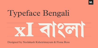 Linotype Bengali, a revival This project by Neelakash Kshetriymayum and Fiona Ross commissioned by Monotype is at heart a revival of the now ubiquitous original Linotype Bengali typeface designed by Tim Holloway and Fiona Ross (1978-1982) based on Ross’s research for her doctoral studies in Indian Palaeography. The new Linotype Bengali is informed by more recent research by Ross and Kshetrimayum resulting in additional glyphs that serve contemporary needs in a variety of genres – the original had been specifically designed for newspaper composition and in now outdated digital formats. The new design makes use of OpenType features with the employment of contextual vowel signs for Bengali – a feature that Ross and Holloway had first introduced in Indian scripts for the Adobe Devanagari typeface – and has sophisticated contextual mark positioning. Furthermore, whereas the original design had existed in only two typestyles, extensive work has been undertaken to produce this new design in 5 weights: Light, Regular, Medium, Bold and Black. It has been an important aspect of this project to remain true to the original design concepts, and so to achieve optimal readability for sustained reading at small type-sizes, but the additional weights enable differentiation in document design, and afford users scope to produce textural variety in their outputs. This revival design is intended to widen the hitherto very limited palette of typographic choices in the field of textual communication in Bengali, Assamese and other languages that make use of the Bengali script.
 - Machin by Hanoded,
$15.00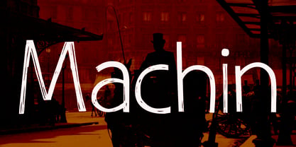 Machin is a French word meaning 'thing'. Apparently, it is also a species of macaque from the Philippines, but I named this font after the French word! Machin is based on a really old font I made back in the day. It was called Whynot and (because I didn't know a thing about making fonts at the time) I could not get it to work properly, so it had its 15 minutes of fame before it was pulled off of the internet. Machin was made using the recycled glyphs from Whynot and it does work. It comes with extensive language support (yes, Vietnamese and Sami too), some handy ligatures and a lot of scribbly panache.
 - Rip TAPE by TypoGraphicDesign,
$19.00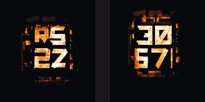 CONCEPT/CHARACTERISTICS The handmade, dirty and yet modern character of the font was designed with analog tape on paper and later digitized. The motto is sticky, wrinkled and rough APPLICATION AREA The dirty, rough and fancy font „rip TAPE“ would look good at display size for poster, flyer, comics and graphic novel lettering and logos. Headlines in magazines or websites, packaging, music covers or webbanner etc. TECHNICAL SPECIFICATIONS Headline Font | Display Font | Grunge/DIY Font „rip TAPE“ OpenType Font with & 78 glyphs & 2 styles (regular, fixed).
 - Super Drift by Mevstory Studio,
$15.00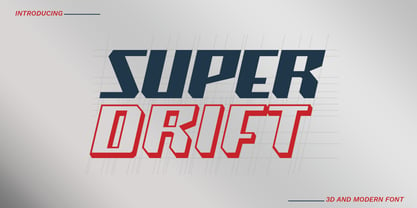 Super Drift consists of a racing style with sharp lines with a verified tilt angle that will emphasize a modern and sporty style. Super Drift very suitable for automotive magazine covers, racing game covers, logos & branding, product design, labels and so on. What’s Included Super Drift 3D Super Drift Ragular Super Drift Line Standard glyphs Works on PC / Mac Simple installations Accessible in the Adobe Illustrator, Adobe Photoshop, Adobe InDesign, even work on Microsoft Word. Thank you for your purchase! Hope you enjoy with our font!
 - Shaky Hand Some Comic by TypoGraphicDesign,
$19.00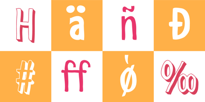 CHARACTERISTICS The kiddy and warmly character and the cute, huge points (amongst others punctuation), gives the typeface a high recognition value and uniqueness. APPLICATION AREA The warm, child-like, bold and striking sans serif font »Shaky Hand Some Comic« would look good at display size for headlines in magazines or websites, posters, packaging, covers or webbanner. TECHNICAL SPECIFICATIONS Headline Font | Display Font | Sans Serif Font »Shaky Hand Some Comic« OpenType Font with 340 glyphs alternative letters and ligatures (with accents & €) & 3 styles (regular, bold & 3d)
 - Trump Script by Canada Type,
$29.95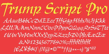 One of the earliest fonts published by Canada Type was Tiger Script, Phil Rutter's digitization of Jaguar, Georg Trump's 1967 wild calligraphic brush face. In 2010, when the font was revisited for an update, it was shown that it too light for applications under 24 pt, and too irregular for applications over 64 pt. So the face was redigitized from scratch. This new digitization brings a more seamless contour and a much steadier stroke, and much better outlines for use at both extremes of scaling. Language support was also greatly expanded, and many alternates and ligatures were added to the redigitized character set. The name was also changed to Trump Script, to better reflect the origins of the design. Trump Script is a master calligrapher's hand producing very uncommon jolts and bursts of sharpness. It showcases some of the most suprising letter forms ever drawn, like the very unique treatments of B, K, W, Y and Z. In the lowercase one can see the cattiest g ever made, and some of the wildest shapes in the f, j, p, y and z. Trump Script comes in all popular formats. The TrueType and PostScript packages are comprised of two fonts. The OpenType version, Trump Script Pro, combines both fonts into one, and includes features for intelligent substitution in software that supports advanced typography. Language support includes Western, Central and Eastern European character sets, as well as Baltic, Esperanto, Maltese, Turkish, and Celtic/Welsh languages.
 - Colore by FSdesign-Salmina,
$39.00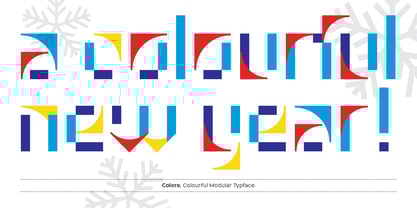 Colore. Colourful and Modular. A happy and colourful New Year from the FSdesign team. In order not to lose the joy of playing, we provide the "Colore" font family: a modular font kit, that encourages to play. By superimposing the different font styles you can create a colourful typographical staging. This New Year's card was realized with the help of "Colore". Too wild? auto-referential? Try Colore and form your own opinion.
 - Grannys Greenhouse by Rocket Type,
$14.00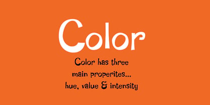 Granny's Greenhouse, a cute fun display font with tons of alternate characters. Granny's Greenhouse’s best uses are for headings, logotypes, quotes, apparel design, toy packaging, invites, flyers, posters, greeting cards, product packaging, book covers, printed quotes, cover albums, movies, etc. To access the alternate glyphs, you need a program that supports OpenType features such as Adobe Illustrator CS and Adobe Indesign. How to use OpenType features: https://helpx.adobe.com/illustrator/using/special-characters.html
 - Shark Snack by Comicraft,
$19.00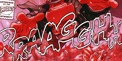 Dumm DUM. Dumm DUM. Duh dum duh dum duh dum DUMMMM... Just when you thought it was safe to get back in the water, this font surfaces to take one last bite out of your summer vacation skinnydip! Scream and scream again — it won’t do you any good, SHARKSNACK is rough and ready to EAT YOU ALIVE! It’s too late to close the beaches, Chief Brody, this particular set of saw tooth letters has already consumed Dracula, the Werewolf, the Frankenstein Monster and any number of 70s comic book characters foolish enough to dip a toe in its maw!
 - Easy Answer by Bogstav,
$17.00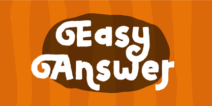 Is there such a thing as an easy answer, or is it just because you know the question? Anyway, as a kindergarten teacher I like to make these quizzes with the kids. The object of the game is not to answer right, but to get a feeling of knowing a lot. I thought of these questions as being logical and really easy, but I also found out that it is a great way for the kids to remember and recall their knowledge! This font is easy to read, even if you use some of the many choices of swashes!
 - Cigar by Durotype,
$22.00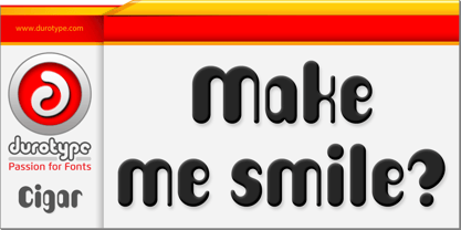 Cigar is a revival of a 1970s and 1980s typeface called Cucumber or Nassel Black or Scanner. It has been carefully redrawn and expanded into a full-featured OpenType font. Cigar Octo and Cigar Quarto are new angular reinterpretations of Cigar. In Cigar Octo, most round shapes have been replaced by octagonal shapes. In Cigar Quarto, most round shapes have been replaced by rectangular shapes. Use Cigar to get attention. Use it for headlines, advertisements, magazines, brochures, book covers, corporate design, presentations, websites, signs, event announcements, and for other things that need attention. For more information about Cigar, download the PDF Specimen Manual.
 - Aeonus by Harvester Type,
$20.00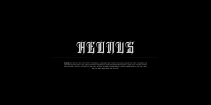 AEONUS is a gothic font, an attempt to combine a wide-edged and pointed pen, while giving the font a readability that many gothic fonts lack. Angular shapes made strictly in 45 degrees and straight lines give the font a touch of futurism. A gothic, futuristic font that retains readability and makes a unique impression is the goal that was followed when creating the font. Aeonus also conveys the spirit of the occult and something dark. Aeonus is good for prints on clothes, posters, packaging, tattoo, merchandising, large headlines, logos, product design, and any other large font compositions.
 - Marne by Eurotypo,
$30.00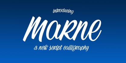 “Marne” is a new font inspired by letter designs from the 80's but updated. Standing out for its condensation, its angular touch, its slight slant and its thick and thin lines, “Marne” is the perfect mix of elegance and informality. Open Type features include a full complement of international characters, alternatives and ligatures. With all this, the text will look alive and dynamic, without the monotony of repeated letterforms. “Marne” can be the choice to create titles, logos and posters for branding and packaging, invitations, greeting cards, magazine and book covers, children's material, fashion, and wherever you want!
 - Noris Script by Linotype,
$29.99Drawn by master German calligrapher Hermann Zapf in the 1970s, Noris Script captures the magic of the irregularities of pen strokes. The idea behind Noris Script was to bring the spontaneity of a quick handwritten script using a broad-edged pen into the modern typesetting environment. Noris is the Latin name for the German city of Nuremberg, where Hermann Zapf was born and raised. Nuremberg has something special about it, aside from Hermann Zapf, it has a great tradition of writing masters, such as Johann Neudörffer (1497-1563), Wolfgang Fugger (1515-1568), and Rudolf Koch (1876-1934). - ITC Honda by ITC,
$29.99This simplified blackletter typeface shares some geometric characteristics with a line of typefaces popular that were especially popular in Germany during the 1920s and 30s. Their forms may have originally come about after a desire to mix the classical Fraktur" forms found in typefaces like Linotype Luthersche Fraktur or Fette Fraktur with more modern sans serif typefaces, like Basic Commercial or Futura. ITC Honda's letters are rather narrow and angular. The type can be used for a number of headlines or logo purposes, and is best legible when set large. A similar typeface in our library is Linotype Gotharda." - P22 Huffer by IHOF,
$24.95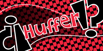 Huffer is a chunky and irregular sans-serif font (with a few serifs) that simulates the look of letters crudely cut out of paper. The basic letters were originally inspired by an early 1970s instructional filmstrip dealing with the dangers of glue sniffing. Further inspiration came from other sources of 1960s display lettering. The lower case is almost as tall as the upper case allowing for a mix and match between cases to achieve a more lively display effect. Huffer Pro includes ligatures as well as Cyrillic and Central European character sets with a total of over 500 glyphs.
 - Grimmig by Schriftlabor,
$40.00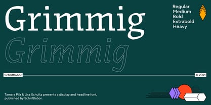 Grimmig draws inspiration from solid and angular blackletter shapes and the idea of cutting letters out of paper. The interaction between curves, sharp edges, and partially unconventional serif placement makes it an excellent typeface for impactful headlines. The vivid details fade into the background in smaller sizes and provide an enjoyable reading experience for continuous text. Open counters and a large x-height contribute to Grimmig’s legibility in text sizes. It was developed as part of the MA Typeface Design in the University of Reading but had started before as a graduation project for Tamara Pilz.
 - Linotype Cutter by Linotype,
$29.99Linotype Cutter was designed by Georg John in 1997. As the name suggests, the font looks like it was cut out of black cardboard pieces. Each letter has a irregular rectangle black background and they combine to form heavy rows of letter elements. The strong contrasts of the font make it good for short headlines or initials in larger point sizes and combines well with almost any text font. Georg John made a second version of this theme called Linotype Schere (scissors) it is a companion typeface where the conturs of the letters are even rougher in its form. - M Comic HK by Monotype HK,
$523.99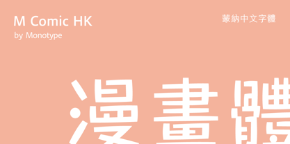 M Comic is a humanistic script design characterised by its modern, stiff, free and blocky construction. M Comic incorporates free and irregular characteristics of M Cute. Crossbars (橫) and stems (豎) are straight and slightly slanted. Entry and finial points of strokes are squarish and parallel without flare. Contrast of stroke is low, together with its bold stems (豎), making it suitable for large display text to catch attention. The result is a loosely coupled line of text of free, stiff and blocky glyphs. It is best for casual and humanistic display, illustrations, set upright, non-condensed.
 - Bucintoro by Three Islands Press,
$24.00Bucintoro is a modern version of the rotunda blackletter, the Gothic book hand of Italy and Spain in the 14th, 15th, and 16th centuries. As the name implies, it's more "rotund" than the tall, angular Textur blackletter used in Germany that Gutenberg imitated. While the use of blackletter continued far into the 20th century in Germany and Scandinavia, the rotunda gave way to roman (and later also italic) letterforms in Italy, France, and Spain. It's less well known these days. Bucintoro has upper- and lowercase alphabets, numerals, punctuation, diacritics but lacks such modern characters as currency symbols. Has light, medium, and black weights. - M Comic PRC by Monotype HK,
$523.99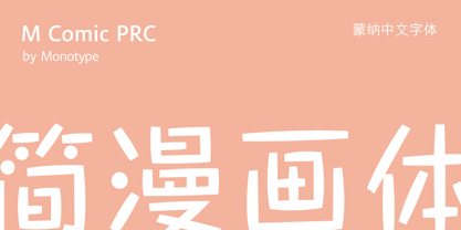 M Comic is a humanistic script design characterised by its modern, stiff, free and blocky construction. M Comic incorporates free and irregular characteristics of M Cute. Crossbars (橫) and stems (豎) are straight and slightly slanted. Entry and finial points of strokes are squarish and parallel without flare. Contrast of stroke is low, together with its bold stems (豎), making it suitable for large display text to catch attention. The result is a loosely coupled line of text of free, stiff and blocky glyphs. It is best for casual and humanistic display, illustrations, set upright, non-condensed.
 - JWX Memo by Janworx,
$15.00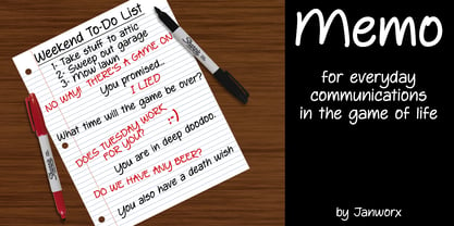 Memo, designed by Janet Valdez of Janworx, is a digital version of her own personal penmanship, currently displayed in abundance on sticky notes all over her desk and monitor. Although its basis is in actual handwriting, it's perfectly legible, offering a casual alternative typeface for everyday correspondence or simple things, ranging from event flyers to children's birthday party invitations. Memo performs well at regularly used correspondence sizes, but at a larger size can also be manipulated in graphics software for interesting effects. The letters can be moved randomly from the baseline, overlapped, and then contoured with good results for a casual look.
 - Grimmig Variable by Schriftlabor,
$200.00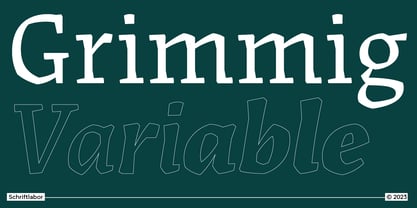 Grimmig draws inspiration from solid and angular blackletter shapes and the idea of cutting letters out of paper. The interaction between curves, sharp edges, and partially unconventional serif placement makes it an excellent typeface for impactful headlines. The vivid details fade into the background in smaller sizes and provide an enjoyable reading experience for continuous text. Open counters and a large x-height contribute to Grimmig’s legibility in text sizes. It was developed as part of the MA Typeface Design in the University of Reading but had started before as a graduation project for Tamara Pilz.
 - Esperanto by Linotype,
$29.99Franko Luin, Esperanto's designer, on this typeface: Esperanto has a lot in common with classic typefaces, and newer interpretations of the classics. The italic reminds of the lettering idea of the Renaissance and their manuscripts. This typeface's name refers to the international language Esperanto, of course. The font is not compatible with the character set of the Esperanto language - Quaker Ladies by Putracetol,
$28.00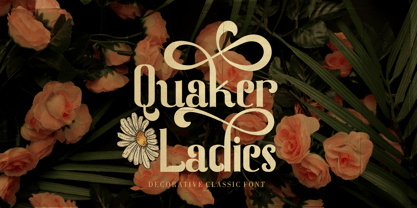 Quaker Ladies is a decorative classic font with tons of alternative glyphs and multilingual support. It's classic, vintage and elegant. Come with open type feature with a lot of alternates, its help you to make great lettering. Quaker Ladies best uses for heading headlines, cover, poster, logos, quotes, product packaging, merchandise, social media & greeting cards and many more.
 - Braggadocio by Monotype,
$29.99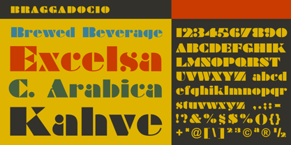 Braggadocio is a very black typeface. Braggadocio is a strange hybrid with characteristics of both sans serif and modern faces; and it belongs very much to its time. Like high society in the 1920's, it should not be taken too seriously. Use the Braggadocio font for display lines in advertising, magazines and light hearted communications.
 - Roshmary by Putracetol,
$28.00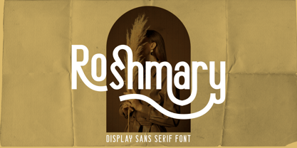 Roshmary is a Display sans serif font with beautiful ligatures, tons of alternative glyphs and multilingual support. It's bold clean and simple. Come with open type feature with a lot of alternates, its help you to make great lettering. Roshmary best uses for heading headlines, cover, poster, logos, quotes, product packaging, merchandise, social media & greeting cards and many more.
 - Lorcan Mist by Here East Fonts,
$16.00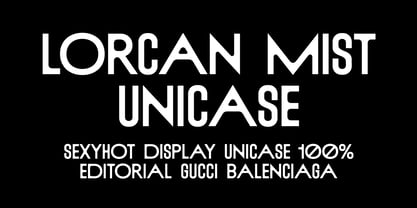 LORCAN MIST is a powerful super modern editorial unicase font with vintage vibes, designed with love and care for amazing projects. It's great for social media, headlines, large-format print, editorial, branding, posters, fashion designs and websites — it's designed not to take too much attention but at the same time be a powerful accent. It's mysterious, elegant and sexy.
 - ID Larques One by Izouuss Design,
$16.00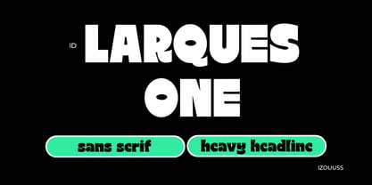 Introducing Larques One, a display sans-serif typeface that brings a fun, friendly and delightful vibe to your projects. Larques One is not too serious and has a touch of playfulness that makes it perfect for branding, packaging, headlines, posters and more. Larques One is also equipped with multi-language support and offers excellent versatility and customisation.
 - 2010 Cancellaresca Recens by GLC,
$38.00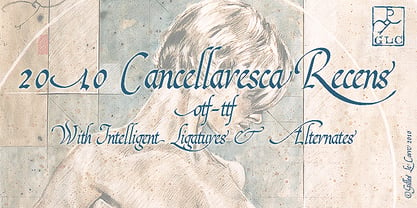 This font was inspired by the Cancellaresca pattern (look at our 1491 Cancellaresca and 1610 Cancellaresca), in particular Spanish one, from Francisco Lucas, who was working in the late 1500s. It is a modern variation, including West European accented characters and a lot of initial and final alternates (not in the Mac TT version for technical reasons).
 - PiS HansHand Pro by PiS,
$28.00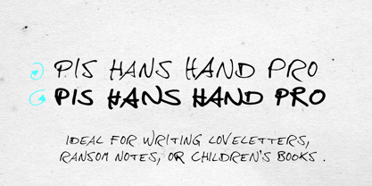 HansHand started out in 2003 as a simple free font, the adaption of my grimy handwriting. For its 10th anniversary it got a complete overhaul and lots of new characters. Now also available in BOLD for the first time, featuring scribbles, strokes, circles and boxes to underline the fast taking-notes-while-on-the-phone look!
 - Clockpunk by Typodermic,
$11.95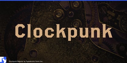 Welcome to a world where the past and future collide, where vintage meets modern in a glorious display of Clockpunk. This industrial grotesque typeface is not your ordinary typeface. Inspired by early twentieth-century boxy railroad signage, Clockpunk is the perfect fusion of steampunk and sci-fi. Its sharp serifs and straight lines bring to mind memories of vintage ads painted on brick walls, adding an air of nostalgia and history to your designs. But don’t be fooled by its retro look, Clockpunk is a versatile font that can be used for both small print and headlines. Its Regular and Small Cap styles are perfect for bringing your vision to life, whether you’re designing a poster for a steampunk festival or creating a sci-fi book cover. With Clockpunk, the possibilities are endless. Get ready to take your designs to the next level with this unique and eye-catching typeface. Clockpunk is here to make a statement and leave a lasting impression. Most Latin-based European, Greek, and some Cyrillic-based writing systems are supported, including the following languages. Afaan Oromo, Afar, Afrikaans, Albanian, Alsatian, Aromanian, Aymara, Bashkir (Latin), Basque, Belarusian (Latin), Bemba, Bikol, Bosnian, Breton, Bulgarian, Cape Verdean, Creole, Catalan, Cebuano, Chamorro, Chavacano, Chichewa, Crimean Tatar (Latin), Croatian, Czech, Danish, Dawan, Dholuo, Dutch, English, Estonian, Faroese, Fijian, Filipino, Finnish, French, Frisian, Friulian, Gagauz (Latin), Galician, Ganda, Genoese, German, Greek, Greenlandic, Guadeloupean Creole, Haitian Creole, Hawaiian, Hiligaynon, Hungarian, Icelandic, Ilocano, Indonesian, Irish, Italian, Jamaican, Kaqchikel, Karakalpak (Latin), Kashubian, Kikongo, Kinyarwanda, Kirundi, Komi-Permyak, Kurdish (Latin), Latvian, Lithuanian, Lombard, Low Saxon, Luxembourgish, Maasai, Macedonian, Makhuwa, Malay, Maltese, Māori, Moldovan, Montenegrin, Ndebele, Neapolitan, Norwegian, Novial, Occitan, Ossetian, Ossetian (Latin), Papiamento, Piedmontese, Polish, Portuguese, Quechua, Rarotongan, Romanian, Romansh, Russian, Sami, Sango, Saramaccan, Sardinian, Scottish Gaelic, Serbian, Serbian (Latin), Shona, Sicilian, Silesian, Slovak, Slovenian, Somali, Sorbian, Sotho, Spanish, Swahili, Swazi, Swedish, Tagalog, Tahitian, Tetum, Tongan, Tshiluba, Tsonga, Tswana, Tumbuka, Turkish, Turkmen (Latin), Tuvaluan, Uzbek (Latin), Venetian, Vepsian, Võro, Walloon, Waray-Waray, Wayuu, Welsh, Wolof, Xhosa, Yapese, Zapotec Zulu and Zuni.
 - Rival Sans by Mostardesign,
$25.00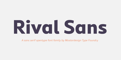 A sans serif with a dynamic look for complex typographic work. Rival Sans is a sans serif font family possessing many strengths. Its 32 fonts and 2 styles, make Rival Sans a very versatile family and suitable for many graphic design projects such as branding, signage, editorial creation, advertising, packaging, broadcasting or logo creation. With the endings cut at 10 degrees and sharp cuts on the top of the stems of certain characters (like the l, b or the d) Rival Sans gives dynamism and readability to the lengthiest of editorial content. This beveled font design also gives rhythm to a text's sentences as well as a very functional look. All these design details give this new font family a modern, energetic and humanistic look. Rival Sans also has many powerful OpenType features such as case sensitivite forms, small capitals, old style and tabular figures, slashed zero, ligatures, fractions,and alternative characters to give personality to graphic design projects. Designed also for complex editorial content, this typeface has a powerful home kerning system called "Pro Kerning". With more than 2500 pairs of glyphs and many languages, Pro Kerning optimizes headlines, subtitles, texts as well as long paragraphs in real time. In addition to these extended features, the italic styles of this fonts family have been drawn as fully-fledged styles with different designs from their regular version so that the italic texts look like calligraphic phrases. Rival Sans has an extended character set with over 930 glyphs. This family covers over 130 languages from Western Europe, Eastern Europe and Central Europe. In addition to all the features of its kind, Rival Sans is part of a very complete "type system" with style variants such as the serif version Rival Serif or the slab version Rival Slab. With all these typefaces, you have 62 styles to make your own vibrant and professional graphics or web creations while maintaining consistency in your creations.
 - Dourcha by Attract Studio,
$12.00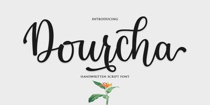 Dourcha Script is a new modern script font with an irregular base line. Handwriting style, trendy and feminine. Dourcha Script looks good on wedding invitations, thank you cards, quotes, greeting cards, logos, business cards and more. Perfect for use in ink or watercolors. Includes beginning and end letters, alternates, ligatures and multiple language support.
 - Sans Culottes by K-Type,
$20.00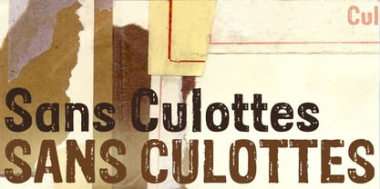 A misprinted sans serif loosely based on Phillip Cavette’s 1999 font 4990810, but with re-drawn outlines, more distress marks, a neater vertical aspect and no baseline irregularity. Unlike its inspiration, Sans Culottes is a complete font which includes a lower case, accented characters and as many dingbats as you can shake a stick at.
 - Etruscan by ITC,
$29.00British designer Tim Donaldson created the lively typeface Etruscan in 1995. Based on Etruscan letters from ancient Italy, this unusual and condensed sans serif face whimsically mixes soft lowercase characters with more angular capitals. Etruscan brings light and airy classical form into contemporary documents, and a sunny Mediterranean flair and jollity into your projects. - Nurhayati by Shape Studio,
$12.00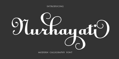 Nurhayati Font is a new modern script calligraphy font with an irregular baseline. Trendy and feminine style. Nurhayati Font Script looks lovely on wedding invitations, thank you cards, quotes, greeting cards, logos, business cards and more. Perfect for using in ink or watercolour. Including initial and terminal letters, alternates, ligatures and multiple language support
 - Jamarius Script Font Trio by Zane Studio,
$15.00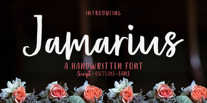 Jamarius Script - This handwritten font is a new modern script with an irregular base line. Trendy and feminine. Jamarius Script looks beautiful in wedding invitations, thank you cards, quotes, greeting cards, logos, business cards, and more. Perfect for use in ink or watercolors. Including beginning and end letters, alternatives and support for many languages.
 - Boisterous Fun by Missy Meyer,
$12.00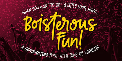 Have you ever been drawing out the letters for a font, then you start making some multi-letter ligatures? Then you think up some more to make, and you make those too? And you keep making them, until you have over a hundred of them? No? Just me? Boisterous Fun is a font that started out simple -- a nice handwriting style with a single stroke width. But add in the ligatures, plus a dozen single-letter alternates and my usual crowd of accented characters for language support, and this baby has grown to over 600 characters total. It's a great casual font for branding or packaging, but it's also smoothed so it's easy for cutting. Boisterous Fun includes: - The usual A-Z, a-z, 0-9, and lots of punctuation; - Over 300 extended Latin characters for language support; - 140 alternates and ligatures for variety, all PUA-encoded for easy use! I had a ton of fun making it, and I hope you have a ton of fun using it!