10,000 search results
(0.022 seconds)
- Waialua by insigne,
$24.99 Aloha to Waialua! Put on your lei and grab a drink umbrella as you kick back and start designing with this island beauty of a font. Soak in the unprecedented potential of this new font. Waialua is one of insigne’s first variable fonts. Avoid the font limbo with a set number of options from Thin to Black. Go with the flow and see where you feel the innumerable amount of weights taking you as you slide your design options along a spectrum of stunning possibilities. There's more, too. Waialua’s auto-replacing terminators allow you never to need connectors at the end of your words. Or if you want, you can dial up your design with optional swash endings. So set your course for the islands and get ready for a fun time with the tropical beauty of Waialua. This is one font vacation your work--and your reader--will never want to end. Production assistance from Lucas Azevedo.
 - Avenir by Linotype,
$42.99 In drawing the Avenir® typeface, Adrian Frutiger looked to both the past and the future for inspiration. His goal was to reinterpret the geometric sans serif designs of the early part of the 20th century in a typeface that would portend aesthetics of the 21st century. He succeeded handsomely. In doing so, Frutiger added a bit of organic humanism to the design, freeing Avenir from the rigid geometric overtones of the earlier designs. Avenir is employed on signage at Dallas Fort Worth and Hong Kong international airports. The city of Amsterdam adopted Avenir as its corporate typeface in 2003. The original Avenir family is made up of designs with gradual weight changes in order to satisfy the needs of specific text applications. While the book and light weights have similar stroke widths, the book weight is well suited for body text, whereas the light was designed for captions and subhead text. Featured in: Best Fonts for Resumes
 - Interzone by MYSTERIAN,
$9.00 This type crept up the sense that it was made in Eastern Europe by poorly trained urbanites from a crippled nation, or that it is the remains of a contemporary gothic (like Eckmann) stencil. The choice of what this type signifies is up to the public. Lately I like the idea of 'putting on' (in McLuhan's sense) a genre of idea that is somewhat different from my tradition's beliefs, and fitting a core category of that toward a teleological/eschatological advantage. Therefore postmodernist/apocalyptic carelessness (which I may 'put on' by using this type) is how I abstain from the cravings of immortality, or more so that wanting it is pointless. It’s stands as memento morí; that I will have to die someday. I have to become less, He must become more. Of course, Interzone may signify a classic Joy Division track from Unknown Pleasures as well as the Cold Warish ongoings of conflicted eastern European life. I considered naming this Lunik 9.
 - ITC Kendo by ITC,
$29.99 ITC Kendo is the work of British designer Phill Grimshaw, suggesting the dash and verve of quick, sketchy calligraphy, complete with splatters of ink. Grimshaw says he worked deliberately against his own habits to create the forms, drawing the letters with slow deliberation" and a pointed pen. He overloaded the pen with ink and drew on rough paper, "applying a lot of pressure at the beginning of a stroke and easing off towards the terminals. Accidental splashes occurred frequently owing to the nib catching the 'tooth' of the paper." Those splashes were refined into features which enhance but do not overwhelm the characters and carefully worked so as not to leave an obvious white strip of unsplattered space between lines and letters. The initial capitals can be used alone or combined with the lowercase alphabet, and the font includes a full set of f-ligatures and some extra ligatures as well as decorative elements."
 - Lightbox 21 by Protimient,
$21.00 Lightbox 21 is a radical update of my previous version of a geometric sans serif. The design of the original Lightbox was fundamentally based on the idea of incorporating the proportions of the ‘Golden Ratio’ into each letterform; Lightbox 21 greatly improves on this concept by entirely abandoning it. The result is a much more readable, ‘natural’ typeface that retains elements of the original without being bound to it. Overall, Lightbox 21 has been designed to convey that classic feel of a geometric sans that makes the genre so tremendously enduring and versatile, as well as providing an effortless sense of class to whatever they are applied. Primarily intended for editorial work (i.e. short to medium length texts) or display settings, Lightbox 21 has a reasonably extensive character set, including support for Vietnamese, many currency symbols, arrows, and small caps. It also has OpenType support for nut fractions (via a stylistic set) and a barred alternate uppercase i and an alternate curled j.
 - Sticky Fingers by Comicraft,
$19.00 LOOK OUT! It's kinda creepy, we know, but we're convinced that this font does whatever a spider can -- in fact, we believe it can actually spin a web of pretty much any size, and even catch thieves as if they were bugs of some sort -- let's say flies. In fact we'd almost go so far as to say that, in the chill of night (perhaps at the scene of a crime) this font may just arrive like a streak of light in the nick of time. We're releasing this font now not for wealth or fame, we ignore those things, action is our reward. Here at Comicraft we think of life as a great big bang up, and whenever there's a hang up, you won't find us climbing -- or crawling -- the walls... well, not without STICKY FINGERS anyway. Find yourself a pair of webshooters and this font is the perfect complement to any Halloween costume.
 - Maiola by TypeTogether,
$49.00 Being inspired by early Czech type design, Maiola is clearly a contemporary typeface, that is mindful of its historical heritage, implementing old-style features and calligraphic reminiscence, more frankly so in the Italic. Nevertheless, through its personality, it attempts to create a welcoming tension on the page, without shouting too loudly at the reader. It handles its expressive tendencies with care and in doing so increases its usability, with legibility being of great importance. Subtle irregularities of the letterforms enhance furthermore the dynamic spirit and liveliness of the typeface. With the advent of Opentype, allowing for bigger character-sets and better language support, as a natural consequence, Maiola Multiscript covers Latin A, Cyrillic and Greek. Although basically independent from each other, they are, however, designed in the same spirit as the Latin, and harmonize well in multilingual text settings. The update to this beautiful font family includes the addition of over 240 glyphs featuring new ornaments, stylistic alternates, ligatures, superior letters, fractions and more. Furthermore, several glyphs were significantly improved and the kerning was fine tuned for better performance. Originally released in 2005, Maiola was an immediate success. It won the renowned TDC competition in 2004 where it was also recognized as a “judge’s choice”, was part of the touring exhibition e-a-t, and was selected in the Creative Review design competition in 2005.
 - Vividangelo by Wiescher Design,
$24.50 Vividangelo is designed after the handwriting of a real person. I saw it on the pricetags in a small shop and convinced the person to have her handwriting converted into a font. She is very happy about it now, so am I.
 - Rafailla Brush Script by Mindtype Co.,
$18.00 Introducing my new font Rafailla is another elegant modern calligraphy typefaces, which is combining the style of brush calligraphy with an modern style and sophisticated flows. So beautiful on invitation like greeting cards, branding materials, wedding designs, social media posts, advertisements & product designs.
 - Blandford Woodland NF by Nick's Fonts,
$10.00The chapbook Pen & Brush Lettering and Practical Alphabets, published by Blandford Press, Ltd., London, in 1929 averred that these letterforms suggested a lightface version of Neuland. And so they do, with the added bonus that this typeface, unlike its inspiration, includes lowercase characters. - Arbuz by Justyna Sokolowska,
$19.00 Arbuz is sans serif and distressed font. It has lowercases and three options for every letter. All of the characters have a high resolution so they can be used in a large size. Every variety contains 3 alternative characters with automatic replacement.
 - Hello Wishes by Good Java Studio,
$22.00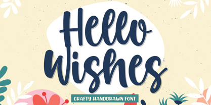 Produly Present Hello Wishes a Crafty Font Hello Wishes a Crafty Font make from handlettering ideas in typeface. This font includes full of Alphabetical glyphs, Numerals, and punctuation. This is so perfect for invitations, monograms, wedding, fashion, branding, label, handlettering or logotype.
 - Fresh Orange by Lettersams,
$12.00 Fresh Orange is a type of font that presents a unique style for every design project such as cartoons, comics, poster designs, and so on. Fresh Orange has two styles: regular and extrude, which will create a great layered look when combined.
 - Sluggo by Patricia Lillie,
$29.00Sluggo, a loose, 3D-ish face with the look of a slightly sloppy brush line, comes with attitude to spare. Has five styles: Regular, Lefthook, Righthook, Open, and Black--all spaced and kerned so that you can stack them for special effects. - Hello Mono One by Good Java Studio,
$18.00 Introducing Hello Mono with Layered Inline Hello Mono is a playfully display font make from handdrawn ideas in typeface. This font includes full of Alphabetical glyphs, Numerals, and punctuation. This is so perfect for invitations, monograms, wedding, fashion, branding, label, handdrawn or logotype.
 - Brume Matinale by Prioritype,
$19.00 A typeface inspired by the world of fashion with a modern and classic look. Yes, Brume Matinale is here for you to use in designs such as creative posts, posters, magazines, logos and so on. Features: Uppercase, Lowercase, Numeral, Punctuation & Multilingual. Thanks!
 - Monk by 4RM Font,
$27.00 Monk font is made with an extra expanded style and combined with the value of beauty and authenticity so that it looks like it has a solid impression. suitable for use in graphic design such as logos, billboards, posters, and large graphic designs.
 - Sunchilla by Hydric Design,
$8.00 Hi there! Hydric Design proudly present the Sunchilla Script font, inspired by The Day of the Dead is a Mexican holiday celebrated throughout Mexico, in particular the Central and South regions, and by people of Mexican heritage elsewhere called "Dia De Muertos" design with a touch of Sweet, Unique and Fun style. Sunnchilla Script font is made in a handwriting style so it is suitable for use in product design and display titles. Sunchilla Script font are included in the display font category so can be used for any designs that have a cheerful, elegant and sweet impression. and also will be very suitable when used on titles, logos, product posters, websites, menu books, books, and many designs that can be explored using document fonts. it will looks very beautiful because it will easy to remember and very easy to use.
 - Delona Script by Hrz Studio,
$15.00 Delona is a classy script. This typeface has a nostalgic feel because of its style, so the font is really suitable for your project with a classic/vintage theme. This font is perfectly made to be applied especially in logos, and the other various formal forms such as invitations, labels, logos, magazines, books, greeting / wedding cards, packaging, fashion, make up, stationery, novels, labels or any type of advertising purposes. Features : Uppercase & lowercase Numbers and punctuations Alternates & Ligatures Multilingual PUAs encoded We highly recommend using a program that supports OpenType features and Glyphs panels like many of Adobe apps and Corel Draw, so you can see and access all Glyph variations. PLEASE READ FIRST: To use alternate character/swash you have to use opentype. For accessing the opentype feature, kindly check this link letterhend.com/tutorials/using-opentype-feature-in-any-software/ Happy Designing
 - Steady Bonanza by Just Font You,
$10.00 Fashion is a trend, Style lives within a person *Oscar de la Rerta. I believe everybody's special. You have your own original character in every single appearance. And i feel so addicted to bring that something special in you to be shown to the universe. And that's what it cames from. Introducing, Steady Bonanza. A versatile hand lettering script typeface to dig up your authentic style. Made from the authenticity of brush and ink character, and delivers with so many style so you can always show up fresh in every use of it. Undoubtedly fit for your fashion branding, logo, posters, promotions kit, social media post, brochure, quote, lookbook, and a possibility to expand more such as wedding stuff, food and beverage, girly things, hand crafted stuff, you got the full control on it, dont stop yourself!
 - CA Spotnik by Cape Arcona Type Foundry,
$40.00 The initial inspiration for CA Spotnik was the opening title of an early Andrei Tarkovsky movie. There was this very unconventional hand drawn “s” which drew my attention. Despite its strange shape, it felt totally natural in that context. So we made a few screenshots and started to sketch some more letters in order to catch the spirit that attracted us so much. The result is a grotesque typeface with a slight contrast, the proportions are rather wide with a large x-height. The bolder the weight, the wider it gets. In case you find the swirly “s” uncomfortable, there is a standard s included as well. The general atmosphere of the typeface, which could be described as “nerdy but friendly” doesn’t depend on this detail. It’s rather the sum of details derived from the original inspiration.
 - Scissor Madness by Hanoded,
$15.00 Back in 2017, I was working on a cutout font that I originally wanted to call Scissor Madness. In the end, I named it Cut Along and it was quite a popular font for a while. This week I decided to clean up my fonts folder a bit (as I usually have tons of unfinished fonts lurking in there) and I found a file named Scissor Madness. It was the original try-out for Cut Along. It contained a couple of nice glyphs that I never used, so I started playing around with them and after a day, I had a whole new font! So, in short, Scissor Madness was partly cut out by hand, partly computer made, but it is 100% fun to use! Scissor Madness comes with a bunch of very cute discretionary ligatures.
 - CA Kometo by Cape Arcona Type Foundry,
$19.00 CA Kometo is an oblique headline typeface that consists of two styles, “Regular” (the Shadow) and “Fill”. Kometo has come to save the world. A superhero typeface featuring the super powers “shadow” and “imperfection”. It comes to save you from a world of boredom. Join Kometo and experience the fun of stacking fonts! Write something with “Fill”, copy paste it to another layer and switch to “Regular“. Maybe you will want to give it a little offset? Or you can also try to use the “Fill” style for body text, but do so at your own risk, spacing and kerning is optimized for the use with the “Regular“ style, so don't be too harsh if the results looks more vivid than text normally does. The character set is well built, supporting Western and Central European languages.
 - Borex by Twinletter,
$17.00 Introducing Borex, the ultimate font for all your sport racing needs. With its bold and dynamic letterforms, it captures the excitement and energy of the race track. And with four unique variations, including regular, slant, and taper styles, you can customize your designs to fit the tone and theme of your project. Not to mention, the font also comes equipped with alternate characters and unique ligatures to add an extra touch of creativity. So rev up your designs with Borex and get ready for the finish line! What’s Included : - File font - All glyphs Iso Latin 1 - Alternate, Ligature - Simple installations - We highly recommend using a program that supports OpenType features and Glyphs panels like many Adobe apps and Corel Draw so that you can see and access all Glyph variations. - PUA Encoded Characters – Fully accessible without additional design software. - Fonts include Multilingual support
 - Supra Demiserif by Wiescher Design,
$29.00 »Supra Demiserif« is the demi serif addition to the Supra family. I am no fan of slab serif fonts, so I designed this one with half serifs, that makes the serifs less important. Then I found, that the italic does not look nice with slab serifs, so I did only one italic cut for the normal weight. The light and normal weights and the dominant x-height with its high ascenders make for easy reading of long copy. The heavy and x-light weights are great for elegant headlines. Supra is an OpenType family for professional typography with an extended character set of over 700 glyphs. It supports more than 40 Central- and Eastern-European as well as many Western languages. Ligatures, different figures, fractions, currency symbols and smallcaps can be found in all cuts. with each other.
 - Whiskey Sour by Fenotype,
$25.00 Whiskey Sour, a robust vintage serif that is as delightful as it is confident. With its soft and warm aesthetic, this typeface effortlessly captures the essence of approachable confidence, making it a tasteful choice for your typographic needs. Whiskey Sour is based on Tomato Ketchup, an earlier release of Fenotype. It has larger and taller uppercase and plenty of differences in lowercase characters, the most significant ones being letters a, h, m and n. Whiskey Sour is an excellent choice for modern graphic design, offering a distinctive touch of familiarity. Whether gracing logos, packaging, restaurant graphics, or any display application, this versatile typeface shines in headlines and shorter texts. Experiment with reduced tracking for a more compact visual impact, or, when using it in small sizes, add a touch of tracking to ensure legibility. Whiskey Sour is naturally equipped with lots of OpenType features: try spicing up your designs with Swash, Stylistic, or Titling Alternates or Discretionary Ligatures. In total Whiskey Sour has 134 Alternate glyphs that can be accessed from OpenType controls or Character Window. See the full selection of Alternates in the specimen posters.
 - Gevher by Hurufatfont,
$23.00 Gevher is a grotesque based font family that the product of a meticulous work that spread over 2 years. It differs from other grotesque fonts with its very soft angular turns to the rounded forms and its daring ink traps. The rigid and stable structure is balanced by deep ink traps and unusual opposite angle at the joints. Thus it has a more humanistic expression. It has 3 widths: Condensed, Narrow and Normal. It consists of 8 main weights and their compatible italics, totally has 48 styles. Therefore, it provides a wide range of usage practices. It offers creative "contextual alternates" for the best reading experience. Ideal for every editorial design, packaging, corporate identity, brand, application, web and desktop usages.
 - De Alandia by Dora Typefoundry,
$17.00 Introduce my new font De Alandia is a unique blend of classic and modern fonts with a variety of beginning and ending swashes, I hope you are drawn to a beautiful and aesthetic font to perfect your extraordinary project. It features varied baselines, smooth lines, gorgeous glyphs and stunning alternatives. De Alandia is suitable for today's growing market designs, this font has a trendy, natural and soft style, with this font you can use. opportunities at every moment of an extraordinary way to highlight your best party celebration, because this font will support needs such as weddings, events, invitations, side cards, table numbers, header menus, displays, logos, blog sliders, addresses specialty, stamps, packaging, greeting cards, etc. Please send a message if you have any questions.
 - Rooney by Jan Fromm,
$45.00 Rooney is based mainly on old-style serif construction principles, such as the angle of stress, the open letterforms and the medium contrast, which lends the typeface a serious feel. Nonetheless Rooney is equipped with rounded shapes and soft curves that add a warm and smooth overall impression. Rooney combines these two different approaches: It has distinctive, original letterforms, but remains very readable and versatile. It includes six weights from Light to Black and Italics. The Rooney family comes with a Pro version, which is intended for professional designers. It contains lots of OpenType features such as small caps, ligatures, different figure sets and alternate glyphs. With around 840 glyphs, Rooney Pro is a powerful tool for any kind of typographical task.
 - Renata by Laura Worthington,
$25.00 Both casual and upscale, Renata features inviting. languorous letterforms, stroked by the hand of an experienced calligrapher with a small brush-tipped pen. Renata is quite readable thanks to its high x-height and spacious connecting strokes. It also looks exceptionally natural – every lowercase letter includes an alternate of each letter and a beginning, ending, and an “isolated” form (useful for settings like “mar y sol,” “o sole mio”; lettered lists; and creative uses like wordmarks). Renata features 119 swashes for a custom look and feel. See what’s included! http://bit.ly/2fQYX6B This font has been specially coded for access of all the swashes, alternates and ornaments without the need for professional design software! Info and instructions here: http://lauraworthingtontype.com/faqs/
 - Halesbridge by Joanne Marie,
$12.00 Halesbridge is a soft sans serif font family consisting of 7 weights (from hairline to black), 4 widths (regular to super wide) and all styles are in italic. Many languages are supported (see the picture showing the international glyphs). It’s simple letterforms make it easy on the eyes for reading large amounts of body text and looks very modern, especially in the lighter weights. This family is perfect for editorial design, website design and general informative media. However, I can see endless possibilities for typographic logo designs because of the different widths and weights. Overall, this font family will be a great addition to your design assets, commanding the attention your creative projects deserve. For regular updates and freebies please follow me on Instagram at joannemarie_cm
 - New Old English by K-Type,
$20.00 New Old English was prompted by two Victorian coins, the mid nineteenth century gothic crown and gothic florin, which featured a gothic script lowercase with quite modern looking, short ascenders and descenders enabling it to fit snugly around the queen’s head or heraldic motif. With thicker hairline strokes than normal Old English, a less sharp, warmer feel than lettering scripted with a pen, and circular instead of rhombic punctuation, this font is an attempt to capture the round-cornered softness of the die-struck lowercase blackletter. To increase harmony and homogeneity between the cases, the uppercase is narrower and simpler than is customary, without the excessive width or antiquated flamboyance of the traditional blackletter. It might even allow text set in capitals to look acceptable.
 - Pawmor by Jipatype,
$27.00 ขอแนะนำ Pawmor ฟอนต์ sans-serif ใหม่ที่น่ารักและขี้เล่น ซึ่งจะเพิ่มความน่ารักให้กับงานออกแบบของคุณ! แบบอักษรนี้เหมาะสำหรับโปรเจ็คที่เกี่ยวข้องกับสัตว์เลี้ยงหรือสัตว์ต่างๆ ด้วยขอบที่โค้งมนและส่วนโค้งที่นุ่มนวล ให้ความรู้สึกอบอุ่นและเป็นกันเองจนยากจะต้านทาน Pawmor มีให้เลือกถึง 18 แบบ ให้คุณได้เลือกใช้ตามความต้องการของคุณ ด้วย Pawmor คุณสามารถสร้างงานออกแบบที่สะดุดตาสำหรับธุรกิจเกี่ยวกับสัตว์เลี้ยง งานกิจกรรมต่างๆ เกี่ยวกับสัตว์ โดยรวมแล้ว Pawmor เป็นตัวเลือกที่สมบูรณ์แบบสำหรับทุกคนที่ต้องการเพิ่มความแปลกใหม่และความสนุกสนานให้กับงานออกแบบของคุณ Introducing Pawmor, the adorable and playful new sans-serif font that will add a touch of cuteness to your designs! This font is perfect for any project that revolves around pets or animals. With its rounded edges and soft curves, it exudes a warm and friendly vibe that's hard to resist. Pawmor comes in 18 different styles, giving you plenty of options to choose from. With Pawmor, you can create eye-catching designs for pet-related businesses, animal-themed events. Overall, Pawmor is the perfect choice for anyone looking to add a touch of whimsy and playfulness to their designs
 - Melrin by Craft Supply Co,
$20.00 Melrin – Display Typeface: A Floral Serif Wonder Introduction to Melrin Introducing Melrin Floral Serif Typeface, a display typeface that blends artistic flair with functionality. Its unique design features serifs that bloom like flowers. Ideal for retro designs, Melrin captures the essence of nostalgia in each character. Design and Aesthetics Melrin stands out with its floral serif accents, reminiscent of blooming flowers. This aesthetic makes it perfect for projects needing a touch of vintage elegance. Its bold structure embodies strength, while the delicate serifs add a soft, artistic touch. Versatility and Usage Beyond retro designs, Melrin excels in various applications. It’s a top choice for circus-themed graphics, posters, and branding materials. Its versatility extends to digital platforms, enriching websites and online ads with its unique charm.
 - Bill Hiffith Handwritten by Colllab Studio,
$19.00 "Hi there, thank you for passing by. Colllab Studio is here. We crafted best collection of typefaces in a variety of styles to keep you covered for any project that comes your way! Bill Hiffith is an Organic Script, a gorgeous font that can be used for making multiple things. it includes smooth brush stroke, simple and soft. Its elegant taste is one of the most gorgeous fonts. This typography is reflected in this exquisite font family. The type is clean and simple yet fun and stylish. It is beautiful, better for headlines style design or logo design. Or you can have it on your website’s body style. Grab it now, Bill Hiffith could elevate your elegance brand design. A Million Thanks Colllab Studio www.colllabstudio.com
 - FS Dillon by Fontsmith,
$80.00 Bauhaus Geometric, economical, functional... The good, wholesome, modernist values that once fired up the tutors and students of the Bauhaus became the inspiration for FS Dillon after an exploration of the work of the pre-war art and design powerhouse in the Fontsmith studio. The font combines simplicity and directness with a characteristic Fontsmith warmth. Letterforms are compact, with a generous x-height, and built for maximum clarity and impact. The Bauhaus sought beauty through function. FS Dillon achieves it. Made for TV The weights of fonts for TV sometimes have to be adjusted so as not to “blow” on-screen. FS Dillon was originally drawn for the on-screen presentation branding of Film Four, whose primary colour was red. Black type on a red background looks heavier than white, so Dillon needed two weights that would allow white and black type to be used together, looking balanced and equal. Type design is an organic process. Years after developing FS Dillon, we revisited it, redrawing elements and adding italics to maintain consistency. Olympic You don’t get a much higher confirmation of the functional fitness of a typeface than to have it selected to guide visitors around an Olympic complex. FS Dillon was selected as the font for signage at some of the key venues at the London 2012 Olympic Park, helping to get spectators, athletes and officials from all over the world to their seats and starting blocks on time.
 - Sublime by Coniglio Type,
$19.95 Sublime45-Regular Sublime Revised for 2021. One font in Opentype format as Sublime45. Families and all TT Truetype versions eliminated in this wonderful stand alone. The Spring 1997 original release of Sublime —borne an organic creature of black water soluble ink & digitized by Coniglio Type. Sublime is a fun font to use in commercial layouts. It is soft and fluid as ink. Like the wrinkles of time, it is imperfect. That in itself makes it incredibly attractive, warm and “human factor”. Sublime offers legibility so sorely missed in the current recreational font market. Sublime was inspired by World War II US fighter pilot Donald Alling. He flew missions over Nazi Germany. His squadron also dropped food, medicine and relief supplies over the Netherlands. Known as “the Colonel” to his friends. Don as a civic engineer ruled literally miles of ink letter callout’s with a template device called a LeRoy in peacetime on vellum and mylar across his career as a technical illustrator. You didn't want to screw up inking into a template with wet black permanent ink. You really had to have a steady hand and it was all done by hand. You can say Don worked “unplugged”. And that is cool! He was part of the broad stroke of postwar industrial expansion that helped keep America strong, rendering exploded views on top secret projects. Many of us were not even born yet when all this was going on. Today at over 80 years young Don is like a national treasure, savvy and bright—and the ladies love him! The Colonel remains a dedicated master airbrush man, stand–up man, caricature artist and letterman all without use of a computer! He was lucky enough to retire before a desktop cathode tube was put in his face. Today the Colonel enjoys restoring VW’s, flying and freelance consulting when not being called to supper by his lovely wife Rea.
 - Kevong Gabion by Product Type,
$13.00 Kevong Gabion Serif font is the epitome of timeless elegance and classic style. The font boasts a sleek and sophisticated design that is perfect for a range of projects, from branding to editorial design. Its classic serif form is perfect for adding a touch of sophistication to your work. In addition to its timeless design, Kevong Gabion Serif font is also incredibly versatile. It comes with a wide range of language support, making it the ideal choice for projects with a global audience. Whether you’re designing a website or creating a marketing campaign, this font is sure to impress. Overall, Kevong Gabion Serif font is a must-have for any designer who values classic design and versatility. Its timeless elegance and wide range of language support make it the perfect choice for a range of projects. So why not add it to your font library today and take your designs to the next level? What’s Included : - File font - All glyphs Iso Latin 1 - We highly recommend using a program that supports OpenType features and Glyphs panels like many Adobe apps and Corel Draw, so you can see and access all Glyph variations. - PUA Encoded Characters – Fully accessible without additional design software. - Fonts include Multilingual support
 - Freco by Canada Type,
$24.95Freco is a celebration of the short but very productive life of Dutch designer and illustrator Fré Cohen (1903-1943). This font is mostly an assembled compilation of letters Fré created for a variety of print designs over the years, showcasing her consistent talent for the architectural moderne, art deco, and Wendingen styles of her era. Freco is a prime example of how seemingly minute details can visually be most relevant and consequential in typography. Fré Cohen's subtle variations on the familiar art deco forms and contrast have made her typographical work so stunning it continues to be taught and celebrated as some of the finest 20th century Dutch design. Freco comes in an expanded character set that includes support for Central and Eastern European languages, as well as Turkish, Baltic, Celtic, Maltese and Esperanto. It also includes complementary alternate forms and letter combinations for added flexibility in usage. - Braga Huis by Juru Rancang Studio,
$15.00 Braga Huis typeface is a font family that is inspired by the famous street in Bandung that was made to embodies the atmosphere and the environment of Netherland-Indie city at its golden time, whereby all the elements were designed to give the impression of structural, artistic, and advance. Braga Huis typeface has a strong Art Deco character, where the impression is depicted from the strong lines, curvy passion so it is very appropriate to describing the future atmosphere from the perspective of the 19th century. Braga Huis typeface has 3 font styles consisting of uppercase, lowercase and various alternative options that can be customize to your taste, poster is one of the media form of presentation that we believe is very appropriate for this type of font. But whatever the medium is, honestly we say; using Braga Huis typeface will make your artwork will never be cracked by time.