10,000 search results
(0.019 seconds)
- The Seasons by My Creative Land,
$25.00 The Seasons is an elegant classic serif font family consisting of a high contrast serif fonts with a vintage chic look, with corresponding calligraphic cursive italics that are based on a number of humanist italic scripts and written with a Pilot Parallel Pen. Both upright and italic fonts (6 in total) share same style soft terminals with a sharp cut and are enhanced by OpenType features such as ligatures and stylistic alternates. The Seasons can be used in high-end branding, logo designs, magazines, product packaging & invitations.
 - Sivellin by Melvastype,
$39.00 Sivellin is an elegant brush script with a lots of alternates, swashes and small caps. All in all it has over 1,300 glyphs. Sivellin has round and soft letterforms, low x-height and quite a generous spacing to get that elegant and very legible result. Because of all the alternates Sivellin is a very versatile script font. It can look very straightforward or with added Swashes very flamboyant. Or something between. It gives you options to customize your typography and designs the way you like.
 - Gumdrop by PintassilgoPrints,
$22.00 Gumdrop is a soft sans. Stylish, original and a little bit retro, it’s an all caps font with two options for each letter and number for added spontaneity. Contextual alternates feature is included and manage the instant cycling of these alternates with the click of a button. The regular cut itself is already quite a versatile one, and the family counts yet with a cool halftone cut and a pencil-like outlined version. Is this just another damn handsome font? Hell, yes. Keep it handy!
 - Traction by Schriftlabor,
$36.99 Traction was originally conceived and designed by Swiss astronomer Christian Thalmann. Schriftlabor designers Chiara Mattersdorfer and Miriam Surányi expanded, completed and produced the font family. This typeface sports signature serifs, soft edges and a fluid, organic design. Enlarged, the organic letters are reminiscent of the profiles of off-road tyres and hiking boots. In text sizes, it is the humanistic forms that set the tone to ensure fluid legibility. Totalling at 18 styles in nine weights, all fonts come with small capitals and all possible numerical variations.
 - Ageo by Eko Bimantara,
$22.00 Ageo is a soft geometric sans serif font family. Contain 8 weights from Thin to Heavy with matching Italics. It's a compromise of bauhaus and modern styles with a soft, minimalist, elegant, warmth, quirky, yet still purposed to be versatile and easy to read. Ageo was created to satisfy reading experience, it's compatible for text and also display, fit for headers, titles, posters, websites, brands, apps and other various design or creative projects. It contains several OpenType features: Standard ligature, figures variation (old style, fraction, numerator, denominator), and also broad latin language support. Ageo has been trusted by large enterprises and is still one of our best selling works. This latest update version 2.0 provides some fixes to the letterforms, spacing, and additional 2 variable font files, also new fonts format to support broad reading experiences.
 - Shocka Family by Skinny Type,
$23.00 Shocka Family is a confident serif. Designed to reflect nature, it creates a sense of softness and natural expression. We pushed the concept in a usability-focused direction, to work as a bold tool and a beautiful communicator. Variable Shocka enables fluid design in 9 weights, italics and 2 styles with major latin based languages. The right slant advances aesthetics, brings energy and makes it suitable for modern designs. The type family blends organic curves and soft repetition into strong and harmonious types. At large dot sizes you can appreciate the shape of the letters, while the same control and focus creates an even texture for small dot sizes and long reads. Fonts extend their use by giving weights ranging from light to black. The natural curve, a swollen and sloping stem, grows in character as the font gains weight. While the thinner weight has lowered contrast and optical correction to create a warm and soft look. The Shocka Family character set combines additional symbols, style alternatives, unique binding, and case sensitive punctuation - resulting in a stable, hard-working family ready to tackle projects of any size. I can't wait to see what you do with Shocka Family! Feel free to use the #Skinny_Type and #Shocka Family font tags to show what you've done visit my Instagram : https://www.instagram.com/skinny.type/ Thank you!
 - FS Rosa by Monotype,
$52.99 FS Rosa is a free-spirited and optimistic serif typeface – reminiscent of those used on fanzines, film sequences and book covers of the 1970s, such as Cooper and Windsor, it has a laid-back nature with a touch of rebellion. It also reminds of type used in colourful protest graphics by nun-turned-designer Corita Kent, and its personality is akin with brands like Whole Foods - positive rather than preachy. While unconventional, it’s sensible enough to work perfectly for socially conscious brands, magazines, websites and campaigns that want a fairer and more responsible world. Hand-drawn digitally, FS Rosa is warm and open-minded – its irregular letterforms are rounded, with soft terminals, a large x-height and wide apertures. But it is also quirky and eclectic, with irregular shapes – its short ascenders and descenders have slanted serifs, its uppercase forms have unusually low crossbars and the letters are filled with oddities and surprises. The typeface looks to stand out against a sea of homogenous, geometric sans serifs, and celebrates beauty through imperfection. It comes in five weights of Thin, Light, Regular, Bold and Black. The heavier weights make an impact and are great for loud, headline statements. The Regular weight is functional, balanced and robust for text, and the lighter weights have an elegance and contemporary beauty. FS Rosa is eclectic yet with its soft roundness, also positive and progressive. Its name, inspired by the phrase “rose-tinted glasses”, reflects its optimism.
 - Arcaro JNL by Jeff Levine,
$29.00 There are times when a typeface is used so consistently that it becomes somewhat synonymous with the subject it's used in. The opening and end titles for the ABC-TV series "Naked City" (1958-1963) were set in a bold version of a popular font emulating the look of calligraphic hand lettering. Arcaro JNL is a somewhat lighter and slightly modified version of this typeface and is offered in both regular and oblique versions. The name Arcaro comes from one of the regular characters in this superbly-written police drama, Detective Frank Arcaro.
 - Congress by Monotype,
$29.99Congress from Adrian Williams was shown for the first time at the Association Typographique International Congress, which proved to be so popular in 1980 at Kiel; designed to present a style equally appealling in European languages. Many characters are more condensed than is usual, while others have had certain elements exagerated, bringing notice to new elements of certain letters. The concept being to bring an equality of importance to the whole, producing a collection of International characters working together in harmony on the page -- a common aim that Europeans wish of any Congress. - Rika by Thinkdust,
$10.00 Rika is a combination of supposedly male and female characteristics, combining together to create a beautifully realised, high impact, condensed typeface. The tall but well-built characters are softened with smooth curves and a mixing in of thin lines, so that the sharpness of many condensed fonts is brought under control. Suave in its application, Rika is all professionalism and elegant showmanship, great for both headlines and text. Rika comes with support for a number of languages, as well as specifically designed glyphs, and its uses might be considered limitless.
 - Penang by AdultHumanMale,
$20.00 Penang is a modern take on an old piece of Art Deco signage I had discovered in Penang Malaysia. The font is available in four styles: Regular, Bold and Italics of both. It looks great as All Caps but works equally well in standard copy. The font is loaded with plenty of extras and glyphs (256 but who is counting). I have various cuts of certain letters available as alternates to enhance whatever design you’re working on. I’m really happy with how this font finished, so I hope you enjoy using it.
 - Personalization by Jeff Levine,
$29.00 In the 1960s it was a popular trend to personalize one’s possessions with your initials. From wallets and handbags to eyeglasses; from luggage to even cars, initial personalization was the fad of the time. The British division of Gulf Oil offered for sale a set of gold metallic stick-on initials for 25 pence, complete with two Gulf logos so the company could get some extra advertising mileage out of the promotion. These extra-wide, bold initials served as the idea model for Personalization JNL, which is available in both regular and oblique versions.
 - Almondy Amor by Storictype,
$19.00 Almondy Amor Script, A new carefully crafted fun script Typeface. The Ideas of this fonts are from wide range of reference, Dessert & Beverages are our main focus for this fonts. So the looks of this fonts must be in the wide range of the reference above. It’s Versatile, Fun, Cute and Beauty feel that you get in Almondy Amor Typefaces. Thjis typeface on the display to give you a reference what it looks like on your project. such as Branding, Header, Logotype, Poster, Magazine, Packaging, Food Menus, restaurant and etc.
 - Inner Shadow by Ably Creative,
$15.00 inner shadow is a great display font that brings out a street art vibe. the inner shadow appears in capital letters and a unique variety of ligatures. Inner Shadow is a graffiti font that combines the improvised qualities of urban graffiti with the subtlety and regularity of typeface. the inner shadow is spaced letter to letter individually so spacing will work smoothly, regardless of irregular shape expression and also includes a decorative font, which has clouds, underlines, arrows, crowns, halos, and more to add flavor. on your design.
 - Boot Camp JNL by Jeff Levine,
$29.00 Boot Camp JNL has the same roots as Jeff Levine's Condensed Stencil JNL, as they were both modeled from a set of vintage brass interlocking stencils made by the Stafford Manufacturing Company. The previous font was drawn from limited examples of the stencils seen in an online photograph, so a number of the basic characters had to be improvised. Since then, a nearly complete set was obtained and the alphabet and numerals are truer to the original design. Additionally, both Regular and Oblique versions of Boot Camp JNL are available.
 - Smoothing by Hanzel Space,
$25.00 Smoothing is a stylish modern calligraphic font in an original handwriting style. It's perfect for branding, wedding invitations and cards, and maybe for red wine labels. Smoothing includes a full set of beautiful upper and lower case letters, numbers, a wide variety of punctuation marks and 46 ligatures. All lowercase letters include initial and final strokes, giving a realistic handwritten style. What did you get, honey? Full Set of standard alphabet and punctuation Extra set of ending swashed lowercase Handwritten ligatures Thanks so much for checking out my shop! Happy creating! Cheers! Hanief - Hanzel Space
 - Hautte by Anomali Creative,
$5.00 Introducing Hautte: A multi-faceted Sans Serif Display typeface with more than 100 different styles: An elegant minimal sans serif. The hybrid personality of Hautte There's beauty in the plain version of Hautte, even without all the extras, for a clean and elegant minimal sans serif. Any version of Hautte brings a touch of luxury and bespoke custom typography to modern logos, websites, social media quotes, wedding branding, and more. Thank you so much for checking out my shop, and please get in touch if you have any questions!
 - Stately GG by Baseline Fonts,
$39.00 TWO LAYERED FONT: Be sure to get both the FRONT and the BACK! Maintaining simultaneous shades of whimsy and versatility is no simple feat, but the meticulously constructed Stately Gothic accomplishes just that, elegantly. Stately Gothic is a redrawn version of Grit Gothic. The strong vertical character of this stacking/layered typeface make it an ideal solution for use where legibility matters most: posters, logos, book and album covers, and so on. It is part of Grit History Series B along with Heirloom Artcraft, Worn Gothic, Grit Sans, and Grit Gothic.
 - Lasting Impression JNL by Jeff Levine,
$29.00Lasting Impression JNL was rendered from scans of a 1930s rubber stamp printing set. At small sizes it has the look of hand-stamped lettering. At larger sizes, the user will see jagged and angular lines giving the font a kind of retro-grunge look. This typeface was the model for the more cleanly-drawn Casual Friday JNL, also by Jeff Levine. There is a limited character set, and both the spacing and kerning have been intentionally omitted so that the results will more closely resemble the uneven letter spacing of rubber stamps on paper. - Cubenzis by Illuminaut Designs,
$12.00 Attempting to marry the warm friendliness of the Cubano typeface with the versatility, functionality, and geometry of Eurostile has resulted in Cubenzis. After finishing the regular weight, I realized that it reminded me of old Soviet military hardware, something you might see on the outside of a tank or rocket, so i made the decision to include a full Cyrillic alphabet as well. It feels very sci-fi to me and i can imagine it being used as signage on a ship or as a warning label on machinery.
 - Pocatello JNL by Jeff Levine,
$29.00 The hand-lettered title, cast and crew credits for 1943's "Presenting Lily Mars" (starring Judy Garland and Van Heflin) inspired Pocatello JNL, but the name of this typeface has another Judy Garland connection. In the 1954 remake of "A Star is Born", Judy sings of being born in a trunk in a theater located in Pocatello, Idaho. The name of this Midwest town had such a great sound to it, so it was the perfect choice for the font's name. Available in regular, oblique, bold and bold oblique versions.
 - Smiling Cat by Hanoded,
$15.00 Smiling Cat is a cute little font. It is an adaptation of and older font of mine: Harimau Dua. I have had many requests for a bold version of Harimau, so I started working on it, changed a few glyphs, redid the kerning and cleaned it up. Rather than adding it as an extra bold style to my existing font, I thought it’d be better to launch it as a new one. Smiling Cat is handmade, cute and quirky, it would be ideal for Children’s Book Covers. Comes with a litter of diacritics.
 - Mayburn by Letterhend,
$19.00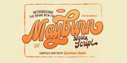 Introducing, Mayburn Script - a bold script with a touch of retro feel. This type of font perfectly made to be applied especially in logo, and the other various formal forms such as invitations, labels, logos, magazines, books, greeting / wedding cards, packaging, fashion, make up, stationery, novels, labels or any type of advertising purpose. Features : uppercase & lowercase numbers and punctuation multilingual alternates and ligatures PUA encoded We highly recommend using a program that supports OpenType features and Glyphs panels like many of Adobe apps and Corel Draw, so you can see and access all Glyph variations.
 - Congress Sans by Club Type,
$36.99 This sans serif type was completed in 1985, a descendant of the earlier serifed Congress shown for the first time at the Association Typographique International Congress, which proved to be so popular in 1980 at Kiel; designed to present a style equally appealing in European languages. Many characters are more condensed than is usual, while others have been exaggerated. The concept being to bring an equality of importance to the whole, producing a collection of International characters working together in harmony on the page-a common aim that Europeans wish of any Congress.
 - Goldest by Twinletter,
$12.00 Introduces "Goldest" font which is created in detail to meet the needs of a charming, elegant and modern design. Using this font creates harmony and beauty in each of your designs, especially designs that require a touch of natural handwriting This font is designed with a natural touch of handwriting which is refined to create a portion and composition that suits your needs. So this font is suitable for craft, children's writing, adventure posters, food banner titles, wedding invitations, product packaging logos, quotes, social media page covers, furniture banner headlines, book covers, and much more.
 - Wee Todd by Typadelic,
$19.95 Wee Todd is a well-connected script font in the rough style of a lefty. Several of my closest friends are lefties and I, over the years, have carefully observed their writing style. For the most part they have unique, interesting handwriting and Wee Todd is a reflection of that style. Notice how Wee Todd’s characters connect. I’ve designed additional ligatures and characters into the typeface so that characters are substituted as you type (in OpenType savvy applications), giving the appearance of natural, spontaneous handwriting. Try it and see!
 - Triole 21 by KaiserType,
$40.00 "Triole 21" is the name of a gothic script font designed by Bertram Kaiser. The forms of this so called "Rotunda" script are based on the manuscripts of italian calligraphers of the late 14th century. Inspiration for this project also comes from the calligrapher Lisa Beck. The glyphs were first written with a broad-nib and then digitized. The Open-Type font is equiped with multilingual (Latin-based) alternates, ligatures and oldstyle figures for various typographical purposes. It can be used for headlines and also stays legible in smaller textsizes for longer textpassages.
 - AT Move Herengracht by André Toet Design,
$39.95 HERENGRACHT (Patricians' Canal or Lord’s Canal) is the first of the three major canals in the city centre of Amsterdam. The canal is named after the heren regeerders who governed the city in the 16th and 17th century. The most fashionable part is called the Golden Bend, with many double wide mansions, inner gardens and coach houses on Keizersgracht. Former bureau of André Toet (SO)Design was situated there for over 32 years, it was about time to name one of our fonts to: HERENGRACHT. Concept/Art Direction/Design: André Toet © 2017
 - Alternasci by Morganismi,
$9.00 The Alternasci family consists of five consists of five individual fonts in the spirit of renaissance. Alternasci Regular is a handmade typeface resembling markings in old manuscripts. It supports most European languages. Alternasci Alchemia comes with the uppercase Alternasci letters and (in Latin) explained alchemy symbols. Alternasci Magia comes with lowercase Alternasci letters. The upper case is the so called Theban or Witch's Alphabet. It has also got some magical idols. Alternasci Picturae gives you by its four hundred pictures an imagery of good old science, mostly related with alchemy and occultism.
 - Alpas by VP Creative Shop,
$12.00 ntroducing Alpas - soft serif typeface Alpas is rounded and soft font with multilingual support. It's a very versatile font that works great in large and small sizes. This font is perfect for branding projects, home-ware designs, product packaging, magazine headers - or simply as a stylish text overlay to any background image. FEATURES Uppercase, lowercase, numeral, punctuation & Symbol regular and italic versions Multilingual support No special software is required to type out the standard characters of the Typeface. Canva friendly Feel free to contact me if you have any questions! Mock ups and backgrounds used are not included. Thank you! Enjoy!
 - Moon Cresta by Typodermic,
$11.95 Introducing Moon Cresta, a charming typeface with a soft design that’s sure to captivate your audience. The font draws inspiration from the timeless Goudy Sans, while embracing a modern and minimalist style. Moon Cresta’s smooth curves and effortless flow give it a welcoming and friendly vibe, perfect for any design project. Initially, Moon Cresta only came in one style—Regular, which boasts a bold weight that demands attention. However, as designers fell in love with its delicate charm, a lighter weight was later added. To avoid any confusion, the original bold style was still named Regular, and the newer weight became known as Light. So, now you can enjoy the gentle touch of Moon Cresta in two weights—Regular and Light. To take your design to the next level, Moon Cresta also includes discretionary f-ligatures and custom ligatures for KA and RA. Simply use your application’s Discretionary Ligatures feature to access them and enhance the uniqueness of your design. In short, Moon Cresta is the perfect font for those seeking a soft, organic design with a touch of modernity. So why not try it out and see how it can add a touch of warmth to your project? Most Latin-based European writing systems are supported, including the following languages. Afaan Oromo, Afar, Afrikaans, Albanian, Alsatian, Aromanian, Aymara, Bashkir (Latin), Basque, Belarusian (Latin), Bemba, Bikol, Bosnian, Breton, Cape Verdean, Creole, Catalan, Cebuano, Chamorro, Chavacano, Chichewa, Crimean Tatar (Latin), Croatian, Czech, Danish, Dawan, Dholuo, Dutch, English, Estonian, Faroese, Fijian, Filipino, Finnish, French, Frisian, Friulian, Gagauz (Latin), Galician, Ganda, Genoese, German, Greenlandic, Guadeloupean Creole, Haitian Creole, Hawaiian, Hiligaynon, Hungarian, Icelandic, Ilocano, Indonesian, Irish, Italian, Jamaican, Kaqchikel, Karakalpak (Latin), Kashubian, Kikongo, Kinyarwanda, Kirundi, Kurdish (Latin), Latvian, Lithuanian, Lombard, Low Saxon, Luxembourgish, Maasai, Makhuwa, Malay, Maltese, Māori, Moldovan, Montenegrin, Ndebele, Neapolitan, Norwegian, Novial, Occitan, Ossetian (Latin), Papiamento, Piedmontese, Polish, Portuguese, Quechua, Rarotongan, Romanian, Romansh, Sami, Sango, Saramaccan, Sardinian, Scottish Gaelic, Serbian (Latin), Shona, Sicilian, Silesian, Slovak, Slovenian, Somali, Sorbian, Sotho, Spanish, Swahili, Swazi, Swedish, Tagalog, Tahitian, Tetum, Tongan, Tshiluba, Tsonga, Tswana, Tumbuka, Turkish, Turkmen (Latin), Tuvaluan, Uzbek (Latin), Venetian, Vepsian, Võro, Walloon, Waray-Waray, Wayuu, Welsh, Wolof, Xhosa, Yapese, Zapotec Zulu and Zuni.
 - Cabrito by insigne,
$24.00 After my son was born, I found myself reading him a lot of books. A LOT of books. Some were good, some were great, but I found myself wanting to develop something using my skills and interests to make something that only I could make. In short, I realized my son needed to be indoctrinated—I mean, introduced into the wonderfully wild world of fonts. So, I set about to make a board book to teach about typography, called “The Clothes Letters Wear.” You can learn more about the book here. I’ve made the captivating illustrations bright and colorful, and the use of different letter forms makes for a fascinating read to delight ages young and young at heart. And, as an added bonus, this children’s book has a custom designed font. I’m always looking for an excuse to design a new font, and this book created the perfect alibi. Drum roll, please. I now give you … Cabrito (“little goat” en Español). This new serif typeface incorporates the latest research on typographic legibility for children, features to make it—well, extra legible. A little background: studies show that Bookman Old Style is one of the most readable typefaces, and as a consequence or perhaps the reason why, it is used thoroughly for children’s books. This font became my initial inspiration for the typeface. Then, I found more legibility research saying that (brace yourselves) Comic Sans is also very legible for beginning readers, much due to the large x-height and softer, easily recognizable forms. In addition, forms that are closer to handwriting also seem to be more legible. Once I threw all that into my cauldron and stewed it a bit, the result was a pleasantly rounded typeface that includes not-so-strictly geometric, handwriting-inspired forms for the b, d, p, and q. Es guapo! Cabrito’s slender weights are simple and fun, with extras that turn any “bah humbug” into a smile. Add lighter touches to your project with the typeface’s included sparkles or rainbows (not included). Splash a little more color on the page with the firmer look of the thicker weights. Cabrito’s upright variations across all weights are matched by optically altered italics, too, giving you even more variety with the font family. This modern typeface’s bundle of alternates can be accessed in any OpenType-enabled software. The fashionable options involve a significant team of alternates, swashes, and meticulously refined aspects with ball terminals and alternate titling caps to decorate the font. Also bundled are swash alternates, old style figures, and small caps. Peruse the PDF brochure to check out these options in motion. OpenType-enabled applications like the Adobe suite or Quark allows comprehensive control of ligatures and alternates. This font family also provides the glyphs to aid a variety of languages. Cabrito is a welcoming, everyday font family by Jeremy Dooley. Use it to convey warmth and friendliness on anything from candy and food packages to children’s toys, company IDs or run-of-the-mill promotional material. Cabrito’s unique appearance and high legibility make it equally at home in print as it is on a screen.
 - Churchward Typestyle by BluHead Studio,
$25.00 Churchward Typestyle is a clean sans serif font, originally designed as a photo font by Joseph Churchward back in 2002. Under exclusive license, BluHead Studio has digitized this typeface by using his original drawings. We added any missing glyphs, being careful to maintain the aesthetic that makes this a classic Churchward design. Joseph intended this to be a six weight family, so we digitized the Light and Ultra Bold weights and interpolated the middle four. We enhanced the functionality of the family by creating a complimentary set of small caps, as well as creating a 10 degree oblique of each weight, being careful to correct the slanted curve forms of the letters. Churchward Typestyle is now an extensive 12 weight family, ranging in weights from Light to Ultra Bold, making it extremely useful in a broad range of design applications, from text and print, to display, posters and billboards. It’s sanserif design is clean and open, with a few of those characteristic Churchward goodies. Joseph loved his ink traps, so look for many of those! They especially become more apparent in the heavier weights. All of the Churchward Typestyle fonts support the major Western European languages, and have OpenType features for ligatures, smallcaps, tabular figures, superiors, inferiors, fractions, and ordinals.
 - Caslon Black by ITC,
$29.99The Englishman William Caslon punchcut many roman, italic, and non-Latin typefaces from 1720 until his death in 1766. At that time most types were being imported to England from Dutch sources, so Caslon was influenced by the characteristics of Dutch types. He did, however, achieve a level of craft that enabled his recognition as the first great English punchcutter. Caslon's roman became so popular that it was known as the script of kings, although on the other side of the political spectrum (and the ocean), the Americans used it for their Declaration of Independence in 1776. The original Caslon specimen sheets and punches have long provided a fertile source for the range of types bearing his name. Identifying characteristics of most Caslons include a cap A with a scooped-out apex; a cap C with two full serifs; and in the italic, a swashed lowercase v and w. Caslon's types have achieved legendary status among printers and typographers, and are considered safe, solid, and dependable. A few of the many interpretations from the early twentieth century were true to the source, as well as strong enough to last into the digital era. Caslon Black was designed by Dave Farey in the ITC library. - Astire Klarish by Dora Typefoundry,
$20.00 Introducing, Astire Klarish is a new retro serif with all clean and soft lines, tight curves, a combination of regular and italic versions adding to the appeal and trendy elegant look! This serif typeface that looks amazing in both large and small settings is perfect for your design needs yet still clean and elegant to apply to a variety of other formal forms such as invitations, labels, logos, magazines, books, greeting/wedding cards, packaging. , fashion, make up, stationery, novel, label or any kind of advertising purposes. WHAT YOU GET : Astire Klarish Regular (Open type) Astire Klarish Italic (Open type) Astire Klarish Bold (Open type) Astire Klarish Bold Italic (Open type) This type of family has become the work of true love, making it as easy and fun as possible. I really hope you enjoy it! Thank you.
 - Marshmallow by Positype,
$39.00 Marshmallow is a fun, fat, super high-contrast script typeface in two variants. A slick connected (Script) and a mellow unconnected (Fluff) style that provides the versatility you need regardless of the display usage you plan. Marshmallow Script tops out at 820 characters, and both fonts feature a wide array of swash and stylistic alternates that complement the other, with varying options in the three additional stylist sets, titling alternates, ligatures and contextual ligature combinations. The fonts even contain ordinals, superior and inferior numerals, OpenType-generated fractions. All of these extras are produced with a sense of decadence and fun to expand the possible uses of the typeface. It can’t be used everywhere, but when it is used, it should be used with indulgent abandon… which is pretty much what happens any time we take a soft, gooey bite into marshmallow now, right?!
 - LFT Etica by TypeTogether,
$35.00 LFT Etica, the-moralist-typefamily-project, was born at the end of 2000, but its development is ongoing, overcoming many hurdles and diversions. The starting point for the designers at Leftloft were the common "cold" grotesk sans serifs, ubiquitous and often badly applied in their everyday visual environment. The challenge was to obtain the same force, versatility and color, but with a much warmer feel. The resulting design has soft strokes, open counters and terminals; aesthetically resting somewhere between a grotesque and humanist sans serif. It successfully combines masculine force with female delicacy. LFT Etica’s wide range of styles, together with a large character set and OpenType features, such as 4 sets of numerals, fractions, several stylistic alternates and a set of arrows and dingbats, allows for a vast variety of applications, be they editorial or corporate.
 - Macaroni Sans by Type Associates,
$30.00 Macaroni Sans evolved from our search for an extended font family consisting of a range of weights in both uprights and obliques, with a contemporary appeal. The desired character was to be sympathetic with a range of high-tech consumer products so a friendly, soft approach was called for. The resulting mix of geometric shape, rounded terminals, subtle italic angle of just six degrees and a few quirky stroke endings met with an enthusiastic response. As its subject product line exhibits brilliant color and imagery, a style was called for that conveyed contemporary appeal and readability but would not compete with the savvy products. We arrived at a clean, modern, sociable look that would suit a broad subject field in either text, semi display or signage. Its simple lines and monoline strokes fit well with logo usage or screaming posters, enhancing letterheads or websites, for foodstuffs to autos, insurance to swimming pools, lawfirms to babyfood. Macaroni Sans is the perfect typeface for branding, logotypes, may even flatter challenging viewing conditions. Rounded types have been around (pardon the pun) for centuries; numerous examples can be seen on old wood type posters, which in a small way prompted the name: in fashion Macaroni was a term used in mid-eighteenth century Europe to describe a dandy, a chap who displayed flamboyance in dress and hairstyle and spoke outlandishly or in an effeminate manner. Hence the term macaronic verse.
 - Cowhand by Monotype,
$9.99 Cowhand is a display typeface designed by Toshi Omagari to keep words at one specific width. Words of one letter will have one very wide character, words of two letters will have characters of half that width and so forth. At the maximum of 20-letter words, characters become very tightly compressed. The design of the Cowhand typeface is inspired by western style block printing with reverse stress that is characterised by chunky slab serifs. This Lite version of the typeface was designed as part of a font marathon over the course of 3.5 days in Monotype’s NY office. Please Note: these "Lite" fonts are offered with a limited character set. Monotype is proud to support Room to Read’s work in literacy and girls’ education through our font marathon initiative.
 - Getrok by Prioritype,
$19.00 Typeface inspired by the wild style of street graffiti artists. There are two styles, namely regular and extrude. Great for poster design, product packaging, merchandise and so on. Features: Uppercase, Lowercase, Numeral, Punctuation & Multilingual. Thanks.