4,578 search results
(0.02 seconds)
- Firefly by Canada Type,
$24.95 Firefly was designed by Miranda Hopper during her time in Patrick Griffin's type design class of 2010 at Humber. It is a light, narrow alphabet that works well in casual, leisurely design.
 - Jingle Wide by ArFF,
$24.95I once tried to imagine what the children of Schoolbook and Bodoni would look like if they were married. I'm still trying to imagine that! In the meantime I drew the Jingles. - Chamferwood JNL by Jeff Levine,
$29.00 Chamferwood JNL is another interpretation of the block lettering style most popular during the late 1800s and the early 1900s. The design was modeled from examples from a set of wood type.
 - Franca by René Bieder,
$29.00 Franca is a neo-grotesk family in nine weights plus matching italics. The inspiration for the design came through the constant interest in new interpretations of the classic grotesk model and a study of "neutral“ typefaces like Helvetica, Univers or Normal Grotesk. During the studies, additional attention was given to the American representatives of the genre, resulting in the initial impetus for a reinterpretation, combining both paths into one contemporary design. This is reflected in the name, blending together the names of the most popular typefaces of each genres, (Fran)klin and Helveti(ca). Due to its large x-height and plain design, the family is perfectly suited for all kinds of text. Its mid-weights are optimized for usage in long paragraphs, while the bolder weights, due to a short descender and ascender, create a compact and confident look in headlines or short copy. In order to create strong and dynamic italics, the oblique glyph shapes come with a faint calligraphic hint, defined by a higher stroke contrast and a steeper connection between stems and arcs in, for example, h n m and u. This is followed by different standard shapes for a and y, supporting the dynamic movement of the lowercase in general. A wide range of OpenType features such as ligatures, old style figures, fractions, case-sensitive shapes and many more, are available for professional and contemporary typesetting. This is completed with eleven alternative glyph sets, enabling a quick customization of the typeface. The family supports up to 92 languages and comes with 500+ glyphs per font.
 - African Textile by Scholtz Fonts,
$19.00The African Textile font had two major influences. The pattern is derived from the bogolan cloths from Africa, originally made using a traditional dyeing technique from Mali that uses bogo or clay as prime dye material. The character shapes are largely based on the Tabwa font. The font is best used as a heading or poster font, although the boldness of the design allows it to be useful at medium sizes, as subheadings as well. It is professionally letter-spaced and kerned and contains a complete character set. - Center Screen by Peterland,
$44.00 Center Screen is a universal font dedicated to making office documents in popular text editors. Due to the interesting disign it is also used for making websites and advertising for films and posters. Center Screen font also allows to create images of work in many forms of marketing due to its versatility and adaptability to many languages of the world. Creating images and text with Center Font Screen allows you to gain competitive edge by highlighting your brand and by bringing attention to the originality of the presentation and the readability of the message.
 - Freco by Canada Type,
$24.95Freco is a celebration of the short but very productive life of Dutch designer and illustrator Fré Cohen (1903-1943). This font is mostly an assembled compilation of letters Fré created for a variety of print designs over the years, showcasing her consistent talent for the architectural moderne, art deco, and Wendingen styles of her era. Freco is a prime example of how seemingly minute details can visually be most relevant and consequential in typography. Fré Cohen's subtle variations on the familiar art deco forms and contrast have made her typographical work so stunning it continues to be taught and celebrated as some of the finest 20th century Dutch design. Freco comes in an expanded character set that includes support for Central and Eastern European languages, as well as Turkish, Baltic, Celtic, Maltese and Esperanto. It also includes complementary alternate forms and letter combinations for added flexibility in usage. - Rococo Titling by Three Islands Press,
$15.00Rococo Titling is a set of ornate titling caps based on work done by Jacques-Francois Rosart (1714-1777) and Pierre Simon Fournier (1712-1768) during the middle decades of the 18th century. - Bumbershoot by Ingrimayne Type,
$9.00 Bumbershoot is a typeface for a rainy day. A letterbat font constructed of umbrellas, it does not have true lower-case letters. Rather it has two mostly different sets of upper-case characters.
 - Who - Unknown license

- ITC Ellipse Neo by Typorium,
$30.00 The Typorium presents a new optimized and enriched version of ITC Ellipse which first appeared in 1996 in the International Typeface Corporation typeface library. ITC Ellipse Neo design has been lightly modified. Three weights have been added (light, Medium, Extra Bold, including Italics) to the original Regular and Bold styles. ITC Ellipse Neo is both modern and classic. Modern in the unusual shape based on the geometric ellipse form. And classic in the structure of some letters like the lower cases c, e, g, o, s. These letters alone could come from a traditional typeface, but they fit perfectly with the atypical rest of the alphabet giving it a present-day and traditional mix. Furthermore, the ellipse shape fits naturally in the italic styles, giving the font an organic and fluid feeling. ITC Ellipse Neo offers OpenType features such as alternate characters for upper and lower case, and an extended accented character set to support many languages. Five weights have been created for each style to offer a wide range of graphic possibilities in a tidy digital footprint. Designer: Jean-Renaud Cuaz Publisher: Typorium MyFonts debut: December 15, 2020 Le Typorium présente une nouvelle version optimisée et enrichie d'ITC Ellipse qui est apparue pour la première fois en 1996 dans la bibliothèque de caractères de l'International Typeface Corporation. Le design de ITC Ellipse Neo a été légèrement modifié. Trois graisses ont été ajoutées (léger, moyen, extra gras, y compris les italiques) aux styles originaux Regular et Bold. ITC Ellipse Neo est à la fois moderne et classique. Moderne dans le dessin inhabituel basé sur la forme géométrique de l’ellipse. Et classique dans la structure de certaines lettres comme les minuscules c, e, g, o, s. Ces lettres pourraient provenir d'une police de caractères traditionnelle, mais elles s'intègrent parfaitement avec le reste de l'alphabet plus insolite en lui donnant un mélange de modernité et de tradition. De plus, la forme de l'ellipse s'intègre naturellement dans les styles italiques, donnant à la police une sensation organique et fluide. ITC Ellipse Neo offre des fonctionnalités OpenType telles que des caractères alternatifs pour les capitales et les bas de casse, et un jeu de caractères accentués étendu pour prendre en charge de nombreuses langues. Cinq graisses ont été créés pour chaque style afin d'offrir un large éventail de possibilités graphiques pour une empreinte numérique rigoureuse.
 - American Donuts - Unknown license

- Bisaya 1880 - Unknown license

- Nevins Hand by Scriptorium,
$24.00Nevins Hand is our first release of a new collection of fonts based on the designs of Peter Nevins, a San Francisco poster artist who does hand-lettered fonts in the Art Nouveau tradition. - Western Railway JNL by Jeff Levine,
$29.00Western Railway JNL was inspired by sample lettering found in an old sign painter's reference book published during the early part of the 20th Century and modified for today's digital applications by Jeff Levine. - White Birds by Yumna Type,
$15.00 A handmade font is a creative designing way to catch attention. That is what this pretty font does. White Birds is a script font in handmade cursive styles with decorative and the dancing basic line characteristics showing the fun, elegant, modern nuances. To be visually attractive, its letter heights are made uneven for a purpose. In addition, White Birds gives you a special bonus called the clipart. Use this font for any text sizes due to its legibility and make use of the available interesting features to beautify your designs. Features: Ligatures Multilingual Supports PUA Encoded Numerals and Punctuations White Birds fits for various design projects, such as posters, banners, logos, magazine covers, quotes, headings, printed products, invitations, name cards, merchandise, social media, etc. Find out more ways to use this font by taking a look at the font preview. Thanks for purchasing our fonts. Hopefully, you have a great experience using our font. Feel free to contact us for further information when you have a problem using the font. Thank you. Happy designing.
 - Ongunkan Sweden Dalecarlian Run by Runic World Tamgacı,
$50.00 The Dalecarlian runes, or dalrunes, was a late version of the runic script that was in use in the Swedish province of Dalarna until the 20th century.The province has consequently been called the "last stronghold of the Germanic script. When Carl Linnaeus visited Älvdalen in Dalarna in 1734, he made the following note in his diary: The peasants in the community here, apart from using rune staves, still today write their names and ownership marks with runic letters, as is seen on walls, corner stones, bowls, etc. Which one does not know to be still continued anywhere else in Sweden. The Dalecarlian runes were derived from the medieval runes, but the runic letters were combined with Latin ones, and Latin letters would progressively replace the runes. At the end of the 16th century, the Dalecarlian runic inventory was almost exclusively runic, but during the following centuries more and more individual runes were replaced with Latin characters. In its last stage almost every rune had been replaced with a Latin letter, or with special versions that were influenced by Latin characters.
 - Faber Fraktur by Ingo,
$22.00 A modern black-letter, so to speak. Composed of a few basic elements with a wide-quill ductus. Faber Fraktur was based on the idea that it must be possible to create a modern black-letter type. The typeface is ”constructed“ according to the same principles as a script without serifs: as few varied basic forms as possible, omission of frills which make the type difficult to read and repetition of similar forms. The typical contrasting strokes of the original handwritten black-letter script are retained nonetheless. The elements of this typeface were even pre-formed with the quill. All characters are reduced to their basic skeleton. The fanciness and manifold ”breaks“ or fractures typical of black-letter typefaces are considerably reduced to just a few essentials. Faber Fraktur is a very legible type perfectly suitable for long texts. It does not appear nearly as foreign and archaic as the old black-letter fonts. The capital letters especially have a charm of their own radiating a kind of playfulness in spite of their severe form.
 - Cedi by Typogama,
$25.99 The Cedi Typeface is a single weight display font that is based on the fluid handwritten style of a work colleague. This design is a fast flowing script that is both lively and original yet equally legible due to it's defined letterforms and open forms. Despite working well in a regular format, during the design process I started to look at ligatures as a solution for solving some problematic combinations. However, this small implementation soon got vastly expanded as I started to focus on the rythm of the letterforms and how best to convey the hand drawn feature in the design. A common problem in most script fonts is the repeating letterforms that would be particularily un-natural for this manual typeface, therefore hinting at it's digital source. The ligature concept soon evolved into over 2400 ligatures, trying to cover all repeating glyphs as well as finding more harmious combiations. This design was created for use in short text settings and use at large point sizes suiting titles, screen use or logo designs.
 - Senorita Cyrillic Script by Ira Dvilyuk,
$16.00 The hand-drawn script Señorita was handwritten with a dry brush and will look great on branding design, posters, apparel, logotype, website header, fashion design, wedding card design, and more. Hand-drawn script font Señorita contains a full set of uppercase letters and 2 full sets of lowercase letters and 43 ligatures - which can be used to create a handwritten calligraphy look. Use alternate lowercase and double-letter ligatures to create a perfect hand-painted look in your creations. The Cyrillic part of the font contains the uppercase letters and lowercase letters and 17 ligatures, giving a realistic hand-lettered style. Multilingual Support for 32 languages: Latin glyphs for Afrikaans, Albanian, Basque, Bosnian, Catalan, Danish, Dutch, English, Estonian, Faroese, Filipino, Finnish, French, Galician, Indonesian, Irish, Italian, Malay, Norwegian Bokmål, Portuguese, Slovenian, Spanish, Swahili, Swedish, Turkish, Welsh, Zulu. And Cyrillic glyphs support for Russian, Belorussian, Bulgarian, Ukrainian, and Kazakh languages. (Does font support more Cyrillic languages just type a message in the text box below and see if all characters you’ll need are there.)
 - Action Hero by Wing's Art Studio,
$10.00 Action Hero - A grungy, textured brush font for action packed movie posters and titles. Action Hero is a hand-drawn brush font inspired by action movie posters of the 1980s and 90s. Does your movie feature a hostage situation on a speeding bus or train? Try Action Hero. How about a one man army tasked with rescuing stranded POWs? Try Action Hero! Maybe a post-apocalyptic race across the desert, or did they dare to kill your favourite second cousin? Big mistake - Get Action Hero!!! The Action Hero font family collects four all-cap variants featuring a complete set of uppercase and lowercase characters, along with numerals, punctuation, language support and underlines. With so many creative options you'll never have to repeat characters (a personal bugbear with hand-drawn fonts) and achieve authentic hand-drawn looking title designs. Check out the visuals for ideas and tips on how to use this font on posters, movie titles, product packaging, broadcast and advertising. With countless creative options and a design that explodes off the screen, this is the last action hero font you'll ever need!
 - Brassens by Typorium,
$53.00 Le Typorium présente une nouvelle famille de caractères calligraphiques basés sur une écriture étudiée à travers les manuscrits et autographes de Georges Brassens, poète et musicien (1921-1981). Son tracé, rigoureux et appliqué, souvent minutieux, est à l’image d’une œuvre unique et singulière, immédiatement reconnaissable. Le script Brassens offre des fonctionnalités OpenType telles que des caractères alternatifs pour les majuscules et les minuscules afin de renforcer la fluidité d’une écriture manuelle, des chiffres alternatifs, des fractions et un jeu de caractères accentués étendu pour prendre en charge de nombreuses langues étrangères. Trois graisses ont été créées afin d’offrir une large palette de possibilités graphiques. 60 images d’un poète qui a cassé sa pipe à l’âge de 60 ans., classées en trois séries de vignettes (pictogrammes, symboles, portraits), elles illustrent l’univers imagé et la richesse symbolique de la poésie de Georges Brassens où les représentations mythologiques et allégoriques y tiennent une part importante. Georges Brassens est un poète, auteur-compositeur-interprète né à Sète le 22 octobre 1921, mort à Saint-Gély-du-Fesc le 29 octobre 1981 et enterré au cimetière Le Py de Sète. Auteur de plus de deux cents chansons populaires, il met en musique et interprète ses poèmes en s’accompagnant à la guitare. Outre ses propres textes, il met également en musique des poèmes de François Villon, Victor Hugo, Paul Verlaine, Paul Fort, Antoine Pol, ou encore Louis Aragon. Il reçoit le Grand Prix de Poésie de l’Académie Française e 1967. Un grand nombre d’écoles, salles de spectacle, voies, parcs et jardins portent également son nom, dont à Paris le parc Georges-Brassens, tout proche de l’impasse Florimont où il vécut ses premières années parisiennes, de sa maison de la rue Santos-Dumont et du café Les Sportifs Réunis – Chez Walczak – rue Brancion qui lui inspira « Le Bistrot ». À Sète, l’Espace Georges Brassens ainsi que de nombreux festivals et associations redonnent vie au poète et à son œuvre. The Typorium presents a new calligraphic typeface family based on a writing studied through the manuscripts and autographs of Georges Brassens, poet and musician (1921-1981). Its layout, rigorous and applied, often meticulous, is in the image of a unique and singular work, immediately recognizable. Brassens script offers OpenType features such as alternate characters for upper and lower case to enhance the fluency of handwriting, alternate numbers, fractions and an extended accented character set to support many foreign languages. Three weights have been created to offer a wide range of graphic possibilities. 60 images of a poet who broke his pipe (French expression for passing away) at the age of 60, classified into three series of vignettes (pictograms, symbols, portraits), they illustrate the imagery world and the symbolic richness of Georges Brassens poetry where mythological and allegorical representations hold an important part. Georges Brassens is a poet, singer-songwriter born in Sète on October 22, 1921, died in Saint-Gély-du-Fesc on October 29, 1981 and buried in Le Py cemetery of Sète. Author of more than two hundred popular songs, he sets to music and performs his poems, accompanying himself on the guitar. In addition to his own texts, he also sets to music poems by François Villon, Victor Hugo, Paul Verlaine, Paul Fort, Antoine Pol, or Louis Aragon. He received the Grand Prix of Poetry from the Académie Française in 1967. A large number of schools, theaters, streets, parks and gardens also bear his name, including in Paris the Georges-Brassens park, very close to the impasse Florimont where he lived his first years in Paris, his house in the rue Santos-Dumont and the café Les Sportifs Réunis - Chez Walczak - rue Brancion which inspired "Le Bistrot". In Sète, the Espace Georges Brassens as well as numerous festivals and associations bring the poet and his work back to life.
 - Bathysphere by Kickingbird,
$24.00 This steam era typeface, created by Gustav Schroeder in 1884, found popular use on soap box labels and tobacco tins during its initial release. Then, later, a successful and stout revival of Gustav's face, named Othello, was carried out by Morris Fuller Benton in 1934, and the typeface's appeal widened to include items such as broadside posters featuring Boris Karloff's Frankenstein. After metal gave way to film type, Gustav's creation experienced a brief fashion moment in the 1960's, but then disappeared entirely, never re-surfacing as a full digital typeface. With the release of Bathysphere, the typeface comes full circle, having been completely redrawn from scratch using Gustav's original specimens. The new extended language support establishes the typeface firmly in the modern era, while Bathysphere's refinement of subtle blunt corners restores a deep-sea grace to this iron giant.
 - Dante by Monotype,
$39.00 Dante was designed by Giovanni Mardersteig. Mardersteig started work on Dante after the Second World War when printing at the Officina Bodoni returned to full production. He drew on his experience of using Monotype Bembo and Centaur to design a new book face with an italic which worked harmoniously with the roman. Originally hand-cut by Charles Malin, Dante was adapted for mechanical composition by Monotype in 1957. The new digital font version has been re drawn, by Monotype's Ron Carpenter, free from any restrictions imposed by hot metal technology. The Dante font family was issued in 1993 in a range of three weights with a set of titling capitals. Dante is a beautiful book face which can also be used to good effect in magazines, periodicals etc. Dante® font field guide including best practices, font pairings and alternatives.
 - Grund by SIAS,
$29.90 GRUND is a new fontographic adaption of a remarkable 1920s epigraphical find in the city of Leipsic. This old well-known European trade fair hotspot struggled with a severe shortage of exhibition space around 1920. The solution was to dig deeper into the matter – literally – and 1924 the world’s first underground trade fair exhibition hall was opened right under the city’s central market square. After several changes of use during the past decades the sophisticated Art Deco entrance structure (architect: Otto Droge) was re-opened in December 2013 as a gateway to a new subway rail track. – The original brass lettering of the UNTERGRUNDMESSHALLE MARKT has been retrieved – and served as the inspiration for this new and unique font. If you’d like to see more exceptional Art Deco type, have a look at my Arthur series. __________________________________________________________________________________________
 - Baskerville Old Face KTKM by KTKM,
$55.00 “So-called Baskerville Old Face of the type foundry Stephenson Blake & Co. of Sheffield. The Script is probably not immediately linked to Baskerville, but it is very much influenced by it. It is one of the most beautiful types of which the mats still exist; it has an incomparably different spirit than the ‘streamlined’ re-cuts of today’s Baskerville. Even keeping the general restraint extremely expressive. According to Berthold Wolpe (‘Signatures’ No. 18), the punches were cut and shown in samples in 1776 by Isaac Moore, who came from Birmingham to Bristol.” – Jan Tschichold, “Meisterbuch der Schrift”, Notes On The Plates, Page 231 Publisher note: I wanted to improve the contrast between thick and thin, reduce some ink-traps and give stems, serifs and links a smoother overall feel. I have also added some alternative letters and old style numerals.
 - Croissant by ITC,
$39.00Phillip Kelly first drew the Croissant typeface in 1978 for Letraset. Back in the 1970s and 80s, Letraset's rubdown lettersheets were a popular means of designing with type. Today, many of these nostalgic classics are available in digital format. Linotype is pleased to re-present Croissant. This experimental typeface is built up out of round, brush-like strokes, creating heavy, and black letters. These forms are best used for display signage and headline text. If you are designing for a local bakery or donut shop, this typeface may be the perfect fit. The dark, heavy character that Croissant lends to the page is similar to Cooper Black , one of the most renowned American type designs ever produced. If you are looking for a typeface with Croissant's feel, but need to set smaller headlines or text, check out that family's offerings." - Rusch by Proportional Lime,
$9.99 Adolf Rusch von Ingweiler, was in the 19 th century known mysteriously as the “R'' printer. He was the first printer North of the Alps to introduce the new Roman style of type known now as Antiqua. He was active in the city of Strasbourg from around the early 1460's to 1489. One wonders if the unusual form of “R'' was a personal conceit. This font is, therefore, an Antiqua style font and has over a 1000 defined glyphs with wide support for medieval characters that have since fallen out of use. The baseline was slightly tidied up in order to give the printed text an even cleaner look than the original. The letters are very close approximations of the original type catalogued by the “Veröffentlichungen der Gesellschaft für Typenkunde des 15. Jahrhunderts” as Typ.1:103R GfT1197.
 - Black Ocean by Fargun Studio,
$14.00 Introducing Black Ocean!! Handwritten font with quick dry strokes and a signature style. perfect for branding projects, home ware designs, product packaging or simply as a stylish text overlay to any background image or posters.
 - Pageu by Realtype,
$14.00 Pageu is a handmade font written with a real brush pen. Written with quick movements using a brush pen. It's Handwritten with quick dry strokes. Suitable for those who need a font with real textures
 - White Buttell by Trustha,
$14.00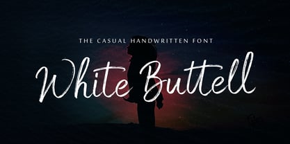 White Buttell is a handwritten brush script font. It has a natural style of a dry marker which makes it perfect for branding, advertising, poster designs, logos, book covers, magazines, packaging, website headers, and more.
 - Arthur Hill by Trustha,
$15.00 Arthur Hill is handwritten with dry brush pen. With sharp details, this font is perfect for branding, logo, book covers, packaging, website headers, greeting cards, poster, merchandise, fashion campaigns, newsletters, album covers, quotes, and more.
 - Restaurant And Lounge JNL by Jeff Levine,
$29.00 Restaurant and Lounge is a casual, brush-style type face based on hand lettering found on a 1940s matchbook for the Park Avenue Restaurant (a popular dining spot during the golden years of Miami Beach).
 - Holywings by Fargun Studio,
$12.00 Introducing Holywings Font!! Handwritten font with quick dry strokes and a signature style. perfect for branding projects, home ware designs, product packaging or simply as a stylish text overlay to any background image or posters.
 - Lebensjoy by Monotype,
$29.99Lebensjoy was used by the Co-op chain stores in Sweden for a nationwide fortnightly flyer (called Livsgldje = Joy of Life) during 1993 and 1994. They wanted a simple but still lively and active letterform. - PL Davison by Monotype,
$29.99PL Davidson Americana is an all-capital typeface based on woodcut designs from the nineteenth century. The PL Davidson Americana font was designed by M. Davison in 1965, during the revival of American headline faces. - PL Davison Zip by Monotype,
$29.99PL Davidson Americana is an all-capital typeface based on woodcut designs from the nineteenth century. The PL Davidson Americana font was designed by M. Davison in 1965, during the revival of American headline faces. - Peach Comix_PersonalUseOnly - Personal use only

- Shelter_PersonalUseOnly - Personal use only

- Hela by Renegade Fonts,
$12.00 Hela is a high contrast rounded font with interpolation twist. I have a personal saying that fits this font: So long you drive around nice lettering, until you digitize it. Hela comes from lettering of an old Czech textile company called Helana, which does not exist anymore, but the signage is still on the building. The weird thing on this font is that it does not add weight on every stem from Light to Black as usual, but rather adds more and more black stems to the light skeleton. Another nice thing about this font is that it does not include unnecessary glyphs. So there are just 10 figures - you don't have to think which one is the correct figure kind for you. There is just one kind. No alternates, no italics, no opentype features - even no lowercase. Well, who would use it anyway, it is a display font! Try it yourself with Basic character set for free.


