10,000 search results
(0.023 seconds)
- High Dreaming by Haksen,
$15.00 High Dreaming is a stylish modern and natural handwritten script font with casual chic flair. It is perfect for branding, wedding invites and cards, and maybe for red wine label. High Dreaming includes full set of gorgeous uppercase and lowercase letters, numerals, a large range of punctuation and ligatures. All lowercase letters of High Dreaming Regular include ending swashes, giving realistic hand-lettered style. What you get? You will get: High Dreaming OTF High Dreaming Alternate OTF In order to use the beautiful swashes, you need a program that supports OpenType features such as Adobe Illustrator CS, Adobe Photoshop CC, Adobe Indesign and Corel Draw. but if your software doesn't have Glyphs panel, you can install additional swashes font files: Thanks and have a great day, Haksen
 - Letraset Romic by ITC,
$40.99Typeface designer and Letraset type director Colin Brignall created the font Romic. The character of the strokes as well as the serif forms give the font its calligraphic look. The placement of the serifs, on the upper left and lower right of a character, also distinguishes this typeface and allows the figures to be set very close to one another. The dots on the i and j do not hang in the air, rather, they are connected to the rest of the letter with a light, serif-like stroke. The elegant and lively Romic font is legible even in smaller point sizes. It is best used in middle length texts and headlines and wherever an individual and sophisticated image is the goal. - Sans Serif Shaded - Unknown license

- Rudelsberg-Initialen - Personal use only

- Linotype Abstract by Linotype,
$29.99American designer Frank Marciuliano created the Linotype Abstract display font in 1997. Abstract's letters are made up of collaged elements: a single letter can contain several different textures. Instead of an upper and lowercase, Linotype Abstract offers two different uppercase alphabets, each with different patterns. Text set in Linotype Abstract takes on the appearance of a cubist painting, making it the perfect font for all of your funky type needs. Linotype Abstract is included in the Take Type 4 collection from Linotype GmbH." - Roller Poster by HiH,
$12.00 Roller Poster is named after Alfred Roller. In 1902, Roller created a poster to advertise the 16th exhibit of Austrian Artists and Sculptures Association, representing the Vienna Secession movement. The exhibit was to take place in Vienna during January & February 1903. The location is not mentioned because everyone in Vienna knew it would be held at the exhibit hall in the Secession Building at Friedrichstraþe 12, a few blocks south of the Opernring, near the Naschmarkt. Designed by Joseph Maria Olbrich in 1897, the buiilding has been restored and stands today as one finest of the many fine examples of Art Nouveau architecture in Vienna (see vienna_secession_bldg.jpg). Because of its dome, it is called “the golden cabbage.” The poster itself is unique. The word “secession” is in one type style and takes up two-thirds of the elongated poster. At the bottom of the poster are the details in a different lettering style. It is this second style at the bottom that is the basis for the font Roller Poster. In keeping with our regular naming conventions, we were going to call it Roller Gezeichnete (hand-drawn), but the wonderful play on both words and the shape of the three S’s in secession was too compelling. In November 1965 there was an exhibit of Jugendstil and Expressionist art at the University of California. Alfred Roller’s Secession Poster was part of that exhibit. Wes Wilson was designing promotional material at Contact Printing in San Francisco. Among their clients was a rock promoter named Bill Graham, staging dance-concerts at Fillmore Auditorium. Wilson saw the catalog from the UC exhibit and Roller’s lettering. Wilson adapted Roller’s letter forms to his own fluid style. The result was the poster for the August 12-13, 1966 Jefferson Airplane/Grateful Dead concert at Fillmore put on by Graham (BG23-1). Wilson continued to use Roller’s letter forms on most of the posters he did for Graham through May 1967, when he stopped working for Graham. The posters were extremely successful and the lettering style along with Roller’s letter forms were picked up by other artists, including Bonnie MacLean, Clifford Charles Seeley, James Gardner, and others. The Secession poster and the Fillmore posters have inspired a number of fonts in addition to ours. Among them are JONAH BLACK (& WHITE) by Rececca Alaccari, LOVE SOLID by Leslie Carbarga and MOJO by Jim Parkinson. Each is different and yet each clearly shows its bloodlines. Our font differs in two ways: 1) the general differences in the interpretation of the letter forms and 2) the modification of the basic letter form to incorporate the diacriticals within the implied frame of the letter, after the manner of the original design by Roller. We borrowed Carbarga’s solution to the slashed O and used it, in a modified form, for other characters as well to accomplish the same purpose. We recommend that you buy ours and at least one of the other three. According to Alaccari, a version called URBAN was released by Franklin Lettering in the 70’s (and is shown on page 51 of The Solotype Catalog). For comparison of our font to original design, see image files roller_poster_2s.jpg of original poster and roller_poster_2sx.jpg showing reconstruction using our font for the lower portion (recontructed area indicated by blue bar). Please note the consistency of character width. In the lower case, 23 of the basic 26 letters are 1/2 EM Square wide. The ‘i’ is an eighth narrower, while the ‘m’& ‘w’ are one quarter wider. All the Upper Case letters are 1/8 EM wider than the lower case. This is to make it easier to fill a geometrical shape like a rectangle, allowing you to capture a little of the flavor of Wes Wilson’s Fillmore West poster using only a word processor. We have also included a number of shapes for use as spacers and endcaps. If you have a drawing program that allows you to edit an ‘envelope’ around the letters to distort their shape, you can really get creative. I used Corel Draw for the gallary images, but there are other programs that can accomplish the same thing. The image file “roller_poster_keys.jpg” shows the complete character set with the keystrokes required for each character (see “HiH_Font_readme.txt” for instruction on inserting the non-keyboard characters). The file “roller_poster_widths.jpg” shows the exact width of each character in EM units (based on 1000 units per EM square). You will notice that the font is set wide for readability. However, most programs will allow you to tighten up on the character spacing after the manner of Roller & Wilson. In MS Word, for example, go to the FORMAT menu > FONT > CHARACTER SPACING. Go to the second Drop-Down Menu, labeled ‘Spacing’ and select "condensed' and then set the amount that you want to condense ‘by’ (key on the little arrows); two points (2.0) is a godd place to start. Let your motto be EXPLORE & EXPERIMENT. Art Nouveau has always been one of my favorite movements in art -- I grew up in a home with a couple of Mucha prints hanging on the living room wall. Perhaps because of that and because I lived through the sixties, I have enjoyed researching and designing this font more than any other I have worked on. Let’s face it (pardon the pun), Roller Poster is a FUN font. You owe it to yourself to have fun using it.
 - YT Steel Latin by Yangtype,
$9.00 The concept of this letter is a tall, well-dressed man with moderate muscles, decent appearance, and manners. We are always impatient. I miss someone who can give me some space. This letter gives you some leeway that you can rely on for a moment.
 - Kid Knowledge by 38-lineart,
$6.00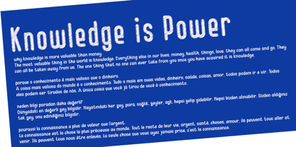 Kid Knowledge is a striking family. It includes 5 amazing styles which can be combined perfectly, giving you the opportunity to create multiple unique designs in an instant. It was inspired by children’s science projects and will give a playful touch to your designs.
 - TypographerGotisch Schmuck - Unknown license

- Fela by Picador,
$24.00 Fela family was designed for books and posters for young children to gain high readability and nice feeling. Every glyph was hand drawn and shaped for better result. This typeface consists of different alternate glyphs with special automatic script, many special characters for different languages and pictograms.
 - !Sketchy Times - Unknown license

- !Futurelic - Unknown license

- !Futurelic Sans Souci - Unknown license

- !The Black Bloc - Unknown license

- Shelflife by Aah Yes,
$6.95 Shelflife is a display typeface with some extras under the lid. It features all the Standard Open-Type features you'd expect, like Class Kerning and Ligatures, plus some other useful additions and of course accented characters for most European languages and others. In essence it's an easy-to-read headline font with clean lines and a bit of character. There's an outline version that can be layered with the standard version to give the shadow effect seen in the accompanying graphics, simplicity itself to do. There's boxed headlines for SALE, SPECIAL, DISCOUNT (20 in total) all ready-made, plus some which can be tilted at an angle, and done automatically - just easily typed in; easy-to-do bullet numbers; a choice of square or rounded dots on j,ffi, and so on in Stylistic Alternatives; and shorter alternatives for U and N with accents. Details are included in the zip files. The zip file will contain both the OTF and TTF versions of the font. Install only one version, either the OTF or TTF, but not both - otherwise you will get all sorts of incompatibility issues and problems.
 - Ratilla Script by Krafted,
$10.00 Be yourself; everyone else is already taken -- Oscar Wilde Being a human being often means fulfilling who you really are. It’s about fulfilling your potential and living to the best of your abilities. And the Ratilla Script will help you show the world who you are! The Ratilla Script paves the way for you to write the information you need to send out to your audience. Make your projects to works of art, conveying your intentions clearly with the font! Maximize your designs with this urban and wavy font. It surely fits anywhere you want them to, giving them a place perfectly tucked in between your designs. Connect with your audience and stand out in the crowd as these fonts will show you that you and your works deserve their attention. Show your boldness as you make the world see of the elegant details put together in your projects! The Ratilla Script will be the perfect addition to aid you in your journey to be who you really are. Let the world see your beauty, bring it out through your handiwork and give your viewers a new perspective!
 - Graphit by HVD Fonts,
$40.00 Graphit is a typeface designed by Lit Design Studio & curated by HvD Fonts. It combines clear, geometric shapes with edgy yet finely-crafted details. Graphit features uncompromising characters such as G, Q, f, k and 1. It works well both for impactful headlines and for reading sizes. The type family consists of six weights plus matching italics. In early 2018, Livius Dietzel & Tom Hoßfeld started developing the typeface’s essential character and released a free font named after the studio, Lit. Just a few months later, Hannes von Döhren had a look at the typeface and suggested expanding it into a family – then publishing it with HvD Fonts. They drew every single letter from scratch, and also decided to give the font a new name — Graphit. The family features six low-contrast weights, ranging from Black to Thin. Every character has been crafted to give it a distinctive and individual feel. Medium, Regular and Light are optimized for usage in copy text. For smaller font sizes & longer body copy, the alternate character set features a double-story a and a simplified Q, f, r and t for improved legibility. All fonts are manually hinted for optimal performance on digital devices.
 - Utopian by Sudtipos,
$39.00 UTOPIAN is a color font family based on primary colors and pure geometric shapes, influenced by Bauhaus, DeStijl and Art Deco. Its pure shapes and basic colors are inspired by the beauty of simplicity of modular order and grid, creating a perfect environment where all these elements live in a perfect color harmony. In the other hand, DYSTOPIAN, the black and white family, represents a close sibling in appearance and structure, that carries an opposite meaning, with a darker look and feel. Both typefaces are, somehow, a reflection of the divided views and posible outcomes that the future times ahead yield before us. Package: Utopian/Dystopian comes in file with a pre-defined color palette. You can always change the colors converting the text to outlines. Technical info to use: The package contains a normal TTF/OTF set of fonts in Black and White and a colorfont in SVG-TTF format. To be able to use the color file you need to have installed Adobe Photoshop CC2017 or Adobe Illustrator CC2018. Not all the browsers support color fonts so please be sure to use them as graphics.
 - Brolike by Alit Design,
$21.00 Presenting the ✨Brolike Typeface✨ by alitdesign. Inspired by cassette music album covers in the 70s and 80s, a retro font was created in a calm and simple style but still gives an interesting and unique impression. Besides that, combined with a dynamic stencil style, the Brolike font becomes more stylish, especially if the design to be made uses swash on alternative fonts to create, for example, lettering or a logotype that is designed to make your design cool and different. Brolike font is very suitable for making designs with retro concepts, simple and playful designs, for example making magazine cover designs, music covers, YouTube thumbs, text headers, logotypes and so on with an elegant retort theme. Besides that this font is very easy to use both in design and non-design programs because everything changes and glyphs are supported by Unicode (PUA). Brolike font has a total of 746 glyphs including symbol, multilingual and alternative glyphs. We really enjoyed the process of making the Brolike font, we hope you are also happy when using the Brolike font. Language Support : Latin, Basic, Western European, Central European, South European,Vietnamese. In order to use the beautiful swashes, you need a program that supports OpenType features such as Adobe Illustrator CS, Adobe Photoshop CC, Adobe Indesign and Corel Draw. but if your software doesn't have Glyphs panel, you can install additional swashes font files.
 - Neufile Grotesk by Halbfett,
$30.00 Neufile Grotesk has its roots in some of the earliest commercially available sans-serif typefaces. This highly legible sans-serif design is well-suited for many display and text-based typographic uses. Users can apply the fonts effortlessly to a large number of messages and media, from advertising to book design. The typeface family ships in two different formats. Depending on your preference, you can install the typeface as a single Variable Font or use the family’s eight static OpenType font files instead. Those weights run from Extralight through Black. While the static-format fonts offer a good intermediary-step selection, users who install the Variable Font have vastly greater control over their text’s stroke width. The Neufile Grotesk Variable Font’s weight axis allows users to differentiate between almost 1,000 possible font weights. That enables you to fine-tune your text’s exact appearance on-screen or in print. But even the eight static fonts satisfy the need for flexibility, creating harmonious variations of texture and emphasis. Whichever format you choose, the Neufile Grotesk fonts include several sophisticated OpenType features. In addition to standard ligatures, there are a few discretionary ligatures and a stylistic set replacing “a”, “g”, and “R” with geometric-sans-style forms. Other features include numeral variants – there are proportional and tabular versions of lining figures and oldstyle figures – as well as fractions and numbers in circles. The fonts have arrows and a feature for setting case-sensitive forms, too.
 - Capsbats by Typephases,
$25.00 Everything your head should not be or would rather not do is here. A complete collection of 225 illustrations (plus bonus shadows) in three fonts. The illustrations collected in the Capsbats keep the free-flowing lines of the ink-on-paper sketches. As a dingbat, or pictorial typeface, the Capsbats are very versatile: you can use them immediately in any application. The vectorial format of the font file means they are scalable with no loss of quality. And you can customize them in no time in your favourite graphics program. They can be used out of the box, as accents or spot illustration, or enlarged, combined, coloured, textured... to achieve an infinite variety of results easily. With Capsbats you have an incredible resource for your concept illustration needs: enlarge them and you can create a high impact page layout, posters, magazine covers and book jackets, advertising... The Capsbats Shadows are bonus silhouettes that you can use in very different situations. Use these shadows to fill them with your own patterns, or use them as a mask or clipping path, to paste the images you want inside them. The possibilities are endless. We didn't limit our imagination in drawing them, so why would you when using them? The book 1000 Heads is a compendium of the drawings featured in the Capsbats and Entestats and it gives a glimpse of the limitless applications of this collection.
 - Plener by LetterPalette,
$20.00 Plener is a type family of layered fonts available in four weights: Light, Regular, Bold, and Heavy. The properties of layered fonts are matched with the classical type family structure, which makes Plener specific. The letters have humanist origins, interpreted expressively with short brush strokes separated in layers. These humanist forms keep the text set in Plein Air surprisingly legible. Layer structure allows the user to play with colors and transparency, giving the text a more personal feel. Plener comes in two additional styles, made of layers from the Light and Heavy weight. These new, display styles, named Plener LLH and Plener LHH are separated from the main family. To make the work easier, we created basic fonts out of merged layers (for every weight and style). We recommend users to set the text using these basic fonts first, then apply an opacity value lower than 100%. When satisfied, copy the text on multiple layers, changing the font to Layer A, B, and C. Apply a unique color to the text on each layer or use the same color but different opacity value. Plener fonts have the following features: ligatures, oldstyle figures, proportional and tabular lining figures, fractions, etc. Besides, there are fifteen dingbats set as discretionary ligatures. Contains Latin and Cyrillic. For some extra tips on how to work with the Plener family, see the pdf file attached to the gallery.
 - Sangect Display by Pista Mova,
$14.00 The display typeface is a modern take on a classic style. While paying homage to old-style type sensibilities, Sangect Display takes the characteristics of serif type and leans into drama and boldness with strong contrast in stroke width, and soft edges. Sangect Display appearance emphasizes elegance and elegance; ideal for loud and proud headlines. Which is included in the file Capital letters Lowercase Number Ligatures Alternative Symbol Multilingual Accents (Uppercase and Lowercase) The download includes the Sangect Display font in an (Open Type Font) file, and as a (True Type Font) file. If you have any questions, or are experiencing technical difficulties with a downloaded file, please send a message and I will be happy to help you!
 - Ogre by Australian Type Foundry,
$30.00A funky, lively display font originally designed for a tourism publication. - Lazy Daisy by Kern Club,
$10.00 Uppercase Character Set A-Z Numerals & Simple punctuation OTF file format
 - Daisy by Ludwig Type,
$45.00 Daisy is an ultra-fat serif typeface with very fine counters.
 - FM University - Unknown license

- DomoAregato - Unknown license

- DomoAregato - Unknown license

- Baumarkt - Unknown license

- Beef'd - 100% free

- Churchward Legible by BluHead Studio,
$25.00 Churchward Legible is an extensive typeface family designed by New Zealand type designer Joseph Churchward. A geometric sans serif, it is, as its name boasts, highly legible and readable on screen as well as in print. The family includes five weights from Light to Extra Bold, with companion italics.
 - MD-Type Rounded by MD-Type,
$25.00 MD-Type Rounded is a modern, stylish font family. The family consists of five fonts (Regular, Bold, Light, Block, Black) which are formed by all capital letters. The strong and accented letters were rounded on the corners and therefore softened. The font family supports Turkish language as well.
 - Cennerik by Ingrimayne Type,
$9.95 Cennerik is a plain, sans-serif typeface with rounded ends. It comes in five weights: light, regular, semibold, bold, and extrabold and each weight has both upright and italics styles. It was originally designed in 1992 and has been updated several times since then, most recently in 2020.
 - SP Jean by Remote Inc,
$39.00I met her in a saloon called Little Texas. I was drinking mescal like it was vodka. She, tossing midgets like they were lawn darts. When the betting was closed, she launched an extra from The Wizard of Oz an impressive five meters, grabbed her margaritta and sat down. - Ruqia Arabic by Zaza type,
$29.00 Ruqia Arabic typeface is a modern Arabic typeface designed by Ahmed Zaza. the design is inspired by the Naskh style. The result is a hybrid that combines modern proportions with Classic Arabic scriptsit's suitable for branding, editorial, packaging, and advertising.Ruqia Arabic Features five weights from Light to Black.
 - Macella by Johannes Hoffmann,
$19.90 The Macella font family is the proportional version of the monospaced Vivala Code. Both families are well matched and have a comprehensive character set. The Sans Serif contains five weights with matching italics. It is suitable for headlines of all sizes, as well as variations of text lengths.
 - Studio Grotesk by Jetsmax Studio,
$10.00 Studio Grotesk is a modern sans typeface with a futuristic touch. This multi-purpose typeface will grab reader's attention with its stylish and neat design. With over 500+ Glyphs, five styles and a wide range of weights its a timeless workhorse for many possible application from branding to editorial.
 - Mafra by DSType,
$26.00 Mafra, the debut typeface by Pedro Leal, a type family suited both for editorial and corporate design, available in five weights, ranging from Light to Black with matching italics. Mafra is a contemporary typeface with plenty of style, asymmetrical and very dynamic serifs, and pleasant openness and balance.
 - Reso by JCFonts,
$30.00 Reso is an experimental geometric typeface built from a pointed arch module. Its minimal and contemporary letter shapes makes it well suited for logo design, headers and short texts. Five weights are available in OpenType format. The fonts include some standard OpenType features and support for most European languages.


