10,000 search results
(0.031 seconds)
- Jalebi by Hanoded,
$15.00 Jalebi font is quite like its namesake, the Indian deep-fried sweet. It is fat(tening), uneven, crunchy and addictive. Jalebi is an all caps font, but upper and lower case glyphs differ slightly and can be mixed. An ideal font for fat headlines, product packaging, signs and posters. Comes loaded with calories and diacritics!
 - Hyggebukser by Bogstav,
$17.00 Hyggebukser are very comfortable trousers in danish. Trousers you'd wear after a long days work, when you just need to relax. The same goes for this font - it has something very comfortable to it! Also, don't forget to enjoy the 5 (!) different versions of each letter, along with the drawings, swashes and small caps!
 - Vivian Script by Vástago Studio,
$19.95 Vivian Script was designed from the study of typeface references like Doyald Young. It has optical adjustment in the details and funny contrasts to get an amazing result. It can used to be applied on different commercial topics like street wear, food and traveling for tourism. This is Vivian Script, the love of my life.
 - Rachel by Gatype,
$8.00 Rachel is modern script font, where every single letter has been carefully crafted to make your text look beautiful. With a modern script style, this font will perfect for many different projects including: quotes, blog headers, posters, weddings, branding, logos, fashion, apparel, letters, invitations, stationery, and more. Rachel includes alternate glyphs and beautiful swirls.
 - Smithrose by Sibelumpagi,
$19.00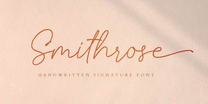 Smithrose is inspired by monoline signature letters and is a natural & modern handwritten signature font. Smithrose comes with 85 ligatures and ending swashes. Smithrose is perfect for many different projects such as logos and branding, invitation, stationery, wedding designs, social media posts, advertisements, product packaging, product designs, label, photography, watermark, special events and more.
 - Bambino New by Mindburger Studio,
$19.00 ‘Bambino New’ font is a geometric sans serif with humanist readability. It comes in 7 different weights, 14 styles and plenty of OpenType features. It can be said it’s an arrogant cousin of Bambino font, mostly because of its legibility, personality and attitude. Each character has been carefully crafted and implemented with properly modified italics.
 - Taluhla by Cultivated Mind,
$20.00 Taluhla is lovely handwritten font with a matching set of borders, banners and ornaments. It is unique, elegant and easy to read. Taluhla has 3 different weights (light, regular and bold). It can be best used for invitations, greeting cards, posters, advertising, film, weddings, books, menus and anytime you would like to express yourself kindly.
 - Isalabella by Maklabu Lab,
$15.00 Isalabella is a handmade script with a natural look that simulates true handwriting. This is achieved by typesetting alternates of each character randomly, and by combining these character variations differently. Isalabella offers outstanding open type features such as the whole Adobe Latin Set, contextual alternates (4 variants for each character), stylistic sets and many ligatures.
 - Sarion by Lemonthe,
$17.00 Sarion is an elegant signature font with a monoline style, featuring a lovely flow. It has a clean, thin and smooth vibe and it will be a hit for any design that you want to add it to. It’s perfect for many different projects such as logos and branding, invitations, signature, labels, photography, and more!
 - Radar.one by Srdjan Kuzmanovic,
$50.00I started creating this font at my university while studying graphic design. It's constructed using nails in different sizes and various parts of floppy-disks. It's a highly decorative font and the best way of using it is for posters, flyers and ads. It can also be used for your own website; see example below. - Rough Cut NF by Nick's Fonts,
$10.00An old Art Nouveau typeface named "Daphne" provided the inspiration for this decidely different font. This version is upright, but the linocut treatment employed visually suggests the slight rightward slant of the original typeface. Bold, unusual and distinctive. Both versions of the font include 1252 Latin, 1250 CE (with localization for Romanian and Moldovan). - Courtland by Garisman Studio,
$22.00 One name originating from Canada greatly inspired the birth of this vintage font. With the opentype feature: standar ligature, stylistic alternate (specifically for lowercase), Stylistic Sets 01 through 06 with different styles in each letter. Courtland is perfect for use in logo types, vintage logos, posters, labels, packaging, headlines, t-shirts and other designs.
 - SK Aristo by Salih Kizilkaya,
$14.99 SK Aristo is a modern geometric and grotesque font. It was designed by Salih Kızılkaya in 2020, taking into account the current design needs. It meets all the typographic needs of your design and offers full support for the Latin alphabet. SK Aristo consists of 10 different fonts and includes a total of 5220 glyphs.
 - Masha by Vladislav Ivanov,
$15.00Masha is a new 3D font notable for its unique style and attractiveness. It is appropriate to use this font as addition to different pictures or pieces of art, it is a good final touch for something unusual and beautiful. The hand made letters provide individuality and an unusual appearance. It supports all European languages. - DF Ko by Dutchfonts,
$33.00 The Ko family was developed for the text posters at the Holland Festival in 1997, based on the filling of a lettering stencil with different pen thicknesses. Ko Heavy and the Ko KAP were the first weights; the family was completed in 2002 with a Ko Light, a second Ko KAP and two italics.
 - Bright Cherry by Sibelumpagi,
$16.00 Bright Cherry is a handwritten calligraphy typeface with a natural style of brush lettering. It comes with the alternates glyph and multilingual support. Bright Cherry is perfect for many different projects such as logos & branding, invitation, stationery, wedding designs, social media posts, advertisements, product packaging, product designs, label, photography, watermark, special events or anything.
 - Gangrena by Stolat Studio,
$19.00 Gangrena is a display font family, based on a old lettersets and style of UK punk posters from 80’s. It is characterized by a huge amount of automatic alternates, cycling in a random way trough the text. Each letter has three versions. To complement the font Gangrena has a set of six different brushes.
 - Futuriata by Tadiar,
$14.00 Futuriata is Elegant Futuristic Conceptual Font Family of four fonts different weights. It has unusual look which will make your title phrase unique, stylish, fashionable and hi-tech. Use it in your projects in such areas as robots & androids, hi-tech, future, virtual reality, space, fashion and others. Multilingual Extended Latin characters and symbols included.
 - Bingkisan by Letterhanna Studio,
$19.00 Bingkisan is a font with Signature style, but with the vibe of real hand lettering, with a lot of swashes, ligatures and stylistic alternate, Bingkisan Font is perfect for many different project such as logos & branding, invitation, wedding designs, social media posts, advertisements, product packaging, product designs, label, photography, watermark, special events or anything.
 - Rétrospectif by Vincenzo Crisafulli,
$29.00 Rétrospectif is a tribute to the fonts of the Thirties and Forties. It consists of two families, Rétrospectif and Rétrospectif faible. The two families differ in height: Rétrospectif is particularly stretched, Rétrospectif Faible is lowest. The latter, compared to Rétrospectif, presents shorter ascending and descendants and more rounded eyelets. The glyphs' structures are modular.
 - Levato by Linotype,
$29.99 Levato, the first font designed by Felix Bonge, is an Antiqua that is full of character and is refined but by no means sterile. This typeface provides for a wide range of options for creating individual designs. It was not really Felix Bonge's intention to create a whole font family when, as a second year student, he began several exercises in contrast and proportion as part of the typeface design course of Professor Veljovi? at Hamburg University of Applied Sciences. However, these initial studies developed into a project that Bonge persisted with over the following years while working towards his degree. He continually had new insights and ideas that he was able to exploit for his font. Of particular importance, he claims, was a calligraphy seminar, which prompted him to completely rework his concept. It took him several years before his extensive font Levato™ was ready. Although the forms of Levato are ultimately derived from Renaissance Antiqua, Bonge has slightly increased the relative contrast in his version. This gives the font a graceful appearance that is further emphasized by the reduced x-height and the associated prominence of the ascenders. And, in addition, the relatively fine serifs, which are almost linear at their ends, infuse Levato with a hint of classical Antiqua á la Bodoni. At the same time, Bonge cleverly compensates for the sterilising tendency of this font form. Soft and rounded serif attachments and rounded line apexes offset the severe nature of the font and provide it with an aura of vivacity. This effect is promoted by the calligraphic-like foot of the lowercase h, n and m and the not quite horizontal bars of the uppercase E and F. Overall, Bonge has succeeded in creating a refined and yet very dynamic typeface. Levato is available in five weights; Light, Regular, Medium, Bold and Black, in each case with the corresponding italic versions. Bonge treats Levato Italic as a genuine cursive typeface. Its letters are thus slightly narrower than the analogous upright letters and their forms are considerably more curvilinear. All the versions of Levato boast an enormous range of characters to meet all possible requirements. In addition to four sets of minuscule and majuscule numerals for tabular and proportional typesetting, there are also small caps, numerous ligatures, ornamental characters and even swash variants of letters. With their generous, sweeping curves, the swash variants (available as OpenType versions) can be used for striking titling effects or as initials.
 - Chrysotile by Typodermic,
$11.95 In a world of cookie-cutter fonts and uninspired typefaces, Chrysotile stands out as a bold and unconventional choice. Comprised of rusty metal tiles and spartan block lettering, this typeface is not for the faint of heart. But for those who dare to be different, Chrysotile offers a chance to make a statement that will not be ignored. One of the key features of Chrysotile is its custom letter pairings, which are automatically swapped to achieve a more genuine look. The grainy tablets of Chrysotile give your message a rugged, industrial feel that is sure to make an impression. If you’re looking for a font that will help you stand out from the crowd, Chrysotile is the perfect choice. With its unique blend of rusty metal tiles and spartan block lettering, this typeface is unlike anything you’ve ever seen before. So why settle for the same boring old fonts when you can make a statement with Chrysotile? Try it out today and see the difference it can make in your designs. Most Latin-based European writing systems are supported, including the following languages. Afaan Oromo, Afar, Afrikaans, Albanian, Alsatian, Aromanian, Aymara, Bashkir (Latin), Basque, Belarusian (Latin), Bemba, Bikol, Bosnian, Breton, Cape Verdean, Creole, Catalan, Cebuano, Chamorro, Chavacano, Chichewa, Crimean Tatar (Latin), Croatian, Czech, Danish, Dawan, Dholuo, Dutch, English, Estonian, Faroese, Fijian, Filipino, Finnish, French, Frisian, Friulian, Gagauz (Latin), Galician, Ganda, Genoese, German, Greenlandic, Guadeloupean Creole, Haitian Creole, Hawaiian, Hiligaynon, Hungarian, Icelandic, Ilocano, Indonesian, Irish, Italian, Jamaican, Kaqchikel, Karakalpak (Latin), Kashubian, Kikongo, Kinyarwanda, Kirundi, Kurdish (Latin), Latvian, Lithuanian, Lombard, Low Saxon, Luxembourgish, Maasai, Makhuwa, Malay, Maltese, Māori, Moldovan, Montenegrin, Ndebele, Neapolitan, Norwegian, Novial, Occitan, Ossetian (Latin), Papiamento, Piedmontese, Polish, Portuguese, Quechua, Rarotongan, Romanian, Romansh, Sami, Sango, Saramaccan, Sardinian, Scottish Gaelic, Serbian (Latin), Shona, Sicilian, Silesian, Slovak, Slovenian, Somali, Sorbian, Sotho, Spanish, Swahili, Swazi, Swedish, Tagalog, Tahitian, Tetum, Tongan, Tshiluba, Tsonga, Tswana, Tumbuka, Turkish, Turkmen (Latin), Tuvaluan, Uzbek (Latin), Venetian, Vepsian, Võro, Walloon, Waray-Waray, Wayuu, Welsh, Wolof, Xhosa, Yapese, Zapotec Zulu and Zuni.
 - Nawin Latin by Letterjuice,
$66.00 Nawin is an informal Arabic typeface inspired by handwriting. The idea behind this design is to create a type family attractive and ownable for children but at the same time a design that keeps excellent letter recognition for reading. Handwriting has been a great source of inspiration in this particular typeface. By emulating the movements of the pen, we have obtained letter shapes that express spontaneity. A bright group of letters create a lively and beautiful paragraph of text. To get closer to handwriting and the variety of letter shapes that we draw while writing, this typeface offers a large number of alternative characters, which differ slightly from the default ones. Because we have programed the «Contextual Alternate» feature in the fonts, these alternate characters appear automatically as you set a text on your computer. For instance, in the Arabic variability on vertical proportions between letters Alef and initial Lam, create movement in text and avoid the cold mechanical feel of repetition. In the case of the Latin a part from having an entire alternate basic alphabet, there are also different letterforms for characters with diacritics, this way variability becomes even greater. Nawin is quirky and elegant at the same time. Letter recognition is relevant when reading continuous text. For this reason, in the Arabic, we have added another contextual alternate feature with alternate characters that help to avoid confusion when letters with similar or the same shape repeat inside one word. This is the case of medial «beh and Yeh» repeated three times continuously in the same word. The alternate characters change in shape and length, facilitating distinction to the reader. Since this typeface is inspired by handwriting and the free movement of the hand while writing, we considered ligatures a good asset for this design. The Arabic has a wide range of ligatures that enhance movement and fluidity in text making look text alive, while the Latin achieves this same effect via contextual alternates.
 - Sixty Niners by Putracetol,
$24.00 Introducing Sixty Niners - a retro display font that draws inspiration from unique typography and lettering found in vintage magazines, combined with modern typography styles. This font features modern ligatures that allow you to create beautiful lettering and artwork. With its open type features, including a variety of alternates and end swashes, Sixty Niners provides ample options for customization and creativity. Sixty Niners is perfect for a wide range of design purposes, including logotypes, headings, covers, posters, logos, quotes, product packaging, headers, merchandise, social media posts, greeting cards, and more. Its distinctive retro style adds a touch of nostalgia and elegance to your designs, making them stand out and capture attention. To access the alternate glyphs in Sixty Niners, you can use design programs that support OpenType features, such as Adobe Illustrator CS, Adobe Photoshop CC, Adobe InDesign, and Corel Draw. This allows you to easily switch between uppercase and lowercase letters, apply alternates and ligatures, and create unique and customized lettering compositions that suit your design needs. In your zip package, you'll find the Sixty Niners font files in otf, ttf, and woff formats, providing versatility for different design projects. The font includes uppercase and lowercase letters, numerals, punctuation, and symbols, ensuring that you have all the elements you need for your designs. Sixty Niners also offers multilingual support, making it accessible for designers around the world to create designs in different languages. Whether you're designing for English, Spanish, French, or any other language, Sixty Niners has got you covered. In summary, Sixty Niners is a retro display font that combines vintage and modern typography styles, providing a unique and elegant look to your designs. With its open type features, multilingual support, and versatile design options, Sixty Niners is perfect for various design purposes. So, elevate your designs with Sixty Niners and create stunning artwork that captures attention and stands out from the crowd! Thank you for choosing Sixty Niners from our collection. Happy designing!
 - Nawin Arabic Ltn by Letterjuice,
$107.00 Nawin is an informal Arabic typeface inspired by handwriting. The idea behind this design is to create a type family attractive and ownable for children but at the same time a design that keeps excellent letter recognition for reading. Handwriting has been a great source of inspiration in this particular typeface. By emulating the movements of the pen, we have obtained letter shapes that express spontaneity. A bright group of letters create a lively and beautiful paragraph of text. To get closer to handwriting and the variety of letter shapes that we draw while writing, this typeface offers a large number of alternative characters, which differ slightly from the default ones. Because we have programed the «Contextual Alternate» feature in the fonts, these alternate characters appear automatically as you set a text on your computer. For instance, in the Arabic variability on vertical proportions between letters Alef and initial Lam, create movement in text and avoid the cold mechanical feel of repetition. In the case of the Latin a part from having an entire alternate basic alphabet, there are also different letterforms for characters with diacritics, this way variability becomes even greater. Nawin is quirky and elegant at the same time. Letter recognition is relevant when reading continuous text. For this reason, in the Arabic, we have added another contextual alternate feature with alternate characters that help to avoid confusion when letters with similar or the same shape repeat inside one word. This is the case of medial «beh and Yeh» repeated three times continuously in the same word. The alternate characters change in shape and length, facilitating distinction to the reader. Since this typeface is inspired by handwriting and the free movement of the hand while writing, we considered ligatures a good asset for this design. The Arabic has a wide range of ligatures that enhance movement and fluidity in text making look text alive, while the Latin achieves this same effect via contextual alternates.
 - Etruria by Dima Pole,
$34.00 Font Etruria is based on a real Etruscan inscriptions and realistic accurately simulates the writing of the Etruscans. The idea of the font Etruria is to give an opportunity for anyone to touch the past of mankind! The character of the Etruscan alphabet involves the creation of a font with only uppercase letters. However, I did not limit this font by that. Etruria has not only a lowercase is different from uppercase, but an additional sets of alternative characters. In General, the main characteristic of Etruscan writing is randomness and diversity of characters. Differs from lowercase to uppercase is only the first step on the road to make randomness effect. Next to the aid of the OT features. To recreate the randomness effect, in Etruria there are several OT features (Contextual Alternates, Stylistic Alternates and Stylistic Sets), which built a script to simulate randomness. Additionally, another script creates the effect of random positioning. Together they create incredibly realistic Etruscan inscription. Thus, any of these features can be disabled at will. I also used a small line spacing, because it is characteristic of the Etruscan writing. Actually the Etruscan writings is a mirror of the writings compared with the current European alphabets. I didn't use this feature all the letters, because this would make the font difficult to perceive, but to make the font characteristic of the Etruscan style, Etruria has a few letters in mirror image. However, if for someone it may seem unusual, mirrored letters can be disabled instead of them will appear more familiar to them. Another feature of Etruscan writing is the use instead of a space dotacentered. Font Etruria has this feature, there is a OT feature Stylistic set ss03. Naturally, it also can optionally be disabled. All these features can be used together, separately, or turn it off. The main goal achieved! The text typed in Etruria, creates full impression of these Etruscan inscriptions.
 - FS Shepton by Fontsmith,
$80.00 Handy Andy Andy Lethbridge had only just completed his graphic design BA at the University of Portsmouth when he was spotted by Jason, who’d seen Andy’s exquisite hand lettering at his degree show and on Instagram. Keen to push the handwritten theme further, having recently launched a digitally-created, chalky script font (FS Sammy), Jason offered Andy a job and the chance to develop a suite of more stylised, truly hand-drawn fonts. Andy duly got out his pads, pencils and pens, and started experimenting with styles and textures. Magic followed. Imperfection perfected Most ‘handwritten’ typefaces are created entirely digitally. Not FS Shepton. From the start, the intention was to create a collection of alphabets of similar character but different texture and style – 100% hand-drawn and purposely imperfect, with the kind of inconsistent, organic shapes and textures of market stall signs, dashed off in chalk or paint. FS Shepton Regular, drawn with a wet brush pen, is solid with a rough outer edge and a casual but controlled feel. The dry brush used to create FS Shepton Light gives it more inner texture and a more formal, slanted, calligraphic style. FS Shepton Bold, drawn using a wider, looser dry brush pen, has a woody grain in the middle of its broad strokes and greater solidity where the brush moves more slowly. Fresh as a daisy Think of FS Shepton not as a family of three weights of the same font so much as a collection of three fonts penned by the same author. All of them – the light, regular and bold – were created independently as display fonts that offer something different to labelling, packaging, point-of-sale and advertising. Lovingly crafted by hand, they’re a good match for products and settings that share the same artisinal qualities: organic foods, drinks and healthcare products, as well as premium chocolate, coffee and condiments.
 - Bulblamp by Popskraft,
$9.00 Layered font set 3D Bulb lamp Bulblamp is a 12 component font system that can be layered in different ways to create endless classic titling effects used commonly in signage by skilled sign painters and sign makers and any who interested in simple and flexible ways to make graphic design. Examples of how to use this you can see on the images. Moreover, You can start fast in Figma, Illustrator and Photoshop with predefined downloadable package. ! Download free predesigned Figma, Illustrator and Photoshop sets for this fonts here: https://drive.google.com/open?id=17ogdSIjPuLA5-CUaAO1TlqJGbRPWy5iA&authuser=popov_av%40koriphey.ru&usp=drive_fs Each file is named according to its purpose. The number indicates the recommended order of the layers. 1 below, 5 on top. 1 means you should place it first. Of course, you do not have to use all the fonts, and vice versa - you can repeatedly use the same font style with different styles. What is Layered font? In fact, these are common fonts located in a stack strictly one above the other. This allows quickly create unique text effects using ordinary fonts. Where can you use this? These fonts can be used in any program that allows you to stack fonts as objects strictly one above the other, however it is recommended to work in professional programs such as Illustrator, Photoshop, Figma and so on ... How to use this font set quickly? For quick use, I recommend using ready designs for Figma, Photoshop or Illustrator. Download fonts and Install all fonts. Go to the link https://drive.google.com/open?id=17ogdSIjPuLA5-CUaAO1TlqJGbRPWy5iA&authuser=popov_av%40koriphey.ru&usp=drive_fs which has contained pre-made solutions for this font applicable in Figma, Photoshop or Illustrator and download presets. Follow the recommendations on the pages. Basically, you will need to replace the words in the template with your own, then edit colors and transfer the result to your design. In that’s all, it's easy.
 - Nipsey by Putracetol,
$28.00 Introducing Nipsey - a unique display font inspired by vintage albums and posters from 1970s music bands. With its classic typeface and groovy impression, Nipsey brings a fun and retro vibe to your designs. What sets Nipsey apart is the combination of various alternates, such as swashes, stylistic sets, stylistic alternates, contextual alternates, and ligatures, making this font even more distinctive and versatile. Nipsey is perfect for a wide range of display purposes, including album covers, posters, labels, t-shirts, apparel, signage, quotes, logos, greeting cards, logotypes, and more. Its eye-catching design adds a touch of nostalgia and personality to any project, making it stand out in a crowd. To access the alternative characters in Nipsey, you can use OpenType savvy programs such as Adobe Illustrator, Adobe InDesign, Adobe Photoshop, Corel Draw X version, and Microsoft Word. The OpenType features allow you to easily switch between uppercase and lowercase letters, as well as apply alternates and ligatures to create unique and customized lettering compositions. In your zip package, you'll find the Nipsey font files in otf, ttf, and woff formats, providing versatility for different design projects. The font includes uppercase and lowercase letters, numerals, punctuation, and symbols, ensuring that you have all the elements you need for your designs. Nipsey also offers multilingual support, making it accessible for designers around the world to create designs in different languages. Whether you're designing for English, Spanish, French, or any other language, Nipsey has got you covered. If you have any questions, feedback, or comments, feel free to reach out to PutraCetol Design Studio via PM or email. The team is happy to assist you in your creative endeavors. In conclusion, Nipsey is a unique and versatile display font that brings a fun and retro vibe to your designs. With its alternative characters and multilingual support, Nipsey offers endless possibilities for creating eye-catching designs for various display purposes. So, let your creativity flow with Nipsey and elevate your design projects to the next level! Thanks for choosing Nipsey from PutraCetol Design Studio. Happy Creating!
 - Gazzarelli, a distinctive typeface created by Graham Meade under the banner of GemFonts, stands out for its unique blend of classical elegance and modern design sensibilities. This font can be easily...
- Effexor - Unknown license

- Mucho Sans by Fontforecast,
$17.00 Mucho Sans is a geometric sans serif type family that comes in six weights with matching Italics. The design is very clean, yet friendly and modern. Some of its characteristics are the generous x-height, the Ascender-height that matches the Cap-height, the friendly looking real italics and the low contrast. The result is a contemporary versatile type family that is excellently suited for both display and text uses and that supports a wide range of languages. Mucho Sans is equipped with many Opentype features such as five numeral styles, numerators, denominators, superiors, inferiors, automatic fractions, alternative a and g, case sensitive forms and ordinals.
 - Albiona by Device,
$39.00 A contemporary slab-serif which revisits aspects of Robert Besley’s all-time classic Clarendon, designed around 1842 for Thorowgood and Co. and named after the Clarendon Press in Oxford. The original design was subsequently extended by Sheffield foundry Stephenson Blake in the 1950s into a widely-used, robust workhorse family. Albiona uses the inwardly curved stroke terminals of the same foundry’s Grotesque series, while rationalising or removing entirely Clarendon’s ball serifs, flicked tails and other eccentricities to make it more functional in contemporary settings. The family consists of five weights plus italics and a stencil, and includes oldstyle and tabular numerals. Its clean readable style suits both text and headline setting.
 - Girga by DSType,
$40.00 Triumphant, vigorous and strong. These were the keywords for the design of Girga, named after an Egyptian city in the Sohag Governorate. The power and strength of the Egyptian letterforms were balance with a few sans serif forms so the darkness of the text and the fatness of the overall glyphs could be kept. We never intended to design a revival of the nineteen century egyptian typefaces, but we included a series of features that can be found in many wood letters from that era. With five styles divided in Regular, Italic, Stencil, Engraved and Banner, Girga is full features that allow many design possibilities.
 - HS Hadeel by Hiba Studio,
$50.00 HS Hadeel is a versatile display typeface designed for use in titles and graphic projects that require both Arabic, Persian and English characters. It draws inspiration from the modern kufi style and boasts a unique blend of sharp and curved lines that lend a beautiful and geometric structure to each character. The sharp endings at the bottom of each character add an additional aesthetic touch. With five weights available, ranging from Light to Black, HS Hadeel offers a diverse range of options for designers seeking to elevate their Arabic typography. Overall, HS Hadeel is a great choice for those seeking a visually striking and flexible typeface for their projects.
 - Dabu by Gunjan,
$42.00 Dabu is a hand paint inspired high contrast decorative display typeface. With unique five ornamental layers which makes Dabu very presentable and eye catchy. Dabu has identical styles that very well goes with logo design, headline, creative sign boards, poster design, social media, fashion brand, beauty product branding, large print and screen. How to use Dabu ? - Select Dabu-Regular. - Copy the same one more time. - Select and choose any one Dabu Depth, Dabu Heart, Dabu Flower, Dabu Diamond, Dabu Square. - Select both and Aline. - Bingo!! :) No animals harmed in the making of this typeface Dabu is supportive to Adobe illustrator, Adobe Photoshop, Adobe In-design and All Adobe.
 - Wolpe Tempest by Monotype,
$50.99 “It looks like it could have been designed last year,” says Toshi Omagari, the lead designer for The Wolpe Collection, about the original Tempest typeface. For Wolpe Tempest™, Omagari drew three weights and additional characters with flourishes that add more energy and movement to the original design. The new designs can take on just about any online or offline project that calls for typography that’s dynamic, flowing and powerful – everything from game branding to billboard sized posters. Available as set of fonts that support most Western European and many Eastern European languages, Wolpe Tempest is also one of the five typeface designs in The Wolpe Collection.
 - FF Advert Rough by FontFont,
$49.99 Dutch type designer Just van Rossum created this display and sans FontFont in 1992. The family has 5 weights, ranging from One to Five and is ideally suited for advertising and packaging, film and tv, music and nightlife as well as poster and billboard projects. FF Advert Rough provides advanced typographical support with features such as ligatures, alternate characters, case-sensitive forms, fractions, super- and subscript characters, and stylistic alternates. It comes with a complete range of figure set options – oldstyle and lining figures, each in tabular and proportional widths. This FontFont is a member of the FF Advert super family, which also includes FF Advert.
 - Americane by HVD Fonts,
$40.00 "It's all about Soul!" – Strong, decided and edgy. The Americane super family is inspired by the old wood type specimen books. Delivering some glorious vibes of the handcrafted values from the pioneers AND keeping one eye on todays demands and technology, Americane is made for high professional use. Americane & Americane Condensed is a super family of 24 fonts in total – a normal and a condensed width in six weights with matching italics. Made for complex, professional typography, the OpenType fonts feature five variations of numerals, alternate letters, arrows and an extended character set to support Central and Eastern European as well as Western European languages.
 - Osbourne by Latinotype,
$39.00 Osbourne is a display typeface with titles based on a refresh, a revival of Salem, originally designed by Keystone Type Foundry. A font with elevated x-height and condense proportions. Visibly “sharp.” In addition to the default version, it has two other versions: one that is sharper and another with wide alternatives to the circular characters. Between these and its five weights, Osbourne has a range of personalities to fit a designer’s needs. Think titles, branding, short texts, whatever you want to make look good. Yet another font in the Latinotype arsenal that covers more than 200 languages within the Latin alphabet and basic Cyrillic.
