10,000 search results
(0.027 seconds)
- Mind Boogie by Bogstav,
$16.00 Get your feet on the dance floor, and make those funky moves that you do so well! Or, you could just use this handmade all-caps font and make your designs look like it is dancing! :) Yes, it's a handmade font - and I've added 6 different versions of each letter + multilingual support!
 - Snacky Plop by PizzaDude.dk,
$18.00 What excactly is a snacky plop? To be honest, I don't know!!! The name comes out of a wordplay! :) But what I know is that this font is playful, unpredictable and fun to look at and use! I have added 5 different versions of each letter, and they automatically changes as you type!
 - Cristhyna Signature by Namara Creative Studio,
$12.00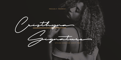 Cristhyna Signature is a modern handwritten script font with natural and stylish flow, this Typeface is an incredible addition to your font library. Perfect for business branding, wedding invitation, cosmetics, fashion, signature logo, magazine cover, advertising and these typefaces work well for many different aesthetics. Features : Stylish & Modern Font Alternates, Ligatures & Multilingual Support
 - Kartoon Kutz NF by Nick's Fonts,
$10.00These charming little cartoon figures, known in the trade as "midgets", added a little extra oomph to everything from business cards to matchbook covers from the 1920s to the 1950s. Each font contains 52 different cuts, ready and waiting to spice up your layouts, and each carefully hand drawn from authentic historical sources. - Garyford by Martype co,
$20.00 GARYFORD VINTAGE SERIF FONT --- Garyford is a Serif font designed with carefully handcrafted. Also suitable for branding, T-shirt, Classic Design, Logotype, and any project. Comes with a tons of ligature and alternates make your life more than comofortable, easier to design and free stress. Multilingual Support, support many different languages 20+ .
 - Valensa by Stefani Letter,
$12.00 Valensa is a fresh & modern script font. It has a bold style and will add an upscale to all your designs. This Font is perfect for many different projects such as logos & branding, invitations, stationery, wedding designs, social media posts, advertisements, product packaging, product designs, photography, watermarks, special events, and much more!
 - Zero Output by PizzaDude.dk,
$15.00 You may recognize the shapes of this font - it's because it's my Universitet font, but this time it took some beating, and turned into a grunge font! The output was Zero Output! It has 5 different versions of each letter and of course multilingual support! Go ahead and grunge up your next project!
 - Allabbad by Abjad,
$5.00 Allabbad typeface was inspired by one of the hand letterings that belong to the godfather of Arab graphic design, Mohieddine Allabbad. The typeface is part of the Arsheef Alkhatt Project, a platform that revives and tributes classical Arabic lettering from different resources and presents them as affordable, digital fonts for independent designers.
 - Raffles by Scrowleyfonts,
$20.00 Raffles is an Art Deco inspired font which takes geometric lettering to another level with comprehensive contextual alternates for exciting uppercase titling. There are four different styles available for a retro or a more contemporary look and feel. I hope that you will enjoy using it as much as I enjoyed creating it!
 - Mental Duck by PizzaDude.dk,
$17.00 Drawn with a thick marker, I present to you: Mental Duck! A loose and laid back comic book font, suitable for both comics, posters, products for children, toys ... in fact anything that needs a legible and handdrawn look. Comes in three different versions: Regular, Fill and Shadow. Mix them for great results!
 - Conundrum by Atom,
$14.00 Conundrum is a cool, rough brush font, quickly painted on paper, so it looks natural and organic. If you want a font character that is unique and different than others, Conundrum is worth a try. With this bold concept it would be suitable if used for movie titles, magazine titles, covers, posters, etc.
 - Banner by URW Type Foundry,
$39.99 Jan Koller designed the Banner typeface family especially for the creation of animated web banners. Banner is best used at 80p without antialiasing. The family comes in 24 styles which, in combination, create great, unusual screen effects. Three different animation modells provide the basis: extrusion, cutting in/out by ‘pixelation’, outline pixel rotation. The available flash clip listed in the Related Links below demonstrates some of the effects. Take a look! The swf clip runs in any web browser (drag & drop) but you need the flash player plugin. Apart from animation use, Banner also works well in print. Since all 24 styles are identical in width and kerning, you can set several styles on top of each other, maybe using different colours for each style. Look at the nice effects yourself!
 - Elise by Context,
$12.00 Elise is a sweet natured, layered display typeface, with a few layers but a wealth of options. From the feminine to the fun to the nostalgic, Elise is a capable and personable set. Best used BIG and with color, you’ll always find an occasion for Elise’s charm. To use this typeface, once you have your copy in place in the design program of your choice, copy your text block and paste it directly on top of your existing text block. Set this new text block to a different Elise layer and voila! You’ll already start to see some interesting effects take place. In some cases, different effects are achieved by bringing The Elise Ribbed layer to the front or to the back. Also available is a free ornament set to get you started.
 - Eterea by Corradine Fonts,
$60.00 Eterea is a formal font inspired in the monumental inscriptions of classic Rome, but not strictly sticking to the ancient roman typographic characteristics. Its unique look is the result of mixing diverse typographic styles, but mostly having traces from the 16th century transitional style. It bears a big difference of proportion between upper and lower case, additionally to the upper case having much more ornamental traces. Eterea has four different flavors of capitals which change very slightly in the cursive versions. In the italic versions, the lower case (actually small capitals) changes substantially its characters to make its reading more flowing and is not simply an inclined version of the letters. Eterea is a very expressive font, ideal for titles and short texts of sober and elegant appearance.
 - Linkus by João Henrique Lopes,
$25.00 The name ‘Linkus’ makes reference to the internet and its power to unite humanity, as well as to Linkus’ distinctive design, where the whole character is unified by a single, unbroken line – without sacrificing its elegance and readability. Linkus is based on the aesthetic decision of having a single, unsplit line forming every character, with a smooth transition of the different line directions, in order to strenghten the unity of form and create a singular fluxus throughout the glyph. Different from most other futuristic fonts (e.g. Slazer), who have an aggressive look, Linkus has a more sensible, refined aura. This display futuristic typeface is meant to be used whenever the subject is technology, cellphones, electronics, internet, computers or science in general, as Linkus creates a feeling of modernity, cleanness, efficiency and high-tech sophistication.
 - ZT Kloftel by Khaiuns,
$10.00 ZT Kloftel has three variants of handwriting with different auras and also gets one variant of icons with a sketch style, this helps add depth to the art of handwriting. ZT Kloftel Stalle is a well-matched and Beautiful Style with natural lines, with a very large difference between uppercase and lowercase letters, and can produce a very natural writing style. ZT Kloftel Wortugo with a wider groove, with a messier concept, it also has its own uniqueness, such as children's writing which is suitable for branding explanations, or graffiti explaining your designs. ZT Kloftel Zlamora with a small and chubby style exudes a relaxed aura, perfect for vintage branding or your sad sunset caption I hope you have fun using ZT Klotin Thanks for using this font ~ Khaiuns X zelowtype
 - Ingrian Euroika by Ingrimayne Type,
$6.95 In the 1990s Adobe’s MultipleMaster technology introduced interpolation into font editing programs. Though the obvious use of interpolation was to create an unlimited number of weights for a font, interpolation could also be used to crossbreed two completely different typefaces. IngrianEuroikaH is a hybrid resulting from such crossbreeding of two very different parents. Euroika is a decorative font with high contrast and thin, square serifs while Ingriana is a relaxed, informal typeface. IngrianEuroikaH was constructed in 1995-6; updates in 2012 and 2020 cleaned up many of the remaining oddities that resulted when parts of the parent fonts clashed. The family retains some peculiarities from the method of its construction but is highly readable as text. The IngrianEuroikaH family has six styles: regular, semibold, bold, italic, semibold italic and bold italic.
 - Excelsor Script by Storm Type Foundry,
$32.00Excelsor Script is inspired by lithographically produced scripts. It is softer and simpler than, for example, engraved Splendid Script, because its designer used pens and lithographic needles. The graver for steel is held in a quite different way and this has an influence on the shape of the letter. Similar type faces were in use from Neo-Classicism until the beginning of Art Nouveau, when they were pushed aside by a completely different view of festive typography. It has, in contradistinction to other scripts, slightly narrowed letters, which signifies a distinctive elegance without wasting space on the line. For practical reasons it was not possible to encircle the bottle with too long a label. It is, therefore, a suitable type face for labels. Its two optical grades cover a wide range of sizes. - Haven by Signature Type Foundry,
$33.00 Haven font family is based on the compositionality of constructive elements that create the final shape of individual letters. Mechanical connecting was continuously adjusted by a type designer’s feeling. In this way Haven differs from similar typefaces of the 1960s and 1990s. Six fonts of different stroke intensity create a rich family of typefaces for a variety of uses in typography for special occasions. Although the typeface was drawn for headings, it is suitable for typesetting of long texts in a book. Even in extreme reduction it retains its technical basis, negating classic book alphabets, and it adds an experimental look to the text. Both extreme fonts Thin and Black create strong contrast and their magnification brings attention to their interconnection of all details. Serif version Haven Serif is also being prepared.
 - Louisa by Julia Hanft,
$30.00 Louisa is a monospaced font-family designed and optimized specifically for small font sizes. But even as headline font it looks good. It has a very good distinguishability of letter forms and legibility even in longer text paragraphs. The character of Louisa is a combination of strong elements and warm, friendly forms. The font family is not only designed for coding and tabular layout, but can be used in different fields of communication design. Therefore it provides two stylistic sets with different letter forms: one with the look of serious modern typewriter font, the second with more soft letter forms and elements of a real italic. Additionally it consists oldstyle numbers (and of course tabular numbers) and a set arrows. The font is available in four styles: regular, italic, bold and bold italic.
 - Poleno by DizajnDesign,
$39.00 Poleno is a custom typeface originally designed in 2006 for the Slovak folk dance ensemble Poleno, as a part of their corporate identity. Ever since, new weights have been added to complete six variables and two different options for accents. The typeface adds a fresh, bold and non-rational feeling to headlines and titles in books and posters in display sizes where emphasis and detail are equally important. Randomly-generated contextual alternates included in the family contribute to add a distinctive look to words with repeating characters, whenever they occur next to each other. The difference between the Poleno Set and the Poleno Alt Set is in the accented characters. In the first one, accents are merged with the characters and in Alt version, accents are separated from the characters.
 - Rukou by DizajnDesign,
$39.00 Rukou originated as a logo for a fashion designer. The idea was to make a fusion of a geometric typeface with the flavour of childish features. Rukou was inspired by school hand-writing models, but adds very specific and interesting features to it. Rather than focusing on readability, the primary goal was to have a unique type texture. This is the reason why lowercase is disconnected. The disconnected letters opened the possibility to create the special shapes for individual letters. The typefaces consist of two different styles inside one font. You can choose to set your titles in uppercase, or lowercase/titlecase. As each style has a slightly different texture, there is the opportunity to combine them in interesting ways. The uppercase can even be set in small paragraphs
 - Le Havre Width by insigne,
$- Le Havre Width is the loveable putty of fonts. Stretch it. Squish it. Squeeze it. Whichever way you play with it, you’re bound to find hours of fun ahead. This avant-garde typeface family has six distinct weights--each one including a set of four different widths. It’s randomized rhythm also includes selectable glyphs for customization, enabling you to bounce plenty of ideas around for diverse logotypes as well as for specific looks focused on a single width. Looking for even more fun with this geometric sans? Try adding in some of the alternate ligatures, or use the two different art deco styles included with the font. The all-around whimsical nature of Le Havre Width is perfect for toys, posters, T-shirts, cards, and anywhere else where fun is the name of the game.
 - Salo by Borutta Group,
$39.00 SALO – is a hybrid of two Italian typographic worlds. The serif version refers to the beautiful and sophisticated typefaces found on the signs of cafes, restaurants, and fashionable boutiques. Its complemented by the sans variant, inspired by Italian modernism and road signage. All styles are based on the same core but with a totally different expressions. The biggest challenge during the project was designing all of the glyphs compatible to work as a 100% variable font. In the OTF version, SALO has 4 varieties: Serif, Semi Serif, Semi Sans and Sans. The family of these typefaces is suitable both for posters, magazine headlines, and branding purposes where the character will count. It is worth experimenting and combining different varieties with each other. (This font cannot be used to create a logo with the phrase "FRANCO").
 - Xmas Wishes by Resistenza,
$29.00 Xmas Wishes Font - A collection of 55 calligraphic Christmas greetings and 10 Christmas dingbats. All handwritten with different tools like broad nib pen, pointed pen and brush pen which allowed us to create diverse styles. The letterings are written in different languages; English, French, Spanish and Italian. Add the beauty of calligraphy to your layout and create unique gadgets for this Holiday Season like posters, greeting cards, wrapping paper, tags, and much more! You can also use the designs as photo overlays for your blog or social media content. Open the images to see all the details AWESOME FEATURES 'Font in .otf .ttf' '55 Handlettering Xmas words' '10 Hand-drawn Xmas dingbats' 'Languages in use English, French, Spanish and Italian' 'We highly recommend Turquoise Font to combine with the letterings.'
 - Organetto by Latinotype,
$25.00 Organetto is a typeface, inspired by the lettering found on Art Deco posters, whose design embraces latest digital font technology. This versatile font contains multiple widths which make it an ideal solution to fit every design need. In addition to its functional geometric style and different widths, Organetto also includes alternate characters that provide even more design options. All these features make the font a great choice for graphic designers and art directors, logos, wordmarks, short text, etc. Organetto is a sans-serif typeface with modern proportions and straight-edge terminals. It comes in 7 weights, ranging from Hair to Ultrabold, and 7 widths (from Ultra Condensed to Expanded) and contains a set of 397 characters that support 180 different languages. Organetto also includes OpenType features- 3 sets of alternates, catchwords and titling.
 - Decoral Soft by Totem,
$30.00 Decoral Soft depicts the character of Art Deco period typography and reinterprets it into modern approaches. This typeface is a friendly and flexible family that is fun to use. It comes with a set of 670 characters per weight, supporting over 50 different languages using the Latin alphabet. Decoral Soft also comes with special stylistic sets and swash characters that allow the user to be creative and playful with the type, helps enhance many different possibilities that certainly will spice up your design. Decoral Soft will satisfy all your typographic needs, from book jackets to monograms to packaging, logos, and even wedding invitations—timelessly elegant, with a distinctive flair that exudes Art Deco typography in a fresh, modern way. The wide selection of titling alternates and ligatures make copyfitting a delight.
 - Du by sugargliderz,
$20.00 Du is a self hommage to Uncertain Felttip. Uncertain, made in 2008, is a typeface which reproduced faithfully the style in which I am writing on copy paper, usually using the felt-tip pen. This time, I wrote the new family by the same method but using the tablet PC and the touch pen. Although, as for some characters, Uncertain differs in a form, it is the result of reflecting my hand writing. I wrote all the characters. If it is original, all the characters diverted and composed, for example, characters, such as Aacute and Agrave, are written. Different specification from Uncertain is family composition. Although Uncertain had only 3 weight, 7 weight were designed for Du. This way a user can choose his favorite weight because the variation of weights increased.
 - Tristyn by Arendxstudio,
$12.00 Tristyn is a signature handwritten font package with a personal charm. With a style that I feel is the first time being blended with a different brush so it has a natural hand Tristyn Regular contains upper and lower case letters, numbers and various complete signs. Tristyn Alt includes alternative characters, with capital letters and small that is completely new. Ligatures are available for some lowercase letters (more natural double letters). This can only be accessed through software with different devices or glyph panels, e.g. Photoshop / Illustrator. There it is! I really hope you enjoy it - comments & likes are always welcome and accepted. More importantly, don't hesitate to send a message if you have a problem or question. Now just read this, go there and make it happen :)
 - Asherah by Artisticandunique,
$50.00 Asherah - Serif font family - Multilingual support, 12 Style - OTF Asherah is a modern serif font family. This font family is multilingual supported and 12 different styles. With different character designs in its structure, it can meet your needs in innovative pursuits. It has a timeless structure where you can create your modern-elegant or classic design alternatives. Well suited for books and magazines, editorials, headlines, websites, logos, branding, advertising and more. Asherah font family can meet your needs in all modern and classic creative projects. CHARACTER RANGES : Basic Latin, Latin-1 Supplement, Latin Extended-A, Latin Extended-B, General Punctuation, Currency Symbols, CJK Symbols And Punctuation, Private Use Area (plane 0), Alphabetic Presentation Forms With this font you can create your unique designs. If you have a question, please contact me. Have a good time.
 - GOBAH by Product Type,
$15.00 Welcome to Gobah, a font that presents the future atmosphere in an amazingly modern and futuristic style. Are you looking for the perfect solution for modern, futuristic, sci-fi, and future-themed projects? Gobah is the right choice. Gobah is a font that transports you to an extraordinary world with a unique look that reflects a sophisticated future feel. Each letter is uniquely designed, giving your project a modern, innovative, and charming look. With Gobah, you can steal the show and create an unforgettable impression. The main benefit of Gobah is its ability to deliver stunning styles. Each letter has an exclusive design, creating an eye-catching futuristic look. This font will give your projects a strong visual appeal, reinforcing the message you want to convey. Gobah also supports multilingualism, allowing you to display text in multiple languages without a hitch. This flexibility ensures that you can easily reach a global audience and convey your message with consistent clarity across cultural contexts. Take a step forward in your design with Gobah. This font will give a stunning modern and futuristic twist, creating a memorable impression on your logos, posters, and web presence. Let Gobah be the right choice for your vibrant, modern, futuristic, sci-fi, and future projects.
 - Thalweg Poetica by Ani Dimitrova,
$29.00 Thalweg Poetica is a revival font that comes with a story created in 1993 by the Bulgarian artist Ivan Kyosev. It is a sequel to the Thalweg font family completed in 2020. The construction of characters combines the upright character of the Thalweg font and the handwritten character of Thalweg Italic. The font partners perfectly with the Talweg font family and gives designers a new opportunity for expression. Thalweg Poetica contains 4 widths / Normal, Semi Condensed, Condensed & Extra Condensed / and 8 weights ranging from Thin to Black with small caps versions, each style containing more than 1100 glyphs. The font comes with extended coverage of the Latin, Cyrillic, and Greek Scripts. All of the weights are specifically equipped for complex, professional typography with Open Type Features. These features include Small Caps, Ligatures, Discretionary Ligatures, Superscript, Subscript, Tabular Figures, Old-Style Figures, Circled Figures, Arrows, Matching currency symbols, and fraction. The Thalweg Poetica family is ideally suited for small text, books and magazines, branding, posters, as well as web and screen design, headlines, and more. The Regular and Medium weights are perfect for body text and they give an interesting texture to the text. The range of styles gives good flexibility to this family.
 - Austral Slab by Antipixel,
$15.00 Austral Slab is a hand-drawn layered font designed by Antipixel, with unique textures & styles that combine giving your work a distinctive impression. This font comes in three weights, Regular, Light & Thin, with irregular outlines and uneven/crooked strokes, giving your work more personality and making it exclusive and powerful. For this same reason it can be used in a vast variety of projects, such as logos & branding, stationery, book covers, magazine design, clothing prints & tags, packaging, animated videos, and many more! Austral Slab has three sets of alphabets in uppercase and lowercase to avoid repeating the same character pattern, and giving the font a more natural handwritten feel. This is included in the Open-Type Contextual Alternates, which applies an automatic substitution of glyphs as long as the Open-Type features are activated. Also, Austral Slab offers other Open-Type features such as Stylistic Alternates, Ligatures, Discretionary Ligatures, Fractions, Superscript, Subscript, Denominator, Numerator, Scientific Inferiors & Kerning. This font has a very large glyph coverage and can be used in a wide range of languages, including English, Spanish, Italian, French, German, Polish, Czech, Vietnamese, Finnish, Icelandic, among many others. The style Maplines Thin is offered Free for commercial & personal use!
 - Volta by Linotype,
$29.99Volta is a robust typeface from the 1950s. A revisit to styles that were en vogue at the turn of the century, Bauer type foundry designers Walter Baum and Konrad Bauer designed this type family in1955. The form of Volta's letters are similar to those in New Transitional Serif typefaces, like Cheltenham and Century. Developed after the Didone (i.e., Bodoni) style types, New Transitional Serifs speak more to the zeitgeist of the late 19th Cntury, and were typographic adaptations to it's newer technologies. Already in the period of mass production, typographers and printers at the dawn of the 20th Century had to cope with larger print runs on cheaper materials. The robust letterforms of New Transitional Serifs were designed to compensate for this, but they were also ingenious little inventions in their own right. Form the beginning, the new, peculiar forms of New Transitional Serif letters were adopted for use by advertisers. Their robustness also allowed them to be used in virtually all sizes. Volta was designed especially with advertising display usage in mind. The x-height of Volta's letters is higher than average for serif faces. It is recommended that Volta be used exclusively for shorter tracks of text, above 12 point. Headlines look dashing set in Volta. Four different font styles are available for the Volta typeface: Regular, Medium, Medium Italic, and Bold." - ATF Railroad Gothic by ATF Collection,
$59.00 First introduced by the American Type Founders Company in 1906, Railroad Gothic was the quintessential typographic expression of turn-of-the-century industrial spirit—bold and brash in tone, and a little rough around the edges. A favorite for the plain speak of big headlines, Railroad Gothic quickly gained popularity among printers. Its condensed but robust forms were likely a source of inspiration for later families of industrial sans serifs. The design feels like a cleaned-up version of some earlier Victorian gothics, notable for their uneven proportions and awkward letterforms. ATF offered a number of sizes of Railroad Gothic as metal type, with cuts varying in design considerably from size to size. Creating this new digital version involved interpreting the characteristics of different sizes and making some aesthetic choices: where to retain the design’s familiar unstudied gawkiness, and where to make improvements. The new ATF® Railroad Gothic features a measured, harmonious interpretation of the original, and has been extended with four new weights (each bolder than the last). The heaviest weights are carefully designed to keep counters open, no matter how dense the overall effect may be, maintaining legibility at any display size. This contemporary rendition of a historic American design boasts a full Latin character set, including glyphs undreamed-of in the heyday of railroads.
 - Sigmund Freud Typeface by Harald Geisler,
$29.00 “For those who regret what keyboards and touch screens have done to their penmanship, typographer Harald Geisler has an answer: Sigmund Freud.” — The Wall Street Journal Sigmund Freud was a neurologist who lived from 1856 to 1939. His research and studies led to the foundation of ‘Psychoanalysis’. When I first saw Freud’s century old letters, I was fascinated by the beauty of these historic manuscripts. It made me smile to imagine a person writing his or her shrink a letter set in Freud’s handwriting. I started to plan creating a font based on his manuscripts. I contacted the Sigmund Freud Museum Vienna and Freud Museum London. To start the creation I selected eight handwritten documents from the archive in Vienna – This selection of specimen was my orientation during the design process. The Samples were created between 1883 to 1938 and are of various character such as handwritten scientific papers, personal letters, notes and a telegram. A successful Kickstarter Campaign "The Sigmund Freud Typeface - A Letter to your Shrink" with over 1400 Backers enabled me to visit the archive in Vienna and study the original manuscripts of Sigmund Freud. After a year of preparation and design work, I finished four alphabets based on Freud’s handwriting. What are the different Versions PRO, Kurrent, #1, #2, #3 and #4 about? “This project gives people the convenience afforded by the computer while maintaining the romantic nostalgia, beauty, and character of letter writing with real handwriting.” — Daniel Vahab, The Huffington Post When you write with your hand, every letter looks a little different. When you write a text on your computer every letter looks exactly the same. In order to make type look like handwriting, I chose four different variations of each letter from Freud’s manuscripts, drew and stored them in the font. The font is then programmed to exchange letters while you are typing. This makes the rendered result on your screen or print look like unique handwriting. PRO While you are typing… the PRO Version actively combines all four alphabets and exchanges them automatically. Through this mechanism never the same two o’s will stand next to each other. With every touch a unique look is generated. This works in certain applications i.e. Word 2010(or newer), Pages, TextEdit, Editor(Pre-installed on Windows 7 or newer), InDesign, Illustrator… →Here you can see an animation of what this effect looks like in action. (Please Note: some applications like LibreOffice, OpenOffice do currently not support this feature. Date: December 2013) #1 #2 #3 and #4 The Sigmund Freud Typeface #1, #2, #3 and #4 each hold one individual lowercase alphabet based on Freud’s handwriting. Kurrent Most of Freud’s correspondence was written in German. Until the 1950′s a different handwriting was taught throughout German speaking countries (Switzerland, Austria, Germany). This style is called Kurrent. The name Kurrent and Cursive derive from the Latin word currere - to run, hurry - both styles were designed to write fast. As you can see in the samples above, Freud practiced both Kurrent and when writing english Cursive (Latin script or Joined-up). Kurrent has three significantly different letters (s,h,e). Use Kurrent to render the authentic look of an historic Sigmund Freud letter in German. Bundle On the Top of this page you can get all six fonts of the Sigmund Freud Typeface Family in a bundle. International Typeface All styles of the Sigmund Freud Typeface feature a wide range of accented letters so you can write to all your friends in Sweden (Bjørn) France (Chloé & Zoë), Ireland (Dáirine), Poland (Łucja), Germany (Jörg) and almost everywhere around the globe (Find a complete list in the tech specs). Usage recommendations I hope that this design will be valuable to you and most of all that you have fun with this typeface! 1. Point Size — To reproduce the size of Sigmund Freud’s handwriting adjust the type size between 18-24 point in your word processor. If you are using an imaging software like Photoshop set the resolution to 300dpi and adjust the point size between 18-24. 2. Line Spacing — Narrow the line hight until swashes of capital letters touch the baseline above. This also happens when you write a letter and gives the document a unique handwritten look. 3. Right Aligned — Freud had the habit to write towards the right edge of the page and start loosely on the left. Set your text alignment to ‘right’ to incorporate this dramatic expression also to your documents. What do other People say about the Sigmund Freud Typeface? “Wouldn’t you love to write a letter to your shrink using the Sigmund Freud typeface?” — Dorothy Tan, Design TAXI ''“JUST DON’T WRITE A LETTER TO YOUR MOTHER WITH IT… …until the reader looks a bit closer, and they see 70+ years of modern science weighing in on turn-of-the-century pop psychology."'' — Mark Willson, Fast Company “Doctor, what does it mean if you dream of creating a font of Freud’s handwriting?” — Ayun Halliday, Open Culture “…geekily romantic, at once artistic and scientific” — Edie Jarolim, Freud’s Butcher “…sympathisch” — Jürgen Siebert, Fontblog !WOW! Thank you for reading the complete font description! You are awesome! If you still have a question please contact me through MyFonts or my website haraldgeisler.com. Credits This project was made possible by the help of 1481 Backers on Kickstarter and the kind support of the Sigmund Freud Museum Vienna and the Freud Museum London. Thank you. All of Freud’s Manuscripts shown are © Sigmund Freud Museum Vienna. Poster Image: IN17 - Sigmund Freud, Germany 1932. © Freud Museum London. Flag Image: IN19 - Sigmund Freud 1930’s. © Freud Museum London.
 - Bitgette Script by Nk Studio,
$14.00 Bidgette Script is a beautiful script font with many alternative styles, this font looks natural, elegant and perfect for extraordinary projects. Bidgette Script is suitable for various products such as invitations, product packaging, offers, product designs, crafters, labels, photography, watermarks, logos & branding. Everything can be accessed using software that supports Opentype, such as Adobe Indesign, Adobe CS Illustrator, Adobe Photoshop CC, and Corel Draw.
 - Monasha Script by Almeera Studio,
$15.00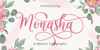 Monasha is a beautiful calligraphy font with many alternative styles & leaf swash, this font looks natural, elegant and perfect for any extraordinary project.Monasha is suitable for various products such as invitations, product packaging, quotes, product design, crafter, labels, photography, watermarks, logos & branding.Everything can be accessed using software that supports Opentype, such as Adobe Indesign, Adobe CS Illustrator, Adobe Photoshop CC, and Corel Draw. Thank you & Happy design :)
 - Bageton by Nk Studio,
$20.00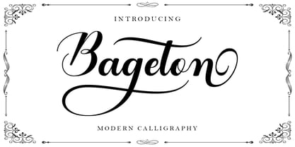 Bageton is a beautiful Calligraphy font with many alternative styles, it looks natural, elegant and perfect for extraordinary projects. This font has 350+ glyphs. Bageton is suitable for various products such as invitations, product packaging, offers, product design, crafters, labels, photography, watermarks, logos & branding. Everything can be accessed using software that supports Opentype, such as Adobe Indesign, Adobe CS Illustrator, Adobe Photoshop CC, and Corel Draw.
 - Fyne Fish NF by Nick's Fonts,
$10.00The pattern for this face was designed by Will Bradley in 1894 for the cover of Inland Printer magazine, and was licensed the following year to American Type Founders. Its classic lines and condensed footprint make this typeface a natural for elegant and inviting headlines. All versions of this font include the Unicode 1250 Central European character set in addition to the standard Unicode 1252 Latin set.