10,000 search results
(0.019 seconds)
- Ms Augustine by Calamar,
$18.00 Ms. Augustine is a light, lovely and modern calligraphy font with sophisticated flows. This beautiful script particularly well suited for wedding invitations, save the date cards and feminine branding. Ms. Augustine includes full set of Uppercase and Lowercase Basic Characters, Numbers and Punctuation. Also it contains a lot of stylistic alternates to perfectly re-create natural calligraphy.
 - Logotype Frenzy by Decade Typefoundry,
$40.00 Logotype Frenzy is a display typographer’s guilty pleasure. It’s one of the very few fonts ever made that can take intense abuse and still look natural. It comes with over 1000 characters, including a lot of alternates and extended language support. In OpenType savvy applications, some letter combinations are automatically replaced with ligatures for a more natural look.
 - WOODTYPE Collection by Borutta Group,
$19.00 WOOD TYPE COLLECTION from Mateusz Machalski is a set of wonderful, warm, and weathered hand made typefaces designed by Mateusz Machalski. The Inspiration for this collection comes from a wooden letter blocks and other old technologies used for printing. WTC supports 40 different languages and contains over 300 glyphs per style. The Family consists of 20 typefaces. ENJOY!
 - Blackbone by Balpirick,
$15.00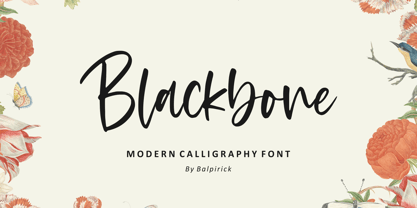 Blackbone is a Modern Calligraphy Font. Blackbone is a lovely and delicate script font that exudes elegance and class. This font was particularly crafted for those who need a beautiful and refreshing look to their designs. Blackbone also multilingual support. Enjoy the font, feel free to comment or feedback, send me PM or email. Thank you!
 - Weltschmerz by Hanoded,
$15.00 Weltschmerz, world-weariness… I love the sound of it, so I chose this name for my new font. Weltschmerz font is a hand made Jugendstil typeface which was modeled on a 1910 poster from Austria. Weltschmerz is a classy typeface, a little melancholic, but with a positive uplift in the end. Weltschmerz comes with extensive language support.
 - Jaina Sans by Linh Nguyen,
$8.00 A display font with expanded width, bold weight is cultivated with high contrast in strokes, suitable for ephemeral design applications. It simulates the impact of cut tools with paper, cloth, and comes along with a feeling of geometric suggestions. Jaina Sans also supports over 200 latin based languages with 235 accented characters along with basic OpenType features.
 - The Little Bonjour by IbraCreative,
$23.00 The Little Bonjour is natural cute and casual handwritten font. The Little Bonjour is suit best for wedding theme, playful concept, love letter, Easter gift card typeface, fashionable theme, fashion sale banner, branding projects, logo, wedding designs, social media posts, advertisements, product packaging, product designs, label, photography, watermark, invitation, stationery and any projects that need casual handwriting taste.
 - Minebold by ahweproject,
$9.00 Minebold is a retro bold handwritten font that will bring you back to the 70s. Fall in love with its unique character and use it to create gorgeous wedding invitations, beautiful stationery art, eye-catching social media posts, and much more! Minebold is PUA encoded, which means you can access all glyphs and swashes with ease!
 - PAG Syndicate by Prop-a-ganda,
$19.99Prop-a-ganda offers retro-flavored fonts inspired by lettering on retro propaganda posters, retro advertising posters, retro packages all the world over. This is perfect font for your retrospective project. PAG Syndicate is rectangle and rather narrow font. This font has squarish face designed only by straight line, it spices up even the short words. - La Vieste by Reyrey Blue Std,
$18.00 La Vieste is a Bold, Elegant and Modern font with beautiful ligatures, tons of special alternative glyphs, ornament and multilingual support. It is suitable for branding, signature, wedding invitation, promotion, product packaging, and other needs. Fall in love with its incredibly versatile style and use it to create spectacular designs! Includes: Uppercase and Lowercase Ligatures PUA Encode Support
 - Meteoric by Nuno Dias,
$24.00 Meteoric is a new playful three-weight typefamily, featuring a soft and rounded sans serif. The semi-stencil style gives it a distinct futuristic look and modern feeling, that is great for logo design, headlines and branding purposes. This monoline typeface, with soft terminals, is a lovely, sweet and perfect typeface for a multitude of typographic applications.
 - Indigo Moon by Make Media Co,
$18.00 Introducing Indigo Moon - a decadent, classic serif with over 150 hand-illustrated alternates, and preserved texture, for a uniquely vintage, yet modern feel. Each letterform has a slightly rough exterior that works beautifully to enhance Indigo Moon's soft, conventional details. This versatile display typeface has enough character for logos and branding, as well as headlines, apparel, bridal and more.
 - Girlish by Balpirick,
$15.00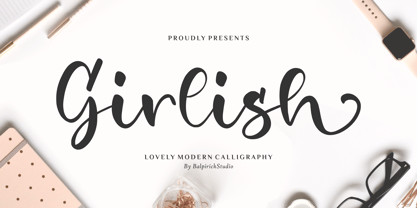 Girlish is a Lovely Modern Calligraphy Font. Girlish is perfect for product packaging, branding project, megazine, social media, wedding, or just used to express words above the background. Girlish also multilingual support. Lowercase font Stylistic Alternates Ligatures Symbols & Punctuation OpenType Features. Enjoy the font, feel free to comment or feedback, send me PM or email. Thank you!
 - FS Siena for Walbusch by Fontsmith,
$80.00Siena is a luxurious type. A modern contrasted sans serif. Over 25 years in the making, FS Siena is tailor made for high-end brands. Sumptuous, elegant and eclectic, a nonconformist typeface with classical roots. It’s been a long time coming, but with its heady mix of elegance and quirky charm, FS Siena is worth the wait. - Gamos by Letterara,
$12.00 Gamos comes from Greek which means marriage. Add some love in an instant. The font comes decorated with small embellishments, such as hearts. Making it the perfect font for Valentines Day designs, but also Christmas, Weddings, Anniversaries, Birthday cards, table numbers, header menus, display’s, logos, slider blogs, custom addresses, stamps, packaging, greeting cards, and much more!
 - The Saily by Stringlabs Creative Studio,
$25.00 The Saily feels equally charming and elegant. This stunning script font is a stylish homage to classic calligraphy. It features a varying baseline, smooth lines, gorgeous glyphs and stunning alternates. Fall in love with its authentic feel and use it to create gorgeous wedding invitations, beautiful stationary art, eye-catching social media posts, and cute greeting cards.
 - Mrs Eaves XL Serif by Emigre,
$59.00 Originally designed in 1996, Mrs Eaves was Zuzana Licko’s first attempt at the design of a traditional typeface. It was styled after Baskerville, the famous transitional serif typeface designed in 1757 by John Baskerville in Birmingham, England. Mrs Eaves was named after Baskerville’s live in housekeeper, Sarah Eaves, whom he later married. One of Baskerville’s intents was to develop typefaces that pushed the contrast between thick and thin strokes, partially to show off the new printing and paper making techniques of his time. As a result his types were often criticized for being too perfect, stark, and difficult to read. Licko noticed that subsequent interpretations and revivals of Baskerville had continued along the same path of perfection, using as a model the qualities of the lead type itself, not the printed specimens. Upon studying books printed by Baskerville at the Bancroft Library in Berkeley, Licko decided to base her design on the printed samples which were heavier and had more character due to the imprint of lead type into paper and the resulting ink spread. She reduced the contrast while retaining the overall openness and lightness of Baskerville by giving the lower case characters a wider proportion. She then reduced the x-height relative to the cap height to avoid increasing the set width. There is something unique about Mrs Eaves and it’s difficult to define. Its individual characters are at times awkward looking—the W being narrow, the L uncommonly wide, the flare of the strokes leading into the serifs unusually pronounced. Taken individually, at first sight some of the characters don’t seem to fit together. The spacing is generally too loose for large bodies of text, it sort of rambles along. Yet when used in the right circumstance it imparts a very particular feel that sets it clearly apart from many likeminded types. It has an undefined quality that resonates with people. This paradox (imperfect yet pleasing) is perhaps best illustrated by design critic and historian Robin Kinross who has pointed out the limitation of the “loose” spacing that Licko employed, among other things, yet simultaneously designated the Mrs Eaves type specimen with an honorable mention in the 1999 American Center for Design competition. Proof, perhaps, that type is best judged in the context of its usage. Even with all its shortcomings, Mrs Eaves has outsold all Emigre fonts by twofold. On MyFonts, one of the largest on-line type sellers, Mrs Eaves has been among the 20 best selling types for years, listed among such classics as Helvetica, Univers, Bodoni and Franklin Gothic. Due to its commercial and popular success it has come to define the Emigre type foundry. While Licko initially set out to design a traditional text face, we never specified how Mrs Eaves could be best used. Typefaces will find their own way. But if there’s one particular common usage that stands out, it must be literary—Mrs Eaves loves to adorn book covers and relishes short blurbs on the flaps and backs of dust covers. Trips to bookstores are always a treat for us as we find our Mrs Eaves staring out at us from dozens of book covers in the most elegant compositions, each time surprising us with her many talents. And Mrs Eaves feels just as comfortable in a wide variety of other locales such as CD covers (Radiohead’s Hail to the Thief being our favorite), restaurant menus, logos, and poetry books, where it gives elegant presence to short texts. One area where Mrs Eaves seems less comfortable is in the setting of long texts, particularly in environments such as the interiors of books, magazines, and newspapers. It seems to handle long texts well only if there is ample space. A good example is the book /CD/DVD release The Band: A Musical History published by Capitol Records. Here, Mrs Eaves was given appropriate set width and generous line spacing. In such cases its wide proportions provide a luxurious feel which invites reading. Economy of space was not one of the goals behind the original Mrs Eaves design. With the introduction of Mrs Eaves XL, Licko addresses this issue. Since Mrs Eaves is one of our most popular typefaces, it’s not surprising that over the years we've received many suggestions for additions to the family. The predominant top three wishes are: greater space economy; the addition of a bold italic style; and the desire to pair it with a sans design. The XL series answers these requests with a comprehensive set of new fonts including a narrow, and a companion series of Mrs Eaves Sans styles to be released soon. The main distinguishing features of Mrs Eaves XL are its larger x-height with shorter ascenders and descenders and overall tighter spacing. These additional fonts expand the Mrs Eaves family for a larger variety of uses, specifically those requiring space economy. The larger x-height also allows a smaller point size to be used while maintaining readability. Mrs Eaves XL also has a narrow counterpart to the regular, with a set width of about 92 percent which fulfills even more compact uses. At first, this may not seem particularly narrow, but the goal was to provide an alternative to the regular that would work well as a compact text face while maintaining the full characteristics of the regular, rather than an extreme narrow which would be more suitable for headline use. Four years in the making, we're excited to finally let Mrs Eaves XL find its way into the world and see where and how it will pop up next.
 - Alas, my dear friend, it appears we've dipped our toes into the vibrant and imaginary sea of typographic creatures, only to fish out the elusive "StingRay" – a font so mysteriously absent from the ma...
- Bianca Kamelo by Ivan Rosenberg,
$16.00 Bianca Kamelo is a modern hand-lettered font with 67 standard ligatures and unique 676 "love ligatures" which connect names with style. Font includes multilingual support for Western and Central Europe. It is ideal for weddings invitations, baby showers, blogs and websites, instagram, branding, invitations, business cards, and many more. This font also include complete set of alternates for uppercase and lowercase characters and stylistic ends for lowercase characters. To activate the "love ligatures" you just need to enable "standard ligatures" and type name without separator (space). For example BiancaKamelo. If the name ending with standard ligature, you need to disable that ligature, enable ligature for last name character and first surname character. For example: ChristianKate - disable ligature for ChristianKate and enable for ChristianKate. For access to Stylistic Alternates is required software with glyphs panel like Photoshop, Illustrator etc. Ligatures shows up automatically.
 - Monk SPF by S6 Foundry,
$19.00 Monk is a multi-language geometric harmoniously balanced font in Arabic and Latin. The font family has its origins in Benedictine and Franciscan writing. Both Arabic and Latin work seamlessly together having shared counters, stem thickness, and curved forms. Monk is a type family that seeks a balance between the openness and legibility of humanist sans serifs. Letterforms have a distinct direction of the ductus, a wide overall stance, large open counters that help in its legibility. The typeface is versatile and can be successfully used in magazines, posters, branding, websites, headlines, large-format prints, brand identities, social media, advertising, editorial design, posters. The family contains over 40 alternative glyphs and over 50 ligatures in each style and comes in 10 styles with their corespondent italics. The family Latin supports Western, Central, South Eastern, South American, Oceanian, Pan African, Vietnamese, Sámi & Arabic
 - Mikal by Eurotypo,
$88.00 David was promised Saul’s daughter in marriage after he defeated Goliath. However, while Saul procrastinated in delivering his elder daughter for marriage, David fell in love with the younger daughter Mikal (1 Samuel 18:20,28). Mikal was the only wife who was reported to have loved David. Her name, Mikal, meant brook, or stream, a symbol of the water of the word. Mikal is a versatile and elegant script font; well suited in the area of magazines, web pages, packaging, logotypes and advertising, etc. This font can be used as body text for its good legibility and accurate kerning. Mikal font has all the advantages of OpenType technology that allows a variety of combinations: Swash, old style numerals, standard and discretionary ligatures, contextual alternates, word ending and tails. Mikal supports all Central European character set as well as basic Western languages.
 - Garrulous by Missy Meyer,
$12.00 Looking for a tall, skinny, rounded serif font, with a fun hand-written feel? Look no farther than Garrulous! Garrulous is a mixed-case font, with the lowercase letters standing just as tall as the uppercase, so you can mix and match uppercase and lowercase in the same word for an extra fun look. It also comes with 32 double-letter ligature pairs, 17 uppercase and 15 lowercase, so you won't have the exact same letter twice in a row. As usual, the letters in Garrulous have been cleaned up extensively, to make everything sharper and easier for crafters and for any print projects. And I've included over 300 extended Latin characters for language support. Garrulous includes: - Standard characters A-Z, a-z, 0-9, and punctuation - 32 double-letter ligature pairs - Over 300 extended Latin characters for language support
 - Double Back by Comicraft,
$19.00 Great Scott, Marty! This font is your density, charged up to 1.21 gigawatts through the Power of Love! Originally created by Comicraft for the official BACK TO THE FUTURE fan club, Remastered DOUBLEBACK has been rebuilt from the ground up, with a new vertical “Curve” weight, six new “Parallel” weights, stylistic alternate letters AMNUWY, and language support for Western & Central Europe and Vietnamese. And if that weren't enough, we've traveled into the future and brought back Solid & Open Variable Fonts which provide precise control of Time and Warp! We cannot be held responsible for any ruptures in the space-time continuum due to use of these fonts. SPECIAL INTRO SALE: from October 21 through November 12, get DoubleBack at half price and we will donate $20.15 of each sale to the Michael J. Fox Foundation for Parkinson's Research. We love ya, Mike.
 - Aldo Pro by Sacha Rein,
$21.17 Aldo Pro is a contemporary sans serif OpenType font family designed by Sacha Rein. With 8 weights from hairline to black and an extended latin character set of 690 glyphs it is suitable for all typesetting needs, from advertising and branding to web and screen. Aldo Pro is the evolution of the free Aldo semi-bold font published on dafont.com in 2007, and which has been downloaded over 700.000 times. « I have gotten quite a lot of feedback on the original Aldo over the years and tried to integrate most of it into Aldo Pro. The x-height has been reduced to make for a less condensed, more legible font, which makes it more useful for body text than before. By popular demand the X glyphs have been changed to a more ‘classic’ shape. The font also contains some useful ligatures now. »
 - Haniberryku by Kotak Kuning Studio,
$20.00 Haniberryku is a lovely modern script font with a natural & stylish flow. Perfect for making elegant stylish statements - or adding a touch of class to your designs. This script has a multitude of lovely alternates character in its OpenType features - making the font look a beautiful. Haniberryku is perfect for many different projects such as logos & branding, invitation, stationery, wedding designs, social media posts, advertisements, product packaging, product designs, label, photography, watermark, special events or anything. I highly recommend using a program that supports OpenType features and Glyphs panels such as Adobe Illustrator, Adobe Photoshop CC, Adobe InDesign, or CorelDraw, so you can see and access all Glyph variations. We hope you enjoy the font, please feel free to comment if you have any thoughts or feedback. Or simply email me at kotakkuningstudio@gmail.com. Thanks for purchasing and have fun!
 - Breakfast Pastry by Missy Meyer,
$12.00 I’d been thinking for a while about making a serif font with ball terminals: big fun round ends to the letters anywhere I can squeeze them in. So I made Breakfast Pastry! I started with a hand-drawn set of basic letters, then went hog-wild making alternates and ligatures galore with fun swirls, curls, and even more balls! I’ve cleaned the letters up significantly to make them smooth and easy for any cutting or printing you may want to do, but I’ve also left in some of the hand-drawn character so that the letters are warmer and not too formal. Then I took the first font, and made a second solid version without the cutouts. After that I thought: I tend to make plumper fonts ... why not make an even thinner version? So I did! All three versions have the same character set (over 700 glyphs total), which means they all have the same extras and alternates. All three fonts have over 300 extended Latin characters for language support, as well as over 200 bonus items: alternate letters, letters with swashes, two-letter ligatures, small caps, catchwords, and even some bonus ornaments and elements to make the fonts even more flexible. (After all, if one swash on a letter is good, two or three might be great!)
 - Ruth Script by Estudio Calderon,
$68.99 Ruth Script is perfect for neon signs, we took as referents some of these signs found in the street, especially those hanging in bars, billiard halls, motels and night clubs, we also took into consideration the Photo-lettering One Line manual to solve ligatures and alternatives (We want to thank Ed Ronthaler for that treasure to study and learn). The scripts can be considered as a compendium of connections, aesthetic and functional alternatives, where all the possible word combination is a universe depending on the language and the user's creativity. We have developed a project that offers to our customers a bridge that connects the brush with the digital typography through a partial vowels and consonants control and ligatures with opentype programming. We know that the scripts make typography users, fall in love. That is why we have created a type font that achieves all the demands and requests for any project where our font can be applied. Ruth Script was designed with patience and love, with the purpose of recovering the work done by those people who have been working as letterer during decades and that have left us hundreds of guides, books and videos. A great legacy! We want to invite you to use Ruth Script in your projects and fall in love with ESTUDIO CALDERÓN's new daughter. ENJOY IT!
 - Fleur Bleue by DM Studio,
$30.00 The Fleur Bleue Beautiful Romantic Font is a graceful and elegant typeface that encapsulates the beauty and romance of delicate flowers. With its flowing letterforms and intricate details, this font brings a touch of sophistication and romance to your designs, making it perfect for wedding invitations, love letters, branding, and other projects that require a touch of enchantment. Features: Romantic and Elegant Style: The Fleur Bleue Font exudes a romantic and enchanting aesthetic. Its graceful letterforms and delicate details create an air of elegance and beauty, making it ideal for projects that require a touch of romance and sophistication. Beautiful Floral Design: The font’s intricate details and floral elements add a touch of enchantment and whimsy to your typography. It captures the essence of delicate flowers, bringing a sense of natural beauty to your designs. Versatile Application: This font is versatile and well-suited for various design projects that aim to evoke emotions of love and romance. Use it in wedding invitations, love letters, branding, packaging, and more to add a touch of beauty and enchantment to your designs. Uppercase and Lowercase Letters: The font includes both uppercase and lowercase letters, providing flexibility and creative freedom in your designs. Mix and match the cases to create visually appealing and harmonious typography. Stylistic Alternates: The Fleur Bleue Font offers a selection of stylistic alternates that enhance the visual interest of your text. These special characters create unique connections between letters and alternate forms, allowing you to create beautiful and captivating typography. Punctuation and Symbols: In addition to the alphabet, the Fleur Bleue Font includes a comprehensive set of punctuation marks, numerals, and common symbols. This ensures consistency and ease of use when incorporating the font into your design projects. Easy to Use: Installing and utilizing the Fleur Bleue Font is hassle-free. It is compatible with both Windows and Mac operating systems and seamlessly integrates into popular design software such as Adobe Photoshop, Illustrator, and InDesign. This ensures a smooth and efficient design workflow. Infuse your designs with the grace and romance of the Fleur Bleue Beautiful Romantic Font. Let its flowing letterforms and intricate details bring a touch of sophistication and enchantment to your wedding invitations, love letters, and branding. Embrace the timeless beauty of this font and create designs that evoke feelings of love and admiration.
 - Castile by Eyad Al-Samman,
$3.00 Castile is a central region of Spain that formed the core of the Kingdom of Castile, under which Spain was united in the 15th and 16th centuries. "Castile" is a Kufic modern Arabic typeface. It is suitable for books' covers, advertisement light boards, and titles in magazines and newspapers. It is very distinctive when used in black and white printout. It decorates colored pages and makes artworks more attractive. This font comes in three different weights. I adore Spain and the historical achievements of the Islamic civilization existed there in the past. By designing "Castile" Typeface, I wanted to refer to the Islamic civilization that Muslims had in Spain and especially in Andalusia. Today the name of Castile survives in two autonomous regions of Spain: Castile-La Mancha (capital city is Toledo) and Castile-Leon (capital city is Valladolid). The main characteristic of "Castile" Typeface is in its modern open-end style for some of its Arabic characters such as "Sad", "Dad", "Seen", "Sheen", "Qaf", "Faa", "Yaa" and others. The shape of the characters' "dot", "dots", and "point" is innovative; a triangle with a semi-circle shape. "Castile" Typeface is suitable for books' covers, advertisement light boards, and titles in magazines and newspapers. Its charactersí modern Kufic styles give the typeface more distinction when it is used also in posters, greeting cards, covers, exhibitionsí signboards and external or internal walls of malls or metroís exits and entrances. It can also be used in titles for Arabic news and advertisements appeared in different Arabic and foreign satellite channels.
 - Salden by Canada Type,
$40.00 The Salden fonts are our tribute to the man who was dubbed the face of the Dutch book, and whose work is considered essential in 20th century Dutch design history. Helmut Salden’s exquisite book cover designs were the gold standard in the Netherlands for more than four decades. His influence over Dutch lettering artists and book designers ranges far and wide, and his work continues to be used commercially and exhibited to this very day. At the root of Salden’s design work was a unique eye for counter space and incredible lettering skills that never failed to awe, regardless of category or genre. This made our attention to his lettering all the more focused within our appreciation to his overall aesthetic. Though Salden never designed alphabets to be turned into typefaces (he drew sets of letters which he sometimes recycled and modified to fit various projects), we thought there was enough there to deduce what a few different typefaces by Salden would have looked like. The man was prolific, so there were certainly enough forms to guide us, and enough variation in style to push our excitement even further. And so we contacted the right people, obtained access to the relevant material, and had a lot of fun from there. This set covers the gamut of Salden’s lettering talents. Included are his famous caps, his untamed, chunky flare sans serif in two widths, his unique Roman letters and an italic companion and, most recognizable of all, his one-of-a-kind scripty upright italic lowercase shapes, which he used alongside Roman caps drawn specifically for that kind of combination titling. All the fonts in this set include Pan-European glyph sets. They’re also loaded with extras. Salden Roman (908 glyphs) and Salden Italic (976 glyphs) each come with built-in small caps (and caps-to-small-caps), quite a few ligatures, and two different sets of alternates. Salden Black and Salden Black Condensed (636 glyphs each) come with a set of alternates, and both lining and oldstyle figures. Salden Caps (597 glyphs) comes with a set of alternates, and Salden Titling (886 glyphs) comes with a quite a lot of swashed forms and alternates (including as many six variants for some forms), a few discretionary ligatures, and two sets of figures. There are also some form alternates for the Cyrillic and Greek sets included in all six fonts. These alphabets were enjoyably studied and meticulously developed over the past ten years or so. We consider ourselves very fortunate to be the ones bringing them to the world as our contribution to maintaining the legacy of a legendary talent and a great designer. The majority of the work was based on Salden’s original drawings, access to which was graciously provided by Museum Meermanno in The Hague. The Salden fonts were done in agreement with Stichting 1940-1945, and their sale will in part benefit Museum Meermanno.
 - McKnight Kauffer by K-Type,
$20.00 McKnight Kauffer is a casual sans derived from poster and book cover lettering by the American designer, Edward McKnight Kauffer, who mainly worked in England through the 1920s and 1930s. The style owes much to Louis Oppenheim's Fanfare of 1927, but without the Germanic blackletter inflection. The two display fonts, regular and outline, have a playful art deco feel, and share spacing and kerning so can be overlapped for bicolor effects.
 - Assegai by Scholtz Fonts,
$19.00 Named for the Zulu traditional spear, Assegai evokes the long, slim outline of the weapon, and the strength of the Zulu warrior. The font combines the irregular shapes of tribal African art with the simple, clean elegance of contemporary design. It is especially useful for headings, subheading, for shorter passages and also works as a body font since it has both upper and lower case and is striking and readable.
 - Battle Ground by Arendxstudio,
$15.00 Battleground is a very characteristic Display Font with a strong Sports theme and is very suitable for the Esport Logo as well Battleground came with opentype features such stylistic alternates, stylistic sets & ligatures good for logotype, poster, badge, book cover, tshirt design, packaging and any more. Features : -Uppercase & Lowercase -Multilingual support -Number, -Symbol -Punctuation. -Support in Mac and Windows OS -Support in design application (photoshop, illustrator, and more)
 - Quasar by VP Creative Shop,
$12.00 Introducing the delightful Quasar sans serif font – a true gem in the world of typography! With its clean and modern design, Quasar brings a touch of elegance to any project. This font family consists of not one, but six distinct weights, offering you a versatile range of options to choose from. Whether you're aiming for a bold and impactful statement or a more subtle and refined look, Quasar has you covered.
 - Quite Something by Hanoded,
$15.00 I have always liked the word ‘quite’ - you can stick it in a sentence and all of a sudden that sentence looks quite sophisticated! Quite Something may not be all that sophisticated; in fact, it is a rather messy font. But that’s where the fun begins! Use it for your children’s book covers, toy packaging and posters. I am sure people will say that your designs are Quite Something!
 - You are Superb by DainType,
$15.00 Nicely scribbled script font. It has a masculine, wild and wild mood. It also has a feeling of being torn. It is good when you want to use a lively atmosphere because of the fast flow of strokes. It is good to use when you want a cool and striking design such as a bromide for a rock festival, an album cover for music, a beer package, or a beer logo.
 - Hipsterism by Arendxstudio,
$18.00 Hipsterism is a bold script with its distinctive character that can be easily implemented in your various design projects. Hipsterism comes with OpenType features such stylistic alternates, stylistic sets & ligatures which make it a great choice for logotype, posters, badges, book covers, t-shirt design, packaging and more. Features : • Character Set A-Z • Numerals & Punctuation (OpenType Standard) • Accents (Multilingual characters) • Ligatures • Alternates There it is! I really hope you enjoy it
 - Skinny Joe by Creativemedialab,
$20.00 Inspired by Bell Bottoms pants which are trending through the disco days of the 80s Skinny Joe features a reverse contrast style with a retro and vintage look. That’s simply ideal for summer theme concepts such as posters, book covers, t-shirts, branding, logo, and many more. Consists of 5 weights from thin to bold and a variable format. Skinny Joe also has alternatives for more decorative and unique looks.
 - Makeba Retro Funky Groovy by Beast Designer,
$15.99 Makeba Retro Funky Groovy Font is a fun and funky display font that brings back the spirit of the 70s. Its bold, rounded letters feature groovy curves and playful embellishments that exude a retro vibe. This font is perfect for creating eye-catching titles and headlines for posters, album covers, and other retro-inspired designs. The font’s energetic and upbeat personality is sure to make any project stand out.
 - Kunst by Matt Grey Design,
$24.00Inspired by European brutalist design aesthetic, Kunst strives for form dominated by pure geometric precision, utilising 45° angles based on a strict grid. See the PDF specimen | Also available in Rounded and Imprint styles. Covers Western and Cyrillic character sets with a full range of Smallcaps. Includes Tabular Figures, Standard and Discretionary Ligatures, and Contextual Alternates such as arrows, Smart Quotes, and German Capital Eszett/scharfes (Sharp s).