10,000 search results
(0.039 seconds)
- Wonder Brush by Canada Type,
$29.95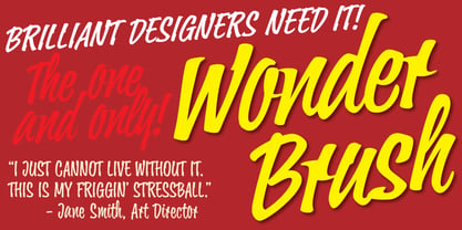 Wonder Brush is a display typographer's guilty pleasure. It's one of very few fonts ever made that can take intense abuse and still look natural. Partly based on a 1969 Friedrich Poppl design called Poppl Stretto, but considerably fused with ideas found in interwar magazine ad lettering and signage, Wonder Brush caters to the idea that most graphic designers would rather use design elements they can enjoy. When you spend your days being "challenged" and "creatively tested" and "communicating the message," you can definitely use a little bit of playtime. And this font gives you just that, playtime on the job. Wonder Brush appears to be a straightforward narrow upright brush script. But it really is made of malleable rubber. Take it into a program like Adobe Illustrator, set something, stretch or squeeze, shear or warp, slant or transform… just play with it like they used to do in the 70s and 80s. You will soon discover that this font really is a big old top hat, and it's up to you and your mischief to pull rabbits or geese out of it. A single font that allows you to emphasize content or manage space mechanically without affecting the integrity of the type setting. And if your playtime includes fiddling with OpenType features, you're in for a bonus treat: Wonder Brush comes with over 800 characters, including a lot of alternates and extended language support. So tweak away until your eyes cry with joy. The only rules are the ones you set, and even those are meant to be broken.
 - Airosol by Firstype Studio,
$15.00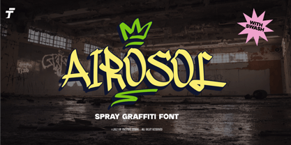 Airosol is an edgy and expressive graffiti font that captures the essence of street art with a style that's undeniably urban. It's the perfect choice for designers and artists looking to infuse their projects with a raw and rebellious vibe, complete with striking swashes for added flair. Gritty Street Art Aesthetics: Airosol is a graffiti font that channels the raw energy and aesthetics of street art. Its bold and expressive letterforms showcase the essence of rebellious creativity, making it a standout choice for projects that demand an urban edge. Street Art Style: What sets Airosol apart is its authentic street art style. Every character exudes a sense of authenticity, as if it were lifted directly from a city wall, ready to make a statement. Swashes for Added Impact: Airosol comes with dynamic swashes, allowing you to accentuate your text with unique and artistic flourishes. These swashes are your tool for adding that extra touch of graffiti-inspired artistry to your designs. Versatile Expression: Airosol is more than just a font; it's a versatile form of expression. Whether you're working on urban branding, event posters, or any project that demands a street-smart aesthetic, Airosol will be your creative companion. Unleash Your Inner Rebel: With Airosol, you're not just selecting a font; you're unleashing your inner rebel and embracing the power of street art in your designs. Choose Airosol for Your Urban Adventures: Explore the creative possibilities with Airosol, and experience how its graffiti-inspired aesthetics and swashes breathe life into your projects, from the streets to the screen.
 - SteamCourt by insigne,
$22.00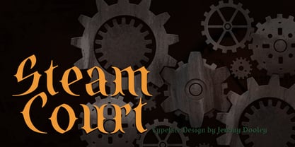 Think smart. Think regal. Think SteamCourt, a new font designed specifically for the card game SteamCourt. A bit of background if you will: In early 2014, some friends from my college days banded together to form their own game company. Their first launch? A current Kickstarter they named SteamCourt. I love Kickstarter. It’s a fantastic platform, a great way for individuals to introduce the public to their visions. I've started a couple of them myself--both including fonts designed specifically for the projects. The first is Chatype, a font created exclusively for the city of Chattanooga. The second: Cabrito, a font developed as part of the children’s typeface book, The Clothes Letters Wear. It’s wonderful to work with so many others who come alongside to help you vision become reality. Naturally, hearing of my friends' project, I contacted them about adding a new face to their venture as well. I gave them carte blanche. They wanted steampunk. It was a great challenge, the result of which is now SteamCourt, an unforgettable display typeface that draws from the mix of Victorian regals, metallic and brass engineering, cogs, clocks and blackletter typography. It evokes a time of skillfully forged metalwork and an era of intrigue and excitement, filled with audacious feats of engineering and innovation and the perilous journeys of the airship. While influenced by the era of blackletter, SteamCourt is an unmistakable departure from the style of two centuries past, yet it still shines in its given display roles with a distinct regal twist. The serifs are asymmetrical, yet the characters are all specially and delicately balanced. It’s an eye-catching alternative to blackletter with modern steampunk touches. The game’s signature typeface has sizeable language support on top of 90 alternate characters as well. In addition to a generous number contextual alternates, SteamCourt features stylistic alternates that allow for buyers to customize its visual appearance for their preferences, helping to make it a superior option for packaging, branding and enormous typesetting logotypes as well as shorter textual content. Check out the game, but grab the font, too, to be a part of that crib created as a companion for the new game in court. It'll be the ace up your sleeve for many rounds of design ahead.
 - LiebeGerda by LiebeFonts,
$29.00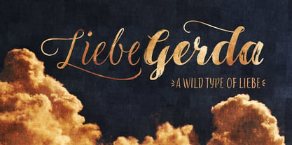 Go out into the wilderness. Cut down a tree. Stop and smell the roses. And then treat yourself with this unplugged, hand-lettered typeface. LiebeGerda is an effortless-but-refined, spontaneous-but-elegant brush font. She is ready for your next project, and she wants to add that little crafty something that makes the difference. Her natural breath of fresh air lets you escape those same old monotonous script fonts you’ve been using. After our successful first brush font, LiebeDoris, and our first interconnected script, LiebeLotte, we’re combining both genres and taking them to the next level: an interconnected brush script. OpenType magic varies LiebeGerda’s letterforms: Most characters have no less than three different variations that are automatically shuffled and inserted as you type. Plus, the “All-Caps” OpenType feature exchanges uppercase letters with less-swashy variants. Now you know why every one of the four styles contains more than 1,200 characters! Ulrike of LiebeFonts painted LiebeGerda’s four styles individually from scratch and carefully adjusted every detail by hand. Rather than being one typeface with different weights, LiebeGerda is a package of four individual fonts that go together really well. Ulrike’s high level of type-nerdy craftsmanship shows. When you use LiebeGerda, your designs will easily convince your audience that they’re looking at a hand-crafted piece of lettering. Feel free to add a few of the stacked ligatures like “the”, “for”, and “new” to round off the illusion. Last but not least, LiebeGerda has a lot more detail than most other brush fonts. That means there’s no ugly, lazy bézier artifacts in the brush traces. You can print words at billboard size, and people will still believe they smell the paint from your brush!
 - Republica Banana by Hanoded,
$15.00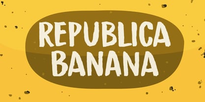 At home we love bananas: the kids take them to school for ‘snack time’, they’re healthy and they look pretty as well! Republica Banana is a pun on the term Banana Republic, which was coined by American author O. Henry in 1901. In economics, a Banana Republic is a country that is run as a private commercial enterprise for the exclusive profit of the ruling class. Of course I can point out a few countries that fit this description, but let’s not get into that. Republica Banana is a very nice, hand painted brush font. It comes with double letter ligatures for the lower case and a lot of diacritics for you to play with.
 - Secret Scrypt by Canada Type,
$29.95Emulating real handwriting has always been an aim of font designers in the digital age. The standard mainstream scripts and doodles that were available for the longest time have not successfully reached that goal. A letter always looked the same wherever you placed it. Some workarounds, such as letter alternates and ligatures, were used in many fonts, but they were a bit inconvenient to use, and in some cases didn't work correctly because they had to be placed in separate fonts from the main character set. Not until now, with OpenType technology, have we been able to emulate real handwriting, by including multiple character sets in the same font and programming it for smart form changes through letter sequence counting. Secret Scrypt was the first Canada Type font to make it to the bestseller list in the summer of 2004. In early 2005 a New York restaurant chain picked Secret Scrypt to use on its menus and internal signage, but they wanted to look even more like real handwriting, where two or three instances of the same letter used in one word would automatically change and look different from each other. Using OpenType technology, Canada Type produced a Secret Scrypt Pro for that restaurant chain under the direction of Mucca Design in New York City. That initial version contained three different character sets in the same font, and some intelligent programming that determines the sequence of the letters and change their shapes accordingly. Now the retail version of Secret Scrypt Pro is available, with four character sets built into the font for even more variety on the real handwriting theme. Make sure to check out the Secret Scrypt Pro PDF in the MyFonts gallery for tips on using Secret Scrypt Pro. Secret Scrypt is perfect for menus, handwritten notes, theater programmes, charity organization posters, and any design that attempts to get close to people with the personal magic of real handwriting. - Herman by Monotype,
$15.99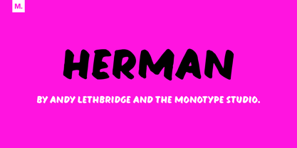 An edgy little number here; Herman was created using a chiselled marker pen and is handwritten as a slanted, bold font with a distinct marker contrast. Designed with two sets of all caps, and alternates that rotate the upper and lower case; Herman is a standout that’s charming and slightly retro, too.
 - Bylum by Adam B. Ford,
$16.00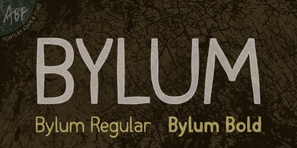 Bylum is put together with a bulbous line segment that makes up the bulk of the font. The verticals bulge out in the middle, the curves vary in width along their lengths. This gives the font a relaxed sway to it even while its verticals are upright and its design is fairly regimented.
 - Murisa Rania by Murisa Studio,
$10.00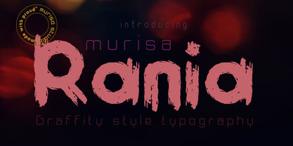 Murisa Rania is our next very attractive font. Have you ever imagined a font that is formed from brush strokes whose ink is almost dry? That's what this font is made of. Murisa Rania combines elements of art and high technique in its creation to create a unique, attractive and beautiful font.
 - Midnight Workers by Figuree Studio,
$18.00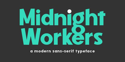 Midnight Workers is a Modern Sans-serif typeface inspired by freelancers who work late into the night to make a living for their beloved families. The simple and dynamic shape makes it very suitable to be used as headlines, logos, or other design needs that require a formal touch but still seem dynamic.
 - Cutting Corners by Just My Type,
$20.00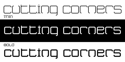 Cutting Corners is all about letters made of squares that also suggest circles. That’s it. This is one of several fonts I’ve created based upon a strictly geometric form; in this case, a round-cornered square. The width is equal to height (except for i, I and most punctuation). Usage recommendations: logos, samplers.
 - Bonaro by Sabrcreative,
$20.00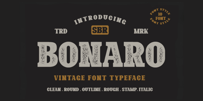 Introducing the Bonaro Vintage Retro Serif All Caps Font, a versatile collection that brings timeless elegance and a touch of nostalgia to your design projects. With its 10 distinct styles, this font offers a treasure trove of possibilities, making it an essential asset for designers seeking to infuse their work with vintage charm.
 - Major Pro Extras NF by Nick's Fonts,
$10.00A supplement to Major Production NF, which includes an assortment of symbols and logos for video, web and mobile applications, including the Blu-ray logo with its region designators. Please remember that logotypes are the property of their respective copyright holders, and should be used solely in accordance with the copyright holder’s guidelines. - Porceleina by PizzaDude.dk,
$20.00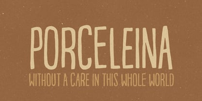 Porceleina is elegant, what more can I say? This handmade and handdrawn font comes with a heavy loadful of diacritics - and the Opentype contextual alternates makes sure that the font cycles between the six different...yes SIX different...versions of each letter from a-z! That's quite awesome, if you ask me!
 - Adagio by Monotype,
$15.99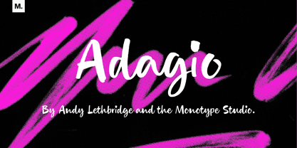 Adagio is a spontaneous, casual kind of font but don’t be fooled into thinking just because it’s all uneven and painted that it’s a pushover. There’s a bold brush pen at the heart of the design as well as a full set of alternate lowercase characters if you’re looking for something extra.
 - MGN Humble by Morgana Studio,
$17.50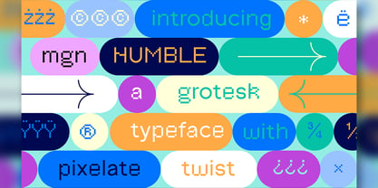 MGN Humble is a sans-serif type that provides room for users to express their experimental and playful side. The pixelated strokes engage venturously with the need to communicate excitement; a perfect set for clothing, gaming, technology, and experimental poster use. Currently available in a beta version and to be developed further.
 - Letterhack Serif by Comicraft,
$19.00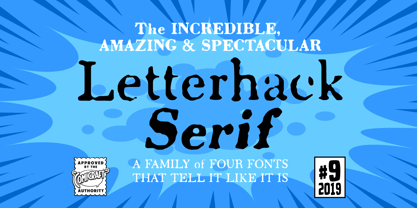 IT’S MAILBAG TIME! Dear Jolly JG Roshell and Rascally Richard Starkings, Comicraft Fonts are a thing of Beauty and a Joy Forever! You guys must be a Wild Bunch, and I roar with delight whenever a new comicbookfonts release appears in my emailbox. But I have to level with you daredevils...what about us Letterhacks? We need representation too! We haven’t spent years hammering away on our typewriters to be ignored! BRING BACK THE LETTER HACK! In fearless font form. You know it makes sense! Truly Yours, Forbush, Irving, senior. We give up! We can’t resist your appeals, threats and commands ANY LONGER!!! We may crack under the strain, but this month’s release IS two (count 'em) Letterhacks! That’s right, a pair of fantastic fonts that recreate the look and feel of your Marvelous Letters of the Sixties! It’s a Bullpen Bulletin! It’s an Iconoclastic Item!
 - Terror JNL by Jeff Levine,
$29.00Creepy...crumbly...spooky... that's Terror JNL. Originally an experimental outline font made in the early days of Jeff Levine's typographic work, it's been revised and properly spaced for the design professional. The font is based on Ray Larabie's 1990's freeware release Foo - and a hand-traced, weathered-look was applied to the letter shapes. There's no kerning and a limited character set - but Terror JNL is still perfect for any headline that depicts "things that go bump in the night"... - Dharma Gothic P by Dharma Type,
$19.99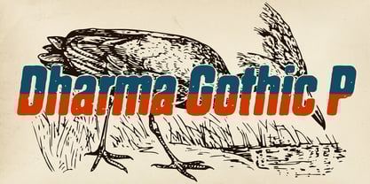 Dharma Gothic P font family is designed based on Dharma Gothic and a distressed offshoot from the original. The glyphs that damaged by printing the original had been tweaked by hand work with great care. This family contains basic Roman, Italic, Bold and it’s Italic to suit a wide range of creative works. g, r & y have their alternative glyphs that can be used with OpenType salt feature. This font will be one of the most powerful solutions for printing and web.
 - Lia Berta by Lia Baratz Fonts,
$40.00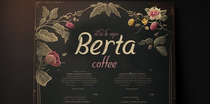 Berta font is a typeface design that is inspired by vintage typographical styles. This font have a classic, timeless feel with distinctive details like, flourished lines, and varied stroke widths. They are commonly used in design projects that require a historical or nostalgic touch, such as wedding invitations, posters, book covers, and more. With a vintage font, designers can add a touch of sophistication and elegance to their work while also evoking a sense of bygone eras. Support both English and Hebrew letters
 - Belgiany by Sealoung,
$25.00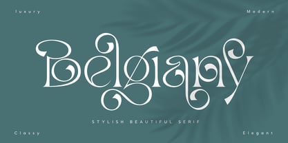 Belgian is a beautifully stylish modern serif font. A new beautiful serif that we created specifically for your logo and branding needs, with an extra unique shape that will add value to your brand. It's great to take advantage of designers or product owners who need a solution to make their designs look more beautiful and modern. And especially for Belgian fonts, We prepare any alternative characters to help you create unlimited variations for your creative needs especially for logo types or wordmarks.
 - Maritime Champion by Kyle Wayne Benson,
$8.00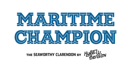 Make no mistake, Maritime Champion is not simply seaworthy. This peacoat-grubbing, all-hands-on-decking, accordion-serenading font is not for the faint of heart. He’s all caps all the time. Even the lightest of his six weights is enough to anchor a man-o-war in any Caribbean maelstrom. This 10-font family includes six weights and a Shoreline style that comes in four weights. It’s an all-caps family that includes lots of language options and OpenType fractions.
 - Historya by Atharuah Studios,
$16.00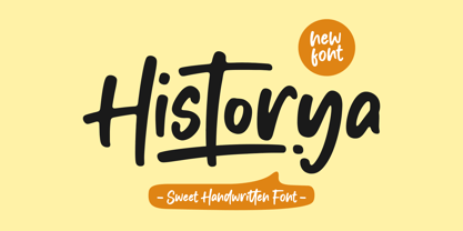 Introducing Historya; A sweet handwritten font! Bold and cheerful fonts are guaranteed to beautify your designs and products. What's Included: Historya comes with a single font file that includes uppercase, lowercase, numbers, punctuation, and multilingual support. Historya also has alternative letters in each uppercase and lowercase and has a swash that you can access in alternative numbers 1-9. That's it! I hope you enjoy it. You can also say hello to me on Instagram: https://www.instagram.com/atharuah_ Thank You!
 - Beautiful rain by Sulthan Studio,
$12.00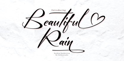 Beautiful rain made in the rainy season I made an irregular handwritten font at will with beautiful and attractive results full of love and affection in it, making this font very attractive to use in your photos with two words that go hand in hand or also to connect your own name or partner's name because Having a swash heart that can be connected is very suitable for use on greeting cards, wedding invitations, magazines, logos, clothes, stickers, and many more.
 - Brittania by Atharuah Studios,
$18.00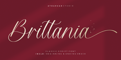 Introducing the Brittania! Classic script font that shows beauty and balance in every letter that is displayed. The font files include uppercase, lowercase, numbers, punctuation, and multilingual support. Brittania also adds a beginning and ending swash to beautify each of your projects. You can access it in every lowercase alternative. That's it! I hope you enjoy it. Feel free to comment if there are issues or queries. You can also say hello to me on Instagram: https://www.instagram.com/atharuah_ Thank You!
 - Happy Easter by Trim Studio,
$15.00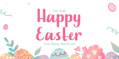 **Happy Easter **A cute script font that's perfect for Easter-themed moments is whimsical and playful. It has flowing, organic lines that resemble the curves of an Easter egg or the curling petals of a spring flower. The letters are so airy, with a gentle bounce that gives them a sense of movement and liveliness. --- File Include: - Readme.pdf Thank you for let us be your design partner, If you have any questions please don't hesitate to drop me a message
 - Stencil Maker JNL by Jeff Levine,
$29.00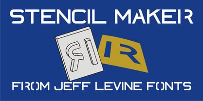 The type design which inspired Stencil Maker JNL comes from a 1920s-era machine used in movie theaters of the day. It rendered tiny punched out letters (some characters solid and some in stencil form), enabling the user to make projection slides of important messages or general notices for the theater audience to read.
 - Cíclope by Andinistas,
$19.95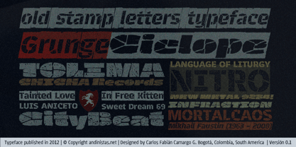 Cíclope is a typeface family designed by Carlos Fabián Camargo in 2012 and used to write the headlines. Its idea is based on an army of stone soldiers that with their size and strength cause earthquakes. Under this concept he obtained stencil and sans serif letters with monstrous shapes and torn counterforms. Its usefulness as well as readability consists in imitate rocks with scars and cracks. For that reason, Cíclope family has three sizes, each with their respective italics distributed at different levels of corrosion. In addition, each file contains 260 glyphs useful for designing words and phrases with systematically eroded treatments for advertisement material. Thus Cíclope works as a raw material in the exploration of new graphic design. Finally, Cíclope concept has grotesque, geometric and humanistics letters roots that seem disastrous but each and every detail has been planned with high definition drawing. Most importantly, it expresses a big amount of grunge style with cracked edges and medium contrast between thin and thick strokes. In that sense, the writing seems impaired and special for design of logos, posters, flyers, brochures and worn, crusty or demolished graphic design.
 - Essonnes by James Todd,
$40.00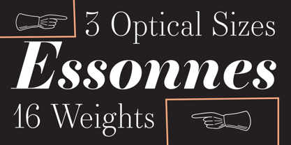 Made up of sixteen individual weights and spread over three different optical sizes, Essonnes is designed to bring utility back to the Didot genre. It’s a common belief among designers that Didones don’t work for text. This wasn’t true in 1819 and it isn’t true today. Like its forbearers, Essonnes is a truly optical family—not just a study in adjusting contrast. The text and display weights have been designed from the ground up for their intended roles. This means that everything from the height of the uppercase & lowercase letters have been specifically tuned for their intended purpose. Like many typefaces, Essonnes started after falling in love with a piece of history. In this case, it was the eccentric forms of Pierre Didot’s Type and the evolution of the High contrast Didone throughout the 19th century. It was out of curiosity and love for these forms that led to the first draft of what would become Essonnes back in 2011. These unique situations—screens, modern printing methods, the previous 200 years of typographic innovation since the original design, my own life experiences—have led to a typeface that, while based on history, is not stuck in it.
 - Mojito by ParaType,
$39.00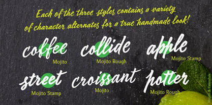 Mojito is a lively and vigorous calligraphic font based on a brush pen calligraphy. The author carefully rethought all of the character forms and created a very concise and clean outline that would look great in any size. Mojito has about 1,400 characters, including alternatives, ligatures, initial and final forms. That’s why letters are not repeated and their combinations look as natural as possible, especially in Cyrillic. For an all caps set in Mojito you can include the replacement of basic forms with the simplified ones, specifically designed for this purpose. Two additional styles imitate writing over a rough surface and a relief print. Mojito is perfect for packaging and advertising, food and beverages, cafes and restaurants, craftsmanship, children's books, magazines, etc. The font was designed by Zahar Yaschin and released by Paratype in 2017. Additional styles were created by Alexander Lubovenko.
 - DGS Art Deco Greek by dgsdesigns,
$10.00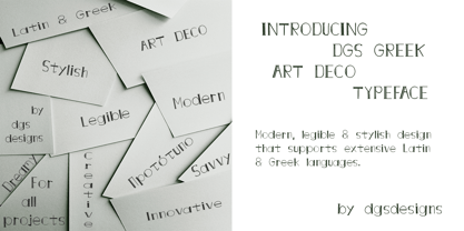 DGS Art Deco Greek is a unique typeface breaking all boundaries available in Latin and Greek scripts. It can be used in a wide range of projects including invitations, theatre and cinematic productions, branding, logos , adverts and much more.
 - Opal Orbit by Putracetol,
$22.00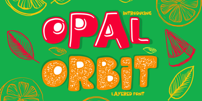 Opal Orbit is a layered font that captures the fun and whimsy of musical themes. This unique typeface is characterized by its bold, rounded letters and vibrant energy, making it a perfect choice for various applications. Whether used alone or combined with its nine thematic variations, Opal Orbit promises versatility and visual appeal. Crafted with precision, each letter exudes a playful aura, resonating with the themes of childhood and crafting. Its distinctive characteristics make it an excellent option for logos, branding initiatives, children’s themes, crafting projects, invitations cards, packaging designs, posters titles business communications greeting cards stickers children’s books magazines and other design needs aligned with its thematic elements.
 - Ciseaux by Wilton Foundry,
$29.00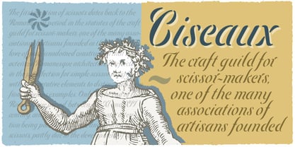 Ciseaux was inspired and is dedicated to the art of paper cutting. Early paper cutting artists were often royalty, but it soon became a folk art practiced by commoners whose cutouts decorated their homes. By the seventeenth century it had spread throughout the world. The Japanese called it Mon-kiri, the German's Scherenschnitte and Turkey even boasted a guild devoted to the art form. In Poland the designs were traditionally symmetrical and often used layers of colors to form pictorial collages. When Russian invaders confiscated scissors, villagers were found to cut their intricate designs with sheep shears! The art form later developed into cutting out elaborate designs of nature scenes and people, celebrating special occasions and even decorating legal documents. Ciseaux letterforms mimic paper cutting art in its shapes with a rather loose and almost joyous rhythm. The overall effect is somewhat earthy and natural yet it has an element of sophistication that cannot be ignored. Just like paper cutting, Ciseaux can be used for special occasions like invitations, brochures, identities, restaurant menus, and if you dare, some awesome looking paper graffiti. Available in TT, PS and Opentype for Mac and Windows.
 - Strata by Just My Type,
$25.00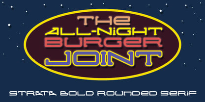 Big, expansive and flat on top; that’s a land formation called a mesa. “Mesa” was the first name for Strata Bold Rounded Serif, but it turns out it’s someone else’s registered trademark; in any case, if you need a bold, extended mono-height font that’s great for logotype, you could, as we used to say in the Mid-West, do a whole lot worse. SBRS is the final generation of an evolution that started with Mesa begating Mesa Bold which begat Mesa Bold Rounded which culminated in this evolutionary superior product. Use it!
 - Saxo Grammaticus by Jonas Stensgaard,
$8.00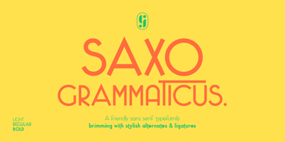 Saxo Grammaticus is a beautiful and friendly family that works great with family themes, elegant & classy material and professional settings. It's so versatile you'll find yourself coming back to it over and over for your projects, and that's whether you're looking to create logos, quotes, poster designs, brochures, packaging, anything with big letters like headlines, wedding invitations, holiday cards, advertisements, signs and on and on and on... There is a total of 107 ligatures and 76 alternates! That's plenty of options for any designer wanting to give those big letters a little extra wham bam!
 - Chivertta by Eurotypo,
$38.00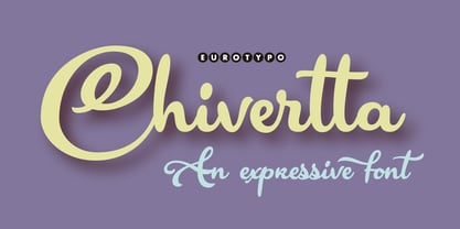 Chivertta combines elements of casual and modern aesthetics. The font is inspired by a logo discovered on the streets of Buenos Aires. One of Chivertta’s distinctive features lies in its careful design and its wide repertoire of ligatures and stylistic alternatives. This extensive collection offers a wealth of options, allowing designers to enhance their creative output, imbuing their designs with a greater sense of authenticity and realism. In essence, Chivertta transcends convention, offering a powerful tool for designers and resulting in designs that come out with authenticity and contemporary style.
 - Bike Decals JNL by Jeff Levine,
$29.00Bike Decals JNL captures the fun and nostalgia of the 1950s and 1960s when kids all around the country ran to their local five and dime or hobby store to purchase water applied decals. The "cool" thing would be to customize your bike, little red wagon or anything that would be fair game with various racing symbols, weird space creatures or other unusual images. In this font, Jeff Levine has put his own spin on some of the classic designs of yesteryear, drawing from scratch some of the most popular of their day. - Bs Monofaked by Feliciano,
$37.92Monospaced become very popular among graphic designers. Nevertheless, I’ve noticed that in most cases that designers use monospaced typefaces is not because of their particular features caused by the strict rules of design — all characters share the same advanced width — rather because of it’s ‘electronic derived’ appearance. So, I decided to create a typeface that keeps the characteristics that, in my opinion attract designers to this particular sort of types, but deliberately break the main rule: characters do not share the same width — but they they look like they do! Characters are better balanced compared to truly monospaced types, giving more even typographic color while used in text setting. One weight might enough to please electronic type lovers. Designed in 2000. - Radon by Sensatype Studio,
$15.00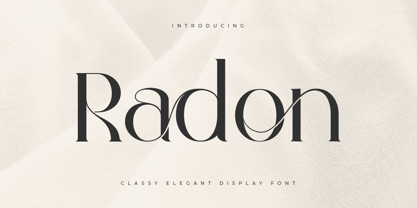 A Classy Elegant Display Font that we created special for elegant and Fashion branding needs that we created special for elegant branding needs, with extra ligature and alternates in unique shape will be ready to add value of your brand. It so nice to leverage designer or product owner that need solutions to make their design look more classy and modern. And specially for this font, We prepared any ligatures, and any alternate characters to help you create unlimited variations for your creative needs. Radon Display font ready with: Any options to get creative variations (combination of Alternate and Ligatures) Preview as a inspirations that you can do with Radon font Ready with Lowercase and Uppercase characters Wish you enjoy our font. :)
 - Sagitaria by Sensatype Studio,
$15.00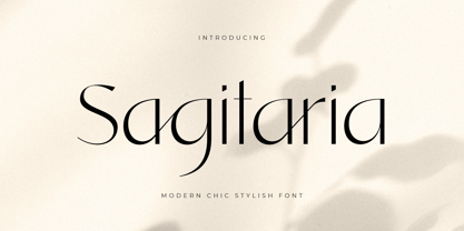 Santiago is A Modern Chic Stylish font that special crafted with love to make your brand standout. A new font that we created special for branding needs, with unique characters and awesome ligature characters are ready to add value of your brand. It so nice to leverage designer or product owner that need solutions to make their design look more beauty, chic and modern. And specially for Santiago font, We prepared any ligature characters to help you create unlimited variations for your creative needs. Sagitaria Modern chic font ready with: Any options to get creative variations (combination of Ligature) Preview as a inspirations that you can do with Sagitaria font Ready with Lowercase and Uppercase characters Wish you enjoy our font. :)