6,294 search results
(0.021 seconds)
- Obvia by Typefolio,
$29.00 Obvia, a geohumanist type for all media. Obvia appeared as a result of direct observation on typefaces classified as geometric and the plan to explore for the first time width axes - to be published soon - expanding its usability. The idea behind Obvia’s design was to create a distancing from geometrically pure shapes, in this case, square shapes. Then some details were added, such as subtle inktraps, concave endings of the stems and carefully drawn alternate characters, giving a ‘geohumanist’ tone to the font. This first family of Obvia has 9 weights ranging from Thin to Black with their respective italics, delivering a strong typographic identity, from the paper to the pixel.
 - Rumpled by Ingrimayne Type,
$9.00 TapedUp, Tinkerer, and Rumpled are based on the template I used for several letterbat fonts—fonts made of wrenches and bolts, hammers, or paper clips. TapedUp can be thought of as a font made from masking tape, and Rumpled is the same design but the tape pieces are wavy. Tinkerer is the same design but with elements that resemble what might happen if one constructed letters from Tinker Toys. All are caps only, but some of the shapes on the lower-case keys differ from the corresponding shapes on the upper-case keys. The Rumpled family has four members, the regular, an oblique, a shadowed, and an oblique shadowed.
 - Bentwood by Paragraph,
$22.00 This font takes its name and the overall shape from modern bentwood furniture, namely Scandinavian designs since the 1940s. The curved corners of the letterforms are practically hyperbolic, to convey the tension and strength of the bent plywood. These curves are meant to appear more dynamic than circular or elliptical segments of traditional sans serif fonts. The letterforms are simplified, without extra corners, stems, connections or hooks, yet remain legible at any size. Now at version 2, Bentwood contains Central/Eastern European, Baltic and Turkish character sets and more ligatures with Open Type functionality. Some minor corrections were made to letter shapes and positions, as well as to kerning and spacing.
 - Lancea by Asenbayu,
$15.00 Lancea is a fancy sharp serif font. Inspired by medieval roman writing combined with the sharpness of a lance, Lancea is packaged in a font that has sharpness in each letter with an elegant shape that has a strong appeal. Lancea also gives it a sophisticated feel with a sleek and clean serif shape. Lancea typography can help you complete various projects such as luxury brand logos, journals, business cards, headline, products, social media posts, web, etc. There is a decorative alternative style feature for uppercase letters. If you are involved in a project that requires fancy and professional writing, Lancea is perfect to assist you in completing it. Thank you!
 - Makro by Tokotype,
$50.00 Makro is a family of extended display sans fonts with an imposing profile with six weights, ranging from Light to Black. This series is distinguished by the excessively contrasting shapes and tones of the shapes on each opening joint and adjusted open counter. This font was designed primarily for large display text that demands more space, such as on out-of-home graphics, headings, titles, or another similar application. The most recent version of Makro supports variable weight and italic axes, as well as OpenType features such as alternatives, circled numbers, etc. In addition, the family has enlarged its linguistic repertoire to incorporate Cyrillic in addition to Latin.
 - Raw Delta Hand Street by TypoGraphicDesign,
$19.00 The typeface Raw Delta Hand Street is designed in 2012 for the font foundry Typo Graphic Design by Manuel Viergutz. The rough hand-made geometric typeface based on a triangle shape with a dirty DIY street style. 432+ glyphs incl. 50+ decorative extras like icons, arrows, dingbats, emojis, symbols, geometric shapes, decorative ligatures (type the word LOVE for ❤ or SMILE for ☺ as OpenType-Feature dlig) and stylistic alternates. For use in logos, magazines, posters, advertisement and packaging plus as webfont for decorative headlines. The font works best for display size. Have fun with this font & use the DEMO-FONT (with reduced glyph-set) FOR FREE!
 - Threepoints North by Type Associates,
$30.00 The Threepoints Series is the result of several years of work that bases three different sans serif type designs on one “shell”. Designed for optimal readability North, with its squarish shapes and rigidity are suggestive of an upright Swiss or Inserat typeface. The East variant takes on the look of another popular condensed grotesk with a softer, more rounded basic shape whilst maintaining the purpose of the original design. With minimal adjustments West leans towards more contemporary European designs. Although these are primarily display typefaces they function extremely well in text sizes in either upper or lowercase composition. Excellent for signage. Each variant comes with matched italic at no additional cost.
 - Rosabella by ParaType,
$30.00 Rosabella is a script typeface with plenty of decorative details — flourishes, swashes, twists and other elements, which impart to the face a gorgeous festive look. An unusually large number of alternates and ligatures make it possible to imitate live calligraphic writing. Lower case letters are divided into several stylistic sets from relatively modest variants to the most decorative contextually-dependent swash shapes. Besides that there are two sets of upper case letters — the second one contains larger and more complex shapes. Letters from the different stylistic sets can be used in a wide variety of combinations with the different levels of embellishments. Rosabella was designated for display material, greetings and advertising.
 - Kaligane by ArimaType,
$18.00 Kaligane is a type family designed with passion. A geometric typeface, first designed in a muscular black weight with a high-powered dynamic typographic aesthetic used in various communications, and later developed in a lighter weight where the shape exhibits some vintage-inspired proportions. With these diverse influences, typefaces allow for the use of impressive displays and effective logo designs as well as the use of more subtle editorials in body text - with a natural inclination for effective and powerful advertising. Sports typography typically uses italics for added dynamism and impact, and Kaligane complies by offering a choice of three alternative italic shapes with different slants.
 - Tola by Agnieszka Ewa Olszewska,
$18.00 Tola is a modern, reversed-weight, experimental display font with a spirit of the 70s. Looks better in large sizes but in smaller thanks to the thick bottom makes also interesting effect. It’s based on my letter shape experiment. I was drawing one single letter in the hope to find interesting results. I started Tola font with the letter “G” and based on that shape I created the rest of the alphabet. Tola looks good in modern graphics. It contains uppercase, numbers, and some punctuation signs, and is multilingual. Perfect for logos, posters, and social media graphics that need a super superhero with a sentimental touch.
 - Threepoints West by Type Associates,
$30.00 The Threepoints Series is the result of several years of work that bases three different sans serif type designs on one “shell”. Designed for optimal readability North, with its squarish shapes and rigidity are suggestive of an upright Swiss or Inserat typeface. The East variant takes on the look of another popular condensed grotesk with a softer, more rounded basic shape whilst maintaining the purpose of the original design. With minimal adjustments West leans towards more contemporary European designs. Although these are primarily display typefaces they function extremely well in text sizes in either upper or lowercase composition. Excellent for signage. Each variant comes with matched italic at no additional cost.
 - Signque by dayflash,
$31.99 Signque is a contemporary sans serif typeface based on geometric shapes. The persistent tension between precise lines and accurate curves as well as the ongoing contrast between open and closed contours constitute the main characteristics of this fresh and modern font family. While unconventional letterforms make up signque’s distinctive appearance, extended widths, tall x-heights and clear shapes provide good legibility and nice readability. With its unique look and feel, signque will perform outstanding for headlines as well as for almost any other type of analogue and digital application. The signque font family comes in nine weights and includes unique letterforms as well as extensive ligatures, fractions, and figures.
 - SK Coisa by Shriftovik,
$32.00 SK Coisa is a decorative slanted geometric typeface with a daring character. Its sharp shapes and angles, and indeed the whole structure, scream for its extraordinary nature. It is unusual and stands out, and most importantly, it does not hesitate to be not like everyone else. SK Coisa is built on the contrast of rounded and sharp geometric shapes, and because of it, its appearance is impossible to forget. The typeface has both capital and lowercase characters. It supports the basic and expanded Cyrillic and Latin alphabet, as well as many other languages and character sets. If you want your design to scream, then SK Coisa is exactly what you need!
 - Threepoints East by Type Associates,
$30.00 The Threepoints Series is the result of several years of work that bases three different sans serif type designs on one “shell”. Designed for optimal readability North, with its squarish shapes and rigidity are suggestive of an upright Swiss or Inserat typeface. The East variant takes on the look of another popular condensed grotesk with a softer, more rounded basic shape whilst maintaining the purpose of the original design. With minimal adjustments West leans towards more contemporary European designs. Although these are primarily display typefaces they function extremely well in text sizes in either upper or lowercase composition. Excellent for signage. Each variant comes with matched italic at no additional cost.
 - Vernon by Giles Edwards,
$25.00 Vernon’s inspiration came while researching and investigating a 'legible' typeface design for tangible purpose. The main characteristics of ‘Vernon’ can be seen in the slightly modulated strokes that reference the natural and friendly humanist proportions of the humanist hand, with open interior letterspace characteristics. The subtle detailing and finishing of strokes and junctions – seen in the curved tail of the lowercase ‘l’ and the head serif of the lowercase ‘i’, create a smooth rhythm along the baseline. Utilizing the ‘contextual alternative’ feature of OpenType, Vernon substitutes select characters in words with word-shapes that may cause visual confusion to some readers. Vernon uses subtle character differentiation in the detailing of the inner-shape / counter space from similar letter shapes (for example: ‘p’, ‘d’, ‘g’ and ‘q’) to assist in creating the contextual alternate designs. Vernon is recommended for use as a text typeface, as it performs well at small text sizes (12 point size and below) intended for continuous reading of printed instructional and presentational information, especially where an inclusive audience demographic is required.
 - Polydot by Christoph Reichelt,
$16.00 Polydot is an experimental Font, built following its own rules. It has interesting letter shapes, making it a perfect choice for creative packaging and magazine design. At the same time it makes a beautiful, neat but vivid text pattern when used in smaller sizes: Use it for children’s books, food and beverage, cosmetics or health topics. Each Glyph is based on at least one dot on the body line, and has up to two more on the lower case level and the ascender level. Since they have the same size and are on the same height on all letters, no matter what weight and shape, these dots give a strong structure to the typeface, allowing for dynamic and easy letter shapes, inspired by brush strokes. It’s not a hand font but it has the dynamics of one. It has no serifs but provides the structure and readability of a roman type. It has an extensive choice of weights, but it’s characteristic dots have the same size and it has the same tracking through all weights. Try it, it’s special.
 - Core Slab M by S-Core,
$25.00 Core Slab M is the serif companion to Core Sans M (Text family of the month. May, 2013). This font family has open and square letter shapes, and overall rounded finishes and serifs provide a soft and friendly appearance but also it is strong in headline. Simple and modern shapes with a tall x-height make the text legible and the spaces between individual letter forms are precisely adjusted to create the perfect typesetting. Core Slab M Family consists of 2 widths (Condensed, Normal), 7 weights ExtraLight, Light, Regular, Medium, Bold, ExtraBold, Heavy), and Italics for each format. Combination fonts such as Core Slab M Ice, Berg and Iceberg are also available. Each font includes support for Superiors and Inferiors, Fractions, Tabular numbers, Arrows, Box drawings, Geometric shapes, Block elements, Mathematical operators, Miscellaneous symbols and Opentype Features such as Proportional Figures, Tabular Figures, Numerators, Denominators, Superscript, Scientific Inferiors, Subscript, Fractions and Standard Ligatures. We highly recommend it for use in books, web pages, screen displays, and so on.
 - Gainsborough by Fenotype,
$30.00 Gainsborough - a clean-cut display pack. Gainsborough is a display combo pack of three styles and extra swooshes. Gainsborough fonts are straightforward with characteristic clarity. All the three fonts are designed to play together. Gainsborough is very easy to use. Gainsborough Pen is a clear script inspired by handwriting with pigment pen but polished clean to be legible and inviting. It’s equipped with Contextual Alternates and Standard Ligatures for smooth flow and connections between letters. In addition there’s Stylistic and Swash Alternates for standard characters. Gainsborough Sans is a sturdy street-sans ready for action. It’s has zero contrast and angular geometric shapes. It’s great for bold headlines. Gainsborough Serif follows pretty much the same proportions but with the serifs and a little bit of contrast and round shapes. Try combining Gainsborough Swooshes with Gainsborough Pen - type one character with Swooshes in the end of a word typed with Pen and you’ll have an ending swash reaching below the word. There’s different shapes and length swooshes + a couple of center balanced ornaments.
 - Balance by Victory Type,
$12.00The three typefaces that make up the Balance font set are legible, funky and stylish. Every character has been spaced and designed on a uniform geometric grid to insure true typographic "balance." There are only two shapes that make up every character: a parallelogram and a quarter circle. This design renders Balance a distinct family of fonts which are appropriate for all documents. Balance Regular is legible, funky and stylish. Every character has been spaced and designed on a uniform geometric grid to insure true typographic "balance." There are only two shapes that make up every character: a parallelogram and a quarter circle. This design renders Balance Regular a distinct font that is appropriate for all documents. Balance Light is legible, funky and stylish. Every character has been spaced and designed on a uniform geometric grid to insure true typographic "balance." There are only two shapes that make up every character: a parallelogram and a quarter circle. This design renders Balance Light a distinct font that is appropriate for all documents. Balance Unicase is legible, funky and stylish. Every character has been spaced and designed on a uniform geometric grid to insure true typographic "balance." Each letter, in this unicase version of Balance uses a single character height. There are only two shapes that make up every character: a parallelogram and a quarter circle. This design renders Balance Unicase a distinct font that is appropriate for all documents. - TT Espina by TypeType,
$19.00 Addition to the collection of TypeType display fonts! TT Espina useful links: Specimen | Graphic presentation | Customization options TT Espina is a display antiqua with expressive serifs. Inspired by the historical shape of the letter O, which took on a diamond shape due to print quality, the designers created a modern typeface with high contrast between horizontals and verticals. TT Espina is yet another proof that antiquas can be stylish and expressive display fonts suitable for modern projects. TT Espina will look harmoniously in headlines of posters or billboards, in gallery and exhibitions design, in large-format printed materials or on websites. The font is easily distinguishable among other antiquas by its high contrast, expressive and large serifs, closed aperture and diamond-shaped circles. TT Espina’s characters are quite narrow, which adds to the materials designed using the font a special aesthetic. It makes you to look closely into each letter, so the headlines set in TT Espina will definitely be read. A full set of different icons is a nice addition for designers who will work with a new typeface. TT Espina consists of 7 typefaces: 6 romans and 1 variable. Each typeface has 648 glyphs. The font family has 21 OpenType features, including changing the shape of some characters (Q, g, j), the possibility to replace characters with high-set diacritics with characters with low-set diacritics, which is convenient for poster design.
 - Cindie Mono by Lewis McGuffie Type,
$34.99 Cindie Mono is a multi-width display font. Six different widths – A (condensed) through F (super extended) – mathematically correspond with one-another creating a stackable type family. Each face contains all caps full West, Central and East European language support. All diacritics and marks are done in a hairline to add style and contrast. And Cindie Mono is ideal for posters, headlines and display lettering. The inspiration for Cindie Mono came from the lettering styles on optometrists sight-test posters. Then through several stages of development the overall concept for Cindie became of a half-broken Commodore64 and the computer from the 1985 movie 'Weird Science' hooked up to a dot-matrix printer spitting out reams of mechanical but distorted mono-lettering all the while an old modem you can't seem find keeps beeping and beeping and beeping...
 - Kush by Our House Graphics,
$17.00 Kush is what happens when you let your fonts sit around watching cartoons and eating cake and ice-cream all day�When their vectors are freed from all constraints and allowed to follow their bliss. Kush has filled its insides to just the other side of contentment and comes to you on a sugar high and with a head full of Looney Tunes. And... It�s two ply! A two-layered display face from Our House Graphics with a plush, organic feel, Kush has 370 glyphs, over two dozen standard and discretionary ligatures, stylistic alternates and a few surprises. Kush Fat and Kush Shade work well independently but together they become a two colour, two layer font. Simply type some text in Kush Shade, copy it and paste it back on top of your original text. Then change the top layer to Kush Fat and adjust the colours to your liking. For best results, use default settings for kerning and tracking (letter spacing).
 - CHILD & MOMSKY by Rhd Studio,
$15.00 Style and Grace personified - say Child Momsky. This typeface has two main styles, Regular and Italic, that are designed to work elegantly in unison and apart. The serif has a boldy different ' f', which sets it apart from regular serifs.....as Child Momsky likes to stand out from the rest. A regular 'f' is included in its alternates, and a extra font style with a regular f is included for projects that require a more staid elegance. The Italic style is dreamy, sultry and light-footed - a perfect partner for the more serious serif. Use them together or apart for stylish, stand-out type designs and projects. For those of you who do not have access to Opentype Software, such as Canva Users, a separately available 'extra letters' font set will be available for purchase soon. Language Supported : Danish, English, French, German, German (Switzerland), Italian, Low German, Luxembourgish, Norwegian Bokmål, Norwegian Nynorsk, Portuguese, Swedish, Swiss German. Enjoy
 - Disquete by Tipos do aCASO,
$23.90Inspired by the shape of a 3.25" floppy disk this unicase font was designed from the combination of three square modules. Made in 1998 Disquete is one of the first projects of Buggy, founder of the Brazilian type foundry Tipos do aCASO. - P22 Mexican Relics by IHOF,
$24.95 Mexican Relics is a collection of over 100 dingbats in font format based on images found on a variety of clay stamps primarily from pre-Columbian Mexico. This font brings ancient artwork featuring fantastic animals and geometric shapes into the computer age.
 - Chamfer Serif JNL by Jeff Levine,
$29.00 A set of vintage wood type printing blocks yielded the alphabet which was to become Chamfer Serif JNL. With its heavy vertical serifs and interesting character shapes, the design is unique when compared to the more familiar wood type offerings of the past.
 - La Volicia by Prominent and Affluent,
$30.00 A modernist typeface with powerful elegance. This bold and sophisticated font captures the essence of idealistic beauty through its tension, balance, and unexpected shapes. Inspired by the ideals of modernism, creating a distinct look that is sure to make a lasting impression.
 - TOMO Nara by TOMO Fonts,
$20.00 TOMO Nara adds plenty of joy to any logo, layout or UI. Geometric shapes and a funny look come together in this font – thus, Nara might be the perfect choice for toys, books, packaging, posters or even webapps! Let’s have some fun!
 - Gersang by Linecreative,
$16.00 Gersang is a retro groovy font with rounded corners that is perfect for designing with a retro style. With bold style and unique shapes, Gersang is the perfect choice for those seeking a retro font that will create eye-catching and memorable designs.
 - Baroque Grotesk by SilverStag,
$19.00 Introducing Baroque Grotesk, a font that seamlessly weaves the grace of baroque aesthetics into the structural simplicity of geometric shapes. It's a typeface that's as comfortable on the grandest stages as it is in contemporary digital spaces, embodying the essence of timeless design.
 - Varly by moretype,
$16.00 Varly is a single weight handwritten style font. It's slight slant and dynamic shapes create a font that is honest and charming but still lively enough to add flare. Varly can bring a personal touch to any project it is used in.
 - Vivala Sans by Johannes Hoffmann,
$15.00 The character of Vivala Sans Round is modern and stylish with elegant squarish shapes. The family includes five weights. A large x-height is ideal for titles and body text. The extended character set supports languages like Western, Central European, and Eastern European.
 - MBF Nanomaton by Moonbandit,
$19.00 Nanomaton is a thin modern minimalist sans serif display font, with a lot of geometric shape and a bit of futuristic scifi flair. This typeface is versatile enough to be applied to multi-purpose projects. Nanomaton emphasize on clean, clarity and minimalism.
 - Nearo Rounded by Digitype Studio,
$20.00 Nearo Rounded features five high-contrast font styles and thick and thin round shapes making this font unique. Nearo Rounded can be applied to various formal projects, including logos, magazines, books, packaging, fashion, cosmetics, invitations, novels, labels, greeting cards, and other advertising.
 - Boysand by Linecreative,
$16.00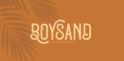 Boysand is a display font that has a modern vintage style, and is complete with uppercase, lowercase, and ligatures to provide unlimited design possibilities. This font works great for posters, logos, magazines, covers, banners, t-shirts and headers, or even large scale artwork.
 - Eccentric Sans JNL by Jeff Levine,
$29.00 An instructional page from a vintage lettering book displayed online showed the construction of an Art Deco sans design with varying widths and stylized character shapes. This was the basis for Eccentric Sans JNL, which is available in both regular and oblique versions.
 - Nergisha by Sealoung,
$25.00 Nergisha is an elegant and trendy serif font. It features uniquely shaped characters and it will most certainly elevate each of your favorite creations. This font is PUA encoded which means you can access all of the glyphs and swashes with ease!
 - Valentine Style by Yoga Letter,
$14.00 "Valentine Style" is a display font decorated with heart-shaped letters and is very easy to use. This font is equipped with uppercase, lowercase, ligatures, numerals, punctuations and multilingual support. Very suitable for valentines, weddings, stickers, romantic moments, spring, winter and others.
 - Brandold by Krisp Designs,
$18.00 Brandold is based on the repetition of one shape, the equilateral triangle. Using these triangles as pixels I built a medieval-like font that looks new, but follows an old aesthetic. I chose to make this font because I hadn’t seen anything similar.
 - Cross Stitch Ornaments by Gerald Gallo,
$20.00 Cross Stitch Ornaments is a collection of classic stitched geometric shapes, plants, birds, and animals. There is an assortment of 47 ornaments located under the character set keys. All ornaments that are asymmetrical have a flopped version located under the shift+character key.