10,000 search results
(0.019 seconds)
- Antoine by Anastasia Kuznetsova,
$19.00 Introducing Antoine — is a vintage retro display typeface. The three font combinations I launched are very compatible if for the victorian classic design concept. As for if the font was worn by itself, without combinations are also brave!! In addition to many get unique character, luxury, brave and elegant. You also have a collection ornament, very suitable if in the gradient. This font is also very easy to use with other design programs or with out design program. Antoine Typeface is perfect for beverage label design project. coffee label. logotype design, badges, classic wedding concept. victorian design concept and so on. gig poster, letterhead, droop cap, titles, and any artworks. Now it’s your time to go crazy and explore the uniqueness of this typeface!! I invite you to familiarize yourself with the preliminary images and hope that you will be imbued with my vision of this creative font, which, I am sure, will be suitable for all the interesting projects you are working on. Fonts can be opened and used in any software that can read standard fonts, even in MS Word. No special software is required to get started. It is recommended to use it in Adobe Illustrator or Adobe Photoshop. Made with love and magic ♡ Thank you for reading it, and do not hesitate to send me a message if you have any questions! ~ Anastasia
 - Maria-Ballé-Initials by ARTypes,
$35.00Maria-Ballé-Initials are derived from the Ballé series I made by the Bauer foundry. When set at 60 pt this font will match the size of the original 48-pt Didot design. - DeBorstel Brush Pro by Ingo,
$49.00 A personalized cursive written with the pointed brush The strange name of this font means nothing other than ”brush,“ but only the Dutch understand it. The typeface is spirited, amusing and flashy. I made the handwritten original of DeBorstel Brush quickly and without interruption with a pointed brush. In the capitals, DeBorstel Brush appears to be almost too balanced for handwriting. In contrast, the lower case letters are intentionally very individual and uneven. A bit more life is added to the typeface with ligatures activated which are constructed with alternative letter forms — and as a result, a number of problematic letter-combinations are improved. And if this typeface is still not lively enough for you, the additional alternative character forms a e g i j l n o s t u z are available with the Open Type-Function ”Discretional Ligatures“. DeBorstel Brush is suitable for all European languages. It includes ”Unicode Latin Extended-A,“ for Central and Eastern Europe incl. Turkish, and even Cyrillic and Greek, too.
 - Magilla by Dora Typefoundry,
$17.00 Magilla is a new elegant serif font that will add a touch of luxury and style to your projects. This is a very versatile font that works well in large and small sizes. Perfect for editorial projects, magazine headers, Logo designs, Clothing Branding, product packaging, and showcasing masculine and feminine qualities. Magilla is equipped with uppercase, lowercase, numbers and full punctuation + Multi language support and PUA-encode. A SUMMARY OF WHAT'S INCLUDED: Magilla Regular Magilla Bold Magilla Outline To activate the OpenType Stylistic alternative, you need a program that supports OpenType features such as Adobe Illustrator CS, Adobe Indesign & CorelDraw X6-X7, Microsoft Word 2010 or a later version. Features: 3 Font weight Uppercase & Lowercase letters Alternative & Ligature Styles Numbers & Punctuation Characters with accents Supports Multiple Languages This type of family has become a work of true love, making it as easy and enjoyable as possible. I really hope you enjoy it! I can't wait to see what you do with Magilla! Feel free to use the #Dora Typefoundry tag and # Magilla Serif font to show what you've done.
 - DT Partel by Dragon Tongue Foundry,
$9.00 DT Portal: This stylised, partially serifed font, made with a slightly rounded square form, may have been inspired initially by old cathode ray tubes and computer screens. Although not intended to be purely a ‘tech’ font, it can have a strong tech feel to it. More suited to being a headline font than body text. It also appears to have a monospaced look to it, since most letters, (other than letters like ‘i, l and t’), do have the same width. There is some automatic contextual shape adjustment happening in places, to avoid taking up too much space, so contextual ligatures should be turned on. As is the case with most of my fonts, when given the choice, ‘metric’ spacing should be used in preference to ‘optical’. Initially this font was going to be called ‘DT Portal’, because its form was similar to that of a window or doorway. But due to other fonts already having that name, I chose to rename it as ‘DT Partel’, for no reason other than it is only a very small change visually.
 - Bembo Book by Monotype,
$34.99The origins of Bembo go back to one of the most famous printers of the Italian Renaissance, Aldus Manutius. In 1496, he used a new roman typeface to print the book de Aetna, a travelogue by the popular writer Pietro Bembo. This type was designed by Francesco Griffo, a prolific punchcutter who was one of the first to depart from the heavier pen-drawn look of humanist calligraphy to develop the more stylized look we associate with roman types today. In 1929, Stanley Morison and the design staff at the Monotype Corporation used Griffo's roman as the model for a revival type design named Bembo. They made a number of changes to the fifteenth-century letters to make the font more adaptable to machine composition. The italic is based on letters cut by the Renaissance scribe Giovanni Tagliente. Because of their quiet presence and graceful stability, the lighter weights of Bembo are popular for book typography. The heavier weights impart a look of conservative dependability to advertising and packaging projects. With 31 weights, including small caps, Old style figures, expert characters, and an alternate cap R, Bembo makes an excellent all-purpose font family. Bembo® Book font field guide including best practices, font pairings and alternatives. - Riposte by Scholtz Fonts,
$15.00 Riposte is a powerful and carefully-integrated handwriting font. You should use it where you want to create a strong impact but want to avoid heavy, boxy, formal fonts. The characters were designed for excellent letter-spacing without kerning, but you can switch kerning on to add some subtle enhancements to the letter-spacing. Riposte is readable, even at quite small sizes. It was designed to be used as a mix of upper and lower-case letters. Do not make text using only uppercase letters since the spacing of the uppercase letters was optimized for use together with lowercase letters. So remember, when you want your text to have the powerful impact of the master swordsman with his balanced stance and vigorous movement -- try Riposte. The font is fully professional: carefully letterspaced and kerned. It contains over 235 characters - (upper and lower case characters, punctuation, numerals, symbols and accented characters are present). It has all the accented characters used in the major European languages. Riposte works well in professional layout application packages as well as in word-processing packages such as Microsoft Word® that do not support professional kerning.
 - Camy by Scholtz Fonts,
$9.50 I wanted to create a "handwriting" font which could be used professionally. I have often needed such a font with a variety of weights and styles for a particular project and have had to resort to mixing fonts, creating a rather messy, amateur job. Camy is named for a little village in South West France where I did much of the initial work on this font. Camy is ideal for contemporary display work, comes in ten styles, and has a contemporary appeal with its casual, easy to read letters. Camy was designed as a total professional package for designers looking for a handwritten font suitable for all kinds of contemporary display work: the idea being that once you have the Camy Professional Pack you don't have to waste time searching for other handwritten fonts. The Family: LIGHT -- NARROW - light weight, condensed width, delicate line -- MEDIUM - light weight, delicate line -- WIDE - light weight, expanded width, delicate line NORMAL WEIGHT -- NARROW - of medium weight and condensed width - perfect for limited space -- MEDIUM - of medium weight -- WIDE - of medium weight and expanded width BLACK - for best readability -- NARROW - condensed width for bolder statements in small areas without losing legibility -- MEDIUM - for bolder statements -- WIDE - expanded width for bolder statements FAT -- WIDE - for maximum impact Use a combination of styles for product branding, book covers, invitations, greeting cards. The Camy combination works well for both headings and body text. Camy contains over 250 characters - (upper and lower case characters, punctuation, numerals, symbols and accented characters are present). It has all the accented characters used in the major European languages.
 - A10 STAR Black by Mogtahid,
$90.00 As a former typographer / lino and calligrapher, Abdallah NASRI had recourse to the nature of the idea of an "INTERCHANGEABLE" collection for types who in reality offer a police collar parallel to the complex typeface of the variable. Our fashion is outlined by a simple calculation defined by superimposed geometric circles where we used only its ¼ to fill the need for the angles of each of our letters. Always with the idea of having in the same allocated space, the same letter nested as many times as fat example from Hairline to Ultrabold. It was in this way that I was able to obtain a large number of styles, with a very interesting kerning which prompted me to extend the font to other languages with +1000 characters and +600 glyphs. I have always been treasured by the all in "1". I assure you that I sought to obtain the maximum of Visibility for a use S / Titling TV, WEB Pages and Typography Typo; once the difficult thing was done, I was rewarded by a font that has countless typographic openings for the world of graphics with 10 styles of weights in hand, and again I am happy to have personalized the charm of each letter by new details; I do not regret the time spent on thinking about it so that it is useful and at the same time pleasant as a working tool, finally profitable in all sectors and more multilingual, without forgetting that it is a family of inter change c ' is to say: All the types occupy the same height of the body and it is their fats which differs in the same space width of each of the letters, therefore no interference in spacing. Here, an additional alternative, a participation of a septuagenarian in the service of the love of modern digital typography. • TEST: At 50% screen in a body of 12 pixels, the A10 STAR Alphabet subjected to a test, has a clear Readability / Visibility. • P.S: A10 STAR integrates Diacriticism in all its forms. Texte d'origine : Abdallah NASRI a eu recours en étant ancien typographe/lino et calligraphe à la nature de l'idée d'une collection "INTERCHANGEABLE" pour les types qui en réalité offre un collier de police parallèle à la fonte complexe du variable. Notre mode est esquissé par un calcul simple défini par des ronds géométrique superposés où on a utilisé seulement son ¼ pour garnir le besoin des angles de chacune de nos lettres. Toujours dans l’idée à avoir dans le même espacement alloué, la même lettre imbriquée autant de fois de graisse exemple du Hairline à Ultrabold. C’est de cette manière que j’ai pu obtenir un grand nombre de styles, avec un crénage très intéressant ce qui m’a incité à étendre la police à d’autres langues avec +1000 caractères et +600 glyphes. J’ai toujours été prisé par le tout en « 1 ». Je vous assure que j’ai cherché à obtenir le maximum de Visibilité pour une utilisation S/Titrage TV, Pages WEB et Maquette typo ; une fois le difficile fait, j’ai été récompensé par une police qui possède d’innombrable ouverture typographique pour le monde du Graphisme avec comme atout en main 10 styles de graisses, et encore je suis content pour avoir personnalisé le charme de chaque lettre par des détails nouveaux ; je ne regrette pas le temps passé dessus à réfléchir pour qu’il soit utile et à la fois agréable comme outil de travail, enfin profitable tous secteurs confondus et en plus multilingue, sans oublié que c’est une famille d’inter change c’est-à-dire : Tous les types occupent la même hauteur du corps et c'est leurs graisses qui diffère dans un même espace largeur de chacune des lettres, donc aucune interférence dans l’espacement. Voilà, une alternative supplémentaire, une participation d’un septuagénaire au service de l’amour de la typographie numérique moderne. • TEST : A 50% d'écran dans un corps de 12 pixels, l'Alphabet A10 STAR soumise a un test, présente une nette Lisibilité / Visibilité. • P.S : A10 STAR intégre la Diacritique dans toutes ses formes.
 - Bloemgracht by Hanoded,
$15.00 In the old Amsterdam neighborhood of 'De Jordaan', you will find a canal called Bloemgracht (Flower Canal). For many years, a coffee store called Schildmeijer could be found here. Their paper coffee bags and advertisements sported a hand made font which I have tried to recreate and the result is Bloemgracht typeface. It is an all caps art deco font, quite angular, but very legible and distinct. Bloemgracht comes with extensive language support.
 - Angelina Script by Din Studio,
$25.00 Introducing Angelina Script - Beautiful Handwritten. It's made with a naturally handwritten and modern style. Angelina font best use for wedding, branding, logotype and quotes. This includes both a Regular version and a Dots version. How to access alternate glyphs? you can see it on this link ( http://goo.gl/1vy2fv) I hope this font can meet your design needs. Fell free to contact me in message or direct email donis4design@gmail.com. Happy Design :) Thank You, Donis
 - Same Old Joke by Bogstav,
$15.00 Same Old Joke is a happy and handmade font. Use it for anything that needs a hand lettered expression. Works well with prints, cards, packaging or perhaps even a poster of your favourite chocolate! Each version of the font is full of personality, and was carefully handdrawn to keep both the legibility and the handmade feeling. I put in ligatures to substitute the most common letter repeating - to make it look even more handmade!
 - Northen by Garisman Studio,
$15.00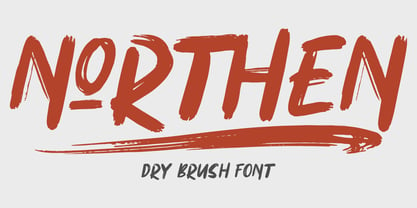 Northen combines attractive curves with a fresh urban edge; delivering a stylish script which is guaranteed to add an eye-catching appeal to your logo designs, brand imagery, handwritten quotes, product packaging, merchandise & social media posts ADVANTAGES: - Simple installation - Work for PC and MAC - Multilingual Support - EXTRA SWASH - Detailed dry brush I hope you enjoy this font. If you have questions, don't hesitate to give me a message :) Thank You! - Garisman Studio
 - Folkner by Garisman Studio,
$18.00 Folkner born from an inspiring vintage display. This font gives a feel of a vintage, classic, old, and based on handmade. With messy line stamp touch in Folkner Stamp give you a vintage taste. Already PUA Encoded and I think this font is perfect for people looking for vintage aesthetic or logo-type. Suitable for any graphic designs such as branding materials, t-shirt, print, business cards, logo, poster, t-shirt, photography, quotes .etc.
 - WTF Strange Crispy by Wasabib Type Foundry,
$15.00 WTF Strange Crispy - is a playful bounced display font that inspired by retro typeface, I make it with 100% hand drawn to get the artistic look. Perfectly suited for quotes, branding, logos, and social media posts, “WTF Strange Crispy” has a unique touch to every design, ensuring it stands out and makes a lasting impact. Illuminate your content with the enchanting allure of “WTF Strange Crispy” font, and let your creativity shine in every project.
 - Swing Era JNL by Jeff Levine,
$29.00 Hand lettered Art Deco lettering for the title on the cover of the 1930s-era song "And I Still Do" provided the inspiration for Swing Era JNL. A bold, casual and friendly typeface, it features an intersecting inline through some of the characters. One could almost picture the hottest big band of the day promoted on a lobby card with this alphabet, beckoning all to come on in and "cut a rug".
 - Sabille by Pen Culture,
$15.00 Proudly present "Sabille - Modern Serif Font" Sabille is a modern serif font that come with awesome alternate that perfect for an kind design project such a branding, cricut project, invitation, embroidery and many others. I really hope you enjoy it – please do let me know what you think, comments & likes are always hugely welcomed and appreciated. More importantly, please don’t hesitate to drop me a message if you have any issues or queries. Thank you
 - Peaky Rangers by Mega Type,
$12.00 Introducing "Peaky Rangers". Peaky Rangers is a handwritten script font in a modern calligraphy style, with a fun and modern look! Peaky Rangers are perfect for elegant home designs, wedding decorations, invitations, cricut projects, crafts, svg files, shirts, quotes, greating cards, branding, prints, logos, and more! Have fun using Peaky Rangers!!! I really hope you enjoy it! Feel free to follow, like and share. Thank you so much for checking out my shop!
 - Brilliant Signature by Arendxstudio,
$18.00 Brilliant Signature is a handwritten font which is very elegant and modern for you to use and your design interests, be them for logos, branding names, posters, podcasts and so on. There it is! I really hope you enjoy it - comments & likes are always welcome and accepted. More importantly, don't hesitate to send a message if you have a problem or question. Now just read this, go there and make it happen :)
 - JennerikInformal by Ingrimayne Type,
$9.95 JennerikInfml is a friendly, casual typeface family that has the appearance of neat hand printing. It began as the italics to Jennerik, but I ended up separating it and giving it a different set of upper-case letters. Although its lower-case letters were designed as italics, it was originally published in 1992 with three weights as upright letters without a slant or skew. The revision of 2020 added the oblique or slanted styles.
 - Fledermaus by Hanoded,
$15.00 Fledermaus (meaning 'Bat' in German) was a cabaret theater from Vienna. The original Jugendstil decor was designed by Josef Hoffman and several posters, advertising performances, were designed by other members of the Vienna Workshop. Fledermaus font was based on a 1907 poster by Bertold Löffler. Since only a few glyphs were available, I designed the missing ones myself. The lower case consists of small caps and the font comes with extensive language support.
 - Midas Style by Sensatype Studio,
$15.00 Midas Vintage Retro Ligature Font is a well-balanced contemporary font with a fancy, unique, and versatile vintage serif, font that you can combine to get any variations and unique shapes easily just in seconds with choose alternates of them. I What's Included: Character set A-Z Uppercase & Lowercase Numerals & Punctuation Accented Characters (West Europe) Stylistic alternates Works on PC & Mac Recommended using Adobe Illustrator or Adobe Photoshop. Wish you enjoy our font. :)
 - Front Row JNL by Jeff Levine,
$29.00 Front Row JNL is an all-caps reinterpretation of Morris Fuller Benton's 1937 type design "Empire", and is available in both regular and oblique versions. As is often the case when a digital type font is based on a few letter examples found on a printed sample [in this case, the sheet music of the 1946 Guy Lombardo hit "What More Can I Ask For"], the missing characters were drawn from scratch.
 - God Hells by madeDeduk,
$12.00 Really excited to introduce God Hells is a classic blackletter font, made with a stylish impression and supported by alternative with references to various letters that I combine. There's come with 2 style font and suitable to create any branding, product packaging, invitation, quotes, t-shirt, label, poster, logo etc. Feature Uppercase & Lowercase Number & Symbol International Glyphs Multilingual support Alternative Ligature Feel free to drop us a message any time Hope you enjoy it.
 - Brundox by Gian Studio,
$15.00 Brundox super bold font Inspired by vintage style, but made a little more modern. In combination with a solid and clean regular san serif type, you can explore the designs you need for your typographic projects. This font pack is perfect for magazines, titles, invitations, movies, product designs, brands, and other design projects. in: I really hope you enjoy using Brundox font, please don't hesitate to drop me a message if you have any question :)
 - Headcorps by Almarkha Type,
$29.00 Headcorps is a Serif military style font, first conceptualize was inspired by the classic vintage military stencil design . I wanted a typeface that could be a solid base for any military inspired project Headcorps Fonts can be used for wallpaper, pattern fills, web page background, surface textures. Perfect for making army posters , scrapbooking,invitation cards, label stickers, stationary, gift wrap, packaging, clothes, buttons, pendants, holiday gifts, print on fabrics and so much more.
 - Notedinary by Invasi Studio,
$17.00 Notedinary comes with elegant script calligraphy with a personal touch. Take inspiration from diary notes. A delicate modern calligraphy script ideal for weddings, elegant branding, and adding a soft feminine touch to your projects. Notedinary comes with alternates and supports 60+ Latin-based languages. In the previews, I have paired Notedinary Script with the free Cormorant font. Features: - Total 204 Glyph - Uppercase & Lowercase - Numerals & Punctuation - Alternates - Multilanguage Supports 60+ Latin based languages
 - Shiny Ink Display by Lloyd David Designs,
$14.99 Hi there, thanks for looking at my first typeface. It began as one of my original sketches back in 2019 as a freelance graphic designer trying to create unique letterforms that I could use for posters or websites with other possible use cases in mind for commercial use. The sketches were then passed on to and worked on with Vladimir Tsagolov who has more experience in creating professional typefaces, the experience for me was invaluable, and I have many more typefaces I'm now working on. Shiny Ink Display is a collection of hand drawn fonts based on the flow of reflective viscous ink with 7 styles, some styles can be interchangeable and used on top of each other. For example, Shiny Ink Display Plain, can be used with Shiny Ink Display Plain Lined to create shadows underneath it, at angles not available with the Shadow styles you'll see in the font collection. Shiny Ink Display has various use cases, maybe even infinite, but more specifically for posters or websites with large text, though it bodes quite well at smaller sizes, and is visually appealing to its viewers as long as it's at a legible font size. When it comes to font pairing, Shiny Ink Display works especially well with Monospace and sans-serif fonts. You can check the poster examples on this page to help you imagine what you could do with the font styles. I also had in mind manufactured products, but I could leave that to you to create your ideas with the available font styles. In regards to languages or typing on a keyboard, most of the English/European latin or cyrillic language keys are supported, so you'll have lots of glyph characters to play with for a number of ideas you may have. All the best with your projects using my fonts, if there are any issues, don't hesitate to contact me for support: lloyddaviddesigns.co.uk - Lloyd David
 - Amberday by Richarts,
$4.99 Amberday is a modern display serif typeface to be used more than just as a header font. When I was creating this typeface my first though was to create a light font but strong enough to stand as a header font. Amberday is a perfect typeface to use for logo design, webdesign, header design, typedesign, posters and many more. Amberday family includes eight weight starting with Thin and ending with a Heavy style. Each style includes kerning, ligatures and alternates.
 - Winterberry by Hanoded,
$15.00 Winterberry (Ilex verticillata) is a species of holly, native to the USA and Canada. I thought it was a rather cool name (pun intended) for a messy script font made during a cold spell. Winterberry was created using Chinese ink and a crappy brush - hence its messy appearance. Use Winterberry on your alt-Christmas invitations, your fantasy novels, your rock albums or your website! You’ll love it! Comes with a bunch of diacritics and some ripe double letter ligatures as well.
 - Chenko by Studio K,
$45.00 Chenko is a nod to Alexander Rodchenko the Russian Constructivist artist and designer whose poster work is characterised by its stark, stripped down typography and bold, geometric graphics. It was truly revolutionary in its day, and continues to be influential in ours. Chenko is my own take on his deceptively simple letterforms, and designing a font without a curve or a diagonal (okay I cheated on a few details like the O-slash and A ring characters) presented some interesting design challenges!
 - Buche by Factory738,
$15.00 Buche - a brief introduction Buche is a contemporary serif font designed for logo and brand design. It exudes an air of affluence and sophistication, despite its curvy appearance. The ligature fonts will come in handy for whatever your imagination can think up! 6 Weights & 2 Styles (Regular & Italic) Basic Latin A-Z and a-z Numerals & Punctuation Stylistic Ligatures Multilingual Support for ä ö ü Ä Ö Ü ... Free updates and feature additions Thanks for looking, and I hope you enjoy it.
 - Raeburn by Arendxstudio,
$15.00 Raeburn is a script with a distinctive look, and is perfect for branding projects, logos, wedding designs, media posts, advertisements, product packaging, product designs, labels, photography, watermarks, invitations, stationery, and any project who need a handwritten look. Features : • Character Set A-Z • Numerals & Punctuations (OpenType Standard) • Accents (Multilingual characters) • Ligature • Swash There it is! I really hope you enjoy it - comments and likes are always welcome and accepted. More importantly, don't hesitate to send a message if you have a problem or question.
 - Olympia by Linotype,
$29.99The typewriter font Olympia was developed by Hell Design Studio and is available in one weight. A typical characteristic of a typewriter face is that it is monospaced, meaning all characters take up the same amount of space, whether a relatively wide m or a relatively narrow i. Typewriters have all but disappeared from the workplace and such faces have lost their original, practical use, but their style and effect has kept them alive and well, especially in advertisements. - Intouch by Fontysia,
$19.00 Intouch is a cool, and display font that has a cool and funny, street art vibe. A playful all-caps Display font that includes four versions font of each letter which can be used separately or on top of each other to achieve a different look. This font is PUA encoded which means you can access all of the glyphs and alternates with ease! (please type the preview to see if I have what you need!)
 - Xanas Wedding by Pedro Teixeira,
$9.00 This font family has derived from a lettering creation for my wedding stationery. One of the most significant momentos for me and my wife Xana (hence the font name - Xanas Wedding). I hope this typography can give a touch of informal elegance and discreet beauty to your projects. There can be multiple applications, since this font is flexible enough to appear as a custom text or a variable, organic, handwritten work. Designed by Pedro Alexandre Teixeira
 - Australove by Garisman Studio,
$20.00 Australove is a modern handwritten font with magical radiance. I believe this font is perfect for creating signature logos and watermarks for a photography studio or wedding invitation, best for initial or branding logo signatures. Made fully with love and uniqueness!! Australove includes a full set of beautiful hand-lettered uppercase and lowercase letters, numerals, a large range of punctuation and ligatures, and contains alternates in every special glyphs for an optional letter! This is so sick!
 - Variety Store JNL by Jeff Levine,
$29.00 Ben Harris' illustrated cover for the sheet music of "I Found A Million Dollar Baby (in a Five and Ten Cent Store)" from 1931's "Billy Rose's Crazy Quilt" lists the show's stars and other credits in a pen lettered monoline design with rounded terminals. This early Art Deco type style has now become the digital font Variety Store JNL (a reference to the Five and Ten Cent stores alluded to in the song title from the sheet music).
 - Rivets by Pelavin Fonts,
$25.00 Rivets is a result of my fascination with the beauty I find in utilitarian industrial objects like the decorative ironwork in Grand Central terminal and the eloquent construction details of the urban infrastructure of the 19th and early 20th century. It began as die-raised typography for a magazine cover, developed further for a book about mid-20th century American manufacturing and evolved into a complete font plus four individual components suitable for producing multiple color variations.
 - Damian by I Can Be Your Type,
$10.00Damian is a font designed with simplicity in mind and a hint of flare to catch the attention of the user. The sans serif style is based off of the geometrical features of Futura and Univers. With the focus on the circle creating the forms this font is geared towards a feeling of modern art deco. The name comes from a colleague who asked to be named after the font, it was his birthday, how could I say no.