10,000 search results
(0.151 seconds)
- Almarena Neue by Almarena,
$29.00 Introducing Almarena® Neue Variable, the evolution of Almarena® Typeface, which we created in 2020. Almarena® Neue is a modern sans serif typeface that combines legibility, impact and contrast. This new version of Almarena is variable with 3 axes: Weight - Display - Slant. It is also available as a static version in 9 weights (+ italics) for each style (Classic & Display) with several alternatives. Almarena Neue® supports 94 languages and contains 565 glyphs for each weight.
 - Praise by TypeSETit,
$89.00 Praise is a versatile script with variations from Casual (non-connecting) to Formal appeal. If you're a professional graphic designer, and use Adobe Illustrator®, or InDesign®, the PRO version is the way to go. With nearly 1600 Glyphs, the Praise OpenType programming gives a powerful solution to the design needs of the graphic design professional.
 - PMN Caecilia Sans by Monotype,
$50.99 Few projects are outside the range of PMN Caecilia® Sans. Drawn specifically for on-screen imaging, the family benefits from a large suite of weights, each with several stylistic variations. This is a design ideally suited to building digital interfaces, complex websites, apps, games, kiosks, HTML ads and large-scale brand identities. “My goal was to create a, friendly, versatile, ageless, yet discerning typeface family that will serve the needs of many users,” says Peter Matthias Noordzij. the typeface’s designer. “It is not intended to be eye-catching, but generous: enabling numerous visual and typographical expressions.” The use of Noordzij’s earlier design, PMN Caecilia, in Amazon’s Kindle® wireless reading devices, gave him the opportunity to study the behavior of the slab serif typeface in an on-screen environment. Although based on his earlier design, Noordzij incorporated fundamental changes to optimize PMN Caecilia® Sans’ digital performance. While PMN Caecilia has proven to be a steadfast serif typeface in print and on screen, the addition of a sans serif counterpart gives designers more flexibility when creating complex hierarchies. The combination of serif and sans serif makes the PMN Caecilia family a good choice for everything from print editorial projects to complicated web sites. A broad range of typefaces pair well with PMN Caecilia Sans. Humanist serif typefaces, such as Agmena™, Dante®, and Frutiger® Serif, set up dynamic typographic harmony, while designs like ITC New Veljovic™ Masqualero™ and Perpetua®, will create a striking counterpoint. And, of course, PMN Caecilia is a natural design partner – as are other slab serif typefaces, like the Aptifer™ Slab, Joanna® Nova and Soho® families.
 - Almarena Mono by Almarena,
$29.00 Almarena® Mono is a variation of the Almarena® font family. It has 2 styles (Classic & Display), 4 font weights and many alternative characters. Almarena® Mono is available in: - Variable-Width -> "Almarena Mono" (classic spacing) - Fixed-Width -> "Almarena Mono FW" (real monospaced typeface)
 - TT Norms Std Condensed by TypeType,
$35.00 TT Norms® Std Condensed useful links: Specimen | Graphic presentation | Customization options TT Norms® Std Condensed is the logical development of our bestselling TT Norms®. Since the release of TT Norms®, we received a bunch of requests to create its narrow version and even managed to make several custom projects of the narrow TT Norms® before we decided to start creating a full-fledged commercial version of the typeface. At the very beginning of the project, we did some research and tested several options for the possible width of the typeface. Despite the fact that TT Norms® Std Condensed has narrower proportions than the original family, it inherited the classic proportions of characters, attention to detail and meticulous elaboration of each character in the typeface. The TT Norms® Std Condensed font family consists of 18 faces (9 upright and 9 italics). Each style includes a sufficient set of characters that allow you to solve most of the problems that arise in the field of graphic design, branding, packaging design or website design.
 - Wayfinder CF by Connary Fagen,
$35.00 Wayfinder® CF imparts both elegance and urgency to any text. Equally warm and intense, Wayfinder is a display font family made for logos, headlines, titles, and other short texts. Seven weights cover everything from an airy thin to a brilliant heavyweight. Wayfinder® CF pairs nicely with simple, unadorned typefaces. Great options include Artifex Hand CF and Greycliff® CF. All typefaces from Connary Fagen include free updates, including new features, and free technical support.
 - Demos Next by Linotype,
$50.99 The Demos® Next typeface family is a complete renewal and expansion to Dutch type designer Gerard Unger’s classic from 1975. This enhanced typeface design introduces subtle changes to character shapes, proportions and spacing to improve legibility and readability in print and on screen. The new expanded family now has 6 weights of regular and condensed designs, each with a complementary italic for a total of 24 typefaces, and provides a welcome set of OpenType® typographic features.
 - Getty Dubay by Handwriting Success,
$9.00 The Getty-Dubay® family of fonts has been 500 years in the making — so that you can make your handwriting worksheets in seconds. These fonts are modern descendants of the chancery handwriting style (now called “Italic”) from the Italian Renaissance, when master scribes designed a fluid and graceful hand, inspired by the proportions of the golden rectangle and Roman capitals. The Italic style has been in constant use since then. In modern times, it has been celebrated by Alfred Fairbank, Lloyd Reynolds and many others including authors Barbara Getty and Inga Dubay in their Getty-Dubay® Italic method. The Getty-Dubay® monoline handwriting fonts provide a replete resource to effectively model the highly-legible and beautiful Italic handwriting style. These are the official fonts of Getty-Dubay® Italic. Download the Getty-Dubay® Font Guide for everything you need to know about the Getty-Dubay® fonts. The Getty-Dubay® Joined fonts produce a clean cursive handwriting with join-as-you-type ease. Four join options are included: Standard, Pointed (altered joins into m, n and r), e k (utilizing the two-stroke e and one-stroke k), and Beginning (easiest joins only). The Getty-Dubay® Basic fonts provide sans-sarif clarity suitable for young writers. The Getty-Dubay® Precursive fonts add serifs to the lowercase letters, while retaining the pure Roman capitals of Basic Italic. The Getty-Dubay® Smallcaps fonts make mixed capitals easy to use. All Getty-Dubay® fonts come with scaffolds such as dashed contours, ruled lines, directional arrow and starting dots (for Basic and Smallcaps). They support multiple Latin-based languages from around the world. Getty-Dubay® is a registered trademark in the United States.
 - China Doll JNL by Jeff Levine,
$29.00 A 1960 edition of the Speedball® Pen lettering instruction book yielded the model for China Doll JNL.
 - Soho Gothic by Monotype,
$29.99 “There is just something magical about type design,” says Sebastian Lester. “If you draw a successful typeface it can travel the world, taking a part of you with it.” If this is true, his Soho® Gothic family has taken him far and wide. Understated, modern and exceptionally versatile, the family has been put to good use in just about every application imaginable. A good choice for virtually any type of project, The Soho Gothic family performs equally well as the backbone of a global brand as it would in an edgy fashion magazine. Versatile, extensive, customizable, and multilingual – the Soho Gothic typeface family has it all.With the same proportions as Soho, its slab serif cousin, Soho Gothic ranges across seven weights, from a willowy hairline to a brawny ultra – each with a complementary italic.Lester took care to ensure that the Soho and Soho Gothic designs work in perfect harmony. According to him, “The typefaces were developed alongside each other so that I could consider every aspect of each design and be certain that they would be absolutely compatible.”Soho Gothic is a more understated and more subtle design than Soho. Features that give the design its distinctive tone are the flat, crisp apexes of the diagonal characters like the A and V, and the marked horizontal stress in the a, g and s. “I wanted the family as a whole to radiate effortless modernity,” recalls Lester, “to be a master communicator that works in all conditions and at all sizes.” A collection of alternate and “semi-slab” characters were also part of Lester’s plan. “I like to develop alternate characters for all my type designs,” he says. “I believe they give graphic designers greater flexibility and make a typeface more valuable.” Soho Gothic is available as OpenType® Pro fonts that have an extended character set which supports most Central European and many Eastern European languages. If you’re looking to complete your designs, consider pairing it with Bembo® Book,Joanna® Nova,Neue Frutiger®,PMN Caecilia®,or ITC Stone® Serif.
 - Ellograph CF by Connary Fagen,
$35.00 Ellograph® CF is a charming monospaced font family with easy readability and striking cursive italics. A generous x-height and short descenders allow for even, organized lines of text. Beautiful as a coding font and in logos, headlines, and text. With its clean construction and expressive italics, Ellograph® CF stands as a versatile font family on its own. It also pairs well with a wide array of typefaces – contrasting Ellograph with a serif like Artifex CF or Wayfinder CF is effective and beautiful. All typefaces from Connary Fagen include free updates, including new features, and free technical support.
 - Quiverleaf CF by Connary Fagen,
$35.00 Like the graceful movement of a ribbon, Quiverleaf® CF glides effortlessly from letter to letter. Five weights – from a delicate, yearning thin to a hearty extra bold – combine with striking italics and wide language support for a well-rounded and expressive typeface. Quiverleaf's versatile design allows for both beautiful text and airy headlines. Quiverleaf® CF pairs well with itself at contrasting sizes and weights; it can also be used effectively alongside both sans typefaces like Greycliff® CF, and simple humanist designs like Artifex Hand CF. Quiverleaf is also available in an Arabic version, Quiverleaf Arabic CF, which pairs perfectly with the original Quiverleaf for multi-script visual design. All typefaces from Connary Fagen include free updates, including new features, and free technical support.
 - Manifold CF by Connary Fagen,
$35.00 Manifold® CF is a utilitarian typeface inspired by the precision of a computer terminal, softened by contemporary design and rounded corners. Manifold's unified letterforms and tall x-height are great for user interfaces, or track it out for a sophisticated look. Manifold also offers wide language support, including Cyrillic script, Vietnamese, and Pinyin Romanization. Manifold® CF excels as a headline or display typeface, and pairs well with contrasting simple serifs like Artifex CF and Artifex Hand CF. All typefaces from Connary Fagen include free updates, including new features, and free technical support.
 - TT Norms Pro by TypeType,
$39.00 Introducing TT Norms® Pro, version 3.200! The updated font now supports more languages and boasts a larger character set. These implementations have made the typeface even more advanced and convenient. TT Norms® Pro is a functional geometric sans serif for aesthetic design choices and TypeType studio's bestseller. It has been a massive success since its release, and rightfully so! This stylish, elegant, and versatile font will become the full-fledged core of your collection. TT Norms® Pro is ideally suited for products in any domain: streaming services, banking, clothing brands, or the automotive industry. It's equally convenient to use in both web and printing. Now, the TT Norms® Pro typeface includes the most extensive font package, both in terms of font styles and character sets. The base version of TT Norms® Pro consists of 22 fully redesigned font styles and 4 additional subfamilies. Besides, this font boasts the most comprehensive language support in the TypeType collection. We've added the characters of extended Cyrillic and Latin writing systems to the updated TT Norms® Pro and configured the new languages support. The character set has become more extensive—we've added currency symbols with their minuscule version and minuscule mathematical symbols. The 3.200 version of TT Norms® Pro includes: 44 roman font styles, 44 italics, and 2 variable fonts; 7 roman and 7 italic font styles in TT Norms® Pro Mono; 2 variable fonts: TT Norms® Pro Variable with three parameters of variation (weight, width, and slant) and TT Norms® Pro Mono Variable with weight and slope axes of variation; 1993 characters in each font style, including an extended set of punctuation marks, symbols, and currencies; 5 widths: TT Norms® Pro with classic proportions, monospaced TT Norms® Pro Mono, narrower-proportioned TT Norms® Pro Compact and TT Norms® Pro Condensed, and wider TT Norms® Pro Expanded; 38 OpenType features, including a large number of ligatures, fractions, numerators, and denominators; 17 stylistic sets; - 280+ languages support, counting in new symbols for French, Norwegian, Bulgarian, Uzbek, Abkhaz, and more; Flawless kerning and manual TrueType hinting. TT Norms® Pro has already become the signature font of Intercom, Inc., Sartorius AG, CSN, CBSN, Shieldex, and many other global brands. Customization is available for TT Norms® Pro upon request—we adjust the font to suit your project. Learn more about customization options in the corresponding website section. In addition to the TT Norms® Pro, we've designed the TT Norms® Pro Serif typeface. These fonts complement each other perfectly, making an ideal typeface pair.
 - Vertical Roundpoint JNL by Jeff Levine,
$29.00 Vertical Roundpoint JNL is one of a number of classic hand-lettered typefaces found in a 1941 edition of the Speedball® Lettering Pen instruction book and re-drawn digitally by Jeff Levine.
 - Fun And Games JNL by Jeff Levine,
$29.00 Fun and Games JNL was redrawn from the lettering found on the cover of a 1935 Speedball® Lettering Pen book.
 - Symphony in ABC - Unknown license

- Almarena by Almarena,
$29.00 Almarena® is a family of modern sans serif fonts. It has 2 styles (Classic & Display), 6 font weights and many alternative characters.
 - URW Geometric by URW Type Foundry,
$35.99 URW Geometric® is a sans serif typeface inspired by the German geometric typefaces of the 1920s but designed for modern usability. The character shapes have optimized proportions and an improved balance, the x-height is increased, ascenders and descenders are decreased. Special glyphs, which are often designed afterwards for the original geometric typefaces from the 1920s, are perfectly integrated in the URW Geometric® . These design characteristics increase the usability and legibility tremendously. With its 10 weights ranging from Thin to Black, plus 10 additional oblique styles, it has a great versatility in mind. The extreme light styles shine bright in large sizes, the middle weights are perfect for body copy and the bolder variants for the use of emphasis information or bring a strong impact to headlines and information. The optically balanced styles are designed to work in perfect harmony together. URW Geometric® is functional, strong, simple and harmonized in form, and at a glance appears as a modern variant of its predecessors. Apart from the basic characters the design has an extra focus on the special glyphs. These are designed for todays needs. For example: the email glyph looks modern and unique, including a perfectly balanced spacing. The numero sign, in modern use called “hashtag”, is space saving and optically balanced for body text. Additionally, various extra and alternate glyphs are designed to provide a friendly usability. Including a wide Latin language support and character sets, URW Geometric® is perfectly designed for today’s requirements. Please have a look at the URW Geometric® Type Specimen (PDF) for further information.
 - Blade Runner Movie Font - Unknown license

- Carnero Variable by Monotype,
$209.99Carnero™ is a feisty hybrid of precise geometry and calligraphic flair; a design that walks that fine line between being sensible and a standout. In an increasingly monotone typographic landscape – Carnero has a unique pulse that moves the reader along with a new energy. Carnero gives life to simple utility with kinetic letter shapes, open apertures, and generous counters Drawn by Steve Matteson for the Monotype Studio, Carnero’s versatility is its strength. From digital ads and applications to packaging and branding, Carnero is comfortable and contemporary. The lightest and boldest weights create inviting headlines, while the middle weights read well for body copy. Used together, they build a lively brand and a clear hierarchy. Matteson infused Carnero with a modernist exterior resting on a 10th century calligraphic foundation. Delightful flourishes on the capital R and K, and lowercase a, k and l, give the design a distinctive demeanor; while the alternate italic swash caps are a saucy nod to the scribes. The result is a design that is warm, approachable – and a bit lighthearted. Matteson describes Carnero as, “transcending the static posture of the geometric sans genre.” The Carnero family is a compact collection of six distinct weights, ranging from an engaging light to an authoritative black, each with an italic counterpart. Its extended Latin character set ensures worry-free localization for eastern/western European languages. This is a design that will prove its value many times over. Matteson has drawn over 80 distinctive typeface families for major corporations, branding firms and retail sales. His passions for the outdoors and performing music balances an intense focus on work – and subtly finds its way into typefaces like Carnero. Matteson has designed custom fonts for three generations of the Microsoft Xbox® game console, the original core fonts for the Android® mobile-phone platform, in addition to branding typefaces for Toyota®, Rocket Mortgage®, and Google®. He also drew the Kootenay™ family, Monotype’s proprietary branding typeface. Matteson’s retail designs range from the elegant and utilitarian Open Serif™ (a companion to Google’s Open Sans), to a growing series of Frederic Goudy revivals. Carnero Variables are font files which are featuring one axis and have a preset instance from Light to Black. - Carnero by Monotype,
$50.99 Carnero™ is a feisty hybrid of precise geometry and calligraphic flair; a design that walks that fine line between being sensible and a standout. In an increasingly monotone typographic landscape – Carnero has a unique pulse that moves the reader along with a new energy. Carnero gives life to simple utility with kinetic letter shapes, open apertures, and generous counters. Drawn by Steve Matteson for the Monotype Studio, Carnero’s versatility is its strength. From digital ads and applications to packaging and branding, Carnero is comfortable and contemporary. The lightest and boldest weights create inviting headlines, while the middle weights read well for body copy. Used together, they build a lively brand and a clear hierarchy. Matteson infused Carnero with a modernist exterior resting on a 10th century calligraphic foundation. Delightful flourishes on the capital R and K, and lowercase a, k and l, give the design a distinctive demeanor; while the alternate italic swash caps are a saucy nod to the scribes. The result is a design that is warm, approachable – and a bit lighthearted. Matteson describes Carnero as, “transcending the static posture of the geometric sans genre.” The Carnero family is a compact collection of six distinct weights, ranging from an engaging light to an authoritative black, each with an italic counterpart. Its extended Latin character set ensures worry-free localization for eastern/western European languages. This is a design that will prove its value many times over. Matteson has drawn over 80 distinctive typeface families for major corporations, branding firms and retail sales. His passions for the outdoors and performing music balances an intense focus on work – and subtly finds its way into typefaces like Carnero. Matteson has designed custom fonts for three generations of the Microsoft Xbox® game console, the original core fonts for the Android® mobile-phone platform, in addition to branding typefaces for Toyota®, Rocket Mortgage®, and Google®. He also drew the Kootenay™ family, Monotype’s proprietary branding typeface. Matteson’s retail designs range from the elegant and utilitarian Open Serif™ (a companion to Google’s Open Sans), to a growing series of Frederic Goudy revivals. Carnero Variables are font files which are featuring one axis and have a preset instance from Light to Black.
 - Magis by Showup! Typefoundry,
$35.00 Magis® is a modern sans serif with a geometric touch. It comes in 18 weights, 9 uprights, matching italics, and variable font. Magis® bringing energy and making it suitable for modern design. Designed with powerful OpenType features in mind. Each weight includes extended language support (+ Cyrillic), arrows, ligatures, and more. Perfectly suited for graphic design and any display use. It could easily work for web, signage, corporate as well as editorial design.
 - Quincy CF by Connary Fagen,
$35.00 Quincy® CF's warm letterforms and medium contrast give any text a smooth, calming motion. Small variations and human touches add charm, with Quincy's boldest weights especially eloquent as large and medium display type. Quincy® CF pairs well with clean, text-friendly sans-serifs, such as Greycliff CF and Work Sans, or for even more contrast, try monospaced typefaces like Ellograph CF and Cartograph CF. All typefaces from Connary Fagen include free updates, including new features, and free technical support. Check out Greycliff® CF which pairs nicely with Quincy® CF.
 - Articulat CF by Connary Fagen,
$25.00 Articulat® CF is a streamlined, updated take on midcentury type design. Strong, sharp, and well-spoken, Articulat was built from scratch to be bold, clean, and clear. Articulat® CF pairs well with itself, as it has many weights to choose from. It also works well with fonts that contrast strongly, such as Wayfinder® CF and Olivette CF. All typefaces from Connary Fagen include free updates, including new features, and free technical support.
 - Rockwell by Monotype,
$40.99 Whether you call them slab serif, square serif, or Egyptian, you know them when you see them – sturdy, nearly monoweight designs with blunt, straight-edged serifs and a no-nonsense attitude. The Rockwell® Nova family is a fine example of this appealing and eminently usable type style. This is a design that is both robust and adaptable. Marked by the flat top-serifs on the cap A, unusual Q tail and high-legibility two-storied lowercase a, Rockwell has a bit of handmade charm that distinguishes it from the cool, more modern interpretations of the slab serif style. The family is excellent for branding, headlines and other display uses. The simple shapes and hearty serifs also make it a good choice for short blocks of textual content in both print and on-screen environments. The light and bold weights are perfect for setting blocks of text copy, while the extra bold and condensed designs bring authority to display copy. Throw in a little color, and you amp up Rockwell’s messaging power. The regular and italic designs perform handsomely, in the most modest of screen resolutions. With four weights of normal proportions, each with a complementary italic, and three condensed designs, two with italics, the family is a commanding and versatile graphic communicator. Rockwell’s large x-height, simple character shapes and open counters, make for an exceptionally legible design. It should not, however, be set so tight that its serifs touch, as this will erode legibility and impair readability. A benefit to Rockwell’s slab serifs, however, is that the design combines beautifully with both sans serif typefaces and a variety of serif designs. Rockwell OpenType® Pro fonts have an extended character set supporting Greek, Cyrillic, most Central European and many Eastern European languages, in addition to providing for the automatic insertion of ligatures and fractions. Looking for its perfect pairing? Look no further than ITC Berkeley Old Style, Between™, ITC Franklin Gothic®, Harmonia Sans™, Metro® Nova or Frutiger® Serif.
 - Visby CF by Connary Fagen,
$35.00 Friendly in lowercase; sophisticated in capitals. Visby® CF is a geometric font family inspired by the stark beauty of the Arctic. Straight lines and sharp corners mesh with subtle humanist influences, giving Visby a blend of precision and warmth. Includes Latin and Cyrillic scripts. Visby® CF pairs well with contrasting softer typefaces, particularly text-friendly serifs like Artifex CF and Addington CF. All typefaces from Connary Fagen include free updates, including new features, and free technical support.
 - Nightowl JNL by Jeff Levine,
$29.00 Nightowl JNL is a headline font encased in rectangles inspired by an Art Deco hand-lettered alphabet found in a 1941 edition of the Speedball® Lettering Pen instruction book. There is only a basic character set plus two different width blank rectangles located on the greater and lesser keys.
 - SST by Monotype,
$82.99 Designed for global branding and supporting 93 languages, the SST® typefaces blend the organic readability and controlled structure of modern sans serif designs. In combining these attributes, the SST family is understated, versatile – and sure to be a timeless design. The SST Pan-European family has 17 fonts in total, supporting the W1G character set. It spans six weights from ultra light to heavy, each with an italic complement. In addition, three condensed designs and two monospaced (typewriter) typefaces were drawn to further expand the family’s vast range of uses. SST’s subtle design traits provide a quietly handsome and consistently friendly typographic presence that can be used for just about any typographic application. Broad range branding applicability combined with coverage for almost a hundred languages, makes SST one of the most widely accessible and usable typefaces available. Originally designed in partnership with the global consumer brand, Sony, the SST family is one of the most comprehensive type families available. Since extensive multi-lingual support was a critical design goal from the beginning, Akira Kobayashi, Monotype type director and primary designer on the project, turned to a network of local designers around the world for their individual language expertise. As a result, the details – which could be as subtle as stroke curvature and width – are consistent across Latin, Greek, Cyrillic, Arabic and multiple Asian languages. SST performs equally well in print and on-screen and the designs can be used at very small sizes in packaging and catalogs; while massive print headlines – even complicated wayfinding projects pose no stumbling blocks to the family’s typographic dexterity. While the family is also large enough to manage complicated typographic hierarchy, SST pairs handsomely with typefaces as far reaching as ITC Berkeley Old Style®, Meta®, PMN Caecilia®, Malabar® and Neue Swift®.
 - Bubble Honey by Create Big Supply,
$15.00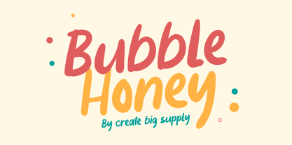 Bubble Honey Font is a cute and fun display font. This will add a cheerful, happy touch to your design. Features: Uppercase & lowercase Numbers and punctuation Multilingual PUA Encoding Full Character Set !"#$%&()*+,-./0123456789:;?@ABCDEFGHIJKLMNOPQRSTUVWXYZ[\]^_`abcdefghijklmnopqrstuvwxyz{}~ ¡¢£¤¥§¨©ª«®°±²³´¸¹º»¿ÀÂÃÄÅÆÇÈÉÊËÌÍÎÏÑÒÓÔÕÖ×ØÙÛÜÝßàáâãäåæçèéêëìíîïñòóôõö÷øùúûüýÿıŒœŠšŸžˆˇ˚˜–—‘’“”†•‹›€−
 - Bubbly Kids by Create Big Supply,
$15.00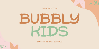 Bubbly Kids Font is a cute and fun display font. This will add a cheerful, happy touch to your design. Features: Uppercase & lowercase Numbers and punctuation Multilingual PUA Encoding Full Character Set !"#$%&()*+,-./0123456789:;?@ABCDEFGHIJKLMNOPQRSTUVWXYZ[\]^_abcdefghijklmnopqrstuvwxyz{|}~ ¡¢£¤¥§©ª«®°±²³¹º»¿ÀÂÃÄÅÆÇÈÉÊËÌÍÎÏÑÒÓÔÕÖ×ØÙÛÜÝÞßàáâãäåæçèéêëìíîïñòóôõö÷øùúûüýþÿıŒœŠšŸž–—‘’“”†‹›€−…·•/‚„
 - Praxis Next by Linotype,
$57.99 Praxis® Next has the same robust shapes and proportions as the original 1976 Praxis design. Its large x-height, substantial counters and open apertures guarantee high levels of legibility and reading ease in print and on screen. More weights, condensed designs and true cursive italics differentiate Praxis Next from the older design. Praxis Next shines where space is at a premium. The regular designs are modestly narrow while the condensed typefaces perform with grace in the most crowded of environments. The bold designs create powerful headlines and banners and the lighter weights are ideal for both long and short-form text copy. Because of its many weights and proportions, Praxis Next is also an ideal design to build a brand identity. Praxis Next Variables are font files which are featuring two axis and have a preset instance from Light to Ultra and Condensed to Roman. Pair Praxis Next with old-style designs like Bembo® Book and Stempel Garamond™ to create a dynamic typographic contrast. Or complement the design with its serifed counterpart, Demos® Next . Unger also drew ITC Flora® as an alternative italic design. Looking for something a little different? Pair Praxis Next with Masqualero™ .
 - Centaur by Monotype,
$29.99 A refinement of Roman inscriptional capitals designed by Bruce Rogers as a titling design for signage in the Metropolitan Museum. Rogers later designed for the Monotype Corporation a lowercase based on Jenson’s work, turning the titling into a full typeface, Centaur, the most elegant and Aldine of the Jenson derivatives. Centaur® font field guide including best practices, font pairings and alternatives.
 - Optima Cyrillic by Linotype,
$65.00Many typefaces are distinctive or attractive at the expense of legibility and versatility. Not so the Optima® family. Simultaneously standing out and fitting in, there are few projects or imaging environments outside of its range. Although Optima is almost always grouped with sans serif typefaces, it should be considered a serifless roman. True to its Roman heritage, Optima has wide, full-bodied characters – especially in the capitals. Only the E, F and L deviate with narrow forms. Consistent with other Zapf designs, the cap S in Optima appears slightly top-heavy with a slight tilt to the right. The M is splayed, and the N, like a serif design, has light vertical strokes. The lowercase a and g in Optima are high-legibility two-storied designs. Optima can be set within a wide choice of line spacing values – from very tight to very open. In fact, there are few limits to the amount of white space that can be added between lines of text. Optima also benefits from a wide range of letter spacing capability. It can be set quite tight, or even slightly open – especially the capitals. If there are any guidelines, Optima should be set more open than tight. It’s not that readability is affected that much when Optima is set on the snug side; it’s just that the unhurried elegance and light gray typographic color created by the face are disrupted when letters are set too tight. Optima is also about as gregarious as a typeface can be. It mixes well with virtually any serif design and a surprisingly large number of sans serif faces. The Optima family is available in six weights, from roman to extra black, each with an italic counterpart. In addition, the family is available as a suite of OpenType® Pro fonts, providing for the automatic insertion of small caps, ligatures and alternate characters, in addition to offering an extended character set supporting most Central European and many Eastern European languages. When you’re ready to find its perfect pairing, browse these fantastic matches: Monotype Century Old Style™, Dante®, Frutiger® Serif, Joanna® Nova, Malabar™, and Soho®. - Optima by Linotype,
$45.99 Many typefaces are distinctive or attractive at the expense of legibility and versatility. Not so the Optima® family. Simultaneously standing out and fitting in, there are few projects or imaging environments outside of its range. Although Optima is almost always grouped with sans serif typefaces, it should be considered a serifless roman. True to its Roman heritage, Optima has wide, full-bodied characters – especially in the capitals. Only the E, F and L deviate with narrow forms. Consistent with other Zapf designs, the cap S in Optima appears slightly top-heavy with a slight tilt to the right. The M is splayed, and the N, like a serif design, has light vertical strokes. The lowercase a and g in Optima are high-legibility two-storied designs. Optima can be set within a wide choice of line spacing values – from very tight to very open. In fact, there are few limits to the amount of white space that can be added between lines of text. Optima also benefits from a wide range of letter spacing capability. It can be set quite tight, or even slightly open – especially the capitals. If there are any guidelines, Optima should be set more open than tight. It’s not that readability is affected that much when Optima is set on the snug side; it’s just that the unhurried elegance and light gray typographic color created by the face are disrupted when letters are set too tight. Optima is also about as gregarious as a typeface can be. It mixes well with virtually any serif design and a surprisingly large number of sans serif faces. The Optima family is available in six weights, from roman to extra black, each with an italic counterpart. In addition, the family is available as a suite of OpenType® Pro fonts, providing for the automatic insertion of small caps, ligatures and alternate characters, in addition to offering an extended character set supporting most Central European and many Eastern European languages. When you’re ready to find its perfect pairing, browse these fantastic matches: Monotype Century Old Style™, Dante®, Frutiger® Serif, Joanna® Nova, Malabar™ and Soho®.
 - Sagrantino by Monotype,
$50.99 Sagrantino™ shines at large sizes – and in vibrant colors. Think big posters, commanding headlines, massive banners and oversized packaging. Set headlines in the Highlight or Shadow designs and running copy in the Regular – all on the same page! Sagrantino could be called the Lava Lamp of fonts. It’s slick, glossy, retro and futuristic. Somehow, it’s fresh and quirky-classic at the same time. This is a design that challenges you to think outside the text box. In fact, Sagrantino is so lively, it took three Monotype typeface designers, Karl Leuthold, Juan Villanueva and Carl Crossgrove, to draw it. Because it’s a script, Sagrantino pairs perfectly with just about any other design – except another script. Maintain the futuristic retro vibe by combining Sagrantino with a typeface like Biome™ or Neo™ Tech. Looking for a counterpoint? Try a cool sans like Avenir® Next or Univers® Next. OpenType® Pro fonts of Sagrantino enable automatic insertions from a crowd of fancy ligatures and delightful alternate characters – in addition to offering an extended character set supporting most Central European and many Eastern European languages.
 - Macro - Unknown license

- Burlingame by Monotype,
$50.99 The Burlingame™ typeface family from Carl Crossgrove is a sturdy typeface with open, clear shapes that offer high legibility, even in constrained digital settings, or in challenging print environments such as tiny pharmaceutical labels. The design performs with strength and grace at any size. It’s a multifaceted, multipurpose typeface family – a perfect addition to the Monotype® library.
 - Yom Tov by Jonahfonts,
$42.00 YomTov is a whimsical hebrew font. Traditional in design with a free spirit and slightly bounced. Hebrew alphabets contain 22 Hebrew letters along with five final letters which are automatically activated when used in Applications such as Apple Pages® and MicroSoft Word®. The Hebrew Letters do not contain cantillation marks very much used in everyday modern Hebrew. Designed with acomplete latin font that mirror the Hebrew letterforms. Latin lower-case letters have been replaced with smaller caps. You may also be interested in my other Hebrew fonts, NEWMARK Hebrew, HEBRON Hebrew, PAGEANTRY Hebrew and a Hebrew Script font KOMUNIDAD Script. YomTov requires OpenType-aware software.
 - Personal Note JNL by Jeff Levine,
$29.00 Personal Note JNL gets its inspiration from a semi-calligraphic pen alphabet found in the 1960 edition of the Speedball® lettering textbook and is offered in both regular and oblique versions.


