6,681 search results
(0.011 seconds)
- Carot Display by Storm Type Foundry,
$45.00 Carot Display is made for book covers and posters, but will also shine in advertising and visual identity. The whole Carot system is built up from what has long been around; in any case, it was the intention: to evoke the already experienced visual reminiscences of today's spectacled people. We all have a tendency toward sentiment, which, with each new diopter, deepens to melancholy. Only good font can calm us down. I believe in the raw effect of “Carot” typefaces. The superfamily of 64 members offers a modern alternative for all types of design work.
 - Boondock by Canada Type,
$24.95Boondock is another Imre Reiner design resurrected from the ashes of hot metal type for digital use. This wild paint font is a revival of the fascinating Bazaar brush type from 1956. Boondock has some very unique characters that combine to form a statement of casual but loud strength, seriousness and raw primal emotion. Great for short sudden-impact spurts, like book cover titles, single sentence headers, movie posters and music sleeves. Redrawn from original specimen by Patrick Griffin, and expanded with some built-in extras too add to the convenience of this digital version. - Bare Knuckles by IKIIKOWRK,
$15.00 Introducing Bare Knuckles - Rawtype, created by ikiiko. Bare Knuckles is a raw and expressive brush font with a touch of street style. This type has a freestyle shape with a bold lines characterize this font. This typeface is perfect for an extreme sport event, poster, flyer, magazine cover, streetwear brand, fashion youth, quotes, or stylish text overlay to any background image. What's included? Uppercase & Lowercase Number & Punctuation Alternates & Stylistic Multilingual Support Enjoy our font and if you have any questions, you can contact us by email : ikiikowrk@gmail.com
 - Mikhael Handwritten by Letterara,
$16.00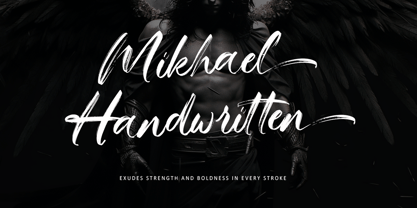 Introducing Mikhael Handwritten, an authentic brush script font that brings a raw and energetic vibe to your designs. With its dynamic strokes and natural brush texture, this font is crafted to make a bold statement in logos, posters, packaging, and various design projects. Its striking appearance and smooth flow make it an ideal choice for conveying a strong and stylish impression. PUA encoding ensures effortless access to all the expressive glyphs. Elevate your projects with Mikhael Handwritten, a font that effortlessly infuses vigor and character into your creative endeavors.
 - Mother Bones by IKIIKOWRK,
$19.00 Proudly present Mother Bones - 90s Type Grunge Vibes, created by ikiiko. Mother Bones inspired by the handwriting style of the 90s, where the Seattle sound trended with a raw, wild and free style. With spontaneous strokes and unique lines, this font has strong vibes of 90s era. This type is very suitable for making a poster, magazine layout, brand logo, sleeve cover, party flyer, quotes, or simply as a stylish text overlay to any background image. What's Included? Uppercase & Lowercase Numbers & Punctuation Multilingual Support Works on PC & Mac
 - Sungarden by Juraj Chrastina,
$39.00 Welcome to my hand-drawn garden! Enjoy the sunshine, surrounded by my line illustrations of flowers, leaves, birds, hearts, arrows, snowflakes and various ornaments. Sungarden is a bouquet of about 400 handmade pics and floral ornaments, created to get along well with my collection of 12 playful sans serifs and a cute script. Sungarden Script is packed with ligatures and automatic initial and terminal forms accessed through contextual altrenates. All the fonts have an extended character set to support Western and Central European languages. The Sungarden family is well-suited for nature cosmetics, organic food, handmade-style products, wedding and greeting cards, invitations, labels, packaging, menus, books or apparel. You can download the instruction PDF here.
 - Schnebel Slab Pro by URW Type Foundry,
$35.99 The refreshingly clear Antiqua Schnebel Slab is a refreshingly clear and strong interpretation of a contemporary Antiqua with subtle contrast and firm serifs, which offer excellent readability at very small size, and, at the same time, provide a lot of expression for use in headlines. The italics, drawn specifically for this purpose, contribute to a harmonious picture, which never loses creative tension, thanks to its aesthetics. The careful addition of ligatures, small caps, and proportional and old-style figures allows for well-proportioned typesetting. The condensed and expanded variants, which also come in 6 weights each, offer plenty of freedom to design with numerous combinations. Schnebel Slab Pro combines especially well with Schnebel Sans Pro.
 - Cubicoola by Little Type,
$20.00 Cubicoola is a playful, friendly and distinctive all-caps typeface inspired by hand-drawn posters. The deliberately wide width of some characters along with the gently variated angle, creates playful combinations. A symmetrical thin stroke with rounded endings makes it modern and legible typeface. It fits on book covers, posters, labels, greeting cards, announcements, headline messages, packaging or perhaps your next project logo. Applicable pretty well to all topics for kids. Contains a total of 429 glyphs, including latin extended diacritics for most languages. Carefully tuned kerning and 18 ligatures makes it even usable for longer paragraphs. Useful in both big and small sizes. Give it a try and summon interesting and creative letter combinations.
 - Koorkin by Monotype,
$29.99 “I originally drew the primary characters with a felt tip marker, scanned them and then proceeded to noodle on the computer,” says George Ryan of his new typeface, Koorkin. “Over the years, I’ve designed many original typefaces, but Koorkin has become one of my favorites. I’ve worked on hundreds of highly structured text faces. For the most part, the roots of all of them can be found in the handwritten letterforms we learn as children. I enjoy going back to these shapes whenever the opportunity presents itself. ”The happy result of Ryan‘s felt tip marker sketches and his love of simple letterforms is a new family of upright and italic scripts in medium and bold weights.
 - Happy Brain Creepy Thalamus by TypoGraphicDesign,
$19.00 CONCEPT/ CHARACTERISTICS The base was a head-vein illustration. This served as a design grid. Novel letterforms were sought and found. Hand-drawn analog and digitized later. Experimentally, novel, fresh and an eye-catcher. Completely new insights into the human brain. A font for happy thoughts. ghostly visions, or simply for the next freshen party flyers. APPLICATION AREA The happy, creepy, Horror handmade font »Happy Brain Creepy Thalamus« with many language support would look good at headlines. Magazines or websites, party flyer, movie posters, music Poster, music covers or webbanner. TECHNICAL SPECIFICATIONS Headline Font | Display Font | Handmade Horror Font "Happy Brain Creepy Thalamus" OpenType Font with 283 glyphs, alternative letters and ligatures (with accents & €) & 1 style (regular).
 - Samuri by Twinletter,
$15.00 SAMURI is our newest font with Japanese style features, developed with an exotic and relaxed shape, this font is extremely attractive to match your extraordinary project, using this font will instantly make your project look exquisite, charming, and everyone will be glad to view the look. Unlike the rest, your project will be one-of-a-kind. Logotypes, food banners, branding, brochure, posters, movie titles, book titles, quotes, and more may all benefit from this font. Of course, using this font in your various design projects will make them excellent and outstanding; many viewers are drawn to the striking and unusual graphic display. Start utilizing this typeface in your projects to make them stand out.
 - Pumpkinseed by Three Islands Press,
$19.00 The tale of Pumpkinseed began with a bit of hand-printing I noticed on the dinner menu at a local restaurant. I took a menu home for future reference. Several months later, some similar hand-lettering on another dinner menu caught my eye. I became a sort of connoisseur of hand-done menu lettering. After tweaking and adjusting a few of these menu-inspired (uppercase) characters, I placed them -- along with some other designs -- in an online Type in Progress survey. They won. So I finished the caps, drew out the lower case from scratch, created three weights and oblique styles. The result: Pumpkinseed, a full-featured casual hand-lettering face. Comes in Light, Medium, and Heavy.
 - Straight Line by K-Type,
$20.00 Straight Line is essentially an outline Modern, but drawn without any curves whatsoever. Thin horizontals and thick verticals provide the classic look of a Didone, updated and enhanced by clean, minimalist geometry. In addition to the Straight Line font itself, the package includes Straight Line Solid with matching spacing and kerning. The Solid font can be used solo, or layered with the outline font to provide a colour background. Straight Line is an excellent display face for contemporary, eye-catching headings and sub-headings, and the fonts contain a full complement of Latin Extended-A characters. The typeface was inspired by a 1930s experimental alphabet by the British artist, Percy J Smith.
 - Honey Biscuit by Gassstype,
$23.00 Here comes a New font, Honey Biscuit is Unique Bold Display Font this is strong Font, that is written casually and quickly amazing. Then crafted carefully drawn into vector format. This font is great for your next creative project such as logos, printed quotes, invitations, cards, product packaging, headers, Logotype, Letterhead, Poster, Label, and etc.It is perfect for any design project as Invitation,logo, book cover, craft or any design purposes.this font is great for your creative projects such as watermark on photography, and perfect for logos & branding, invitation,advertisements,product designs, stationery, wedding designs,label ,product packaging, special events or anything that need handwritting taste. You can activate Alternates glyphs OpenType panel.
 - Bozon by ROHH,
$39.00 Bozon™ is a modern, minimalist geometric grotesk typeface. Letter shapes are crafted with the highest care for proportions and legibility. This clean, sharp sans serif is a great choice for all kinds of modern projects including branding, logo design and display use. Bozon™ family consists of 10 weights with corresponding italic styles, that give total of 20 styles. Italic styles were hand drawn to get sharp and fine letter shapes. The family has extended language support, as well as broad number of OpenType features, such as small caps, case sensitive forms, ligatures, stylistic sets, contextual alternates, lining, oldstyle, tabular, circled and small cap figures, slashed zero, fractions, superscript and subscript, ordinals, currencies and symbols.
 - Prenton RP by BluHead Studio,
$39.00 BluHead Studio LLC is pleased to announce the complete Prenton typeface family! Born of an award winning pedigree, Prenton is an elegant and meticulously drawn sans serif typeface by Roy Preston of Great Britain. Perfect for intricate text settings, it is an extensive family of typefaces containing twenty-one weights in all. The ten OpenType Pro fonts are typographically rich collections of small caps, inferiors/superiors, numerous figure sets and fraction styles, and ligatures. There are Condensed and Ultra Condensed versions of the roman weights and a single Thin Display weight. This wide-ranging variety provides a solid foundation for lengthy and complex typographic layouts. All fonts are OpenType CFF and support an extended Central Europe character set.
 - Myteri Tattoo by Mans Greback,
$59.00 Myteri is an expressive tattoo script font. Drawn and created by Mans Greback in 2021, this lettering has a wild rock'n'roll style and a tough personality, with graffiti-inspired calligraphy and vivid movements. To make swashes, use [ ] { } _ anywhere in a word. Example: Tatt_oos Write multiple [ ] { } to make swashes of different lengths. Example: Super[[[star (Download required) The font is built with advanced OpenType functionality and has a guaranteed top-notch quality, containing stylistic and contextual alternates, ligatures and more features; all to give you full control and customizability. It has extensive lingual support, covering all European Latin-based languages. It contains all characters and symbols you'll ever need, including all punctuation and numbers.
 - Bapalopa by Okaycat,
$24.50 Bapalopa is inspired by classic graffiti "blockbuster" letter forms. These letters are made to look as big and as wide as possible. Bapalopa's linework is kept very loose & relaxed, mostly smooth with some distressed edges. Viewed up-close, there is lots of texture from the individual pen strokes which gives Bapalopa it's cool freehand drawn look. Use "Bapalopa" and "Bapalopa Pa" together to create eye catching designs. To make it extra fun, a handful of the largely useless alternates, (like that dumb "currency" symbol) were replaced with big blocky hearts, stars, and arrows. Check it out! Bapalopa is extended, containing the full West European diacritics & a full set of ligatures, making it suitable for multilingual environments & publications.
 - F2F Simbolico by Linotype,
$29.99The techno sound of the 1990s, a personal computer, font creation software, and some inspiration all came together to inspire the F2F (Face2Face) font series. Alessio Leonardi and his friends had the demand to create new unusual typefaces, which would be used in the leading German techno magazine of the day, Frontpage. Even typeset as small as 6-points, in nearly undecipherable layouts, it was a pleasure for the kids to read and try to decrypt the messages. Hearts, candles, bombs, and peace signs are just some of the great elements you'll find in F2F Simbolico. This collection of ruggedly drawn symbols is meant to bring a smile to the reader's face. - Venetian 301 by ParaType,
$30.00 Venetian 301 is the Bitstream version of the Centaur type family. Centaur was designed by the American book designer Bruce Rogers on the basis of Venetian typefaces of 1470 of Nicolas Jenson. Beautiful Italic based on a face by Ludovico degli Arrighi was developed by Frederic Warde who was an American calligrapher and typography researcher was added as Italic to Centaur. Adapted for mechanical composition by English Monotype in 1929. Its lettershapes owe much to pen-drawn letters of Italian humanist minuscule and cursive. This elegant humanist face is useful for the finest typography both for book text and display matter. Cyrillic version included small caps was developed for ParaType in 2003 by Dmitry Kirsanov.
 - Neuro X by Sawdust,
$35.00 Neuro X is a narrow sans serif typeface consisting of three weights with additional rounded versions and matching italics. It was first drawn as an exploration for a headline font and later expanded on to become a full typeface family. Neuro X explores the extremities of narrow proportions whilst also allowing for eccentric cuts. The typeface has been tightly monospaced and intended for use at larger sizes as a display but can also work at smaller scales for the more courageous among us. This 339 glyph font has language support for 26 languages: Afrikaans, Albanian, Catalan, Croatian, Czech, Danish, Dutch, English, Estonian, Finnish, French, German, Hungarian, Icelandic, Italian, Lithuanian, Maltese, Norwegian, Polish, Portuguese, Slovak, Slovenian, Spanish, Swedish, Turkish, Zulu.
 - Craftsman by Woodside Graphics,
$19.95The Craftsman font is a faithful reproduction of the logo, or Title typeface used for Gustav Stickley's "Craftsman" Magazine, the foremost journal of the American Arts & Crafts Movement during its publication years of 1901-1916. It is an All-Caps font, with condensed and closely-spaced characters, specifically designed for titles and headlines. The "Craftsman" font is available in two versions: "Craftsman Regular" and "Craftsman Outline." Each is two fonts in one, in the sense that the capital letters are contained in a hand-drawn box (as on the cover of "The Craftsman" Magazine). Lower-case characters are identical, but without the box. Thus, the two may be used separately, or in combination, to achieve a desired effect. - Ramisa Faux by Twinletter,
$15.00 Ramisa is a Japanese-style font that is designed as uniquely as possible to create a beautiful and easy-to-read combination of sentences. Of course, this font is also very flexible for you to use in your various projects, ensuring that your project has a fantastic and appealing appearance that will be remembered by all audiences. Logotypes, food banners, branding, brochure, posters, movie titles, book titles, quotes, and more may all benefit from this font. Of course, using this font in your various design projects will make them excellent and outstanding; many viewers are drawn to the striking and unusual graphic display. Start utilizing this typeface in your projects to make them stand out.
 - FT Massachusettz by Foxys Forest Foundry,
$9.00 FT Massachusetts is a dense, hand-drawn sans-serif typeface with uneven edges and a dancing baseline. It creates a vivid impression, feels friendly, playful, and communicative. The font is full of alternate letters, symbols, and graphics. It easily adapts, confidently engages with the customer, and transforms slightly depending on the space and purpose. Change letters to alternates for the uniqueness of spellings. For convenience, alternative characters are used when typing in lowercase, and normal letters are used when typing in uppercase. Additionally, you can always switch letters to additional alternative ones and insert symbols. Furthermore, to add visual interest, the font is equipped with auto-replacements for prepositions and word endings.
 - Blackoak by Adobe,
$29.00Joy Redick designed Blackoak, a big and heavy Egyptienne-sytle titling slab serif face, in 1990. The extremely robust style of the characters in this typeface was consciously distorted; creating letterforms that appear flattened and stretched, like a rubber band. Blackoak is drawn in the style of old wood tpes, just like those that one envisions when one thinks of the large, decorative posters that once filled Wild West America. The wood type collection of the Smithsonian Institute in Washington, DC acted as a primary source of inspiration for this design. True to its rooks, Blackoak is meant for use exclusively in headlines in very large point sizes, or for logos and other corporate advertising purposes. - Rival by Mostardesign,
$25.00 Rival – A serif font family with contemporary distinctive signs Rival is a modern serif font family inspired by characters drawn with a round nib, it has many distinctive signs such as broken curves, slightly curved downstrokes, curved diagonals, and curved, slanted axes. All these typographic tokens gives Rival a modern and contemporary aspect for all kinds of graphic projects. It comes in 7 weights with corresponding italics and it’s suited for multiple purposes including display and editorial use, especially for advertising, long text, packaging and branding. Rival provides advanced typographical support with OpenType features such as small caps, ligatures, discretionary ligatures, old style figures, case-sensitive forms, slashed zero, fractions, and pro kerning.
 - Apnea by The Type Fetish,
$25.00 Apnea is a layerable type family consisting of fifty weights. It is an all caps font with a few lowercase alternatives (a, e, i, m, n, t, w, and y) thrown in for a more casual feel. The base letterforms are inspired by a painted sign I found in the garage of an old house I moved into years ago. All the hand-drawn elements were done directly in FontLab to keep them loose and playful without getting distorted or grungy. At its core Apnea consists of eight base weights (Base, Drop Shadow, Halftone, Inline Fill, Outline, Outline 3D, Shading and Shadow) that when combined, can make up the rest of the family. Have fun, experiment and play!
 - Deanicked by Gassstype,
$23.00 Here comes our new font Deanicked this is a Unique All Caps Display Font that is written casually and quickly. This is Textured Natural Style and Classy Style. This font are handmade with brushes on Procreate. Then crafted carefully drawn into vector format.this font is great for your creative projects such as watermark on photography, and perfect for logos & branding, photography, invitation, watermark,advertisements,product designs, stationery, wedding designs,label ,product packaging, special events or anything that need handwritting taste. Deanicked a natural handwritten feel. This handmade font will make your design has a beautiful natural touch for each details. It is perfect for any design project as Invitation,logo, book cover, craft or any design purposes.
 - Composer JNL by Jeff Levine,
$29.00 There are thousands of pieces of vintage sheet music available for collectors and curiosity seekers. Prior to the 1930s, a large percentage of them had wonderfully hand-lettered titles on the covers, but gradually there was a shift by music publishers to utilizing metal type for the bulk of their output. Normally set in an all-caps format, certain type faces reappeared in growing frequency and familiarity. Composer JNL is one such example of a “workhorse” font, and has been re-drawn and reinterpreted by Jeff Levine Fonts in both regular and oblique versions. It is based on the design "Glamour", released by Lanston Monotype in 1948; which in turn was based on "Corvinus", designed by Imre Reiner.
 - 1968 GLC Graffiti by GLC,
$38.00 This font was inspired by the paint brushed letters in use in the 60 - 70s for protest slogans tagged on the cities walls. In those days, we didn't commonly use aerosols like today, so we used paint brushes, with paint or tar cans, drew the letters, and ran away quickly ! Capitals and lower case have the same size, and a lot of alternates characters or ligatures allows the user to vary each letter (until tree alternates for single letters) in each word of a text . Likewise, the words may be easily underscored or intersected by a few stains looking like paint spots, substituted to the following standards characters: [greater], [less], [dagger], [backslash], [bullet], and [underscore].
 - Ganz Grobe Gotisch by URW Type Foundry,
$39.99 It is not only coarse but extremly black, and it is quite right to name it Black Letter in English. Ernst Schneidler, the designer, created the smallest possible counters. Still, this very coarse black letter is sensitive in detail and drawn with a high level of aesthetics. By the way, it was said in Schneidler's design class in Stuttgart that his number one student Walter Brudi had cut some of the characters with �silhoutte scissors� from black paper. Sharing his ideas and work with his students does not at all decrease or lower his copyright.Ganz Grobe Gotisch is not only a distinguised but also a very catchy design.(Albert Kapr in Fraktur -- �Form und Geschichte der gebrochenen Schrift�.)
 - ALS Klementina by Art. Lebedev Studio,
$63.00 Klementina is a cursive typeface based on brush pen handwriting. It has flowing feminine shapes and letters drawn with care and love, much like you find in a romantic young lady's album. All characters settle into a line with ease, partially thanks to a number of ligatures and contextual alternates that help you avoid unpleasant combinations. This type is ideal to set something personal and touching. It will have this effect regardless of the presence of any sense in the text. Due to the attention paid to fine details it looks great even in big sizes. Klementina will come as a helping muse to any designer working with wedding invitations, announcements, gift and delicatessen packaging, or magazine layouts.
 - Arkanotes by Gassstype,
$23.00 Here comes a New font, Introducing Arkanotes - Fun Script Font is a Authentic script that is written casually and quickly. Letters are made with handwritten on paper. Then scanned and carefully drawn into vector format. That is why Arkanotes has charming, authentic and relaxed characteristic more natural look to your text with a more natural look to your text. Arkanotes Perfect for designs,branding projects, Logo design, Quotes product packaging ,design project as Invitation,logo, scrapbooking, tags and so much more! This font is PUA encoded which means you can access all of the magical glyphs with ease! It also features a wealth of special features including You can activate 12 Ligatures OpenType panel.
 - Zombie Punks by Wing's Art Studio,
$15.00 Zombie Punks - The Retro Horror Video Font Introducing the first in a range of new font designs inspired by 80s VHS covers and the nostalgic video rental store experience. Starting off with a classic horror flavour, Zombie Punks is a grungy, hand-drawn brush font supplied in two styles with additional underlines and paint spills. The perfect choice for use on movie posters and trailers, album covers, books and much more. This all-caps design features punctuation, numerals and language support along with an alternative set of characters ensuring that you’ll never have to repeat your e’s or t’s for a more convincing and natural hand-made look. Check out the visuals for more details and cool usage examples.
 - Vinho De Amora by Mans Greback,
$59.00 Vinho De Amora is a truly vintage serif font. Drawn by Mans Greback between 2019 and 2021, this font is created with inspiration from wine cellars, painted typography and genuine quality produce. It has a distinct sharp character, steady legs and a bold and wide appearance. The Vinho De Amora family consists of three styles: Black, White and Stencil; each one geometrically consistent and complimenting, perfect for stacking on top of each other to create more variations. The font is built with advanced OpenType functionality and has a guaranteed top-notch quality. It has extensive lingual support, covering all European Latin-based languages. It contains all characters and symbols you'll ever need, including all punctuation and numbers.
 - Printers Drawer JNL by Jeff Levine,
$29.00 Printers Drawer JNL continues building on a library of letterpress illustrations, cartoons, ad builders, Art Deco ad panels, ornaments, embellishments, and general miscellany. The images are re-drawn from vintage source material, and this font is jam-packed with 89 images spread throughout most all of the standard keyboard positions. This is officially the 1000th release from Jeff Levine Fonts since its inception in January of 2006. Jeff Levine Fonts aims to preserve the almost-lost artwork and lettering styles of the past within a digital type format, and often recreates the designs complete with their evident flaws, idiosyncrasies and eccentricities; allowing for a “real world” and nostalgic look to the computer generated art projects of today.
 - Sagan by Associated Typographics,
$29.00 Sagan was designed as an alternate to Ramsey ; you could call them brothers. It was drawn, redrawn, and expanded on, to put it lightly. It boasts 770 glyphs in each weight, covering all European languages, and also contains an extended Cyrillic. Sagan provides advanced typographical support with features such as case-sensitive forms, old style numerals, fractions, and many alternate glyphs. Like all of our typefaces, Sagan is fun to use. Sagan has 7 weights, with accompanying italics for each weight, ranging from Extra Light to Black. It is ideally suited for branding, editorials, advertising, packaging, posters, billboards and digital screen design. Sagan will work hard for your brand or project. Make a statement that demands notice.
 - Meno Text by Lipton Letter Design,
$29.00 Richard Lipton designed Meno in 1994 as a modest yet elegant workhorse serif family in seven styles. In 2016, he expanded this spirited oldstyle into a 78–style superfamily. The romans gain their energy from French baroque forms cut late in the 16th century by Robert Granjon, the italics from Dirk Voskens’ work in 17th-century Amsterdam. Meno consists of three carefully drawn optical sizes—Text, Display, and Banner, with Condensed and Extra Condensed widths added to the latter two cuts. Steadfast in text settings, Meno is replete with alternate forms, swashes, and other enhancements that showcase Lipton’s masterful calligraphic hand. The series offers a complete solution for achieving high-end editorial typography.
 - Meno Display by Lipton Letter Design,
$29.00 Richard Lipton designed Meno in 1994 as a modest yet elegant workhorse serif family in seven styles. In 2016, he expanded this spirited oldstyle into a 78–style superfamily. The romans gain their energy from French baroque forms cut late in the 16th century by Robert Granjon, the italics from Dirk Voskens’ work in 17th-century Amsterdam. Meno consists of three carefully drawn optical sizes—Text, Display, and Banner, with Condensed and Extra Condensed widths added to the latter two cuts. Steadfast in text settings, Meno is replete with alternate forms, swashes, and other enhancements that showcase Lipton’s masterful calligraphic hand. The series offers a complete solution for achieving high-end editorial typography.
 - Stitchin Crochet Pro by Adriprints,
$6.00 StitchinCrochet Pro is the third font in the Stitchin Family following StitchinCrochet and StitchinKnit. Unable to find a stylish and easy-to-use crochet symbol font, I decided to make one! StitchinCrochet offers incredibly legible, intuitive symbols that are easily accessible without special numerical codes on the keyboard. StitchinCrochet Pro has updated crochet symbols (compared to StitchinCrochet) and are newly re-drawn, scaled, and have corresponding increase and decrease symbols ranging from single crochet to double treble crochet. StitchinCrochet Pro also includes an updated QWERTY keyboard key, better symbol layout, and symbol guide for both U.S. and U.K. crochet terminology! Choose the “manual install” method to access the .PDF guides and symbol guides.