10,000 search results
(0.025 seconds)
- Huntsman by Solotype,
$19.95Issued from the Haddon Foundry in England. Most of their original faces had names beginning with H, like their own name. Some of their types were designed by Phil May, but we cannot guarantee that this is one of them. - Afterbutler by WNGSTD,
$15.00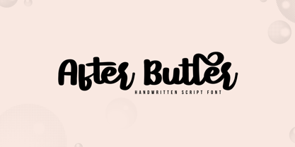 After Butler is a lovely and timeless handwritten font. It is the best choice for creating eye catching logos, branding and quotes. After Butler is PUA encoded which means you can access all of the glyphs and swashes with ease!
 - Courant by Hanoded,
$20.00 Courant means "newspaper". Courant font was modeled on 17th century Dutch newspapers and most of the glyphs are authentic. The 'modern' glyphs, like @, $, €, * and several others have been designed by me, as they were not in use in the 1600's.
 - Degila by Letterena Studios,
$10.00 Degila is a cool and trendy serif font. It is PUA encoded which means you can access all of the glyphs and swashes with ease! Add it to your most creative ideas and notice how it makes them come alive.
 - Sock Hop JNL by Jeff Levine,
$29.00Back in the 1950s and 1960s a popular event was the sock hop - when kids would meet in the school gymnasium, kick off their shoes and dance to the popular records of the day. Sock Hop JNL recalls those simpler times. - Heldustry by URW Type Foundry,
$35.99 Heldustry is a sans serif design with letterforms partway between Helvetica and Eurostile. The Heldustry font family has a large x-height and wide characters, making it ideal for situations where there is not much copy but pages must be filled.
 - Pentastic by Okaycat,
$24.50 Pentastic is a natural hand printed font designed for the look of written by pen. Clear legible style yet cute and fun. Pentastic features extended characters, containing West European diacritics and ligatures, making it suitable for international environments and publications.
 - Doodles by Outside the Line,
$19.00Doodles received honorable mention in U&lc's First Annual Type Design Competition in the Picture Category. Inspiration came from many long hours logged in corporate strategic planning meetings. Check out Doodles the Alphabet designed to compliment the Doodles picture font. - Mightwell by Ditatype,
$29.00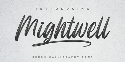 Mightwell is a modern Brush font. With a classy and natural handwritten style, it brings a classy and chic typeface. Mightwell is best used for weddings, branding, logotype, and quotes. Features: - Beautiful Ligatures - PUA Encoded - Multilingual Support - Numerals and Punctuation
 - Kitcat by Solotype,
$19.95This was a favorite of the old time job printers; decorative but readable. The MacKellar foundry was the largest and most creative of the old foundries, and decorative fonts like this one came out at the rate of several every year. - Torpedo - Unknown license

- Saltwater - Unknown license

- KG Always A Good Time by Kimberly Geswein,
$5.00 Happily-lettered handwriting full of optimism. This handwriting was drawn with a chunky round marker and is bold enough for drawing attention yet still completely legible.
 - Letterpress Sorts JNL by Jeff Levine,
$29.00 Letterpress Sorts JNL adds to the growing library at Jeff Levine Fonts of classic dingbats, embellishments, cartoons, ornaments, etc. all re-drawn from vintage source material.
 - Bessington by wearecolt,
$16.00 Bessington is a quirky rough uppercase display font, each character hand drawn using rich black ink on a soft paper giving it a beautifully ragged look.
 - Janda Happy Day by Kimberly Geswein,
$5.00 Hand-drawn playful lettering full of curls and whimsy. This is designed to be completely legible while still offering a fun flair to a finished project.
 - Rongjam by Motokiwo,
$15.00 Cool hand drawn font crafted from textured dry brush, this is Rongjam. An all caps typeface that very recommended for outdoor projects, sport, hipster, and youth.
 - Printers Dingbats JNL by Jeff Levine,
$29.00 Printers Dingbats JNL gathers another assortment of classic cartoons, borders, embellishments, sales helpers and whatnots into one digital file; all re-drawn from vintage source material.
 - Stenson JNL by Jeff Levine,
$29.00Stenson JNL is another "lost" stencil typeface, re-drawn from punches made by a commercial stencil machine as used in rubber stamp shops and industrial warehouses. - Mick by Oleg Stepanov,
$12.00 Mick is a hand-drawn typeface inspired by graffiti works of old style. The family contains Regular and Light styles. Cyrillic and extented latin character sets.
 - Solomonk by Etewut,
$30.00 Solomonk is a hand-drawn script with extended latin. • All European languages are supported. • Basic alphabet has alternates. (a→α) • Solomonk can be connected and disconnected
 - Zoe by Autographis,
$39.50 Zoe is a hand-drawn script that has a very even flow and is readable down to very small sizes. In big sizes it is elegant.
 - Letterpress Helpers JNL by Jeff Levine,
$29.00 Letterpress Helpers JNL continues a series of vintage cartoons, border and corner elements, stock designs, sales helpers and other embellishments re-drawn from vintage source material.
 - Ergonomix - Unknown license

- Ergonome - Unknown license

- Roughcast by Hanoded,
$10.00 Roughcast is a kind of outside plaster, composed of cement and pebbles. It’s not the best looking plaster and it is estimated that in the UK, a roughcast outer reduces the value of a house by 5%. I am in the middle of renovating our old farm, but I won’t cover it in roughcast! Roughcast font is actually quite an attractive brush font. I made it with a brush I found hiding underneath my stove (where it had been for a while). I cleaned it and used it to make a couple of fonts, including Roughcast. Roughcast is best used for packaging, book covers and posters.
 - Portaso by Larin Type Co,
$12.00 PORTASO This is a vintage display font inspired by signage, logos in the style of the wild west of the old time. This is a great find for creating logos, various kinds of designs in vintage and wild West style. Portaso font family has only Capital letters and alternates to them. Also the Stamp style has a different texture for upper and lowercase. This collection includes 14 font styles: regular, rough, two shadows for regular style and two shadows for rough style and stamp style, also vintage, vintage rough, two shadows for vintage style and two shadows for vintage rough style and stamp style,
 - Amora by Jen Wagner Co.,
$19.00 Amora is a messy, feminine, carefree script that is perfect for logos, posters, signage, and more! Fonts I paired with in the samples are Adobe Caslon, Proxima Nova (both available through www.typekit.com) and Bebas Neue. Comes with 79 ligatures for a totally unique hand-written feel! Includes: Upper + Lowercase Letters w/ alternates Non-English support 79 Ligatures Best for: Logos Branding Large format writing Feminine look + feel Paired with sans serifs (Proxima Nova, Bebas) and classic serifs (Adobe Caslon, Baskerville) Web headers Signage Wedding invitations and decor (table numbers, signage, balloons, etc.) Not best for: Small printing Long quotes (generally flows better with just a few words) Patterned backgrounds
 - Young Baroque by ITC,
$29.99Young Baroque was designed by Doyald Young, and the font first appeared in the ITC library in 1984. It is a delicate and elegant typeface, whose basic forms are those of baroque script. The generous spirals adorning the capital letters give the font its temperament and contrast beautifully with the small, heavily slanted lower case letters. The flowing, graceful characters create an overall image of aristocratic elegance and dignity. This font can be used advantageously for labels, invitations and certificates and its capitals as initials to contrast harmoniously with both serif and sans serif fonts. Young Baroque is best used for headlines or short texts. Featured in: Best Fonts for Tattoos - Hegemony by Akarija Studio,
$12.00 Hegemony is an energetic, modern calligraphy typeface which is composed of heavy and clean strokes. Its clean appearance will help you keep the balance of your overall design easier. It is made as a complimentary font that works well with any sans serif font and most design styles for both print and display purpose. Hegemony offers maximum flexibility by its alternates which are available for all uppercase and lowercase characters. Hegemony supports most latin-based alphabets in its Latin Extended-A character set. Its alternate characters and swashes are PUA-Encoded, which make them accessible through Windows/Mac built-in application (Character Map/Font Book).
 - Bad Marker by Haiku Monkey,
$10.00 The marker has been sitting in your pen drawer for years. You can't bring yourself to throw it out, because it's the best marker in the world; but it has become worn and frayed, and you can't bring yourself to use it, either. But today you have just the project for the best bad marker in the world, and you take it from the drawer, remove the cap, and notice with glee that time has accumulated a perfect supply of ink in the frayed tip. You bring it down on the pristine white paper in front of you, and magic begins to trace itself on the page...
 - Lumen Script by Chris Mizen,
$19.99 Lumen Script is a contemporary monoline script display face. Combining the loops and swashes from the fanciest of hand painted scripts, with the consistencies of shape and form from the most regimented of sans, Lumen Script is a fresh and unique take on the ever popular script typeface. To get the most out of Lumen Script, make sure you have Contextual Alternates and Standard Ligatures turned on in your Opentype menu. Lumen Script also has a set of small caps, designed to sit comfortably alongside the standard letters, allowing you to change your tone without changing typeface. Lumen Script is also versed in multiple languages, with many accented characters included.
 - Barosa by NREY,
$19.00 Hi, friends! Introducing new typeface - Barosa. It is a new display font with 2 styles and cool characters. Typeface designed as monolite, all descending and ascending elements has same size as most characters. Barosa has multilingual support includes cyrillic. Many ligatures make your typography most variable. Barosa Typeface was inspired by ethnic slavonic style which combining classic typography with awesome features bring classic touch on this culture. It works well with normal size text and for large displays or short words. You may combine uppercase and smallcase in the text body, as alternates symbols. The Barosa typeface is suitable for : product packaging, labeling, logo, classic shop, ethnic shop, titles, etc
 - Linotype Schachtelhalm by Linotype,
$29.99Linotype Schachtelhalm is part of the Take Type Library, chosen from the entries of the Linotype-sponsored International Digital Type Design Contests of 1994 and 1997. The inspiration of German designer Ilka Kwiatkowski is not hard to figure out and the font carries the German name of the plant which was its model. The alphabet consists exclusively of capital letters with clear geometric basic forms. The font is meant for headlines in point sizes of 18 and larger. The details which make Linotype Schachtelhalm unique and true to its inspiration are however best seen in large point sizes, such as on posters, and Schachtelhalm is best combined with neutral fonts. - Strippenzieher - Unknown license

- Plain O Matic - Unknown license

- Berling Nova by Linotype,
$29.99Swedish designer Karl-Erik Forsberg created the original Berling typeface in 1951. Owned by Verbum in Sweden, Berling was completely redesigned and released in 2004, under the name Berling Nova. Forsberg (1914–1995) is considered one of Sweden’s most masterful graphic designers, and his original Berling has come to be seen as possibly the most definitive Swedish typeface. But a redesign was necessary in order to secure that the spirit of Berling would survive in the digital age. Linotype, the distributor of the original Berling™ , provided its collection of source materials to the designers working on Berling Nova. Additionally, Akira Kobayashi — Linotype’s Type Director — lent them his advice as their project advanced. Berling Nova is available in two optical sizes: Text and Display. The original Berling was a classic Renaissance roman face, with fine terminals and sharp, beak-like serifs. If one looks at Berling’s old lead type proofs in the smaller type sizes, it is clear that these had a fuller and more readable form than in later digital versions. So, in order to help return the new Berling Nova to its original splendor, both the base forms and the serifs were softened and inflated. In the text version, the x-height has been increased a bit (by 4%), the diagonal axis is less apparent, and special glyph ranges, such as those for small caps and old style figures, have been included in the font’s character sets. The display version still has the unmistakable “Berling” character that displays Forsberg’s mastery. Berling Nova is well suited for longer text passages in books, publications, and magazines. This typeface fulfils all the demands that one can make on a legible newspaper typeface. Access to both text and display versions are important to the demanding typographer. This is the first time since the typeface was digitalized that it is possible to use it in order to create truly beautiful and functional typography in all type sizes. - Biome by Monotype,
$29.99 In the sketches that formed the basis for his typeface Biome, Crossgrove experimented with inner and outer shapes in different styles, adapted letters to the form of the super-ellipse, and added curves only to remove these again. His challenge was to find a harmonious and coherent approach that provided sufficient contrast with existing fonts. Biome is essentially in the sans serif tradition and the letters exhibit only minor variations in terms of line thickness. There is still a suggestion of the super-ellipse at many points, but this never becomes the predominant design factor. While most of the terminals of the vertical strokes are only slightly rounded, the horizontals and diagonals have pronounced arches and it is these that basically determine the round and soft character of the typeface. The more unconventionally shaped letters, such as the lowercase 'g' with its two semi-open counters and the 'k' and 'x' with their crossbars, provide Biome with an individual personality. And this effect is emphasized by the generously rounded links in the 'v' and 'w' and the uppercase 'M' and 'N'. Biome has been designed as a typeface super-family. From the near hairline Extra Light to the amply proportioned Ultra, there are seven clearly differentiated weights and three tracking widths. There are oblique italic versions of all variants. The range includes small caps and numeral sets containing lowercase and uppercase digits. With its available range of characters, Biome can be used to set texts in all Eastern European languages. Although the remarkable individuality of Biome is most clearly apparent in the larger point sizes, this typeface is not just suitable for producing headlines and logos. Biome's elegant visual effects mean that it is equally comfortable in short texts while its large x-height and generous counters make it readily legible even in the small font sizes. Biome is a contemporary typeface that employs mid-20th century futurist elements which ironically give it a retro feel.
 - Pinatas Cottons by Piñata,
$12.00 Original Foundry: TypeType Original typeface name: TT Cottons Pinatas Cottons is a friendly hand-drawn typeface with condensed proportions. Each separate style of Pinatas Cottons was drawn by using different instruments. For instance, the black style was painted with a real brush, and the thin one was created with a pen. We tried to keep this analog feeling of hand drawing while we digitalized each style of the typeface. Pinatas Cottons is your ideal design helper.
 - Mustang by Linotype,
$29.99German Designer Klaus Sutter digitized Mustang, a brush script typeface from the 1950s originally drawn by Imre Reiner (1900-1987) and published in 1956 by D. Stempel AG. Mustang is a right slanted brush type drawn with simple and strong strokes. It has a dynamic character, and could be perfectly applied for emphasis in headlines. Mustang has the character of Imre Reiner's handriting. Imre Reiner was a prominent book illustrator, painter, and typographer during the 1950s.


