10,000 search results
(0.051 seconds)
- Asking Ladies by Youngtype,
$18.00 New Asking Ladies Beautiful Modern Serif . This professional resource is also powerful because each font has its own magical design. Equipped with three versions Regular, Italic & Bold. You can use it for almost anything like blog headers, posters, wedding elements, t-shirts, clothing, book covers, business cards, greeting cards, branding, invitations and quotes, and so on. Feature: Uppercase Lowercase Number Accents (multilingual characters) How To Access Alternate Characters: https://www.youtube.com/watch?v=Go9vacoYmBw https://www.youtube.com/watch?v=XzwjMkbB-wQ https://www.youtube.com/watch?v=x1A_ilsBsGs https://www.youtube.com/watch?v=xFlMwARHusY https://www.youtube.com/watch?v=NVJlZQ3EZU0 Thanks for your purchase!
 - Qualzharo by Muhammad Alkaf,
$14.00 The Qualzharo Blackletter font Duo Version Regular and Italic comes with beautiful alternate characters. Designed to deliver stylish elegance. Classic style is very suitable to be applied in various formal forms such as invitations, labels, menus, logos, fashion, make up, stationery, letterpress, romantic novels, magazines, books, greeting/wedding cards, packaging, labels and includes multiple language support. Features : Uppercase Lowercase Numeral Accent (multilingual characters) Ligature Stylistic Sets How To Access Alternate Characters: https://www.youtube.com/watch?v=Go9vacoYmBw https://www.youtube.com/watch?v=XzwjMkbB-wQ https://www.youtube.com/watch?v=x1A_ilsBsGs https://www.youtube.com/watch?v=xFlMwARHusY https://www.youtube.com/watch?v=NVJlZQ3EZU0 Thanks for your purchase!
 - Molto by TypeTogether,
$49.00 Xavier Dupre’s Molto font family is a tonal master, creating tenderness in a slab serif and tempering toughness with flourishes. Slab serifs created their original niche by their ability to grab attention and overwhelm, which caused them to be seen as strong, dominant, and desired fonts, especially in advertising. Slab serifs are the result of placing defined edges on something meant to take up an inordinate amount of space, rather than meant to be graceful. Molto updates this concept to allow a greater, and gentler, range in the lighter weights. Molto’s nine weights are defined by their intended use. The two extreme weights (Hair and Fat) act as display partners for magazines, titles, and posters. The Hair weight is runway ready with its sturdy serifs, breathy internal space, and stable lettershapes that were designed both to perform and impress. Molto’s Fat weight packs maximum punch in a believable way. Its wide and deliberate curves contrast against thin connections and landing strip stems. Molto can be put to perfect use in a fashion magazine using swashy Hair headlines set against its darkest weight. Molto’s seven intermediate weights, with their classic and legible shapes, are meant for texts of all sizes. The notches on diagonals, distinct numerals, and acute terminals grant benefits from caption sizes up to headings. Molto’s refined light weights and punchy heavy weights set the stage for a swashy surprise — alternate capital letters act as refined garments laid atop its concrete skeleton. The Molto font family rejects saving space in favour of intensifying shapes, placing maximum weight on the edges for better legibility and impact. Latin-based digital and printed designs will benefit from Molto’s design voice and breadth. This means UI, video, and online text, and print materials like dictionaries, packaging, advertising, and branding can all put Molto’s robust forms to multipurpose use. Molto successfully creates balance in a slab serif design: an opinionated and striking type family, stalwart in captions and exuberant in display, thanks to swashes which add some originality to the slab category.
 - Kalpa by Octotypo,
$15.00 The early inspiration designs for Kalpa comes from some old wrist watches dials from an iconic diving watch company. The result is a sharp and sleek design that gives an extremely strong look to the font. Kalpa comes in 4 weights and italics to make it versatile and easy to use on all kinds of media. It is a wise choice for headlines, logos, branding, packaging, publications and websites. The design comes with some alternatives glyphs which enhanced the use of the font and let you customise your letter works. The name comes from a Sanskrit word meaning a relatively long period of time to connect with its early inspirations of wrist watches dials.
 - Lovatine by Arterfak Project,
$18.00 Feel the love with Lovatine, a brand new lovely font that is created with smooth, soft, and lovely feels. Designed with extra alternates characters, Lovatine is the perfect choice for decoration, branding, children's needs, books, quotes, and more! Lovatine is complete with extra dingbats containing some symbols, ornaments, and doodles which you can apply to beautify your design and make it more attractive! Featured : Uppercase Lowercase Numbers Symbols Stylistic Alternates Swashes Ligatures Multilingual Characters. Thank you for watching and stay safe!
 - Vecchia by Talavera,
$75.00 This font looks forward to the humanist venetian oldstyle flavor. With high contrast and nice modulation, it has low x height wich is ideal for reading and to design books or long texts. Vecchia has a calligraphic basis and counts with small caps, ligatures and open face titling capitals.
 - English Monarchs by Celebrity Fontz,
$24.99 English Monarchs is a unique font collection with accurate digital replicas of 84 signatures of English and British monarchs from Richard II through Elizabeth II, including many of the royal consorts. Also included in this font are the Stuart pretenders and Mary Queen of Scots and her consort. A must-have for autograph collectors, desktop publishers, history buffs, fans, or anyone who has ever dreamed of sending a letter, card, or e-mail "signed" as if by one of these famous nobles. This font behaves exactly like any other font. Each signature is mapped to a regular character on your keyboard. Open any Windows application, select the installed font, and type a letter, and the signature will appear at that point on the page. Painstaking craftsmanship and an incredible collection of hard-to-find signatures go into this one-of-a-kind font. Comes with a character map. This font includes signatures from the following noble figures: Richard II, Henry IV, Henry V, Henry VI, Margaret of Anjou, Edward IV, Elizabeth Woodville, Edward V, Richard III, Henry VII, Elizabeth of York, Henry VIII, Catherine of Aragon, Anne Boleyn, Jane Seymour, Anne of Cleves, Catherine Howard, Catherine Parr, Edward VI, Lady Jane Grey, Mary I Tudor, Elizabeth I, James I, Charles I, Henrietta Maria of France, Oliver Cromwell, Richard Cromwell, Charles II, Catherine of Braganza, James II, William III, Mary II, Anne, Prince George of Denmark, George I, George II, George III, George IV, William IV, Victoria, Prince Albert, Edward VII, George V, Edward VIII, Wallis Warfield Simpson, George VI, Elizabeth II, Prince Philip, Prince Charles, Princess Diana, Camilla Duchess of Cornwall, Prince James Edward Stuart, Prince Charles Edward Stuart, Mary Queen of Scots, Henry Stuart Darnley, Francis II of France.
 - Text Tile by Tetradtype,
$25.00 TextTile is a system of heavy sans titling faces which can be utilized to carry a repeating chromatic pattern across words and letters. It stands apart from other chromatic faces, where layered effects typically interact only within each letter and do not carry through from one letter to another. The pattern repetition across letters of varying widths is achieved through OpenType substitution, using conditional alternates for each successive letter to allow for a seamless appearance across words, regardless of letter combinations. Though the pattern exists on a strict grid and the letters' widths and spacing must be highly regular in order to preserve the pattern repeat, the letterforms themselves are not rigid; rather, they appear organic, lively. The initial release includes patterns inspired by a classic buffalo plaid, separated into its horizontal and vertical components to maximize the creative possibilities for layering one-, two-, three-, and even four-color plaid patterns. Kits are available to produce the plaid pattern in detail—with overlapping diagonal hatching fully visible—or as a simplified version in which transparency can be used to simulate plaid or to create a checkered or striped effect. The TextTile family of fonts is a flexible canvas for mixing and matching a broad array of patterns to create a unique look. Check back for more pattern releases and take a look at the online specimen to see what is possible with the current offerings. Usage Notes For best results use an OpenType aware program. Enabling Contextual Alternates will ensure pattern alignment. For patterns that are made up of vertical stripes or columns using the Stylistic Alternate/Stylistic Set 1 will shift the columns. Stylistic Set 2 will change 1-0 into blocks of patterns.
 - Materia Pro by Elsner+Flake,
$79.00 Minimal, modular, modern—at first glance, Materia shows a contemporary flair, combining pure, strong geometrical form with a subtle, distinct appearance. Actually, the design was inspired by lettering from the turn of the 19th to the 20th century that still can be found in the East of France. While its formal origins date back as far as this, revived e. g. by the constructivists into the nineteen twenties and later on by Dutch information designer Wim Crouwel in the nineteen-sixties, the visual language of Materia still speaks of the »future«. Following a minimalistic concept the font is formally built on a grid. Wherever optical curves are needed for a smoother, more comfortable shape of letters than a simple rectangular block, diagonals cut off the egdes – like a diamond is cut to achieve more beauty. Thus headlines and texts set in Materia are given a certain »egdy« feeling, whereas their tonality is still kept well-balanced, keeping concentation all on information in a nonconfomist way. Materia comes in eight styles, from elegant Thin to attention-forcing Ultra. Even a regular Italic is available, following the classic type-set-principle. Two of the styles are explicitly designed for display use, Shadow and Code. Both are ready for combinations with Bold or each other respectively, the layering of Shadow and Code e. g. allows astonishing effects or highlighting within the letters. For OpenType-users Materia is a real Pro, containing accented Latin letters for over 70 languages, small caps, old style, tabular and lining figures and special condensed titling all caps for cases in which space is all that counts. How useful all of the above mentioned is may be seen in the book David Lynch – Lithos, designed by Koma Amok, published in 2010 by item éditions, Paris, and Hatje Cantz, Germany, which was typeset completely in Materia.
 - Vanny Onesha by Youngtype,
$18.00 Vanny Onesha script is a hand brush font made with brushes and ink. This typeface is ideal for use in thick watercolour designs or handwriting styles, such as blog titles, posters, wedding elements, t-shirts, clothing, book covers, business cards, greeting cards, branding, merchandise etc. Contains full set: - Uppercase - Lowercase - alternative - Ligatures - Punctuation - number - multilingual support. How to access all alternative characters, using Windows Character Map with Photoshop: - https://www.youtube.com/watch?v=Go9vacoYmBw How to access all alternative characters using Adobe Illustrator: - https://www.youtube.com/watch?v=XzwjMkbB-wQ Thank you!
 - Astella Script by Youngtype,
$18.00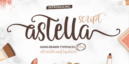 Astella Script is a hand brush font made with brushes and ink. This typeface is ideal for use in thick watercolor designs or handwriting styles, such as blog titles, posters, wedding elements, t-shirts, clothing, book covers, business cards, greeting cards, branding, merchandise, and more. Contains full set: - Uppercase - Lowercase - Alternative - Ligatures - Punctuation - Numbers - Multi-lingual support How to access all alternative characters, using Windows Character Map with Photoshop: https://www.youtube.com/watch?v=Go9vacoYmBw How to access all alternative characters using Adobe Illustrator: https://www.youtube.com/watch?v=XzwjMkbB-wQ Thank you!
 - The Angella Script Duo by madjack.font,
$10.00 The Angella Script Duo is a hand brush font created with brush and ink. This typeface is ideal for use in bold watercolour designs or handwritten styles, such as blog titles, posters, wedding elements, t-shirts, clothing, book covers, business cards, greeting cards, branding, merchandise, etc. Contains the complete set: - Uppercase - Lowercase - alternative - fasteners - Punctuation - number - Multilingual support. How to access all alternative characters, using the Windows Character Map with Photoshop: - https://www.youtube.com/watch?v=Go9vacoYmBw How to access all alternative characters using Adobe Illustrator: - https://www.youtube.com/watch?v=XzwjMkbB-wQ
 - Strives Less by Youngtype,
$18.00 Strives Less script font is a made with brushes and ink. This typeface is ideal for use in thick watercolor designs or handwriting styles, such as blog titles, posters, wedding elements, t-shirts, clothing, book covers, business cards, greeting cards, branding, merchandising, and more. Contains a full set of : Uppercase Lowercase Alternates Punctuation Numbers Multi-lingual support How to access all alternative characters, using Windows Character Map with Photoshop: https://www.youtube.com/watch?v=Go9vacoYmBw How to access all alternative characters using Adobe Illustrator: https://www.youtube.com/watch?v=XzwjMkbB-wQ
 - Phoony Script by Youngtype,
$12.00 Phoony script is a hand brushed font with and irregular baseline. Contains a complete set of lowercase, uppercase, alternates, ligatures, punctuation, numbers, and multilingual support. This font ideal for use as bold lettering style in blog headers, posters, wedding elements, t-shirt, apparel, cover books, business cards, greeting cards, branding, merchandise, invitations and handmade quotes and more. How to access all alternative characters, using Windows Character Map with Photoshop: https://www.youtube.com/watch?v=Go9vacoYmBw How to access all alternative characters using Adobe Illustrator: https://www.youtube.com/watch?v=XzwjMkbB-wQ
 - Mongnai Script by Youngtype,
$14.00 Mongnai Script is a hand brush font made with brushes and ink. This typeface is ideal for use in thick watercolor designs or handwriting styles, such as blog titles, posters, wedding elements, t-shirts, clothing, book covers, business cards, greeting cards, branding, merchandise etc. Contains full set: - Uppercase - Lowercase - alternative - fastener - Punctuation - number - multilingual support. How to access all alternative characters, using Windows Character Map with Photoshop: - https://www.youtube.com/watch?v=Go9vacoYmBw How to access all alternative characters using Adobe Illustrator: - https://www.youtube.com/watch?v=XzwjMkbB-wQ Thank you!
 - Blusher Script by Youngtype,
$18.00 Blusher script is a hand brush font made with brushes and ink. This typeface is ideal for use in thick watercolor designs or handwriting styles, such as blog titles, posters, wedding elements, t-shirts, clothing, book covers, business cards, greeting cards, branding, merchandise etc. Contains full sets of: - Uppercase - Lowercase - Alternatives - Ligatures - Punctuation - Numbers - Multi-lingual support How to access all alternative characters, using Windows Character Map with Photoshop: https://www.youtube.com/watch?v=Go9vacoYmBw How to access all alternative characters using Adobe Illustrator: https://www.youtube.com/watch?v=XzwjMkbB-wQ Thank you!
 - Miss Moonling by Youngtype,
$18.00 Miss Moonling is a hand brush font made with brushes and ink. This typeface is ideal for use in thick watercolor designs or handwriting styles, such as blog titles, posters, wedding elements, t-shirts, clothing, book covers, business cards, greeting cards, branding, merchandise etc. Contains full set: - Uppercase - Lowercase - Alternative - Ligatures - Punctuation - Number - Multilingual support. How to access all alternative characters, using Windows Character Map with Photoshop: - https://www.youtube.com/watch?v=Go9vacoYmBw How to access all alternative characters using Adobe Illustrator: - https://www.youtube.com/watch?v=XzwjMkbB-wQ Thank you!
 - Strawn by PizzaDude.dk,
$20.00 Strawn is my Wobbly and curvy funk font with bouncy serifs. Watch it bounce its way down the street, or into your next project - you know, that one that needs a fresh breath of fun! Comes with both fi and fl ligatures! You will need to use OpenType supporting applications to use the autoligatures.
 - Spadoya by Youngtype,
$18.00 Spadoya is a hand brushed font made with brush and ink. This typeface is ideal for use in bold watercolor designs or handwritten styles, such as blog titles, posters, wedding elements, t-shirts, clothing, book covers, business cards, greeting cards, branding, merchandise, etc. Contains full set: - Uppercase - Lowercase - alternative - Ligature - Punctuation - number - multilingual support. And also Spadoya Alternates and Swash, working in tandem with Spadoya Regular to create extraordinary typographic creations. Get inspired by the preview above. How to access all alternative characters, using the Windows Character Map with Photoshop: - https://www.youtube.com/watch?v=Go9vacoYmBw How to access all alternative characters using Adobe Illustrator: - https://www.youtube.com/watch?v=XzwjMkbB-wQ Thank you!
 - Baby Basley by Youngtype,
$18.00 Baby Basley is a hand brushed font made with brush and ink. This typeface is ideal for use in bold watercolor designs or handwritten styles, such as blog titles, posters, wedding elements, t-shirts, clothing, book covers, business cards, greeting cards, branding, merchandise, etc. Contains full set: Uppercase Lowercase Alternative Ligature Punctuation Number Multilingual support. And also Baby Basley Alternates and Underlines, working in sync with Baby Basley Regular to create incredible typographic creations. Get inspired by the preview above. How to access all alternative characters, using the Windows Character Map with Photoshop: https://www.youtube.com/watch?v=Go9vacoYmBw How to access all alternative characters using Adobe Illustrator: https://www.youtube.com/watch?v=XzwjMkbB-wQ
 - Traseraha by IbraCreative,
$17.00 Traseraha – A Retro Cartoon Font Traseraha, a captivating retro cartoon font, effortlessly channels the whimsical charm of classic animated aesthetics. Designed by the creative minds at Traseraha Studios, this font pays homage to the golden era of cartoons with its playful curves and vibrant personality. Each letter exudes a nostalgic vibe, reminiscent of vintage comic strips and animated shows, making it an ideal choice for projects seeking a touch of retro flair. The Traseraha font seamlessly blends fun and readability, allowing it to shine in a variety of applications, from logo designs to creative headlines. With its unique character and timeless appeal, Traseraha captures the essence of a bygone era while injecting a dose of lighthearted energy into contemporary design projects. Traseraha is perfect for branding projects, logo, wedding designs, social media posts, advertisements, product packaging, product designs, label, photography, watermark, invitation, stationery, game, fashion and any projects. cartoon font, cute font, traseraha font, retro, vintage, 90s, 80s, 70s, cartoon, cartoon font, comic, comic font, delicious, display, display font, distressed, hand drawn, handwritten font, headline, holiday font, lettering, mexican, mexico, mexico font, packaging, playful, poster, retro, sticker, vintage font Fonts include multilingual support for; Afrikaans, Albanian, Czech, Danish, Dutch, English, Estonian, Finnish, French, German, Hungarian, Italian, Latvian, Lithuanian, Norwegian, Polish, Portuguese, Slovak, Slovenian, Spanish, Swedish.
 - Neuarc by CozyFonts,
$25.00 Neuarc Font Family This is the 20th font family of CozyFonts Foundry, established 10 years ago in 2012 with the release of Aladdin Bold. Neuarc is based loosely on arcs and curves, hence it’s naming. As shown in one of the font posters that serves to showcase this font, a collage of rough sketches is displayed as the poster’s background. These hand drawn pencil drawings were worked and reworked and The final drawings were scanned and built in Adobe Illustrator and transferred to glyph windows, glyph by glyph, in Fontlab 8. The 5 styles, so far, are reminisscent of The Art Deco Era of Design between the 1030s and 1950s. Neuarc also has it’s own footprint with several characters that stand out, eg. A, 8, &, B, ?, $, 5, w, x, a, c, e, etc. giving the reason for the ’Neu’ in the naming. These letterforms & Numbers work extremely well in monograms. Each styles has it’s own personality. From the ultra chic Light style to the dominant cool Bold style, this family maintains a uniform legibility at small to large sizes. Meant primarily for display uses, Neuarc works well for posters, logos, headlines, packaging, branding, signage for a myriad of applications. The Neuarc Deco style font will work well in titles and numbers of any application.
 - Bembo Book by Monotype,
$34.99The origins of Bembo go back to one of the most famous printers of the Italian Renaissance, Aldus Manutius. In 1496, he used a new roman typeface to print the book de Aetna, a travelogue by the popular writer Pietro Bembo. This type was designed by Francesco Griffo, a prolific punchcutter who was one of the first to depart from the heavier pen-drawn look of humanist calligraphy to develop the more stylized look we associate with roman types today. In 1929, Stanley Morison and the design staff at the Monotype Corporation used Griffo's roman as the model for a revival type design named Bembo. They made a number of changes to the fifteenth-century letters to make the font more adaptable to machine composition. The italic is based on letters cut by the Renaissance scribe Giovanni Tagliente. Because of their quiet presence and graceful stability, the lighter weights of Bembo are popular for book typography. The heavier weights impart a look of conservative dependability to advertising and packaging projects. With 31 weights, including small caps, Old style figures, expert characters, and an alternate cap R, Bembo makes an excellent all-purpose font family. Bembo® Book font field guide including best practices, font pairings and alternatives. - Times New Roman Windows compatible by Monotype,In 1931, The Times of London commissioned a new text type design from Stanley Morison and the Monotype Corporation, after Morison had written an article criticizing The Times for being badly printed and typographically behind the times. The new design was supervised by Stanley Morison and drawn by Victor Lardent, an artist from the advertising department of The Times. Morison used an older typeface, Plantin, as the basis for his design, but made revisions for legibility and economy of space (always important concerns for newspapers). As the old type used by the newspaper had been called Times Old Roman," Morison's revision became "Times New Roman." The Times of London debuted the new typeface in October 1932, and after one year the design was released for commercial sale. The Times New Roman World Version is an extension of the original Times New Roman with several other scripts like with the Helvetica World fonts. It is part of the Windows Vista system. The following code pages are supported:1250 Latin 2: Eastern European 1251 Cyrillic 1253 Greek 1254 Turkish 1255 Hebrew 1256 Arabic Note: The Roman and Bold versions include the arabic scripts but they are not part in the corresponding italic versions. 1257 Windows Baltic 1258 Windows Vietnamese
- VLNL Tp Kurier by VetteLetters,
$35.00 VetteLetters is proud to bring you the TpKurier-family. It is cooked up by our German chef Martin Lorenz currently living in lovely Barcelona! Chef Lorenz about the TpKurier recipe: “TpKurier is the second redesign we did of Courier. The first redesign in 2000, although based on a five-unit grid, was drawn completely by hand. Six years later we designed another grid version of Courier, and the TpKurier family was born. This version is completely constructed up till its last detail. We didn't want to correct ‘mistakes’ deriving from the use of the grid, but instead make them visible (see “S”). TpKurier is based on a very simple grid, composed a proportion of four units high by two units wide. A series of other links between them make it possible to form a font from this grid. We felt it was important to consistently work within these limitations so that any unexpected asperities would help provide the font with its character. Even though it is a rough constructed typeface it was important to us to design real italic lower case letters and not just a sloped roman (see “a”, “g” or “s”). The first family published contained a serif and sans-serif version of the TpKurier, with italic and bold.”
 - Austral Slab by Antipixel,
$15.00 Austral Slab is a hand-drawn layered font designed by Antipixel, with unique textures & styles that combine giving your work a distinctive impression. This font comes in three weights, Regular, Light & Thin, with irregular outlines and uneven/crooked strokes, giving your work more personality and making it exclusive and powerful. For this same reason it can be used in a vast variety of projects, such as logos & branding, stationery, book covers, magazine design, clothing prints & tags, packaging, animated videos, and many more! Austral Slab has three sets of alphabets in uppercase and lowercase to avoid repeating the same character pattern, and giving the font a more natural handwritten feel. This is included in the Open-Type Contextual Alternates, which applies an automatic substitution of glyphs as long as the Open-Type features are activated. Also, Austral Slab offers other Open-Type features such as Stylistic Alternates, Ligatures, Discretionary Ligatures, Fractions, Superscript, Subscript, Denominator, Numerator, Scientific Inferiors & Kerning. This font has a very large glyph coverage and can be used in a wide range of languages, including English, Spanish, Italian, French, German, Polish, Czech, Vietnamese, Finnish, Icelandic, among many others. The style Maplines Thin is offered Free for commercial & personal use!
 - Paradise Point by Swell Type,
$20.00 Surf's up! Take an unforgettable adventure to the sparkling shores of Paradise Point. Ride our 25 majestic weights, from tranquil tall & thin to thunderous wide & heavy. Expand your horizons with the versatile Variable font to select any spot between. One-of-a-kind activities: Drop in a thrilling Inline weight for stylistic flair. Overlay with the matching Heavy for striking color effects. Discover hidden wonders! Stylistic Alternates will take you to the scenic heights of uppercase in a friendly lowercase style. Or immerse your text in interlocking Discretionary Ligatures for an authentic Tiki Type island experience. Enchanting views: Two versions of each letter and number automatically rotate for a natural, hand-drawn appearance. The Light weights have round ends to simulate a single pen stroke, which matches the center of the Inline weights for a perfect pairing. Explore! If you venture into unknown territory, each weight of Paradise Point contains 775 glyphs for stress-free support of over 200 languages. An all-inclusive getaway: Each weight of Paradise Point includes the features above, and can set readable body text as well as create striking logos and headlines. Use it for restaurant menus, surf and skate brands, or any design project where you want to convey lively, friendly, stress-free fun.
 - Phiz by Shinntype,
$29.00 Phiz is a diverse suite of 28 decorative fonts based on Figgins Sans Extra Bold. Classic (10 fonts), Rounded (7 fonts), Rough (4 fonts) and Particles (7 fonts). The Rough and Particles styles emerge as a unique niche—neither imitating distressed printing (e.g. the “rusty” look), nor casual, hand-drawn styles. These type designs are conceived and executed as complex algorithmically-generated graphic procedures, in which repetitive elements have been artfully applied to the Sans capitals, and manually nuanced. As such they also differ substantially from textured glyph shapes that have been cut out from larger pattern fields, for the constituent particles are disposed in relation to the specific shape of each character they define. The caps-with-small-caps format was chosen for two reasons. Firstly, titling display usage is predominantly capitals, and secondly, rather like optical scaling, having the same resolution of texture available in two different “sizes” (upper and lower case) should prove useful in the hierarchy of page layout—not primarily for setting upper and lower case text as caps-with-small-capitals, although this is of course an option. All figures and major symbols (punctuation and currency) are provided in both cap and small cap height.
 - Partitura1941 by Idoia de Luxan,
$37.50 Tipograf�a caligr�fica inspirada nos t�tulos das canci�ns dun caderno familiar de partituras de 1941. � unha fonte creada da maneira m�is fidel posible a como se debuxar�a cunha pluma estilogr�fica do momento. Axeitada para t�tulos ou letras capitais. Non se recomenda empregar para textos longos, de non ser que se pretenda simular un arquivo antigo dun estilo manuscrito semellante. Tipograf�a caligr�fica inspirada en los t�tulos de las canciones de un cuaderno familiar de partituras de 1941. Es una fuente creada de la manera m�s fiel posible a como se dibujar�a con una pluma estilogr�fica del momento. Adecuada para t�tulos o letras capitales. No se recomienda utilizar pata textos largos, a no ser que se pretenda simular un archivo antiguo de un estilo manuscrito semejante. Calligraphic typography inspired by the titles of the songs of a family notebook of 1941. It is a source created in the most faithful way possible to how it would be drawn with a stylus pen of that moment. Suitable for titles or capital letters. It is not recommended to use for long text, unless you pretend to simulate an old archive with a similar manuscript style.
 - Wolby by LetterMaker,
$16.00 Wolby is a rough and organic hand drawn typefamily which draws inspiration from a variety of sources such as sign painting, hand lettering, comic books, cartoons, health food, sticks and stones to name a few. The letter shapes were all originally created by writing with a pointed brush. The use of one writing tool results in an aesthetical harmony between the very different styles making them all fit together. The family consists of eight styles; upright and slanted caps in regular and bold, a layered block style in fill, outline and shadow styles and a lively script. Wolby is capapble of creating very different moods depending on which style you choose to highlight. Because of it’s aesthetics, range of styles and extensive language support, Wolby is especially suitable for use in advertising, packaging design and gritty branding & fashion design. When using the layered block styles you’ll get the best result by placing the shadow layer on the bottom, the fill in the middle and the outline layer on top. These can also be combined freely so you can use just shadow + fill, shadow + outline or fill + outline. The script style is armed with a set of ligatures and swash capitals which allow you to supercharge your designs.
 - So Unusual JNL by Jeff Levine,
$29.00 The hand lettered credits for the 1942 film comedy “I Married a Witch” were so unusual (with their mix of rounded and flat terminals and varying character shapes) that the only logical name for a digital revival would be So Unusual JNL… which is available in both regular and oblique versions.
 - DeDisplay by Ingo,
$24.99 A type designed in a grid, like on display panels Type is not only printed. There were always and still are a number of forms of type versions which function completely differently. Even very early in the history of script there were attempts to combine a few single elements into the diverse forms of individual characters and also efforts to construct the forms of letters within a geometric grid system. The “instructions” of Albrecht Dürer are probably most well-known. But although designers of past centuries assumed the ideal to basically be an artist’s handwritten script, the idea which developed in the course of mechanization was to “build” characters in a building block system only by stringing together one basic element — the so-called grid type was discovered, represented most commonly today by »pixel types.« But even before computers, there were display systems which presented types with the help of a mechanical grid display, like the display panels in public transportation (bus, train) or at airports and train stations. In a streetcar, I met up with a modern variation of this display which reveals the name of each tram stop as it is approached. This system was based on a customary coarse square grid, but the individual squares were also divided again diagonally in four triangles. In this way it is possible to display slants and to simulate round forms more accurately as with only squares. The displayed characters still aren’t comparable to a decent typeface — on the contrary, the lower case letters are surprisingly ugly — but they form a much more legible type than that of ordinary [quadrate] grid types. DeDisplay from ingoFonts is this kind of type, constructed from tiny triangles which are in turn grouped in small squares. The stem widths are formed by two squares; the height of upper case characters is 10, the x-height 7 squares. DeDisplay is available in three versions: DeDisplay 1 is the complex original with spaces between the triangles, DeDisplay 2 forgoes dividing the triangles and thus appears somewhat darker or “bold,” and DeDisplay 3 is to some extent the “black” and doesn’t even include spaces between the individual squares.
 - Rival Sans by Mostardesign,
$25.00 A sans serif with a dynamic look for complex typographic work. Rival Sans is a sans serif font family possessing many strengths. Its 32 fonts and 2 styles, make Rival Sans a very versatile family and suitable for many graphic design projects such as branding, signage, editorial creation, advertising, packaging, broadcasting or logo creation. With the endings cut at 10 degrees and sharp cuts on the top of the stems of certain characters (like the l, b or the d) Rival Sans gives dynamism and readability to the lengthiest of editorial content. This beveled font design also gives rhythm to a text's sentences as well as a very functional look. All these design details give this new font family a modern, energetic and humanistic look. Rival Sans also has many powerful OpenType features such as case sensitivite forms, small capitals, old style and tabular figures, slashed zero, ligatures, fractions,and alternative characters to give personality to graphic design projects. Designed also for complex editorial content, this typeface has a powerful home kerning system called "Pro Kerning". With more than 2500 pairs of glyphs and many languages, Pro Kerning optimizes headlines, subtitles, texts as well as long paragraphs in real time. In addition to these extended features, the italic styles of this fonts family have been drawn as fully-fledged styles with different designs from their regular version so that the italic texts look like calligraphic phrases. Rival Sans has an extended character set with over 930 glyphs. This family covers over 130 languages from Western Europe, Eastern Europe and Central Europe. In addition to all the features of its kind, Rival Sans is part of a very complete "type system" with style variants such as the serif version Rival Serif or the slab version Rival Slab. With all these typefaces, you have 62 styles to make your own vibrant and professional graphics or web creations while maintaining consistency in your creations.
 - Picture Yourself by Linotype,
$29.99Create your own world with the Picture Yourself collection! Picture Yourself is a graphic image collection, which functions a font family instead of hundreds of EPS files. The family is made up of 24 different symbol typefaces. Designed by the collaborative effort of Karin and Peter Huschka, both living in Germany, Picture Yourself was a winner in the 2003 International Type Design Contest, sponsored by Linotype GmbH. The symbol library found in Picture Yourself offers an astounding array of high-contrast, simple forms, which may be used happily either separately or together in your layouts. Just as the fonts themselves stem from two designers working in collaboration, the imagery of the collection itself stems from two different influences. In large part, the font family was inspired by work displayed in the Frankfurt-based German Architecture Museum's 2003 Oscar Niemeyer exhibition. The photographs and sketches that were displays there inspired the first ideas for the Picture Yourself world of images. More of the typeface's design, as well as its name, were inspired by the underlying philosophy of the Beatles' music, especially the classic song from Lennon and McCartney, "Lucy In The Sky With Diamonds." In comparison with other large pictographic type collections, all of the characters in Picture Yourself fonts share the same horizon. The glyphs themselves are also drawn so that many of them can be combined with one another, creating tall or wide decorative compositions. Additionally, the proportions of the forms of the pictographs are aligned with various industry standards, in order to harmonize workflow. Picture Yourself Portraits (3:4), Landscapes (6:4), Cinema (9:4), and Panorama (12:4) each adhere to one of several photo or video formats. The Picture Yourself family of fonts can best be used with graphics applications like Adobe Photoshop or Illustrator, where different characters may be assigned to different layers, each with their own color. - Rosamund Cyrillic by Ira Dvilyuk,
$17.00 Rosamund Cyrillic Script Font is an inky brush script with heavy downstrokes, and skinny loops, and upstrokes. It was made with my favorite brush pen and retains a playful handwritten look for all your designs and will be perfect for use in your projects, be it logos, signatures, labels, packaging design, or blog headlines. Also, it will look great in mugs, cards, gorgeous typographic designs, stationery, and much more. Rosamund Cyrillic Script contains a full set of uppercase letters and 2 full sets of lowercase letters, (standard and alternative), and 17 ligatures. Use alternate lowercase and double-letter ligatures to create a perfect hand-painted look in your creations. The Cyrillic part of the font includes a full set of gorgeous uppercase and lowercase letters, ligatures, numerals, a large range of punctuation. Rosamund Symbols is a font with over 50 unique, hand-drawn doodles and illustrations that can help to make your design awesome. A different symbol is assigned to every uppercase and lowercase standard character so you do not need graphics software just simply type the letter you need. Multilingual Support for 32 languages: Afrikaans, Albanian, Basque, Bosnian, Catalan, Danish, Dutch, English, Estonian, Faroese, Filipino, Finnish, French, Galician, Indonesian, Irish, Italian, Malay, Norwegian Bokmål, Portuguese, Slovenian, Spanish, Swahili, Swedish, Turkish, Welsh, Zulu And Cyrillic glyphs support for Russian, Belorussian, Bulgarian, Ukrainian, and Kazakh languages. Works perfectly on the Canva platform. For Cricut & Silhouette recommended. Thanks!
 - Vintage Price Tags JNL by Jeff Levine,
$29.00 Vintage Price Tags JNL comprises three sets of numbers in both ribbon, circle and star patterns which, when combined will produce point-of-sale price elements. The designs were re-drawn from examples found in an old wood type catalog, and are now collected in digital format. Ribbon-style numbers are found on the upper case keys. A through J have the large numbers, K through T are the smaller, underlined numbers. The remaining upper case keys contain the dollar sign, cents sign and the phrases "each", "for", "dozen" and "pair". On the lower case, the circle set of combination numbers are on the following keystrokes: The keys a through j are the left side semi-circle numbers and the "k" key is a blank left side semi-circle. The l through u keys are the right side semicircle numbers and the "v" keystroke is a blank right side semi-circle. The star set is on the standard numbers keys for the left side of the star, with the right side characters on the corresponding shift keystrokes for the number keys. In following the original design examples, a cents sign follows the numbers on the right side of the circle or star sets. The lower case w through z contain a left side star blank, a left side star with $1, a right side star blank and a right side star with small double zeros (to comprise a star shaped price tag for $1.00).
 - Hostrange by Ditatype,
$29.00 Hostrange is a captivating handwritten font that brings a touch of authenticity and personality to your designs. With its brush-style letterforms and varying brush stroke thicknesses, this typeface captures the essence of handcrafted charm. The special feature of this handwriting lies in its dynamic brush stroke variations, where each letter showcases a range of thicknesses. This adds a sense of organic movement and visual interest to the font, mimicking the natural variations found in hand-drawn brush calligraphy. The result is a font that feels alive and full of character. The brush strokes create a natural and flowing appearance, as if they were crafted by hand with a brush. The varying thicknesses add depth and dimension, enhancing the font's authenticity and handcrafted feel. The letterforms of Hostrange strike a balance between legibility and artistic expression. While each letter maintains its distinctive shape, the varying brush stroke thicknesses bring a sense of uniqueness to each character. Features: Alternates Ligatures Multilingual Supports PUA Encoded Numerals and Punctuations Hostrange fits in headlines, logos, posters, invitations, packaging, branding materials, or any project that calls for a handwritten aesthetic. Find out more ways to use this font by taking a look at the font preview. Thanks for purchasing our fonts. Hopefully, you have a great time using our font. Feel free to contact us anytime for further information or when you have trouble with the font. Thanks a lot and happy designing.
 - ITC Chivalry by ITC,
$29.99ITC Chivalry is a calligraphic hybrid that honors the tradition of combining Roman capitals with italic lowercase letters. Drawn by Missouri lettering artist Rob Leuschke, who used a flat-nib pen on textured watercolor stock and then converted the drawings into a digital font, the design combines an old world" feel with "new world" legibility. A companion set of black letter caps completes the suite of characters. "I've loved drawing letters for as long as I can remember," says Leuschke. "Even in kindergarten, I tried to draw letters like my teacher." After graduating from college, Leuschke worked for a short time at a sign company in St. Louis, and in the early 1980s began working at Hallmark Cards in Kansas City. His talent as a calligrapher and lettering artist eventually brought him back to St. Louis to begin a freelance career. Since then Leuschke has created over 250 fonts, primarily for the greeting card industry, that are now being used on work for his clients all over the world. Leuschke first conceived of the face as just the black letter caps; he later added the Roman letters to give the design more versatility. The Roman caps of ITC Chivalry combined with the lowercase are well suited to blocks of copy, while the more decorative black letter caps are ideal for showcasing short text of just a few words. Both sets of capitals also make great initial letters." - Dena by Linecreative,
$16.00 Presenting Dena Font, a forward-thinking typeface that straddles the boundaries of future aesthetics and modern design. Designed for the cutting edge designer, Dena Font is more than simply a letterform—it's a design language, a representation of sophisticated elegance influenced by cyberculture, sci-fi movies, and innovative video games. Dena Font is a tool that gives designers the ability to push the frontiers of creativity and reshape the visual world. Elevate your projects with Dena Font's futuristic appeal, which combines typography with creativity. Every letterform in Dena Font has a vibrant, futuristic feel to it. The deftly drawn characters blend together to create a visual rhythm that mirrors the quick-paced, constantly-changing nature of contemporary design. Modern Futuristic style: With futuristic style, Dena Font is at the vanguard of modern design. It is the perfect option for forward-thinking design projects because every curve and shape is painstakingly created to communicate a sense of innovation and advancement. Ligature-Enhanced Creativity: Dena Font's rich ligature set enables designers to smoothly combine characters to create a flowing and melodic typographic expression. These artistically elegant ligatures provide a touch of refinement to your designs and are ideal for creating distinctive logo types and brand identities. Overcoming linguistic obstacles, Dena Font provides extensive assistance for the Latin Western Europe character set. This makes your creative vision a flexible instrument for international design projects by guaranteeing successful communication across linguistic environments.
 - Schnorr by HiH,
$10.00 Schnorr is a family of three fonts drawn by a German designer, Peter Schnorr. Schnorr Dekorativ is one of the less frequently seen of the alphabets he designed and one of the few for which he designed as lower case. Like many of the alphabets of the period, Schnorr Dekorativ is a delicate design. To provide a little more presence, we have added a DEMIBOLD version. Included in both Schnorr Dekorativ and Schnorr Demibold are an ornament of Schnorr’s design, seven T-ligatures and an alternate lower case t. 123=Ta, 125=Te, 135=Th, 137=Ornament, 167=Ti, 172=To, 188=Tr, 190=Tu and 177=alternate t. Schnorr’s design for the lower case t is unusual and not readily recognized. The alternate may be used to improve readability. Schnorr Initialen was designed as an upper case only design and as such is quite popular. It is often seen under the name of Odessa. Our font is a fresh scan and is paired with our Schnorr Demibold to provide a compatible lower case, along with all the rest of the auxiliary characters. Schnorr Initialen includes all the extras supplied with Schnorr Dekorativ and Schnorr Demibold: 123=Ta, 125=Te, 135=Th, 137=Ornament, 167=Ti, 172=To, 188=Tr, 190=Tu and 177=alternate t. In addition, Schnorr Initialen also includes an alternate uppercase I (172) and five lotus ornaments (123, 125, 167, 188 and 190).