10,000 search results
(0.037 seconds)
- Tame by Suomi,
$25.00 This a headline font with three degrees of liveliness. Choose appropriately.
 - Backstage by AVP,
$19.00Backstage is a bold sans serif stencil with subtly rounded corners. - DB Smartypants by Illustration Ink,
$3.00DB Smartypants is a fun DoodleBat with flowers, dots, and stars! - Talbot by Suomi,
$25.00 Talbot is a connecting script with influence of car logo design.
 - Holiday Font by TypeSETit,
$29.95 A non-traditional font with 52 images for the Winter Holidays.
 - Stuyvesant by Image Club,
$29.99The Stuyvesant fonts include delicate incline alphabets with an engraved look. - Charmelade by Bogstav,
$17.00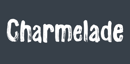 Another handmade brush font with that lovely green and organic feeling! :)
 - HeartBeats BH by BluHead Studio,
$20.00HeartBeats BH is a BluHead Studio font family with 1 style. - Empty Streets by PizzaDude.dk,
$15.00 Empty Streets is a brush made font with loads of attitude!
 - KG All Of The Stars by Kimberly Geswein,
$5.00 A whimsical star-themed font with letters inside a star shape.
 - Gras Vibert by Intellecta Design,
$24.95a family with decorative variations of Gras Vibert, a bodonian typeface - Signs Of Faith by Fonts of Chaos,
$10.00 Signs of Faith maturity font for artworks. Make cash with it.
 - TB FireSigns by TrueBlue,
$12.00This font contains signs associated with fire safely and fire prevention. - Xantigo by PizzaDude.dk,
$20.00Xantigo is a fun, smooth and romantic font with rounded edges. - Luco Sans by artill,
$19.00 A headline typeface with an impression of standardisation and stylish touches.
 - Daisy by Ludwig Type,
$45.00 Daisy is an ultra-fat serif typeface with very fine counters.
 - Benton Sans Pro by Font Bureau,
$40.00 An upgrade to the original Benton Sans with extended Language support.
 - FourHand by JOEBOB graphics,
$20.00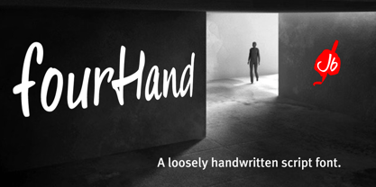 A friendly, legible, handwritten script font with a couple of ligatures.
 - Captain Blackbeard by Joanna Rzezak,
$14.90 Captain Blackbeard is a bold headline font with a western look.
 - Elamy MF by Masterfont,
$59.00 Intuitive freestyle handwriting font, with unique emphasizes on curves and rhythm.
 - Stuyvesant Engraved by Monotype,
$29.99The Stuyvesant fonts include delicate incline alphabets with an engraved look. - Longbranch Initials JNL by Jeff Levine,
$29.00Decorative monograms are easy with Longbranch Initials JNL from Jeff Levine. - ModernSketch, designed by Leonard Posavec, is a distinctive font that captures the essence of creativity and uniqueness. This font stands out for its sketch-like appearance, mimicking the hand-drawn ...
- Japura by Putracetol,
$28.00 Japura - Modern Display Typeface for Versatile Designs Japura is a unique and modern display typeface that will give your designs a classic, fun, and trendy impression. This font is perfect for display purposes such as album covers, posters, labels, t-shirts, signage, quotes, logos, and much more. With its elegant design inspired by vintage typefaces and posters, Japura comes with several variations such as ligatures, making it stand out from other fonts. Japura supports multiple languages, and its alternative characters are divided into several Open Type features, including Swash, Stylistic Sets, Stylistic Alternates, Contextual Alternates, and Ligatures. You can access these features using Open Type savvy programs such as Adobe Illustrator, Adobe InDesign, Adobe Photoshop Corel Draw X version, and Microsoft Word. In the Zip package, you will find Japura in otf, ttf, and woff formats. It comes with uppercase and lowercase letters, OpenType Alternates and Ligatures, numbers, punctuation, and symbols. With its multilingual support, Japura is perfect for any design project that requires a unique and modern display typeface. Upgrade your design game with Japura, the perfect font for a wide range of businesses and projects. Meta Description: Introducing Japura, a unique and modern display typeface perfect for album covers, posters, labels, t-shirts, signage, quotes, logos, and more. With multilingual support and Open Type features, upgrade your designs with Japura today.
 - Gordita by Type Atelier,
$25.00 Gordita is a minimal sans serif typeface with a geometric foundation that has been built upon with modern details that result in an optically balanced, friendly typeface. When designing Gordita referring to features in Futura were influential as were the structural and harmonious strokes of Gotham. Forms have been optically compensated to appear natural and purely geometric. Joints are slightly tapered and ink traps feature in heavier weights with the purpose of achieving maximum legibility. Gordita has been tested in print and on screen in a wide range of point/pixel sizes. The family is equipped with OpenType features including alternate glyphs, fractions, case sensitive forms, small figures, arrows and symbols as well as old style and tabular figures. Now delivered in 7 weights with matching italics that slant at 15°. The italics are slightly lighter and narrower than the upright versions. The horizontal weighting in the italics have been reduced to compensate for the loss of vertical stroke thickness. With support for over two hundred languages with an extended Latin and Cyrillic character set, Gordita is ready to be put to work. Designed by Thomas Gillett, metrics and engineering by iKern (Igino Marini). The family has been recently updated to include two additional weights (Thin & Ultra + their matching italics) as well as slightly opened apertures for better legibility in the heavier weights, new glyphs and more opentype features.
 - Slight by Up Up Creative,
$29.00 Introducing Slight, an elegant, full-featured script font with tons of alternate characters and OpenType features. Hand-lettered with a heavy right slant, Slight is particularly well-suited for invitations, branding, and editorial design. Slight comes with more than 1000 glyphs! Specific OpenType features include contextual alternates, stylistic alternates, initial and final forms, multiple alternate glyphs for many letters (accessed through the glyphs panel), multilingual support (including multiple currency symbols), ligatures, standard numbers, and six ampersand styles. Perhaps the most fun thing about Slight is that it includes multiple versions of all ascending and descending letters, making it lots of fun to play with in your layouts and compositions. The OpenType features can be very easily accessed by using OpenType-savvy programs such as Adobe Illustrator and Adobe InDesign. (To access these awesome features in Microsoft Word, you'll need to get comfortable with the advanced tab of Word's font menu. If you need help with this, ask me!) Files included: Slight-Regular.otf Mail support : julie@upupcreative.com --- Find inspiration (and sneak peeks at my next font-in-progress) on - Instagram: http://instagram.com/julieatupupcreative - Facebook : https://www.facebook.com/upupcreative - Pinterest: https://www.pinterest.com/upupcreative - My website: http://upupcreative.com --- PLEASE ENJOY! I can't wait to see what you make with Slight! Feel free to use the #upupcreative and #slightscriptfont tags to show me what you've been up to!
 - Leftfield by Fenotype,
$35.00 Leftfield - stylish vintage font collection. Leftfield collection includes following: •Leftfield Brush -a bold baseball style script with Clean and Rough version •Leftfield Swoosh -a set of swooshes designed to go with Leftfield Brush. Clean and Rough version. •Leftfield Sans -a sturdy all caps sans serif with Regular and Bold weight and Clean and Rough version of both •Leftfield Serif -a sturdy all caps serif with Regular and Bold weight and Clean and Rough version of both Leftfield Brush is a bold and strong sports team style vintage connected script. It’s great for any kind of display use from impressive logos to packaging and headlines. Brush is equipped with automatic Contextual Alternates that keep the connections smooth. In addition there is Swash, Titling and Stylistic alternates for standard characters. Try combining Leftfield Swoosh to make stunning compositions. Leftfield Sans and Serif work great as themselves, they make striking word blocks and they are designed to go with the Brush. Try Leftfield Serif in large sizes to make the best out of the subtle serif’s. Leftfield Rough versions simulate a printed version of the font for authentic vintage look. They’re otherwise the same font but with a rugged outline and print texture inside the characters. Leftfield has a wide language support including West European, Central European, Baltic, Turkish and Romanian character sets.
 - Axial cut by deFharo,
$21.00 Axial Cut is a sans serif typeface (Latin Extended-A), a contemporary and rounded evolution of geometric fonts for screen, but this time the letters are built on an axial axis that results in trapezoidal counter-shapes, joints with reduced antlers and rounded corners that correct optical effects in small sizes to make the typography more legible, and at the same time, in large sizes it shows its original shapes. The Axial Cut typeface family is made up of four weights: Light, Regular, Medium and Bold, each with 785 characters. I have taken particular care with the metrics and dimensions of each letter or sign, with a very careful and precise kerning configuration to achieve the For maximum readability, these are fonts with slightly higher ascenders than capitals and short descenders to make it more compact. The editing possibilities and unique designs with these complex typefaces are very wide, the fonts have a complete set of uppercase letters and a lowercase set with alternative characters as well as lowercase letters and numbers in different positions (lowercase, denominators, numerals, and uppercase) that They also work as automatic fractions, they also incorporate small capital letters and three sets of alternative numbers (Normal, Old style numbers, Square numbers), etc. Discover other alternative signs, characters and Open Type functions in the PDF: Specimen & The Cheat Sheet.
 - Rex Stephane by Mans Greback,
$79.00 Rex Stephane, designed by Mans Greback, is a striking blackletter font that artfully blends medieval influences with modern geometric shapes. Inspired by the tall stature of Gothic architecture, merged with sharpened edges, this font captures the essence of strict ruling while having an elegance of the Middle Ages. First imagined while exploring an abandoned castle, the typeface is based on ancient manuscripts adorned with calligraphic lettering. These texts became the foundation for Rex Stephane, as Mans Greback aimed to recreate the rich history and grandeur of the medieval era while adding his own contemporary twist. The font is built with advanced OpenType functionality and has a guaranteed top-notch quality, containing stylistic and contextual alternates, ligatures, and more features; all to give you full control and customizability. It has extensive lingual support, covering all Latin-based languages, from Northern Europe to South Africa, from America to South-East Asia. It contains all characters and symbols you'll ever need, including all punctuation and numbers. Mans Greback is a Swedish typeface designer with a passion for creating unique and versatile fonts. With an extensive background in design and typography, Mans has built a reputation for his meticulous attention to detail and prolific craftsmanship. His many fonts are widely used by designers around the world, making his work synonymous with creativity and innovation.
 - Archeron Pro by Mostardesign,
$25.00 Archeron Pro is a modern serif font family with 18 fonts ranging from light to Heavy with the corresponding italics. This new font family revisits the neo-classical style of highly contrasted serifs and brings a resolutely contemporary touch to graphic or editorial projects. Archeron Pro has also been designed with high-contrast character ratios and a high x-height to give sentences more rhythm and legibility to long texts for on-screen display or printed materials. The italic styles of this family of characters are voluntarily removed from the calligraphic style to bring modernity to the italicized style, thus giving more of a typographic style. With these features, Archeron Pro is an elegant and contemporary serif specially adapted for modern communication as well as complex typographic projects. Archeron Pro also has a complete set of real small capitals with a little more tension than uppercase and generous proportions to give more emphasis to the texts you want to highlight. In terms of features, Archeron Pro is equipped with professional features such as case sensitivity, alternative glyphs, F-ligatures, circled numbers, localized letters, ordinals, or “Pro Kerning” with more than 5,000 pairs of glyphs which brings more clarity when reading long paragraphs. Archeron Pro also has a complete set of proportional and tabular numbers, fractions, and circled numbers for complex realizations such as tables or numerical lists.
 - Wanderlust Collection by Cultivated Mind,
$32.00 Wanderlust Letters has returned, but now offered in a beautiful collection of hand painted scripts. New versions include Wanderlust Letters Pro, Decorative, Boho, Chic, Shine, Gold, Caps, and Ornaments. Wanderlust Letters Pro is an extended version of the immensely popular Wanderlust Letters. This latest version includes three sets of basic alternates, one set of decorative alternates, and one set of ligatures. Wanderlust Decorative Pro offers a magnificent updated flow from the initial Wanderlust Letters release. Decorative Pro includes two sets of decorative alternates, two sets of basic alternates, and one set of ligatures. Decorative Regular comes with one set of decorative alternates. Boho, Chic, Shine and Gold are an updated spin off of Wanderlust Letters. These fonts offer new letter styles that blend seamlessly with all Wanderlust fonts. Pro versions of Chic, Shine and Gold comes with three sets of basic alternates and one set of decorative alternates. Boho Pro comes with with two sets of basic alternates and two sets of decorative alternates. Caps is a perfect choice for headline use since it’s an all uppercase font. But don't be afraid to mix it up with all the other Wanderlust fonts. The entire Wanderlust Collection works impeccably to enhance your magazine, packaging, advertising, branding, posters, websites, and films. Combine all Wanderlust fonts with Ornaments to create unique hand painted typography art.
 - Antikor by Taner Ardali,
$35.00 Antikor is "mono geometric sans" family consist of 3 styles, 55 fonts with real italics... All fonts of family contains 800+ glyphs, and equipped with many typographic features. (Styles: Mono, Text and Display) Antikor Text is designed for those who prefer to use monospaced fonts not only in coding but in many different media of graphic design. The idea came from creating a typeface with monospaced aesthetic without disturbing aspects of monospaced typefaces . Antikor text has proportional spacing and precise kerning to avoid poor rhythm and track in reading text. It also provides wide range of useful features with extended glyph sets and opentype features. Antikor Mono is geometric sans monospaced typeface with all typographic features except spacing and kerning. As other styles it has many opentype features and extended character set including SmallCaps, Stylistic Alternatives, Scientific Numbers, Fractions, Oldstyle Numbers, Case Sensitive Forms, Arrows, Circled numbers and etc... It is designed to meet all the needs of the monospaced text medias... As Antikor is a versatile family, Antikor Display is a very alternative typeface with playful calligraphic curves. It is designed with the idea of creating a contrast and eye catching touch in display use of typography. It creates tasty contrast against the serious and solid monospace look. Each style has 11 weights ranging from Hairline to ExtraBold + real italics, consist of 22 fonts.
 - PR Vanaheim by PR Fonts,
$10.00 This is a perfect font for historical or fantasy titles. It is influenced by ancient Nordic runes. the strokes flare slightly, to a concave terminal for a finely carved appearance. There are two sets of capitals in PR-Vanaheim-DC (Dual Capitals); one set of narrow letters, more closely related to Runic forms, and one set which includes wider and circular letters, which can be freely combined with the narrow letters for the variety associated with hand lettering. There is one version with dots placed in the centre of large counters and one version without the dots. The broad caps character set includes characters which allow for tight spacing; a dropped L, and a tall T. There are also two different lowercase sets, one modern, and one archaic, all of which can be freely mixed to fine tune the appearance of your text. Here is the brief description of the available faces: PR-Vanaheim-Med-DC-01 Duplex Caps PR-Vanaheim-Med-DC-02 Duplex Caps, Dotted counters and dot space PR-Vanaheim-Med-DC-03 Duplex Caps, Dotted counters PR-Vanaheim-Med-LC-04 Broad Caps, with modern style lower case. PR-Vanaheim-Med-LC-05 Narrow Caps, with modern style lower case. PR-Vanaheim-Med-LC-06 Broad Caps, with archaic lower case. PR-Vanaheim-Med-LC-07 Narrow Caps, with archaic lower case.
 - Behind The Nineties Sans by Casloop Studio,
$9.00 Introducing Behind The Nineties Sans - the perfect counterpart to our beloved font, "Behind The Nineties." This new sans-serif addition effortlessly captures the classic vibes of the 80’s and 90’s while infusing a contemporary touch for a timeless yet modern aesthetic. Key Features: Sans Serif Sophistication: "Behind The Nineties Sans" exudes sleek and modern elegance, offering a clean alternative to its serif predecessor. Regular and Italic Styles: Whether you prefer a straightforward look or a touch of italicized flair, this font provides versatility for all your design needs. Classic with a Contemporary Twist: Embrace the spirit of the 80’s and 90’s with a font that seamlessly blends classic elements with contemporary sophistication. Editorial Excellence: Elevate your editorial projects with the precision and clarity of "Behind The Nineties Sans," ensuring a polished and professional appearance. Luxury Serif Companion: Pair it with "Behind The Nineties" serif font for a cohesive design that radiates opulence and luxury. Dramatic Impact: Make a statement with the font's dramatic presence, capturing attention and adding a bold touch to your creative endeavors. Multi-language support including Western European, Central European, South Eastern European, South American, Oceanian, and even Esperanto. "Behind The Nineties Sans" is your go-to font for achieving a harmonious blend of nostalgia and modern flair. It's time to redefine classic design with this exquisite sans-serif typeface.
 - Cas Pixalatte by Casloop Studio,
$10.00 Cas Pixalatte Typeface - Dive into Y2K Nostalgia with Pixel Perfection Unleash the power of pixelated aesthetics with Cas Pixalatte Typeface, a cutting-edge font inspired by the iconic Y2K era. This unique typeface is a masterful blend of typography, graphic design, and pixel art, crafted to infuse your projects with a distinct visual style that's both nostalgic and contemporary. Two Distinct Pixel Font Styles Tailor your designs with precision by choosing between the 'Regular' and 'Rounded' styles, allowing you to achieve the perfect balance between retro charm and modern aesthetics. Multi-Language Support Cas Pixalatte goes beyond borders, offering comprehensive support for Latin-based languages across Western Europe, Central Europe, South Eastern Europe, South America, Oceania, and Esperanto. Why Cas Pixalatte? Here's what sets it apart: Visual Versatility: Whether you're working on a gaming interface, website design, or branding project, Cas Pixalatte adds a unique visual flair, making your creations truly stand out. Easy Integration: With a range of file formats, seamless integration into your design workflow is guaranteed, ensuring a hassle-free creative process. Global Appeal: Break language barriers with multi-language support, allowing you to reach audiences around the world without compromise. Elevate your design, embrace nostalgia, and make a lasting impression with Cas Pixalatte Typeface. Discover the possibilities, unlock creativity, and transform your projects into unforgettable visual experiences.
 - String by Lián Types,
$45.00 Inspired by the sound of acoustic guitars, delicacy of harps and elegance of the engrossers script, String is a trendy monoline font which will for sure make unique layouts for your pieces of design. Combining String with String Hole in the same word is a good idea when a more playful rhythm is needed. The font works particularly well when standing on photographs, so be ready to use it in magazines with food, landscapes or super models. I like thinking of String as a distilled version of Erotica. A more “pure” relative of hers. When I designed Erotica, I was so in love with the spencerian style that I knew it'd be hard to just abandon it. With that in mind, this time my aim was to take the subtlety of it to the limit. So, in order to do that I had to find out what was actually the secret of its beauty. I found that the essence of Erotica, in other words, its ductus was the most responsible. The result is a font made of hairlines with a lot of emphasis on the pureness of the form and, (with a lot of inspiration in music) the sensation of continuity between its letters as if they were written with a string. Try String and its flowing melody.
 - Thicker by Zetafonts,
$39.00 Thicker is a type-family designed for Zetafonts by Francesco Canovaro with Andrea Tartarelli. A geometric sans typeface on steroids, it was first designed in the muscular Extrablack weight with the aesthetics of high-power dynamic typefaces used in sports communication, and then developed in the lighter weights where the shapes show some vintage-inspired proportions and the slightly squared look that nods to Novarese famous Eurostile, eponymous with retro-futurism. With these diverse influences the typeface allows for both impressive display use and effective logo design as well as more fine-tuned editorial use in body text - with a natural inclination for effective and powerful advertising. Sports typography usually uses italics to add dynamism and impact, and Thicker complies with this by offering a choice of three alternate italic forms with different slant, made even more customizable by the inclusion of variable font technology that allows fine tuning of the weight range as well as precise choice of typeface slant. In each of the 44 weights of the typeface family (as well as in the all-in-one variable type solution) Thicker offers a extended charset of over 900 latin, Cyrillic and Greek glyphs, covering over two hundred languages and including useful Open Type features (Alternate forms, Positional Numerals, Small Caps and Case Sensitive Forms) for flawless typesetting.
 - Neon Goo by Hanoded,
$16.00 I’m a bit of a sucker for neon lights, especially in big cities. My favourite city is Tokyo, with its brightly coloured billboards and its back alleys full of neon-lit eateries. At first sight, Neon Goo is a slightly warped font, with some funny looking glyphs and a generous spacing. When you start using it, you’ll find out that the glyphs do complement each other! Neon Goo comes with all diacritics and a set of alternates for the lower case letters.
 - Kristolit by Sasha Denisova Type Foundry,
$35.00 Kristolit is a Scotch Roman-inspired typeface with a technological twist. Version 1.0 features regular and italic styles with basic Latin and Cyrillic sets. It’s both elegant and robust: its ample curves contrast with the brutality of its lines, the verticality of its axis and stroke contrast. It is optimized type family for editorial use, branding projects and identities striking a balance between aesthetic experimentation, functionality, and legibility. The italic version adds a calligraphic touch while maintaining its tech-savvy and robust character.
 - Konga Next by RodrigoTypo,
$25.00 Konga has gone through different changes, the first idea was born in 2014 with the help of Andrey Kudryavtsev, then some time passed and the Rough version was developed, and a long time passed and in 2022 the idea of redesigning was taken with Bruno Jara, in addition to making many styles such as Rough, Inline, Shadow, as well as dingbats which was based on Stefania Ahumada's graphics, which results in a family of 6 styles, with different Alternatives, perfect for informal titles.