10,000 search results
(0.095 seconds)
- Rebahan by Zeenesia Studio,
$14.00 The Rebahan, A vintage style font for your awesome next project! This font created for straight forward text in big display but also good and readable in smaller paragraph size. Best suitable for branding, packaging, posters, wall sign, print titles, t-shirt design, ads, and similar projects. No lower case included in this first pack but might be added in the next update. Hope you like this all caps font!. If you find any bug or issue using this font please let me know, I’ll work on it as fast as i can.
 - ITC Mister Chuckles by ITC,
$29.99Round, firm, and bursting at the seams with good humor, ITC Mister Chuckles is based on the premise that barrel shapes have pleasant associations. Think: beer-barrel polkas, a barrel of fun, or a barrel of laughs, and you'll get the idea. Designer Nick Curtis has combined sans serif sturdiness, a hint of 1930s deco and a handful of giggles in this remarkably versatile all-cap face. If the typographic occasion calls for mirth and merriment, invite Mister Chuckles to the party. You'll have more fun than a barrel of monkeys! - Manifold CF by Connary Fagen,
$35.00 Manifold® CF is a utilitarian typeface inspired by the precision of a computer terminal, softened by contemporary design and rounded corners. Manifold's unified letterforms and tall x-height are great for user interfaces, or track it out for a sophisticated look. Manifold also offers wide language support, including Cyrillic script, Vietnamese, and Pinyin Romanization. Manifold® CF excels as a headline or display typeface, and pairs well with contrasting simple serifs like Artifex CF and Artifex Hand CF. All typefaces from Connary Fagen include free updates, including new features, and free technical support.
 - Recording Artist JNL by Jeff Levine,
$29.00 When 45 RPM records were the norm for a teenager’s music collection in the 1950s and 1960s, many discs had their labels printed by letterpress. Some record companies utilized a bold, condensed typeface set in all caps for the song’s title and other pertinent information. The digital version of this font is called Recording Artist JNL, and is available in both regular and oblique versions. A companion font loosely based on this type design [but with more original characters and a slightly lighter weight] is Promotional Copy JNL.
 - Hey Julia by IM Studio,
$13.00 Hey Julia Script is an elegant and flowing handwritten font. This is a PUA code which means you can access all the glyphs and sweeps easily! It features varied baselines, smooth lines, gorgeous glyphs and stunning alternatives. The font comes with upper and lower case letters, numbers, punctuation, support for languages, swashes and ligatures. Hey Julia Script It maintains a classy calligraphic influence while feeling contemporary and fresh. Fall in love with this font and take your project to the highest level! Thank you for visiting our store, hope you like it :)
 - Zealand by Hanoded,
$15.00 When you think of Zealand, you’ll probably think of NEW Zealand. But did you know that New Zealand was named after the Dutch province of Zeeland (meaning Sea-land)? And did you know that there are many sealands in the world? Denmark has Sjælland and there is even a micronation called Sealand off the coast of England. Zealand font is a handmade, all caps display font. I used a Japanese brush pen for the outlines and the fill. It has a nice textured look, making it ideal for book covers and product packaging.
 - Toadstool by Hanoded,
$15.00 My kids love toadstools, especially the red capped ones with the white spots (they’re called Amanita muscaria, a.k.a. fly agaric - in case you’re wondering). A couple of months ago you could find loads of them in the forest, but now they’ve all disappeared. Toadstool font will not disappear, however. It is a very legible, clean and neat text font with an uneven baseline, slightly bouncy glyphs and more diacritics than a forest has mushrooms. Use if for packaging, kids’ book covers and posters. This toadstool is the non-toxic variety, so go nuts.
 - Cheerful Day by Letterara,
$14.00 Cheerful Day is a cute and casual handwritten font with an incredibly friendly feel. It features gorgeous swashes and ligatures that make this script incredibly versatile. Whether you’re looking for fonts for Instagram or calligraphy scripts for DIY projects, Cheerful Day will turn any creative idea into a true piece of art! Fall in love with this font and bring your projects to the highest levels! This font is PUA encoded which means you can access all of the glyphs and swashes with ease! It features a varying baseline, gorgeous glyphs, and stunning alternates.
 - Executive Boss by Letterara,
$14.00 Executive Boss is a cool and versatile duo font (serif and script). The beautiful signature monoline-style font perfectly complements the elegant serif font. Combining these two fonts in your next design will give a modern and sophisticated feel, and it makes it a perfect addition to your font collection. Fall for its ravishing style and use it to create gorgeous wedding invitations, beautiful stationary art, eye-catching social media posts, logos, packaging, advertising, and much more! This font is PUA encoded which means you can access all the glyphs and swashes easily!
 - Romeo Juliet by Letterara,
$12.00 Romeo Juliet is a beautiful and romantic handwritten font. It features amazing sweet heart-shaped titling. These sweet handwritten fonts with connecting hearts are great for creating personalized items. This font is PUA encoded which means you can access all of the cute glyphs and swashes with ease! It also features a wealth of special features including alternate glyphs and ligatures. Fall in love with its authentic feel and use it to create gorgeous wedding invitations, beautiful stationary art, eye-catching social media posts, and cute greeting cards, and many more.
 - Kutilang by Allouse Studio,
$16.00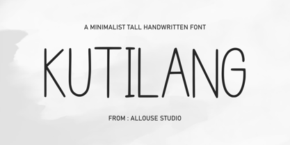 Proudly Present, Kutilang a Minimalist Tall Handwritten Font. Kutiling come along with Multi-Lingual Support to fulfill your need. We highly recommend using a program that supports OpenType features and Glyphs panels like many of Adobe apps and Corel Draw, so you can see and access all Glyph variations. Kutilang is perfect for any tittle, product packaging, branding project, megazine, social media, wedding, or just used to express words above the background. Enjoy the font, feel free to comment or feedback, send me PM or email. Thank You!
 - Frozenflare by Balpirick,
$15.00 FROZENFLARE is a Sweet and Soft Handbrushed Font. It is suitable for svg designs, mug decorations, pottery, shirts, hats, tote bags, card making, wall art, interior prints, and various other creations. Whatever the topic, this font will be a wonderful asset to your font library, as it has the potential to enhance any creation. This font only has all uppercase letters, but if accessed with lowercase letters it will automatically become uppercase. also multilingual support Enjoy the font, feel free to comment or feedback, send me PM or email. Thank you!
 - Sweet Macarons by Stefani Letter,
$14.00 Sweet Macarons is a playful display font that is easy to read. It’s perfect for Christmas cards, branding, stationery, blog design, custom art, custom stamps, custom embossers, book, apparel, packaging, headline, Crafting, Logo, or much more! It will add a unique feel and looks stunning to any design project! This font is PUA encoded which means you can access all of the cute glyphs with ease! It also features a wealth of including ligatures. Fall in love with its incredibly distinct and timeless style and use it to create spectacular designs!
 - Meuthia Beauty by Awan Senja,
$14.00 Meuthia is a beautiful and classy signature font. This is a beautiful combination of timeless elegance and authentic calligraphy. It features an incredibly classic style, while still keeping a friendly feel. Fall in love with its authentic feel and use it to create gorgeous wedding invitations, beautiful stationary art, eye-catching social media posts, and cute greeting cards. This font is PUA encoded which means you can access all of the amazing glyphs and swashes with ease! It also features a wealth of special features including alternate glyphs and ligatures.
 - Al Badlooking Brush by Aluyeah Studio,
$90.00 Badlooking Brush, the ugly duckling modern script font. Coming with 52 alternates, 9 stunning swash and super easy to use alternates. Very suitable for magazine, headline, website, ads, product package and all type of design project you have. Features: OpenType support Multilingual support (15 languages) PUA Encoded Super Easy to Use alternates - It's OpenType support but you can easily call alternates character using special combination like A.2 R.2 a.2 h.2 etc so you don't need a special software. To get results like the preview just type Badloo.2king B.2ru.2sh
 - VanderHand by JOEBOB graphics,
$29.00 The 'VanderHand' font is a friendly and easy to use handwritten font. It is so loaded with ligatures it could easily pass for actual handwriting. The font was created with a felt-tip brush pen and so there are natural thick and thin parts in the characters. All writing was done upright with tightly fit characters. As a result this font has a unique 'instant logo' quality. But you should really try this out for yourself. O, and the font was written by Jeroen van der Ham. It's his handwriting. That's why it's called VanderHand.
 - Plastic Fantastic by Hanoded,
$15.00 I have just returned from a trip to Malaysia, Java and Bali with my family: my wife had some family business there, so we turned it into a holiday. The last time I visited these places was 26 years ago and I knew things would have changed, but I wasn’t prepared for the ugly truth. Malaysia’s interior has been converted into one big oil palm plantation, Java is choked in plastic and Bali is one endless string of concrete hotels, restaurants and cheap tattoo parlours. Plastic Fantastic is not an ode to the many uses of plastic. It is a wake up call: we really need to stop using disposable plastic! You can start by implementing the Plastic Fantastic font family in your durable water bottle designs, the compostable bag holding your organic potato crisps or that big ole sign advertising your local food truck event. Or whatever it is you want to create. ;-)
 - Ongunkan Cypriot Linear C Sylla by Runic World Tamgacı,
$100.00 This font is an adaptation of the cyprus syllabic script to a Latin-based font. I tried to assign as many correct letters as possible, but there were too many characters so I had to fit them. Please review the alphabet table of Cypriot syllabic to use the Font. To see all the characters, you can see all the characters and add them to the text by selecting this font from the add character section on the word page. Cypriot syllabary The Cypriot syllabary was used in Cyprus from about 1500 and 300 BC and is thought to have developed from the Linear A. The earliest known inscriptions from between 1500 and 1200 BC are in an unknown language called 'Eteo-Cypriot', or 'True Cypriot', and the script in which they are written is called Cypro-Minoan. From around 1200 BC Cyprus began to be colonised by Mycenaean, Minoan and possibly Cretan Greek settlers, and they probably adapted the existing script to write their own language - the oldest known inscription in Greek dates from the 11th century BC. Cypriot Greek had much in common with Greek dialects of Arcadia and Pamphylia, which corresponds to the province of Antalya in Turkey.
 - Selfie Neue Sharp by Lián Types,
$29.00 INTRODUCTION When I started the first Selfie back in 2014 I was aware that I was designing something innovative at some point, because at that time there were not too many, (if any) fonts which rescued so many calligraphy features being at the same time a monolinear sans. I took inspiration from the galerías’ neon signs of my home city, Buenos Aires, and incorporated the logic and ductus of the spencerian style. The result was a very versatile font with many ligatures, swashes and a friendly look. But… I wasn’t cognizant of how successful the font would become! Selfie is maybe the font of my library that I see the most when I finally go out, (type-designers tend to be their entire lives glued to a screen), when I travel, and also the font that I mostly get emails about, asking for little tweaks, new capitals, new swashes. Selfie was used by several renowned clients, became part of many ‘top fonts of the year’ lists and was published in many magazines and books about type-design. These recognitions were, at the same time, cuddles for me and my Selfie and functioned as a driving force in 2020 to start this project which I called Selfie Neue. THE FONT "Selfie for everything" Selfie Neue, because it’s totally new: All its glyphs were re-drawn, all the proportions changed for better, and the old and somehow naive forms of the first Selfie were redesigned. Selfie Neue is now a family of many members (you can choose between a Rounded or a Sharp look), from Thin to Black, and from Short to Tall (because I noticed the feel of the font changed notoriously when altering its proportions). It also includes swashy Caps, which will serve as a perfect match for the lowercase and some incredibly cute icons/dingbats (designed by the talented Melissa Cronenbold, see also Selfie Neue Rounded for more!) which, as you see in the posters, make the font even more attractive and easy to use. You'll find tons of alternates per glyph. It's impossible to get tired with Selfie! Like it happened with the old Selfie, Selfie Neue Sharp was thought for a really wide range of uses. Magazines, Book-covers, digital media, restaurants, logos, clothing, etc. Hey! The font is also a VF (Variable Font)! So you can have fun with its two axes: x-height and weight, in applications that support them. Let me take a New Sharp Selfie! TECHNICAL If you plan to print Selfie Neue VF (Rounded or Sharp), please remember to convert it to outlines first. The majority of the posters above have the "contextual" alternates activated, and this makes the capitals a little smaller. I'd recommend deactivating it if you plan to use Selfie for just one word. Use the font always with the "fi" feature activated so everything ligatures properly. The slant of the font is 24,7 degrees, so if you plan to have its stems vertical, you may use Selfie with that rotation in mind. THANKS FOR READING
 - KG Two Is Better Than One by Kimberly Geswein,
$5.00 This font was created in honor of my husband for our 12th wedding anniversary. 14 years ago, I met this tall, skinny guy from Indiana in the lobby of a hotel in Hong Kong. We talked. The next day, we had lunch together. And that night we had dinner together. And the next day. And the next. We met just before my 19th birthday, and on my birthday he took me to the top of Victoria Peak, where we looked out over the city of Hong Kong- such a beautiful place to begin a lifetime of love! We spent 4 months together in Hong Kong, falling in love with each other and with the beautiful city we were privileged to call home for that short time. We married the next year. We've lived in Indiana, Texas, China, Kentucky, and Florida over those 12 years of marriage and have welcomed 2 daughters into our lives. I know beyond a shadow of a doubt that he completes my life in a way I didn't know was possible. And I know that I'm blessed beyond words to have a supportive, wonderful, encouraging husband who is also a loving, involved, caring dad to our daughters. This font is for you, Keith!
 - DeDisplay by Ingo,
$24.99 A type designed in a grid, like on display panels Type is not only printed. There were always and still are a number of forms of type versions which function completely differently. Even very early in the history of script there were attempts to combine a few single elements into the diverse forms of individual characters and also efforts to construct the forms of letters within a geometric grid system. The “instructions” of Albrecht Dürer are probably most well-known. But although designers of past centuries assumed the ideal to basically be an artist’s handwritten script, the idea which developed in the course of mechanization was to “build” characters in a building block system only by stringing together one basic element — the so-called grid type was discovered, represented most commonly today by »pixel types.« But even before computers, there were display systems which presented types with the help of a mechanical grid display, like the display panels in public transportation (bus, train) or at airports and train stations. In a streetcar, I met up with a modern variation of this display which reveals the name of each tram stop as it is approached. This system was based on a customary coarse square grid, but the individual squares were also divided again diagonally in four triangles. In this way it is possible to display slants and to simulate round forms more accurately as with only squares. The displayed characters still aren’t comparable to a decent typeface — on the contrary, the lower case letters are surprisingly ugly — but they form a much more legible type than that of ordinary [quadrate] grid types. DeDisplay from ingoFonts is this kind of type, constructed from tiny triangles which are in turn grouped in small squares. The stem widths are formed by two squares; the height of upper case characters is 10, the x-height 7 squares. DeDisplay is available in three versions: DeDisplay 1 is the complex original with spaces between the triangles, DeDisplay 2 forgoes dividing the triangles and thus appears somewhat darker or “bold,” and DeDisplay 3 is to some extent the “black” and doesn’t even include spaces between the individual squares.
 - Heller Sans JNL by Jeff Levine,
$29.00 Heller Sans JNL is based on the main letterforms of an experimental alphabet designed by Steven Heller; noted author of over 170 books on design and visual culture. Some modifications were made in turning his design into a digital font. In his own words, here is the background to this typeface: “I recently recovered this from the junk heap. It is a yellowing photostat of my first and only typeface design (1969-70). Total folly! At the time I was smitten by Art Moderne lettering. I called it “Klaus Boobala Bold” because I liked the K and B. I’ve lost the letters S through Z, which were made. The letters were drawn with compass, Techno pen (that frequently clogged). as well as a triangle and T-square. The inline and outline made no real logical sense. I based the design, in part, on Kabel, Avant Garde and it was a product of whatever I could accomplish with those tools. The caps-only alphabet was photographed and produced as a film negative that was cut in foot-long strips and spliced to fit on a Typositor reel. Sadly, the negatives made for the font were too brittle and the splice snapped apart in the Typositor. I worked on it for well over a month and used the face only once. I realized with this attempt, like so many other times I attempted different challenges, that type design — indeed mechanical drawing — was not my strong suit.” Heller Sans JNL is available in both regular and oblique versions.
 - Ballestro by Rex Face,
$19.99 Ballestro is a playful, versatile display font. Its name is a nod to the characters being constructed using a grid-like pattern of balls. Ballestro is great for headlines, signage, logos, packaging and more.
 - The Mephisto™ font by The Scriptorium is an evocative and stylistically unique typeface, designed to encapsulate a sense of historical depth and artistic flair. The name itself, Mephisto, is a nod to...
- Daily Challenge by Hanoded,
$15.00 My daily challenge is how to get my kids out of bed, feed them breakfast, get them to dress, wash and pack their school bags and drop them off at school before the bell rings. The rest of the day, the challenge is to renovate our house, get my work done, pick up the kids from school (plus all of their friends, who want to come and play) and cook dinner. Of course, the word ‘challenge’ was misused by the internet. Not too long ago, there seemed to be and endless stream of crazy challenges that ended up hurting or even killing a few people. Daily Challenge font is none of the above: it is a clean cut, 100% handmade, all caps font. The only challenge here is how to adapt your design so it fits this font perfectly… ;-)
 - Whatchamacallit by Comicraft,
$19.00 We popped the Doohickey into the Framistat and out popped this Whatchamacallit! Is it fat? is it thin? Is it tall? Is it short? Is it light? Is it heavy? Is it condensed?! is it expanded?! Yes, yes, yes and yes -- It’s all of the above and more! Our resident mad scientist John “Mr. Fontastic” Roshell has developed a single contraption that can handle any design emergency, from crimelords to supervillain team-ups to alien invasions. Whatchamacallit is a friendly and readable sans-serif, inspired by some of our all-time favorites -- Gill Sans, Futura, Venus and Antique Olive. But, like its machinery-contraption namesakes Doohickey and Framistat, Whatchamacallit has a lively personality -- the strokes are a little wavy, the ends a bit bulbous, and the circles are like little loaves of bread, rising in the Whatchamacallit's oven... delicious!
 - Mashok by Twinletter,
$18.00 Mashok is a retro condensed font that exudes a vintage feel, perfect for adding a touch of nostalgia to your designs. This font features a tall and narrow letterform, making it ideal for creating eye-catching headlines and titles. With its unique stylistic alternates and ligatures, Mashok adds an extra level of charm and personality to your designs. Whether you’re creating posters, book covers, or other graphic design projects, Mashok is sure to make your text stand out. Give your designs a retro flair with Mashok today! What’s Included : - File font - All glyphs Iso Latin 1 - Alternate, Ligature - Simple installations - We highly recommend using a program that supports OpenType features and Glyphs panels like many Adobe apps and Corel Draw so that you can see and access all Glyph variations. - PUA Encoded Characters – Fully accessible without additional design software. - Fonts include Multilingual support
 - The Galaxus font is a bold display sans typeface that is strongly themed as futuristic, making it ideal for science fiction and space-related designs. Its characters are heavy and wide, with a unique...
- Vanitas by Reserves,
$49.00Vanitas is an elegant high contrast contemporary sans. It is rooted in the style of a classic didone, excluding the typical serifs and ball terminals as well as being designed with a cleaner, more reductionist appearance. Strict attention was given to the cohesiveness and balance between letterforms as well as the careful refinement of all curves. Stylistically, Vanitas’ alluring, sophisticated sensibility is directly inspired by high fashion. The upright styles are complimented by a pairing of optically adjusted true italics, which were purposefully adapted to retain the sharpness of their counterparts. Abandoning traditionally executed cursive italic letterforms retains Vanitas’ sharp characteristic through each style. Features include: Precision kerning Standard Ligatures set including ‘f’ ligatures (fb, ff, fh, fi, fj, fk, fl ffb, ffh, ffi, ffj, ffk, ffl, ffy, ae, oe, AE, OE) Discretionary Ligatures set including (st, ct, No) Alternate characters (H, A, AE, Q, $, h circumflex, ¶ and numero sign) Case forms (shifts various punctuation marks up to a position that works better with all-capital sequences) Capital Spacing (globally adjusts inter-glyph spacing for all-capital text) Slashed zero Full set of numerators/denominators Tabular Lining, Proportional Lining, Tabular Oldstyle and Proportional Oldstyle Figures Automatic fraction feature (supports any fraction combination) Extended language support (Latin-1 and Latin Extended-A) *Requires an application with OpenType and/or Unicode support. - All Over Again, a captivating font created by the talented David Kerkhoff, stands out as a distinguished member of the handwritten font family. David Kerkhoff, known for his ability to infuse persona...
- Shaded Spheres by Dingbatcave,
$15.00These Op-Art-looking little balls and gems appear 3-D without the help of any special graphic filters, which makes them perfect for use with flat colors or one-color print jobs. 72 characters. - BF Garant Pro by BrassFonts,
$39.99 BF Garant™ Pro elegantly balances geometric design with dynamic character! (This Pro-Edition is the fully packed upgrade of the well-known Hot New Fonts #1 BF Garant.) The strict architecture is combined with open counters, tapered spurs and diagonal cut ascenders and descenders that create an open, lively character without denying the straightness of geometry. 10 weights from Thin to Black and matching (oblique) Italics ensure versatile use of the type family. BF Garant Pro’s characters include the extended Latin Unicode range (incl. Vietnamese), Cyrillic and Greek. So it is very suitable for branding and packaging. “The last modern geometric typeface you really need!” The large x-height, dynamic details and some more conventional, humanist-inspired letter alternatives (a, g, k, u, y, G, Q - some of which are grouped together in the style set “Text”), make it not only a contemporary graphic element, but a highly legible timeless design tool, is not only ideal for logotypes or contemporary branding use, but also for modern editorial design. The 1,760 characters per font include ligatures, alternates, line figures and old style figures, small caps, numerals for small caps, fractions, symbols (incl. Peace sign), currencies, different arrows etc. In addition, 23 useful OpenType features make BF Garant™ Pro a workhorse for many typographic applications. With the 11 style sets, BF Garant™ can be fully adapted to the user’s requirements without losing its unique character. And for those who ever wanted to open a bar on Tatooine, BF Garant™ Pro also includes the currency sign of Galactic Credits! Feel the Font!
 - Clinto by XdCreative,
$29.00 Clinto Sans Serif Clinto Sans is a simple geometric sans serif font Clinto Sans are constructed using basic geometric shapes such as circles, squares, and triangles. The letterforms are based on simple geometric proportions, resulting in a consistent and harmonious visual rhythm. Clinto sans serif fonts embrace simplicity and have a minimalistic approach. They aim to reduce letterforms to their essential elements, eliminating any unnecessary embellishments or flourishes Clinto Sans also has Straight Lines and Clean Edges. Clinto Sans also have open apertures, which refer to the space enclosed by the curved or diagonal strokes of certain letters like "a," "e," "g," and "s." The open apertures contribute to legibility and readability, especially at smaller sizes. Special features: - Ink trap Ink traps are small recessed areas or notches incorporated into the corners or junctions of letterforms. They were originally designed for letterpress printing to prevent ink from filling in and distorting the shapes, especially at small sizes. However, in modern digital fonts, ink traps are often used as a design element to add visual interest and maintain legibility at small sizes or in low-resolution environments. - Alternates Stylistic alternates offer alternative shapes or forms for certain letters in the font, a, e, g, and r, etc. Stylistic alternates can be accessed through OpenType features in design software. OpenType is a font format that allows for advanced typographic features and character substitutions, you can access the alternate letterforms through the glyphs palette or the OpenType panel in their design software and apply them selectively to specific letters. Thank You _
 - Palatino Linotype by Linotype,
$197.99The Palatino™ typeface was first designed over 50 years ago by Hermann Zapf, and is probably the most universally admired and used of his type designs. In 1950, it was punchcut in metal by August Rosenberger at D. Stempel AG typefoundry in Frankfurt am Main, and then adapted for Linotype machine composition. Zapf optimized Palatino's design for legibility by giving it open counters and carefully weighted strokes, producing a typeface that was legible even on the inferior paper of the post-World War II period. The font was named after Giambattista Palatino, a master of calligraphy from the time of Leonardo da Vinci. Palatino is a typeface based on classical Italian Renaissance forms. It has become a modern classic in itself, and is popular among professional graphic designers and amateurs alike. Palatino works well for both text and display typography. The new Palatino™ Linotype typefaces are OpenType format fonts, which include many newly designed characters in four large character sets; including extensive support for the Latin, Greek, and Cyrillic alphabets, as well as for Central European and many other languages. The Palatino Linotype OpenType fonts contains the following Microsoft code pages: 1252 Latin 1, 1250 Latin 2 Eastern, 1251 Cyrillic, 1253 Greek with polytonic Greek, 1254 Turk, 1257 Windows Baltic, and 1258 Windows Vietnamese. The fonts also include many ligature glyphs, including some historical long s-ligatures, as well as sets of Small Caps, Old style Figures, and vertical & diagonal fractions. Each font contains 1325 different glyphs. - ITC Franklin by ITC,
$40.99 The ITC Franklin™ typeface design marks the next phase in the evolution of one of the most important American gothic typefaces. Morris Fuller Benton drew the original design in 1902 for American Type Founders (ATF); it was the first significant modernization of a nineteenth-century grotesque. Named in honor of Benjamin Franklin, the design not only became a best seller, it also served as a model for several other sans serif typefaces that followed it. Originally issued in just one weight, the ATF Franklin Gothic family was expanded over several years to include an italic, a condensed, a condensed shaded, an extra condensed and, finally, a wide. No light or intermediate weights were ever created for the metal type family. In 1980, under license from American Type Founders, ITC commissioned Victor Caruso to create four new weights in roman and italic - book, medium, demi and heavy - while preserving the characteristics of the original ATF design. This series was followed in 1991 by a suite of twelve condensed and compressed designs drawn by David Berlow. ITC Franklin Gothic was originally released as two designs: one for display type and one for text. However, in early digital interpretations, a combined text and display solution meant the same fonts were used to set type in any size, from tiny six-point text to billboard-size letters. The problem was that the typeface design was almost always compromised and this hampered its performance at any size. David Berlow, president of Font Bureau, approached ITC with a proposal to solve this problem that would be mutually beneficial. Font Bureau would rework the ITC Franklin Gothic family, enlarge and separate it into distinct text and display designs, then offer it as part of its library as well. ITC saw the obvious value in the collaboration, and work began in early 2004. The project was supposed to end with the release of new text and display designs the following year. But, like so many design projects, the ITC Franklin venture became more extensive, more complicated and more time consuming than originally intended. The 22-font ITC Franklin Gothic family has now grown to 48 designs and is called simply ITC Franklin. The new designs range from the very willowy Thin to the robust Ultra -- with Light, Medium, Bold and Black weights in between. Each weight is also available in Narrow, Condensed and Compressed variants, and each design has a complementary Italic. In addition to a suite of new biform characters (lowercase characters drawn with the height and weight of capitals), the new ITC Franklin Pro fonts also offer an extended character set that supports most Central European and many Eastern European languages. ITC Franklin Text is currently under development.
 - Sequel Rounded by OGJ Type Design,
$35.00 Sequel Rounded is a post-Max Bill font, developed in close cooperation with the Max Bill Georges Vantongerloo foundation in Switzerland. MAX BILL Last universal scholar, most important design teacher of the 20th century: There are superlatives, always very enthusiastic, when the importance of Max Bill is discussed. The trained silversmith studied at the Bauhaus, with personalities such as Josef Albers, Paul Klee and Oskar Schlemmer. He worked as an architect, later as sculptor and designer.
 - Sign Panels JNL by Jeff Levine,
$29.00Alf R. Becker was a noted sign painter, designer and the creator of hundreds of unique alphabets which were published in the trade magazine Signs of the Times during the 1930s through the 1950s. Thanks to Tod Swormstedt of ST Media [and who is also the curator of the American Sign Museum in Cincinnati], Jeff Levine received some reference material on Becker's work. Becker displayed many of his type styles within decorative panels—a popular trend in the days when signs were hand-lettered. Using the reference material as a guide, Jeff has re-drawn twenty-six sign panels for adaptation to digital print work. While the designs in themselves are not thoroughly unique to Alf Becker, he has left behind some tangible examples of how sign painters embellished their lettering work. With the use of complementary colors and tones, these panels—joined with vintage lettering - classically recreate the warm and attractive advertising of years ago. - Loxley by Canada Type,
$24.95 Drawn shortly before Jim Rimmer's passing in 2010, Loxley was designed to be used in a fine press edition of the folklore story of Robin Hood. It was named after the cited birthplace of the story's classic hero. Loxley's shapes were inspired the same early Roman faces (such as Subiaco from the late 1400s) that influenced Frederick Goudy's Aries, Franciscan and Goudry Thirty types. It exhibits the preculiarities of Jim's left-handed calligraphy, as well as his outside-the-box thinking with exit strokes and serif variations. Loxley was remastered for the latest technologies in 2013. Now it comes with a character set of over 450 glyphs, including plenty of stylistic alternates, a full compliment of f-ligatures, a Th-ligature, basic fractions, ordinals, a long s for historic setting, comprehensive class-based kerning, and extended Latin language support. 20% of this font's revenues will be donated to the Canada Type Scholarship Fund, supporting higher typography education in Canada.
 - Ciao Bella by Oddsorts,
$29.00 Oddsorts’ Ciao Bella family pairs the funky elegance of a hand-drawn copperplate script with a bouquet of ornament fonts. Ciao Bella’s expansive range of alternate opening and closing forms, word-connecting ribbons, and swash characters use the power of OpenType to create a genuinely hand-lettered look. Bursting with over 2,000 characters, the Ciao script mates broad linguistic support with expressive possibilities galore in an easy-to-use software experience. But then there are the ornaments! What’s truly innovative about Ciao Bella’s ornaments is that most of the characters come in pairs that can be set in multiple colors without any stacking, layering, or aligning. They work in any application that supports kerning — even most word processors. See the slideshow and Gallery link above to see how they work. Ciao Bella marries the best of the old world — the warm, classic feel of ink on paper — and the new — the amazing capabilities of “smart” OpenType fonts — in a union that’s sure to delight.
 - Dudley Castle by Putracetol,
$28.00 Dudley Castle - Hand Written Script Font is a beautifully crafted font with a hand-drawn script style that exudes elegance and luxury. Designed to resemble handwritten text, this font adds a personal touch and a sense of authenticity to your designs. With its abundance of alternative characters and flourishes, Dudley Castle offers versatility and allows for creative exploration. It is a perfect choice for titles, names, branding, headlines, logos, and various other design applications. The hand-written script style of Dudley Castle brings a unique and personalized feel to your projects. It captures the essence of beautiful handwriting, giving your designs a human touch and an intimate connection. The font's elegant and luxurious appearance elevates the visual appeal and adds a touch of sophistication to any text it is applied to. Whether you're creating a title for a magazine, a name for a product, or a logo for a high-end brand, Dudley Castle will help you achieve a refined and stylish look