10,000 search results
(0.345 seconds)
- Scrap Caps by Illustration Ink,
$3.00Cap off your project with this all capital letter font. Bold and stylish with hand lettered appeal. Great for any paragraph or headline that demands attention. - Emedan by Cercurius,
$19.95 An all-capitals reversed sans-serif font, designed for easy creation of signs, labels and banners. Various endpieces are included. Upright and italic can be combined.
 - Triangle by Suomi,
$30.00 A family with retro feel in four weights, Roman and Italic, all with Old Style Numerals and Small Caps, for both headlines and body text use.
 - Magnificent Ornaments by Gerald Gallo,
$20.00 Magnificent Ornaments was inspired by the ornamental styles produced during the Victorian era. There is an assortment of 47 ornaments all located under the character keys.
 - KG Summer Storm by Kimberly Geswein,
$5.00 An all-caps title font in a whimsical style. This font comes in 2 styles- a rough edged marker version and a smooth-edged clean version.
 - Flat Pack by Fontmill Foundry,
$19.00Despite its name, Flat Pack is expertly constructed, easy to assemble and will not collapse after a weeks use. All OpenType features required for assembly included. - Hatcher by Letterena Studios,
$9.00 Hatcher is a stylish and distinct serif font. This font is PUA encoded which means you can access all of the glyphs and swashes with ease!
 - Windlesham Pro by Red Rooster Collection,
$60.00 Windlesham is a more traditional sans serif version of our Guildford typeface. Windlesham contains all the high-end features expected in a quality OpenType Pro font.
 - Pipo by bb-bureau,
$65.00 Pipo is a minimalist rounded tubular and stencil font in 5 weights (Thin, Light, Regular, Medium & Bold) — many symbols and cleverly ligatured! language: all latin glyphs
 - Joyeux by Angele Kamp,
$20.00 Joyeux is a font family of an all caps font and a dingbat font with 52 cute clipart illustrations which will make crafting so much fun.
 - Letterpress Assistants JNL by Jeff Levine,
$29.00 Letterpress Assistants JNL once again combines a choice of cartoons, embellishments, ornaments and sales helpers (all redrawn from vintage source material) into one handy digital font.
 - Ventnor by Lemonthe,
$14.00 Ventnor is a all caps futuristic sans serif font. It was created to help you designing makes gorgeous logos, posters, blog posts, social media, and more!
 - Road Racer by Creativework Studio,
$12.00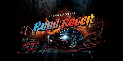 Road Racer is an esport style font that has a sporty character, very suitable for automotive design projects, sports and all products with a dynamic character.
 - Hobo by Bitstream,
$29.99Morris Fuller Benton’s 1910 contribution to the Art Nouveau sanserif, designed for ATF, with all descenders eliminated to encourage combinations of this typeface with other shapes. - Amaro Fleurie by Autographis,
$29.50 Amaro Fleurie is the first decorative addition to my Amaro font. Yes the font can be mixed with all Amaro fonts. Enjoy and cheers to you!
 - TXT HunkaSpunk by Illustration Ink,
$3.00The name says it all. HunkaSpunk is whimsical, eye-catching, and fun. Download and use this cool TrueType font for lively scrapbook journaling and paper crafting. - Tip by Suomi,
$40.00 New, slightly calligraphic sans family with seven weights, Roman and Italic, all with Old Style Numerals and Small Caps, for both headlines and body text use.
 - Algaida by Hikhcreative,
$19.00 Algaida is a beautiful modern script font with beginning and ending swashes, All characters that add more beautiful and aesthetic fonts to perfect your extraordinary project.
 - Shishki MF by Masterfont,
$59.00 So friendly yet so naughty. A practical font family with 3 weights for all your needs: headlines, body text, signage etc. High legibility at small sizes.
 - Merendina by Resistenza,
$29.00 Merendina has a geometric construction with an handwritten touch. This family contains regular and slanted and 6 weights. Do not miss all the alternates and swashes.
 - Philadelphia by Elemeno,
$25.00Philadelphia is all stars, stripes and Fourth of July fun. It is based on the text font Aldersgate, which compliments it well. Best at large sizes. - Gumbutcha by PizzaDude.dk,
$20.00 A jumpy all caps comic font - has got a good handful of funny ligatures! You will need to use OpenType supporting applications to use the autoligatures.
 - Leonel Px by Letradora,
$12.00 Based on aa architect friend's handwriting with a calligraphic pen, this cool all-caps font comes with lots of alternates and a very complete character set.
 - Lemon Melon by RahagitaType,
$16.00 Lemon Melon is a cute & fun display font. This font is the perfect fit for all of your logos, branding, social media, and crafty DIY projects.
 - URAL by Fenotype,
$19.00 On a clear day you can see all the way to URAL from a high place in Helsinki. There your eyes will meet strange permafrost letters.
 - Hebrew Saphire Std by Samtype,
$59.00 Beautiful font, good for posters, books, and folders. This is a complete font with all Nikud and also Shevana, Kamatz Katan, Dagesh Chazak, and Holam chaser.
 - RONDOS by Letterena Studios,
$10.00 Rondos is a squared lettered and robotic styled display font. This font is PUA encoded which means you can access all glyphs and swashes with ease!
 - Mr. Quincy - Personal use only

- ahonde - Personal use only

- Rintvera - Personal use only

- Overya - Personal use only

- Jumbalo - Personal use only

- Getboreg Minus Tech - Personal use only

- Fear Logo Fires Trial - Personal use only

- Funny Sports - Personal use only

- Helmswald Post - Personal use only

- ATF Alternate Gothic by ATF Collection,
$59.00 ATF Alternate Gothic is a new, significant digital expansion of Morris Fuller Benton’s classic 1903 type design. Originally available in one bold weight, the metal typeface came in three slightly different widths for flexibility in copy-fitting layouts. ATF Alternate Gothic has impact at any size. Its letterforms are instantly familiar: Benton’s original metal type family was used throughout the 20th century in newspapers, magazines, and advertising, providing “strong and effective display” in a compact space. Monotype issued its own metal version for machine typesetting, and Alternate Gothic likely served as inspiration for Linotype’s ubiquitous Trade Gothic® Bold and Bold Condensed. ATF Alternate Gothic expands on the characteristics that perhaps made Trade Gothic so popular, providing a wider range of weights and widths to address the needs of today’s designers and technologies. The space-saving clarity of ATF Alternate Gothic brings readability to the world of advertising typefaces. With its finely graded range of ten weights, with four widths of each weight (40 fonts total), this extensive type family can be used to pack a lot into a narrow space, and the range makes it easy to create variations of an advertisement or announcement for different formats and media. The tall x-height and narrow proportions, combined with a relatively low waist and springy, tension-filled forms, make ATF Alternate Gothic strong and effective in display. All ten weights have been carefully spaced for readability, caps and lowercase work well together, while attention-grabbing all-caps settings are clear and never crowded, no matter how narrow.
 - Megre by JAB,
$16.00The courageous Russian author of the best seller Anastasia, Vladimir Megre, once said that this remarkable woman would inspire creative people around the world to produce their best work. Since I consider myself a creative person who has been deeply touched by her story, I sincerely hope that this will be true for me also. Anastasia talks a lot about God, the wonders of the natural world and how all things have been created so perfectly. This belief in universal perfection, however, is not confined to mystics alone. Many great mathematicians and scientists, including Albert Einstein, were of the same opinion. Having read Dan Brown’s The Da Vinci Code, I became quite fascinated with the so-called Fibonacci series; "a sequence of integers in which each integer (Fibonacci number) after the second is the sum of the two preceding integers; specif., the series 1, 1, 2, 3, 5, 8, 13, . . ." (Webster’s Dictionary). These mysterious numbers, which are said to give divine proportions, are found throughout nature in everything from a rose to a spiral galaxy. Many believe that this reinforces the argument that there is a divine intelligence back of creation. With that in mind, I thought it would be interesting to see if I could somehow create a font using these numbers in the design process. If I have succeeded - even partially - in attaining these mystical proportions, it will definitely have been worth all the hard work. And, I sincerely hope that many will enjoy using this font in producing their own best work. - Kontext H by Elster Fonts,
$20.00 Imagine a font that is easier to read the smaller it is – or the further away the text is. There are already many line screen fonts, I wanted to take it to the extreme and use as few lines as possible, while keeping the grid of the fonts metrics. The result is a typeface that lives up to its name. Each individual line makes no sense on its own; individual letters are only recognisable in the context of all associated lines, individual letters are most likely to be recognised in the context of whole words. Attached to a building wall, text would be readable from a great distance and become increasingly difficult to decipher the closer you get to the building. Placed on the ground or on a large flat roof, text would only be readable from an aeroplane or - depending on the size - in Google Earth. Kontext has old style figures, superscript numerals, case-sensitive questiondown and exclamdown and an alternative ampersand, 390 glyphs at all. Use the same value for font size and line spacing to keep the lines in the grid, or change the line spacing in 10% steps. Change the spacing in 100-unit or 25-percent increments increments to keep the grid. The »H« in the font name stands for horizontal (lines). The numbers in the font name refer to the brightness of the background and letters themselves, with the first number describing the background and the second the letters. Starting with »00« (white) to »200« (dark) See also my Family Kontext Dot
 - Kontext V by Elster Fonts,
$20.00 Imagine a font that is easier to read the smaller it is – or the further away the text is. There are already many line screen fonts, I wanted to take it to the extreme and use as few lines as possible, while keeping the grid of the fonts metrics. The result is a typeface that lives up to its name. Each individual line makes no sense on its own; individual letters are only recognisable in the context of all associated lines, individual letters are most likely to be recognised in the context of whole words. Attached to a building wall, text would be readable from a great distance and become increasingly difficult to decipher the closer you get to the building. Placed on the ground or on a large flat roof, text would only be readable from an aeroplane or - depending on the size - in Google Earth. Kontext has old style figures, superscript numerals, case-sensitive questiondown and exclamdown and an alternative ampersand, 390 glyphs at all. Use the same value for font size and line spacing to keep the lines in the grid, or change the line spacing in 10% steps. Change the spacing in 50-unit or 25-percent increments to keep the grid. The »V« in the font name stands for vertical (lines). The numbers in the font name refer to the brightness of the background and letters themselves, with the first number describing the background and the second the letters. Starting with »00« (white) to »200« (dark) See also my family Kontext Dot


