3,672 search results
(0.039 seconds)
- Charriot Deluxe by Jelloween,
$-Charriot Deluxe was released in early 2006 at deviantArt.com - where it received a Daily Deviation frontpage feature - and daFont.com. It has already been downloaded over 20.000 times and now it's your turn to try this sexy pixelfont, absolutely free of charge! Charriot Deluxe has all letters, numbers, punctuation and (currency) symbols to suit your needs and is best used at (any multiple) of size 10pt without anti-aliasing. - Marlyn Malson by Bosstypestudio,
$12.00 Marlyn Malson is a beautiful and light handwritten font with a romantic twist. Use it to add an authentic spark to any design project. It includes 1-10 amazing alternates, which gives you the opportunity to create multiple unique designs with just this one download. It is suitable for logos, web, stationary kits, banners, greeting cards, quotes and every other design which needs an elegant touch. Have a great day! Thanks :)
 - Beauty Butterfly by Zeenesia Studio,
$12.00 Beauty Butterfly - A Beauty Typeface Beauty Butterfly is a beauty typeface that's perfect for creating gorgeous headlines and designs with personality. Beauty Butterfly makes an excellent typeface for vintage graphics, and the clean lines, elegant look to logos, wedding invitations, editorials, and more. Create gorgeous headlines with an all caps design, or try the lowercase for a delicate look that's simply beautiful. Download Beauty Butterfly for your next project today.
 - Sklow by Andfonts,
$14.00 Elevate your designs with Sklow, a sleek and modern sans font designed to bring versatility to your creative projects. With a wide array of alternates, Sklow empowers you to craft unique logos that seamlessly blend standard characters with distinctive alternatives. Unleash your creativity and make a lasting impression with Sklow's refined and customizable aesthetic. Explore the perfect fusion of modern simplicity and individuality—download Sklow and redefine your design possibilities today.
 - Goga Zhane by Piece of Cake Typework,
$15.00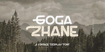 Hello World, Introducing, Goga Zhane is a textured display font suitable for your design project needs, such as; social media posts, quotes, overlays on images, taglines, logos, posters, print needs, website banners, and more. Features A set of uppercase and lowercase glyphs Number, symbol, and punctuation Multilingual Support Solid version Thank you a million times for downloading and using this font for your projects. Enjoy this font and happy creating!
 - Bernound by 38-lineart,
$8.00 The Bernound is an amazing typeface which comes in three weights. The clean weight comes with rounded corners and a slim shape that presents a minimalist impression. The outlined weight has a fancy feel when displayed on its own, and the rough weight has a vintage, rustic, and grunge look. All weights can be combined perfectly which gives you the opportunity to create endless unique designs with just this one download.
 - MFC Westport Monogram by Monogram Fonts Co.,
$19.95 The inspiration for MFC Westport Monogram was a heavily soiled vintage lettering & penmanship book which only listed this alphabet specimen as "Banker Tilted". The look and feel of this typestyle is reminiscent of old checks and cartography lettering styles, lending itself a wonderful sense of antiquity for any monogram or headline typeset with it. Download and view the MFC Westport Monogram Guidebook if you would like to learn a little more.
 - Billabong by Type Associates,
$32.95 Billabong has its origins in the handlettered 40s and 50s script headings that seem to have endured especially in signage when style doesn't matter too much. Unlike today’s scripts Billabong is tightly spaced and Opentype font features allow for a myriad of ligatures to improve fit and evenness of color. Users can select their choice of strokes, ornaments and ending flourishes for added emphasis and style. Download comprehensive User Guide here.
 - Chocolate Smoothies by Mevstory Studio,
$20.00 Chocolate Smoothies is an experimental display font, which was hand-drawn and then digitized. This playful and stylish font draws inspiration from Lettercorner vintage & handrawn Font. If you have any queries, questions or issues please don't hesitate to contact us directly. Download within a few clicks and use across a huge range of programs including Silhouette, Cricut, SCAL, Photoshop, InDesign, Illustrator, and Microsoft Word as well as many more.
 - Oh Manoghara by Bosstypestudio,
$14.00 Oh Manoghara is a beautiful and light handwritten font with a romantic twist. Use it to add an authentic spark to any design project. It includes 1-10 amazing alternates, which gives you the opportunity to create multiple unique designs with just this one download. It is suitable for logos, web, stationary kits, banners, greeting cards, quotes and every other design which needs an elegant touch. Have a great day! Thanks :)
 - Sweet Youth by Atom,
$14.00 Sweet Youth is a modern calligraphy typeface. It includes amazing swashes in 4 styles, which gives you the opportunity to create multiple unique designs with just this one download. It is suitable for logos, web, stationary kits, banners, greeting cards, quotes and every other design which needs an elegant touch. Features : 1. Ligatures 2. Titling and swash 3. 6 Stylistic Sets 4. OpenType Features 5. PUA Encoded Thank you :)
 - Polyline by Mårten Nettelbladt,
$- Polyline is based on a small 3x5 grid giving it a rather crude and technical look, further emphasized by the monospacing. ‘Polyline’ is a command often found in CAD-software that is used to create a series of connected lines. The typeface can also be installed as an AutoCAD .shx font, included in the download along with the .shp source file and the stroke shapes for all characters as .pdf
 - Epicentrum by 38-lineart,
$5.00 Epicentrum is a universal sans serif with a minimal style of strokes, a closed aperture and geometric shapes. It comes with four rounded styles which are perfect for large arrays of texts. The individually developed design of each glyph makes it possible to use it successfully as a display font. All weights can be combined perfectly which gives you the opportunity to create endless unique designs with just this one download.
 - Spire by GroupType,
$19.00 Originally designed by Sol Hess for the Lanston Monotype Foundry in 1938, this revival was designed by Ann Pomeroy in the early 90s. Spire is a condensed serif with a very 1930s retro look. PLEASE NOTE: Each Spire font (Regular, Extra Light and Monoline) include a companion Expert font in the download. The Experts feature several alternate glyphs. The Family includes three Styles and three Expert styles. 6 fonts all together.
 - MFC Carnivale Monogram by Monogram Fonts Co.,
$69.00 The inspiration source for Carnivale Monogram is an elegantly sexy antique of typographic history. Known as Romantiques No. 3 or Ornate No. 2, this fantastic typefaces has been digitally revived and expanded for monogram designs. While this typestyle was never originally intended for monograms, its ornate nature lends itself so wonderfully to the craft. Download and view the MFC Carnivale Monogram Guidebook if you would like to learn a little more.
 - Samalia Script by Bosstypestudio,
$14.00 Samalia Script is a beautiful and light handwritten font with a romantic twist. Use it to add an authentic spark to any design project. It includes amazing alternates, which gives you the opportunity to create multiple unique designs with just this one download. It is suitable for logos, web, stationary kits, banners, greeting cards, quotes and every other design which needs an elegant touch. Have a great day! Thanks :)
 - Sherina Script by Bosstypestudio,
$15.00 Sherina Script is a beautiful and light handwritten font with a romantic twist. Use it to add an authentic spark to any design project. It includes amazing alternates, which gives you the opportunity to create multiple unique designs with just this one download. It is suitable for logos, web, stationary kits, banners, greeting cards, quotes and every other design which needs an elegant touch. Have a great day! Thanks :)
 - Rocinante Titling by XO Type Co,
$40.00 Rocinante Titling is a study in interior and exterior tension, with tightly-packed interiors and unexpected lightwells contrasting generous letterspacing. 5 weights and obliques on the same weight range as Havelock Titling, the family is a contrasting partner meant for combination. It’s made for creating contrast and tension in your work. Here’s a downloadable PDF specimen, and here's more about the process of getting from Havelock to Rocinante.
 - Engravia by K-Type,
$20.00 Engravia is a Didone display face supplied in three varieties of engraving – Inline, Shaded and Sawtooth – plus a plain basic font. All four fonts share the same spacing and kerning, so engraved characters can be overlaid onto plain ones to produce bicolor effects. All four Engravia fonts are included in the download. The typeface was developed from K-Type’s rustic Building & Loan font, redesigned and drawn with precision outlines.
 - Scriptys by Atom,
$14.00 Scriptys is a beautiful and light handwritten font with a romantic twist. Use it to add an authentic spark to any design project. It includes 1-10 amazing alternates, which gives you the opportunity to create multiple unique designs with just this one download. It is suitable for logos, web, stationary kits, banners, greeting cards, quotes and every other design which needs an elegant touch. Have a great day! Thanks :)
 - Eurotech Pro by RMU,
$40.00 The design of Eurotech Pro was inspired by Thannhaeuser’s Technotyp font family which was cut by Typoart, Dresden, in 1949. Eurotech is not a mere revival of the old Typoart version but many letterforms have been updated and modernized. The Cyrillic letters are designed entirely by myself. Eurotech Pro is well suited for technical purposes, like catalogs, manuals or articles which are multilingual.
 - Dekal by The Northern Block,
$29.00 A modern display typeface with ultra sharp detailing. The unique line style takes influence from earlier fonts produced in the 1970’s by Letraset. These lines are then blended with a stronger letterform creating a more visually dynamic font suitable for today’s market. Details include: three unique styles, all caps character set with alternatives, manually edited kerning and Euro symbol.
 - Moldiv by ATK Studio,
$15.00 Moldiv is a sans serif display typeface with geometric appearance. Its clean and angular shapes provide a futuristic and robust design. Moldiv consists of a single weight, an extended European character set, and kerning and symbols were manually edited. It has a timeless style which is great for display purposes, especially for headlines, posters, magazines, book covers, logos, and much more.
 - Uniman by The Northern Block,
$19.30 A clear and simple sans serif typeface. Straight lines are combined with precision curves to form a functional and versatile font best suited for a wide range of applications. Developed to meet the needs of the professional user, details include 9 weights with italics, 540 characters, 5 variations of numerals, small caps, stylistic alternatives, manually edited kerning and Opentype features.
 - Kuro by The Northern Block,
$- Kuro is a precisely rendered sans-serif type family. Modern geometric forms combined with subtle detailing create a charming, straightforward and versatile design. The lighter weights bring a contemporary touch to body copy while the bold weights add the strength of character to branding, identity and packaging. Details include eight weights, over 450 characters, manually edited kerning and Opentype features.
 - Pepita Script by Fenotype,
$25.00 Pepita is a flexible and easy to use connected script. Pepita has plenty to offer: a selection of 72 ornaments and plenty of ligatures and alternate characters: try turning on Contextual Alternates, Swash or Stylistic Alternates in any Opentype savvy program or manually choose the characters from the glyph palette. For best results combine all 3 weights of the font.
 - Facto by The Northern Block,
$39.00 A simple, mechanical typeface without distractions. Slightly condensed curves are developed from a compact grid layout to produce a crisp, fresh and legible type family. The unadorned letterforms work perfectly with complex information-based applications such as user interfaces, mobile devices and websites. Details include six weights with italics, 480 characters, five variations of numerals, stylistic alternatives, manually edited kerning and Opentype features.
 - La Paz by Underground,
$24.90 La Paz is a typeface created to emulate handwriting. It consists of three different alphabets which are interleaved to provide variations in height, weight and inclination, typical of handwriting. In addition it has tens of ligatures, ornaments and opentype programming that help to recreate human gestures. It's ideal for use in small sizes for designs with a warm imprint and with manual gestures.
 - Zanderley by Greater Albion Typefounders,
$15.00 Zanderley was inspired by a small, almost random sample from a turn-of-the-last- century calligrapher’s instructional manual. It’s a bit Roman, mixed with a little blackletter and a lot of random decorative fun.The family consists of two typefaces- Zanderley regular is a heavy, friendly an d fun display face. They are well complimented by Zanderley initials. Try them out soon!
 - Printa by Latinotype,
$19.00 It is inspired by mandalic structures. Its visual language is based on misregister and flaws in textiles printed by serigraph technique in the ’70s. This typeface allows you to combine two characters (front/uppercase; back/lowercase) into a single one to create print repeat patterns. This way you can get many different combinations. Printa is ideal for those who seek handmade designs.
 - Artegra Soft by Artegra,
$29.00 Artegra Soft is the round cornered addition to the Artegra superfamily. It's based on the perfectionist geometric forms of Artegra Sans, all the glyphs are softened with round corners with manual corrections to the soft edges. The family has 54 fonts in condensed, normal and extended widths, 9 weights per width with matching true italics to achieve the upmost versatility.
 - Reznik by The Northern Block,
$32.00 A compact sans serif with a technical origin. Each character was drafted out from a grid template and then refined through the application of subtle curved detailing. The result is a precise, contemporary typeface best suited to identity, mobile and video game development. Details include 9 weights with italics, 500 characters, 5 variations of numerals, stylistic alternatives, manually edited kerning and Opentype features.
 - Sapeca by Just in Type,
$35.00 This project started from an idea to create a fun & informal typeface that would be cool for designers and for the general public. So, Just in Type designed a font with several OpenType features to create different letterings for different occasions, always in a cute way, sometimes even fancy. Have a look at the Sapeca Manual in the Gallery Menu.
 - Poster Chamfer JNL by Jeff Levine,
$29.00 Type books and lettering manuals of the 1900s were resplendent with examples of chamfered type faces, as this was a popular and simple style of lettering that was easy to reproduce with little effort. Poster Chamfer JNL is one such example taken from one of these turn-of-the-century publications that exemplifies the style as a condensed version of the letters.
 - Gothicus by Aerotype,
$29.00 From original samples of Rudolf Koch's Maximilian, Gothicus and Gothicus Alternate have Fraktur style captials, Gothicus Roman has Roman capitals. All three have the same lower case which includes three swash characters for g, s and t, available as discretionary ligatures in OpenType versions, and manually otherwise. All include two authentic ornaments, also penned by Koch. Gothicus Roman has three additional floret ornaments.
 - Anke Calligraphic FG - Unknown license

- Impossible - Selfdestruct - Unknown license

- Mouseyer - Unknown license

- Science Noire by Fonts of Chaos,
$10.00 Science Noire is a special font with more than 154 glyphes, upper and lower case, punctuation, number and special characters.
 - Impossible - 1000 - Unknown license


