9,639 search results
(0.047 seconds)
- Bahar by Hurufatfont,
$29.00 Bahar was inspired by the playful-energetic nature of Cooper Black from Souvenir's soft but confident stance and was born from the idea of creating a new structure by blending this structure with calligraphic strokes. The title and body are presented in two sets for perfect results. Bahar has a wide variety of character alternatives to create the perfect and fun title. It offers calligraphic flavors with swashes, start-finish forms, and fun ligatures. Bahar Text is prepared for Body texts and offers a good reading experience. Does not include swash and style alternatives. Bahar consists of five weights, Bahar Text four, a total of nine weights, and 18 styles with true italics. For each weight, there is a complete set of open type features including ligatures, small caps, old-style and table numbers, and positional numbers.
 - Vagebond by Characters Font Foundry,
$17.50 Vagebond is a monoline family in three widths, Condensed (C), Normal (N), and Extended (XT). With Vagebond I was inspired by a very old television I once saw on a junkyard. I wanted to create a typeface with round edges that would fit within the 4 x 3 proportion of the screen. It had to be monoline, because that gives it a very simplistic and minimalistic look. Having created the XT width I felt it needed the both complementing widths to make it complete. The Condensed version, for me, is the funky rounded version of the DIN. I love DIN, but it sometimes feels just a bit to ‘normed’ for me. Vagebond C brings in a bit more personality. Although Vagebond looks kinda ‘oldstyle’, it works very well in futuristic designs. It feels best in combination with a super futuristic 3d object.
 - Mario by Tipo Pèpel,
$22.00 Once upon a time, Mestre Patau, the «Black» magician, concerned about children´s typefaces historical ugliness, decided to settle the matter and using his vector powers, made letters embellished to be used in that stories so that they were according with the great genius all children have inside. Well done face but happy, goodness is not incompatible with joy. A solid construction, smooth, rounded, vibrant, generous curves and even more generous x-height and general proportions, give to the letter the vitality and freshness needed for use in projects where formality is not a requirement. Naughty but welldone, although not heeding the overshoots or the formal alignments, no symmetry in the horns is, despite this, or because of it, a fresh, cheerful but perfectly legible type. A full menu of freshness in your tales and stories!
 - JMTF Robin by John Moore Type Foundry,
$55.00 JMTF Robin is a new post-modernist typeface in the spirit of Art & Crafts, born as a concept of a reformulation of a Gothic traditional building structure. Interestingly medieval structural architectural rescue form is for creating a font of traits absolutely contemporary without losing its artisan flavor. JMTF Robin is then a modular typography with very specific characteristics that provides an innovative texts while an appearance of great personality. Early versions of Robin was winners in Letras Latinas 2006. JMTF Robin representing a before and after in terms of contemporary texts composition. JMTF Robin is a typeface family that is presented in a wide variety of forms, from JMTF Robin in condensed forms to other roman proportions like Robin9, ideal for text, also JMTF Robin comes in Shadow and Double Outline. I dedicate this letter to creative genius William Morris father of modernism.
 - Guau by Cuchi, qué tipo,
$9.95 From the abyss and the quarantine hell, drawn in absolute lonelyness, and finished during the darkest hours of confinement… "Guau" is born, the type that barks directly at your face! "Guau" is a high-contrast display font with as many weights and versions as there are types of puppies in this fantastic world. It is thought to bring up glances in middle and heavy boxing weights, although you can also take its compressed and italic styles just for a walk. "Guau" is a font with three axes (italic, weight and width) and 20 instances, and it also contains thousands of glyphs and Opentype features that means a "guaorld of posibilities". This name comes from the time when you could only go to the street to take a walk to your pooch. Definitely, "Guau!, your new best friend!".
 - Somatype by ArtyType,
$29.00 As with any attempt at a new typeface, you want to create something different. A difficult task as most legible fonts are based on something previous. Somatype isn't actually based on any particular font but it has unavoidable similarities to others. The important difference here being the distinctive quirk of the connection points going opposite to the norm; exemplified best by the lower case d & e. Once devised, the unique characteristic was applied wherever possible, keeping the rest of the characters in a sympathetic, rounded style. I first designed this in the light weight version, seeing it working best as a large open display font for magazines etc. but realized it would be too light for body copy at small scale, so, medium and bold weights were created to resolve that issue. Incidentally, the word ‘somatype’ literally means body-type.
 - Masonic Lodge by Eclectotype,
$20.00 As part of the day job I had to trace an old hand drawn logo of a Masonic Lodge from a very poor scan. When I finally got to the end of it I had almost a whole alphabet and I really liked the hand drawn uneven quality, so I made up the rest of the letters and set about making it into a font. I roughened up all the edges for an even older look, added a host of OpenType features and hey presto, Masonic Lodge was born. There are two versions of each letter and number which automatically alternate when contextual alternates are set, more alternates for O and o characters, a good amount of interlock style L and T ligatures (uppercase) and a square & compass ornament. Use it for pub signs, secret society meetings, monster movie titles and pub menus.
 - Sabana by fragTYPE,
$20.00 Sabana is my first step in font design. A font that is born from the organic, from a creative process that starts from improvisation as a result of my training as an artist. To design Sabana I asked myself the question, why not make a font that emulates my own writing? as I found it fun to see my handwriting on a computer. This font can be used in a wide range of projects such as editorial design, motion graphics, web, advertising and branding where emulating handwriting is a necessity. The font has coverage for more than 200 languages ??derived of the latin alphabet in addition to Cyrillic. Sabana is where I come from, where I am from, a constant on the horizon that is occasionally interrupted by vertical lines and that together make a perfect visual symphony.
 - Monden by Tour De Force,
$29.00 If you'd like to scream, but you have no self esteem, or you'd love to start a fight, but you're scared of the night, I made this font for you all, whether you're short or tall. Monden is wide, gentle and fun, but it wasn't born under the Sun, it was my intention to make it unique, I surely hope I didn't make some freak, it looks a bit classical, in moments maybe here and there radical, but it surely is really graphical with a dose of something magical. Want a logo, poster or any other design, but you'd rather cry and then run, even this description sounds lousy, at least it isn't so drowsy, so meet Monden family from our hood and keep your spirit in good mood, and do the things on any way you think they should.
 - Deuterium by Kostic,
$40.00 This versatile font family comprises 10 distinct weights, ranging from the delicate Thin to the bold and distinctive Ultra Heavy. What makes Deuterium special is its approach to the heavy styles. Balancing geometric principles with the challenges of extreme weight, Deuterium manages to preserve the geometric character even when the stems expand to extraordinary widths and the apertures narrow to the size of a dot. In the world of type design, geometric sans-serif fonts are known for their precision and adherence to symmetry. Deuterium deviates from this norm while keeping its geometric essence — it is a thoughtful reinterpretation of the classic style. Whether you’re designing for branding, headlines, or text, Deuterium is a versatile tool that adds a modern touch to your projects. It explores geometry in unconventional heavy styles, making your designs stand out with a subtle yet distinct geometric charm.
 - Lotto by Canada Type,
$24.95 Designed by expert ad artist Herbert Thannhaeuser for East German foundry Typoart in 1955, Lotto was until now one of the long lost gems of European sign and brush lettering faces. Unlike in Kurier (Thannhaeuser’s other brush face digitized by Canada Type as Puma), the forms’ brush construct uses a series of strokes that are mostly sudden, whimsical, and at times even look like great genius being born out of simple afterthought or straight-forward idiosyncracy. For instance, check out the simple brush pause that is the top of the f, the confident yet welcoming serifs on the T, the similarly-themed C/E and O/Q relationship, and much more. Lotto comes with over 400 glyphs, contains a few alternates and ligatures sprinkled throughout the character set, and includes support for the majority of Latin languages.
 - Catesque by Gumpita Rahayu,
$20.00 After several months discovering and developing the traits and personalities well balanced typefaces such like Frutiger and the other identical typefaces, Catesque was born as the new typefaces. The vocal flourish yet harmonious shapes not purely geometrically, it has imperfect rounded characters such as “O” “C” and “G”. Catesque can make some distinctness for large scale design as well as small text. The traits versatilities usable for many design applications, it’s comes with five weights from light to black plus mathcing italics. All characters included the Tabular figures, case-sensitive forms, fractions, and another most common numerals features such as super & subscript to accomplish the numeric design works such like menu, annual reports, etc. The alternate characters are included as well, all features can accessed with OpenType-savvy programs on Adobe Creative Suite via OpenType Panel.
 - Bayer Sans by Victory Type,
$20.00Bayer Sans, is based on the typography of the Austrian-born artist Herbert Bayer. Bayer worked as a teacher and graphic designer at the Bauhaus, a revolutionary German art school, during the 20's. His specialty was commercial art and he had many "radical" views on typography and its interaction with society. Bayer felt that written language should be merely a graphic version of spoken language. Thus, he advocated a single alphabet without majuscules and miniscules. Bayer's designs are simple, geometric letterforms that lend themselves to lowercase form. This font, based on the typography of Bayer and his students at the Bauhaus Werkstatt (studio), was digitally modeled by Noah Rothschild. Bayer Sans features a complete character set including European characters, alternate letters with adjusted widths and designs and ligatures. Included are the "f" characters and a special linked double-o. - Dear Dolores by Samuelstype,
$24.00 Dear Dolores has had its name from the latin word dolorem, meaning sorrow or grief. When I started working on this display font I found myself trying it out using the latin requiem texts. The capitals somehow sat well with the monumental and solemn words of mourning. The broken hairlines suggested stone cuttings where the fine details had been worn down and obliterated over time and it felt at home in a churchyard or in a monument park. Adding lowercase gave the font a more personal and friendly appearance and opened up new possibilities for use. The name itself is a fictional message to someone long missed or perhaps lost too soon. Dear Dolores comes in a cut and an uncut version where the fine details are left intact. Both are excellent for headlines or memorable quotes.
 - Walls by Piñata,
$8.00 What do you use to write a price tag at a store or to design a wall menu in a cafe? What to choose – a marker or chalk? Now it makes no more sense to be torn apart by the choice – use both techniques for your design. Walls fontfamily allows to perfectly combine an eco-friendly style with contemporary motives. Walls fontfamily supports over 70 languages and consists of 10 typefaces in 5 popular weights (Thin, Light, Regular, Bold, Black). Initially we wanted to create a font that would imitate an inscription made by a square tip marker which is usually used to write price tags at supermarkets, shops and cafes. During the working process we've decided to extend the conceptual boundaries of the Walls fontfamily and added 5 rough typefaces that imitate the style of ecologic chalk writing
 - Excited Alphabets by Harald Geisler,
$50.00 Excited-Alphabets is a lowercase display font. The letterform is sans-serif with a few appendages to give the letters a life-like and cheerful form. Also, each Letter has two poses (i.e. s and S) which makes it easy to design the perfect headline, characters can also be chosen individually from the glyphs menu to get a unique look. Its dynamic or ‘dancing’ look makes it perfect for (short) editorial headlines, celebratory lines, fun branding, social media posts, website headers, posters, ads, products, stationery designs and more. Excited alphabets was born in Frankfurt (Germany) when two ‘almost-neighbours’ met at a coffee shop. Inspired by the illustration of Sumbo Pinheiro, Excited was designed by Harald Geisler and Sumbo Pinheiro. From quirky illustration to font, this was a fun project to work on because each alphabet comes with its own sassy character.
 - Tuna by Ligature Inc,
$49.00 Tuna is simply a contemporary body text font. It is contemporary, meaning the merge of charming broad-nibbed calligraphic style with optimized readability on screen – showing that the roots of writing and typesetting are still in charge when reading “Anna Karenina” on your Kindle till 4 o’clock in the morning. Tuna has a natural fit for cross-media use because the design is based on forms characterized by different conditions of constancy, stability and good readability. Well-defined shapes and distinctive details only become apparent when used in larger sizes, making Tuna a true all-rounder. With more than 700 glyphs in 10 styles created with a maximum of consideration, it has all the qualities of a modern OpenType font serving the needs of today's communication. If you would like to read more about the Typeface please visit our promo site.
 - Diecast by Device,
$39.00 A companion piece to Mulgrave, this font is the intermediary design between the chunky Victorian style that Mulgrave reproduces and the Ministry of Transport sans introduced in 1933 and digitised as Ministry. Although they date from between 1910 and 1933, these signs show the beginnings of several features Ministry later incorporated, notably the thinner strokes and the more modern forms of the G, M, R and S. The letter widths are approaching a monospace - the L, F and E are relatively wide compared to the W and M, a feature that may have something to do to the casting process. These idiosyncracies were all ironed out when the first version of the MOT alphabet was produced. The Device digitization, as with Mulgrave, stays true to the worn and repainted original metal source material and preserves the unusual widths.
 - Stevia by Andinistas,
$47.00 Stevia is a font family designed by Carlos Fabian Camargo Guerrero. Stevia is a sweet font family created to design logos, cards, posters, book covers, blogs, packaging, walls, etc. Stevia is useful to differentiate your designs and stimulate your imagination through 5 fonts drawn with an apparent handmade lettering look. Stevia dingbats has more than 250 special monolineal icons to accompany Stevia Script Black (600 glyphs), Stevia Script Light (470 glyphs), Stevia Subtitles Bold (300 glyphs) and Stevia Subtitles Light (300 glyphs) in quotes, legends and short writings. That’s why you'll get a lot of alternative letters in uppercase, lowercase and opentype numbers as well as ligatures and flourishes ideal for beginning, middle and end of word. In summary Stevia is great for communicating naturalness and freshness in designs that need to be outside conventional typographic norms.
 - Blakstone by Albatross,
$19.00 Borne of geometry, found-type and a genuine love of texture, Blakstone has a lot to offer the letterpress style type genre. With 25 styles including hatches, halftones, grunge, linen, inline, shadow, fills, and outlines, Blakstone becomes useful as a layered type system. Combine styles to control colors on different layers to achieve your desired effect or just use a single style to keep it simple. Blakstone is full of open-type features including ligatures, discretionary ligatures, superscript numbers, subscript numbers, and automatic open-type fractions. Another great feature of Blakstone is its support for 130 International languages and dialects. Blakstone has many uses in the design world including signage, branding, invites and cards, clothing design, the music industry, restaurant and grocery signage, coffee shops, the list goes on. Blakstone has a texture for any occasion.
 - LFT Etica by TypeTogether,
$35.00 LFT Etica, the-moralist-typefamily-project, was born at the end of 2000, but its development is ongoing, overcoming many hurdles and diversions. The starting point for the designers at Leftloft were the common "cold" grotesk sans serifs, ubiquitous and often badly applied in their everyday visual environment. The challenge was to obtain the same force, versatility and color, but with a much warmer feel. The resulting design has soft strokes, open counters and terminals; aesthetically resting somewhere between a grotesque and humanist sans serif. It successfully combines masculine force with female delicacy. LFT Etica’s wide range of styles, together with a large character set and OpenType features, such as 4 sets of numerals, fractions, several stylistic alternates and a set of arrows and dingbats, allows for a vast variety of applications, be they editorial or corporate.
 - Thorben by Studio Buchanan,
$18.00 The old Norse legend of Thorben Odinson is a cautionary tale. And this typeface, like the nebulous kingdom he ruled, is something of a cloudy concoction. Thorben the typeface is something of an inspiration-hybrid, pulling aspects from multiple sources and combining them into a typeface that strangely seems to work (or not – depending on your point of view). What started as a redrawing of some old carvings (on a castle wall in deepest, darkest Suffolk), is now something entirely different. Part Nouveau curves and Celtic script, topped with a few sprinkles of modernism, darkness and some quirky ideas – Thorben absorbs it all, creating a display face that feels antiquated and current at the same time. Each style also comes pre-loaded with a handful of pictograms and icons perfect for adorning your designs with extra Thorben-ness.
 - FS Sophie by Fontsmith,
$50.00 Slinky Chic, svelte and slinky, FS Sophie was inspired by and designed in partnership with ATTIK UK. With clean lines, simple, elegant curves and dynamic forms, it brings a feminine sophistication to text and headlines in publishing and advertising. Kinky FS Sophie’s engaging simplicity arises from its construction, using a modular set of core, rounded shapes and straight strokes, drawn and then repeated to create letterforms. An extra technical detail of occasional, short 45-degree diagonals adds a distinctive little kink to Sophie’s cool exterior. Alchemy By some kind of typographic alchemy, the combination of simple curves and lines with unexpected twists to the shapes of characters creates an unusually spirited and lively design in all three weights and their italic sets. Born for the spotlight, FS Sophie is a natural for big headlines, pull quotes and other high-profile text elements.
 - OXIDO ExtBd ExtCond - Personal use only

- The Spring by Sakha Design,
$14.00 The Spring is a romantic and sweet handwritten font. It looks astonishing on love letters, greeting cards, logos, business cards, and every other design which needs a personalized touch. This font is PUA encoded which means you can access all of the glyphs and swashes with ease!
 - Andyou by Sakha Design,
$12.00 Andyou is a lovely and delicate script font that exudes elegance and class. This font was particularly crafted for those who need a beautiful and refreshing look to their designs. Andyou is PUA encoded which means you can access all of the glyphs and swashes with ease!
 - Rough Letterline by Blankids,
$25.00 Introducing of our new product the name is Rough Letterline Authentic Brush Font. Rough Letterline inspired by brush calligraphy style this font is a fun theme very good for display, tshirt design, craft, quote sign, logotype and etc FEATURES : Uppercase Lowercase Number Punctuation Multilingual PUA Encode Opentype
 - Brightwall by Din Studio,
$22.00 Brightwall is made with a natural brush. This texture will make your design more beautiful and powerful. This font is suitable for any design like branding, quotes, t-shirt printing and more. Features: Accents (Multilingual Characters) Many Alternates Extra Swashes PUA encoded Numerals and Punctuations (OpenType Standard)
 - Saphire by Yumna Type,
$16.00 Saphire is a elegant handwritten font with a natural and unique design will make your project more beautiful. The font is suitable for your branding project, printing, logos dan wedding. Included: Saphire (OTF) Features: Standard Ligatures Stylistic Sets Multilingual Support PUA encoded Numeral and Punctuation by Yumnatype
 - Fairgrid Urban by Ditatype,
$29.00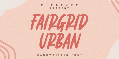 Fairgrid Urban is a modern handwritten font. With a classy and natural handwritten style, it brings a classy and chic typeface. Fairgrid Urban is best used for weddings, branding, logotype, and quotes. Includes: - Fairgrid Urban (OTF) Features: - Beautiful Ligatures - PUA Encoded - Multilingual Support - Numerals and Punctuation
 - Hello Dark by Andrey Font Design,
$9.00 Hello Dark is a thick-lettered and spooky decorative font. It is perfectly suitable for any Halloween-related project or crafty idea! The only limit is your imagination. Hello Dark is PUA encoded which means you can access all of the amazing glyphs and ligatures with ease!
 - Sweet Brownie by Yumna Type,
$16.00 Sweet Brownie is a elegant handwritten font. Made for any professional project branding. It is the best for logos, branding and quotes. Every letter has a unique and beautiful touch. Includes: Sweet Brownie (OTF) Features: Standard Ligatures PUA Encoded Multilingual Support Numerals and Punctuation by Yumnatype
 - Romantic Heart by Blankids,
$25.00 Introducing of our new product the name is Romantic Heart Script Font. Romantic Heart inspired by bouncy script style this font is a fun theme very good for display, tshirt design, craft, quote sign, logotype and etc FEATURES : Uppercase Lowercase Number Punctuation Multilingual PUA Encode Opentype
 - Popy Jelly by Yumna Type,
$16.00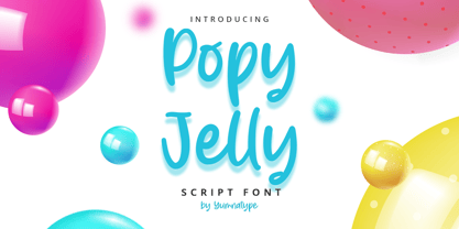 Popy Jelly is a elegant handwritten font. Made for any professional project branding. It is the best for logos, branding and quotes. Every letter has a unique and beautiful touch. Includes: Popy Jelly (OTF) Features: Standard Ligatures PUA Encoded Multilingual Support Numerals and Punctuation by Yumnatype
 - Rhythmics by Fauzistudio,
$12.00 Rhythmics is a smooth and simple monoline script font, but intricately worked on. suitable for retro or modern style designs with a minimalist and elegant impression. with PUA encoded so all characters are easily accessible. The supporting font is the Satisfactory font. Hope you enjoy. Intuisi Creative
 - Goldfish by Letterara,
$16.00 Goldfish is a modern and classic serif typeface with a unique style and modern look. Fall in love with its incredibly stylish and glam vibe and use it to create spectacular designs! This font is PUA encoded which means you can access all of the glyphs.
 - Mistyca Brush by Letterena Studios,
$9.00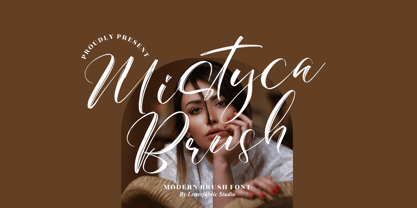 Mistyca Brush is a lovely and delicate script font that exudes elegance and class. This font was particularly crafted for those who need a beautiful and refreshing look to their designs. Mistyca Brush is PUA encoded which means you can access all glyphs and swashes with ease!
 - Welcome Santa Claus by Andrey Font Design,
$10.00 Welcome Santa Claus is a beautiful handwritten font. Its natural and unique style makes it incredibly fitting to a large pool of designs. The only limit is your imagination! This font is PUA encoded which means you can access all of the glyphs and swashes with ease!
 - Hello Berlin by Hrz Studio,
$14.00 Hello Berlin is a sweet, all round and flexible handwritten font. Warm, romantic and jolly, this font will turn each of your project ideas into real works of art. This font is PUA encoded which means you can access all of the glyphs and swashes with ease!
 - Bondy Quirky by Blankids,
$23.00 Introducing of our new product the name is Bondy Quirky Playful Font. Bondy Quirky inspired by Quirky Handwritten style this font is a fun theme very good for display, tshirt design, craft, quote sign, logotype and etc FEATURES : Uppercase Lowercase Number Punctuation Multilingual PUA Encode Opentype
