10,000 search results
(0.036 seconds)
- Chen Xing by Pelavin Fonts,
$25.00 Chen Xing, literally “morning star”, a font both futuristic yet mystifyingly ancient is cast in contemporary forms on the cutting edge of the present moment, but harkens back centuries to endless cultural heritage.
 - Qeuliner by BaronWNM,
$14.00 Qeuliner is a font with a modern, sporty, and futuristic design. Carrying the form of oblique blocks separated by vertical lines. Very suitable for use on sports-themed displays, racing, games, space, etc.
 - Albion's Incised Masthead by Greater Albion Typefounders,
$15.00 Albion’s Incised Masthead combines the heavy Black Letter forms of Greater Albion’s “Albion’s Old Masthead” with the ‘Hand-Tooled’ incised look demonstrated so readily by Mr Goudy. Another tribute to the engraver’s art…
 - Offroad by Grype,
$16.00 Geometric typefaces can harken back and visually tie themselves to so many genres, from constructivist posters, to techno club flyers, to raw industrial era power. The Offroad family finds its origin of inspiration in the O’Neal MX logo for their motocross division, represented in its truest form in the MX styles of this family, and expanded to a type megafamily. Offroad grabs hold of that unique pseudo-unicase style and runs with it to create a range of widths and weights that are perfect for historical through modern use. It embodies the hardcore motocross rigidity from the limited inspiration of the original logotype and expands to include a full and expansive glyphset, and a comprehensive range of widths and weights, creating a straightforward, uncompromising collection of typefaces that lend a solid foundation and a broad range of expression for designers. Here's what's included with the Offroad Collection bundle: 382 glyphs per style - including Capitals, Lowercase (Unicase Style), Numerals, Punctuation and an extensive character set that covers multilingual support of latin based languages. (see the 6th graphic for a preview of the characters included) 45 fonts in 6 width subfamilies: Extra Condensed, Condensed, Standard, Expanded, & Wide. 5 weights per subfamily with obliques: Light, Book, Regular, Bold, & Black. Fonts are provided in TTF & OTF formats. The TTF format is the standard go to for most users, although the OTF and TTF function exactly the same. Here's why the Offroad Collection is for you: You're in need of a geometric pseudo-unicase family with a big range of weights and widths You're a die-hard motocross fan, and want to design anything within that genre You're a club flyer designer, and need a kick-ass techno style font family You're totally into constructivist design, and want to create designs within that genre You just like to collect quality fonts to add to your design arsenal
 - Glamour Shine by V Anderson Designs,
$10.00 Glamour Shine is a handwritten serif mixed-case/unicase font to give your products that handwritten, spunky feel. It's perfect for greeting cards, fun branding, and crafting files.
 - Mondiale by PintassilgoPrints,
$15.00 Mondiale is a three-flavor unicase family with a tasty hand drawn feel. It contains uppercase letters and uses the lowercase as variations, providing flexibility for your designs.
 - Invention by Create Big Supply,
$15.00 Invention Font is a unique, This will add a very unique and powerful touch to your design. This font is PUA encoded which means you can access all the glyphs and sweeps easily! Features: Uppercase & lowercase Numbers and punctuation Multilingual PUA Encoding Full Character Set !"#$%&()*+,-./0123456789:;=?@ABCDEFGHIJKLMNOPQRSTUVWXYZ[\]^_abcdefghijklmnopqrstuvwxyz{|}~ ¡¢£¤¥§©ª«®°±²³·¹º»¿ÀÁÂÃÄÅÆÇÈÉÊËÌÍÎÏÑÒÓÔÕÖ×ØÙÚÛÜÝÞßàáâãäåæçèéêëìíîïñòóôõö÷øùúûüýþÿıŒœŠšŸž–—‘’‚“”„†•‹›€−
 - Banegsa by Rvandtype,
$9.00 Banegsa is a sans serif font. Its elegant and cool look makes it the perfect choice for logos, branding, invitations, stationery, wedding designs, social media posts, and so much more. Banegsa Font is PUA encoded which means you can access all of the glyphs. Features : uppercase & lowercase numbers and punctuation multilingual Alternate Characters PUA encoded
 - Ah, Rusty Sign by GemFonts, the brainchild of Graham Meade, is a font that walks the fine line between elegantly aged and outright rebellion against the sleek, clean fonts that populate our digital s...
- Boppa Delux by Patricia Lillie,
$39.00 Say it with authority and style with Boppa Delux, a big, bold display font in four weights. For use in OpenType aware applications, Boppa Delux includes small caps, alternates, case sensitive forms, and more.
 - Copperplate Classic Light Floral by Wiescher Design,
$39.50 Copperplate Classic Light Floral is the latest addition to my Copperplate Classic Group of fonts. The floral decorations go perfectly well together with the classic forms of the Copperplate. Your decorative designer Gert Wiescher.
 - Alfrine by Greater Albion Typefounders,
$12.00 Alfrine is a gently rounded oblique Sans-Serif typeface, ideal for banner text with a simple clear outline and a sense of motion and speed. Two typefaces are offered-regular and diagonally shaded forms.
 - Bond by 4RM Font,
$10.00 Its very simple form is the hallmark of this font, the bond font is a simple styled font but still has an aesthetic value, this font is suitable for use in simple themed designs.
 - PR Pointers 01 by PR Fonts,
$5.00Perfect for anything from treasure maps to grocery flyers. This font provides directional arrows in outline, solid and highlighted forms. Each arrow is available in at least 4 directions, and many in eight directions. - Alfredo by Pedro Mello Type Foundry,
$24.00 Alfredo is a neo-humanist family with a contemporary touch, presenting a subtlety in forms, in which it’s simu- lates calligraphic fluidity. With rectangular serifs, Alfredo was designed exclusively for publishing projects and texts.
 - Disco by Solotype,
$19.95Each letter or character comes in two forms on this font: One as a complete disc, the other as a disc with a segment removed so the succeeding character can overlap the preceding one. - Splinters JNL by Jeff Levine,
$29.00Splinters JNL is a fun, hand-drawn font emulating letters formed from pieces of wood. Use at larger point sizes for best results. Please note: There is no kerning and a limited character set. - Gmuender Antiqua Pro by RMU,
$40.00 Inspired by the former hot-metal fonts of Imprimatur, Gmuender Antiqua Pro is a fresh designed versatile and multilingual serif font family. All five styles contain three different forms of numbers and small caps.
 - Gourds by Oliveira 37,
$24.00 The Gourds is a geometric font that has its personality in extreme forms without losing its identification with the legibility and recognition of its characters. indicated for titles and sub-titles or even logos.
 - Punta Negra by Volcano Type,
$19.00A prolific lava producer, Volcan Puntas Negras is a collection of flows and domes forming a distinct large edifice. There is no current activity known unless you will activate the font on your computer ;) - Triple Condensed Gothic by BA Graphics,
$45.00A triple condensed gothic based on the letter form of Franklin Gothic. Great for fitting a lot into a small space. With its condensed and extra bold appearance it makes a great headline face. - Overspray - Personal use only

- Texas Chili by FontMesa,
$29.00 Texas Chili is a modified version of our Philadelphian font family. With Texas Chili we've squared the curved inside brackets from the Philadelphian font which helps open up the inside of some letters for a sharper appearance. The Texas Chili font family also includes a Unicase i that's balanced to the weight of the uppercase. You need an application such as Adobe Creative Suite or any other Opentype aware program to access the alternate Unicase i in the Chili font family.
 - Parisine Plus Std by Typofonderie,
$59.00 A playfull fancy sanserif typeface in 16 fonts Parisine Plus was designed in 1999 as an informal version of Parisine. A reaction to the subjective functionalism of Parisine. In fact, when Parisine try to express neutrality (a typeface is never neutral), Parisine Plus has fun with contrasts and not-so-obvious additions for a sans family. Parisine Plus is a precursor in the way it offers many ligatures and strange forms we generally find more in serif typefaces families that express historical connotations. The various Parisine Plus typeface subfamilies Parisine Plus is organised in various weight subsets, from the original family Parisine Plus (4 compatible fonts), Parisine Plus Gris featuring lighter versions of the usual Regular and Bold (4 compatible fonts), Parisine Plus Claire featuring extra light weights (4 compatible fonts), to Parisine Plus Sombre with his darker and extremly black weights as we can seen in Frutiger Black or Antique Olive Nord (4 compatible fonts). About Parisine Parisine helps Parisians catch the right bus Parisine Plus and its fancy type effects Observateur du design star of 2007
 - Charpentier Sans Pro by Ingo,
$41.00 A humanistic sans serif The first version of this font was created in 1994 within the framework of the bid placed by the city of Graz to become the location for the Winter Olympics in 2006. Appropriately, its original name was ”Olympia.“ The font is intended to embody classic ideals as well as to meet modern demands. The proportions of Charpentier Sans are directly derived from Roman capitals and the humanistic book-face. The contrast between strokes and thin strokes is based on medieval uncial script. And thus, a modern serif sans was created emphasizing thick and thin strokes together. Thanks to its traditional form language, Charpentier Sans is very legible, adapts to various forms of content and expresses a kind of calmness and certainty. Details resulting from writing with the quill guarantee that the font doesn’t appear too rough and unemotional. Even the tiny, pointed mini serifs contribute to the unmistakable appearance of the font. They create an exciting contrast to the soft flowing forms of the letters and are, to a great extent, conducive to the legibility. Consequently Charpentier Sans always appears with an extremely sharp and clear outline. Charpentier Sans Italique has an even more distinct ductus derived from writing. Especially the rounded forms from a, e, f, g and y reflect the handwritten humanistic cursive. Charpentier Sans is comprised of many ligatures, including discretional ones, plus proportional medieval and capital figures for the normal type as well as disproportional tabular figures with a consistent width. Above and beyond the ”normal“ Latin typeface system, small caps are available as an especially elegant form of distinction.
 - Supernett by FaceType,
$19.90 Supernett was originally created in 2013. Now we decided to upgrade it: more styles, more glyphs, more features, more everything. Have fun with Supernett 2019! Supernett 2019 super revised version Supernett is a versatile handmade text- and display-family and is perfect for space-saving headlines. All letters and numerics are available in three variants which alternate randomly with OpenType Contextual Alternates activated. One of Supernetts key features is Wiggling & jumping letters: letters jump around the baseline or tilt forward and backwards without a plan. Combine this with OpenType Contextual Alternates and let Supernett look truly hand-drawn with a maximum effect when applied to big typesetting. Further features include small caps, glyph alternates, case-sensitive forms, fractions, symbols and many more. Supernett is a hand-drawn / handmade / handdrawn Sans-Serif font-family. Supernett is available in three weights, two widths, Uprights and Italics. The handmade family is tailored for large font sizes but also impresses with seamless legibility in small type sizes. Due to its display origin and slightly condensed appearance, make sure to increase the spacing a little when used in text setting. The extensive character set supports 209 Central and Eastern European as well as Western European languages (for details, please see below). Supernett Font and Feature Guide Download it | View it online Supernett OpenType Features Alternating Letters Letters and numerics are available in three variants which alternate randomly → OpenType Contextual Alternates Small Caps Supernetts Small Caps mixes Upper- and Lowercase letter forms. Choose between »Small Caps« or »OpenType All Small Caps«. The latter replaces lower- AND uppercase letters, as well as the dotted i and activates punctuation to match the small caps’ height. Wiggling letters All glyphs tilt slightly and randomly forward and backwards → OpenType Swashes (or OpenType Stylistic Set 06) Jumping letters Each single glyph moves individually up or down → OpenType Titling Alternates (or OpenType Stylistic Set 07) → for a stronger effect, add OpenType Stylistic Set 08 (Jumping Baseline MORE) Case-Sensitive Forms This feature shifts various punctuation marks to a position that works better with all caps typography. → activated when an app’s all-caps styling is applied Slashed Zero Make clear what you’re talking about and work with a slashed zero → OpenType Zero with a Slash Fractions Figures separated by a slash are substituted by proper fraction glyphs. A date however, written like 10/12/2019 will remain unchanged. → OpenType Fractions Alternate Glyph Set 1 → OpenType Stylistic Set 01 Alternate Glyph Set 2 → OpenType Stylistic Set 02 Alternate Glyph Set 3 The default glyph set. Activate it to disable Alternating Letters within OpenType Contextual Alternates. → OpenType Stylistic Set 03 Y Alternate Choose between two different styles of Y → OpenType Stylistic Set 04 Underlined Uppercase O & ordinals → OpenType Stylistic Set 05 → activate OpenType Ordinals to substitute No. by № Uppercase I Alternate There’s an alternate for the isolated ›I‹ (I love you) → included in OpenType Contextual Alternates → or activate OpenType Positional Forms: Automatic Form → substitute every single ›I‹ with OpenType Stylistic Set 09 Bullet Alternate Choose between two different styles of bullet (•) → OpenType Stylistic Set 11 Squares and Circles Type a – z and out pop squares and circles. All symbols are PUA-encoded for easy copy and paste between different applications. → OpenType Stylistic Set 10 → or open your apps’ glyphs panel and double-click the desired symbols Supernett is an organic and decorative hand-drawn / handmade Sans Serif display-family for packaging, posters, book-covers, kids- (children-), food- and logo-design and will best stand out in huge grades. Its handmade / hand-drawn origin is subtle yet visible. Supernett supports 209 languages Abenaki, Afaan Oromo, Afar, Afrikaans, Albanian, Alsatian, Amis, Anuta, Aragonese, Aranese, Aromanian, Arrernte, Arvanitic, Asturian, Atayal, Aymara, Bashkir, Basque, Belarusian, Bemba, Bikol, Bislama, Bosnian, Breton, Cape Verdean, Catalan, Cebuano, Chamorro, Chavacano, Chichewa, Chickasaw, Cimbrian, Cofan, Corsican, Creek, Crimean Tatar, Croatian, Czech, Danish, Dawan, Delaware, Dholuo, Drehu, Dutch, English, Esperanto, Estonian, Faroese, Fijian, Filipino, Finnish, Folkspraak, French, Frisian, Friulian, Gagauz, Galician, Ganda, Genoese, German, Gikuyu, Gooniyandi, Greenlandic, Guadeloupean, Gwichin, Haitian Creole, Han, Hawaiian, Hiligaynon, Hopi, Hotcak, Hungarian, Icelandic, Ido, Ilocano, Indonesian, Interglossa, Interlingua, Irish, Istroromanian, Italian, Jamaican, Javanese, Jerriais, Kala Lagaw Ya, Kapampangan, Kaqchikel, Karakalpak, Karelian, Kashubian, Kikongo, Kinyarwanda, Kiribati, Kirundi, Klingon, Ladin, Latin, Latino Sine, Latvian, Lithuanian, Lojban, Lombard, Low Saxon, Luxembourgish, Maasai, Makhuwa, Malay, Maltese, Manx, Maori, Marquesan, Meglenoromanian, Meriam Mir, Mirandese, Mohawk, Moldovan, Montagnais, Montenegrin, Murrinhpatha, Nagamese Creole, Ndebele, Neapolitan, Ngiyambaa, Niuean, Noongar, Norwegian, Novial, Occidental, Occitan, Oshiwambo, Ossetian, Palauan, Papiamento, Piedmontese, Polish, Portuguese, Potawatomi, Qeqchi, Quechua, Rarotongan, Romanian, Romansh, Rotokas, Sami Inari, Sami Lule, Sami Northern, Sami Southern, Samoan, Sango, Saramaccan, Sardinian, Scottish Gaelic, Serbian, Seri, Seychellois, Shawnee, Shona, Sicilian, Silesian, Slovak, Slovenian, Slovio, Somali, Sorbian Lower, Sorbian Upper, Sotho Northern, Sotho Southern, Spanish, Sranan, Sundanese, Swahili, Swazi, Swedish, Tagalog, Tahitian, Tetum, Tok Pisin, Tokelauan, Tongan, Tshiluba, Tsonga, Tswana, Tumbuka, Turkish, Turkmen, Tuvaluan, Tzotzil, Ukrainian, Uzbek, Venetian, Vepsian, Volapuk, Voro, Wallisian, Walloon, Waraywaray, Warlpiri, Wayuu, Welsh, Wikmungkan, Wiradjuri, Wolof, Xavante, Xhosa, Yapese, Yindjibarndi, Zapotec, Zulu, Zuni View other fonts from Georg Herold-Wildfellner Sofa Serif | Sofa Sans | Mila Script Pro | Pinto | Supernett | Mr Moustache | Aeronaut | Ivory | Weingut
 - Outlander Nova by Device,
$29.00 Outlander Nova is a reworking of Outlander, and adds uppercase characters in addition to the previously available unicase versions. This new version also provides italics for the first time.
 - Dynatype by Alphabet Soup,
$60.00 Suddenly...it’s the World of Tomorrow! With the push of a button Dynatype automates your typesetting experience. Dynatype is actually Two fonts in One–without switching fonts you can instantly change from Dynatype’s “regular” style to its alternate connecting version with the simple push of a button. For more details download “The Dynatype Manual” from the Gallery Section. What is Dynatype? Dynatype is the upright, slightly more formal cousin of Dynascript. It shares many of the characteristics of it’s slightly older relation, but is drawn entirely from scratch and has it’s own unique character. Dynatype may be reminiscent of various mid-century neon signage, and of sign writing, Speedball alphabets and even baseball scripts. Its design also takes some cues from a historical typographic curiosity that began in Germany in the ‘20s and which lasted into the ‘60s—when Photo-Lettering gave it the name "Zip-Top". Basically it was believed to be the wave of the future—that by weighting an alphabet heavier in its top half, one could increase legibility and reading speed. The jury’s still out on whether or not there’s any validity to this notion, but I think you’ll agree that in the context of this design, the heavier weighting at the top of the letters helps to create some uniquely pleasing forms, and a font unlike any other. Typesetters across the planet will also be able to set copy in their language of choice. Dynatype’s 677 glyphs can be used to set copy in: Albanian, Basque, Catalan, Cornish, Croatian, Czech, Danish, Dutch, Esperanto, Estonian, Faroese, Finnish, French, Galician, German, Hungarian, Icelandic, Indonesian, Irish, Italian, Kalaallisut, Latvian, Lithuanian, Malay, Maltese, Manx, Norwegian Bokmål, Norwegian Nynorsk, Oromo, Polish, Portuguese, Slovak, Slovenian, Somali, Spanish, Swahili, Swedish, Turkish, and Welsh—and of course English. Sorry! Off-world languages not yet supported. PLEASE NOTE: When setting Dynatype one should ALWAYS select the “Standard Ligatures” and “Contextual Alternates” buttons in your OpenType palette. See the “Read Me First!” file in the Gallery section.
 - Sofia Pro Condensed by Mostardesign,
$25.00 A geometric sans for space saving typography Sofia Pro Condensed is the condensed version of the popular Sofia Pro font family. This typeface was completely drawn with the look of the original normal-width version. Sofia Pro Condensed contains 16 styles from Ultra Light to Black (Ultra Light, Extra Light, Light, Regular, Medium, Semi Bold, Bold and Black) with an alternative glyph set to improve its use in different graphic contexts. This typeface will be suitable for many projects such as titles, subtitles, long editorials, brand building, mobile applications, ebooks, websites or company signage. Its contemporary aspect and its condensed style will also be suitable for editorial projects who needs to save space. Sofia Pro Condensed also has many powerful OpenType features such as case sensitivite forms, old style and tabular figures, ligatures, capital spacing, fractions and alternative characters to give personality to graphic design projects. Designed also for complex editorial content, this typeface has a powerful home kerning system called “Pro Kerning”. With more than 1500 pairs of glyphs in many languages, Pro Kerning optimizes headlines, subtitles, texts as well as long paragraphs in real time. In addition to all the features of its kind, Sofia Pro Condensed is part of a very complete “type system” with style variants such as the normal-width-version (Sofia Pro), the soft version (Sofia Soft) or the rough version (Sofia Rough). With all these typefaces, you have more than 40 styles to make your own vibrant and professional graphics or web creations while maintaining consistency in your creations. The OpenType features of Sofia Pro Condensed have an extended character set to support Central and Eastern European as well as Western European languages, Cyrillic and Greek. For more info about the powerful opentype features and the complete character map of Sofia Pro Condensed, download the PDF specimen to get a detailed view of all features.
 - Dynascript by Alphabet Soup,
$60.00 Typography enters the Space Age! Dynascript brings the ease of “Pushbutton Automatic” to your typesetting experience. Dynascript is actually Two fonts in One–without switching fonts you can instantly change from Dynascript’s connecting font to the non-connecting italic with the simple push of a button. For more details download “The Dynascript Manual” from the Gallery Section. What is Dynascript? Dynascript is the slanted script cousin of Dynatype. It shares many of the characteristics of it’s sibling, but is drawn entirely from scratch and has it’s own unique character. To some it may be reminiscent of various mid-century neon signage, and of sign writing, Speedball alphabets and even baseball scripts. The design of Dynascript also takes some cues from a historical typographic curiosity that began in Germany in the ‘20s and which lasted into the ‘60s—when Photo-Lettering gave it the name "Zip-Top". Basically it was believed to be the wave of the future—that by weighting an alphabet heavier in its top half, one could increase legibility and reading speed. The jury’s still out on whether or not there’s any validity to this claim, but I think you’ll agree that in the context of this design, the heavier weighting at the top of the letters helps to create some uniquely pleasing forms, and a script unlike any other. Typesetters across the planet will also be able to set copy in their language of choice. Dynascript’s 694 glyphs can be used to set copy in: Albanian, Basque, Catalan, Cornish, Croatian, Czech, Danish, Dutch, Esperanto, Estonian, Faroese, Finnish, French, Galician, German, Hungarian, Icelandic, Indonesian, Irish, Italian, Kalaallisut, Latvian, Lithuanian, Malay, Maltese, Manx, Norwegian Bokmål, Norwegian Nynorsk, Oromo, Polish, Portuguese, Slovak, Slovenian, Somali, Spanish, Swahili, Swedish, Turkish, and Welsh—and of course English. Sorry! Off-world languages not yet supported. PLEASE NOTE: When setting Dynascript one should ALWAYS select the “Standard Ligatures" and “Contextual Alternates” buttons in your OpenType palette. See the “Read Me First!” file in the Gallery section.
 - ATF Franklin Gothic by ATF Collection,
$59.00 ATF Franklin Gothic® A new take on an old favorite Franklin Gothic has been the quintessential American sans for more than a century. Designed by Morris Fuller Benton and released in 1905 by American Type Founders, Franklin Gothic quickly stood out in the crowded field of sans-serif types, gaining an enduring popularity. Benton’s original design was a display face in a single weight. It had a bold, direct solidity, yet conveyed plenty of character. A modern typeface in the tradition of 19th-century grotesques, Franklin Gothic was drawn with a distinctive contrast in stroke weight, giving it a unique personality among the more mono-linear appearance of later geometric and neo-grotesque sans-serif types. Franklin Gothic has been interpreted into a series of weights before, most notably with ITC Franklin Gothic. But as the original type was just a bold display face (later accompanied by a few similarly bold widths and italics), how Benton’s design is expanded to multiple weights and styles as a digital type family can vary significantly. Benton designed several gothic faces that harmonize with one another, including Franklin Gothic, News Gothic, and Monotone Gothic, that can serve as models for new interpretations of his work. With ATF Franklin Gothic, Mark van Bronkhorst looked to Benton’s Monotone Gothic—originally a single typeface in a regular weight, and similar to Franklin Gothic in its forms—as the basis for lighter styles. ATF Franklin Gothic may appear familiar given its heritage, but is a new design offering a fresh take on Benton’s work. The text weights are wider and more open than some previous Franklin Gothic interpretations, and as a result are quite legible as text, at very small sizes, and on screen. ATF Franklin Gothic maintains the warmth and the spirit of a Benton classic while offering a suite of fonts tuned precisely for contemporary appeal and utility. The 18-font family offers nine weights with true italics, a Latin-extended character set, and a suite of OpenType features. Download the PDF specimen for ATF Franklin Gothic.
 - Hugio by Rockboys Studio,
$23.00 Hugio is a simple and casual serif font with an undeniably clean feel. With its neat and beautiful arrangement of letters, this typeface will look outstanding in both formal and non-formal designs. PUA encoded = Accessible in the Adobe Illustrator, Adobe Photoshop, Adobe InDesign, even work on Microsoft Word. PUA Encoded Characters - Fully accessible without additional design software.
 - Cliona by Create Big Supply,
$15.00 Cliona Bold Script. Perfect for all your design needs such as branding designs, logos, and more. This font is PUA encoded which means you can access all the amazing glyphs and ligatures easily Features: Uppercase & lowercase Numbers and punctuation Multilingual Ligatures PUA Encoding Full Character Set !"#$%&'()*+,-./0123456789:;?@ABCDEFGHIJKLMNOPQRSTUVWXYZ[\]^_`abcdefghijklmnopqrstuvwxyz{|}~¡¢£¤¥§¨©ª«®¯°±²³´¹º»¿ÀÁÂÃÄÅÆÇÈÉÊËÌÍÎÏÑÒÓÔÕÖ×ØÙÛÜÝÞßàáâãäåæçèéêëìíîïñòóôõö÷øùúûüýþÿ•†‹›‒–ˆˇ˜€“‘ŸœŒš˚”’ıžŠ„‚
 - Wadgres by Rvandtype,
$15.00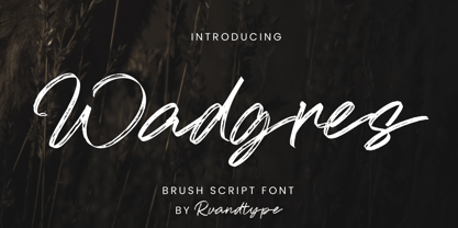 Wadgres is a Script Brush font. Its elegant and cool look makes it the perfect choice for logos, branding, invitations, stationery, wedding designs, social media posts, and so much more. Wadgres Font is PUA encoded which means you can access all of the glyphs. Features : – Uppercase & Lowercase – Alternate Characters – Numbers and Punctuation – Multilingual Support – PUA Encoded Thank You
 - KS Roam by Kreuk Type Foundry,
$16.00 KS Roam is a handmade display font with fun thick brush impression at a glance. Brush inspired display with strong, catchy & striking form display. KS Roam ideally suited for headline title, logo, branding, posters etc.
 - Cybrox JNL by Jeff Levine,
$29.00 Cybrox JNL takes a simple bitmap font and regenerates it into its most distressed form. The design is perfect for "technology-gone-bad" messages, radical headlines and anything with an electronic, techno or digital theme.
 - Squint by Hanoded,
$15.00 Squint is a unique typeface, created with just 2 basic forms: a rectangle and a line. Squint is ideal for use in (futuristic) posters, designs and ads. It comes with old fashioned extensive language support.
 - Kaluny Pro by Muykyta,
$12.00 Kaluny Pro is a humanistic style font. It has two versions: one slab serif and one non-slab serif. Modern and with some classic features, it is easy to read and forms a homogeneous set.
 - Deeney by DawnCreative.Id,
$13.00 Deeney is a handwritten style font. The natural form will make your work look more natural, like normal handwriting. This font is perfect for you to use in art, invitation, video, children's books and more.
 - Lonely Together by Dumadi,
$20.00 Lonely Together is a unique handwritten-style font created with brush tools. if you have a project in the form of romantic nuances, invitation cards, social media designs, branding, valentine events, crafting designs, and more.
