10,000 search results
(0.059 seconds)
- Unity Dances - Personal use only

- Disquete by Tipos do aCASO,
$23.90Inspired by the shape of a 3.25" floppy disk this unicase font was designed from the combination of three square modules. Made in 1998 Disquete is one of the first projects of Buggy, founder of the Brazilian type foundry Tipos do aCASO. - Organic Benefit by Bogstav,
$15.00 Say hello to my new organic monospaced unicase font! It's handmade and has this true organic look to it! Choose between 5 different versions of each letter, or just type ahead and let the Contextual Alternates do their cycling of letters automatically!
 - Spicy Note by PizzaDude.dk,
$18.00 Here's my eye-catching alternative unicase font - build with a twist of grafitti and dash of pizzadude! Each letter has 5 slightly different versions and they automatically cycles as you type. A great way to make your text look naturally organic and dynamic!
 - Fair Sans by District,
$15.00 Fair Sans is a distinctive sans-serif with much of its calligraphic structure left intact. Its casual construction and unconventional letterforms create a unicase family that’s relaxed and lively at the same time. Includes four weights and two widths, ligatures, and extras.
 - Designal by Type-Ø-Tones,
$40.00 Designal is a Félix Rufín design based on the DIN theme. The goal was to create a suitable unicase, an old dream of typographers. The icons collection —more than 400— is a result of Rufín’s obsession with label design. OpenType, 8 styles.
 - The font named "Hendrix Demo" by The Scriptorium is a vivid encapsulation of both creativity and tribute, designed with an essence that echoes the legendary flair of Jimi Hendrix, to whom it ostensib...
- Lido STF - Personal use only

- Karn by Typebae,
$10.00KARN is a display typeface inspired by psychedelics. Regular, bold, outline, and summer dingbats are available. Perfect for projects that require fun and creativity. Punctuation, Multilingual & PUA Encode - Golden Moment by MJB Letters,
$17.00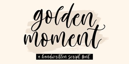 ‘Golden Moment’ a handwritten script font that has multilanguage and PUA encoded, this font is perfect for t-shirt designs, quotes, logos, display, branding, wedding invitations, and more.
 - Cybero by Din Studio,
$29.00 Cybero is modern display font and is suitable for your any project like branding, clothing prints ad more. This font is PUA encoded and includes multi-lingual support.
 - RT Austin Plain by Estudio Calderon,
$19.00 Austin Plain is derived from the union between Melts Script and Deftone Stylus, the result is a friendly typeface that mixes old American styles with modern design concepts.
 - Trauville by Eurotypo,
$22.00 Inspired by Beauville Script, Trauville is a handmade, modern, joyful and elegant pen font with a vintage touch. Its informal appearance, the bouncy baseline, the round forms and bumpy stems, the good connection between the letters and the large number of ligatures that create more authentic and varied connections between the letters, refer to the fluent handwriting. With its 830 glyphs, the Trauville font is equipped with contextual and stylistic alternatives, many stylistic alternatives, swashes, initial forms and ligatures. This font contain a Central European language support to adapt to your design. Trauville works perfectly on greeting cards, invitations, weddings, posters, magazines, fashion world, brands and logos, packaging, etc. He is friendly and kind, fresh and fun to work with.
 - Fargo Tuscan by Greater Albion Typefounders,
$20.00 Fargo Tuscan is the first of seven typefaces exploring the decorative possibilities of the Tuscan letter form, all of which are releasing in 2017. It’s the most European of the seven- it’s a Mid-Victorian inspired display face which would have been (and is) at home on either side of the Atlantic, unlike some of the others in this batch of Tuscan faces which are distinctly ‘trans-Atlantic’ (we know, that depends on your point of view but we are Greater ALBION Typefounders after all) in flavour. Fargo Tuscan is replete with decorative features, including Swash Capitals, alternate numeric forms and stylistic alternates ideal for the beginning and ending of words. Have some mid-Victorian mid-Atlantic fun with your next design project!
 - VLNL Tp Martini by VetteLetters,
$35.00 Our chef Martin Lorenz likes to mix cool and fresh cocktails - shaken, not stirred! You have to taste his awesome Martini or mix it yourself! To make matters more easy, cocktail master Martin reveals his special recipe: “The TpMartini refers esthetically to typefaces drawn with a pointed nib as the Bodoni or Didot, but with the clear distinction that it is obviously constructed by modules. The visual system for the TpMartin is based on a square 5x9-unit grid and three different basic forms with which the font and other elements are designed. The basic forms consist of a straight line and circles of two different sizes. The line can be extended, but the circles retain their related proportions.” One piece of advice: Don’t drink and type!
 - Linotype Flamingo by Linotype,
$29.99Linotype Flamingo, from German designer Michael Leonhard, is part of the TakeType Library, chosen from the entries of the Linotype-sponsored International Digital Type Design Contest 1999 for inclusion on the TakeType 3 CD. The figures of this font have pieces missing, the curve of an a, the stroke of an n. The eye fills in the gaps, allowing the designer to present a unique font with reductionist forms which can still communicate written ideas to the reader. A small number of forms come together to create the alphabet and the 'missing pieces' make a light and airy overall impression. Linotype Flamingo should be used in point sizes of 18 and larger and because of reduced legibility should be used only for very short texts. - Allotrope by Kostic,
$40.00 Allotropes are different structural forms of the same element and can exhibit quite different physical properties and chemical behaviors. The change between allotropic forms is triggered by the same forces that affect other structures – pressure, light, and temperature. From Wikipedia the Free Encyclopedia With ten weights in five widths plus Italics, this family comes to a total of 100 fonts. The large number of styles was made with the intent to cover most cases UI designers have to tackle, with one type family. Stylistic alternates were made to follow the same logic, so there is an optional single-story g, serifed capital I, and dotted zero – all available through the OpenType feature. The character set supports Western and Central European languages, as well as Turkish.
 - BoiTu by Vei Vei,
$16.00 BoiTu is a typeface in the BoiTu project designed by Vei Vei. BoiTu has a strong contrast between bold bars and long sharp hook strokes inspired by pheasant feathers on the hat in Hat Boi costume. "Tuong or Hat Boi is a form of Vietnamese classic opera, combining various elements of arts such as stage, music, fine art, literature, dancing, and martial arts. Older Tuong plays are usually about historical events or tales. Allegories, melodramas, soliloquies, modes of expression, forms of performance, repartee singing and recitative conventions, etc., are constantly updated and elevated, and are quintessential elements in the art of Tuong." Boi Tu is a classic design to bring traditional art and culture closer to everyone. Boi Tu is a Vietnamese font that supports multiple languages.
 - Multipolar by MYSTERIAN,
$9.00 This typeface was designed as the house style by and for design studio Mysterian. It was drafted and completed during most of 2020. The intention of the design of the forms was to develop a unique signification in the mind, but one that could have potential relevant associations such as with sci-fi. The solution, brought along with a fascination with this rarely seen pattern in type, was to taper round forms. The name 'Multipolar' was inspired by the term used by game theorist Daniel Schmachtenberger, which is a kind of event that seemed relevant to the Covid-period in which the font was made. Alternate characters include: Two Ampersands Upper and Lowercase PI Upper and Lowercase Eszett Latin Characters
 - AG Bambook by Alexandr Galuzin,
$26.00 AG Bambook- compressed geometric sans serif with the closed forms. Contains 4 fonts. 2 regular and 2 italic. The font is universal and can be used in different directions of graphic design. Internet, printed materials, clothing, logos, posters, labels, navigation and more. Thanks to character compression, you can place a large amount of information in a compressed space. It will read equally well in large and small sizes. A small difference in the width of the glyphs for different styles allows you to change the saturation while maintaining the size of the text block. OpenType: alternate numbers, old-style numbers, arrows, case sensitive forms, superscript and subscript, numerators and denominators. Support: Cyrillic, Cyrillic extended, Latin, Latin Extended (Western European, Central European, South-East), Kazakh.
 - Reinfolk by IKIIKOWRK,
$17.00 Introducing Reinfolk - Decorative Sans, created by ikiiko. Reinfolk is a sans serif typeface with a unique decorative shape. The form is a combination of the sans typeface with the tail character on the slab letter, so that it forms a unique formation and has a distinctive character. Reinfolk is a simple font, with a elegant and calm impression. This typeface is perfect for an elegant logo, branding, layout magazine, home & decor layout, beauty product, packaging product, quotes, or simply as a stylish text overlay to any background image. What's included? Uppercase & Lowercase Number & Punctuation Alternates & Stylistic Multilingual Support Get also a good offer & FREEBIE at our site : www.ikiiko.com Enjoy our font and if you have any questions, you can contact us by email : ikiikowrk@gmail.com
 - Lifeform by Supremat,
$12.00 Lifeform is a modern display font created as a result of my experiments on the forms of letters. While working on the font, I had ambivalent feelings, on the one hand I liked the individual curved lines, on the other hand they seemed very strange, alien and illogical. It was like looking into a microscope and seeing something strange. I wanted to develop and study these forms as something new, because I had never seen anything similar before. The result is a contrasting font that has both curves and sharp, and smooth lines that resemble some kind of organic matter. The font is well suited for large headlines, posters and covers. Its strange design catches the eye and will not leave the viewer indifferent.
 - Takox by John Moore Type Foundry,
$7.00 Takox is a display typeface based on a synthesis of righteousness extreme, futuristic spirit leads us to a way of plotting the words in a new way and in line with trends and technology synthesis century. Extreme music. Takox is provided with style forms to small caps, in both Regular and Italic. What was the inspiration for designing the font? Takox is the result of my own research in finding straight shapes of great simplicity. What are its main characteristics and features? Display font witn straight shapes of great simplicity. Usage recommendations: This letter design is ideal for use 3D extrusions, ideal to represent natural forms of cristals, metal or mechanical things. Fits indiustriales representations and aerospace, also for extreme music and avant garde.
 - Bernhard by Linotype,
$29.99 The German typeface artist Lucian Bernhard designed Bernhard Antiqua as the first of his many text typefaces. The first weights were produced in 1912 by the foundry Flinsch in Frankfurt am Main. Further weights followed in the 1920s, produced by the Bauersche foundry, which had acquired Flinsch in the meantime. Bernhard font is an alphabet with a marked historical influence. It brings the viewer back to the early 20th century, when the bold forms of this typeface graced advertising displays and posters. Distinguishing characteristics of this typeface are the cross of the capital W and the rounding of the capital R. Linotype's Bernhard condensed bold, with its narrow, robust forms, is best for headlines in medium and larger point sizes.
 - Occam by Veil of Perception,
$20.00 Occam is an informal calligraphic script face. The letter forms were drawn and constructed rather than penned or brushed but reflect a definite flat pen influence. The ascenders and descenders incorporate an abstract implied loop form. Some curves that would normally be round are pointed and some transitions that would normally be sharp and pointed have been made round. A few exit strokes curve back instead of moving up and out for a little different look. This font could be put to good use as a contrasting style combined with sans and serif faces in applications such as newsletters, brochures, invitations and annual reports. It could be used for heads, subheads, pull quotes, drop caps and as a title font for covers.
 - Trico Script by FlehaType,
$33.00 Trico Script is an attempt to create a script using a cut-out technique. Every basic glyph is made of three forms which gives the script a unique personality and a very distinctive appearance. In order to maintain an even script texture and to keep its character numerous advanced typographic features were created: contextual lowercase alternates, finial lowercase forms, two sets of uppercases, standard and discretionary ligatures etc. Trico Script can either be used as a regular script or as a typeface in three layers. Although the regular version is surprisingly legible in small sizes it’s distinctive character is suitable for the projects where a powerful wordmark is needed. This typically includes cases such as packaging, editorial design, digital use, social media and branding.
 - Bourne by Greater Albion Typefounders,
$12.00 Bourne is a comprehensive text and display sans-serif family consisting of 21 typefaces, all with a range of features including stylistic alternates, discretionary ligatures, as well as old-style and tabular numeral forms and fractions. The 21 typefaces include two widths and three weights of type as well as square and round terminal forms and oblique faces. Three specialised display faces are also included. The face is ideal for establishing a consistent 'look' across a range of projects and could readily become the basis of an organisation's house publication style. Bourne works well in poster and large scale design work, as well as for the setting of large amounts of text. Individual faces are priced economically and substantial discounts are offered for packs of multiple typefaces.
 - Basco Std by Typofonderie,
$59.00 A mix of Renaissance & tropical atmosphere Basco is an exploration of the Renaissance style, a period in which letterforms were informed primarily by hand writing. It is clearly a contemporary interpretation of calligraphic shapes forms. The serifs are subtly asymmetrical. Slightly curved arches on the n, m and u are noticeable, creating an interesting tension in the text. Bruno Mello’s distinctive style is most obvious in his mastery of super fluid curves. It is a result of his extensive exploration of calligraphic forms, their tensions and dynamics, mixing angularities with curves. The roman weights include alternate swashes, as well as initial and terminal glyphs. The italics, based on chancellery script, feature simple stroke endings, most visible on the s and c. ➼ Basco minisite
 - Auteur by Up Up Creative,
$29.00 Introducing Auteur, a graceful, full-featured script font with tons of alternate characters and OpenType features. Hand-lettered with a heavy right slant and realistic disconnected letters (connected versions also included), Auteur’s casual elegance is particularly well-suited to invitations, branding, and editorial design. Auteur comes with more than 1200 glyphs! Specific OpenType features include contextual alternates, stylistic alternates, optional initial and final forms, multiple alternate glyphs for many letters (accessed through the glyphs panel), multilingual support (including multiple currency symbols), ligatures, multiple numeral forms (standard, tabular, proportional oldstyle), and ten ampersand styles. Perhaps the most fun thing about Auteur is that it includes multiple versions of all ascending and descending letters, making it lots of fun to play with layouts and compositions.
 - Emperatriz by Latinotype,
$19.00 Emperatriz—with deep roots in the Roman tradition—is an elegant font and, above all, firmly situated in the present, featuring monumental forms and a classical design yet with a contemporary twist. It is a refreshing, clean, modern display font, perfect for the editorial design of magazines and catalogs, for the creation of titles and short texts, on book covers and large format publications, or as part of a corporate identity, logos, packaging and labels. Every variant in the family has generous counter forms, with ligatures and alternative capitals (Q, R, P, O), as well as oldstyle and Roman numerals, manicules, and monetary and mathematical symbols, providing a complete set with language support for more than 200 Latin script languages.
 - RF Rufo by Russian Fonts,
$29.00 Rufo — condensed geometric sans serif with the closed forms. Contains 12 fonts. 6 regular and 6 italic. From thin to black. A rich palette gives full freedom for creativity and bright decisions. Extensive area of use. The versatility of the sans serif typeface covers various aspects of graphic design. Web, printed materials, clothing, logos, posters, labels and much more. Rufo is pragmatic typeface. Can save space and will accommodate a large amount of information in a limited space. The font was designed so that condensed letters remains readable even in small sizes. Opentype: alternate numbers, oldstyle numbers, arrows, fractions and automatic fractions, case sensitive forms, superscript and subscript, numerators and denominators. Support: cyrillic, cyrillic extended, latin, latin extended (Western European, Central European, South-East).
 - ITC Vino Bianco by ITC,
$29.99ITC Vino Bianco was created by German designer Jochen Schuss. He drew his inspiration from the handwriting of the waiter in his favorite local pub, especially the form of the capital Q. Based on this one character Schuss developed the entire alphabet. The figures are sketchy and generous and look as though they were written on paper with a ball point pen. Vino Bianco is an alphabet of capital letters, each of which also has an alternative form, making it very flexible and true to the tendency of true handwriting. In spite of its fine strokes, the overall look is open and light due to the large amount of space each character occupies. The cheerful, carefree ITC Vino Bianco is best used for headlines and short texts. - Fontin, a creation by the talented type designer Jos Buivenga, is a sophisticated and versatile typeface that seamlessly blends classic type qualities with contemporary styling. Its design is a harmo...
- Grenale Slab by insigne,
$- Grenale Slab adds to the new standard of elegance within the Grenale family. Not your typical slab, Grenale has some unique forms that give it a look all its own. This glamourous slab still draws much inspiration from Grenale’s Didone sans and its haute couture influence. Independently attractive, it’s balanced and poised, with well formed strokes. Grenale Slab’s thin weights are simple but vibrant--elegant forms that naturally lend themselves to designer journals and high-end branding along with upscale applications. With added energy and power, the thicker weights give your work a firmer, statlier look. Grenale Slab’s upright versions are also matched by optically adjusted italics. The fashionable typeface includes a multitude of alternates that may be accessed in any OpenType-enabled application. The stylish features include a large group of alternates, swashes, and meticulously refined details with ball terminals and alternate titling caps to accessorize the font. Also included are capital swash alternates, old style figures, and small caps. Peruse the PDF brochure to see these features in action. OpenType enabled applications such as the Adobe suite or Quark can take full advantage of the automatic replacing ligatures and alternates. This family also offers the glyphs to support a wide range of languages. Any of Slab’s weights also provide a well-matched companion to its original counterparts, Grenale #2 and the original Grenale. It’s time to think high-class. Graceful and assured, the carefully crafted forms of Grenale Slab step pleasantly onto each page with elegant charm. Include its range of alternate glyphs, and this chic font is a superb choice for bringing a far more refined look to your copy.
 - Beckman Demons by Aldedesign,
$18.00Beckman Demons is a stylish signature font that is inspired by modern photography. It’s easy to use, to create a stunning watermark for your photos, invitations, branding. It also works great as a business signature or on other branding materials. - PUA encoded = Accessible in the Adobe Illustrator, Adobe Photoshop, Adobe InDesign, even work on Microsoft Word. - PUA Encoded Characters - Fully accessible without additional design software. How to access alternate glyphs? you can see it on this link: http://goo.gl/1vy2fv - Shaping Heart by Sarid Ezra,
$19.00 Introducing, Shaping Heart - a lovely serif with heart touch! Shaping Heart is an elegant and modern serif with a thoughtful details that will make your presentation, logo or your wedding invitations more stunning and lovely! You can use this font for several purposes such as a wedding invitations or even your own branding! This fonts support Multi Language and already PUA Encoded! Also comes with beautifully crafted details that make this font more stylish. Features Uppercase & Lowercase Number & Symbol Multi language PUA Encoded
 - Argue by Sarid Ezra,
$17.00 Introducing, Argue - a stylish font based on sans serif! Argue is an elegant and modern sans serif with a bunch of features that will make your presentation or logo more stunning and stand out! You can use this font for several purposes such as a wedding invitations or even your own branding! This fonts support Multi Language and already PUA Encoded! Also comes with beautifully crafted details that make this font more stylish. Features Uppercase & Lowercase Number & Symbol Multi language Alternates PUA Encoded
 - Arlista by CBRTEXT Studio,
$15.00 Arlista is a stylish, classy and modern handwritten font with many alternative styles for your beautiful project. We make this font carefully so that each letter can be accessed well. Alternatives to the letters a-z, beautiful decoration, and the ligatures make your project more elegant and classy. Arlista also has multilingual support and is PUA encoded. Features : 350+ Glyphs Ligatures Alternates Simple installations Standard Uppercase and Lowercase Alphabet Numbers and Punctuation Swash Stylistic Set Open Type Features PUA Encoded Multi-lingual Support
 - TypoLatinserif-Bold, a distinguished font created by the prolific German type designer Manfred Klein, is a testament to the harmonious blend of traditional elegance and modern precision. This font em...
- Givry by TypeTogether,
$49.00 The bâtarde flamande is a style of writing used predominantly in France and present-day Belgium in the 15th century. The style shares an ancestry with other writing styles traditionally grouped as blackletter— fraktur, textura, rotunda, and schwabacher. It had evolved, however, into an æsthetic far removed from its relatives. While high-contrast in nature, the bâtarde flamande is more delicate and dynamic than the austere and condensed fraktur and textura. Quick curves lack the rigidity of the schwabacher and rotunda. Flair through swashes is thematic, as are the variations in letterforms. The flowing rhythm, achieved through a letterform axis that is overall slightly rightward, is most noticable in the hallmark f and long s. Round forms are fused together for economy of space. It is a writing hand that, with its syncopation and fluidity, produces a vibrance uncharacteristic of other blackletters. Givry has been created in the spirit of the bâtarde flamande. It melds the particular traits compiled from the works of the style’s prominent scribes—Jean Fouquet, Loyset Liédet, and Jean Bourdichon. While suitable as an elegant and energetic display face, Givry was conceived for setting continuous text. The result of many refinements and adjustments is the preservation of the style’s irregular nature, as well as a consistency that continuous-text typography requires. Carefully researched and developed in OpenType format for a wealth of typographic features and support for more than forty languages, Givry is neither derivative nor experimental, but historically accurate. Of the many blackletter digital typefaces available, fraktur and all its connotations have become representative. In contrast, the bâtarde flamande is essentially non-existent in digital form, and has until now been overlooked. Givry provides designers and anyone searching for typographic expression a lively, delicate, and striking side to blackletter.

