4,286 search results
(0.011 seconds)
- Party Mush by PizzaDude.dk,
$20.00You can't take anything for granted when it comes to the Party Mush font - every single letter has got its own personality...and madness! This is a font that will definately kick those party invitations the right way! - Giamatti by Febri Creative,
$10.00 Giamatti is a handwritten font made with its own uniqueness. Unique, beautiful, simple font but looks elegant and professional. This font is perfect for use as logos, signatures, product names, company names, brands, promotional adverts, and much more.
 - Heralen Antelik by Letterena Studios,
$17.00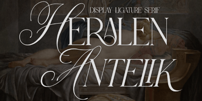 A serif modern and classic typeface that has its own unique style & modern look. This typeface is perfect for an elegant & luxury logo, book or movie title design, fashion brand, magazine, clothes, lettering, quotes, and so much more.
 - Shutter Stone by Sarid Ezra,
$13.00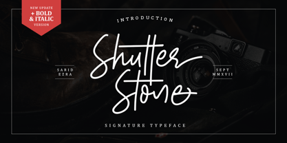 Introducing, Shutter Stone. Another Signature Script Font for you! Shutter Stone is handwritten font that contain stylistic alternate, swash, etc to create your own customised signature. This font is also support multi language. Also Support PUA. Thank You!
 - Mechanoid by Studio K,
$45.00 Mechanoid is a machine age font: crisp, clean, bold and unadorned, yet with a distinctive character of its own. As the name suggests it is well suited to engineering or technological themes, yet versatile enough for universal applications.
 - Trelink by Letterena Studios,
$17.00 A serif modern and classic typeface that has its own unique style & modern look. This typeface is perfect for an elegant & luxury logo, book or movie title design, fashion brand, magazine, clothes, lettering, quotes, and so much more.
 - Hello Blushberry Script by Great Studio,
$14.00 Allow me to introduce Hello Blushberry - Font Duo is a playful script containing many choices of alternative characters to choose from as well as ligatures that look natural to add to the authenticity of letters. A collection of strange and initial swash tips is also included to add finishing touches or fill the design space in your type design. Hello Blushberry a modern handwriting fonts, loaded with awesome opentype features, and full alternative upper and lower case character sets. make custom letters a dream thanks to all the extra decorative choices you can enter for beautiful and unique customizations - swash, endings, alternative letters and ligatures all make it the prettiest little thing since tutus and tiara. Designed to work harmoniously, this duo font consists of super fine and casual signature scripts and a complete and clean set of all sans serif letters. Sans Serif fonts consist of two outline fonts of different weights, and a regular version. Layer them with different colors and turbidity to get a million different views. This font is perfect for branding, logos, web and editorial design, branding, prints, invitations, crafts, quotes, and more. Includes Files: • Hello Blushberry Script • Hello Blushberry Script Capitals Need help? If you need help or advice, please contact me by e-mail at Greatstudio92@gmail.com.
 - Seafont by VP Creative Shop,
$10.00 Introducing Seafont - serif typeface , 24 fonts + 26 swashes Seafont is elegant and timeless typeface loaded with 24 font styles (narrower, narrow, regular, wide, wider, widest) 26 swashes, 87 languages support and ligature glyphs to make you typography truly unique! Language Support : Afrikaans, Albanian, Asu, Basque, Bemba, Bena, Breton, Chiga, Colognian, Cornish, Czech, Danish, Dutch, Embu, English, Estonian, Faroese, Filipino, Finnish, French, Friulian, Galician, Ganda, German, Gusi,i Hungarian, Indonesian, Irish, Italian, Jola-Fonyi, Kabuverdianu, Kalenjin, Kamba, Kikuyu, Kinyarwanda, Latvian, Lithuanian, Lower Sorbian, Luo, Luxembourgish, Luyia, Machame, Makhuwa-Meetto, Makonde, Malagasy, Maltese, Manx, Meru, Morisyen, North Ndebele, Norwegian, Bokmål, Norwegian, Nynorsk, Nyankole, Oromo, Polish, Portuguese, Quechua, Romanian, Romansh, Rombo, Rundi, Rwa, Samburu, Sango, Sangu, Scottish, Gaelic, Sena, Shambala, Shona, Slovak, Soga, Somali, Spanish, Swahili, Swedish, Swiss, German, Taita, Teso, Turkish, Upper, Sorbian, Uzbek (Latin), Volapük, Vunjo, Walser, Welsh, Western Frisian, Zulu FEATURES Uppercase, lowercase, numeral, punctuation & Symbol ligature glyphs Narrower - 4 weights Narrow - 4 weights Regular - 4 weights Wide - 4 weights Wider - 4 weights Widest - 4 weights Multilingual support - 87 languages No special software is required to type out the standard characters of the Typeface. Feel free to contact me if you have any questions! Mock ups and backgrounds used are not included. Thank you! Enjoy!
 - Odisean by deFharo,
$24.00 Odisean Fonts and its 3 styles (One, Tech & Small Caps) are ideal for graphic design, editorial, logos and posters. Its rounded finish and marked contrast between antlers evoke the charm of bygone eras. In addition, it has a collection of retro icons accessible through OpenType: Small Caps. Letter proportions are multiples of 8, ensuring exceptional visual harmony, while metrics and kerning use values multiples of 8 for impeccable legibility and aesthetics. Discover Odisean and revive retro nostalgia in your designs. Each Odisean variant comes loaded with a set of alternative letters that allow you to customize and adapt each project to your liking. In addition, you will be able to access an exclusive collection of retro icons through the OpenType feature: Small Caps, adding even more versatility and charm to your creations. - Odisean One will transport you to a bygone era with its retro charm, offering you alternative lyrics that evoke the aesthetic of the golden and happy years. - Odisean Tech for those who love technology and innovation, the font is full of graphic elements and retro transportation icons, which will immerse you in a futuristic world of the past. - Odisean Small Caps bring elegance and versatility to your designs with their small capital letters.
 - Visible by Andinistas,
$24.00 Visible is a dynamic typeface family designed by CFCG @andinistas. Visible Script has narrow horizontal spacing between lowercase, while Visible Script 2 has generous and wide horizontal spacing. Mixing both styles you will achieve italic designs loaded with speed and strength to communicate aggressiveness, nervous and sanguine temperament. Visible Caps contains capital letters derived from the font's writing, but drawn aggressively and slanted 15 degrees to the right. This type of visual characteristic is typical of very fast and nervous writing that is performed with emotion without sacrificing harmony. a monolineal and condensed version is the Visible caps 2, allowing for significant horizontal space saving economies. Used Visible Caps 1 and 2, become much more than just an expressive and functional artistic tool. In short, by combining their expressive writing or Visible Caps & Script lettering styles, they make words and phrases appear to be written with a brush and ink-filled calligraphic strokes and with eye-catching qualities, their design is the perfect choice for distinctive headlines and brand identities. for music, movies, video games and more. A special thanks to the Venezuelan artist for his impressive illustrations @franciscomarin_artistaplastico ENJOY more than 1100 glyphs: + Visible Script: 398 glyphs + Visible Script2: 221 glyphs + Visible Caps: 222 glyphs + Visible Caps2: 298 glyphs
 - Solantra by Stephen Rapp,
$44.00 Solantra is a solidly crafted handwritten script. I’ve long felt that beautiful writing is more pleasing to the eye than the more attention grabbing swashes and flourishes. That being said, both have their role in design and Solantra has a large slice of each. Solantra combines vintage style handwriting with all its quirks and English Roundhand of that same era. The result is a solid setting script filled with charm and personality. With default Adobe Illustrator settings for Ligatures and Contextual Alternates active, the vintage charm is in full display. Want to add more flair? There are loads of more embellished letters inside the full version. Solantro takes into account how scripts are actually written so that connections from letter to letter are more fluid and rhythmic than the average script font. In natural script/handwriting most letters end at the bottom right and move up to connect with the next. Some letters like o, v, and w, however; end at the top right. Rather than force these letters to dip down and go back up they should ideally connect from that upper right point. This is accomplished through a series of alternate letters and ligatures with extensive contextual feature programming. So, for example, you might get one version of a ligature in the middle of a word and a different one at the beginning or end of that word. Solantra also takes into account another often overlooked feature of natural handwriting. When you write you inevitably pick your pen up from the paper at times. This is often just to reposition the hand, but in the days of writing with dip pens this was also needed to attain a fresh supply of ink. Having these occasional breaks in connections makes the writing less static and more rhythmic. While the Basic versions are limited to a standard character set and several ligatures and alternates for better settings of text, the full pro versions contains 1292 glyphs and an abundance of features. Even with numbers there are options like Oldstyle numbers, fractions, and ordinals. Central European language support is included as well as some select ligatures that use accents. To see more on the technical aspects and instructions on using Solantra, please check out the user’s guide in the Gallery section. **Note: The Pro versions of Solantra which do not have the word “Basic” attached to the title, have everything in them. So if you license a Pro version there is no need to get the Basic versions.
 - FS Truman by Fontsmith,
$80.00 Beyond broadcast Like Truman Burbank, the star of The Truman Show, FS Truman was born for TV. You’ll know it from Sky One’s on-screen trails and announcements, but it’s just as at home in other media. Its starting point was the skeleton of a highly legible, space-saving, corporate font with some of FS Dillon’s geometric discipline built in. Its distinctive tone of voice and “ownability” are in its boxy but friendly shapes, and characters with hybrid features. FS Truman’s weights and widths were honed to work at TV screen resolutions. A face for TV it may have been, but this is a font that works on every level, on screen, in print, in headlines, in listings, in longer text, in tight corners and open spaces. The space-saver Compact, condensed but crystal clear, FS Truman comes into its own where a lot needs to be said in not a lot of space. Its letter spacing allows the type room to breathe, even at small sizes, while its fulsome x-height and diminutive descenders pave the way for tighter leading. A natural for headlines and titles over three or four lines. “Hybrid” features With every font, Fontsmith look for crafty new ways to imbue letterforms with a consistent character. The idea with FS Truman was to introduce “hybrid” features. In open letters such as “c” and “s”, for example, the top terminals have straight, vertical cuts while their lower terminals have a more angular, cursive finish. Boxy, spacious forms with unusual curves and angles create not just highly legible and efficient letters but strongly distinctive ones, too.
 - Wolves, Lower - Unknown license

- Penzance by TEKNIKE,
$45.00 Penzance is a display monospace handwriting font. The typeface is a distinct hand drawn font using a fountain pen quill ink style. The Penzance name means "holy headland" in the Cornish language and is derived from the town on the English coast of Cornwall. Penzance is great for display work, invitations, writing, books, posters, logos and headings.
 - Falfurrias NF by Nick's Fonts,
$10.00Another in the Whiz-Bang Woodtype series, based on authentic xylographic designs from the late nineteenth century. Named after (surprise!) a small town in Texas. The net effect is a typeface which can add style and warmth to any project. Both versions of this font include the complete Unicode 1252 Latin and Unicode 1250 Central European character sets. - P22 Akebono by IHOF,
$24.95 Akebono means dawn in Japanese. It expresses the pleasure of imbalance. Stems and strokes are mixed--straight and round with slender terminals and arches. Akebono is available in three styles; Regular, Alternate, Italic. Akebono Alternate resembles the Regular but features some of the hooked tails found on the Italic. P22 Akebono is licensed exclusively to P22/IHOF
 - Coverack by Scriptorium,
$18.00Coverack was inspired by some hand lettering spotted by Dave Nalle on a pub menu blackboard during a recent trip to England. It's in the tradition of Celtic uncial lettering, but is extra bold and has some fantastical embellishments. The name comes from a lovely little town on the Cornish coast where the designer stayed during the trip. - Uptown Line JNL by Jeff Levine,
$29.00 Ask any typical New Yorker about subway directions and they'll tell you to take the "uptown line", "downtown line" or "cross-town line". Uptown Line JNL is yet another variation of the Art Deco monoline style of lettering prevalent during the 1930s and 1940s, and is based on titling from vintage sheet music for a Johann Strauss classical piece.
 - Antiphon by Gustav & Brun,
$18.00 Created to illustrate the frustration of a punk band, the fear of a gigantic Blob in a small Michigan town, Kurt Vile, the scariness of a totally awesome party, your local band at your local pub, the awkwardness of Satan, your voice and some other super rough stuff. All caps. At Least every common letter x 2.
 - Superme by Forberas Club,
$16.00 Superme, This is the new serif in town i mean in my font family. It's super ready for any crafter, event planner, or thirsty idea seeker for making your project or crafting material. It will smooth your presentation font, or your novel book font, and making any invitation card, greeting card, gift, decorative font, or your branding image.
 - Zushboy by PizzaDude.dk,
$20.00Zushboy is a ragged verion of my own tagging style (even though it has been years and years since I did a thing like that!). The font is spaced tight in order to copycat a real homeboy's handwriting! Yo! - Gorthe by Letterena Studios,
$17.00 A serif modern and classic typeface that has its own unique style & modern look. This typeface is perfect for an elegant & luxury logo, book or movie title design, fashion brand, magazine, clothes, lettering, quotes, and so much more. **Uppercase
 - Gods Must by Letterena Studios,
$17.00 A serif modern and classic typeface that has its own unique style & modern look. This typeface is perfect for an elegant & luxury logo, book or movie title design, fashion brand, magazine, clothes, lettering, quotes, and so much more. **Uppercase
 - LHF Classic Panels 2 by Letterhead Fonts,
$39.00 A vast array of 39 expertly-drawn decorative vector panels in the form of a single font. Each letter generates a different panel so you can simply insert your own text for a quick design your clients will love.
 - Stunning Christmas Monogram by AEN Creative Studio,
$15.00 Stunning Christmas Monogram is a stunning and comprehensive duo font (display and decorative), ideal for giving your projects a branded but friendly feel. The two included styles can be combined together perfectly but are also beautiful on their own.
 - Bagias by Letterena Studios,
$9.00 Bagias is a modern and classic sans serif font that features its own unique look. This typeface is perfect for elegant & luxurious logos, book or movie title designs, fashion brands, magazine covers, clothes, lettering, quotes, and so much more.
 - F2F OCRAlexczyk by Linotype,
$29.99The Face2Face (F2F) series was inspired by the sound of 1990s music, personal computers, and new font creation software. For years, Alexander Branczyk and his friends formed a unique type design collective, which churned out a substantial amount of fresh, new fonts, none of which complied with the traditional rules of typography. Many of these typefaces were used to create layouts for the leading German techno magazine of the 1990s, Frontpage. The typeface F2F OCRAlexczyk is one of the Face2Face fonts in Linotype's Take Type Library. It is based on the popular computer font OCR A, which was developed by the American National Standards Institute in 1966 as a system of letters that both humans and machines could easily read. Alexander Branczyk made a more 1990s/techno version, which later became this font. - West Shine by Jafar07,
$17.00 West Shine is a retro Slab Serif font that captures the timeless charm of the Western cowboy era. Designed specifically for headlines and logos, this font adds the perfect touch to your design projects. With its distinct Slab Serif characters, West Shine brings a strong, masculine, and captivating vibe. Combining retro design elements with a modern twist, this font creates a delightful and unique harmony. With its bold and expressive features, West Shine exudes courage and adventure. Its well-balanced letter thickness and exceptional clarity ensure that your message is read loud and clear across all media. West Shine is ready to bring your logos, headlines, and branding designs to life with its classic yet relevant Western cowboy flair. Publish West Shine font on Creativemarket and give your designs an unforgettable and authentic appeal.
 - Bodoni Classic Ad by Wiescher Design,
$55.00 I became interested in designing Bodoni Classic because of a lazy graphic designer at Jacques Damase publishing house. He had to change a single letter on a bookcover about J. B. BODONI. The French call him Jean Baptiste instead of Giambattista! And that unknown graphic designer just took any old “J” from some newly cut Bodoni. All the new Bodoni cuts have square serifs, whereas the originals had rounded serifs and slightly concave feet. The single letter “J” with the squared off serif was for me like a road sign to start redesigning the entire Bodoni family. That’s exactly what I started in 1993 and a dozen years later I am finished. Okay, I am still adding new Bodoni Classics, but those are my personal additions. Yours very retro, Gert Wiescher
 - Bodoni Classic Initials by Wiescher Design,
$55.00 I became interested in designing Bodoni Classic because of a lazy graphic designer at Jacques Damase publishing house. He had to change a single letter on a bookcover about J. B. BODONI. The French call him Jean Baptiste instead of Giambattista! And that unknown graphic designer just took any old “J” from some newly cut Bodoni. All the new Bodoni cuts have square serifs, whereas the originals had rounded serifs and slightly concave feet. The single letter “J” with the squared off serif was for me like a road sign to start redesigning the entire Bodoni family. That’s exactly what I started in 1993 and a dozen years later I am finished. Okay, I am still adding new Bodoni Classics, but those are my personal additions. Yours very retro, Gert Wiescher
 - Maritote by I Can Be Your Type,
$20.00While designing a logotype for a client, she described herself as "loud and colorful." Thinking about some eras in typefaces that portrayed this idea, I instantly thought of the "Roaring 20s" and the Prohibition era where the cinema is starting to take off and the Italian mafia are running the bars. (Which is coincidental because my client has family connections to Al Capone.) One of the most iconic typefaces designed for these times was Broadway by Morris Fuller Benton in 1925. This typeface was the zeitgeist of Broadway, the big city, theater, and cinema, which can now be seen in use almost everywhere an old family run cinema is located. Using the heavy influences of the thick and thin contrast of this typeface, Maritote brings the charm of Broadway into the 21st century. - Bramante LP by LetterPerfect,
$39.00 Bramante™ is an original display font by LetterPerfect Fonts, designed by Garrett Boge in 2020. It is modeled after a fifteenth-century inscription in the church of Santa Cecilia in Trastevere, Rome. The name is a tribute to the pre-eminent Renaissance architect Donato Bramante, whose Tempietto (1502, San Pietro in Montorio) marked the beginning of the High Renaissance in Rome. In 1503 he was named lead architect for the new St. Peter's Basilica, which was completed by Michelangelo, Maderno and Bernini a century later. Based on the pervasive use of Adobe Trajan as a classical-inspired titling face, LetterPerfect offers this Renaissance revival of imperial Roman capitals as an alternative with additional refinement and personality. (The full size capitals are complemented with small capitals in the lowercase positions.)
 - Opticum by ParaType,
$25.00Font family Opticum is not just a set of fonts, it’s a maze construction kit that hides letters inside. Each inscription is a little brain-twister with variable difficulty, where the level is defined by the style. The third one is the most difficult. When you type with these fonts you fill the space entirely without spaces because characters in the fonts don’t have side bearings and the leadings are set to zero. This converts you into an artist who produces geometric abstractions containing verbal messages. Texts set with this font not only catch an eye, but keep it for a long time. The duration of attention period can be adjusted by selection of the font style. The third one keeps longer. Opticum was designed by Erken Kagarov and released by ParaType in 2009. - Stevie Sans by Typefolio,
$29.00 Some years ago I had my first contact with a grotesque typeface, when handling a sample catalog of typographic specimens from the age of phototypesetting. The style eventually settled in my memory waiting for the work of time. Behind its apparent neutrality, there is a complex balance game, that almost leads to the basic principles of design which deliver such power to the grotesque style. Stevie Sans is the answer to the action of time. A bridge that allows the designer to go into the past, while being in the present and looking towards the future. It is what it’s expected from a grotesque designed in the 21st century. With 7 roman styles ranging from thin to black, support to many languages and essential opentype features, Stevie Sans is the ideal choice for your project.
 - F2F Frontpage Four by Linotype,
$29.99The Face2Face (F2F) series was inspired by the techno sound of the mid-1990s, personal computers and new font creation software. For years, Alexander Branczyk and his friends formed a unique type design collective, which churned out a substantial amount of fresh, new fonts, none of which complied with the traditional rules of typography. Many of these typefaces were used to create layouts for the leading German techno magazine of the 1990s, Frontpage. Branczyk and his fellows would even set in type at 6 points, in order to make it nearly unreadable. It was a pleasure for the kids to read and decrypt these messages! F2F Frontpage Four is one of 41 Face2Face fonts included in the Take Type 5 collection from Linotype GmbH. Branczyk designed 16 of these himself." - Bodoni Classic Chancery by Wiescher Design,
$55.00 I became interested in designing Bodoni Classic because of a lazy graphic designer at Jacques Damase publishing house. He had to change a single letter on a bookcover about J. B. BODONI. The French call him Jean Baptiste instead of Giambattista! And that unknown graphic designer just took any old “J” from some newly cut Bodoni. All the new Bodoni cuts have square serifs, whereas the originals had rounded serifs and slightly concave feet. The single letter “J” with the squared off serif was for me like a road sign to start redesigning the entire Bodoni family. That’s exactly what I started in 1993 and a dozen years later I am finished. Okay, I am still adding new Bodoni Classics, but those are my personal additions. Yours very retro, Gert Wiescher
 - MFC Peony Monogram by Monogram Fonts Co.,
$19.95 The inspiration source for Peony Monogram was a unique stackable monogram design with floral accents from a vintage embroidery publication. Originally intended to adorn handkerchiefs, this simple pattern has so many design possibilities, from colorizing to formatting options. You can really play around with this monogram font! Peony Monogram can create one, two, or three letter monograms, even basic titling due to its unique design. Because of Peony's unique stackable monogram formatting, make certain that the point size of the font is the same as the leading being applied to the font in order to minimize gapping between stacked forms. While we've adjusted this within the font, your program may override these settings. Download and view the MFC Peony Monogram Guidebook if you would like to learn a little more.
 - Bodoni Classic Text by Wiescher Design,
$55.00 I became interested in designing Bodoni Classic because of a lazy graphic designer at Jacques Damase publishing house. He had to change a single letter on a bookcover about J. B. BODONI. The French call him Jean Baptiste instead of Giambattista! And that unknown graphic designer just took any old “J” from some newly cut Bodoni. All the new Bodoni cuts have square serifs, whereas the originals had rounded serifs and slightly concave feet. The single letter “J” with the squared off serif was for me like a road sign to start redesigning the entire Bodoni family. That’s exactly what I started in 1993 and a dozen years later I am finished. Okay, I am still adding new Bodoni Classics, but those are my personal additions. Yours very retro, Gert Wiescher
 - Tengwar Transliteral by Zephyris,
$- You can read more about how to use this font and how it works here. This font lets you write in accurate Tengwar (elvish) quickly and easily. While writing his Middle Earth books, JRR Tolkein invented an entire alphabet for the elves called Tengwar. His attention to detail was incredible, Tengwar is a fully functioning writing system. This is the famous Elvish writing seen all through Lord of The Rings and the Hobbit. Tengwar is an alphabet, not a language, and can be used to write many languages. Tolkein gave detailed notes on how to write English in the Tengwar alphabet. This font uses advanced font features (contextual alternates, ligatures and kerning) to automatically convert any English text, as you type, into an accurate representation in the elvish Tengwar alphabet.
 - F2F Burnout Chaos by Linotype,
$29.99The Face2Face (F2F) series was inspired by the techno sound of the mid-1990s, personal computers and new font creation software. For years, Alexander Branczyk and his friends formed a unique type design collective, which churned out a substantial amount of fresh, new fonts, none of which complied with the traditional rules of typography. Many of these typefaces were used to create layouts for the leading German techno magazine of the 1990s, Frontpage. Branczyk and his fellows would even set in type at 6 points, in order to make it nearly unreadable. It was a pleasure for the kids to read and decrypt these messages! F2F Burnout Chaos is one of 41 Face2Face fonts included in the Take Type 5 collection from Linotype GmbH. Branczyk designed 16 of these himself."
