10,000 search results
(0.079 seconds)
- Dimensions by Dharma Type,
$19.99 Dimensions is redesigned font family based on Blackout font released as free font in 2005. The original blackout has been used especially for company or brand logo of fashion and music label in the world. In 2011, Blackout had evolved into this Dimensions font family of seven weights with roman and italics. They are one of the most condensed, black and skinny font in the world. All weights and italics have upper and lower cases, accented characters and small capital glyphs that can be used with OpenType smcp feature. There is high contrast version called Speedometer.
 - Otamendi by Pen Culture,
$19.00 Proudly present "Otamendi Signature Font" Otamendi is beautiful signature font which has a beautiful and natural arch shape, this font is very suitable for various types, such as logos / brands, posters, magazines, Instagram templates, and many more. I really hope you enjoy it - please do let me know what you think, comments & likes are always hugely welcomed and appreciated. More importantly, please don't hesitate to drop me a message if you have any issues or queries. Guides to access all alternates glyphs : http://adobe.ly/1m1fn4Y Please fell free to contact me if you have any question Thank you
 - Liak by TypeClassHeroes,
$29.00 Liak is a sans serif family. Design with various width and weight that you can explore and combine creating rhythm and texture for comfortable reading. This font supports more than 100 Latin-based languages and has extensive Cyrillic and Greek support for languages like Russian, Bulgarian, Ukrainian, and many more.In variable version, it allows multiple options when designing, adapting to different composition solutions. Feature Uppercase & Lowercase Number & Symbol International Glyphs (Cyrillic & Greek) Multilingual support Ligature Feel free to drop us a message any time and follow my shop for upcoming updates Shoot me on email at: Suandana_Ipandemade@hotmail.com Hope you enjoy it.
 - Carle by Kaer,
$19.00 Carle is a display font family with regular and colored styles. 3D style letters are based on impossible isometric shapes. Perfect for childish labels, illusion company, birthday posters etc. What you will get: Colored, regular and shadow styles Uppercase only (lowercase glyphs are same) Numbers and symbols Please feel free to request to add characters you need: kaer.pro@gmail.com You can use color fonts in PS since CC 2017, AI since CC 2018, ID since CC 2019, QuarkXPress since 2018, Pixelmator, Sketch, Affinity Designer Since macOS 10.14 Mojave, Paint.NET Windows only. Please note that the Canva do not support color fonts!
 - Magnolia Rainflower by Mevstory Studio,
$30.00 Magnolia Rainflower Font This modern serif typeface features serif. The name of this font is taken from one type of tulip. Perfect for gorgeous logos & titles, Magnolia Rainflower will pair beautifully with many fonts and work well with whatever project you're working on. A full set of punctuation and numerals Some instructions consist of NOTE about using alternative style fonts and glyphs after you download it Include Alternate, Swash & stylistic set Typeface. That's it! If you have any questions at all, feel free to pop me a private message, I'm always more than happy to help you along :) Happy creating!
 - Blingston Brush Font by madjack.font,
$18.00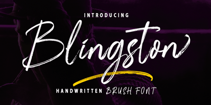 Blingston Brush. is a textured brush font, a contemporary approach to design, with handcrafted and natural underlines and also has alternatives & binders that make your designs more attractive. Suitable for use in title design. Such as clothes, invitations, book titles, stationery designs, quotes, branding, logos, greeting cards, t-shirts, packaging designs, posters, and others. Blingston Brush. equipped with Standard Characters upper and lower case, Punctuation, Numbers. And some glyph variations of OpenType features like Standard Ligatures and Stylistic Sets. Includes multiple multilingual support If you have any questions, feel free to message me :) Thank you so much for watching and enjoying it!
 - Vista Morgan Sans by VistaType,
$9.00 Morgan Sans is a minimal and Modern font family. Made for text display purposes, Morgan brings a modern and Strong appearance to your design projects with a bold style, making this font appropriate as the primary text/header text on a website or layout design. The Morgan family includes 18 fonts in a variety of weights and styles. 18 fonts total 2 font styles Upper / lowercase glyphs Multilingual Webfonts included Free updates and feature additions If you have any questions about licensing, need help with a typeface, or would like to request a new feature, contact us at hello@vistatype.com. Thank you!
 - Vista Nordic by VistaType,
$9.00 Vista Nordic is a minimal and Modern font family. Made for text display purposes, Nordic brings a contemporary and Robust appearance to your design projects with a bold style, making this font suitable as the Prior heading and common text on a website or layout design. The Nordic family includes 18 fonts in a variety of weights and types. 18 fonts 2 font styles Upper / lowercase glyphs Multilingual Webfonts included Free updates and feature additions If you have any questions about licensing, need help with a typeface, or would like to request a new feature, contact us at hello@vistatype.com. Thank you!
 - Gezart by Ani Dimitrova,
$30.00 Gezart is a modern sans serif with geometric touch in 32 weights - 16 uprights and its matching italics. The weights are ranging from Hair to Heavy, with one of them (Extra Thin) is for free of charge. Each weight of Gezart contains more than 700 glyphs. The family is equipped for complex, professional typography with Open Type Features including — small caps, localized forms, old-style figures, standard ligatures, subscripts, superscripts, numerators, denominators, numbers in circles arrows, currency symbols and fractions. The Gezart font family is ideally suited for branding & layout design, posters, body text, web, editorial design, and more.
 - Koolvexa by Qaratype,
$15.00 Koolvexa is a modern display serif font. This font is perfect for branding, logos, social media, prints, stickers, shirts, svg files and more! Koolvexa is unique as it can be used for a variety of design styles. It fits in wonderfully for free-spirited, boho designs and also for more classy editorial looks! There are a lot of fun stylistic alternates available to use with this font. These letters are embedded into the font file and easily accessible in programs such as photoshop and illustrator. Main Features: Uppercase & Lowercase letters Punctuation and special characters Multilingual support Ligatures & Alternate glyphs
 - Sharlotte by MJB Letters,
$16.00 Sharlotte is a modern calligraphy that has a natural handwritten touch, this font has a strong character in each glyph and is very suitable for branding design, logo design, packaging design, wedding invitation design, poster design, business card design, and anything that needs a handwritten look. Files Included: - Works on PC & Mac - Simple installations - Accessible in Adobe Illustrator, Adobe Photoshop, Adobe InDesign, and even work on Microsoft Word. - PUA Encoded Characters – Fully accessible without additional design software If there's anything else you are unsure of feel free to pop me a message :) That's it! Have fun using Sharlotte Font!
 - FS Pele by Fontsmith,
$50.00 Iconic Conjuring memories of chunky typefaces from the late-60s and early-70s, and named after the world’s greatest footballer of that and probably any other era, FS Pele is one of a set of Fontsmith fonts designed specifically for headlines and other prominent applications. “We wanted to create fonts that could be integral to the design of posters, album covers and magazines,” says Jason Smith. Welcome to FS Pele, iconic, like its namesake (though, perhaps, a little less nimble). Big Pele, little Pele There was only one Pele. But there are two sizes of FS Pele. FS Pele One, with the finer counters and details, adds considerable weight and style at large sizes, especially in big block headlines on posters. FS Pele Two’s thicker “slots” make it a better choice for smaller-sized text. A load of blocks FS Pele began as an exercise by Phil Garnham in turning squares into legible letters, via the least means necessary. The idea extended his ideas about logo-making, and the search for a stamp-like brand mark that lends authority, stability and instant identification. “The thought that the type was a 2D/3D jigsaw of slotted, architectural pieces was almost an after-thought. I wanted to create a strong, stacking, block aesthetic for the most contemporary poster design. “At the time there were a lot of designers creating their own versions of the same thing but I wanted to take the blocker forms to the next step, and infer a more legible text without sacrificing the idea.”
 - FS Pele Variable by Fontsmith,
$199.99Iconic Conjuring memories of chunky typefaces from the late-60s and early-70s, and named after the world’s greatest footballer of that and probably any other era, FS Pele is one of a set of Fontsmith fonts designed specifically for headlines and other prominent applications. “We wanted to create fonts that could be integral to the design of posters, album covers and magazines,” says Jason Smith. Welcome to FS Pele, iconic, like its namesake (though, perhaps, a little less nimble). Big Pele, little Pele There was only one Pele. But there are two sizes of FS Pele. FS Pele One, with the finer counters and details, adds considerable weight and style at large sizes, especially in big block headlines on posters. FS Pele Two’s thicker “slots” make it a better choice for smaller-sized text. A load of blocks FS Pele began as an exercise by Phil Garnham in turning squares into legible letters, via the least means necessary. The idea extended his ideas about logo-making, and the search for a stamp-like brand mark that lends authority, stability and instant identification. “The thought that the type was a 2D/3D jigsaw of slotted, architectural pieces was almost an after-thought. I wanted to create a strong, stacking, block aesthetic for the most contemporary poster design. “At the time there were a lot of designers creating their own versions of the same thing but I wanted to take the blocker forms to the next step, and infer a more legible text without sacrificing the idea.” - Jambetica - Personal use only

- MoxyRoxie - Unknown license

- Elfin by Lindstrom Design,
$29.00 A fanciful reinterpretation of the elvish type found inside the ring in J. R. Tolkien's "Lord of the Rings". Elfin has a very small x height with large ascenders and descenders. Unlike most scripts, Elfin characters connect from the x height, not the base line. If you're looking for a magical, Disneyesque, fairies-prancing-about type, you need Elfin. Elfin contains upper and lower case letters, old style figures (numbers), punctuation, foreign accents. Indulge the Peter Pan that lurks within!
 - Glupsk by Hökarängens Bokstavsfabrik,
$19.00 Do you remember that kid from Lord of the Flies? Why do I even remember that kid, I’m too young for that. However, his name was Piggy, and I wanted to make a typeface that resembled him. So this is my tribute to Piggy who got killed by that falling plastic rock in the movie. May he live forever through this typeface, on birthday cards, or maybe some sweet candy packaging or why not through an graphic identity for a toy company?
 - Bombarda by ParaType,
$30.00 Bombarda is a big gun, and surely a font named like that must have specific dimensions in order to make the text sound loud and powerful. Due to extreme thickness of basic strokes and of maximum possible serifs it will look great on the cover of a comic book, colorful splash screens of computer games as well as other applications where the title should have particular weight. The font was designed by Alexander Lubovenko and released by ParaType in 2016.
 - Blank Lemon by PizzaDude.dk,
$18.00 Blank Lemon is my heavy stroke handmade serif font. Yes, it is heavy and it's loud and is very noisy when it comes to making your headlines visible and the reason for this is that the shapes of the font is based on classic serif fonts. Blank Lemon comes with 7 different versions of each letter, and these automatically cycle as you type. Also there are fancy swashes of a, k, n, q and r - and of course multilingual support! Enjoy!
 - Digital Delivery by Comicraft,
$49.00 No, we’re not referring to the strange phenomenon of babies who are born pinkies first, and we’re not talking about downloading oven-fresh loaves of bread byte by byte! If you have any UNDERSTANDING of the name of this font then you’re in good shape, because we won’t be REINVENTING it any time soon. Created by John Roshell for the incomparable Scott McCloud to letter REINVENTING COMICS, this friendly & easy-to-read pen style later appeared on the letters pages of ELEPHANTMEN.
 - F2F Provinciali by Linotype,
$29.99Heavy techno music, a personal computer, a font creation program and some inspiration had been the sources to the Face 2 Face font series. Alessio Leonardi and his friends had the demand to create new unusual faces that should be used in the leading german techno magazine Frontpage". Even typeset in 6 point to nearly unreadability it was a pleasure for the kids to read and decrypt the messages. The Provinciali letters look like they would be reversed in the spotlight." - Vintage Travel by Fenotype,
$20.00 Inspired and after 20th century’s travel posters, Vintage Travel is a font duo with a monoline Script that has small x-height and a bulky vernacular Sans designed to play together. Script is equipped with several OpenType features such as Swash and Titling alternates as well as Small Caps for small capital letters. Sans comes with Stylistic Alternates that provides you with a selection of lowered accented characters that can be used to create more uniform text blocks and tighter leading.
 - Fragua Pro by deFharo,
$14.00 Fragua Pro is a family of 14 fonts (Latin Extended-A and the Cyrillic alphabet) Condensed Sans Serif of geometric construction inspired by the Russian constructivism of the mid-20th century; the typography has a rounded finish in all corners to avoid the coldness of the rectilinear fonts and providing warmth and docility, the ascending and descending short and a high height of the x make it very compact, all this results in a unique typeface with maximum readability due to the careful configuration of metrics and Kerning. The cursive styles have an inclination of 8 degrees and a narrower proportion than the regular ones, they also have their own letters and meticulous optical corrections to compensate for the deformations produced by the inclination. Fragua Sans has Advanced Open Type functions, several alternative letters, full support for numbers, monetary symbols and crypto currencies and more. 681 glyphs. This typography is specially designed for advertising and editorial composition, behaving correctly in both short and medium texts and headlines where horizontal space saving is needed, being an ideal typographic system for signage, editorial or corporate design. This typography is dedicated to the memory of my grandfather C·ndido (Pa), the blacksmith of my town. THE COMPLETE 14 FONTS PACKAGE INCLUDES THE REGULAR VERSION IN "VARIABLE FONT" FORMAT, compatible with Adobe CC 2018.
 - Marguerite - Personal use only

- Indoctrine - Personal use only

- Quintus 'StainedCameo' - Unknown license

- Effluence - Unknown license

- BN Year 2000 - Unknown license

- MFC Botanical Borders by Monogram Fonts Co.,
$19.95 The inspiration source for MFC Botanical Borders is a collection of border treatments from the 1886 “Spécimens de caractères d'imprimerie” by E. Houpied a Paris. This collection of elegant floral and foliage borders has been put together with their original decorated rules, as well as alternate matching precision rules for added versatility. You can start with a new document or work on a new layer within an existing document. Select MFC Botanical Borders from the font menu. (Some users may have font previewing enabled in the font menu which will cause the font name to appear as border elements, disable this option in order to choose the name) Make certain that the point size of the font is the same as the leading being applied to the font so the borders will meet up properly. While we’ve adjusted this within the font, your program may override these settings. For instance a 12 point font should have 12 points of leading. A PDF guidebook for MFC Botanical Borders is included in the font package. Download and view the MFC Botanical Borders Guidebook if you would like to learn a little more.
 - MFC Spindler Borders by Monogram Fonts Co.,
$19.95 The inspiration source for MFC Spindler Borders is a collection of border treatments revived from the “Catalog 25 TYPE FACES” by Barnhart Brothers & Spindler. The border designs were recreated from two different border sets, “Classic Art Borders” and “Classic Black & White Borders”. This collection of borders represents a structured repetition of elements in various ways to create elegant patterns and backgrounds. You can start with a new document or work on a new layer within an existing document. Select MFC Spindler Borders from the font menu. (Some users may have font previewing enabled in the font menu which will cause the font name to appear as border elements, disable this option in order to choose the name) Make certain that the point size of the font is the same as the leading being applied to the font so the borders will meet up properly. While we’ve adjusted this within the font, your program may override these settings. For instance a 12 point font should have 12 points of leading. Download and view the MFC Spindler Borders Guidebook if you would like to learn a little more.
 - Jalo by BRtype,
$19.00 Jalo is a playful font. Every single letter has own personality.
 - Prored by Tour De Force,
$25.00 Prored is an avantgarde sans serif typeface that contains 5 weights – Light, Regular, Bold, ExtraBold and Black. It is small and compact font family with own characteristic expression, constructed to be safe choice for all kinds of typographic tasks. With specific curved endings that are adhered on baseline, Prored includes tiny note of singularity – just enough to make it’s own identity recognizable and catchy. Taller x-height gives an afterimage of a bit narrowed look, but with rational proportions and well balanced weights, 5 of them are really sufficient and capable to handle extreme typographic issues. Especially charming is Black which can be used also as display typeface in situations where elegant solutions are required in combination with stronger visibility. Beside Central Europe, Prored also contains glyphs for Turkish and Baltic languages. Highly neutral impression recommends Prored as an excellent choice for branding campaigns or new identities. Recommended for use in: branding campaigns, identities, editorial publications, packages, web design, as web font and many more.
 - Mr Eaves Modern by Emigre,
$59.00 Mr Eaves is the often requested and finally finished sans-serif companion to Mrs Eaves, one of Emigre’s classic typeface designs. Created by Zuzana Licko, this 2009 addition to the Emigre Type Library expands the versatility of the original Mrs Eaves with two complimentary families: Mr Eaves Sans and Mr Eaves Modern. Mr Eaves was based on the proportions of Mrs Eaves, but Licko took some liberty with its design. One of the main concerns was to avoid creating a typeface that looked like it simply had its serifs cut off. And while it matches Mrs Eaves in weight, color, and armature, Mr Eaves stands as its own typeface with many unique characteristics. The Sans version relates most directly to the original serif version, noticeably in the roman lower case letters a, e, and g, as well as in subtle details such as the angled lead in strokes, the counter forms of the b, d, p, and q, and the flared leg of the capital R, the tail of the Q. The distinctly loose-fitting letter spacing of Mrs Eaves was applied also to the Sans version. This, together with generous built-in line spacing due to a small x-height and extended ascenders and descenders, renders the same kind of lightness and airiness when setting text that is so characteristic of Mrs Eaves. Deviations from the original Mrs Eaves are evident in the overall decrease of contrast, as well as in details such as the flag and tail of the f and j, and the finial of the t, which were shortened to maintain a cleaner, sans serif look. And the lower case c had to be balanced out differently after it lost its top ball terminal. And with the loss of serifs, Mr Eaves set width is slightly narrower. Mr Eaves Italic also carries over many forms from its Mrs Eaves model, most notably the v, w, and z, which are unusually flamboyant for a sans italic design. It also utilizes lead in and terminal tails that are reminiscent of the serif italic. The biggest departure here is the width of the characters. The extra narrow gauge and delicate features seemed more appropriate for the Serif than the Sans. To allow for a comfortable fit, Mr Eaves Italic has a more robust design and wider character width. Meanwhile, the Modern family provides an overall less humanistic look, with simpler and more geometric-looking shapes, most noticeably in the squared-off terminals and symmetric lower case counters. This family has moved furthest from its roots, yet still contains some of Mrs Eaves’ DNA. The Modern Italic is free of tails, and overall the Modern exhibits more repetition of forms, projecting a cleaner look. This provides stronger differentiation from the serif version whenever a more contrasting look is desired. Each version (Sans and Modern) contains its own set of alternates providing unique options for applications such as headlines, word logos, letterheads, pull quotes, and other short text settings. Both the Sans and Modern come in six weights. The simpler forms of a sans-serif provide the opportunity of more weights than do serif letter forms, which are more complex in structure, making it difficult to accommodate additional weight without distortions. Regular and Bold match the original Mrs Eaves weights, while the Heavy provides an additional weight for extra emphasis.
 - Mr Eaves Sans by Emigre,
$59.00 Mr Eaves is the sans-serif companion to Mrs Eaves, one of Emigre’s classic typeface designs. Created by Zuzana Licko, this 2009 addition to the Emigre Type Library expands the versatility of the original Mrs Eaves with two complementary families: Mr Eaves Sans and Mr Eaves Modern. Mr Eaves was based on the proportions of Mrs Eaves, but Licko took some liberty with its design. One of the main concerns was to avoid creating a typeface that looked like it simply had its serifs cut off. And while it matches Mrs Eaves in weight, color, and armature, Mr Eaves stands as its own typeface with many unique characteristics. The Sans version relates most directly to the original serif version, noticeably in the roman lower case letters a, e, and g, as well as in subtle details such as the angled lead in strokes, the counter forms of the b, d, p, and q, and the flared leg of the capital R, the tail of the Q. The distinctly loose-fitting letter spacing of Mrs Eaves was applied also to the Sans version. This, together with generous built-in line spacing due to a small x-height and extended ascenders and descenders, renders the same kind of lightness and airiness when setting text that is so characteristic of Mrs Eaves. Deviations from the original Mrs Eaves are evident in the overall decrease of contrast, as well as in details such as the flag and tail of the f and j, and the finial of the t, which were shortened to maintain a cleaner, sans serif look. And the lower case c had to be balanced out differently after it lost its top ball terminal. And with the loss of serifs, Mr Eaves set width is slightly narrower. Mr Eaves Italic also carries over many forms from its Mrs Eaves model, most notably the v, w, and z, which are unusually flamboyant for a sans italic design. It also utilizes lead in and terminal tails that are reminiscent of the serif italic. The biggest departure here is the width of the characters. The extra narrow gauge and delicate features seemed more appropriate for the Serif than the Sans. To allow for a comfortable fit, Mr Eaves Italic has a more robust design and wider character width. Meanwhile, the Modern family provides an overall less humanistic look, with simpler and more geometric-looking shapes, most noticeably in the squared-off terminals and symmetric lower case counters. This family has moved furthest from its roots, yet still contains some of Mrs Eaves' DNA. The Modern Italic is free of tails, and overall the Modern exhibits more repetition of forms, projecting a cleaner look. This provides stronger differentiation from the serif version whenever a more contrasting look is desired. Each version (Sans and Modern) contains its own set of alternates providing unique options for applications such as headlines, word logos, letterheads, pull quotes, and other short text settings. Both the Sans and Modern come in three weights. The simpler forms of a sans-serif provide the opportunity of more weights than do serif letter forms, which are more complex in structure, making it difficult to accommodate additional weight without distortions. Regular and Bold match the original Mrs Eaves weights, while the Heavy provides an additional weight for extra emphasis.
 - Murrx - 100% free

- Pea Kim - Unknown license

- Pea Martha - Personal use only

- Pea Martha - Unknown license

- XXII STATIC - Unknown license

- Pea Mandy - Unknown license


