10,000 search results
(0.053 seconds)
- Servus Slab by Dada Studio,
$29.00 This family is very special to me. I started working on it right after my first son was born. I decided to name the typeface "Servus" which means "Hello" in my country. The whole idea of the family symbolizes a child’s growth. It starts with Thin and Narrow weights - just like a newborn baby - then it slowly grows to Black and Wide. As You can guess, my son is quite chubby now! And I can assure You that I put all my love into details. Servus consists of 9 weights which gives us 18 fonts with matching italics. Lights and Bolds, due to their strong personality, are perfect for display uses. At the same time, Regulars create a harmonious structure that provides good legibility in long texts. Servus covers all latin languages. It contains a wide set of numerals, small capitals, fractions, ligatures and other OpenType goodies.
 - Koo Koo Puff by astroluxtype,
$20.00 Does the world really need one more vernacular pop culture typeface? We here, at astroluxtype shout a resounding yes! Sure, at myfonts.com, you can find the apex of fine font design that will have your mind and eyes burst with joy at the level of sophistication and craftsmanship they exhibit- Koo Koo Puff Light Condensed and Regular Condensed are not one of those fonts. But if kooky goofy is your thing, we're selling it at the astroluxtype booth. Koo Koo Puff Regular Condensed is the companion font to Koo Koo Puff Light Condensed. Both fonts includes an upper and lowercase glyph set. Regular Condensed has a different upper and lowercase “O” from the original Koo Koo Puff Light Condensed. Spacing metrics are looser, as well. The font is not a match for Light Condensed, it is a separate font. Both are headline display faces, for optimum usage it is recommended to be set at 48 points or larger in size. Look to astroluxtype’s Sugarbang ! as the first in a series of fonts inspired by vintage product packaging, Koo Koo Puff is the second release in the Cerealboxx series. The third font is in the fridge getting cool now, watch for it in the future. Rave on you design genius.
 - Candylove by Attract Studio,
$12.00 Candylove Script is a lovely script font, including Regular. This font is casual and pretty with swashes. Can used for various purposes. such as logo, product packaging, wedding invitations, branding, headlines, signage, labels, signature, book covers, posters, quotes and more. Candylove Script features OpenType stylistic alternates, ligatures and International support for most Western Languages is included. To enable the OpenType Stylistic alternates, you need a program that supports OpenType features such as Adobe Illustrator CS, Adobe Indesign & CorelDraw X6-X7, Microsoft Word 2010 or later versions.How to access all alternative characters using Adobe Illustrator: https://www.youtube.com/watch?v=XzwjMkbB-wQ Candylove Script is coded with PUA Unicode, which allows full access to all the extra characters without having special designing software. Mac users can use Font Book , and Windows users can use Character Map to view and copy any of the extra characters to paste into your favourite text editor/app.How to access all alternative characters, using Windows Character Map with Photoshop: https://www.youtube.com/watch?v=Go9vacoYmBw If you need help or have any questions, please let me know. I'm happy to help :) Thanks & Happy Designing!
 - Fixture by Sudtipos,
$39.00 Fixture is our massive 72-font take on plentiful offerings of the late 19th century’s typefaces, posters and wood letterpress sundry done in the Grotesk genre. Four widths ranging from Ultra Compressed to Expanded each come in nine weights and accompanying italics. Some common sans-serif alternates, such as the a and g, are included in all the fonts. The idea with this design was to put together a workhorse font family with enough functional flexibility to work in multiple environments, from the subtlety of magazine layout or film credits to the visual drama of billboards or packaging. Aesthetically speaking, it is quite interesting — though in retrospect quite unintentional — that each different width and/or weight of this face ended up pulling a different dominant trait from the melting-pot origins of the entire family. It’s almost like a tribute album to some famous band’s covers of older songs. It may also be a good conversation piece on our tools shaping the very things for which they’re used. Can’t really get any more post-Grotesk than this. In the 21st century, this is the one genre to rule them all.
 - Sodra by Harvester Type,
$20.00 Sodra is a wide-accented antiqua with sharp serifs and hints of futuristic forms. This typeface emerged from a passage in the Manifesto del Futurismo by Filippo Tommaso Marinetti. One short word was the inspiration and the guidance for the creation of this font. An attempt to create something unique and distinctive, an attempt to add a bit of futurism to something historical. The special aesthetics and expressiveness the type conveys will make you look closely at each letter and draw attention to your design. The font has been in development for a long time and painstaking work has been done on it. Large language support, about 470 characters and almost 4,000 kerning pairs. Hinting and testing the font itself in business and in a wide variety of applications. The uses of the type are very wide. Whether it's a branding, logo, identity or merch, a headline or product design. The nature of typeface is not limited to something rough and gloomy, on the contrary, it all depends on how you look at it. I've shown you my point of view, you in turn will see yours!
 - Weg by Huerta Tipográfica,
$18.00 WEG* font is an experimental type system where legibility isn’t the focus. This project studies how glyphs are constructed and how their ductus can be modified. I explored how far I can move the limits if I don’t worry about the legibility. In Weg, letters are built by a single line that connects them, along with words and paragraphs. When weight decreases, the legibility of the signs increases. This is the first stage. It’s a project in expansion. The set contains uppercase, lining figures and basic punctuation in three weights: Regular, Light and Thin. The current supported languages are Spanish, Guaraní and English. If you need any other language, please let me know. I would like to expand the character set. Second stage project WEG is an experimental in-expansion font family. Here I present to you the second stage. I’m planning the first upgrade for middle 2021. I’m preparing a pattern set for July 2021. Here you can see the first four patterns. If you buy the font before July 2021, you’ll get this upgrade! • Second stage April - July 2021: pattern set (first four ready). • This upgrade will be available on August 2021.
 - Honeycomb by Mans Greback,
$59.00 Honeycomb Script is a delightfully charming handwriting font, boasting a cute and quirky aesthetic. With its naive and endearing style, it's perfect for adding a touch of craft-inspired charm to your creative projects. The birth of Honeycomb Script was sparked by blooming wildflowers and bustling honeybees. The harmonious dance of the bees in their natural habitat inspired the unique and playful letterforms of Honeycomb Script, capturing the magical essence of the natural world's sweetest architect. Use one or multiple underscores _ anywhere in a word to add a decorative underline. Example: Sweet_____Honey Try using # before or after any word to make lovely swashes. Example: #beehive# The font offers six high-quality styles: Thin, Regular, Bold, and their italic versions, giving you the flexibility to adapt to any design context. The font is built with advanced OpenType functionality and has a guaranteed top-notch quality, containing stylistic and contextual alternates, ligatures and more features; all to give you full control and customizability. It has extensive lingual support, covering all Latin-based languages, from Northern Europe to South Africa, from America to South-East Asia. It contains all characters and symbols you'll ever need, including all punctuation and numbers.
 - Hello Balgetia by Mega Type,
$14.00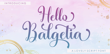 INTRODUCING Hello Balgetia Script is a lovely script font, including Regular. This font is casual and pretty with swashes. Can used for various purposes. such as logo, product packaging, wedding invitations, branding, headlines, signage, labels, signature, book covers, posters, quotes and more. Hello Balgetia Script features OpenType stylistic alternates, ligatures and International support for most Western Languages is included. To enable the OpenType Stylistic alternates, you need a program that supports OpenType features such as Adobe Illustrator CS, Adobe Indesign & CorelDraw X6-X7, Microsoft Word 2010 or later versions.How to access all alternative characters using Adobe Illustrator: https://www.youtube.com/watch?v=XzwjMkbB-wQ Hello Balgetia Script is coded with PUA Unicode, which allows full access to all the extra characters without having special designing software. Mac users can use Font Book , and Windows users can use Character Map to view and copy any of the extra characters to paste into your favourite text editor/app.How to access all alternative characters, using Windows Character Map with Photoshop: https://www.youtube.com/watch?v=Go9vacoYmBw If you need help or have any questions, please let me know. I'm happy to help :) Thanks & Happy Designing!
 - Kefir by ROHH,
$39.00 Kefir™ is charismatic, cheerful and full of character. It is inspired by such classics as Cooper and Windsor and serves as their modern alternative. It is a display font family with very strong personality and feels at home in editorial design, all kinds of headlines, posters, badges, websites and branding. Its light weights let you set friendly and legible paragraphs of text as well! Kefir has beautifully flowing lines, its nature is soft, rounded and elegant with charming retro vibes. The letterforms were crafted with much passion and love in order to send powerful positive message whenever used! Kefir has two additional stylistic sets to adjust the font to your liking and decide if you choose upright or sloping stems (in characters like h, m ,n , a) or go even more playful with some super-friendly letterforms. Kefir family consists of 7 styles + 1 variable font, letting you adjust the weight to your exact needs. It has extended latin language support as well as broad number of OpenType features, such as stylistic sets case sensitive forms, ligatures, swash caps, final forms, contextual alternates, lining & oldstyle figures, basic fractions, superscript and subscript, ordinals, currencies and symbols.
 - MVB Diazo by MVB,
$59.00 Mundane information—the sort you might ignore—often appears in the form of very simple, utilitarian lettering, devoid of personality, the sort of industrial lettering you find on old blueprints, park restrooms, and electrical boxes. MVB Diazo is such a thing. It looks like lettering done earnestly with a plastic template. The monoline caps—constructed from straight lines and simple curves—have rounded details as if rendered by a blunt pen on a topographical survey or by a router on a rustic campground sign. The MVB Diazo fonts are compact, available in two widths: Condensed and Extra Condensed. Each width offers four weights from Light to Black. The fonts are perfect for wherever plain and boring letterforms are required. All widths and weights are also available in two distressed textures (#1 and #2) that accentuate the industrial character of the design. Rough #1 is gritty, with finer texture for use at larger sizes. Rough #2 exhibits more damage, the roughness apparent when used at smaller sizes. The Rough fonts include alternates of a number of glyphs so that variation of texture is possible when letters repeat in a word.
 - Boister Black Pro by CheapProFonts,
$10.00 I loved the look of this font so much that I couldn't resist reworking it - although it probably had the most basic character set I've ever used as a starting point. But here it is in its complete, professional, multilingual state. I hope this wonderful swashbuckling font now finds many new users and uses. Celebrate! ALL fonts from CheapProFonts have very extensive language support: They contain some unusual diacritic letters (some of which are contained in the Latin Extended-B Unicode block) supporting: Cornish, Filipino (Tagalog), Guarani, Luxembourgian, Malagasy, Romanian, Ulithian and Welsh. They also contain all glyphs in the Latin Extended-A Unicode block (which among others cover the Central European and Baltic areas) supporting: Afrikaans, Belarusian (Lacinka), Bosnian, Catalan, Chichewa, Croatian, Czech, Dutch, Esperanto, Greenlandic, Hungarian, Kashubian, Kurdish (Kurmanji), Latvian, Lithuanian, Maltese, Maori, Polish, Saami (Inari), Saami (North), Serbian (latin), Slovak(ian), Slovene, Sorbian (Lower), Sorbian (Upper), Turkish and Turkmen. And they of course contain all the usual "western" glyphs supporting: Albanian, Basque, Breton, Chamorro, Danish, Estonian, Faroese, Finnish, French, Frisian, Galican, German, Icelandic, Indonesian, Irish (Gaelic), Italian, Northern Sotho, Norwegian, Occitan, Portuguese, Rhaeto-Romance, Sami (Lule), Sami (South), Scots (Gaelic), Spanish, Swedish, Tswana, Walloon and Yapese.
 - Studio Neon by LLW Studio,
$22.00 Studio Neon is an all-caps display font constructed with three rounded-end strokes; the lowercase set is included as a repeat of the uppercase to make setting type just that little bit easier. It’s a modern rendition of neon sign lettering, with a decidedly art deco pedigree, and is intended for use in larger sizes of type, upwards of 36 pt. It’s perfect for a design that wants to imitate neon — use Photoshop layer effects to light it up! I originally started this font with only a few letters, since I could not find a neon-style font made with 3 strokes that looked modern. (Once I started, I found out why. It's a LOT of work!) Most traditional neon fonts include a “bent tube” element in the design; however, not all modern neon signage is constructed with the tubes bent. I also wanted to design a fun font that would have more life than just as an imitation of signage — something to inspire designers who love the geometry of art-deco type. So I made all the corners consistent, with no references to bent tubes. Use this font for any application that needs a bold and decorative look. Studio Neon should work well for sign production and even vinyl cut applications at larger sizes.
 - Hand Scribble Sketch Times by TypoGraphicDesign,
$19.00 CHARACTERISTICS A state-of-the-art OpenType-Feature (like Contextual Alternates (calt) and Stylistic Alternates (salt)) of “Hand Scribble Sketch Times” is, that each uppercase and each lowercase letter has automatically alternated two variations to bring humanly-random characteristics of handwriting to life. The character of the rough, ruggend and raw handwritten classic serif typeface is a very unique warmly atmosphere. An pro-version of the font “Hand TIMES”. APPLICATION AREA warmth, love, handmade. For support of human warmth. Of cooking recipes, menus in the restaurant across party flyer, music cover Art to logo (word marks), headings in magazines and websites. TECHNICAL SPECIFICATIONS ? Font Name: Hand Scribble Sketch Times ? Font Weights: Regular, Rough, Invert ? Font Category: Grunge Serif Display for Headline Size ? Font Format: OTF (OpenType Font for Mac + Win) ? Glyph coverage: 601 ? Language Support: Basic Latin/English letters, Central Europe, West European diacritics, Baltic, Romanian, Turkish ? Specials: Alternative letters, Standard & Discretionary Ligatures, extras like symbols, dingbats, Old-style Digits, Lining Figures, accents & €, incl. OpenType-Features like Contextual Alternates (calt), Glyph Composition/Decomposition (ccmp), Discretionary Ligatures (dlig), Kerning (kern), Standard Ligatures (liga), Numerators (onum), Ordinals (ordn), Stylistic Alternates (salt), Stylistic Set 01 (ss01), Stylistic Set 02 (ss02), Stylistic Set 03 (ss03), Slashed Zero (zero), Lining Figures (lnum), Tabular Figures (tnum), Old Style Figures (onum), Proportional Figures (pnum) ? Design Date: 2013 ? Type Designer: Manuel Viergutz
 - Antoine by Anastasia Kuznetsova,
$19.00 Introducing Antoine — is a vintage retro display typeface. The three font combinations I launched are very compatible if for the victorian classic design concept. As for if the font was worn by itself, without combinations are also brave!! In addition to many get unique character, luxury, brave and elegant. You also have a collection ornament, very suitable if in the gradient. This font is also very easy to use with other design programs or with out design program. Antoine Typeface is perfect for beverage label design project. coffee label. logotype design, badges, classic wedding concept. victorian design concept and so on. gig poster, letterhead, droop cap, titles, and any artworks. Now it’s your time to go crazy and explore the uniqueness of this typeface!! I invite you to familiarize yourself with the preliminary images and hope that you will be imbued with my vision of this creative font, which, I am sure, will be suitable for all the interesting projects you are working on. Fonts can be opened and used in any software that can read standard fonts, even in MS Word. No special software is required to get started. It is recommended to use it in Adobe Illustrator or Adobe Photoshop. Made with love and magic ♡ Thank you for reading it, and do not hesitate to send me a message if you have any questions! ~ Anastasia
 - Artis Sans by Wiescher Design,
$30.00 »Artis« is the name for my latest art-project-font. Obviously I just chopped off the last »t«. Then I looked it up on Wikipedia and what do you know, it is of latin descent. »Ars Gratia Artis« which means »art for arts sake« or in French »l’art pour l’art«, a perfect font name. If I would cut off the »s« as well it would mean disambiguation and that in turn is, what I just did here. Enough disambiguation! »Artis« is a modern classical beauty with extreme contrast between up- and downstrokes that make it unique with a touch of art deco and showing Renaissance roots. But – »Artis« is a twin-font that has an elegantly decorated twin sister »Artis-Swing«. Between the 2 fonts you have endless possibilities for combination. I love these twins! It is a great everyday workhorse with seven weights from ExtraLight to Bold and all the necessary weights in between. Great for short copy and elegant headlines! With 879 Glyphs it is a truly European font designed for all Central European and Latin using countries. »Artis« has a set of Cyrillic that is – besides Russia – also good for Serbia, Macedonia and Ukraine. It has oldstyle- and lining-, tabular- and tabular-oldstyle-figures and many ligatures. »Artis« comes in Sans and Swing and is an elegant, playful and friendly font. Enjoy!
 - Whichit by Ingrimayne Type,
$5.00 Whichit contains typefaces designed with a hexagonal motif. The opposite sides of the hexagon are parallel but two of them are longer than the other four. It does not have reflective symmetry so flipping it over a vertical line returns a different appearance. One of these appearances is the basis for WhichIt and the other for WhichItTwo. Each has three weights and each weight has an italic style. The result is a quirky sans-serif family of a dozen faces.
 - Arab Brushstroke by URW Type Foundry,
$35.00 Arab Brushstroke is a graceful, upright German calligraphic script. At first glance, Arab Brushstroke does not seem to have much in common with Arabic calligraphy. Yet the gracefulness of its letterforms remind the viewer that calligraphy is a global passion, one that can be seen in the Arab world as well. Perhaps that feeling was the inspiration behind this typeface's name? In any case, Arab Brushstroke is a good choice for use in headlines, as well as other display applications.
 - Orgon Slab by Hoftype,
$49.00 Orgon Slab complements the Orgon family with its clear, unexcited appearance. It offers high readability both for desktop and web applications. The Orgon Slab consists, as does the Orgon family, of 16 styles and is well suited for ambitious typography. It comes in OpenType format with extended language support. All weights contain ligatures, small caps, superior characters, proportional lining figures, tabular lining figures, proportional old style figures, lining old style figures, matching currency symbols, fraction- and scientific numerals and matching arrows.
 - Arab Brushstroke by Linotype,
$40.99Arab Brushstroke is a graceful, upright German calligraphic script. At first glance, Arab Brushstroke does not seem to have much in common with Arabic calligraphy. Yet the gracefulness of its letterforms remind the viewer that calligraphy is a global passion, one that can be seen in the Arab world as well. Perhaps that feeling was the inspiration behind this typeface’s name? In any case, Arab Brushstroke is a good choice for use in headlines, as well as other display applications. - Mangan Nova by Hoftype,
$49.00 Mangan Nova is the semi-condensed version of Mangan. Designed for strong headlines but with slender and economical proportions, it fosters space saving text applications while permitting very pleasant reading. Mangan Nova, as does also Mangan, comprises 14 styles and is well suited for ambitious typography. It comes in OpenType format with extended language support. All weights contain small caps, ordinals, ligatures, proportional lining figures, tabular lining figures, proportional old style figures, lining old style figures, matching currency symbols, fraction- and scientific numerals.
 - Hiroko by Thinkdust,
$10.00 Hiroko is a remix of the multi-functional Hiruko typeface, with a bigger, bolder look and extra textured surface. Hiroko takes the functionality of its predecessor and turns it towards making an impact, so it does more than pass the message along, it makes it stand out and ensures that people read it. Hiroko comes with support for a number of languages, and has a finely crafted set of both upper and lowercase characters, round and friendly for a positive tone.
 - TT Ricordi Allegria by TypeType,
$29.00 Please note! If you need OTF versions of the fonts, just email us at commercial@typetype.org TT Ricordi Allegria useful links: Specimen | Graphic presentation | Customization options TT Ricordi Allegria is a sleek and intelligent contemporary Florentine grotesque inspired by the half-erased lettering in Basilica di Santa Croce, Florence. TT Ricordi Allegria was drawn by Antonina Zhulkova and reflects in its graphics the transitional stage between the classic serif with varying proportions, gravitating towards the Roman capital type, and the Florentine sans serif. The font is characterized by variability in the proportions of characters, contrast between strokes, wedge-shaped triangular characters, and the absence of traditional serifs. The main visual feature of the typeface is its diversity and the ability, using different stylistic sets, to completely change the character and perception of the typeface. The drawing of the characters from the main set is strict, thanks to which the font looks stern, as if the inscription in the font was really carved out of stone. And with the help of another set, we can add roundness, or even smoothness, to the font. This is due to the fact that the letters (E R K Q J Y in Latin, and Л К Ж Э in Cyrillic) from the second set have either very noticeable "curls" or smooth, rounded "legs". In addition, the typeface includes a set of beautiful ligatures for use in display inscriptions, such as large headlines. An interesting moment when working on the typeface was the creation of the Cyrillic typeset, since the Cyrillic alphabet does not so easily fit into the concept of the Florentine grotesque and stressed semi-serif. The most difficult thing in working on the Cyrillic alphabet was to create a system of spacing for characters, as it was done in the Latin alphabet, and to make sure that when typing in Cyrillic, the drawing of the text remained beautiful. That is why the letters Д Л У Ы appearing in the font family are somewhat unusual to the eye, and the proportions of other characters in Cyrillic are not quite “classic” either. In general, the Cyrillic set looks more display than its Latin prototype, but at the same time it lacks the sense of historicity or legacy of the Soviet past, which often comes to the foreground when working on the design of the Cyrillic alphabet in this type of serifs. TT Ricordi Allegria consists of two weights (Regular and Bold) and one variable font. Each style includes over 750 characters, as well as 19 OpenType features. Interesting features of the typeface include three stylistic sets that greatly change the perception of the font, a set of bright display ligatures, a few neat icons that are suitable for breaking text and will emphasize the visual language of the font. Please note! If you need OTF versions of the fonts, just email us at commercial@typetype.org FOLLOW US: Instagram | Facebook | Website
 - Mauritius by Canada Type,
$29.95 Ten years or so after his unique treatment of Garalde design with Trump Mediaeval, Georg Trump took on the transitional genre with Mauritius, which was to be his last typeface. He started working on it in 1965. The Stuttgart-based Weber foundry published a pamphlet previewing it under the name Barock-Antiqua in 1967, then announced the availability of the metal types (a roman, a bold and an italic) a year later. The global printing industry was already in third gear with cold type technology, so there weren't that many takers, and Weber closed its doors after more than 140 years in business. Subsequently, Trump’s swan song was unfairly overlooked by typography historians and practitioners. It never made it to film technology or scalable fonts. Thus, one of the most original text faces ever made, done by one of the most influential German type designers of the 20th century, was buried under decades of multiple technology shifts and fading records. The metal cuts of Mauritius seem to have been rushed in Weber’s desperation to stay afloat. So the only impressions left of the metal type, the sole records remaining of this design, show substantial problems. Some can be attributed to technological limitations, but some issues in colour, precision and fitting are also quite apparent, particularly in Mauritius Kursiv, the italic metal cut. This digital version is the result of obsessing over a great designer’s final type design effort, and trying to understand the reasons behind its vanishing from typography’s collective mind. While that understanding remains for the most part elusive, the creative and technical work done on these fonts produced very concrete results. All the apparent issues in the metal types were resolved, the design was expanded into a larger family of three weights and two widths, and plenty of 21st century bells and whistles were added. For the full background story, design analysis, details, features, specimens and print tests, consult the PDF available in the Gallery section of this page.
 - CA Capoli by Cape Arcona Type Foundry,
$29.00 CA Capoli is a fine script typeface with a vintage touch. Perfect for illustrative titles or logotypes. It comes in two styles, Regular and Stroke. The inspiration came during our trip to Italy, where we took a short rest in a bar during a hot day. We discovered a simple ceramic ashtray on the table. The word “Nido” was inscribed in a typeface that looked like it dated back to the 1950s. We made some investigations about the word, its meaning and origin but it still remains a big mystery. Was it the name of a hotel or a restaurant or some vintage Italian cigarettes? We don’t know. We were so amazed about the design of the logo that we decided to create a typeface out of it. A sophisticated endeavor because we just had four letters. How could the rest of the letters – if it ever existed – have looked like? Our hypothesis is CA Capoli. A typeface with a full Central European character set and some nice alternative letters to chose from. When we thought about “Nido” and its possible derivation of hotel business, we felt like creating a small side project for this typeface, a brand for a fictional hotel called Hotel Capoli with business cards, letterheads, a reception book, key fobs and embroidered patches for the service dress of the hotel service stuff. The Hotel Capoli is located at the wonderful beach of Cape Arcona on the fictional country of Arcona Islands where our type foundry is located.
 - Groovy by ArtyType,
$29.00 Groovy started out as a prospective variant in the ‘Flashback’ series but very quickly established its own distinct appearance, especially with the lower case letters blending into the format so well. There wasn't any preconceived idea to design a retro looking font in principle, it simply evolved that way, but I do think it has several characteristics reminiscent of style genres from the '70s. It’s probably quite subliminal and like me, you may find yourself thinking, what does that remind me of? The double-entendre'd title is quite apt too, not merely for reasons of its outwardly retro appearance but also because of the considered, rounded elements forming the negative spaces throughout. The font also has something of a chameleon-like personality, being both adaptable and capable of having a trendy / fun appearance, or alternatively something solid and stylish, depending on the use, as demonstrated in the banner examples here.
 - Dual by North Type,
$- DUAL is a full width sans-serif typeface with an experimental side. Its straight lines and 90 degree angles give it a very geometric feel without hindering its legibility. It’s now available in 6 weights, ranging from 100 to 600. The idea behind DUAL has been brewing for quite some time, and though there has been many “experimental” released in the past, it does have its unique features. For starters, it is a fully usable and legible font in its original state. Also, its 251 alternate glyphs and 10 stylistic sets are, of course, its main attraction making DUAL a very versatile typeface for any user, from the casual designer to the hardcore artist. Finally, it has extensive additional language support for the Americas and parts of Europe. With its 563 glyphs, It’s actually two fonts in one, and thus the name DUAL. Enjoy!
 - CoolKids by SevenType,
$29.99 CoolKids was inspired by the song “Signs of Life” by Arcade Fire. Since the lyrics talk about some cool kids we wondered what a typeface with the name cool kids would look like. We immediately knew it had to be laid back yet bold and to stand out from the crowd. After designing the bold script we decided to include a light, regular and medium weight to offer you more options for your designs. It comes with initial and final alternates, that show up automatically, to make it feel more natural and similar to handwriting. Every character was carefully drawn and connections are real smooth. This casual font-family speaks most Latin languages, both in their basic and alternate forms. CoolKids is great for creating logos, packaging, posters and much more. More important than to create a font is to use it… so now it’s up to you to create something awesome with it. Feel free to share your designs with us via email to hi@seventype.com We would love to see and share them with the world!
 - Motisan Script by Areatype,
$13.00 Motisan Script is a lovely, modern calligraphic script. It features dynamic and pretty swashes and can be used for many purpose, such as titles, signatures, logos, wedding invitations, letterhead, signage, labels, newsletters, posters, badges, etc. Motisan features OpenType, including the initial and terminal letters, ligatures and International support for most Western languages included. To activate OpenType Stylistic alternative, you need a program that supports OpenType features such as Adobe Illustrator CS, Adobe Indesign and CorelDraw X6-X7, Microsoft Word 2010 or later. How to access all of the alternate characters, using the Windows Character Map to Photoshop: https://www.youtube.com/watch?v=Go9vacoYmBw How to access all of the alternate character using Adobe Illustrator: http://youtu.be/iptSFA7feQ0nn How to use stylistic sets font in Microsoft Word 2010 or later versions: https://youtu.be/x1A_ilsBsGs Motisan PUA encoded with Unicode, which allows full access to all the extra characters without having to design special software. Mac users can use Font Book, and Windows users can use the Character Map to view and copy one additional character to paste into your text editor / favorite applications. Enjoy using
 - Ornable by Casloop Studio,
$16.00 Meet Ornable Typeface, your font of choice for a captivating blend of Renaissance, Art Nouveau, Medieval, and Art Deco vibes. This single-weight typeface is designed for those seeking a font that embodies a rich tapestry of artistic nuances. With 35 meticulously crafted ligatures, Ornable ensures your text is not just seen but experienced. Dive into the charm of fractions for precise numerical representation and case-sensitive forms for a perfect interplay of uppercase and lowercase letters. Stand out effortlessly with the inclusion of a unique arrow symbol, adding a modern touch to your designs. Ornable adapts seamlessly to various themes, from the classic allure of Renaissance to the bold geometry of Art Deco. Whether you're crafting posters or logos, Ornable celebrates your creativity with sharp lines and intricate details. It's the ideal choice for projects that demand a touch of mystique and retro charm. Capture the essence of artistic movements with this typeface and step into a world where past and future converge – embrace Ornable and redefine the boundaries of your creative expression.
 - Retro Mango by Ahmad Jamaludin,
$19.00 Say hello to Retro Mango! The font that's as chunky as it is funky! Retro Mango is all about playful, bold vibes, with a dash of cuteness that's hard to resist, thanks to its soft corners. This font is like a friendly face you just want to hug, and it brings that fun-loving spirit to your designs :D Plus, you get three family styles to choose from: Regular, Bold, and Extra Bold to helps to create stunning logos, quotes, posts, blog posts, branding projects, magazine imagery, wedding invitations, and much more. What's Included? Retro Mango Main File Regular, Bold and Extra Bold version Instructions (Access special characters, even in Cricut Design) Unique Letterforms Works on PC & Mac Simple Installations Accessible in Adobe Illustrator, Adobe Photoshop, Microsoft Word even Canva! PUA Encoded Characters. Fully accessible without additional design software. Language Support: Danish, English, Estonian, Filipino, Finnish, French, Friulian, Galician, German, Gusii, Indonesian, Irish, Italian, Luxembourgish, Norwegian Bokmål, Norwegian Nynorsk, Nyankole, Oromo, Portuguese, Romansh, Rombo, Spanish, Swedish, Swiss-German, Uzbek (Latin) Thank you Dharmas Studio
 - Charissa Script by Areatype,
$13.00 Charissa script is a lovely, modern calligraphic script. It features dynamic and pretty swashes and can be used for many purpose, such as titles, signatures, logos, wedding invitations, letterhead, signage, labels, newsletters, posters, badges, etc. Charissa features OpenType, including the initial and terminal letters, ligatures and International support for most Western languages included. To activate OpenType Stylistic alternative, you need a program that supports OpenType features such as Adobe Illustrator CS, Adobe Indesign and CorelDraw X6-X7, Microsoft Word 2010 or later. How to access all of the alternate characters, using the Windows Character Map to Photoshop: https://www.youtube.com/watch?v=Go9vacoYmBw How to access all of the alternate character using Adobe Illustrator: http://youtu.be/iptSFA7feQ0nn How to use stylistic sets font in Microsoft Word 2010 or later versions: https://youtu.be/x1A_ilsBsGs Charissa PUA encoded with Unicode, which allows full access to all the extra characters without having to design special software. Mac users can use Font Book, and Windows users can use the Character Map to view and copy one additional character to paste into your text editor / favorite applications. Enjoy using
 - Magpie by Elster Fonts,
$24.00 Magpie is a font family consisting of three sub-families with both regular and italic styles. Originally designed on squared paper, over time it has moved further and further away from this rigid grid, although its appearance is still based on it, so it can easily be used for logotypes or headlines with strict grid-based layouts. While Magpie Text is suitable for headlines and short texts, Magpie Display is ideal for logotypes or more playful headlines. Finally, Magpie Mix is a combination of both families. Magpie Text Regular represents stability, Magpie Display Italic is ideal for dynamic logos or headlines. To cover more languages, cyrillic and greek letters were added and Magpie can be used for nearly a hundred languages. In addition to the four common numeral variants, special numerals, punctuations and symbols for all-caps (c2sc) are included. Furthermore case-sensitive punctuations and symbols are available. To expand the typographic possibilities, four stylistic sets, different symbols, forms and standard- and discretionary ligatures have been added. Each Magpie-font contains more than 880 glyphs.
 - Sentosha Script by Areatype,
$13.00 Sentosha is a lovely, modern calligraphic script. It features dynamic and pretty swashes and can be used for many purpose, such as titles, signatures, logos, wedding invitations, letterhead, signage, labels, newsletters, posters, badges, etc. Sentosha features OpenType, including the initial and terminal letters, ligatures and International support for most Western languages included. To activate OpenType Stylistic alternative, you need a program that supports OpenType features such as Adobe Illustrator CS, Adobe Indesign and CorelDraw X6-X7, Microsoft Word 2010 or later. How to access all of the alternate characters, using the Windows Character Map to Photoshop: https://www.youtube.com/watch?v=Go9vacoYmBw How to access all of the alternate character using Adobe Illustrator: http://youtu.be/iptSFA7feQ0nn How to use stylistic sets font in Microsoft Word 2010 or later versions: https://youtu.be/x1A_ilsBsGs Sentosha PUA encoded with Unicode, which allows full access to all the extra characters without having to design special software. Mac users can use Font Book, and Windows users can use the Character Map to view and copy one additional character to paste into your text editor / favorite applications. Enjoy using
 - Absurdies by Typephases,
$25.00 Absurdies is a trilogy of pictorial typefaces with lots of mischief, fun, weirdness, black humour and amusement. It includes 143 digitized illustrations. You will find many inexplicable behaviours, madmen, strange occupations, absurd and chaos-loving characters, and general whimsy. This little crowd can be used in many ways, from spot illustration to big illustration work or graphic designs, taking advantage of the vectorial format of the font file. The characters in Absurdies (together with their kin, the Illustries, Whimsies, Ombres, Bizarries and Genteta dingbats) are drawings from the sketchpad of Joan M. Mas, drawn from imagination and with no reference, except in a handful of cases pulled from historical photography. He wanted an easy-to-use format to collect his hundreds of imaginary ink drawings and he realized a digital typeface was an ideal solution. Having the illustrations gathered in a font file means you can use them instantly in any program you like. You may choose to use the images out of the box, or further customize them with colours and textures. The possibilities are endless.
 - Alista by Fran Studio,
$10.00 Alista is a lovely, modern calligraphic script. It features dynamic and pretty swashes and can be used for many purpose, such as titles, signatures, logos, wedding invitations, letterhead, signage, labels, newsletters, posters, badges, etc. Alista features OpenType, including the initial and terminal letters, ligatures and International support for most Western languages included. To activate OpenType Stylistic alternative, you need a program that supports OpenType features such as Adobe Illustrator CS, Adobe Indesign and CorelDraw X6-X7, Microsoft Word 2010 or later. How to access all of the alternate characters, using the Windows Character Map to Photoshop: https://www.youtube.com/watch?v=Go9vacoYmBw How to access all of the alternate character using Adobe Illustrator: http://youtu.be/iptSFA7feQ0nn How to use stylistic sets font in Microsoft Word 2010 or later versions: https://youtu.be/x1A_ilsBsGs Alista PUA encoded with Unicode, which allows full access to all the extra characters without having to design special software. Mac users can use Font Book, and Windows users can use the Character Map to view and copy one additional character to paste into your text editor / favorite applications. Enjoy using
 - Marsya Script by Areatype,
$13.00 Marsya script is a lovely, modern calligraphic script. It features dynamic and pretty swashes and can be used for many purpose, such as titles, signatures, logos, wedding invitations, letterhead, signage, labels, newsletters, posters, badges, etc. Marsya features OpenType, including the initial and terminal letters, ligatures and International support for most Western languages included. To activate OpenType Stylistic alternative, you need a program that supports OpenType features such as Adobe Illustrator CS, Adobe Indesign and CorelDraw X6-X7, Microsoft Word 2010 or later. How to access all of the alternate characters, using the Windows Character Map to Photoshop: https://www.youtube.com/watch?v=Go9vacoYmBw How to access all of the alternate character using Adobe Illustrator: http://youtu.be/iptSFA7feQ0nn How to use stylistic sets font in Microsoft Word 2010 or later versions: https://youtu.be/x1A_ilsBsGs Marsya PUA encoded with Unicode, which allows full access to all the extra characters without having to design special software. Mac users can use Font Book, and Windows users can use the Character Map to view and copy one additional character to paste into your text editor / favorite applications. Enjoy using
 - Fearlessly Authentic by Ahmad Jamaludin,
$19.00 Say hello to the new classic nineties retro font, Fearlessly Authentic! The trend is to make thin serif fonts that made the 80s and 90s style, so we wanted to make them too but with a different touch. Make it slightly rounded for a retro look and make your design look great! Fearlessly Authentic - A classic nineties retro with a complementary italic version. In the italic family, we make it different from the regular and make a shape with a unique uppercase so it looks more classic, retro but a little modern We've also been loving combining the regular and italic, especially for logos (see the "Symphatize logo, image #3) Included : Regular and Italic Letters, numbers, symbols, and punctuation Use in many programs even in Canva Multilingual Support Language Support: Danish, English, Estonian, Filipino, Finnish, French, Friulian, Galician, German, Gusii, Indonesian, Irish, Italian, Luxembourgish, Norwegian Bokmål, Norwegian Nynorsk, Nyankole, Oromo, Portuguese, Romansh, Rombo, Spanish, Swedish, Swiss-German, Uzbek (Latin) Come and say hello over on Instagram! https://www.instagram.com/dharmas.studio/ Dharmas Studio
 - Eurotypo BKL by Eurotypo,
$28.00 Eurotypo BKL is a family of fonts inspired in on one of the most beautiful British Typography ever done. This version of Baskerville tries to reflect the taste of his fine style, compatible with the bluntness of the digital present. As many other designers and foundries, our intention has been to represent the atmosphere of Baskerville's style, than simply relive the shapes of its letters. Actually, capitals fits almost to a square proportions, lowercases are more open, ascenders and descenders are shorter, offering more space for enlarge the "x" high. The beauty of his letterforms can enrich headlines; this font can also be used as body text for its good legibility and accurate kerning. John Baskerville (1706-1775) was born 1706 in Wolverley, England. He was a great typographer and printer who published a remarkable edition of Virgil in 1757. His typefaces were greatly admired by Benjamin Franklin; He also has improved and developed many innovations in printing, paper and ink production. Baskerville’s typefaces are regarded as transitional types that represents the link between Old Roman Style and Modern Roman typography.
 - Amelina Script by Areatype,
$13.00 Amelina is a lovely, modern calligraphic script. It features dynamic and pretty swashes and can be used for many purpose, such as titles, signatures, logos, wedding invitations, letterhead, signage, labels, newsletters, posters, badges, and more. Amelina features OpenType, including the initial and terminal letters, ligatures and International support for most Western languages included. To activate OpenType Stylistic alternative, you need a program that supports OpenType features such as Adobe Illustrator CS, Adobe Indesign and CorelDraw X6-X7, Microsoft Word 2010 or later. How to access all of the alternate characters, using the Windows Character Map to Photoshop: https://www.youtube.com/watch?v=Go9vacoYmBw How to access all of the alternate character using Adobe Illustrator: http://youtu.be/iptSFA7feQ0nn How to use stylistic sets font in Microsoft Word 2010 or later versions: https://youtu.be/x1A_ilsBsGs Amelina PUA encoded with Unicode, which allows full access to all the extra characters without having to design special software. Mac users can use Font Book, and Windows users can use the Character Map to view and copy one additional character to paste into your text editor / favorite applications.
 - Mina by Resistenza,
$39.00 Go back to a time when the Mediterranean coastline was truly glamorous, when stylish women and men in wire-framed glasses listened to Domenico Modugno songs on the radio while sipping wine in sidewalk cafes. A relaxing summer’s day, a gentle sea breeze, taking the time to write a postcard to your loved ones in your best handwriting. The 1950’s may have come and gone, but the elegance and simplicity of that classic style has not, Mina keeps the feel of calligraphy, the long connections between letters is elastic, the clean, thin lines, it is a relaxed cursive ideal for logotypes, titles, and lettering. There are eleven Mina font styles and many loops to choose from to customize any letter. Bring the seaside glamour of a bygone era to your projects of today with Mina. Ranging from light to heavy, Mina Calligraphic, and Mina Shadow, this family of fonts work perfectly separately but you can also achieve beautiful results when combining them. Check out also Mina Chic We recommend to combine Mina with: PestoFresco Turquoise