10,000 search results
(0.108 seconds)
- Neufile Grotesk by Halbfett,
$30.00 Neufile Grotesk has its roots in some of the earliest commercially available sans-serif typefaces. This highly legible sans-serif design is well-suited for many display and text-based typographic uses. Users can apply the fonts effortlessly to a large number of messages and media, from advertising to book design. The typeface family ships in two different formats. Depending on your preference, you can install the typeface as a single Variable Font or use the family’s eight static OpenType font files instead. Those weights run from Extralight through Black. While the static-format fonts offer a good intermediary-step selection, users who install the Variable Font have vastly greater control over their text’s stroke width. The Neufile Grotesk Variable Font’s weight axis allows users to differentiate between almost 1,000 possible font weights. That enables you to fine-tune your text’s exact appearance on-screen or in print. But even the eight static fonts satisfy the need for flexibility, creating harmonious variations of texture and emphasis. Whichever format you choose, the Neufile Grotesk fonts include several sophisticated OpenType features. In addition to standard ligatures, there are a few discretionary ligatures and a stylistic set replacing “a”, “g”, and “R” with geometric-sans-style forms. Other features include numeral variants – there are proportional and tabular versions of lining figures and oldstyle figures – as well as fractions and numbers in circles. The fonts have arrows and a feature for setting case-sensitive forms, too.
 - Fishwrapper by E-phemera,
$25.00 Fishwrapper is a three-member font family (Regular, Bold, and Italic) designed to replicate the look of authentic vintage newspaper typography. The fonts are rough and are meant to be used at newspaper sizes. All three fonts have a complete alternate alphabet built in: using the contextual alternates feature will automatically substitute alternate versions of most glyphs, so that identical characters do not appear side by side, thus helping to create the look of metal type. Fishwrapper Regular has a complete set of small caps built in. Each font features assorted rule lines and other decorative material, many accessible through the discretionary ligature OpenType feature (three em dashes in a row, for example, will become a rule line), as well as fractions and a full international character set. Used in conjunction with some of E-phemera's vintage headline fonts, the Fishwrapper family is intended as a complete vintage newspaper and job-printing type solution.
 - Abigail by Fonthead Design,
$19.00Abigail is a font designed by Ethan Dunham that looks like it is made of ribbons. It comes in two versions, plain and dots. This whimsical font is perfect for headlines that need a contemporary but informal feel. - Lilypaly by Sronstudio,
$15.00 Lilypaly is a modern and elegant font with a lot of stylistic alternates for your beautiful project. I made this font carefully so that each letter could be connected well and elegantly either using alternate or not. Lilypaly includes start and ending swash, and middle swash for some letters, this is very easy to use. Lilypaly is perfect for many different project such as logos & branding, invitation, stationery, wedding designs, social media posts, advertisements, product packaging, product designs, label, photography, watermark, special events or anything.
 - Mocha Mattari by Dharma Type,
$19.99 Mocha Mattari is a distressed font designed based on Bebas Neue released as a free font in 2010. The Original Bebas Neue has an inordinate level of popularity and it has often been used as a web font in recent years. This Mocha Mattari was made by damaging the original and tweaked by hand work. Basically, Mocha Mattari does not have lowercases but alternative Uppercases. Exceptionally “g, m, oz, fl, lb” for “gram, milli, ounce, fluid, pound” can be available by opentype dlig or salt features.
 - LHF Chicago Script by Letterhead Fonts,
$46.00 This Charles Borges' script takes full advantage of the Open Type format with several automatic ligatures that occur as you type for a nicer fit. Plus, the manual stylistic alternates allow you to choose the letters you prefer. Alternates occur automatically as you type in supported programs when you have "Ligatures" or "Stylistic Alternates" turned on. If your program does not support automatic ligatures and substitutions, you may still access the alternates manually using the printable keyguide or using Character Map (Windows) or Font Book (Mac).
 - Fonia by Locomotype,
$15.00 Fonia is a calligraphic art deco font with feminine touch, unique and exotic. It is designed to be more simple, so it keeps the legibility in different font sizes. You will get a semi-classical typography that does not eliminate the modern concept. Opentype features allow you to mix and match to create a rich and beautiful design. With Fonia, you can create an attractive packaging design, wedding invitations, wine labels or great packaging of beauty products. That will be a really cool design.
 - P22 Ornes by IHOF,
$24.95Ornes is inspired by the runic alphabet with ornamentation based on the woodcarvings of the Urnes Stave Church (Norway), an old wooden church from approximately 1150 CE. The woodcarvings and their symbolism reach back to the pre-Christian era. The Ornes Pro styles each contain the runic alphabet, ornamented caps, small caps, ornamented small caps and other pro OpenType features (as shown on the "Pro" tab). Ornes Ornamented Rustic Pro features a subtle uneven lowercase, but does not include a set of regular uppercase characters. - The Voyage Culture by Vintage Voyage Design Supply,
$10.00 Introduce you perfect font duo to give you many typographic variations for your project. It does not really matter, what the project is — t-shirts for sale or logo for your friends cafe, music poster or candy's package. These two lovely fonts would be perfect to combine in your design. Inspired by Travel Posters from Early 20th Century. A little bit art-deco massive sans with some playful characters like A, C, G, M, R, S, V, W and Handwritten retro style brush script.
 - Smudger by ITC,
$39.00 Smudger, from designer Andrew Smith, is oriented toward a young generation who does not want to mind the rules. The font invites unconventional and playful use. The figures seem to be almost coincidentally shaped. Letters alternate between thin and thick strokes alternate and give the font the smudged look that inspired its name and gives the font its unmistakable character. Smudger is a font that just cannot settle down. It is best used for headlines and short texts in point sizes of 12 or larger.
 - Florentina by Namistudio,
$15.00 If you ever dream about light vibe, playful, easy going, cute, has some nature touch in it and still has a good read-ability font: it's time to wake up. Florentina is here. The "ink bleed", irregular line, it looks like you write it by yourself. Not mentioning that dreamy hand-drawn bonus... LOTS OF THEM. And it is support 22 languages as well. I hope it support yours. Happy designing! BONUS vector can be downloaded from https://www.dropbox.com/sh/fwgkzcecjy8tqsu/AADi06i-Hf0R49mtT8_DPMw8a?dl=0
 - CA Mystery Girl by Cape Arcona Type Foundry,
$29.00 Elegance meets accident. A sturdy distressed all caps typeface that gives you the feeling of the happy little incidents that may happen when you print with silkscreen or letterpress. A whole bunch of alternative letters embedded in a pseudo-random OpenType feature does the magic. Get yourself surprised CA Mystery Girl speaks a lot of languages, at least all those covered by the extended Latin character set. Which means you can travel to Iceland, Turkey, France or Poland, this girl will always be your interpreter.
 - Sekhmet by Three Islands Press,
$29.00Stylish, elegant, and alluring, Sekhmet got its name from the lion-headed war goddess of ancient Egypt. And the typeface does possess a kind of feline, forward-directed energy - a result of its calligraphic detailing combined with a very slight slope in the roman. Sekhmet is essentially a display face; still, it's as carefully crafted as any of the designer's text fonts and so also works well in reasonably large text blocks, especially at larger point sizes. Comes with a book-weight roman and calligraphic italic. - Grindylow by Hanoded,
$15.00 In English folklore (in particular that of Yorkshire and Lancashire), Grindylow is a creature that dwells in rivers and lakes and is said to grab children who come too close to the water’s edge and drown them. It is thought the name Grindylow may be connected to the monster Grendel. Grindylow font does not grab children; it is a rather messy handmade brush font. I used a cheap brush and Chinese ink to create the glyphs. Comes with discretionary double letter ligatures for the lower case.
 - Ardena by Julien Fincker,
$34.99 About the design: Ardena is a modern sans-serif typeface family. While neutral and clear at first glance, it can be characterized as both pleasant and confident due to its open, rounded forms and vertical terminals. It can be used in both a restrained and expressive way. The thinner and thicker weights are particularly suitable for strong headlines, while the middle weights can be used for typographic challenges and body text. Completed with an extensive character collection, it becomes a real workhorse. A versatile allrounder that is up to all challenges – for Corporate Identity, Editorial, Branding, Orientation and Guidance systems and much more. Features: The Ardena family has a total of 20 styles, from thin to heavy with matching italics. With over 1064 characters, it covers over 200 Latin-based languages. It has an extended set of currency symbols and a whole range of Open Type Features. There are alternative characters as stylistic sets, small caps, automatic fractions – just to name a few. Arrows and numbers: In particular, the extensive range of arrows and numbers should be highlighted, which are perfectly suited for use in orientation and guidance systems. Thanks to Open Type Features and an easy system, the various designs of arrows and numbers can also be simply "written" without first having to select them in a glyph palette. The principle is easily explained: If a number is placed in round or square brackets, it will automatically be displayed in an outlined circle or square. If you add a period to the number, it is displayed in a full circle or square. The same principle also applies to the arrows. The arrows themselves are combinations of greater/less symbols with the various slashes or hyphens. Get the Variable Font here: https://www.myfonts.com/fonts/julien-fincker/ardena-variable/
 - Ardena Variable by Julien Fincker,
$185.00 About Ardena: Ardena is a modern sans-serif typeface family. While neutral and clear at first glance, it can be characterized as both pleasant and confident due to its open, rounded forms and vertical terminals. It can be used in both a restrained and expressive way. The thinner and thicker weights are particularly suitable for strong headlines, while the middle weights can be used for typographic challenges and body text. Completed with an extensive character collection, it becomes a real workhorse. A versatile allrounder that is up to all challenges – for Corporate Identity, Editorial, Branding, Orientation and Guidance systems and much more. Variable Font The Variable Font contains 2 axes: weight and oblique – all in just one file. Features: With over 1064 characters, it covers over 200 Latin-based languages. It has an extended set of currency symbols and a whole range of Open Type Features. There are alternative characters as stylistic sets, small caps, automatic fractions – just to name a few. Arrows and numbers: In particular, the extensive range of arrows and numbers should be highlighted, which are perfectly suited for use in orientation and guidance systems. Thanks to Open Type Features and an easy system, the various designs of arrows and numbers can also be simply "written" without first having to select them in a glyph palette. The principle is easily explained: If a number is placed in round or square brackets, it will automatically be displayed in an outlined circle or square. If you add a period to the number, it is displayed in a full circle or square. The same principle also applies to the arrows. The arrows themselves are combinations of greater/less symbols with the various slashes or hyphens. Get the static version of the Ardena family here: https://www.myfonts.com/fonts/julien-fincker/ardena/
 - Mildred by Burghal Design,
$29.00Remember when a coyote was a light-boned rangy member of the canine family and not the name (spelled C-A-O-T-I) of your neighbor's four year old daughter? When a cricket was a leaping, chirping insect and not the name (spelled K-R-I-Q-U-I-T-T-E) of your purple-haired, pierced-tongued waitress? When Madison and Austin were cities, when brie was a variety of cheese, when radon and alar were hazardous substances and NOT FIRST NAMES? Burghal Design remembers the good old days, when people were not named Whisper, Zandren, Skylar or Dakota but were called Eleanor, Arthur, Edward and Irene. In the spirit of these classic monikers, we give you Mildred, a script font family for proud and simple folk: the down to earth Mildred Plain, hearty Mildred Stout, the barely-there Mildred Scrawn,and the barfly Mildred Cocktail. There's also the slightly more formal (but still all-purpose) Mildred Fancy, bolder Mildred Strong, and the wisp of Mildred Mild. Rounding out the family is Mildred Ornaments, a collection of symbols that can be used for snowflakes, for bullets, or just for fun. Mildred: just an old-fashioned, hard working font. - Pompeian Cursive by Wordshape,
$30.00 Pompeian Cursive is a calligraphically-inspired display typeface featuring a limited number of alternate characters and a handful of graceful ligatures. A lively set of non-lining numerals accompanies, as well as a few calligraphically-inspired flourishes for ornament. The history of this typeface: Oswald Cooper’s relationship with the Barnhart Brothers & Spindler foundry was one instigated under the auspices of creating new styles of type in lieu of following stylistic trends. In 1927, BB&S requested that Cooper create a script-like cursive typeface design in step with Lucien Bernhard’s Schoenschrift and ATF’s similarly-styled Liberty typeface. In response to BB&S’s desire to emulate instead of innovate, Cooper wrote to Mcarthur, “I am desolated to see Barnhart’s hoist the black flag. Your own efforts through the years to boost the foundry into a place in the sun as an originator seem wasted.” Still, Cooper took up the task at hand, creating a delicate, sophisticated type design which he named Pompeian Cursive. The typeface featured a limited number of alternate characters and a handful of graceful ligatures. A lively set of non-lining numerals accompanied, as well as a few calligraphically-inspired flourishes for ornamenting the end of lines of type accompanied the typeface, as well. By reviewing the few remaining original drawings for the type, as well as copious samples of Pompeian Cursive from both Cooper & BB&S' proofing process and period-specific type specimens, Wordshape presents the first digital version of this classic hybrid script/sans typeface, complete with all original alternate characters and ornaments. Pompeian Cursive has been intensively spaced and kerned for the finest setting for weddings, announcements, and general display work. - What was the inspiration for designing the font? While researching a biographic essay for Japan’s IDEA Magazine, I came across the original proofs and drawings for Pompeian Cursive. While a number of foundries have released interpretations of Cooper’s assorted typefaces, they stray from the original rather dramatically in parts. Cooper is without a doubt my favorite type and lettering designer, and to bring a refined return to his original intentions is an immense gift. - What are its main characteristics and features? Pompeian Cursive is a typeface which functions as both a display face and a limited text face. It features classy, thoughtful, and delicate swash capitals and rugged lowercase characters with a low x-height and gracefully long ascenders and descenders. - Usage recommendations: Display type or text-setting. Perfect for newspaper work, editorial design, materials intended to invoke an "old-timey" flavor, or just about anything in need of personality.
 - Youbee by Ingrimayne Type,
$9.95 Youbee is a casual serifed font that is highly legible. It has a bit of contrast, but not much. It could be used as book text, but is better suited for less formal uses such as newsletters and pamphlets. Youbee gets its name from it origin, the Ultimate Blend (UB) of four very different typefaces: Euroika, Ingriana, BetterTypeRight, and KampFriendship. The earliest members of the family were constructed in 1996, with a shadow version added in 2011, extra weights in 1999, and two different widths in 2022.
 - Vonique 43 by Sharkshock,
$125.00 Vonique 43 is a stylish display font designed to stop passerby in their tracks. Curvaceous lowercase members define this font along with a consistently thin line weight throughout. Most are elegantly styled after circles featuring very short descenders and matching the cap height of capital letters. Vonique 43, like its predecessors, was not designed for everyday text, but eye catching logos. It's equipped with support for many different languages including Russian and Greek. Use it for a luxury brand, clothing line, or a company logo.
 - JollyGood Sans Condensed by Letradora,
$18.00 JollyGood Sans Condensed is another member of the JollyGood family. This is a narrower comic font that allows you to fit a lot of text, while still being fun & legible. It is a complete complete family with 4 weights in regular and italic (8 fonts in total). It has an amazing character set, with support for most european languages, as well as alternates and ligatures. JollyGood Sans Condensed is suitable for packaging, children’s books, greeting cards or wherever you need a fun touch in your text.
 - Moklan by Jadatype,
$12.00 Moklan is an all caps bold display font that has a funky and playful style. suitable for logotype, branding, social media, posters, advertisements, and so on. contains standard English letters, numbers, punctuation, and several accents that support multilingualism.
 - Expanse by Alfareaniy,
$500.00 Expanse is a retro futuristic typeface. The font has a bold and big vibe and mixes sharp and round corners, kind of like the very old sci-fi movie titles. Expanse includes uppercase multilingual letters, numbers and punctuation.
 - Longbow BB by Blambot,
$20.00 Longbow BB is an unconventional gothic/blackletter typeface with a hefty compliment of European characters. The Opentype version has autoligatures to make any two adjacent, duplicate letters or numbers look slightly different for a more hand-lettered look.
 - Bar Book by Lauren Ashpole,
$15.00 My take on a cocktail themed dingbat font. The lowercase and uppercase letters offer an assortment of glassware, bottles, and drinks while the numbers include accessories and garnishes that can be mixed and matched to create new combinations.
 - Stinko by Hanzel Space,
$25.00 Introducing the "Stinko" font designed elegantly and simply, with a combination of bold, thick, and symmetrical. This font is suitable for your work needs. Web font Uppercase Lowercase Numbers & Punctuation Any Questions? just ask! Designed by hanief farandi
 - No Help by Jadatype,
$15.00 No Help is an all caps display font that comes with a scary-dark-black-halloween style. suitable for tshirt, branding, social media, and so on. contains standard English letters, numbers, punctuation, and several accents that support multilingualism.
 - Gamata by Rillatype,
$15.00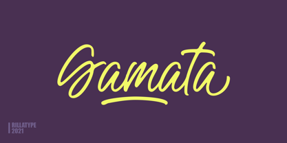 Introducing, Gamata Brush Script. Gamata is a brush script with natural feel that make this font is perfect for branding, packaging, book, logol labels, etc. Features : uppercase & lowercase numbers and punctuation multilingual alternates / swashes and ligatures PUA encoded
 - Starbell by Aah Yes,
$4.95Starbell is a fun-font, a serif typeface with all letters and numbers interspersed with stars for a fun and festive feel. The zip files contain both OTF and TTF versions of the font -install one version only. - Stature by Gerald Gallo,
$20.00 Stature is an original, clean and crisp, sans serif compressed font, which can be used for text or as an effective display font. The font includes upper and lowercase alphabets, numbers, punctuation, accented characters, symbols, and miscellaneous characters.
 - Mixed Messages JNL by Jeff Levine,
$29.00Mixed Messages JNL brings back a favorite old theme... mixing up various letters and numbers from different fonts to create a printed message that resembles a ransom note or a collage of type with many styles of lettering. - DB Flornaments by Illustration Ink,
$3.00Flornaments are decorative font ornaments, with a hint of floral styling. Each Doodlebat corresponds to a letter or number on the keyboard. This downloadable set of dingbat doodles will add a fanciful, formal flair to your scrapbook journaling. - Lokanova by limitype,
$11.00 Lokanova is a display font with a sans serif type designed in a bold and unique style to give the impression of a firm but still playful design. Lokanova is available with uppercase, lowercase, number, symbol and multilingual
 - Totem by Cuda Wianki,
$20.00 TOTEM is simple and geometric, strong and modern. Previously it was designed for our logo and next we made the rest of the alphabet, including multi-language coverage and numbers. Totem has a nice set of ornaments too.
 - Dustine Script by Letterfreshstudio,
$14.00 Dustine script is an extraordinary and bold script, suitable for a large number of designs. This font has two styles, Regular and Italic. With two styles, you can choose according to the project that you are working on.
 - Spoongky by Juliawan90,
$30.00 Introducing of our new product the name is Spoongky a Horror Font, Spoongky inspired by Bouncy horror style with a fun theme very good for horror, scary, spooky and halloween theme design. FEATURES : Uppercase Lowercase Number Punctuation Multilingual
 - Beatrick by Mevstory Studio,
$20.00 Beatrick created by Muhammad Afif Ersya is a futuristic modern font that features upper & lowercase characters, multilingual, numbers & punctuation. It’s well suited for use in the tech & gaming space for logos, titles, packaging, web design, apps & much more.
 - Metalform Gothic JNL by Jeff Levine,
$29.00 Metalform Gothic JNL is based on examples of stamped metal numbers used for house identification and similar purposes. The lettering is square in shape with rounded corners, perfect for text that needs to emit authoritarian messages or instructions.
 - Hauntress by Jadatype,
$15.00 Hauntess is a Serif Font that comes with a scary sharp-display's style. suitable for posters, logotype, branding, social media, book, movie and so on. contains standard English letters, numbers, punctuation, alternates, and several accents that support multilingualism.
 - Retro Mansion by Olivetype,
$18.00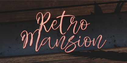 Retro Mansion is a casual dry brush font that is suited for retro style logo and poster. So what's included: Basic Latin A-Z & a-z. Numbers, symbols, punctuations and ligatures. Multilingual Support. Accented Characters : ÀÁÂÃÄÅÆÇÈÉÊËÌÍÎÏÑÒÓÔÕÖØŒŠÙÚÛÜŸÝŽàáâãäåæçèéêëìíîïñòóôõöøœšùúûüýÿžß Thank You.