10,000 search results
(0.035 seconds)
- Gans Antigua Manuscrito by Intellecta Design,
$14.95Gans Antigua Manuscrito is a revival font by Intellecta Design. researched at the rare catalogue from the extinct Fundicion Richard Gans, from Madrid. See also other font families inspired by Gans' original typefaces: Gans Tipo Adorno , Gans Lath Modern , Gans Titular Adornada , Gans Ibarra , Gans Antigua , Gans Fulgor and Gans Radio Lumina . - Wolfsburg Castle by Unitype Studio,
$29.00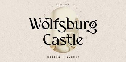 Introducing Wolfsburg Castle, a timeless Serif font that exudes classic elegance and modern sophistication. With its luxurious and stylish design, this font is perfect for adding a touch of refinement to your projects. Whether you're creating branding materials, wedding invitations, or editorial designs, Wolfsburg Castle will captivate your audience with its regal charm.
 - Hexide JNL by Jeff Levine,
$29.00 Hexide JNL was modeled and modified from an original design created by the late sign artist Alf R. Becker for Signs of the Times® Magazine. Thanks to Tod Swormstedt of ST Publications, Inc. and the American Sign Museum of Cincinnati, Ohio for providing the reference material used to make this font.
 - Choosing by OKSHUtypeCO,
$12.00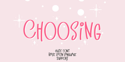 Choosing - a new fresh handmade calligraphy font. Very suitable for greeting cards, branding materials, business cards, quotes, posters, and more!This font are perfect for wedding postcard. Or you can create perfect and unique design of your logo, blog, stationery, marketing, magazines and more :) Features : UpperCase & Lowercase Numerals & Punctuations Multilingualcharacters(AÀÁÂÃÄÅCÇDÐEÈÉÊËIÌÍÎÏNÑOØÒÓÔÕÖUÙÜÚÛWYÝŸŸ ÆŒßÞàáâãäåæçèéêëìíîïðñòóôõöøùúûüýÿ)
 - Beauty angel Script by Letterfreshstudio,
$13.00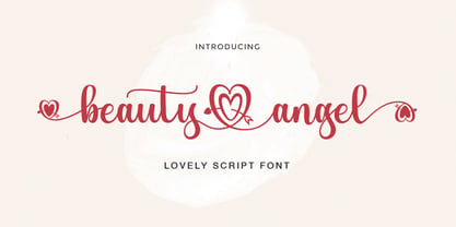 Beauty Angel ! A new fresh an modern hand lettered font with decorative characters and a dancing baseline. So beautiful on invitation like handicraft, greeting cards, branding materials, business cards, quotes, posters, and more design concepts. Features : Ligatures Stylistic sets Basic Latin A-Z and a-z Numbers International Symbols included Punctuation Ligature
 - Studio Five by Lafonts,
$29.00 Designed after the sixties neon sign of an arthouse cinema in downtown Zurich, Studio 5 is now a typeface for many applications. The three different styles include old style numbers and alternate characters for titling. All styles have the same metrics. Bold and open styles can be layered for neon sign effects.
 - Bugmansta by OKSHUtypeCO,
$12.00 Bugmansta - a new fresh handmade calligraphy font. Very suitable for greeting cards, branding materials, business cards, quotes, posters, and more!This font are perfect for wedding postcard. Or you can create perfect and unique design of your logo, blog, stationery, marketing, magazines and more :) Features : UpperCase & Lowercase Numerals & Punctuations Multilingualcharacters(AÀÁÂÃÄÅCÇDÐEÈÉÊËIÌÍÎÏNÑOØÒÓÔÕÖUÙÜÚÛWYÝŸŸ ÆŒßÞàáâãäåæçèéêëìíîïðñòóôõöøùúûüýÿ)
 - Humilde Regular by MrLetters,
$15.00 Introducing Humilde Script a new fresh & modern script with a handmade calligraphy style, decorative characters So beautiful on invitation like greeting cards, branding materials, business cards, quotes, posters, and more!! If you have any question, don't hesitate to contact me by email hello.mrletters@gmail.com Thanks and happy designing :-) Thank You for purchase!
 - Sporting by OKSHUtypeCO,
$14.00 Sporting- a new fresh handmade calligraphy font. Very suitable for greeting cards, branding materials, business cards, quotes, posters, and more!This font are perfect for wedding postcard. Or you can create perfect and unique design of your logo, blog, stationery, marketing, magazines and more :) Features : UpperCase & Lowercase Numerals & Punctuations Multilingualcharacters(AÀÁÂÃÄÅCÇDÐEÈÉÊËIÌÍÎÏNÑOØÒÓÔÕÖUÙÜÚÛWYÝŸŸ ÆŒßÞàáâãäåæçèéêëìíîïðñòóôõöøùúûüýÿ)
 - Ranchstyle by Ampersand Type Foundry,
$29.00 Based off of research into Nevada cattle branding irons of the 19th century, Ranchstyle takes the vernacular from rancher’s brands of the old west, digitizes it, and brings it into the contemporary world as a vivacious spunky typeface. The letterforms mimic bent metal and have the fluidity that follows such a material.
 - Marker Line by Sakha Design,
$10.00 Marker Line is a dynamic display font that captures the essence of casual, playful handwriting. Its thick strokes resemble marker pen strokes, adding a fun and modern touch to any design. This font is perfect for bold headlines, posters, and branding materials that aim to stand out with a youthful and vibrant appeal.
 - Bismika by SimpleType Studios,
$15.00 Exquisite and elegant, our Script Font showcases the artistry of beautiful calligraphy. With its flowing curves, delicate strokes, and stylish flourishes, this font adds a touch of sophistication to your designs. Perfect for wedding invitations, branding materials, and refined projects that demand a timeless charm. Elevate your typography with our captivating Script Font.
 - Challenge by ITC,
$29.99Challenge is the work of English designer Martin Wait. The brush lettering gives the typeface a unique, spontaneous quality. Capitals should be set closely and lowercase letters overlapped to produce the look of authentic handwriting. Challenge is at the same time informal and authoritative and good for a variety of display applications. - Sonderlina by Craft Supply Co,
$9.00 Sonderlina is a convenient and modern grotesk sans serif features low contrast details to cover small text purposes. It can be used to create almost all types of design projects like print materials. Just use your imagination and your project will become more alive and look great than ever with this typeface.
 - LiebeDoris by LiebeFonts,
$29.00 Inspired by a workshop with iconic American sign painter Mike Meyer, Ulrike of LiebeFonts set out to create a versatile, lovely typeface for sign painting that looks not at all like a font but rather like the letters on a unique, hand-painted storefront sign. LiebeDoris combines the best of two worlds: the beauty of all-American sign painting and the meticulous craft of German engineering. Each and every letter in each of the four different styles in LiebeDoris was hand-painted on large sheets of paper with a brush and ink, then carefully transferred for digital typesetting. So rather than being one typeface with different weights, think of LiebeDoris as a package of four individual designs that go together very well. Advanced OpenType features enable this font to really shine: every letter in this all-caps font comes in four variations, so that two of the same letters typed in a row won’t look the same, giving a truly handmade charm. (This feature requires layout software or a word processor with OpenType support.) And if you do have a storefront or a restaurant menu to prettify with LiebeDoris, you will love the integrated collection of store-themed catch words like “FREE”, “NEW”, and “SALE”. If you fall in love with LiebeDoris, you may also like our other best-selling fonts, LiebeErika and LiebeGerda, or our whimsical pictogram fonts such as LiebeMenu.
 - Peter by Vibrant Types,
$33.00 Peter started as a sketch in the static sans-serif tradition of Helvetica®. Then slight references to the calligraphic origin of type were added, giving it a more distinct character. This neo-grotesque sans has rational and clear basic letterforms, while in its details it unfolds attributes of humanist type. As a neo-grotesque sans it claims a very modest design, yet being a bit wider than its relatives and offering the warmth of humanist drafts. The early sketch grew to a type family of 18 fonts and now supports 700+ glyphs with pro opentype features.
 - Chiripa by Huy!Fonts,
$25.00 Chiripa is a casual, handcrafted, display font that gets a semi-random effect rotating between three different sets of characters (with Contextual Alternates on). Chiripa means luck in Spanish, but if you do not trust in your Chiripa you can turn Contextual Alternates off and change the glyphs switching between sets in the OpenType menu of your application or in the Glyphs list. Chiripa is perfect for children's books, fresh advertising, food packaging and any use in large sizes.
 - Running With Scissors by Comicraft,
$19.00 Your Mama told you not to do it, so you just KNOW this font will be good for you! In fact, you might say it’s a Cut Above the Rest. OUCH! Blade Runners: Be careful, you don’t want to retire a human by mistake... Remastered Running With Scissors contains: Two weights with hook-topped uppercase and hookless lowercase Activate "Discretionary Ligatures" to create perfectly futuristic sci-fi logos! support for 221 languages including Western & Central Europe and Vietnamese
 - Westey by sizimon,
$12.00 Westey is a script signature, beautiful for wedding card designs, logotype, website header, fashion design and any more. Westey come with 73 Glyph alternates and 63 Swash Characters. It contains a full set of lower & uppercase letters, a large range of punctuation, numerals, and multilingual support. - PUA encode - Bonus Swash - Multilingual support : (Danish,Finnish,English,,Spanish,Dutch,German,Icelandic,Italian,Norwegian,Portuguese,Indonesian, Swedish) If you have any question please do not hesitate to contact me.Thank You!
 - Gloss Drop by phospho,
$20.00 Gloss Drop is a wild hand lettered typeface, that passed the process of digitization without losing the spontaneous vibrancy of brush lettering. With the power of OpenType it gets real close to what you normally do with ink, brush and paper. Like in real handwriting, some, but not all, letters connect within a word. Automatic OpenType features handle the choice of inital and final forms neighbouring a gap and choose the adequate medial or isolated forms.
 - UUeirdie by Ingrimayne Type,
$7.95UUeirdie is weird. The Condensed-Light style was derived from the star-serifed font Asterx by replacing the star serifs with a rounded flare serif. Widening that style resulted in UUeirdie-Regular and the bold was then constructed to complement it. The warped version was a result of play with a font distortion program. Although the glyphs have sharp corners, they do not have straight lines. The UUeirdie faces are rough, irregular, and maybe a bit creepy. - Spilled Ink by Michael Rafailyk,
$15.00 Spilled Ink is a handwritten typeface designed to complement illustrations. Inspired by the idea of spilled ink that spreads and fills the shape of letters. Therefore, the symbols do not have sharp corners and looks smooth, soft and cute. Spilled Ink is intended for use in headlines, so lowercase have the same height as uppercase, allowing them to be used as alternates. Make your stories fabulous with Spilled Ink! Scripts: Latin, Greek, Cyrillic, Hebrew Language count: 480+
 - Linotype Mailbox by Linotype,
$29.99Linotype Mailbox is part of the Take Type Library, chosen from the entries of the Linotype-sponsored International Digital Type Design Contests of 1994 and 1997. The typefaces was created by German designer Andreas Karl. An entire alphabet, only lower case letters, with the look of @ -- who doesn’t think of the Internet? If you want to give your headlines or short texts an unmistakable feel of the Internet, you could not do better than Linotype MailBox. - Thebes by Simeon out West,
$25.00 Thebes is a font based on an ancient Coptic script. The Copts are Egyptian Christians, and theirspoken language is a dialect of ancient Egyptian. Their letters, however, are Hellenized andresemble the Greek Alphabet and do not have any relationship to hieroglyphics. Thebes comes with full punctuation, a character 535 glyphcharacter set that allows the user to type in most Western European Latinalphabet languages, Cyrillic, and Modern Greek. Being a decorative font, it works best at larger point sizes.
 - Bianca by Laura Worthington,
$25.00 Bianca is a semi-connected script whose slim strokes, gently curving verticals, and big, beautiful capitals convey a fashionable, feminine style. Customize with over 50 alternate glyphs to add variation to your design. See what’s included! http://bit.ly/2cdTMIe *NOTE* Basic versions DO NOT include swashes, alternates or ornaments This font has been specially coded for access of all the swashes, alternates and ornaments without the need for professional design software! Info and instructions here: http://lauraworthingtontype.com/faqs/
 - Rosiecated by sizimon,
$20.00 Introducing our New Collection, she is really pretty and sweet. Let's call Rosiecated, she's a stylish modern calligraphy with casual chic flair. She's perfect for packaging, wedding invites and cards, and branding. She will show you with a full set of lower & uppercase letters, a large range of punctuation, numerals, and multilingual support. What she have : Web Font PUA encode Multilingual support If you have any question please do not hesitate to contact me. Thank You!
 - Sabon eText by Linotype,
$34.99 A clear and enjoyable reading experience hinges on the legibility of text copy, especially when reading on screen. This is why Monotype has developed the eText collection of fonts specifically tailored for the text-heavy display environments of e-readers, tablets, mobile devices, and the Web.
 - Swipe Write by Something and Nothing,
$10.00 The Swipe Write letterforms are casual yet also look neat in a paragraph block of display copy. Available in both Regular and Solid styles, it is a powerful font that can be used for, posters, T-shirts, signage & design projects with a freehand and artistic feel.
 - Wood Condensed Grotesk JNL by Jeff Levine,
$29.00 Wood Condensed Grotesk JNL is a more condensed version of the type style found in Wood Type Grotesk JNL. The font was a popular sans used for large posters or broadsheets as well as newspaper titles where more copy needed to be fit into limited space.
 - Avergent by Variatype,
$16.00 ABOUT THIS FONT Avergent is a simple display sans font that designed for modern corporate branding, copy ads, and much more. FONT FEATURES - Additional Accents - Stylistic Alternates - Cyrillic Support - Ligatures - 95 Languages SOFTWARE RECOMMENDATION - Adobe Photoshop - Adobe Illustrator - Adobe InDesign - Affinity Designer OS COMPATIBILITY - Mac OS - Windows
 - Amasis eText by Monotype,
$49.00A clear and enjoyable reading experience hinges on the legibility of text copy, especially when reading on screen. This is why Monotype has developed the eText collection of fonts specifically tailored for the text-heavy display environments of e-readers, tablets, mobile devices, and the Web. - Township JNL by Jeff Levine,
$29.00 Township JNL is based on French Antique Condensed [a classic wood design] and is available in both regular and oblique versions. Reminiscent of Old West wanted posters and circus broadsides, this ultra-condensed typeface allows for more word copy to fit into a single line’s space.
 - Uncial by Monotype,
$29.99Victor Hammer created many faces based on uncial handwriting of which American Uncial, released commercially by the Stempel foundry in 1952, is the source for this version. Uncial is an ideal choice for historical or church pieces, provided that the length of the copy is brief. - Neue Helvetica eText by Linotype,
$42.99 A clear and enjoyable reading experience hinges on the legibility of text copy, especially when reading on screen. This is why Monotype has developed the eText collection of fonts specifically tailored for the text-heavy display environments of e-readers, tablets, mobile devices, and the Web.
 - Dante eText by Monotype,
$29.99 A clear and enjoyable reading experience hinges on the legibility of text copy, especially when reading on screen. This is why Monotype has developed the eText collection of fonts specifically tailored for the text-heavy display environments of e-readers, tablets, mobile devices, and the Web.
 - Ysobel eText by Monotype,
$99.00A clear and enjoyable reading experience hinges on the legibility of text copy, especially when reading on screen. This is why Monotype has developed the eText collection of fonts specifically tailored for the text-heavy display environments of e-readers, tablets, mobile devices, and the Web. - Fonce Sans Pro by Ryan Ford,
$10.95 Fonce Sans Pro is a mono-weight, Swiss-style typeface with influences from great typefaces like Din, Helvetica, Interstate, and Trade Gothic. Its form is unique and sophisticated with an unmistakable Dutch style. It’s subtle and enjoyable, and works beautifully in both display and body copy.
 - Palatino eText by Linotype,
$103.99 A clear and enjoyable reading experience hinges on the legibility of text copy, especially when reading on screen. This is why Monotype has developed the eText collection of fonts specifically tailored for the text-heavy display environments of e-readers, tablets, mobile devices, and the Web.
 - Linotype Didot eText by Linotype,
$50.99 A clear and enjoyable reading experience hinges on the legibility of text copy, especially when reading on screen. This is why Monotype has developed the eText collection of fonts specifically tailored for the text-heavy display environments of e-readers, tablets, mobile devices, and the Web.
 - Eezyl by Partu Haodis,
$25.00 A title font that looks better as larger the font size. First of all, it is designed for use in the upper-case format. Feature style: futurism, space, modernism, glyph variety (uniqueness (minimum automatic generation)). A kind of „s‟ in the lower-case format sets the tone and emphasizes the character, formed in the Prime Numbers Nebula — they determined its appearance, and influenced the style as a whole. Particular attention is paid to the kern: the kern table is formed manually, taking into account absolutely all the glyphs included in the font-family. Two types of stress (grave, acute) for all letter glyphs. The font contains basic Latin and several additional tables, as well as three types of quotation marks, a non-breaking space and a hyphen, a short, medium, and long dash. For a set of mathematical expressions there are centrifugal signs: equal, minus (not a hyphen or minus-hyphen), plus, multiplication (X-shaped and dot), plus-minus, division. The font was made for 3 years.