10,000 search results
(0.014 seconds)
- Salsiccia by Bech Type,
$19.00 Inspired by bold and rounded typefaces on signs from the 1970s, Salsiccia can promote both your hot dog stand and your international toy store enterprise. Its boldness and roundness is combined with classical proportions, with wide letters — like the O — next to little nubby ones — like the T. This not only looks nice, but helps us even out the white spaces across words and sentences.
 - Punto Poly by Fontador,
$24.99 Punto Poly is the layered type system of Punto for cromatic typesetting. Endless effects can be created by 11 stackable layers and different colors. The dots of Punto Poly are not made up of grid-based dots, they are optical corrected and there is always the same distance between the dots, with the aim to create more harmonic letterforms. The dots also vary gradually in size to reflect the thickening and thinning of strokes, giving the letterforms a sophisticated overall look. Punto Poly comes up with 11 layer system and is perfectly suited for logos, posters, brands and magazines. The language support includes Western, Central and Eastern European character sets, as well as Baltic and Turkish languages.
 - Irritation by Ingrimayne Type,
$12.95 Have you ever had to read text from a cheap dot-matrix printer which is not aligned quite right, so that the tops of the letters are either darker or lighter than the bottoms? Now with IrritationOne and IrritationTwo you can relive that experience even though you no longer use a dot-matrix printer. IrritationOne has dark tops and fading bottoms, while IrritationTwo has the opposite. Naturally both are monospaced.
 - African Elephant Trunk by Dharma Type,
$14.99 Based on retro vinyl records in the early and middle of 20th century. This font includes small caps for advanced typography. There are three other fonts designed by in the same concept. -Moon Star Soul -Rebel Train Goes -Word From Radio -African Elephant Trunk
 - Subway Ticker by K-Type,
$20.00 Subway Ticker is based on a 5×7 grid, electronic display observed on a New York subway train in February 2005. Also included is a ‘Grid’ variation of the font that is slightly more spaced out and based upon a more precise grid structure.
 - Moon Star Soul by Dharma Type,
$14.99 Based on retro vinyl records in the early and middle of 20th century. the mixture of funky, hippie and mid-century’s futuristics. There are three other fonts designed by in the same concept. -Rebel Train Goes -Word From Radio -African Elephant Trunk -Moon Star Soul
 - Sausage by Eclectotype,
$40.00 Sausage is unapologetically bold and bulbous. Influenced by magnetic fridge letters, hot dogs and 70s phototype fonts, it is retro, but not cloyingly so. It was a deliberate plan to make Sausage only a single style typeface. The freedom that not having to think about how the font should relate to other weights allowed me to push the glyphs to places they might not otherwise have been able to go. There isn't a single corner in the entire font, and you'd be hard pushed to find a straight line. This is as soft and friendly as they come, and still equipped with numerous ligatures, alternates and arrows for sophisticated typography.
 - Zega Text by Isaco Type,
$24.00 Zega Text is a top-heavy sans family, inspired in the imprecisions of letterpress printing. Zega has 14 versions that give to your text (printed or on screen) a delicious sense of old printing. Give an exclusive touch to your text with normal versions, without losing reading clarity. Try the heavier versions and add a nice impact to your titles! The family consists of 14 styles, 7 weights plus their respective italic versions. The fonts are available in OpenType PS and have extended character set to support CE, Baltic, Turkish as well as Western European languages. You can test Zega Text downloading the free trial font in Semibold version (TT only). This trial file supports only Western languages.
 - Midwest Railway JNL by Jeff Levine,
$29.00 An antique, hand-cut metal stencil for the Chicago-Burlington rail route stating “CB&Q RR – Private Property” inspired the sans serif stencil design Midwest Railway JNL, which is available in both regular and oblique versions.
 - FS Truman by Fontsmith,
$80.00 Beyond broadcast Like Truman Burbank, the star of The Truman Show, FS Truman was born for TV. You’ll know it from Sky One’s on-screen trails and announcements, but it’s just as at home in other media. Its starting point was the skeleton of a highly legible, space-saving, corporate font with some of FS Dillon’s geometric discipline built in. Its distinctive tone of voice and “ownability” are in its boxy but friendly shapes, and characters with hybrid features. FS Truman’s weights and widths were honed to work at TV screen resolutions. A face for TV it may have been, but this is a font that works on every level, on screen, in print, in headlines, in listings, in longer text, in tight corners and open spaces. The space-saver Compact, condensed but crystal clear, FS Truman comes into its own where a lot needs to be said in not a lot of space. Its letter spacing allows the type room to breathe, even at small sizes, while its fulsome x-height and diminutive descenders pave the way for tighter leading. A natural for headlines and titles over three or four lines. “Hybrid” features With every font, Fontsmith look for crafty new ways to imbue letterforms with a consistent character. The idea with FS Truman was to introduce “hybrid” features. In open letters such as “c” and “s”, for example, the top terminals have straight, vertical cuts while their lower terminals have a more angular, cursive finish. Boxy, spacious forms with unusual curves and angles create not just highly legible and efficient letters but strongly distinctive ones, too.
 - Beverly Shores Script SG by Spiece Graphics,
$39.00 If you take the South Shore Line from Chicago to South Bend, your train will pass though the small community of Beverly Shores, Indiana. The beautifully restored and highly colorful “Beverly Shores” train station sign not far from the Lake Michigan beach is the source of inspiration for this connecting script typeface. The sign’s existing ten letters have now been extended to include the entire alphabet. This old-fashioned depot letterstyle is much in the spirit of such faces as Fulton Sign and Inserat Cursive. Ascenders and descenders have been lengthened and capitals are now much larger. Alternate lowercase swashes, capitals, and small figures have been included for your convenience. And custom uphill words such as “The,” “for,” and “to” have been added for more novelty and spark in headline settings. Beverly Shores Script with Alternates is also available in the OpenType Std format. Some new characters including old style figures have been added to this OpenType version. Advanced features currently work in Adobe Creative Suite InDesign, Creative Suite Illustrator, and Quark XPress 7. Check for OpenType advanced feature support in other applications as it gradually becomes available with upgrades. All aboard for Beverly Shores!
 - Monotype Bodoni by Monotype,
$40.99 Bodoni expresses the beginning of the Industrial Revolution; its serifs are flat, think and unbracketed, while the stress is always on the mathematically vertical strokes. Bodoni believed in plenty of white space and therefore descenders are long. The M is rather narrow; in the Q the tail at first descends vertically and the R has a curled tail. The italic, like most continental modern faces, has roman serifs. Monotype Bodoni provides a clear-cut effect due to its simplicity. It reproduces well, particularly in sizes over 12pt. This font is slightly darker than Bauer Bodoni. The contrast makes Monotype Bodoni appear more condensed.
 - Signage by Fontador,
$36.00 Signage is not made up of grid-based dots. They are optical corrected and there is always the same distance between the dots, with the aim to create more harmonic letterforms. The dots also vary gradually in size to reflect the thickening and thinning of strokes, giving the letterforms a sophisticated overall look. Signage comes up with 3 weights and 3 italics and is perfectly suited for logos, brands, magazines and special for signage systems and mobile devices. The language support includes Western, Central and Eastern European character sets, as well as Baltic and Turkish languages.
 - Minimalist by Ingrimayne Type,
$12.95 PostScript fonts are constructed by connecting dots, dots that have special attributes that control the shape of the connecting lines. In designing Minimalist, I wanted to see how few dots could be used to construct each letter. This is the source of the name--it is (or was) a minimum-point alphabet. I did not expect much from it, and was surprised that it turned out as well as it did. Since I originally drew it, I have added some points to some of the letters to get them to generate proper bitmaps, so it no longer has minimum points.
 - Alisal by Monotype,
$29.99 Matthew Carter has been refining his design for Alisal for so long, he says, that when he was asked to complete the design for the Monotype Library, it was almost as if he were doing a historical revival of his own typeface. The illusion even extended to changes in his work process: although he now does all his preliminary and final drawing on screen, the first trial renderings of Alisal were done as pencil renderings. Alisal is best classified as an Italian old style design. Originally created between the late 15th and mid-16th centuries in northern Italy, the true Italian old styles were some of the first roman types. They tend to be the most calligraphic of serifed faces, with the axis of their curved strokes inclined to the left, as if drawn with a flat-tipped pen or brush. These designs offer sturdy, free-flowing and heavily bracketed serifs, short descenders, and a modest contrast in stroke weight. Alisal has nearly all the classic Italian old style character traits, plus a few quirks of its own. It is calligraphic in nature, with more of a pen-drawn quality than faces like Palatino or Goudy Old Style. It is more rough-hewn than either Goudy's Kennerley or Benton's Cloister, and is generally heavier in weight than most of the other Italian old style designs. One place where Alisal makes a clean break with traditional old style designs is in the serifs. While sturdy and clearly reflecting pen-drawn strokes, Alisal's serifs have no bracketing and appear to be straight strokes crossing the main vertical. Like Caslon or Trajanus, Alisal is a handsome design when viewed as a block of copy. Ascenders are tall and elegant, and serve as a counterpoint to the robust strength of the rest of the design. Alisal is available as a small family of roman and bold with a complementary italic for the basic roman weight, providing all that is needed for the majority of text typography. Alisal is not as well-known as some of Carter's other typefaces, but this lovely and long-incubated design was certainly worth the wait.
 - California Bound JNL by Jeff Levine,
$29.00 California Bound JNL is based on the hand lettering found on the side of the old California Zephyr passenger trains; the route now being a part of Amtrak. This somewhat unusual Art Deco design is more utilitarian than decorative, yet it still captures the "Streamline Era" perfectly.
 - Gans Rasgos Escritura by Intellecta Design,
$20.90 Gans Rasgos Escritura shapes (108 tails) was selected and freely interpreted from the vignettes catalog by Fundicion Gans published in 1920. You can combine these ornaments with your favorite fonts. We suggests the use of Pretoria Gross.
 - Groovy Tuesday JNL by Jeff Levine,
$29.00 Hand lettering from the 1965 movie poster for “The Loved One” – a classic 1960s spurred serif design with added curly-tailed terminals was the working model for Groovy Tuesday JNL – available in both regular and oblique versions.
 - Kindersley Sans by K-Type,
$20.00 Many street nameplates in Britain use versions of Kindersley serif capitals designed by David Kindersley in the 1950s. K-Type Kindersley Sans is an unfussy alternative to the signage stalwart, perfectly suited to newer environments and more contemporary tastes. Kindersley Sans is a humanist sans-serif that conserves the Gill-inspired character and some of the calligraphic qualities of Kindersley’s lettering, it retains the Roman proportions and its Britishness, but traditional prettiness and intricacy are discarded in favour of a clean modernity. For purposes where Transport (MOT) is considered too formal and Kindersley too old-fashioned, Kindersley Sans offers an open and amiable up-to-date alternative. The typeface is comfortably spaced and carefully kerned to deliver beautiful results with ease, and although designed with nameplates in mind, it excels as an all-purpose text face in print and on screen. The tail of the uppercase Q has minimal descent to avoid constriction. Kindersley Sans includes a lowercase designed for signage with short descenders to prevent unsightly congestion. A generous x-height assists legibility, and characters are designed for easy reading and distinctiveness. The curved foot of the lowercase L distinguishes it from the uppercase i. The six fonts contain a full complement of Latin Extended-A characters, Welsh diacritics and Irish dotted consonants, so European language nameplates need not be a source of frustration. The ascent and descent of accented characters has been kept to an acceptable minimum.
 - WBP Nel by Studio Jasper Nijssen,
$30.00 This typeface family is developed with the designer in mind. WBP Nel is a narrow sans serif with lots of options. The Regular consists of UPPERCASE and lowercase glyphs, beautiful kerning and a nice ampersand. All other styles are just uppercase and made to give your designs some extra flair. The Brickbuild is a playful, stencil version and the Dots (freebie) is a dotted typeface. The Light and Heavy version complement the Regular beautifully. These two also come with a display variant, the WBP Nel Stamped and WBP Nel Hypno. So you get lots of options to mix and match while designing awesome prints, posters, logo's, websites or identities.
 - Sonita by HansCo,
$15.00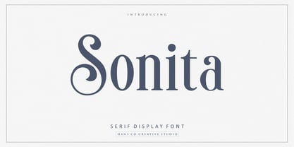 Sonita is an elegant serif display font designed with lovely circle tails to create a classy feeling. It perfectly represents a classic yet modern style. This font is perfect for elegant logo design, packaging or invitation cards. Enjoy!
 - DIVERGENT - Personal use only

- Bullerby by Maria Brachmańska,
$10.00 Bullerby is a font inspired by children's handwriting. The letters are characterized by charming curves in the lowercase and distinct condensed traits in the upper case. It is very versatile in use: it is ideal for logos, packaging, posters, advertisements, and much more. The font supports 68 languages.
 - Milonia by Khoir,
$15.00 Milonia - Serif font that prioritizes beauty with beautiful letter shapes and beautiful tails, has many alternative font choices that can support your design to be perfect. What's included? Uppercase Characters Lowercase Characters Support 75+ Language 87 Alternative FEATURES Milonia
 - Rhythm by Positype,
$42.00 I hate the idea of revivals. I have publicly said I choose not to do revivals because they make me uncomfortable. This is as close as I have been to crossing my own line. To be direct, Rhythm is based on the ATF typeface, Ratio (I just recently learned the foundry of origin). I came across this typeface from a printed specimen years ago when I was in school and held onto it. It was unique and I loved how well integrated the inline worked within both the flourish and serif of the glyphs—it was old, but not, reminiscent, but fresh. My specimen was limited in the glyph offering (it was c. 1930ish) and I realized a lot would need to be done to ‘finish’ it and bring it to contemporary expectations. I didn't want to do ‘retro’ and tried to avoid the visual trappings associated with it. What I did want to do is interpret what I had in the specimen and reinterpret it digitally, refining its construction and extending its typographic equity along the way. The ‘One’ and ‘Two’ (and their matching ‘Solids’) styles diverge providing various elaborations that coordinate well between rigid bracketed serifs and compact tails. I further expanded the glyph offering to include a full diacritic set, old style numerals, fractions, stylistic alternates, swashes, titling alternates and controlled flourishes that adhere to the efficient framework of the script. And yes, I refer to it as a ‘script’ because calling it a ‘cutesy serif’ seems wrong :) I hope this is seen less as a slavish revival and more as a championing of a really unique typeface. The Original Typeface was Adastra, designed by Herbert Thannhaeuser for the Foundry D. Stempel AG in Frankfurt, Germany.
 - Yasuragi by Hanoded,
$15.00 Yasuragi means ‘Peace of Mind’ or ‘Tranquility’ in Japanese. It is something I do not have a lot of since the corona lockdown…the ;-) Yasuragi is a handmade script font. It is quite neat, quite elegant and quite useful (in a tranquil, peace-of-mind kinda way). Yasuragi comes with double letter ligatures and all the diacritics you want.
 - Buinton by Melvastype,
$35.00 Buinton is a script typeface with noble and vintage looks. It has serifs at the beginnings of the strokes, swash capitals and formal design. Buinton has lots of alternate characters, swashes and ligatures. It has also a bunch of tails with different shapes and widths to give the vintage logotype or sports look to your design. These alternates makes Buinton very versatile. You can design beautiful, elegant and diverse typographic elements with it. It’s well suited for logos, lettering artwork, t-shirt designs, editorial illustrations to name a few. Buinton is also available in roughed up versions: Buinton Rough
 - Bonedigger by Hanoded,
$15.00 For some reason I had Paul Simon’s song ‘You Can Call Me All’ in my head when I was busy working on this font, so I just had to call it Bonedigger. Bonedigger does not dig bones, but it does have ‘heavy bones’, as it is quite big. Bonedigger is seriously eroded and would look great on book covers and product packaging. It comes in a lovely regular and italic style and a seriously twisted inline style (with, of course, its own italic). As the song goes: With a knick-knack paddywhack, give the dog a bone, this old font came rolling home.
 - Mind Boggle by Hanoded,
$15.00 Mind Boggle was made during the renovation of our fixer upper farm house. We had to demolish an old annexe (because it was unsafe) and it caused us some stress, as one wrong movement of the excavator would mean at least a partial collapse of our home… Luckily the driver was a pro and it was mind boggling to see what he could do with a huge machine like that. Mind Boggling? Ah! Check! Mind Boggle is a handmade, all caps, headline font. It is a bit wobbly in places, but it comes with loads of character. The dotty style comes with thousands of hand made dots. They’re not perfect, they’re not even round, but they are unique!
 - Punto by Fontador,
$24.99 Punto is not made up of grid-based dots. They are optical corrected and there is always the same distance between the dots, with the aim to create more harmonic letterforms. The dots also vary gradually in size to reflect the thickening and thinning of strokes, giving the letterforms a sophisticated overall look. Punto comes up with 3 weights and 3 italics and is perfectly suited for logos, brands, magazines and special for signage systems and mobile devices. The language support includes Western, Central and Eastern European character sets, as well as Baltic and Turkish languages. The little sister of Punto is Punto Poly : A layered type system for cromatic typesetting.
 - Korbin by Talbot Type,
$19.50 Inspired by the sans-serifs of the late 19th and early 20th century, Korbin is a legible and versatile text and display face available in five weights. It mixes geometric and humanist traits to achieve a modern, clean, friendly appearance. The italic variations include bespoke characters for a more flowing look.
 - Aeolus Pro by DBSV,
$50.00 Aeolus Pro is a second attempt at writing a monoline style. Completed after many design transformations. And here (as in KhamaiPro) attempted to provide a different visual design with style as Staccato: (dashed line) Rail: (double line) Tribe: (triple line) and finally a New style Shadow. Also (Bold, BoldItalic) has the advantage of involving between styles… (Rail, RailItalic, Tribe, TribeItalic, Shadow and ShadowItalic) for example: …you have a text frame with some text or one word or one letter with Bold or BoldItalic style with e.g. (color blue), if you duplicate the text frame or duplicate the Layer (as is, without shifting position - text) and you make changes ONLY (the Style* and color of text) in second text frame, would have the effect of filling the gap at the following styles... *(Rail, RailItalic, Tribe, TribeItalic, Shadow and ShadowItalic) you can see the presentation of the photo “Multiplex”. This series of 20 fonts with 624 glyphs each is composed and includes true italics and supports Latin, Greek and Cyrillic.
 - Miarlem by Pen Culture,
$15.00 Miarlem is a modern calligraphy font that perfect for branding, wedding, apparel and many other. This font comes with gorgeous uppercase and lowercase, punctuation, multilingual language. This font also equipped with beautiful beginning and ending tail and ligature which will be perfect for your design project. I really hope you enjoy it - please do let me know what you think, comments & likes are always hugely welcomed and appreciated. More importantly, please don't hesitate to drop me a message if you have any issues or queries. Thank you
 - Gold Spur by FontMesa,
$20.67 Gold Spur is a spurred version of the FontMesa Gold Rush set of fonts. Each version includes many extended characters for Western, Central and Eastern European countries. The Gold Spur Trail OpenType version has alternate double letter pairs included in the font and will automatically be substituted when used in Adobe CS products or other software that takes advantage of OpenType features. The $20.67 price of each font reflects the price of an ounce of gold in 1865 which was the year that the original Gold Rush font was created.
 - Madelican by Subectype,
$19.00 Madelican is a beautiful combination of modern and classical calligraphy, inspired by the handwriting of Italian women and ancient manuscripts. I think calligraphy has an advantage for the alternate characters, Madelican has tons of possibilities for just one letter. My exploration of this fonts was not as easy as in my imagination, it took several trial and errors for the perfect balance of the style. Madelican is very suitable for weddings, book covers, greeting cards, logos, branding, business cards and certificates, even for any design work that requires a classic, formal or luxurious touch. Almost all letters have more alternate than others, it is fine because the limitations of the shape of the letters. It must be readable and legible. Every letter that I've chose are only the best on it and fit with the character style. Multi-lingual support and up to 16 stylistic alternates. If you do not have programs that support OpenType features like Adobe Illustrator and CorelDraw X Versions, you can access all alternative flying machines using Font Book (Mac) or Character Map (Windows). And feel free contact me if you have a question.
 - Dark Garden - 100% free

- Stile by FSdesign-Salmina,
$39.00 Are you looking for a true cursive sans serif? Stile is a true cursive with moderate inclination. Its cursive character has mainly to do with writing-speed. Therefore it may serve also as copy font and not only for emphasizing purposes. Stile has a good readability and is really flexible and universally applicable. Stile is a sans serif and renounces to an excessive use of ligatures and other explicit calligraphic shapes in order to ensure a contemporary style and a homogenous text color. The whole font family consists of 8 weights (from ultrathin to black) and offers a wide range of Western and Eastern European special characters, typographical ligatures, uppercase, oldstyle and fraction figures. In addition Stile features a very complete and specifically tailored range of numberings and arrows. Bring a personal style into the artwork, with Stile. Download a free trial version of Stile with a reduced character set. Check it out!
 - Momentum by Baseline Fonts,
$29.00The Momentum family of typefaces is not for the faint of heart. Although difficult to spot at small point sizes, the glyphs are nothing but dot-to-dot letterforms raggedly, haphazardly placed for a chunky appearance. Brazen and bold in its appearance, Momentum may be EXACTLY WHAT YOU ARE NOT LOOKING FOR in a font family, unless you desire a chiseled, flat, cut-out look. Originally developed for package design requiring a grunge appearance, the Momentum family of fonts creates controversy and speculation wherever it is utilized. Momentum is a modern, chiseled typeface designed with a sense of humor. Perfect for large and small display alike, the extended character set allows flexibility on the fly. - Mandatory by K-Type,
$20.00 Mandatory is a full small caps font developed from the typeface used for UK vehicle registration plates. There is improved stroke separation on the M and W which are pointed at the centre, and the tail of the Q is thinner and clearer.
 - Olivier by Letters&Numbers,
$28.00 Olivier is based on painted black ink letters. Inspiration for this typeface is fluidity of wine. Shifting base-, mean- and cap lines, varying tails and ascenders give it an organic, playful feel. The font is suitable for logo types, short paragraphs and headings.

