10,000 search results
(0.103 seconds)
- Gingle Snowland by Balpirick,
$15.00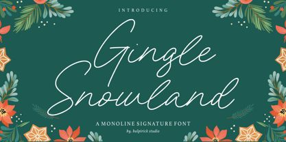 Gingle Snowland is a Monoline Signature Font. Gingle Snowland is a gorgeous monoline script font. This amazing typeface is perfect for product packaging, branding project, magazine, social media, wedding invitations, or just used to express words above the background. Gingle Snowland also multilingual support. Enjoy the font, feel free to comment or feedback, send me PM or email. Thank you!
 - Ballistone by Timurtype,
$14.00 Introducing by Timur type Proudly Present, Ballistone Ballistone A Handwritten Script Font Ballistone is perfect for product packaging, branding project, megazine, social media, wedding, or just used to express words above the background. This Ballistone font includes: -Full Set of standard alphabet and punctuation & symbol -Extra set ligature & underline -multilingual support. Embelish your designs with our original fonts.Enjoy the font,Thank you!
 - Karasha by Nurf Designs,
$25.00 Karasha is a display font with Japanese style. You will get an Japanese feel to every text that uses this font. It’s the perfect font for any design projects that require a Asian aesthetic. Works on PC & Mac Simple installations Accessible in the Adobe Illustrator, Adobe Photoshop, Adobe InDesign, even work on Microsoft Word. PUA Encoded Characters – Fully accessible without additional design software.
 - Bold Marker by Timurtype,
$14.00 Introducing by Timur type Proudly Present, Bold Marker Bold Marker A Handwritten Font Bold Marker is perfect for product packaging, branding project, megazine, social media, wedding, or just used to express words above the background. This Bold Marker font includes: -Full Set of standard alphabet and punctuation & symbol -multilingual support. Embelish your designs with our original fonts.Enjoy the font,Thank you!
 - Gurgle Jock by Bogstav,
$14.00 urgle Jock is actually two fonts in one: The Regular version is a classic handmade sans and the Outline version is…well, an outlined version of the Regular - however, I made it a bit off-grid and hasty scribbled looking. The two versions works well as they are and even greater together!
 - Cordel by Tipos do aCASO,
$23.90Cordel is the first digital typeface created by the founder of Tipos do aCASO in 1998. Its design refers to the unique woodcuts features used to illustrate the covers of old cordeis, pamphlets of Brazilian northeastern popular poetry. This unicase font presents irregular widths and spacing, a caricature of those woodcut graphics. - ITC Benguiat Gothic by ITC,
$29.99A roman face designed in the early 1980s by Ed Benguiat for ITC, ITC Benguiat shows a strong Art Nouveau influence. As with ITC Korinna, the stress of the ITC Benguiat font family occurs in the upper half of each capital. This distinctive typeface is particularly useful for display and advertising work. - Mister Rii PB by Pink Broccoli,
$19.00 A spunktastic offbeat latin typeface inspired by numerous Caribbean travel brochures & retro album covers from the mid 50’s. This font really dances off the page! Opentype features include Stylistic Alternates that change the scale of monetary symbols, and Contextual Alternates that modifies the second letter when typing double letters in lowercase.
 - Hexide JNL by Jeff Levine,
$29.00 Hexide JNL was modeled and modified from an original design created by the late sign artist Alf R. Becker for Signs of the Times® Magazine. Thanks to Tod Swormstedt of ST Publications, Inc. and the American Sign Museum of Cincinnati, Ohio for providing the reference material used to make this font.
 - Art Materials JNL by Jeff Levine,
$29.00 The cover of the 1930s-era “Catalog of Artists’ Materials” from Ernst H. Friedrichs, Inc. (New York) has the words “Artists’ Materials” hand lettered in a stylized Art Deco sans serif type style. This unique design is now the digital font Art Materials JNL, which is available in both regular and oblique versions.
 - Electrical Tape by PBinns,
$20.00 Electrical Tape is a mono-case display type. The idea came from generating custom letters using pieces of electrical tape. The over all design was then influenced by the graffiti subgenre as well as a hint of constructivist influence. Recommended applications of the font are for display purposes as well as digital media.
 - Allabbad by Abjad,
$5.00 Allabbad typeface was inspired by one of the hand letterings that belong to the godfather of Arab graphic design, Mohieddine Allabbad. The typeface is part of the Arsheef Alkhatt Project, a platform that revives and tributes classical Arabic lettering from different resources and presents them as affordable, digital fonts for independent designers.
 - Radicals by ITC,
$29.99Calligrapher Margaret Layson works in partnership with Australian typographer Harry Pears, bringing designs such as the wonderful Lindisfarne Nova family to life. They both work on the digital incarnation in a true collaboration. Originally from the UK, Margaret began her professional career as a geophysicist. After arriving in Australia in 1968, she began to work as a freelance calligrapher. Over the years she has maintained an interest in the history of writing, particularly the scripts and decorations in manuscripts. - Voguish by Redy Studio,
$19.00 Voguish – Sophisticated Calligraphy Are you looking for an outstanding and unique font? Do you want to add some fun and playfulness to your creations? Then this is the font that you need! Say hello to Voguish – the new, exclusive, and elegant font! Voguish is a sophisticated font ideally crafted to easily create amazing results with a minimum of fuss. Voguish is a perfectly balanced font with unique, stylish letter shapes that have been combined with a sophisticated contemporary touch. Being a perfectly multifunctional font, it is the ideal fit for new season designs. It’s perfect for all those luxurious projects or designs that you want to stand out from the crowd! Download it now and make all your dreams come true! It’s so unique and elegant in look, that it will be the talk of your town! Voguish features: A full set of upper & lowercase characters Numbers & punctuation Gorgeous ligatures A full set of alternate upper & lowercase characters Uppercase beginning swashes Lowercase ending swashes Lowercase alternates characters Multilingual symbols PUA Encoded Characters – Fully accessible without additional design software. Feel free to give me a message if you have a problem or question. Thank you so much for taking the time to look at one of our products.
 - Activate - Unknown license

- Hustle Faster by Arendxstudio,
$14.00 Hustle Faster font is very suitable for type & logotype. This font is very stylish and with 2 different styles so it gets variations and flavors that will appear more retro style and I think this is perfect for the needs of your design projects
 - Rhiccus by Patria Ari,
$19.00 Rhiccus is inspired from vintage and classic look. This font is suitable for any design like branding, print templates, fashion, print templates, & more. With more than 9 variants, this font works well to mix and match with each other to best fit the occasion.
 - Quintrell by Jorsetype,
$12.00 Quintrell is a very natural looking yet bold handwritten script. The Features of this fonts is; Standart ligatures, Stylistic Alternates, Stylistic sets, PUA Unicode (Private Use Areas). Programs that support in this font are Adobe Photoshop, Adobe Illustrator, Adobe Indesign, Corel Draw and Microsoft Office.
 - Another Fool by PizzaDude.dk,
$15.00 Another font, Another Fool! This one made me think of cake - you know, a crisp crust and sprinkles on top. Perhaps the recipe includes blueberry and peanuts? Well, this fonts' recipe includes 6 different versions of each letter as well as multilingual support! Yummy!
 - Real One Specific by Sulthan Studio,
$8.00 Real one specific! This font duo comes with a script typeface as well as a sans serif typeface. The two typefaces complement each other really well with beautiful, eye-catching handwritten nuances. This font is very light and can also make your job stand out.
 - Headley by Sarid Ezra,
$13.00 Headley - Vintage Font Duo is a handmade font duo. Contain two fonts, the rough sans and monoline script. You can use this font for every project. Suitable for branding logo, hand lettering, or apparel design. This font duo also support multilingual, number and symbol, alternates, swash, and underline. Also this font already PUA Encoded. PS: Type underscore + number (from 1 to 5). Or copy Hea_3dley in preview bellow.. Don't hesitate to ask me at saridezra@gmail.com - Thank you!
 - Habita Scenic by Mans Greback,
$59.00 Habita Scenic is the heavy and beautiful serif font that adds a touch of femininity and class to any project. Designed by Mans Greback in 2023, this font features high contrast and retro style, making it the perfect choice for designers looking to add a touch of cool to their work. With its beautiful swash letters, Habita Scenic is perfect for logos, headlines, and other creative projects. This font's classic and elegant design makes it an ideal choice for high-end brands and premium products. If you're looking for a font that exudes sophistication and timeless style, look no further than Habita Scenic. Use underscore _ anywhere to make a swash. Example: Love_Passion The Habita Scenic family consists of four high-quality fonts: Regular, Italic, Bold and Bold Italic The font is built with advanced OpenType functionality and has a guaranteed top-notch quality, containing stylistic and contextual alternates, ligatures and more features; all to give you full control and customizability. It has extensive lingual support, covering all Latin-based languages, from Northern Europe to South Africa, from America to South-East Asia. It contains all characters and symbols you'll ever need, including all punctuation and numbers.
 - Acton by Device,
$29.00 Acton is a deceptively simple, grid-based design. Though derived from a 2 by 3 arrangement of blocks, it uses white spaces to allow for more complex shapes – for example as the R – where the underlying 3 by 5 arrangement is apparent. It also departs from this strict grid-based logic for characters such as the the T, L, f and r, whose cross-bars are shorter than they would otherwise be in order to promote optical evenness. No elegant solution could be found for the V, which in geometric fonts can appear very similar to the U, lacking as it does the cross-bar that can differentiate a square A from the capital form of the n. However, the resultant diagonal retroactively proved useful on the lower-case e and a, characters that otherwise would have more uninteresting design solutions.
 - Allrounder Grotesk by Identity Letters,
$40.00 A true workhorse. The only Grotesk you’ll ever need. Allrounder Grotesk is a neutral, powerful Neogrotesk member of the Allrounder superfamily. An unobtrusive teamplayer as well as an excellent soloist, this hard-working sans-serif typeface is ready for any task you’ll throw it at. A workhorse that lives up to its name, Allrounder Grotesk consists of ten weights ranging from a delicate Air to a powerful Black with 900+ glyphs per font. Each weight is accompanied by carefully hand-corrected italics. Allrounder Grotesk supports more than 200 Latin-based languages, containing the complete “LatinPlus” glyph set developed by Underware. It also provides you with plenty of OpenType features and additional goodies: small capitals, ten sets of figures, case-sensitive forms, ligatures, superiors, fractions and arrows. Equipped like this, you’ll be ready for any kind of sophisticated typesetting scenario you might encounter. With Allrounder Grotesk, you’ve got a sans that works great for body text, yet looks crisp and clean in headlines and display sizes. Whether annual reports, magazine and editorial layouts, nonfiction books, branding and packaging work, large-scale advertising, forms and contracts, or contemporary posters: Allrounder Grotesk is up for it. This multitalented font family was developed in a 2-year process by Moritz Kleinsorge. It was the first release of the Allrounder superfamily, a series of typefaces sharing the same color and horizontal metrics (cap height, small cap height and x-height): a typesetting system whose components match each other perfectly. Any other part of this design kit, e. g., Allrounder Antiqua or Allrounder Monument, may be easily combined with Allrounder Grotesk. Perfect Pairing: Allrounder Antiqua + Allrounder Grotesk Allrounder Antiqua is the ideal complement to Allrounder Grotesk. They both share common vertical metrics and a common color. This allows you to pair both typefaces within the same layout—even within the same paragraph—without creating visual disruption. Head over to the Family Page of Allrounder Antiqua to get more information about this typeface. Design Trick: Bilingual Design With the Allrounder Superfamily Combining Allrounder Grotesk with Allrounder Antiqua is an ideal approach for bilingual designs, wherein both languages get the same emphasis yet are distinguished with two different typefaces. It's also best practice to set headlines in a different typeface than the body text if they harmonize with each other. Allrounder Grotesk and Allrounder Antiqua provide you with the perfect pair for this purpose. In any kind of design, in any type of medium, working with Allrounder fonts is effortless. That’s why Allrounder got its name.
 - Sirens by Sarid Ezra,
$13.00 Introducing, Sirens - Bold Sans with Alternates! Sirens a casual and modern sans. The special things is this font comes with alternates in each lowercase! Every alphabet have alternates up to 3 kinds! This font fits in any project. Strong for your headline. You can use it for a tittle, logo, quotes, or become a pairing in any font. This font also support multi language! Also already PUA Encoded. Caps only Fonts. Foreign Languages Support: ÀÁÂÃÄÅÇÈÉÊËÌÍÎÏÑÒÓÔÕÖØÙÚÛÜÝßàáâãäåæçèéêëìíîïñòóôõöøùúûüýÿ
 - Hello Bride Script by 50Fox,
$19.00 Redefine elegance with Hello Bride! This lovely font "Hello Bride" comes with classy style of calligraphy. This fonts is one of the most elegant fonts for wedding or engagement ceremony. Especially if it's an luxury ceremony. Hello Bride Font has huge ligatures & alternative characters. This Font is great for logo, printed quotes, badge, insignia, packaging, headline, poster, t-shirt/apparel, greeting card, and wedding invitation, & etc. Thanks for looking and have a wonderful day
 - Troyline by Sarid Ezra,
$13.00 Troyline is my newest font duo. Contain two fonts, the organic script and sans. Comes with Rough and Stamp style. You can use this font for every project. Suitable for branding logo, hand lettering, or apparel design. This font duo also support multilingual, number and symbol, alternates, swash, and underline. Also this font already PUA Encoded. What will you get: Troyline Script (OTF/TTF) - Rough & Stamp Troyline Sans (OTF/TTF) - Rough & Stamp
 - Albrecht Fraktur by New Renaissance Fonts,
$20.00 In his 1538 book on measurement, Albrecht Dürer gave clear descriptions and drawings about the proportions of the letters in both Roman and 'fraktur' alphabets (from Latin 'fractura', meaning that it's broken up with lots of different angles rather than smooth curves). Here is the fraktur alphabet as a font completed for use today, with a few characters modernised and some gaps filled. Of course there are countless examples of fraktur fonts already circulating, and indeed one foundry even has another version of this particular one; but we have different approaches to some of the questions raised, we have aimed at a more even tracking (horizontal spacing), and the 260 glyphs in our version include accents and other diacritics, and the modern symbols which Dürer would surely have embraced if he had had access to the internet.
 - Stuffed Shirt JNL by Jeff Levine,
$29.00 Stuffed Shirt JNL acquires its name from a term popularized during the years when the Art Deco period flourished. The Great Depression further widened the gap between the 'haves' and the 'have nots'. Occasionally, some of those that 'had' (and some who pretended they did) came off as standoffish, egotistical and pompously arrogant. Such individuals were referred to as a "stuffed shirt"; a blowhard who thought he was better than others. In this case, Stuffed Shirt JNL is no more than a dual-line adaptation of Playwright JNL, itself an interpretation of the classic Broadway type design in a way that emulates the hand lettering of old-time sign painters.
 - Spotlight by ITC,
$29.99Spotlight was created by British designer Tony Geddes in the tradition of the bold serif fonts of early 19th century England. It too is a robust alphabet exhibiting extreme stroke contrasts, however, Geddes gave his font a more relaxed feel by not filling in the strokes completely. Long white rays break up the otherwise dark black strokes, following the form of the outer contours and giving the figures a three dimensional look. Spotlight is also reminiscent of the decorative advertisements of the 1930s and of the glamorous revues and shows of this time. Spotlight is perfect for headlines and display in larger point sizes. - saxMono - Unknown license

- Thoriq by Cititype,
$17.00 Introducing our new font which is signature style. monoline looks like writing with a 'Rollerball pen'. We give the name this font "Thoriq". Thoriq means path, pattern or way. its analogized from the way people write with bold and definite strokes. The font consists of a lowercase, uppercase and swash with a strong character so it is suitable for use for brand logos, you can print it on t-shirts, cards, posters and other merchandises. We also created a special font that consists of a beginning and ending swash only, uppercase is a beginning swash while lowercase is an ending swash, this is so that you can easily apply it to online media, such as web banners and digital signatures. Also equipped with ligatures to add a natural writing impression. You want to write a quick note or quote, come on… this is the right choice
 - Pickled Limes by Missy Meyer,
$15.00 It all started with the letter S. I drew it, I liked it, I based a font around it! This is Pickled Limes, a tall and narrow single-case font. It's built clean from the ground up, for ultra-sharp lines and corners, as well as super-smooth curves. The slightly flared ends and quirky character mix make this font a ton of fun to use on its own, but it will also pair well with tons of hand-written styles! I've branched out on this one; in addition to over 300 Extended Latin characters, I've also included Unicode's 256 Cyrillic and 121 Greek characters for even more language support. Add in the 90+ alternates, ligatures, and catchwords, and Pickled Limes clocks in at just over 1000 characters. I hope you enjoy using my tasty Pickled Limes for your branding project, logo, crafting work, or design project. Happy fonting, MyFonts fans! :)
 - Berliant by Naqsya.Co,
$15.00 Introducing Berliant, a modern signature font. This font was designed by handwriting, and it has unique forms of calligraphy, the writing style is very natural. The Features of this fonts are: Standart ligatures Discretionary ligatures Berliant has PUA Unicode (Private Use Areas) Programs that support this font are Adobe Photo Shop, Adobe Illustrator, Adobe Indesign, Corel Draw and Microsoft Office. To enable the OpenType Stylistic alternates, you need a program that supports OpenType features such as Adobe Illustrator CS, Adobe Indesign & CorelDraw X6-X7. Languages supported: Breton, Catalan, Czech, Danish, Estonian,French, German, Hungarian, Icelandic, Italian, Romanian, Scottish Gaelic, Slovak, Latvian, Lithuanian, Norwegian, English, Finnish, Polish, Portuguese, Slovenian, Spanish, Swedish, Turkish, Welsh. Basically all European languages that are based on the Latin alphabet. Berliant can be used for various purposes such as headings, logos, wedding invitation, t-shirt, letterhead, signage, labels, news, posters, badges etc.
 - Kattelo by Malindo Creative,
$10.00 Introducing, Kattelo is a beautiful retro style font, with a Kattelo giving a touch of attractive design typography, Kattelo is one of the handwriting projects. It was very inspired by the famous retro typography design. Kattelo also comes with the Extruded Font version. So you don’t need extra effort to make the effect repel for this font,with Kattelo you can create many design styles. Kattelo is also equipped with 514 Glyphs, and also features OpenType. The Features includes: Stylistic Alternates, Swashes, Ligatures, and Stylistic Set.Extrude,and You can pick the alternate for all style Kattelo has given PUA encoded (fonts with special code). This Font Equipped: -Uppercase -Lowercase -Figures & Punctuation -Stylistic Alternatives -Ligatures -Extruded for All Glyph -Language Support To enable the OpenType Stylistic alternates, you need a program that supports OpenType features such as, Adobe Indesign,Adobe Illustrator CS & CorelDraw X6-X7, Microsoft Word 2010 or later versions. How to access alternate glyphs? you can see it on this link goo.gl/1vy2fv If There Any questions, Please Let Me Know,Contact Me,At malindocreative@gmail.com,Your support and suggestion is needed, And I am Happy To Help You. Thank you for your kindness and support,Hopefully Useful,And Good Luck For You.
 - Renais by Wiescher Design,
$39.50 Renais is a set of Renaissance Initials. The embellished letters are on the keys A through Z. The letters without embellishments are on the lowercase letters a through z. The embellishments without the letters are in alphabetical order on the following keys: 1234567890!§$%&/()=?,.-;:_ You can superimpose the three forms for special effects, they are designed to fit exactly over each other. Have fun! Gert Wiescher - forever discovering old fonts!
 - Swanville by Ingrimayne Type,
$5.00 Swanville developed as part of a train font that eventually became LetterTrain. The letters of Swanville are bold, have a funny “serif” on the top but not on the bottom, and when the letters have interiors, the interior has the shape of the letter. Lower-case letters are smaller versions of the upper-case letters. Because development of this face stopped long ago, it has a limited character set.
 - Antique by Storm Type Foundry,
$26.00The concept of the Baroque Roman type face is something which is remote from us. Ungrateful theorists gave Baroque type faces the ill-sounding attribute "Transitional", as if the Baroque Roman type face wilfully diverted from the tradition and at the same time did not manage to mature. This "transition" was originally meant as an intermediate stage between the Aldine/Garamond Roman face of the Renaissance, and its modern counterpart, as represented by Bodoni or Didot. Otherwise there was also a "transition" from a slanted axis of the shadow to a perpendicular one. What a petty detail led to the pejorative designation of Baroque type faces! If a bookseller were to tell his customers that they are about to choose a book which is set in some sort of transitional type face, he would probably go bust. After all, a reader, for his money, would not put up with some typographical experimentation. He wants to read a book without losing his eyesight while doing so. Nevertheless, it was Baroque typography which gave the world the most legible type faces. In those days the craft of punch-cutting was gradually separating itself from that of book-printing, but also from publishing and bookselling. Previously all these activities could be performed by a single person. The punch-cutter, who at that time was already fully occupied with the production of letters, achieved better results than he would have achieved if his creative talents were to be diffused in a printing office or a bookseller's shop. Thus it was possible that for example the printer John Baskerville did not cut a single letter in his entire lifetime, for he used the services of the accomplished punch-cutter John Handy. It became the custom that one type founder supplied type to multiple printing offices, so that the same type faces appeared in various parts of the world. The type face was losing its national character. In the Renaissance period it is still quite easy to distinguish for example a French Roman type face from a Venetian one; in the Baroque period this could be achieved only with great difficulties. Imagination and variety of shapes, which so far have been reserved only to the fine arts, now come into play. Thanks to technological progress, book printers are now able to reproduce hairstrokes and imitate calligraphic type faces. Scripts and elaborate ornaments are no longer the privilege of copper-engravers. Also the appearance of the basic, body design is slowly undergoing a change. The Renaissance canonical stiffness is now replaced with colour and contrast. The page of the book is suddenly darker, its lay-out more varied and its lines more compact. For Baroque type designers made a simple, yet ingenious discovery - they enlarged the x-height and reduced the ascenders to the cap-height. The type face thus became seemingly larger, and hence more legible, but at the same time more economical in composition; the type area was increasing to the detriment of the margins. Paper was expensive, and the aim of all the publishers was, therefore, to sell as many ideas in as small a book block as possible. A narrowed, bold majuscule, designed for use on the title page, appeared for the first time in the Late Baroque period. Also the title page was laid out with the highest possible economy. It comprised as a rule the brief contents of the book and the address of the bookseller, i.e. roughly that which is now placed on the flaps and in the imprint lines. Bold upper-case letters in the first line dramatically give way to the more subtle italics, the third line is highlighted with vermilion; a few words set in lower-case letters are scattered in-between, and then vermilion appears again. Somewhere in the middle there is an ornament, a monogram or an engraving as a kind of climax of the drama, while at the foot of the title-page all this din is quietened by a line with the name of the printer and the year expressed in Roman numerals, set in 8-point body size. Every Baroque title-page could well pass muster as a striking poster. The pride of every book printer was the publication of a type specimen book - a typographical manual. Among these manuals the one published by Fournier stands out - also as regards the selection of the texts for the specimen type matter. It reveals the scope of knowledge and education of the master typographers of that period. The same Fournier established a system of typographical measurement which, revised by Didot, is still used today. Baskerville introduced the smoothing of paper by a hot steel roller, in order that he could print astonishingly sharp letters, etc. ... In other words - Baroque typography deserves anything else but the attribute "transitional". In the first half of the 18th century, besides persons whose names are prominent and well-known up to the present, as was Caslon, there were many type founders who did not manage to publish their manuals or forgot to become famous in some other way. They often imitated the type faces of their more experienced contemporaries, but many of them arrived at a quite strange, even weird originality, which ran completely outside the mainstream of typographical art. The prints from which we have drawn inspiration for these six digital designs come from Paris, Vienna and Prague, from the period around 1750. The transcription of letters in their intact form is our firm principle. Does it mean, therefore, that the task of the digital restorer is to copy meticulously the outline of the letter with all inadequacies of the particular imprint? No. The type face should not to evoke the rustic atmosphere of letterpress after printing, but to analyze the appearance of the punches before they are imprinted. It is also necessary to take account of the size of the type face and to avoid excessive enlargement or reduction. Let us keep in mind that every size requires its own design. The longer we work on the computer where a change in size is child's play, the more we are convinced that the appearance of a letter is tied to its proportions, and therefore, to a fixed size. We are also aware of the fact that the computer is a straightjacket of the type face and that the dictate of mathematical vectors effectively kills any hint of naturalness. That is why we strive to preserve in these six alphabets the numerous anomalies to which later no type designer ever returned due to their obvious eccentricity. Please accept this PostScript study as an attempt (possibly futile, possibly inspirational) to brush up the warm magic of Baroque prints. Hopefully it will give pleasure in today's modern type designer's nihilism. - Ongunkan Varna Vinca by Runic World Tamgacı,
$50.00 The Vinča script is a cache of symbols found belonging to the Vinča culture of the central Balkans over 7000 years ago. The symbols have been a topic of debate amongst historians. The Tărtăria tablets are three tablets discovered in 1961 in the village of Tărtăria(Hungarian: Alsótatárlaka). This is about 30 km (19 mi) from Alba Iulia in Romania.The tablets, dated to around 5300 BC, have symbols inclay: the Vinča symbols. Some claim they are a yet undeciphered language. If this is so, they would be the earliest known form of writing. In 1908 similar symbols were found during excavations, by Miloje Vasić (1869–1956) in Vinča. This is a suburb of Belgrade (Serbia), some 300 km from Turdaș. Later, more were found in another part of Belgrade. Since 1875 over one hundred and fifty Vinča sites have been found in Serbia alone. Many, including Vinča itself, have not been fully excavated. The culture of the whole area is called the Vinča culture. Although some of these symbols look exactly the same as some letters in Etruscan, Greek, and Aramaic, they are generally regarded as a an original, independent development.
 - STARSsoft Nika by STARSsoft,
$19.90 Currently, the STARSsoft NIKA font family is represented by two fonts - Bold & Bold Italic. The letters and numbers in the font are shown in such a way that there are no holes in the letters and the entire outline of the font consists of one closed line. The font has both a standard Latin set and an extended one. The font also has Cyrillic support. In addition to the Russian Cyrillic alphabet, the font has support for Ukrainian and Kazakh Cyrillic. In addition to standard character sets, the font has many additional letters with diacritics.

