10,000 search results
(0.064 seconds)
- Trade Printer JNL by Jeff Levine,
$29.00Trade Printer JNL is another font design inspired by an old rubber stamp sign printing set. In this case, the lettering has a classic "wood type" look, reminiscent of the letterheads, billheads and fliers made by local printers of the 1880s-1920s. - Spartacus by Alan Meeks,
$45.00 A further development of the Colosseum range but this with a slab serif. Visually monoline and modern in appearence it still retains its Trajan characteristics. The addition of Spartacus black with its unusual Italic gives a the face a strong original headline font.
 - Sophia Marilyn by Timurtype,
$14.00 Introducing by Timur type Proudly Present, Sophia Marilyn Sophia Marilyn A Handwritten Script Font Sophia Marilyn is perfect for product packaging, branding project, megazine, social media, wedding, or just used to express words above the background. This Sophia Marilyn font includes: Sophia Marilyn multilingual support. Embelish your designs with our original fonts.Enjoy the font,Thank you!
 - Concrete Forge by Get Studio,
$10.00 ConcreteForge: A fearless brutalist font with extended shapes, exuding strength, and resilience. Captivating and impactful, it embraces simplicity while making a bold statement for branding and design projects. Inspired by the raw aesthetics of brutalist architecture, this typeface exudes strength and confidence. The family includes 9 fonts in a variety of weights and supports Variable Font.
 - FX Neofara by Differentialtype,
$10.00 FX Neofara is a sans serif font family that comes with 9 weights, 9 italics, and an outline. It’s perfect for documents, font logos, blogs, social media, marketing campaigns, and many other projects! FX Neofara masterfully designed to become a true favorite, this font has the potential to bring each of your creative ideas to the highest level!
 - Kufwan by Twinletter,
$15.00 Kufwan Arabic style display font can be used to give your designs a genuine Arabic touch. The display font displays a beautiful style similar to the handwriting on a typical Arabic book. Use this font in your super projects to grab everyone’s attention. Don’t put off adding an elegant Arabic touch to your designs any longer.
 - Satreva Neue by Balevgraph Studio,
$14.00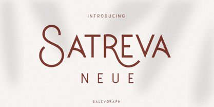 Satreva Neue is a stylish, elegant and distinct sans serif font. Suitable for a wide variety of designs because of its neat and simple style, this font has the potential to become your favorite font, whatever the occasion! What's Included : Uppercase, Lowercase, Numerals & Punctuations Alternate & Ligature Works on PC & Mac Simple installations Multilingual support PUA Encoded
 - TF Bombass by Teenage Foundry,
$19.00 TF Bombass – Groovy Display Font By Teenage Foundry Introducing our latest font creation – a groovy typeface that’s sure to transport you back to the funky, psychedelic era of the 60s and 70s! With its bold, playful style and unique character, this font is perfect for adding a retro feel to your design projects. Features: Uppercase, Lowercase, Numeral, Punctuation & Multilingual.
 - Brother Time by Timurtype,
$14.00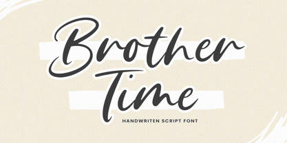 Introducing by Timur type Proudly Present, Brother Time Brother Time A Handwritten Script Font Brother Time is perfect for product packaging, branding project, megazine, social media, wedding, or just used to express words above the background. This Brother Time font includes: Brother Time multilingual support. Embelish your designs with our original fonts.Enjoy the font,Thank you!
 - Mogathe by Invasi Studio,
$16.00 Mogathe was inspired by the west life era. Mogathe is a slab serif font with a vintage western look and feel. Four varieties are available: Regular, Stamp, Spurs, and Spurs Stamp. The use of this font results in carefully-crafted styles. Mogathe font is ideal for branding projects or packaging that need a vintage western feel.
 - Counter Courage by Viaction Type.Co,
$15.00 Counter Courage is a vintage-style sans serif font with an ink effect that’s perfect for industrial and vintage-themed designs. This font is equipped with the opentype feature and supports multilingual. Included in the fonts: Uppercase Lowercase Symbols & Pointing Alternate Characters Multilingual Support Get it now at an affordable price and high value for your needs. Thank You.
 - UT Sugar Cane by Uniontype,
$15.00 Sugar Cane by Uniontype is a fresh and light multilingual script inspired by vintage monoline fonts. It provides advanced typographical support with contextual alternates, ligatures and swashes. That way, you’ll have automatic access to the dozens of extra glyphs in each of the fonts. This font is good for menu, signs, packaging, posters, letterings and logos.
 - Onry Display by NicolassFonts,
$35.00 Onry Display is a modern family based on Willgray font family. It comes in 20 weights, 10 uprights, and matching italics. The ExtraBold weight is free of charge. This font family can be used as a headline or as a body copy typeface. The font features excellent legibility for print, as it does for reproduction on TV screens.
 - Mr Palker by Letterhead Studio-YG,
$35.00 A slab serif Mr Palker and grotesque Mr Palkerson build one superfamily together. These are blank types. In a way even the display ones. Typefaces for newspapers, announcements, cheap advertising and police posters. Mr Palker and Mr Palkerson will turn every language into a fence. And due to six types of faces one can choose what material should the fence be made from — from Thin steel rods to the Black stone blocks. In their simplest appearance Mrs P&P are intended for the solid blank composition in victorian or industrial style. They are quite decent, a bit old-fashioned slab serif and grotesque with closed aperture. All my types have layers. Walker and Palkerson also do. Besides the standard set of symbols, they have 4 add-ons. 1. Alternate glyphs, including unicase ones. 2. Ligatures with A letter. 3. Extra tall small caps. 4. Two-storey ligatures. All this options are intended for the complex composition. The additional letters are rather eccentric as their main function here is to imitate the victorian oddities. Imitate, parody, just not repeat. There are lower-case As and Es in the set in height of small caps and uppercases. They can turn every writing into the unicase. The lower-case A (as well as uppercase and small caps version of it) has deliberately by my taste grown a ludicrous tail. To compensate it I’ve built all the possible ligatures - ад, ал, ая. There are 35 of this ligatures all together. Take a closer look at the Russian letters D, L, K, Ya from the main set as well as their alternates. The additional glyphs are one more comic than the other — on purpose to imitate (not to repeat!) the victorian set. This sets have lowercase numbers. And small caps numbers as well. What a modern typeface without them. They also have an У-letter with a generously curvy tail. As if before the WWI. The Latin of course has alternates as well. It has letters to make the perfect French sound more like the russian provincial version of it. The tails of Js and Ts can be made a little bit more open — or a little bit closed. My favorite feature here, an invention of a kind - extra tall small caps. It allows to compose logos with the small caped uppercases directly from the keyboard. The small caps of this typefaces are usually much taller than the customary ones. This is the kind of small caps that Palker and Palkerson have. More to that, the strokes’ weight and the letters width are corresponded to the uppercases. Just a ready set for making a logo a la 1913 style. With a unicase, one has to mind! One more trick with the tall small caps is a possibility to make them work like lower uppercases. Their height is just in between of lower- and uppercases. Isn’t it great to have an additional set of uppercase working ponies in stock for the case of emergency. And finally — the trademark of Palkers family, two-storey ligatures. They are made in the height of uppercases and turn every writing into an ornament or a puzzle of a kind, while at the same time making them much shorter. Each face has 90 of them. Mainly those are twins: CC, BB, DD and so on. ll this things are for the unhasty compositing, even for lettering. Which means that for the things which are not there you always should have Command+Option+O and some patience. Also — among the two storey ligatures one also can find some belvedere villas. All my types are glasses from the one kaleidoscope. The P&Ps family was preliminary part of the victorian set, which already has 1 Cents and Clarendorf - optionally one can add Costro, Gordoni, Handy, Guardy, Surplus, Red Ring, Red Square, Babaev to the list. And also Sklad, Odessa, Dreamland, Romb, Platinum - here, at Letterhead’s, every second one is victorian. All together our typefaces can allow one to set advertisement of any kind, even the trickiest one, and compose everything, from the coffee place’s menu to the antiquarian magazine.
 - Mr Palkerson by Letterhead Studio-YG,
$35.00 A grotesque Mr Palkerson and slab serif Mr Palker build one superfamily together. These are blank types. In a way even the display ones. Typefaces for newspapers, announcements, cheap advertising and police posters. Mr Palker and Mr Palkerson will turn every language into a fence. And due to six types of faces one can choose what material should the fence be made from — from Thin steel rods to the Black stone blocks. In their simplest appearance Mrs P&P are intended for the solid blank composition in victorian or industrial style. They are quite decent, a bit old-fashioned slab serif and grotesque with closed aperture. All my types have layers. Walker and Palkerson also do. Besides the standard set of symbols, they have 4 add-ons. 1. Alternate glyphs, including unicase ones. 2. Ligatures with A letter. 3. Extra tall small caps. 4. Two-storey ligatures. All this options are intended for the complex composition. The additional letters are rather eccentric as their main function here is to imitate the victorian oddities. Imitate, parody, just not repeat. There are lower-case As and Es in the set in height of small caps and uppercases. They can turn every writing into the unicase. The lower-case A (as well as uppercase and small caps version of it) has deliberately by my taste grown a ludicrous tail. To compensate it I’ve built all the possible ligatures - ад, ал, ая. There are 35 of this ligatures all together. Take a closer look at the Russian letters D, L, K, Ya from the main set as well as their alternates. The additional glyphs are one more comic than the other — on purpose to imitate (not to repeat!) the victorian set. This sets have lowercase numbers. And small caps numbers as well. What a modern typeface without them. They also have an У-letter with a generously curvy tail. As if before the WWI. The Latin of course has alternates as well. It has letters to make the perfect French sound more like the russian provincial version of it. The tails of Js and Ts can be made a little bit more open — or a little bit closed. My favorite feature here, an invention of a kind - extra tall small caps. It allows to compose logos with the small caped uppercases directly from the keyboard. The small caps of this typefaces are usually much taller than the customary ones. This is the kind of small caps that Palker and Palkerson have. More to that, the strokes’ weight and the letters width are corresponded to the uppercases. Just a ready set for making a logo a la 1913 style. With a unicase, one has to mind! One more trick with the tall small caps is a possibility to make them work like lower uppercases. Their height is just in between of lower- and uppercases. Isn’t it great to have an additional set of uppercase working ponies in stock for the case of emergency. And finally — the trademark of Palkerson family, two-storey ligatures. They are made in the height of uppercases and turn every writing into an ornament or a puzzle of a kind, while at the same time making them much shorter. Each face has 90 of them. Mainly those are twins: CC, BB, DD and so on. ll this things are for the unhasty compositing, even for lettering. Which means that for the things which are not there you always should have Command+Option+O and some patience. Also — among the two storey ligatures one also can find some belvedere villas. All my types are glasses from the one kaleidoscope. The P&Ps family was preliminary part of the victorian set, which already has 21 Cents and Clarendorf - optionally one can add Costro, Gordoni, Handy, Guardy, Surplus, Red Ring, Red Square, Babaev to the list. And also Sklad, Odessa, Dreamland, Romb, Platinum - here, at Letterhead’s, every second one is victorian. All together our typefaces can allow one to set advertisement of any kind, even the trickiest one, and compose everything, from the coffee place’s menu to the antiquarian magazine.
 - MFC Memoriam Initials by Monogram Fonts Co.,
$19.95 The inspiration source for Memoriam Initials is the 1934 Book of American Types by American Type Founders. In that specimen book, they had created a sophisticated two color initial design they called “University Initials” which was only available in metal type at 24, 36, and 48 points. This wonderfully detailed initial style is now digitally recreated and revived for modern use. Memoriam Initials is only capable of initial or single letter monograms due to its unique design. The two color aspect of the original design has been preserved and made accessible within all programs. The Capital character slots contain the background color glyphs, and the lowercase slots hold the outline art for the letters. You can choose a color, type a capital letter, then switch to black and type a lowercase letter for the two color effect, or just type a lowercase letter on its own. It’s that easy! Download and view the Memoriam Initials Guidebook if you would like to learn a little more.
 - Exelancer Extra by Popskraft,
$9.00 Introducing the cutting-edge Excelancer Extra font, a modern masterpiece born from the rich heritage of classic sci-fi typography. Our inspiration? The boundless allure of outer space. And bestseller — the Excelancer font! https://www.myfonts.com/collections/exelancer-font-popskraft Excelancer Extra font is a harmonious blend of sleek, contemporary design, drawing from the timeless elegance of its predecessor. What sets Excelancer Extra apart is its captivating fusion of bold, ornate uppercase characters with meticulously crafted lowercase letters that maintain exceptional readability, even in extensive text. With Excelancer, you possess an all-encompassing font toolkit, designed to tackle every facet of forward-looking design. But that's not all. This font isn't just for intergalactic tales; it's also a striking choice for anything related to technology, innovation, progress, and even the world of sports. In essence, Excelancer embodies the pure essence of the future—an infusion of dynamism that knows no bounds!
 - Arabic Scratch by Si47ash Fonts,
$19.00 And now Arabic Scratch font is here! Based on the old Naskh based typeface, this font along with the other Si47ash dirty font Persian Grunge, is introducing new possibilities to use Arabic letters for some of your exciting graphic projects, including book covers, posters, banners, brochures, catalogs, logotypes, and more! Every glyph is unique and all the patterns and textures are distinctively designed and make the font an artwork itself! It's so convenient, you do even have to do anything! Just type the words and the magic happens spontaneously! Shahab Siavash, the designer has done more than 30 fonts and got featured on Behance, Microsoft, McGill University research website, Hackernoon, Fontself, FontsInUse,... Astaneh text and headline font which is one of his latest designs, already got professional typographers, lay-out and book designers' attention as well as some of the most recognizable publications in Arabic/Persian communities.
 - Daitengu by Hanoded,
$15.00 I have always been fascinated by Tengu - a mythical creature from Japan. Tengu are usually depicted with a red face, a very long nose, white moustaches and a funny hat. They used to be regarded as harbingers of war, but over the centuries, their image softened and they became the protective spirits of mountains and forests. Daitengu means ‘greater tengu’ and stems from the Genpei Jōsuiki - an extended version of the ‘The Tale of the Heike’ - an epic account of the struggle between the Taira and Minamoto clans for control of Japan. So, now you know about tengu, end of the history lesson! Daitengu is an epic brush font. I made it with a soft brush and China ink (like most of my brush fonts), but instead of forming the glyphs I saw in my head, I let the brush do the work. A more ‘zen’ approach to brushwork if you will! The result is a messy, organic brush font with a lot of spirit. Comes with diacritics and double letter ligatures.
 - Scotch Modern by Shinntype,
$79.00 Sporting pot-hook serifs and a tiny aperture, the Scotch Modern was an evolution of the Didone and Scotch Roman classifications, becoming the default type genre of the 19th century. Recontextualizing the 10-point type of a scientific report published in 1873, Nick Shinn has produced sleekly refined, micro-detailed vector drawings by eye, without the assistance of scans, of this magnificent classic. A beautiful genre of type, so popular in books, magazines and advertisements during the Victorian era and much of the 20th century, the Scotch Modern was derided by advocates of both the Arts & Crafts movement and 20th century modernists, and was never been properly adapted to hot metal, phototype, or digital media -- until now. Now the full range of typographic expression is possible in this style. The OpenType fonts support Western and CE encodings, Cyrillic (with Bulgarian alternates) and Polytonic Greek. There are many special features, including small caps, unicase, italic swash capitals, ten sets of figures per font, and both slashed and nut (vertical) fractions. Together with Figgins Sans, comprises The ModernSuite of matched fonts.
 - Mattock Germany Script by Alit Design,
$19.00 Presenting the Mattock Germany font duo from alitdesign. The Mattock Germany font duo is inspired by spontaneous and dynamic signature strokes with ink textures that bring the Mattock font to life. The Mattock font looks unique and charming which makes the design using the Mattock font look more prominent and cool. German font with elegant serif characters and has a unique character when combined with the Mattock font creates an elegant, natural and different design. The Mattock Germany duo font is perfect for new font collections on your computer, tablet and smartphone to create unique designs, logos, quotes. The duo Mattock Germany font is perfect for magazine cover designs, brochures, pamphlets. Instagram ads, Canva Design and so on with unique and modern concepts. Besides that, this font is very easy to use both in design and non-design programs because all changes and glyphs are supported by Unicode (PUA). The Mattock Germany duo font contains 769 + 569 glyphs with many unique and interesting alternative options. Language Support : Latin, Basic, Western European, Central European, South European,Vietnamese. In order to use the beautiful swashes, you need a program that supports OpenType features such as Adobe Illustrator CS, Adobe Photoshop CC, Adobe Indesign and Corel Draw. but if your software doesn't have Glyphs panel, you can install additional swashes font files.
 - Aerolite Pro by CheapProFonts,
$10.00 The history of Aerolite, from Jan Paul: "The Aerolite fonts are essentially stripped down versions of a complex outline typeface I designed for the first Midnight Oil album in 1978, affectionately known as "The Blue Meanie". Many years later I saw the font "powderworks" and asked Brian Kent if he would be interested in digitizing Aerolite. Brian is a font (!) of knowledge and was of invaluable help by getting Aerolite to where it is today. Special care was taken in keeping the distinct character while as Aerolite Regular also providing a legible, thouroughly kerned body type which can be used in all sizes for large volume text." For the Pro version the kerning has been tweaked further, and the character set completed and expanded - and the alternate uppercase A (also with accents) is available as OpenType stylistic alternates. It is now ready for your next international science or sci-fi project. ALL fonts from CheapProFonts have very extensive language support: They contain some unusual diacritic letters (some of which are contained in the Latin Extended-B Unicode block) supporting: Cornish, Filipino (Tagalog), Guarani, Luxembourgian, Malagasy, Romanian, Ulithian and Welsh. They also contain all glyphs in the Latin Extended-A Unicode block (which among others cover the Central European and Baltic areas) supporting: Afrikaans, Belarusian (Lacinka), Bosnian, Catalan, Chichewa, Croatian, Czech, Dutch, Esperanto, Greenlandic, Hungarian, Kashubian, Kurdish (Kurmanji), Latvian, Lithuanian, Maltese, Maori, Polish, Saami (Inari), Saami (North), Serbian (latin), Slovak(ian), Slovene, Sorbian (Lower), Sorbian (Upper), Turkish and Turkmen. And they of course contain all the usual "western" glyphs supporting: Albanian, Basque, Breton, Chamorro, Danish, Estonian, Faroese, Finnish, French, Frisian, Galican, German, Icelandic, Indonesian, Irish (Gaelic), Italian, Northern Sotho, Norwegian, Occitan, Portuguese, Rhaeto-Romance, Sami (Lule), Sami (South), Scots (Gaelic), Spanish, Swedish, Tswana, Walloon and Yapese.
 - Slightly Hollow - Unknown license

- African Gold by Scholtz Fonts,
$19.00 The name African Gold is associated with Johannesburg, the "City of Gold"; (the Zulu name for Johannesburg is eGoli). The font was so named for two reasons: the intricate African patterns within the characters of the font suggest the shafts and tunnels of a gold mine, and, as with a gold mine, the richness lies within. African Gold is a display font that is best used at larger sizes, however, it contains a full character set with all accents, special characters, diacritical marks and all the characters are carefully spaced and kerned. The numerals are mono-spaced so that they will line up correctly in columns of figures. The letters of the alphabet are spaced according to their width and are carefully kerned to create an attractive appearance.
 - DT Decopolis Hotel by Dragon Tongue Foundry,
$9.00 DT Decopolis Hotel is a sharply stylised Sans Serif Art Deco font, crafted with a wide oval, dissected and contrasted against precision straight edges and pixel sharp corners. The Capitals have a raised centre line, aligning with the tall lowercase height. A nostalgic looking Art Deco font referencing the 1920's to 1940's during the Golden age of Hollywood, Art Moderne and the rise of luxury items from 100 years ago. Totally geometric with great variations in glyph widths designed to attract attention and create Headlines. DT Decopolis Hotel is a display font with clean simple lines, intended to create a sleek elegance that displays the sophistication of a by-gone era. With both upper and lower-case, this font is Great for Logotypes, Headlines, Strap-lines and smaller descriptive text to give that authentic Art Deco look and feel. Evoking the Art Deco Era of the Great Gatsby, glamorous Hotels and Movie Theatres of the period. Packed with over 500 glyphs, you will enjoy the uniqueness of this typeface! Inspired by 1920's Art Deco, Artisual Deco is a 2020's celebration dedicated to the hundred-year-old history of geometric design. This retro typeface will be the perfect fit for your logo designs or graphic project. DT Decopolis Hotel is a perfect choice for designs with a luxurious but minimalist look and feel. Useful in headlines, logos or product packaging it will match perfectly against sloped script fonts. The typeface works perfectly in both All-Caps or full Upper and lower case. Use with Contextual/Standard Ligatures turned on when possible. to allow the letters to match their neighbours. This will also enable larger Caps for the first letter of a new sentence.
 - Louisalkan by FadeLine Studio,
$15.00 This is a handwritten script font with a natural, elegant and simple style. Made with slowly and carefully to provide the natural and modern elements. The great thing about this font is you can find some style when you use it, examples such as natural handwriting style, unique, simple, elegant, and luxury. Very suitable to meet your various design needs that are trending now and using this font can make your design more alive! With a style like this, this font will be suitable in use for logo's, branding projects, homeware designs, product packaging, mugs, quotes, posters, shopping bags, logo's, t-shirts, book covers, name card, invitation cards, greeting cards, and all your other lovely projects.
 - Sada by Arabetics,
$45.00 Sada is a text font designed with hand held devices and ebooks in mind. Glyphs are designed to be larger than usual and very clear with soft visual characteristics and many traditional Arabic calligraphic transitional features incorporated to improve legibility. The word “sada” means “echo” in Arabic. Even though Sada is a cursive style font it offers clearly distinguished and visually unified letter shapes in every position of a word. Sada supports all Arabetic scripts covered by Unicode 6.1, and the latest Arabic Supplement and Extended-A Unicode blocks, including support for Quranic texts. It comes with three weights, regular, bold, and ultra-light. Each weight has normal and left-slanted “italic” styles. The script design of this font family follows the Arabetics Mutamathil Taqlidi style and utilizes varying x-heights. The Mutamathil Taqlidi type style uses one glyph per every basic Arabic Unicode character or letter, as defined by the Unicode Standards, and one additional final form glyph, for each freely-connecting letter in an Arabic text. Sada includes the required Lam-Alif ligatures in addition to all vowel diacritic ligatures. Sada’s soft-vowel diacritic marks (harakat) are only selectively positioned with most of them appearing on similar lower or upper positions to emphasize they are not part of letters. Kashida is zero width glyph.
 - Rockyeah by Majestype,
$19.00 Rockyeah is 3 style fonts: brush, serif and sans serif who have strong personalities and work very well in many design projects. - Rockyeah Brush made with fine brush pen with the fastest stroke movement. Comes with over 300 glyphs that will give you a vast possibility to play with each character. - Rockyeah Serif is an interpretation of Rockyeah brush. A serif font that focuses on legible, elegant and unique. With light and bold stroke combination this serif will give a modern-classic vibes on your design project. - Rockyeah Sans a geometric sans serif that focuses on legible, clean and useful for any project. This sans is an interpretation of Rockyeah Serif with the same caps height and bold stroke. This font is suitable for poster, tattoo, tees graphic, headline and etc :) Just play and rock it!
 - Linotype Belle by Linotype,
$29.99Linotype Belle is a casual script face. Created in 1999 by the Swiss designer Isabelle Stutz, the letters in this design have a light, informal nature, and appear as if they were written out quickly, using a writing instrument similar to a ballpoint pen. Linotype Belle has two fonts to offer: Linotype Belle Plain and Linotype Belle Bonus. Linotype Belle Bonus contains more extravagant, swash-like capitals than Linotype Belle Plain's characters; when used together, these two fonts can create a varied, lively impression. Linotype Belle was a prizewinner in Linotype's Third International Type Design Contest. Additionally, the design is part of the innovative Take Type Library, and can be purchased as part of the Take Type 3.1 CD collection. The typeface works excellently when used to set magazine or newsletter headlines, and as text for greeting cards." - Ceres by Wilton Foundry,
$29.00 Ceres is has its roots in Cyan, our other font family. Like Cyan, Ceres has a complementary lowercase that provides more versatility than a classic Roman. It is arguably more elegant than Cyan with its accentuated serifs. The lowercase "e" and "g" give Ceres a distinct calligraphic personality. Ceres, the font, derived its name from Ceres the Roman goddess. In Roman mythology, Ceres is the goddess of growing plants (particularly cereals) and of motherly love. Ceres was usually equated with the Greek goddess Demeter. Ceres was the daughter of Saturn and Ops, wife-sister of Jupiter, mother of Proserpina by Jupiter and sister of Juno, Vesta, Neptune and Pluto. Ceres made up a trinity with Liber and Libera, who were two other agricultural gods. She also had twelve minor gods who assisted her, and they were in charge of specific aspects of farming.
 - Churchward Tua by BluHead Studio,
$25.00 Churchward Tua and Churchward Tua Italic are two more OpenType font releases by Bluhead Studio from the exciting and unique library of Joseph Churchward type designs. The Tua fonts sport an Old West, cattle drive sort of look. One can imagine Tua being used on the swinging front doors of the local saloon or jailhouse. These fonts are perfect for headlines, posters or wherever you want to express your inner cowboy. Giddy-up!
 - Leronda by Larin Type Co,
$16.00 Leronda is an awesome font that can look austere and classic or vintage and softer and more pliable thanks to alternatives. They will add charisma, diversity to your project and emphasize your brave decision. Also lowercase ligatures are included in this font, use them and it will also show your personality. This font is quite heavy weight and is perfect for creating logos, headlines, advertising, branding, book covers and magazines, and much more. Use it in headings and text to highlight important information. This font is easy to use and has OpenType features.
 - Lavoza by Alit Design,
$22.00 Presenting the LAVOZA typeface from alitdesign. LAVOZA font is designed by combining a slant blackletter font with a classic serif font style. The Lavoza font is inspired by a classic roman design that we apply modern elements according to current trends. This bold classic concept will create a design that is frightening but still looks modern and elegant. The Lavoza font is perfect for the design of young people who dare to be different and unique from the current trending design concept. Lavoza font is highly recommended to be a collection of fonts for current or future design creation. LAVOZA is perfect for magazine cover designs, brochures, flyers. Instagram ads, Canva Design and so on with unique and modern and brave concepts. besides that this font is very easy to use both in design and non-design programs because everything changes and glyphs are supported by Unicode (PUA). The "LAVOZA"contains 587 glyphs with many unique and interesting alternative options. Language Support : Latin, Basic, Western European, Central European, South European,Vietnamese. In order to use the beautiful swashes, you need a program that supports OpenType features such as Adobe Illustrator CS, Adobe Photoshop CC, Adobe Indesign and Corel Draw. but if your software doesn't have Glyphs panel, you can install additional swashes font files.
 - Zabars by K-Type,
$20.00 ZABARS is a full font developed from the six characters in the spectacular logo of the Zabar’s speciality foodstore in New York City. The Zabar’s lettering is a jewel, possessing greater sophistication and subtlety (and a more contemporary flavor) than the usual bifurcated (split serif) font which might simply suggest ‘Circus’ or ‘Old West’. And it’s been given an even fresher twist through the addition of a new lowercase which helps add to the 1960s countercultural aspect of the font’s personality.
 - Breaker Rockin by Nathatype,
$29.00 Two is better than one, right? With Breaker Rockin, you will not have problems in terms of lack font options. It is a versatile font duo that brings your design result vintage looks. The display font comes all in uppercase characters makes this font easy to read, while the script font shows bold and curvy strokes. You can mix and match this harmonious font duo to make gorgeous result in your design. Even more, this font duo has fascinating features that allows you maximize your design. Features: Stylistic Sets Ligatures Multilingual Supports Numerals and Punctuations PUA Encoded It can be used for many design projects, such as poster, logo, book cover, branding, heading, printed product, merchandise, quotes, social media campaign, etc. Learn more about how to use it by seeing the font preview. Thank you for purchasing our fonts. Please don’t hesitate to contact us, if you have any further question or issues. We’re happy to help. Happy Designing.
 - East Gates by Nathatype,
$29.00 East Gates is a mesmerizing display font that commands attention. Each letter is a work of art, meticulously crafted to elevate the overall appearance with a perfect blend of visible contrast and intricate details. The characters in East Gates boast a generous size, ensuring a bold and impactful presence. The visible contrast between thick and thin strokes adds a dynamic quality to the font, creating a sense of both strength and delicacy. What sets East Gates apart is the enchanting ornamentation gracing the letters, enhancing the overall beauty with a touch of intricate design. Enjoy the features here. Features: Multilingual Supports PUA Encoded Numerals and Punctuations East Gates fits in headlines, logos, posters, flyers, branding materials, greeting cards, print media, editorial layouts, and many more designs. Find out more ways to use this font by taking a look at the font preview. Thanks for purchasing our fonts. Hopefully, you have a great time using our font. Feel free to contact us anytime for further information or when you have trouble with the font. Thanks a lot and happy designing.
 - SF Square Head Pro by CheapProFonts,
$10.00 A completely square typeface. And wide. It is all futuristic and fast. I have redesigned the uppercase D (which was identical to the O), V and Y - and also a couple of the lowercase letters: a narrower r, a more identifiable t and f and weight corrections to the v, x and z. This font only had a very basic ASCII character set, so I have created a large amount of glyphs, and expanded it with the usual multilingual support. The future is now. ALL fonts from CheapProFonts have very extensive language support: They contain some unusual diacritic letters (some of which are contained in the Latin Extended-B Unicode block) supporting: Cornish, Filipino (Tagalog), Guarani, Luxembourgian, Malagasy, Romanian, Ulithian and Welsh. They also contain all glyphs in the Latin Extended-A Unicode block (which among others cover the Central European and Baltic areas) supporting: Afrikaans, Belarusian (Lacinka), Bosnian, Catalan, Chichewa, Croatian, Czech, Dutch, Esperanto, Greenlandic, Hungarian, Kashubian, Kurdish (Kurmanji), Latvian, Lithuanian, Maltese, Maori, Polish, Saami (Inari), Saami (North), Serbian (latin), Slovak(ian), Slovene, Sorbian (Lower), Sorbian (Upper), Turkish and Turkmen. And they of course contain all the usual "Western" glyphs supporting: Albanian, Basque, Breton, Chamorro, Danish, Estonian, Faroese, Finnish, French, Frisian, Galican, German, Icelandic, Indonesian, Irish (Gaelic), Italian, Northern Sotho, Norwegian, Occitan, Portuguese, Rhaeto-Romance, Sami (Lule), Sami (South), Scots (Gaelic), Spanish, Swedish, Tswana, Walloon and Yapese.
 - Oscar Bravo by Studio K,
$35.00 This font family was inspired by a visit to the Duxford Air Museum just outside of Cambridge, UK, where the whole history of aviation is represented in a series of exhibits ranging from early prop planes to supersonic jetliners. A common feature is the clipped, blockletter painted on the wing or fuselage of each aircraft, my interpretation of which I present here. To add an original touch each letter incorporates its designation in the NATO phonetic alphabet. In response to popular demand this font is now available in 'Scotch' and 'Irish' versions. If you take your whiskey with an 'e' choose Oscar Bravo Whiskey. If you prefer it neat, choose Oscar Bravo. And no, I am not going to bring out an Oscar Bravo Bourbon version! For variations on this font family see also Alma Mater.
 - Bilgres by Azzam Ridhamalik,
$18.00 Introducing Bilgres, a hippie-themed font that combines strong and gentle shapes with rounded edges, giving it a unique and playful style. This bold and wide font is perfect for creating eye-catching designs that stand out, whether you're designing posters, album covers, logos, or social media graphics. With extensive multilingual character support, including Latin Pro, Bilgres is versatile and adaptable to all your design needs. If you're looking to create designs that are both hippie and modern, Bilgres is the font for you. Its distinct and playful style will elevate your designs to the next level, making them pop and catch the eye. Don't wait to try out Bilgres – purchase now and start creating stunning, hippie and groovy designs that will leave a lasting impression.
 - Magtis by Identitype Co,
$25.00 Magtis is a standout display font that is an ode to Contrast Serif typography in present day. It’s elaborate curves and unique shapes make it perfect for headings, logos & wedding invitations. Magtis is all class so if you want a stylish font that is guaranteed to draw the eye, then this is it! Magtis come with elegant style, strength and contrasts, with features an extended latin character set of 396 glyphs covering over 87 languages. Magtis is ready to be like a top model on the design catwalk, making your projects looking classic but contemporary, finely tuned but assertive, and elegant as the best luxury fashion. There Include : 7 Font Style 49 Ligature Extended Latin Opentype Feature Alternate Character Multilanguage
